Plan responsive tabs for Teams mobile
Teams platform offers the opportunity to build apps on mobile and desktop. Your app users can prefer either desktop or mobile, or both. The users can prepare data on desktop but consume and share more data using mobile. The key to build any app is to understand and meet the user's needs.
Capabilities such as bots, message extensions, and connectors work seamlessly on desktop and mobile clients. However, building tabs and dialogs (referred as task modules in TeamsJS v1.x) require planning for hosting your web experience on Teams mobile.
Consider the following before you implement responsive tabs for your app in Teams mobile:
App functionalities: Consider cross-device functionality for the Teams app.
For example, if you've a well performing app on desktop, you can explore to build similar app on mobile. Initially, it can be difficult to shift the entire desktop experience on mobile, but you can start with basic and common scenarios. Add functionalities and capabilities after you gather more insights and user feedback.
User roles: Ensure to target appropriate user role on Teams mobile.
For example, if you're building an app that provides data visualization tools to end users such as data analysts and senior managers, both can use your app on Teams mobile. You can decide to cater to all the roles that you have on your desktop app. We recommend you to start with a user role that has larger base and possible early adopters for smaller screen experience.
In this case, the data analysts are the appropriate user role to target first. You can gradually add functionalities to support other user roles on your Teams mobile.
Understand different stages to build apps
After you've identified the functionalities and user roles, it's time to understand the following three stages to plan any app on Teams mobile and enhance user experience:
| Stages | Description |
|---|---|
| Consumption | The first value that you want to deliver for your mobile users must be the right viewing experience on Teams mobile. To build an app on mobile, you can start with the consumption experience for your users. Since the mobile world has made scrolling for content a common practice, you can show relevant information. Additionally, you can use engagement mechanisms, such as notifications to inform updates. |
| Quick actions | The next value that your users might want is the basic editing and querying experience on mobile. After your users start consuming the content on mobile, you can scale your app to the next step by migrating some actions from desktop app. You can also optimize and build new actions for mobile. |
| Enablement | The final value that you can deliver to your users is the parity between desktop and mobile. As your users engage with your app, provide full immersive experience on mobile, either at par or better than desktop experience. To provide good experience for your users, make all use-cases, actions, and UI or UX elements responsive on mobile. For more information on the design guidelines, see design process for Teams apps. |
Use cases
You can go through the following use cases to understand how to plan different types of apps for Teams mobile:
Dashboarding and data visualization apps
You can understand how to plan responsive tabs for dashboarding and data visualization apps on Teams mobile platform.
Consumption:
In the first stage, you can implement the most basic consumption experience, to view data. The purpose of any app in the domain is to show data in the form of visualizations. In your app, you can show recently viewed visualizations on desktop, or list of all authorized charts for the users. After creating dashboards on desktop, users can access the information using mobile. You can show a detailed view of any chart selected by user as an expanded view in your tabs or by using dialogs.
You can show the following information:
- Dashboards and summaries.
- Data visuals, maps, and infographics.
- Charts, graphs, and tables.
Quick actions:
In the second stage, the users can work on the existing charts and visuals from desktop experience. You can introduce the following actions:
- Search content.
- Filter data.
- Create bookmarks.
Enablement:
In the third stage, enable users to create content such as, charts and graphics from scratch. Plan to introduce all the capabilities in your app for mobile. For example, you can use dialogs to help access specific data items with detailed view.
You can provide following access to users:
- Modify title and description.
- Insert data items to create visualizations.
- Share visualizations in a channel or group chat.
Task boarding apps
You can understand how to plan responsive tabs for task boarding apps on Teams mobile platform.
Consumption:
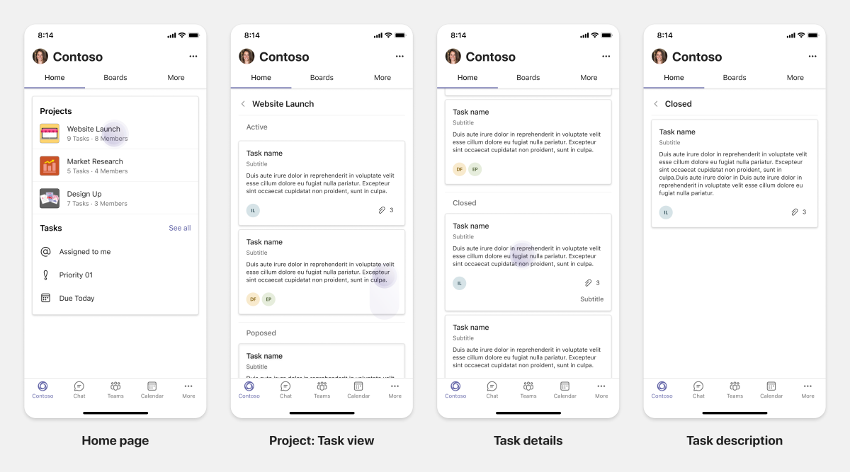
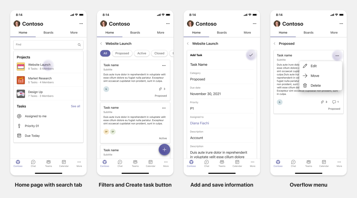
In the first stage, your app can show the list of tasks to the user in a vertical stack. If there are multiple categories of tasks, such as Proposed, Active, and Closed then provide filters for showing grouped tasks or as headers to see the grouped tasks.
Quick actions:
In the second stage, you can provide the following functionalities to users:
- Create tasks or items with mandatory fields to reduce cognitive load of the users.
- Change the board type or view.
- Review tasks by expanding the view.
- Use dialogs to see detailed view.
- Move the tasks into different categories.
- Share relevant tasks in chats and channels through emails and activity feed.
Enablement:
In the third stage, you can enable users with the following features:
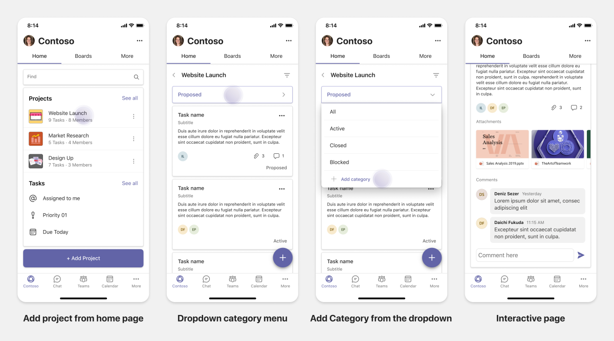
- Add new projects and boards.
- Add and modify different categories, such as Proposed, Active, and Closed.
- Configure the tasks for comments, attachments, and other complex features.
Co-authoring and whiteboarding apps
You can understand how to plan responsive tabs for co-authoring and whiteboarding apps on Teams mobile platform.
Consumption:
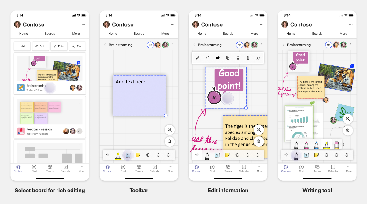
In the first stage, you can consider desktop experience to show the content and assets in your app. You can show the following functions:
- Comments or feedback.
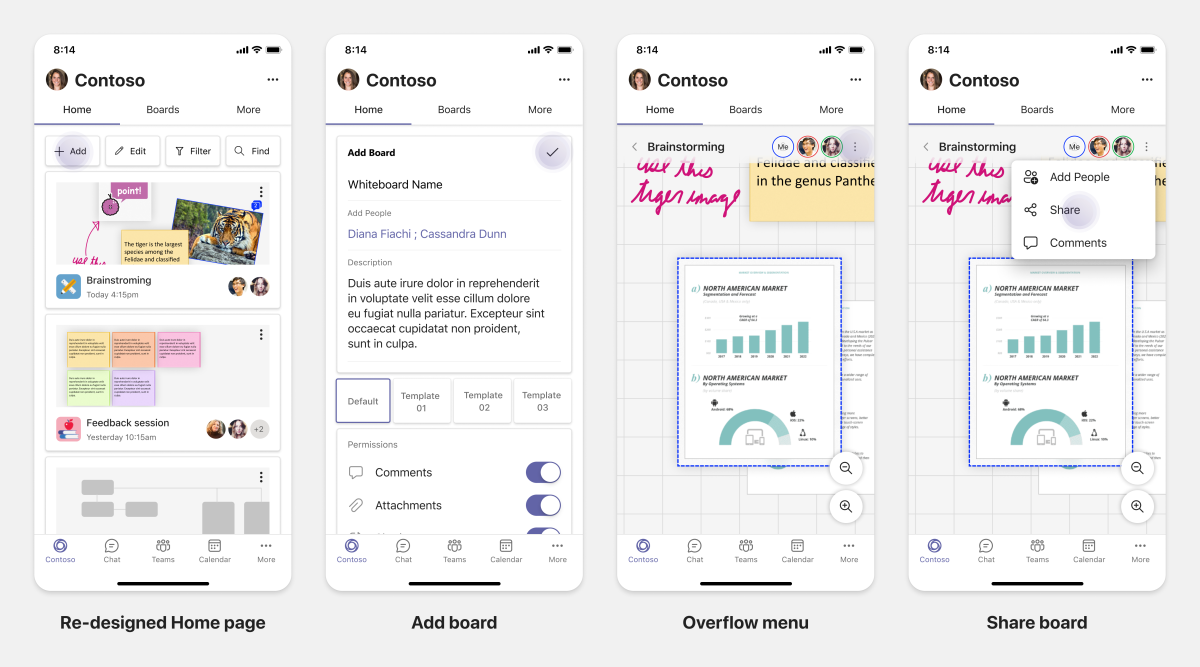
- Zoom in or out.
- Current stage or progress of a pending document.
Quick actions:
In the second stage, you can introduce the following actions:
- Create a new board for collaboration or new documents for signing.
- Share boards internally and with guests.
- Configure admin permissions.
Tip
You expose actions, which can be shown easily on the small screens.
Enablement:
In the third stage, provide complete experience to your users. You can enable users with the following features:
- Adding text, shapes, and quick notes.
- Navigate around content.
- Add layers and filters.
- Delete, undo, and redo operations.
- Access camera and microphone using TeamsJS APIs. For more information on device capabilities, see device capabilities overview.
See also
Platform Docs


