Track progress with status and trend query-based charts
TFS 2017 | TFS 2015 | TFS 2013
You can quickly view the status of work in progress by charting the results of a flat-list query. Different chart views such as pie, column, pivot, or trend are supported. Charts support viewing a count of work items or a sum of values for select numeric fields, such as Story Points, Effort, or Remaining Work. Group work by State, Assigned To, or other system defined or custom field.
In this article you'll learn how to carry out the following tasks:
- Construct a flat-list query to support your chart
- Create and share your query-based chart
- Create a status pie, column, bar, or pivot chart
- Create a trend chart
- Add a chart to a dashboard
- Configure a query widget
Note
This article describes how to configure work tracking query charts and the Chart for Work Items widget. To add existing query charts to dashboards, see Add charts to a dashboard. For an overview of all work tracking charts and in-context reports, see About dashboards, charts, reports, & widgets.
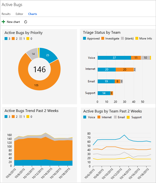
For example, the following image illustrates four different charts created from the same flat-list query. The pie chart groups the 146 active bugs by priority, and the bar chart groups the bugs by team and their triage status. The last two chart show two different trend views of the active bugs over the last two weeks.
Prerequisites
By default, users with Basic access or higher can create charts. Users with Stakeholder access can't view or create charts from the Queries page, however, they can view charts added to a team dashboard. For details, see Stakeholder access quick reference.
- Connect to a project. If you don't have a project yet, create one.
- To create a chart, you must be added to a project as a member of the Contributors or Project Administrators security group. To get added, Add users to a project or team.
- To add a chart to a team dashboard, you must be a member of the team, be a team administrator, or be a member of the Project Administrators security group.
- You can add charts to multiple team dashboards and get access to the widget catalog, which is another way to add charts to a dashboard.
To learn more about default groups, see Get started with permissions, permission inheritance, and security groups.
Note
The images you see from your web portal may differ from the images you see in this article. These differences result from updates made to your web app, options that you or your admin have enabled, and which process was chosen when creating your project—Agile, Basic, Scrum, or CMMI. The Basic process is available with Azure DevOps Server 2019 Update 1 and later versions.
Create a flat-list query
When creating a query to support your chart, follow these guidelines.
Always select the Flat list of work items query type. Other query types aren't supported for charting. For more information, see Define a query, Define a flat-list query.
Add those fields to either a query clause or the column options that you want to use within your chart. You can group charts by any field except date-time, free-form text, and tag fields. For example:
- To group by Status, include the State field
- To group by work assignments, include the Assigned To field
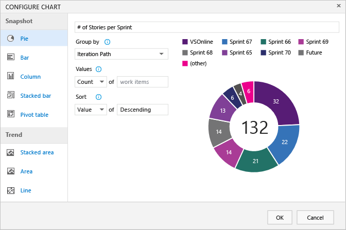
- To group by sprints or iterations, include the Iteration Path
- To group by team, include the Node Name field that displays the leaf node of the Area Path
- To group by a custom field, include it.
To sum a numeric column, include the corresponding field in your query clause or column options. For more examples of charts created from numeric fields, see Query by a numeric field.
If you plan to add your query to a dashboard, save your query as a Shared query.
You can't group charts by the following field data types:
- ID
- Date-time, such as Created Date, Changed Date
- Plain text, such as Title
- Rich-text, such as Description, Repro Steps
- Tags (You can filter a query using tags, however you can't use tags to configure your chart).
Chart availability
- Charts saved under Shared Queries are viewable by all team members, except members with Stakeholder access, and can be added to dashboards.
- Charts that you create for queries under your My Queries folder are visible only to you.
- You can copy and email the URL of any chart page to share it with a project member.
- To create similar charts for tests, see Track test status.
Display of areas and iterations
When you select Area Path or Iteration Path, only the leaf node appears in the chart. The leaf node is the last node of the full path. For example, Phone is the leaf node of FabrikamFiber/Fabrikam Website/Phone. If your query contains a mixed level of leaf nodes, your chart might not reflect expected results.
Select the Node Name field, the area path leaf node, to see if that improves your results.
Charts display in browsers that support Scalable Vector Graphics (SVG). Supported browsers include Microsoft Edge, Internet Explorer 9 and later versions, Chrome, Firefox and Safari on Mac. Charts aren't optimized for mobile or touch displays.
Sort by Value or Label
Most charts allow you to choose how you want to sort the data. You can sort by Value or Label and select Ascending or Descending.
- Value: Sorts data by the numeric value
- Label: Sorts by the label selected for grouping the data.
Limited display of series
When a chart contains more than seven items within the data series, values in the eight-plus items are consolidated into a set labeled "other"?
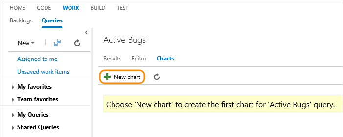
Create a query-based chart
From Queries, open the chart editor for a flat list query. You must belong to the Contributors group to create charts.
If you have Stakeholder access, the Charts and New Chart links won't appear.
Select the chart type and field for grouping values. When you use pie, bar, and column charts, select a single field to view a count of work items.
If you don't see the field you want in the Group by drop-down list, add the field as a column to the query and save the query. Also, the Aggregation options depend on the fields used in the query or those selected from the Column Options.
If you receive an error message when you close the chart editor, you need to request Basic access.
To sort the results, select Value or Label as the sort option and then Ascending or Descending.
To change a color, select a color on the chart and pick a new color from the color picker.
Charts automatically update when you edit the query or refresh the query results.
Add a Pie chart
Use a pie chart to show group percentages with six or fewer categories. Good examples of pie charts are:
- Active Bugs Status, group by State
- User Story Status, group by State
- User Story Progress, group by Completed, In Progress, or Cut
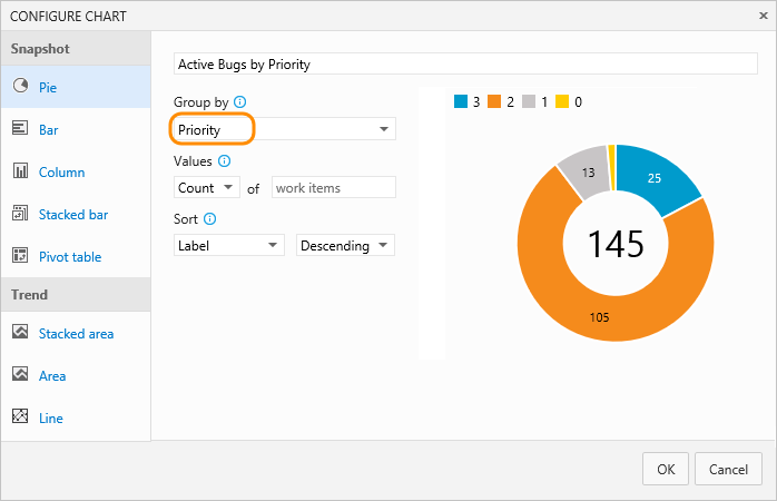
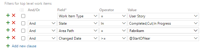
For example, the following query filters User Stories based on the State for Cut, In Progress, and Completed since the start of the year.
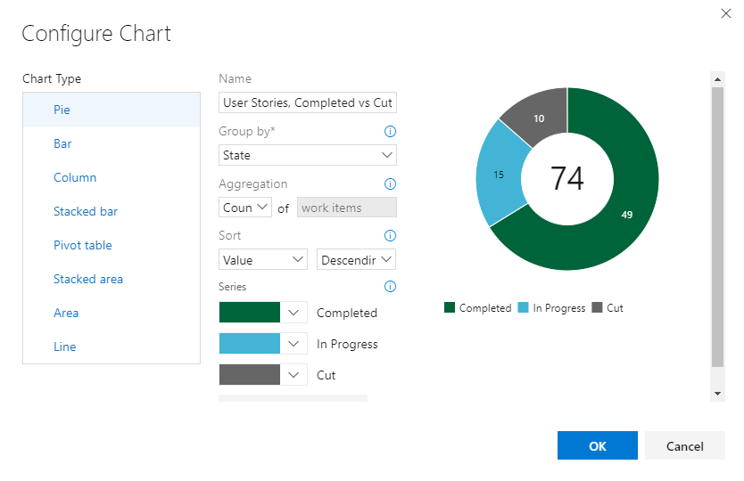
The pie chart configuration is as shown in the following image.
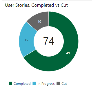
The combined query and chart configuration yield the following pie chart.
Add a Stacked bar chart
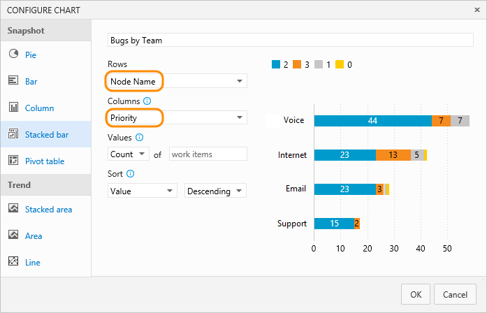
A stacked bar chart lets you track progress against two field values. Node Name will display the last leaf within an area path. Use this when you want to show data across teams, and each node corresponds to a team.
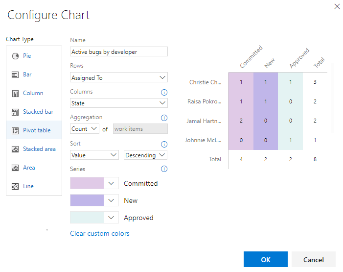
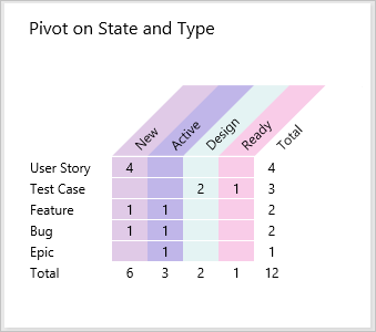
Add a Pivot table
The Pivot table displays a table of configurable rows and columns, with columns showing a count of work items or sum of a numeric field. Choose a Pivot table when you want to compare across areas the work being performed.
The following image shows an example of active bugs assigned to developers and their current state.
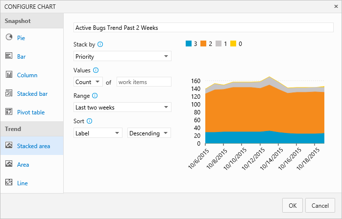
Add a Trend chart
Trend charts let you view progress over time. You can select a rolling period ranging from the last week to the last year (earlier versions of TFS may have limited selections).
Trend data is extracted from the work tracking data store. Like most data stores, the schema of the relational database is designed and optimized for the online transactional processing of data. As the tool or plug-in performs an activity, it writes the latest information to the operational store. Therefore, data in the operational store is constantly changing and being updated, and all data is current.
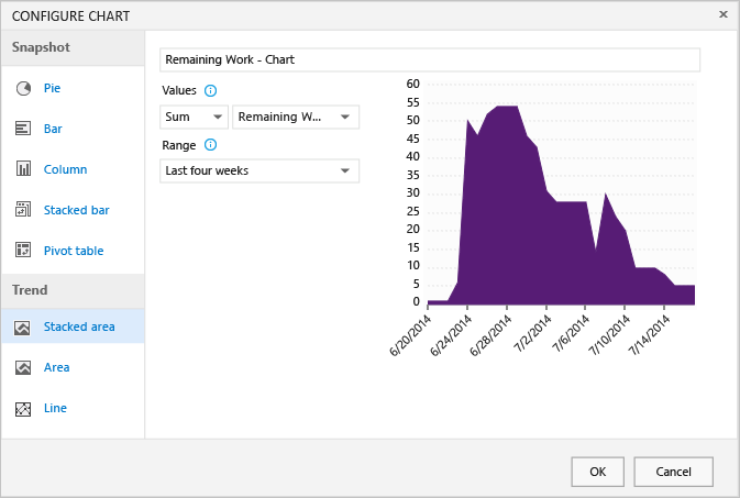
Add a Burndown chart
Burndown charts are useful for determining how quickly work is progressing based on a numeric field value, such as Story Points, Effort, or Remaining Work, or on a count of work items.
To create a burndown chart, make sure to add the numeric field you want to your query. To view a burndown chart of tasks, select the Sum operator for Remaining Work.
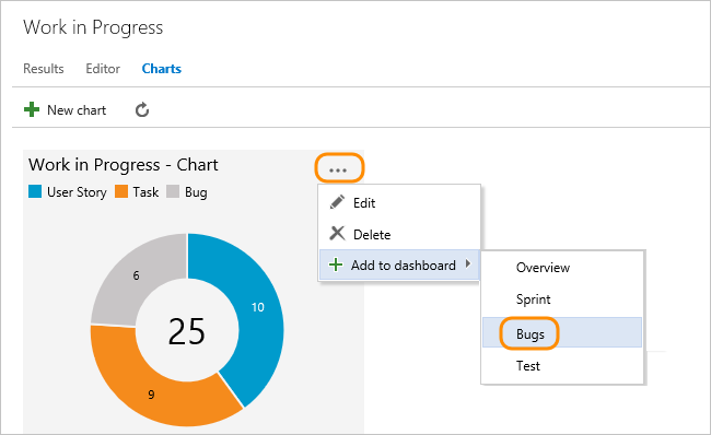
Add chart to a dashboard
To add a chart to a dashboard, you must be a team administrator or have permissions to edit a dashboard (default settings). You can only add charts defined for shared queries.
Select the ![]() actions icon for the chart you want to add, and select Add to dashboard.
actions icon for the chart you want to add, and select Add to dashboard.
To add other types of charts, such as test results and build summary charts, see Add widgets and chart to a dashboard.
Add a chart widget to a dashboard
If you've already defined your flat list query, you can add and configure a chart to a dashboard using the Chart for work items widget.
From the web portal, open the team dashboard you want to add the chart to.
To add widgets to the dashboard, select
 Edit. The widget catalog will automatically open. Add all the widgets that you want and drag their tiles into the sequence you want.
If you don't see these icons, then you need to be added as a team administrator or a member of the Project Administrators group.
Select the Chart for work items widget and then select Add.
Select the widget's
 gear icon to open the configuration dialog.
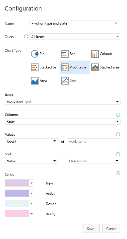
Give the chart a title, select the flat list query on which the chart is based, and choose the chart type.
Based on your chart type, specify values for the remaining fields. Change a chart color simply by choosing another color from those shown.
Note
All rules for configuring charts described previously in this article apply to configuring the chart for work items widget.
After you save your changes, you'll see the new chart has been added to the dashboard.
Drag the tile anywhere on the dashboard to put it where you want it.
When you're finished with your changes, select
 to exit dashboard editing.
Query-based charts versus Excel-generated PivotCharts
Query-based charts generate data from the work item tracking data store and therefore displays the most recent data. Excel PivotCharts access data published to the Analysis Services cube, which is refreshed every two hours by default. Excel charts require your project's project collection is configured with SQL Server Reporting Services and Analysis Services.