An accessibility case study - Reading List. Part 1: Introduction
Reading List is an app introduced with the Windows 8.1 Preview. During development of the app, the Reading List team focused carefully on its accessibility, to make sure customers of all abilities can fully leverage the app’s features. This series of blog posts details the things we considered, and how we implemented specific accessibility-related functionality in the app. I’ll also point out some areas where the accessibility could be enhanced further. It’s our goal that features should not only be technically accessible, but should provide a fast and efficient experience for all our customers.
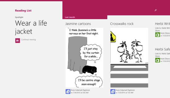
Figure 1: The Reading List app in the Windows 8.1 Preview.
Once you’ve used the Reading List app, you’ll know that at its heart it’s a list. (You might have guessed that by its name.) The app is built using the WinJS UI framework, and the list is a WinJS.UI.ListView. The WinJS team has done a cracking job at incorporating accessibility into the ListView, so you may be thinking, “the app is mostly a ListView, and the ListView’s accessible, so there’s nothing left for the app team to do”. Well, this really isn’t the case; there’s plenty to consider around accessibility. The ListView does give us a great foundation for accessibility, but as an app developer it’s my responsibility to understand exactly what experiences I’m delivering to all my customers, and to make those experiences as efficient as possible.
While some of the technical details I’ll describe in this series are specific to WinJS apps, many of the principles apply to any app. So if you’re building a XAML app, you’ll still be interested in the topics raised.
Throughout these posts I’ll be focusing mainly on the UI in the Reading List app, rather than associated UI. For example, the Reading List Share flyout invoked from other apps to add an item to the Reading List, or the Options and About pages. All of the topics I’ll mention apply to all that associated UI. After all, if the Share flyout isn’t fully accessible, then we’d block some customers from generating Reading List items, and the accessibility of the main app would become a moot point.
There are five areas I’ll be describing in detail in these posts:
1. Colours and contrast
2. Keyboard accessibility
3. Programmatic accessibility
4. Live Regions
5. Narrator touch
But before we explore all these topics, I’d like to mention some other topics which the team also considered, but where we didn’t need to do any specific development work. These are described below.
Audio output
An app that outputs audio needs to take action to make sure related features are accessible to customers who are deaf or hard-of-hearing. In Reading List’s case, we don’t output any audio.
Showing everything larger on the screen
On devices with a sufficiently high resolution, there’s a display option to have everything shown on the screen at a larger-than-default size. This is an extremely useful setting to many people. From an app-implementation perspective, when the larger setting is turned on, the app is simply shown at a different resolution. With the exception of incorporating higher resolution images to be shown appropriately, we didn’t have to take any action to account for the larger display setting because we developed the app’s css to allow the UI to adapt to all different supported screen resolutions.
Having said that, it’s definitely worth running your app with this setting turned on and checking that all your UI looks great. This is such an important setting; you wouldn’t want to discover anything unexpected with your UI late in the development cycle, (for example some content clipping, or scrollbars unexpectedly appearing).
Windows Magnifier
Some assistive technology (AT) tools track keyboard focus in order to highlight the element with focus in some way. The Windows Magnifier tool has a related option, and in its Full Screen mode can change the current view to automatically bring the element with focus into view. All the UI elements used by the Reading List app raise a UI Automation (UIA) Focus Changed event by default whenever they get keyboard focus, and also by default, they expose their bounding rectangles correctly through UIA. This is a great example of how the WinJS team has made things easy for us. My customer can turn on Magnifier, use the arrow keys to move around the list, and the focused item will be brought into view. And I didn’t have to do anything to make this happen. Nice!
While collecting the screen shots below, I was reminded of the importance of providing a great experience to your customers in all the views that your app supports. The Reading List app changes its layout of items depending on the width of the app. For many customers, they’ll have the app narrowed at the side of the screen. So it’d be pretty unhelpful of me to deliver a great accessible experience when the app occupies the full screen, but a degraded experience when the app’s narrow. Instead I should strive to deliver a great experience in all views.
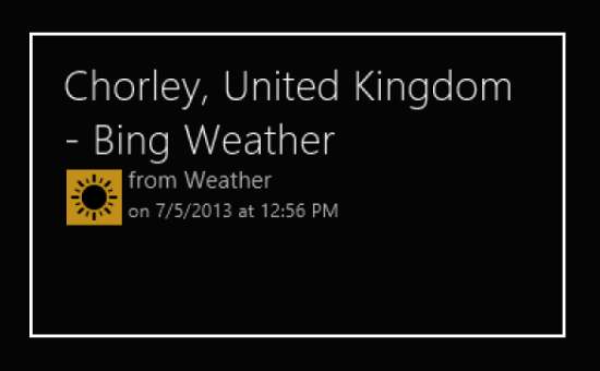
Figure 2: Magnifier following keyboard focus in the fullscreen Reading List app, bringing an item with focus into view.
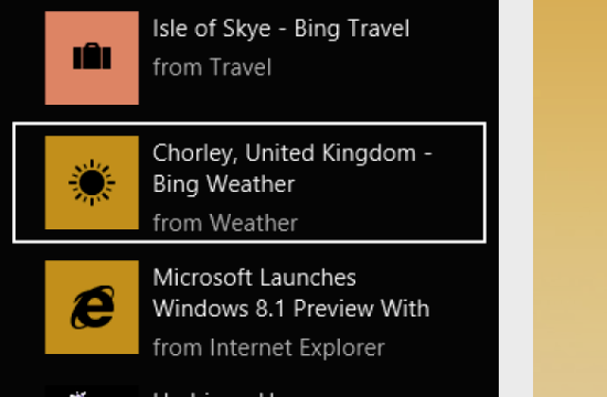
Figure 3: Magnifier following keyboard focus in the narrow Reading List app, bringing an item with focus into view.
Ease of Access Settings “More options”
Some customers will adjust the following settings at the Ease of Access Settings page.
1. Notification timeouts
The Reading List app does not display any notifications, and so this setting will not impact the Reading List customer.
2. Play animations
Some UI animations are shown in the Reading List app. For example, the app name and Search UI animates when the app starts due to the app’s use of the enterPage() API. Also, the ListView items animate as the Reading List view changes due to the ListView’s default animation behavior. All this animation is disabled automatically when the customer turns animations off at the Ease of Access settings page.
3. Cursor thickness (or what devs might call “Caret width”)
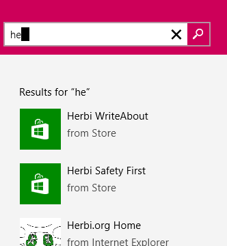
The Reading List app hosts a SearchBox control. (This control is described at https://msdn.microsoft.com/en-us/library/windows/apps/dn301949.aspx.) The caret presented in that control is automatically resized to account for the customer’s selection at the Ease of Access Settings page.
Figure 4: The Reading List Search UI showing a caret whose width respects the customer’s selection at the Ease of Access Settings page.
Summary
The Reading List team considered many aspects of accessibility in order to determine where our energies needed to be focused. It was clear that in some areas the nature of the app and the built-in support for accessibility in the WinJS framework, no specific work was required on our part. We then set to work analyzing the areas where work by us would be required, in order to understand how we could enhance that default accessibility to provide a fully accessible and efficient experience for all our customers.
An accessibility case study - Reading List. Part 1: Introduction
An accessibility case study - Reading List. Part 2: Colours and Contrast
An accessibility case study - Reading List. Part 3: Keyboard accessibility
An accessibility case study - Reading List. Part 4: Programmatic accessibility
An accessibility case study - Reading List. Part 5: Live Regions
An accessibility case study - Reading List. Part 6: Using Narrator with touch input only


