Customizing the accessibility of my XAML and WinJS Windows 8 apps – Part 2: The XAML app
Customizing the accessibility of my XAML and WinJS Windows 8 apps – Part 2: The XAML app
Guy Barker
So I’ve built my cool new Windows 8 in XAML. I’ve checked out its accessibility, and found there’s a lot I’ve got by default. I’ve also decided there are four specific things I need to do in order to deliver the fully accessible app my customers expect. This blog describes the steps I took around enhancing my XAML app’s accessibility.
Accessible names
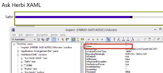
If I point the Inspect SDK tool to my slider, it tells me that the slider has no accessible Name property, (as shown in the image below). That’s because there's no label for the control that XAML can use to set the accessible Name from. So I need to give the slider an accessible Name, such that when a screen reader user tabs to the control, they’re told what the meaning of the slider is.
I could set the Name in the slider’s XAML, by setting the AutomationProperties.Name property. This is really easy to do, and would seem to fix the issue. However, I mustn’t hard code English strings in the XAML, as what good is English to a screen reader user who doesn’t speak English? I want this app to be fully accessible in every market I ship.
So instead, I’m going to give the slider a localizable accessible Name property. First I have to add the resource file for localizable strings. (I’d have to do this anyway, to localize the strings shown visually in the app.) There are lots of details up at MSDN around localizable resources, and it’s pretty much a case of doing the following:
- Right click on your project, do Add->New Item, Resources file (.resw)
- Move the file into a Strings\en-us folder, (for US English strings).
- Add strings to the file, matching ids of elements to the strings associated with them.
So in my case, I’m going to give the slider an id, like this:
x:Uid="sliderRiskLevelId"
I’m then going to update the resources file to match the AutomationProperties.Name for that element with a localizable string:
sliderRiskLevelId.[using:Windows.UI.Xaml.Automation]AutomationProperties.Name Risk level
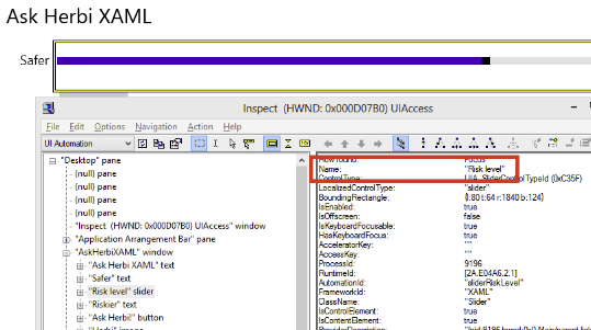
When I next point Inspect to the slider, I see the required Name property.
I can then take the same steps for the image element in the app, so that when a screen reader examines the image, a relevant localized name can be presented to my customers.
Note, as someone once said, “What’s in a name?” It can be tempting to think that if your XAML element has an “x:Name” set, then that will become the accessible Name property, as exposed through UIA. But that’s not the case. The “x:Name” property is exposed as the AutomationId property. The AutomationId is intended to be a unique identifier for that element relative to whatever else is shown in your app. The AutomationId is not localized, so a screen reader or your automation tests can use it to access the element regardless of the language of the app.
Also, it's worth a comment here on how useful Inspect is when it comes to helping you become aware of things in your UI element hierarchy which could be a problem for your customers. When I ran Inspect, I noticed that the UIA tree of elements for my app included a text-related element with no name. This element was associated with the TextBlock which presents the advice that gets shown after the Ask button is invoked, but initially no text is shown in the TextBlock. As such, it's pretty confusing for it to be exposed in the UIA tree. To fix this, I initialized the TextBlock to not be shown, with the following XAML:
Visibility="Collapsed"
That removes the element from the UIA tree. When I later set the text on the TextBlock, I made it visible and so it then appeared in the UIA tree.
adviceTextBlock.Visibility = Windows.UI.Xaml.Visibility.Visible;
Descriptive Slider values
While the AutomationProperties class can make it really easy to easily control some aspects of the app’s accessibility, sometimes you need the deeper customization available through a custom AutomationPeer. AutomationPeers are what make XAML elements accessible, and by introducing your own custom AutomationPeer, you might do a little work to customize a single accessible property, or take more involved steps to add specific behavioral support to a control. This MSDN article on custom automation peers, https://msdn.microsoft.com/en-us/library/windows/apps/xaml/jj219211.aspx gives loads of useful details on what they can be used for. (Some of what follows here will only make sense if you’ve read that article.)
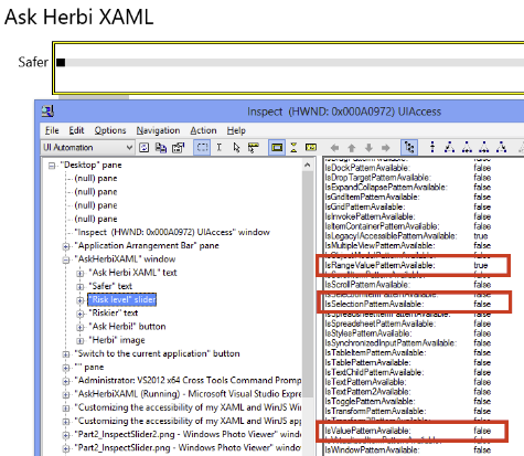
After I first built my XAML app containing the slider, I ran Narrator and used the keyboard to change the slider position. Narrator notified me of new the slider values, but that took the form of speaking the percentage values “0”, “33”, “67” and “100”. The purpose of my slider is to set a risk level, and numeric values don’t express much meaning, other than perhaps assuming that a higher number is riskier than a lower number. What’s more, why don’t I hear the absolute values “0”, “1”, “2” and “3”? To answer this, we should point the Inspect tool at the slider again, and look closely at what UIA patterns are supported by the slider. (UIA patterns relate to the behaviors of elements.) Of interest to me here is that Inspect tells me that the RangeValue pattern is supported, but the Value pattern and Selection pattern are not, (as shown in the image below).
When Narrator examines an element, it might look for specific pattern support based on the element’s UIA control type. (Inspect shows me that the slider has a control type id of UIA_SliderControlTypeId.) In the case of a slider, Narrator will first check for support of the Selection pattern, then the Value pattern and finally the RangeValue pattern. If only the RangeValue pattern is supported, it will access the current value and speak this as a percentage of the full slider range. This is the behavior I get by default in my app. If I wanted to override this to have absolute values spoken by Narrator, I would need to add Value pattern support to the slider. And if I want to have Narrator speak some descriptive text associated with each slider value, I need to add Selection pattern support. So I’ll add Selection pattern support next. (I would add Value pattern support in a similar way, if I’d needed that.)
So here I go, adding Selection pattern support to my slider.
The first thing I’ll do is create my own class, through which my custom AutomationPeer can be accessed.
public class CustomSlider : Slider
{
protected override AutomationPeer OnCreateAutomationPeer()
{
return new CustomSliderAutomationPeer(this);
}
}
I’ll then reference my custom class in the XAML, by replacing the use of the “Slider” element with “local:CustomSlider”. This means that when Narrator asks for accessible data associated with the element, that data will be provided by a CustomSliderAutomationPeer class that I now need to create.
Given that most of the accessible data that I want exposed by the element will be the same as that exposed by a regular slider, I want my custom AutomationPeer to be derived from the AutomationPeer class that provides the accessible data for a regular slider.
public class CustomSliderAutomationPeer : SliderAutomationPeer
{
public CustomSliderAutomationPeer(CustomSlider owner)
: base(owner)
{
}
}
Next I’ll override the GetPatternCore() method, to say that the element supports the Selection pattern in addition to the RangeValue pattern that it supports by default.
protected override object GetPatternCore(PatternInterface patternInterface)
{
if (patternInterface == PatternInterface.RangeValue)
{
return this;
}
else if (patternInterface == PatternInterface.Selection)
{
return this;
}
return null;
}
Now, having declared that my custom AutomationPeer class supports the Selection pattern, I’d better add that support. To add support, I’ll need to implement all the members of the ISelectionProvider interface, (as described at https://msdn.microsoft.com/en-us/library/windows/apps/windows.ui.xaml.automation.provider.iselectionprovider.aspx). The IsSelectionRequired and CanSelectMultiple properties are easy, but the GetSelection() method’s going to take a bit more thought.
public class CustomSliderAutomationPeer : SliderAutomationPeer, ISelectionProvider
{
public bool IsSelectionRequired
{
get
{
return true;
}
}
public bool CanSelectMultiple
{
get
{
return false;
}
}
public IRawElementProviderSimple[] GetSelection()
{
…
}
}
The GetSelection() method returns an array of IRawElementProviderSimple objects, but in my case there’s only going to be one element in the array. This element represents the selection, and will only be used to provide an accessible name to be spoken by Narrator. The object must implement the ISelectionItemProvider interface if it’s to be the item returned by the slider as the element that is the current selection, so I first wondered if I needed to define some new class for the selection item. But then I took a look through https://msdn.microsoft.com/en-us/library/windows/apps/dd319586(v=vs.85).aspx to see what standard XAML controls support the SelectionItem pattern. The ListBoxItem seemed pretty tempting, so I decided to leverage that class as my selection item.
I created an instance of a ListBoxItem when my AutomationPeer is created, and cached the ListBoxItem for later use. I also cached my single-element array which I’d return from the calls to GetSelection(). In fact I now have all the objects I need to return a selection.
private ListBoxItem m_item;
private IRawElementProviderSimple[] m_collection;
public CustomSliderAutomationPeer(CustomSlider owner)
: base(owner)
{
m_item = new ListBoxItem();
AutomationPeer itemPeer = FromElement(m_item);
m_collection = new IRawElementProviderSimple[1];
m_collection[0] = ProviderFromPeer(itemPeer);
}
Finally, I fill in the blanks in the GetSelection() method, by setting an appropriate AutomationProperties.Name property on the ListBoxItem I created, and returning that in the array representing the selection.
public IRawElementProviderSimple[] GetSelection()
{
string[] sliderItemTextIds = {
"riskLevelLowId",
"riskLevelMediumId",
"riskLevelHighId",
"riskLevelTopId"
};
int idxSlider = (int)base.Value;
var loader = new Windows.ApplicationModel.Resources.ResourceLoader();
string sliderText = loader.GetString(sliderItemTextIds[idxSlider]);
m_item.SetValue(Windows.UI.Xaml.Automation.AutomationProperties.NameProperty, sliderText);
return m_collection;
}
The bulk of that function simply gets the localized text that I want to be spoken for the slider value.
By making the changes above, I’ve added Selection pattern support to my slider. When Narrator examines the slider and finds the Selection pattern supported, it retrieves an IRawElementProviderSimple associated with the selection. In my case that’s provided by the ListBoxItem whose accessible Name property I’ve set to be a string associated with the current slider value. Narrator speaks that Name as I change the slider value.
So this all works great for me. In theory another screen reader might examine other properties of the object that I return as the selection, and those properties might be rather unexpected from the user’s perspective. For example, why would a slider’s selection have a control type of ListBoxItem? If that ever turned out to be an issue, I’d need to look into changing that.
By the way, for completeness I thought it might be worth setting a ThumbToolTipValueConverter on my slider too. This would allow me to have the tooltips shown which match the text spoken by Narrator. So I created the necessary class, and referenced an instance of it on my slider.
sliderRiskLevel.ThumbToolTipValueConverter = new TooltipStringGenerator();
public class TooltipStringGenerator : IValueConverter
{
public TooltipStringGenerator() {}
public object Convert(object value, Type type, object parameter, string language)
{
string[] sliderItemTextIds = {
"riskLevelLowId",
"riskLevelMediumId",
"riskLevelHighId",
"riskLevelTopId"
};
double dv = (double)value;
int idxSlider = (int)dv;
var loader = new Windows.ApplicationModel.Resources.ResourceLoader();
return loader.GetString(sliderItemTextIds[idxSlider]);
}
public object ConvertBack(object value, Type type, object parameter, string language)
{
throw new NotSupportedException();
}
}
It’s worth pointing out here that setting the tooltip strings alone isn’t sufficient to meet the meets of the screen reader experience. When the tooltip pops up with the friendly text, Narrator might speak that text, depending on what else is going on at the time. But as the slider value changes, Narrator won’t speak the updated tooltip. So the custom AutomationPeer is necessary to provide the experience I want my customers to have.
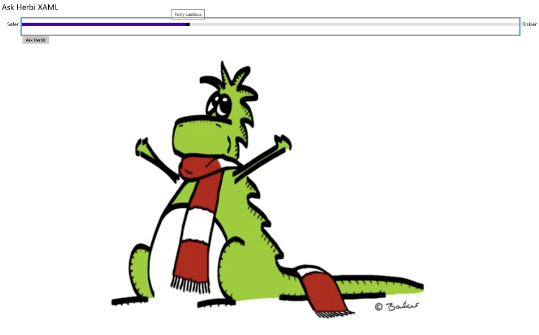
The image below shows the Narrator cursor on the slider, and the visual tooltip showing the same text as Narrator is speaking for the slider value.
Announcing visual updates
When I invoke the app button, the answer I’m looking for appears visually in the UI. But if Narrator doesn’t announce that text when it appears, then the app’s as good as useless. I need a way to tell a screen reader to pay attention to the text that appeared, even though it’s appearing at some point distant from where keyboard focus is. (In general, screen readers need to be careful not to announce all visual changes on the screen, because many of those changes would only be a distraction to the user.)
So I’ll explicitly declare the TextBlock that shows the answer to be what’s known as a “live region”, with a handy one-line change.
AutomationProperties.LiveSetting="Assertive"
(Here we see the same useful AutomationProperties class that we saw earlier when setting the accessible Name.)
There are two aspects of having some UI be a live region. The first is that when the contents of the element change, an event should be raised so that UIA clients such as screen readers are aware that’s something’s changed. This is done by raising a UIA LiveRegionChanged event. If I’d built some custom control I’d need to raise the event itself. But conveniently, if I've declared the TextBlock to be a live region, then XAML raises the event for me whenever the text in the element changes.
The second part of using live regions is declaring what type of live region the element is. When Narrator receives the event, it will examine the AutomationProperties.LiveSetting property of the element that raised the event. If the LiveSetting is assertive, Narrator will let the user know about the current state of the element immediately, (including the new text set on it). So this announcement will interrupt Narrator if it happened to be saying something else at the time of the event. If I’d given the element a LiveSetting of “polite”, then Narrator would finish what it was in the process of saying when the event was raised, before announcing the new state of the element to my customer.
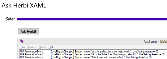
To get confirmation that all was as I expected when the contents of the TextBlock in my app changed, I pointed the AccEvent SDK tool to the TextBlock. As the image shows below, I could see the event getting raised, and that the LiveSetting property on the element that raised the event was “Assertive”.
I can’t stress the importance of the AutomationProperties.LiveSetting enough. If your customers interact with some controls in your app, and some critical information is displayed elsewhere in the app as a result of the interaction, a screen reader will very likely need to announce that critical information at that time. Often the simple step of declaring a TextBlock to have an assertive LiveSetting is all you need to do.
Presenting appropriate high contrast images
When I first built my app, I created an Image element and slapped in an existing image that I had lying around. That was easy. But then I turned on one of the high contrast themes and ran my app, and realized I’m not quite done yet. I don’t want to display large chunks of a white background when my customer wants light text shown on a black blackground. In many cases, presenting colours that are inappropriate to the current theme will make things difficult or impossible to make out, and in some cases it can be physically painful.
I could choose to show no images at all when a high contrast theme is active. But in the case of my images I think it would generally be preferable to present high contrast versions of them rather than not showing any image at all. So I set to work in Paint, creating black-on-white and white-on-black versions. The results aren’t too inspiring, but they illustrate the point I’m making here.
There were three steps to leveraging my new high contrast masterpieces.
1. Add the new png files as asserts to my app project.
2. Change the source property in my Image element’s declaration to use an image loaded as a resource.
Source="{StaticResource imageHerbi}"
3. Update the existing ResourceDictionary in the project’s StandardStyles.xaml, such that an image appropriate to the active high contrast theme will get loaded.
<ResourceDictionary.ThemeDictionaries>
<ResourceDictionary x:Key="Default">
…
<x:String x:Key="imageHerbi">Assets/Herbi.png</x:String>
</ResourceDictionary>
<ResourceDictionary x:Key="HighContrast">
…
<x:String x:Key="imageHerbi">Assets/Herbi.contrast-black.png</x:String>
</ResourceDictionary>
<ResourceDictionary x:Key="HighContrastWhite">
<x:String x:Key="imageHerbi">Assets/Herbi.contrast-white.png</x:String>
</ResourceDictionary>
</ResourceDictionary.ThemeDictionaries>
To test my high contrast change, I need to set the high contrast theme before running my app. I tend to pick a high contrast theme by right-clicking on the desktop, choosing Personalize, and then selecting the theme I’m interested in. I could instead just turn on high contrast from the Ease of Access settings, but that will only use the most recent high contrast theme used, (or the default). I always check my UI in High Contrast White and at least one of the light-on-dark themes.
By the way, in Visual Studio the XAML Design view reported the following exception when I added the resource string:
Exception: An object of the type "System.String" cannot be applied to a property that expects the type "Windows.UI.Xaml.Media.ImageSource".
I ignored that exception given that everything seemed to work fine when I ran the app.
The images below show the app running in two high contrast themes.
Summary
Ok, so having done the above, my app now exposes localized friendly names for my slider and image, and also provides meaningful strings for the slider values. It announces the results as they appear in the UI, and also presents colours which are appropriate for high contrast themes. It’s now good to be declared “Accessible” when I upload it to the Windows Store!
Customizing the accessibility of my XAML and WinJS Windows 8 apps – Part 1: Introduction
Customizing the accessibility of my XAML and WinJS Windows 8 apps – Part 3: The WinJS app
Customizing the accessibility of my XAML and WinJS Windows 8 apps – Part 4: Postscript
Comments
Anonymous
April 29, 2013
After I posted the XAML part of this blog, I worked on the WinJS part. During that WinJS work, I added the aria-valuetext attribute to the slider and gave it a role of slider, and as a result had added UIA Value pattern support to the slider. I could then assign useful localized text strings to be the current value of the slider. So then I started wondering, if I only had to add Value pattern support to get the strings I wanted spoken by a screen reader, why did I go to the effort of adding Selection pattern support to the slider in my XAML app? And the answer is - I didn't have to. When I'd originally considered what I'd need to do to get slider to speak a text string for the value, I discounted use of the Value pattern as I'd assumed that that would only cover numeric values rather than strings. So that was just a mistake on my part. It would have been simpler for me to have added Value pattern support than Selection pattern as I did. I still would have created a custom AutomationPeer, but it would implement the IValueProvider interface rather than ISelectionProvider. If I'd done that I wouldn't have had to return an object representing the selection, (which provides the string I want spoken), instead I would just return the string as the value of the slider. Much simpler. But having added the Selection pattern to the slider, I'll leave my app as is it. Who knows, perhaps one day I really will need to add Selection pattern to some element, and I can refer to the code I added to this app.Anonymous
May 13, 2013
As I mentioned earlier, I've realized that I don't need to add Selection pattern support to my slider in order to have useful localized strings spoken by a screen reader for the values on my slider. Instead, Value pattern support would be sufficient, and would be less work. So I thought I'd show the code for that here. The first bit relates to adding support to my custom AutomationPeer. Because I want it to support the Value pattern, it will need to implement the IValueProvider interface. In its GetPatternCore(), it will declare that it supports that interface. And then we go on to actually implement the two properties and one method contained in that interface. (Those members are described at msdn.microsoft.com/.../windows.ui.xaml.automation.provider.ivalueprovider.aspx.) public class CustomSliderAutomationPeer : SliderAutomationPeer, IValueProvider { // Cache our ValuePattern's Value property. string m_value = ""; public CustomSliderAutomationPeer(CustomSlider owner) : base(owner) { } // Override GetPatternCore to say that we also support the Selection pattern. protected override object GetPatternCore(PatternInterface patternInterface) { if (patternInterface == PatternInterface.RangeValue) { return this; } else if (patternInterface == PatternInterface.Value) { // This is the pattern we're adding. return this; } return null; } // Now implement the two properties and one method on the Value pattern. public bool IsReadOnly { get { return false; } } public string Value { get { return m_value; } } public void SetValue(string newValue) { m_value = newValue; } } I chose to have a private member for the value associated with my IValueProvider implementation. I expect I don't need that given that the slider also implements the IRangeValueProvider interface. I could probably call through to set and get the RangeValue pattern's value whenever the Value pattern's value is being worked with. After all, it would seem undesirable to have the Value pattern's value and the RangeValue pattern's value as being different. But I left the code as it is, because it demonstrates how to add Value pattern support to a control which has no value otherwise. (I'm splitting this comment into two here, as apparently I can't post one long comment...)Anonymous
May 13, 2013
The comment has been removedAnonymous
December 30, 2014
Hi, I could not find the AutomationProperties.LiveSetting property. Am I missing any DLL?Anonymous
January 02, 2015
Hi Pratik, what UI framework are you using? I can find AutomationProperties.LiveSetting in the Windows.UI.Xaml.Automation namespace when I build a C# Windows Store app, but I can't find it in the AutomationProperties class in System.Windows.Automation when I build a WPF app. Maybe the AutomationProperties.LiveSetting property is only available to Windows Store apps. I notice in the "What's new in UI Automation" article at msdn.microsoft.com/.../hh437316(v=vs.85).aspx it lists "Support for Live Regions", so I'll bet it's not available to WPF apps. Guy
