Prise en main des appels de la bibliothèque d’interface utilisateur Azure Communication Services vers les applications vocales Teams
Ce projet vise à guider les développeurs pour lancer un appel du SDK Web d’appel Azure Communication Services vers la file d’attente d’appels et le standard automatique Teams à l’aide de la bibliothèque d’interface utilisateur Azure Communication.
En fonction de vos besoins, vous devrez peut-être offrir à vos clients un moyen simple de vous contacter sans configuration complexe.
L’appel vers la file d’attente et le standard automatique Teams est un concept simple mais efficace qui facilite l’interaction instantanée avec le support client, un conseiller financier et d’autres équipes orientées client. L’objectif de ce tutoriel est de vous aider à initier des interactions avec vos clients lorsqu’ils cliquent sur un bouton sur le Web.
Si vous souhaitez l’essayer, vous pouvez télécharger le code à partir de GitHub.
Suivez ce tutoriel pour :
- Vous permettre de contrôler l’expérience audio et vidéo de vos clients en fonction de votre scénario client
- Apprenez à créer un widget pour démarrer des appels sur votre application web à l’aide de la bibliothèque d’interface utilisateur.
Prérequis
Ces étapes sont nécessaires pour suivre ce tutoriel. Contactez votre administrateur Teams pour les deux derniers éléments pour vous assurer que vous êtes correctement configuré.
- Visual Studio Code sur l’une des plateformes prises en charge.
- Node.js, LTS (support à long terme) actif et versions Node 20 recommandés. Utilisez la commande
node --versionpour vérifier la version que vous utilisez. - Une ressource Azure Communication Services. Créer une ressource de communication
- Terminer la configuration du locataire Teams pour l’interopérabilité avec votre ressource Azure Communication Services
- Utilisation des Files d’attente d’appels Teams et d’Azure Communication Services.
- Utilisation des Standards automatiques Teams et d’Azure Communication Services.
Vérification de Node et de Visual Studio Code
Vous pouvez vérifier que Node a été installé correctement avec cette commande.
node -v
La sortie vous indique la version que vous avez, elle échoue si Node n’a pas été installé et ajouté à votre PATH. Comme avec Node, vous pouvez vérifier si VS Code a été installé avec cette commande.
code --version
Comme avec Node, cette commande échoue en cas de problème lors de l’installation de VS Code sur votre ordinateur.
Mise en route
Ce tutoriel comporte 7 étapes et à la fin de l’application sera en mesure d’appeler une application vocale Teams. Les étapes à suivre sont les suivantes :
- Configuration du projet
- Obtenir vos dépendances
- Configuration initiale de l’application
- Créer le widget
- Styliser le widget
- Configurer les valeurs d’identité
- Exécuter l’application
1. Configuration du projet
Utilisez cette étape uniquement si vous créez une application.
Pour configurer l’application react, nous utilisons l’outil en ligne de commande create-react-app. Cet outil crée une application TypeScript avec React facile à exécuter.
Pour vous assurer que Node est installé sur votre ordinateur, exécutez cette commande dans PowerShell ou le terminal pour afficher votre version de Node :
node -v
Si vous n’avez pas create-react-app installé sur votre ordinateur, exécutez la commande suivante pour l’installer en tant que commande globale :
npm install -g create-react-app
Une fois cette commande installée, exécutez la commande suivante pour créer une nouvelle application de réaction dans laquelle créer l'exemple :
# Create an Azure Communication Services App powered by React.
npx create-react-app ui-library-calling-widget-app --template typescript

# Change to the directory of the newly created App.
cd ui-library-calling-widget-app
Une fois ces commandes terminées, vous souhaitez ouvrir le projet créé dans VS Code. Vous pouvez ouvrir le projet avec la commande suivante.
code .
2. Obtenir vos dépendances
Ensuite, vous devez mettre à jour le tableau de dépendances dans le package.json pour inclure certains packages d'Azure Communication Services pour que l'expérience de widget que nous allons créer fonctionne :
"@azure/communication-calling": "^1.23.1",
"@azure/communication-chat": "^1.4.0",
"@azure/communication-react": "^1.15.0",
"@azure/communication-calling-effects": "1.0.1",
"@azure/communication-common": "2.3.0",
"@fluentui/react-icons": "~2.0.203",
"@fluentui/react": "~8.98.3",
Pour installer les packages nécessaires, exécutez la commande suivante du gestionnaire de package Node.
npm install
Après avoir installé ces packages, vous devez commencer à écrire le code qui génère l’application. Dans ce tutoriel, nous modifions les fichiers dans le répertoire src.
3. Configuration initiale de l’application
Pour commencer, nous remplaçons le contenu App.tsx fourni par une page principale qui va :
- Stocker toutes les informations Azure Communication dont nous avons besoin pour créer un CallAdapter pour alimenter notre expérience d’appel
- Affichez notre widget exposé à l’utilisateur final.
Votre fichier App.tsx doit se présenter ainsi :
src/App.tsx
import "./App.css";
import {
  CommunicationIdentifier,
  MicrosoftTeamsAppIdentifier,
} from "@azure/communication-common";
import {
  Spinner,
  Stack,
  initializeIcons,
  registerIcons,
  Text,
} from "@fluentui/react";
import { CallAdd20Regular, Dismiss20Regular } from "@fluentui/react-icons";
import logo from "./logo.svg";

import { CallingWidgetComponent } from "./components/CallingWidgetComponent";

registerIcons({
  icons: { dismiss: <Dismiss20Regular />, callAdd: <CallAdd20Regular /> },
});
initializeIcons();
function App() {
  /**
   * Token for local user.
   */
  const token = "<Enter your ACS Token here>";

  /**
   * User identifier for local user.
   */
  const userId: CommunicationIdentifier = {
    communicationUserId: "Enter your ACS Id here",
  };

  /**
   * Enter your Teams voice app identifier from the Teams admin center here
   */
  const teamsAppIdentifier: MicrosoftTeamsAppIdentifier = {
    teamsAppId: "<Enter your Teams Voice app id here>",
    cloud: "public",
  };

  const widgetParams = {
    userId,
    token,
    teamsAppIdentifier,
  };

  if (!token || !userId || !teamsAppIdentifier) {
    return (
      <Stack verticalAlign="center" style={{ height: "100%", width: "100%" }}>
        <Spinner
          label={"Getting user credentials from server"}
          ariaLive="assertive"
          labelPosition="top"
        />
      </Stack>
    );
  }

  return (
    <Stack
      style={{ height: "100%", width: "100%", padding: "3rem" }}
      tokens={{ childrenGap: "1.5rem" }}
    >
      <Stack tokens={{ childrenGap: "1rem" }} style={{ margin: "auto" }}>
        <Stack
          style={{ padding: "3rem" }}
          horizontal
          tokens={{ childrenGap: "2rem" }}
        >
          <Text style={{ marginTop: "auto" }} variant="xLarge">
            Welcome to a Calling Widget sample
          </Text>
          <img
            style={{ width: "7rem", height: "auto" }}
            src={logo}
            alt="logo"
          />
        </Stack>

        <Text>
          Welcome to a Calling Widget sample for the Azure Communication
          Services UI Library. Sample has the ability to connect you through
          Teams voice apps to a agent to help you.
        </Text>
        <Text>
          As a user all you need to do is click the widget below, enter your
          display name for the call - this will act as your caller id, and
          action the <b>start call</b> button.
        </Text>
      </Stack>
      <Stack
        horizontal
        tokens={{ childrenGap: "1.5rem" }}
        style={{ overflow: "hidden", margin: "auto" }}
      >
        <CallingWidgetComponent
          widgetAdapterArgs={widgetParams}
          onRenderLogo={() => {
            return (
              <img
                style={{ height: "4rem", width: "4rem", margin: "auto" }}
                src={logo}
                alt="logo"
              />
            );
          }}
        />
      </Stack>
    </Stack>
  );
}

export default App;
Dans cet extrait de code, nous inscrivons deux nouvelles icônes <Dismiss20Regular/> et <CallAdd20Regular>. Ces nouvelles icônes sont utilisées à l’intérieur du composant de widget que nous allons créer dans la section suivante.
4 Créer le widget
Maintenant, nous devons créer un widget qui peut s’afficher dans trois modes différents :
- En attente : cet état de widget correspond à l’état du composant avant et après l’exécution d’un appel
- Configuration : cet état correspond au moment où le widget demande des informations à l’utilisateur, comme son nom.
- Dans un appel : le widget est remplacé ici par le composite d’appel de la bibliothèque d’interface utilisateur. Ce mode widget est utilisé lorsque l’utilisateur appelle l’application vocale ou parle avec un agent.
Créons un dossier nommé src/components. Dans ce dossier, créez un nouveau fichier appelé CallingWidgetComponent.tsx. Ce fichier doit se présenter comme l’extrait de code suivant :
CallingWidgetComponent.tsx
import {
  IconButton,
  PrimaryButton,
  Stack,
  TextField,
  useTheme,
  Checkbox,
  Icon,
  Spinner,
} from "@fluentui/react";
import React, { useEffect, useRef, useState } from "react";
import {
  callingWidgetSetupContainerStyles,
  checkboxStyles,
  startCallButtonStyles,
  callingWidgetContainerStyles,
  callIconStyles,
  logoContainerStyles,
  collapseButtonStyles,
} from "../styles/CallingWidgetComponent.styles";

import {
  AzureCommunicationTokenCredential,
  CommunicationUserIdentifier,
  MicrosoftTeamsAppIdentifier,
} from "@azure/communication-common";
import {
  CallAdapter,
  CallAdapterState,
  CallComposite,
  CommonCallAdapterOptions,
  StartCallIdentifier,
  createAzureCommunicationCallAdapter,
} from "@azure/communication-react";
// lets add to our react imports as well
import { useMemo } from "react";

import { callingWidgetInCallContainerStyles } from "../styles/CallingWidgetComponent.styles";

/**
 * Properties needed for our widget to start a call.
 */
export type WidgetAdapterArgs = {
  token: string;
  userId: CommunicationUserIdentifier;
  teamsAppIdentifier: MicrosoftTeamsAppIdentifier;
};

export interface CallingWidgetComponentProps {
  /**
   *  arguments for creating an AzureCommunicationCallAdapter for your Calling experience
   */
  widgetAdapterArgs: WidgetAdapterArgs;
  /**
   * Custom render function for displaying logo.
   * @returns
   */
  onRenderLogo?: () => JSX.Element;
}

/**
 * Widget for Calling Widget
 * @param props
 */
export const CallingWidgetComponent = (
  props: CallingWidgetComponentProps
): JSX.Element => {
  const { onRenderLogo, widgetAdapterArgs } = props;

  const [widgetState, setWidgetState] = useState<"new" | "setup" | "inCall">(
    "new"
  );
  const [displayName, setDisplayName] = useState<string>();
  const [consentToData, setConsentToData] = useState<boolean>(false);
  const [useLocalVideo, setUseLocalVideo] = useState<boolean>(false);
  const [adapter, setAdapter] = useState<CallAdapter>();

  const callIdRef = useRef<string>();

  const theme = useTheme();

  // add this before the React template
  const credential = useMemo(() => {
    try {
      return new AzureCommunicationTokenCredential(widgetAdapterArgs.token);
    } catch {
      console.error("Failed to construct token credential");
      return undefined;
    }
  }, [widgetAdapterArgs.token]);

  const adapterOptions: CommonCallAdapterOptions = useMemo(
    () => ({
      callingSounds: {
        callEnded: { url: "/sounds/callEnded.mp3" },
        callRinging: { url: "/sounds/callRinging.mp3" },
        callBusy: { url: "/sounds/callBusy.mp3" },
      },
    }),
    []
  );

  const callAdapterArgs = useMemo(() => {
    return {
      userId: widgetAdapterArgs.userId,
      credential: credential,
      targetCallees: [
        widgetAdapterArgs.teamsAppIdentifier,
      ] as StartCallIdentifier[],
      displayName: displayName,
      options: adapterOptions,
    };
  }, [
    widgetAdapterArgs.userId,
    widgetAdapterArgs.teamsAppIdentifier.teamsAppId,
    credential,
    displayName,
  ]);

  useEffect(() => {
    if (adapter) {
      adapter.on("callEnded", () => {
        /**
         * We only want to reset the widget state if the call that ended is the same as the current call.
         */
        if (
          adapter.getState().acceptedTransferCallState &&
          adapter.getState().acceptedTransferCallState?.id !== callIdRef.current
        ) {
          return;
        }
        setDisplayName(undefined);
        setWidgetState("new");
        setConsentToData(false);
        setAdapter(undefined);
        adapter.dispose();
      });

      adapter.on("transferAccepted", (e) => {
        console.log("transferAccepted", e);
      });

      adapter.onStateChange((state: CallAdapterState) => {
        if (state?.call?.id && callIdRef.current !== state?.call?.id) {
          callIdRef.current = state?.call?.id;
          console.log(`Call Id: ${callIdRef.current}`);
        }
      });
    }
  }, [adapter]);

  /** widget template for when widget is open, put any fields here for user information desired */
  if (widgetState === "setup") {
    return (
      <Stack
        styles={callingWidgetSetupContainerStyles(theme)}
        tokens={{ childrenGap: "1rem" }}
      >
        <IconButton
          styles={collapseButtonStyles}
          iconProps={{ iconName: "Dismiss" }}
          onClick={() => {
            setDisplayName(undefined);
            setConsentToData(false);
            setUseLocalVideo(false);
            setWidgetState("new");
          }}
        />
        <Stack tokens={{ childrenGap: "1rem" }} styles={logoContainerStyles}>
          <Stack style={{ transform: "scale(1.8)" }}>
            {onRenderLogo && onRenderLogo()}
          </Stack>
        </Stack>
        <TextField
          label={"Name"}
          required={true}
          placeholder={"Enter your name"}
          onChange={(_, newValue) => {
            setDisplayName(newValue);
          }}
        />
        <Checkbox
          styles={checkboxStyles(theme)}
          label={
            "Use video - Checking this box will enable camera controls and screen sharing"
          }
          onChange={(_, checked?: boolean | undefined) => {
            setUseLocalVideo(!!checked);
            setUseLocalVideo(true);
          }}
        ></Checkbox>
        <Checkbox
          required={true}
          styles={checkboxStyles(theme)}
          disabled={displayName === undefined}
          label={
            "By checking this box, you are consenting that we will collect data from the call for customer support reasons"
          }
          onChange={async (_, checked?: boolean | undefined) => {
            setConsentToData(!!checked);
            if (callAdapterArgs && callAdapterArgs.credential) {
              setAdapter(
                await createAzureCommunicationCallAdapter({
                  displayName: displayName ?? "",
                  userId: callAdapterArgs.userId,
                  credential: callAdapterArgs.credential,
                  targetCallees: callAdapterArgs.targetCallees,
                  options: callAdapterArgs.options,
                })
              );
            }
          }}
        ></Checkbox>
        <PrimaryButton
          styles={startCallButtonStyles(theme)}
          onClick={() => {
            if (displayName && consentToData && adapter) {
              setWidgetState("inCall");
              adapter?.startCall(callAdapterArgs.targetCallees, {
                audioOptions: { muted: false },
              });
            }
          }}
        >
          {!consentToData && `Enter your name`}
          {consentToData && !adapter && (
            <Spinner ariaLive="assertive" labelPosition="top" />
          )}
          {consentToData && adapter && `StartCall`}
        </PrimaryButton>
      </Stack>
    );
  }

  if (widgetState === "inCall" && adapter) {
    return (
      <Stack styles={callingWidgetInCallContainerStyles(theme)}>
        <CallComposite
          adapter={adapter}
          options={{
            callControls: {
              cameraButton: useLocalVideo,
              screenShareButton: useLocalVideo,
              moreButton: false,
              peopleButton: false,
              displayType: "compact",
            },
            localVideoTile: !useLocalVideo ? false : { position: "floating" },
          }}
        />
      </Stack>
    );
  }

  return (
    <Stack
      horizontalAlign="center"
      verticalAlign="center"
      styles={callingWidgetContainerStyles(theme)}
      onClick={() => {
        setWidgetState("setup");
      }}
    >
      <Stack
        horizontalAlign="center"
        verticalAlign="center"
        style={{
          height: "4rem",
          width: "4rem",
          borderRadius: "50%",
          background: theme.palette.themePrimary,
        }}
      >
        <Icon iconName="callAdd" styles={callIconStyles(theme)} />
      </Stack>
    </Stack>
  );
};
Dans le CallAdapterOptions, nous voyons certains fichiers son référencés, ces fichiers doivent utiliser la fonctionnalité Sons appelants dans le CallComposite. Si vous souhaitez utiliser les sons, consultez le code terminé pour télécharger les fichiers son.
5. Styliser le widget
Nous devons écrire certains styles pour nous assurer que l’apparence du widget est appropriée et qu’il peut contenir notre composite d’appel. Ces styles doivent déjà être utilisés dans le widget si vous copiez l’extrait de code que nous avons ajouté au fichier CallingWidgetComponent.tsx.
Créons un nouveau dossier appelé src/styles. Dans ce dossier, créez un fichier appelé CallingWidgetComponent.styles.ts. Le fichier doit se présenter comme l’extrait de code suivant :
import {
  IButtonStyles,
  ICheckboxStyles,
  IIconStyles,
  IStackStyles,
  Theme,
} from "@fluentui/react";

export const checkboxStyles = (theme: Theme): ICheckboxStyles => {
  return {
    label: {
      color: theme.palette.neutralPrimary,
    },
  };
};

export const callingWidgetContainerStyles = (theme: Theme): IStackStyles => {
  return {
    root: {
      width: "5rem",
      height: "5rem",
      padding: "0.5rem",
      boxShadow: theme.effects.elevation16,
      borderRadius: "50%",
      bottom: "1rem",
      right: "1rem",
      position: "absolute",
      overflow: "hidden",
      cursor: "pointer",
      ":hover": {
        boxShadow: theme.effects.elevation64,
      },
    },
  };
};

export const callingWidgetSetupContainerStyles = (
  theme: Theme
): IStackStyles => {
  return {
    root: {
      width: "18rem",
      minHeight: "20rem",
      maxHeight: "25rem",
      padding: "0.5rem",
      boxShadow: theme.effects.elevation16,
      borderRadius: theme.effects.roundedCorner6,
      bottom: 0,
      right: "1rem",
      position: "absolute",
      overflow: "hidden",
      cursor: "pointer",
      background: theme.palette.white,
    },
  };
};

export const callIconStyles = (theme: Theme): IIconStyles => {
  return {
    root: {
      paddingTop: "0.2rem",
      color: theme.palette.white,
      transform: "scale(1.6)",
    },
  };
};

export const startCallButtonStyles = (theme: Theme): IButtonStyles => {
  return {
    root: {
      background: theme.palette.themePrimary,
      borderRadius: theme.effects.roundedCorner6,
      borderColor: theme.palette.themePrimary,
    },
    textContainer: {
      color: theme.palette.white,
    },
  };
};

export const logoContainerStyles: IStackStyles = {
  root: {
    margin: "auto",
    padding: "0.2rem",
    height: "5rem",
    width: "10rem",
    zIndex: 0,
  },
};

export const collapseButtonStyles: IButtonStyles = {
  root: {
    position: "absolute",
    top: "0.2rem",
    right: "0.2rem",
    zIndex: 1,
  },
};

export const callingWidgetInCallContainerStyles = (
  theme: Theme
): IStackStyles => {
  return {
    root: {
      width: "35rem",
      height: "25rem",
      padding: "0.5rem",
      boxShadow: theme.effects.elevation16,
      borderRadius: theme.effects.roundedCorner6,
      bottom: 0,
      right: "1rem",
      position: "absolute",
      overflow: "hidden",
      cursor: "pointer",
      background: theme.semanticColors.bodyBackground,
    },
  };
};
6. Configurer les valeurs d’identité
Avant d’exécuter l’application, accédez à App.tsx et remplacez les valeurs d’espace réservé par vos identités Azure Communication Services et l’identificateur de compte de ressource pour votre application vocale Teams. Voici les valeurs d’entrée des token, des userId et des teamsAppIdentifier.
./src/App.tsx
/**
 * Token for local user.
 */
const token = "<Enter your ACS Token here>";

/**
 * User identifier for local user.
 */
const userId: CommunicationIdentifier = {
  communicationUserId: "Enter your ACS Id here",
};

/**
 * Enter your Teams voice app identifier from the Teams admin center here
 */
const teamsAppIdentifier: MicrosoftTeamsAppIdentifier = {
  teamsAppId: "<Enter your Teams Voice app id here>",
  cloud: "public",
};
7. Exécuter l’application
Enfin, nous pouvons exécuter l’application pour effectuer nos appels ! Exécutez les commandes suivantes pour installer nos dépendances et exécuter notre application.
# Install the new dependencies
npm install

# run the React app
npm run start
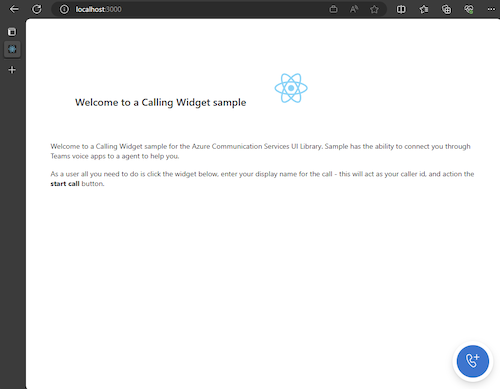
Une fois que l’application s’exécute, vous pouvez la voir sur http://localhost:3000 dans votre navigateur. Vous devez normalement voir l’écran de démarrage suivant :
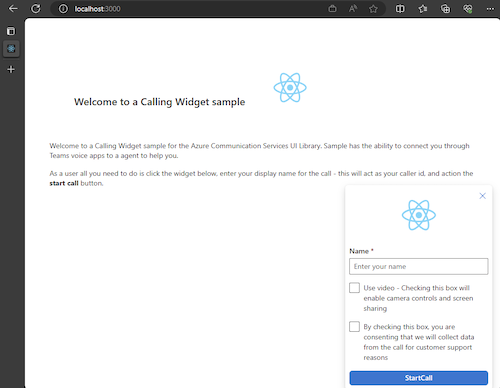
Ensuite, lorsque vous actionnez le bouton du widget, vous devriez voir un petit menu :
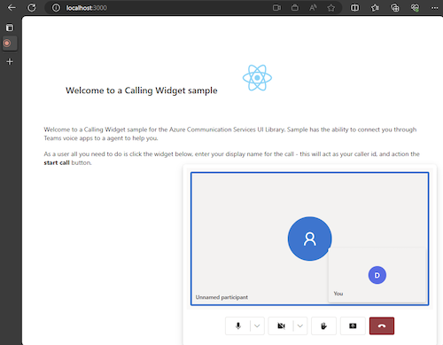
Une fois que vous avez renseigné votre nom, cliquez sur Démarrer l’appel et l’appel doit commencer. Le widget doit ressembler à ceci après le démarrage d’un appel :
Étapes suivantes
Pour plus d’informations sur les applications vocales Teams, consultez notre documentation sur les standard automatiques Teams et les files d’attente d’appels Teams. Vous pouvez également consulter notre tutoriel sur la création d’une expérience similaire avec les offres groupées JavaScript.
Démarrage rapide : joindre votre application d’appels à une file d’attente d’appels Teams
Démarrage rapide : Joindre votre application d’appels à un standard automatique Teams