Nóta
Teastaíonn údarú chun rochtain a fháil ar an leathanach seo. Is féidir leat triail a bhaint as shíniú isteach nó eolairí a athrú.
Teastaíonn údarú chun rochtain a fháil ar an leathanach seo. Is féidir leat triail a bhaint as eolairí a athrú.
Microsoft Fabric Maps offers a comprehensive set of options for customizing the map and display. By default, the map style is set to Grayscale Light, but you can easily change the map style, and toggle the visibility of various map elements. More customization options include adding interactive controls, setting the initial map view, and selecting a display language that best suits the needs of the map's audience.
Prerequisites
- A workspace with a Microsoft Fabric-enabled capacity
- A map with editing permissions and connected data sources, either geoJson files in lakehouse, or KQL databases.
Change Map settings
The Map visual in Microsoft Fabric offers a comprehensive set of options for customizing the map and display. By default, the map style is set to Grayscale Light, but you can easily change the map style, and toggle the visibility of various map elements. More customization options include adding interactive controls such as zoom, scale, pitch, compass, and world wrap, setting the initial map view, and selecting a display language that best suits the needs of the map's audience.

The following screenshot displays a map using the "Road" style, centered around the state of Washington in the United States.

The following screenshot displays the same map as in the previous example, but with labels and administrative borders hidden. Additionally, all map controls—such as zoom, pitch, compass, and scale—are enabled.

The following table describes the available map settings and their corresponding properties.
| Section | Property | Description |
|---|---|---|
| Style | Map style | Supports the following built-in map styles:
Default = Grayscale (Light) |
| Background color | Configure background color when the map style is set to Blank or Blank (accessible). | |
| Initial map view | Latitude | The latitude coordinate defines the center point of your preferred map view. The value must be set between -90 and 90 degrees. |
| Longitude | The longitude coordinate defines the center point of your preferred map view. The value must be set between -180 and 180 degrees. | |
| Zoom level | The initial zoom level for the preferred map view should be set between 1 and 22. Default = 1 | |
| Pitch | Pitch controls the viewing angle of the map relative to the horizon. The value must be between 0 and 60 degrees. Default = 0 | |
| Compass | The compass setting allows users to rotate the map view, with values ranging from -180 to 180 degrees. Default = 0 | |
| Map elements | Labels | Toggle the visibility of map labels such as road names, city names, and country/region names. Default = on |
| Country/Region border | Toggle the visibility of Country/Region borders on the map. Default = on | |
| Administrative district border | Toggle visibility of borders for first-level administrative areas, such as states or provinces. Default = on | |
| Admin district 2 border | Toggle visibility of borders for second-level administrative areas, such as counties. Default = on | |
| Road details | Toggle visibility of detailed street layouts in populated areas. Default = on | |
| Building footprints | Toggle visibility of building footprints at higher zoom levels. Default = on | |
| Controls | Zoom control | Toggle visibility of the zoom control on the map, enabling users to adjust the zoom level interactively. Default = off |
| Pitch control | Toggle visibility of the pitch control on the map, enabling users to adjust the viewing angle. Default = off | |
| Compass control | Toggle visibility of the compass control on the map, enabling users to adjust the rotation of map. Default = off | |
| Scale control | Toggle visibility of the scale bar on the map. Currently, only metric units are supported. Default = off | |
| World wrap | The world wrap control enables seamless horizontal panning across the globe. Default = on | |
| Localization | Display language | Set the language for map labels. By default, it follows the Fabric user's language setting. For more information on supported languages, see Localization support in Azure Maps |
Customize geometry data
Spatial data is typically represented as points, lines, or polygons. Map offers various visual effects to emphasize business-relevant patterns, relationships, and spatial distributions. The following sections detail how to configure properties for each visual effect type to enhance map readability and analytical value.
General settings
The following table describes the general settings for data layers.
| Setting | Description |
|---|---|
| Layer color | Defines the base color applied to this data layer. |
| Tooltips | Specifies which more data properties should be displayed when hovering over map geometries. These properties provide contextual information about the spatial features shown on the map. |
| Zoom level | Defines the range of zoom levels at which map geometries are visible. Note: This setting isn't supported when using PMTiles as the data source. |
Data label settings
When enabled, data labels display text derived from the chosen fields in your dataset, allowing each map point to show relevant information directly on the visual.
The following examples illustrate data labels on maps with various geometries including point, line, and polygon.
This example uses point geometry to display public schools, with data labels indicating school names:

This example uses line geometry to display National Forest System trails, with data labels indicating trail name:

This example uses polygons that represent areas previously affected by forest fires in California, with each polygon labeled using the official fire name:

The following table describes the general settings for data labels.
| Setting | Description |
|---|---|
| Enable data labels | A toggle switch used to enable/disable data labels for the selected layer. |
| Data labels | A drop-down list showing available fields from the selected data source. |
| Font weight | Sets the font weight: Regular, Medium, or Bold. |
| Text color | The text color of the data label. |
| Text size | The text size of the data label. Valid text sizes range from 8-48. Default=12. |
| Text stroke color | The text stroke color of the data label. |
| Text stroke width | The text stroke width of the data label. Valid text sizes range from 0-10. Default=1. |
| Label position | Sets the position of the data label relative to the element it's tied to. This setting is available for the following geometry types:
|
| Data label overlap | Controls whether data labels can overlap map symbols. |
Point settings
Bubble layer
A bubble visual displays individual data points as circles on a geographic map. Each bubble's size, color, and opacity can be customized to represent attributes such as magnitude, category, or intensity. This visualization is ideal for highlighting differences across locations, helping users compare values and spot patterns or outliers in spatial datasets. Bubble layers are especially useful for mapping quantitative data like population, sales volume, or event frequency.
The following screenshot shows EV charging station locations across Washington State. A bubble layer is used to represent the data, which consists of point features. Each station is visualized as a bubble, with size and opacity customized to reflect station-specific attributes.

The following table outlines the available bubble visual settings along with their descriptions.
| Setting | Description |
|---|---|
| Opacity | Controls the opacity of point features on the map. Valid range: 0% (fully transparent) to 100% (fully opaque). |
| Stroke width | The numeric value that determines how thick the border of each bubble appears on the map, measured in pixels. Valid values: 0-10. |
| Stroke color | Specifies the color used for the border of each bubble. This helps distinguish bubbles from the map background and can be used to emphasize or categorize data points. |
| Size | Configure how bubble sizes are displayed on the map:
|
| Enable clustering | Groups nearby data points into clusters to reduce visual clutter and improve map readability. Default = off |
| Cluster size | Configure size of clustered bubble, Support fixed value, users can configure clustered bubble size from 1px to 50px. Default = 16px |
| Aggregate by | The "Aggregate by" property allows users to select a numeric data field from a dropdown list to group and categorize bubble data. This feature is only applicable when working with numeric properties and is typically used to summarize or visualize aggregated values across spatial features. |
| Aggregation | Select a method for summarizing data based on the chosen numeric property. Available options include:
|
| Data-driven styling | Colors are driven by the selected data field and apply only to predefined markers. Custom markers don't support data-driven color styling. For more information, see Data-driven styling for map layers. |
Enable clustering
The following screenshot displays taxi pick-up location statistics in New York City. Enabling clustering based on the average trip distance can provide aggregated insights into which areas typically generate longer trips.

When using the zoom control to zoom in, more granular clustering visuals appear.

Marker layer
Markers let you replace standard point bubbles with meaningful icons so point data is easier to interpret and better aligned with business context.
With a marker, points can be rendered using either built‑in Fluent icons or custom icons stored in a Lakehouse. This makes it possible to visually distinguish different types of locations, assets, or events at a glance, instead of relying only on color or size variations.
Markers are especially useful when points represent well‑known entities—such as facilities, vehicles, devices, or incident types—where an icon conveys meaning more effectively than a generic shape.

Custom markers
To use custom images as a marker, browse files in a Lakehouse and select supported image formats such as SVG, PNG, or JPG. Once selected, the image is applied directly as the symbol used to represent point data on the map.

Tip
For custom marker images that may need to scale at different zoom levels, SVG works best. SVG icons are vector‑based, so they resize cleanly without losing sharpness, keeping markers crisp and readable at any size. PNG and JPG are raster formats and can appear blurry or pixelated when scaled up, which can reduce map clarity—especially on high‑resolution displays or when zooming in. Custom marker images must be 1 MB or smaller.
Marker settings
Markers support a range of styling options, including size, color, stroke, opacity, rotation, and placement. These options help ensure markers remain readable at different zoom levels and integrate cleanly with the overall map design.
| Setting | Description |
|---|---|
| Symbol | Specifies the icon used to represent each point on the map. This can be a standard bubble or a custom marker icon. |
| Stroke color | Specifies the color of the marker border. This helps distinguish markers from the basemap and can be used to emphasize or categorize data points. |
| Stroke width | Specifies the thickness of the marker border in pixels. Valid values range from 0 to 10. |
| Data-driven styling | Colors are driven by the selected data field and apply only to predefined markers. Custom markers don't support data-driven color styling. For more information, see Data-driven styling for map layers. |
| Size | Controls the overall size of the marker on the map, helping balance visibility and visual density. Valid values range from 12px to 72px. |
| Rotation | Rotates the marker icon to indicate orientation or direction when applicable. |
| Opacity | Controls the transparency of point features on the map. Valid values range from 0% (fully transparent) to 100% (fully opaque). |
| Marker overlap | Allows markers to overlap with each other and with other map elements when enabled. |
| Marker anchor | Determines which point of the icon is anchored to the marker's geographic position on the map. |
| Rotation alignment to map | Aligns the marker with the map's rotation, allowing the marker to rotate as the map view rotates. Rotation values range from –180 to 180 degrees. Default is 0. |
| Pitch alignment to map | Aligns the marker with the map's pitch (viewing angle relative to the horizon). Pitch values range from 0 to 60 degrees. Default is 0. |
| Enable clustering | Groups nearby data points into clusters to reduce visual clutter and improve map readability. Default = off |
| Aggregate by | The "Aggregate by" property allows users to select a numeric data field from a dropdown list to group and categorize data. This feature is only applicable when working with numeric properties and is typically used to summarize or visualize aggregated values across spatial features. |
| Aggregation | Select a method for summarizing data based on the chosen numeric property. Available options include:
|
Heat map layer
Heat maps, or point density maps, use color gradients to visualize where data points are most concentrated. They highlight high-density areas ("hot spots") and make spatial patterns easier to detect. This method is especially effective for large datasets, converting raw data into a smooth, continuous surface that reveals both absolute and relative densities across geographic regions.

The following table describes the available heat map visual settings.
| Setting | Description |
|---|---|
| Color gradient | The color theme for displaying hot spots of the data |
| Opacity | The opacity of heat map visual. Valid values range from 1% to 100%. Default = 100% |
| Intensity | Adjusts the multiplier applied to each data point's weight to control heatmap intensity. Valid values range from 1% to 100%. Default = 1% |
| Radius | Specifies the pixel radius used to render each data point in the heat map layer. This determines how far the influence of each point spreads visually. Valid values range from 1 to 100. Default = 30 |
| Weight | Set the weight of each point using a numeric data property. Default = 1 |
| Enable clustering | Groups nearby data points into clusters to reduce visual clutter and improve map readability. Default = off |
Apply weight
The following screenshot illustrates a taxi trip heat map of New York City. Each trip is represented as a data point, with the fare_amount used as a weight, meaning areas with higher fares contribute more intensity to the heat map. To enhance readability, lower opacity is applied, allowing the map and overlapping data to remain visible.

Enable clustering
The following screenshot illustrates a clustered heat map that visualizes spatial data density. By fine-tuning parameters such as radius and intensity, the map more effectively reveals patterns that are obscured by overlapping data points.

Line settings
Line layer
Line layers are used to visualize linear geographic features such as roads, paths, routes, or boundaries on a map. It connects a series of coordinates to form lines, which can be styled with various attributes like color, stroke width. This type of visual is especially useful for representing movement, direction, or connections between locations, and is commonly applied in scenarios like route planning, infrastructure mapping, or network visualization.
The following screenshot shows national forest trails near Mount Rainier.

The following table describes the available line visual setting and description.
| Setting | Description |
|---|---|
| Stroke opacity | The opacity of line features. Valid values range from 1% to 100%. Default = 100% |
| Stroke width | The width of lines measured in pixels. Valid values: 0-10. Default = 3px |
| Data-driven styling | Colors are driven by the selected data field and apply only to predefined markers. For more information, see Data-driven styling for map layers. |
Polygon settings
Polygon layer
Polygon layers are used to visualize areas or regions by connecting multiple geographic coordinates to form enclosed shapes. These polygons can represent boundaries such as city limits, zones, or regions of interest. You can customize the appearance of these shapes using attributes like layer color, and opacity. This visual is useful for highlighting specific geographic areas and analyzing spatial relationships or coverage.
The following screenshot displays a historical fire perimeters map of California, showing the geographic extent of past wildfires using red polygons. Each polygon represents a distinct fire event and includes metadata such as the year, cause, and GIS-calculated acreage. This visualization enables users to quickly identify fire-prone areas, analyze historical fire patterns, and support wildfire mitigation and land management planning.

The following table describes the available polygon visual setting and description.
| Setting | Description |
|---|---|
| Fill opacity | The opacity of polygon features on the map. Valid range: 0% (fully transparent) to 100% (fully opaque). Default = 60% |
| Data-driven styling | Colors are driven by the selected data field and apply only to predefined markers. For more information, see Data-driven styling for map layers. |
| Enable extrusion | This property allows polygons to be rendered in 3D by applying height based on a numeric field. It enhances spatial visualization by adding depth and volume to flat shapes. Default = off. |
| Height | Specifies the numeric data field used to determine the vertical extrusion of each polygon. This option is only accessible when the Enable extrusion setting is active. |
Enable extrusion
The following screenshot presents a 3D map visualization of the Seattle area, showcasing building extrusion. Each building is rendered with varying heights based on its actual elevation data, creating a realistic urban landscape.

Data-driven styling for map layers
Data‑driven styling lets you control how map layers are colored based on values in the underlying data, rather than using a single fixed color. By applying visual rules to layer properties, you can highlight patterns, trends, and outliers directly on the map and present data with clear business meaning. Data‑driven styling is supported for the following vector layer types:
Fabric Maps supports the Color by category data‑driven styling mode for layer properties, as described in the following table.
| Styling mode | Description | Supported data types | Typical use cases |
|---|---|---|---|
| Color by category | Assigns a distinct color to each unique value in a selected property. This mode emphasizes differences between discrete categories and displays a corresponding legend on the map. | Text or categorical fields | Status classification (for example, Active, Inactive), asset types, regions, ownership, or any field with a limited set of distinct values. |
A corresponding data legend is displayed on the map to help viewers understand how values map to colors.
Use data‑driven styling on a map layer
You enable and configure data‑driven styling from the Layer settings pane while editing a map.
Enable data‑driven styling
Open the map in Edit mode.
Select a vector data layer (line, polygon, bubble, or marker).
In the Layer settings pane, select Enable data‑driven styling.
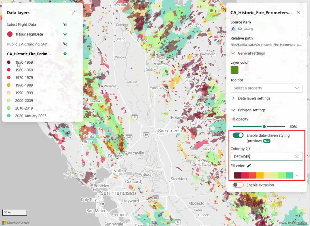
In the Color by field, select a data property to drive the styling.

Configure the styling mode
- Color by category
Choose a categorical property.
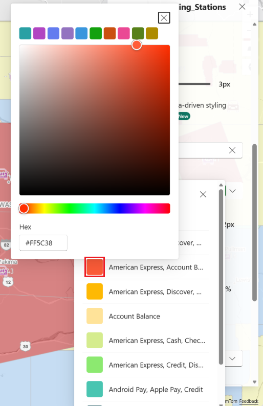
Select a built‑in color palette or customize individual category colors using the color picker.
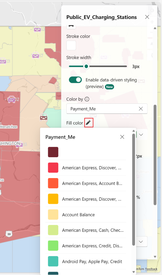
Select the color next to a category name to assign a custom color to that category:
The map displays a legend in the Data layer pane showing each category and its assigned color.
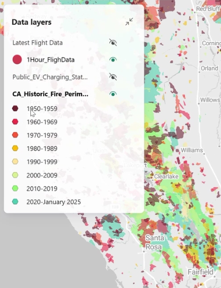
The map displays a legend in the Data layer pane showing each category and its assigned color.
Additional behavior and considerations
- Legends collapse automatically when more than 10 items are shown; select Show more to expand.
- A maximum of 100 categories is supported. Additional values appear as Other.
- Data‑driven styling works with other layer features such as filters, labels, and built‑in marker layers.
- Existing layers that used series grouping are automatically upgraded to Color by category, preserving existing color assignments.