הערה
הגישה לדף זה מחייבת הרשאה. באפשרותך לנסות להיכנס או לשנות מדריכי כתובות.
הגישה לדף זה מחייבת הרשאה. באפשרותך לנסות לשנות מדריכי כתובות.
Question
Sunday, August 14, 2016 7:15 PM
I enclose snap shot of output also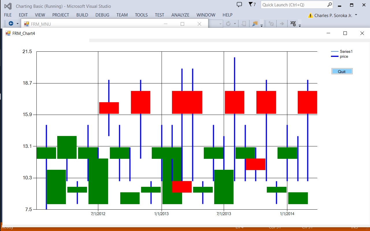
Imports System.Windows.Forms.DataVisualization.Charting
Public Class FRM_Chart4
    Dim MY_MIN As Integer = 8
    Dim MY_MAX As Integer = 21
    Public Sub Chart_It()
        ' Fields used   Date       High , Low , Open, Close
        Dim k As New List(Of dbdata)() From {
            New dbdata("2/1/2012", 15.0F, 7.0F, 12.0F, 13.0F),
            New dbdata("3/1/2012", 11.0F, 10.0F, 8.0F, 11.0F),
            New dbdata("4/1/2012", 14.0F, 10.0F, 12.0F, 14.0F),
            New dbdata("5/1/2012", 10.0F, 8.0F, 9.0F, 9.5F),
            New dbdata("6/1/2012", 15.0F, 10.0F, 12.0F, 13.0F),
            New dbdata("7/1/2012", 13.0F, 10.0F, 8.0F, 12.0F),
            New dbdata("8/1/2012", 19.0F, 14.0F, 17.0F, 16.0F),
            New dbdata("9/1/2012", 15.0F, 10.0F, 12.0F, 13.0F),
            New dbdata("10/1/2012", 13.0F, 10.0F, 8.0F, 9.0F),
            New dbdata("11/1/2012", 19.0F, 12.0F, 18.0F, 16.0F),
            New dbdata("12/1/2012", 10.0F, 8.0F, 9.0F, 9.5F),
            New dbdata("1/1/2013", 15.0F, 10.0F, 12.0F, 13.0F),
            New dbdata("2/1/2013", 12.0F, 10.0F, 8.0F, 12.0F),
            New dbdata("3/1/2013", 20.0F, 10.0F, 18.0F, 16.0F),
            New dbdata("2/1/2013", 15.0F, 10.0F, 12.0F, 13.0F),
            New dbdata("3/1/2013", 13.0F, 9.0F, 10.0F, 9.0F),
            New dbdata("4/1/2013", 20.0F, 10.0F, 18.0F, 16.0F),
            New dbdata("5/1/2013", 10.0F, 8.0F, 9.0F, 9.5F),
            New dbdata("6/1/2013", 15.0F, 10.0F, 12.0F, 13.0F),
            New dbdata("7/1/2013", 14.0F, 8.0F, 8.0F, 11.0F),
            New dbdata("8/1/2013", 21.0F, 10.0F, 18.0F, 16.0F),
            New dbdata("9/1/2013", 15.0F, 10.0F, 12.0F, 13.0F),
            New dbdata("10/1/2013", 13.0F, 10.0F, 12.0F, 11.0F),
            New dbdata("11/1/2013", 19.0F, 10.0F, 18.0F, 16.0F),
            New dbdata("12/1/2013", 10.0F, 8.0F, 9.0F, 9.5F),
            New dbdata("1/1/2014", 15.0F, 10.0F, 12.0F, 13.0F),
            New dbdata("2/1/2014", 14.0F, 10.0F, 8.0F, 9.0F),
            New dbdata("3/1/2014", 19.0F, 10.0F, 18.0F, 16.0F)
        }

        Dim price As New Series("price")
        ' <<== make sure to name the series "price"

        Chart4.Series.Add(price)

        ' Set series chart type
        Chart4.Series("price").ChartType = SeriesChartType.Candlestick

        ' Set the style of the open-close marks
        Chart4.Series("price")("OpenCloseStyle") = "Triangle"

        ' Show both open and close marks
        Chart4.Series("price")("ShowOpenClose") = "Both"

        ' Set point width
        Chart4.Series("price")("PointWidth") = "2.0"

        ' Set colors bars
        Chart4.Series("price")("PriceUpColor") = "Green"
        ' use text indexer for series
        Chart4.Series("price")("PriceDownColor") = "Red"
        ' use text indexer for series
        Chart4.Series("price").BorderWidth = 4
        Chart4.Series("price").Color = Color.Blue
        Chart4.ChartAreas(0).AxisY.Minimum = MY_MIN - 0.5
        Chart4.ChartAreas(0).AxisY.Maximum = MY_MAX + 0.5
        For i As Integer = 0 To k.Count - 1
            ' adding date and high
            Chart4.Series("price").Points.AddXY(DateTime.Parse(k(i).My_Date), k(i).My_high)

            Chart4.Series("price").Points(i).YValues(1) = k(i).My_Low ' adding low

            Chart4.Series("price").Points(i).YValues(2) = k(i).My_Open 'adding open

            Chart4.Series("price").Points(i).YValues(3) = k(i).My_Close ' adding close
        Next

    End Sub

    Private Sub Form1_Load(sender As Object, e As EventArgs) Handles MyBase.Load
        Chart_It()
    End Sub

    Private Sub BTN_Quit3_Click_1(sender As Object, e As EventArgs) Handles BTN_Quit3.Click
        Close()
    End Sub

End Class

Public Class dbdata
    Public My_Date As String
    Public My_high As Single
    Public My_Low As Single
    Public My_Open As Single
    Public My_Close As Single
    Public Sub New(d As String, h As Single, l As Single, o As Single, c As Single)
        My_Date = d
        My_high = h
        My_Low = l
        My_Open = o
        My_Close = c
    End Sub

End Class
Charlie Soroka
All replies (16)
Sunday, August 14, 2016 7:44 PM ✅Answered
That is probably the pointwidth:
' Set point width
Chart4.Series("price")("PointWidth") = "2.0"
Set to "0.5" or whatever.
PS you can also use:
Chart1.Series()("PixelPointWidth") = "20"
Monday, August 15, 2016 2:47 PM ✅Answered
Thank you for your reply, I tried both statements and the width of the body never changed. The following two statements change the color of the body.
Chart4.Series("price")("PriceUpColor") = "Green"
Chart4.Series("price")("PriceDownColor") = "Red"
In other venders candlestick charts the volume of traded stocks determine the width of the body.
Charlie Soroka
Monday, August 15, 2016 3:02 PM ✅Answered
Thank you for your reply, I tried both statements and the width of the body never changed. The following two statements change the color of the body.
Chart4.Series("price")("PriceUpColor") = "Green"
Chart4.Series("price")("PriceDownColor") = "Red"In other venders candlestick charts the volume of traded stocks determine the width of the body.
Charlie Soroka
Is this what you mean?
Imports System.Windows.Forms.DataVisualization.Charting

Public Class Form2
    Private Sub Form2_Load(sender As Object, e As EventArgs) Handles Me.Load
        Chart1.ChartAreas.Clear()
        Chart1.ChartAreas.Add("Default")
        Chart1.Series.Clear()
        Chart1.Series.Add("Width 0.1")
        Chart1.Series.Add("Width 2.0")

        Chart1.ChartAreas(0).AxisX.MajorGrid.Enabled = False

        With Chart1.Series(0)
            Chart1.Series(0)("PointWidth") = ".1"
            '.IsVisibleInLegend = False
            .ChartType = DataVisualization.Charting.SeriesChartType.Candlestick
            .Points.AddXY(2, 12, 8, 10, 11)
        End With

        With Chart1.Series(1)
            Chart1.Series(1)("PointWidth") = "2"
            '.IsVisibleInLegend = False
            .ChartType = DataVisualization.Charting.SeriesChartType.Candlestick
            .Points.AddXY(4, 12, 8, 10, 11)
        End With
    End Sub
End Class
Monday, August 15, 2016 8:41 PM ✅Answered | 1 vote
Thank you for your reply, That will take care of my problem & I will also be able to come up with formula
to get reflect volume in body of candle stick.
Charlie Soroka
Monday, August 15, 2016 9:24 PM ✅Answered
Thank you for your reply, That will take care of my problem & I will also be able to come up with formula
to get reflect volume in body of candle stick.
Charlie Soroka
Yes that is what you do I guess is make a ratio. When you use the PointWidth a value of 1 is the space between the xaxis ticks which is your date or each day or whatever units you have. I am not sure how it will work just try to simulate what you have seen that looks good. ie you will need to know the max volume for the chart to make the ratio. If you have many stocks with a wide range I am not sure how best to handle that. Just pick something I guess.
Tuesday, August 16, 2016 1:33 AM ✅Answered
Thank you for your help.
Would there be a way to change the the candle width for each entry, that way I would
be able to have an indicator for volume, also your sample adds a new series which
I have already done. What entry would I use to reflect change on Series Price?
Charlie Soroka
Tuesday, August 16, 2016 2:19 AM ✅Answered
Thank you for your help.
Would there be a way to change the the candle width for each entry, that way I would
be able to have an indicator for volume, also your sample adds a new series which
I have already done. What entry would I use to reflect change on Series Price?Charlie Soroka
Doh. You are right. The pointwidth is for the entire series. So I dont know if that would work.
It appears what we have for each point is the BorderWidth. That is the centerline width. I showed two points you would make a loop and set the width for each points volume. Not sure if that is what you want.
That is all I could find looking through the samples I have. There seems to be lots of options it could be there is a way to do exactly what you want I don't know.
You could always make another series that is a column chart on the bottom axis with the volume.
Here is the borderwidth example you can set each point.
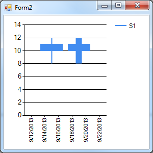
Public Class Form2
    Private Sub Form2_Load(sender As Object, e As EventArgs) Handles Me.Load
        Chart1.ChartAreas.Clear()
        Chart1.ChartAreas.Add("Default")
        Chart1.Series.Clear()
        Chart1.Series.Add("S1")

        Chart1.ChartAreas(0).AxisX.MajorGrid.Enabled = False

        With Chart1.Series(0)
            .ChartType = DataVisualization.Charting.SeriesChartType.Candlestick
            .Points.AddXY(DateTime.Parse("09.15.2013"), 12, 8, 10, 11)
            .Points(.Points.Count - 1).BorderWidth = 2
            .Points.AddXY(DateTime.Parse("09.19.2013"), 12, 8, 10, 11)
            .Points(.Points.Count - 1).BorderWidth = 12
        End With

    End Sub
End Class
Tuesday, August 16, 2016 3:19 AM ✅Answered
Oh no, wait, you can do it using a new series for every point.
I tested it to 200 series and it seemed ok. I tried 1000 and it got real slow so I would not use more than 200 series or so. Therefore each of your data points would be a new series and you set the pointwidth for each series to the volume.
Here is an example with 50 pnts therefor 50 series in the chart. The vol increased from 1 to 100 or approx in the random data. See the width increase from left to right? The vol is also shown in the label on top just fyi.
So now you have two choices. How many points do you normally have per chart?
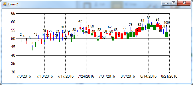
Option Strict On
Imports System.Windows.Forms.DataVisualization.Charting

Public Class Form2
    Private Sub Form2_Load(sender As Object, e As EventArgs) Handles Me.Load
        Dim rand As New Random(Now.Millisecond)
        Dim startDate As DateTime = CDate("07-01-2016")
        Dim theDates As New List(Of Date)
        Dim theHighs As New List(Of Single)
        Dim theLows As New List(Of Single)
        Dim theOpens As New List(Of Single)
        Dim theCloses As New List(Of Single)
        Dim theVols As New List(Of Single)
        Dim thisdate As DateTime
        Dim t As Single = 50

        For i = 1 To 50
            thisdate = startDate.AddDays(i)
            theDates.Add(thisdate)
            t += rand.Next(-2, 3)
            If t > 90 Then t = 90
            If t < 30 Then t = 30
            theHighs.Add(t + rand.Next(0, 4))
            theLows.Add(t - rand.Next(0, 4))
            theOpens.Add(t + rand.Next(-3, 4))
            theCloses.Add(t + rand.Next(-2, 1))
            theVols.Add(2 * i)
        Next

        Chart1.ChartAreas.Clear()
        Chart1.ChartAreas.Add("Default")
        Chart1.Series.Clear()

        With Chart1.ChartAreas(0)
            .AxisX.MajorGrid.LineDashStyle = ChartDashStyle.Dot
            .AxisX.ScrollBar.Enabled = True
            .CursorX.IsUserEnabled = True
            .CursorX.IsUserSelectionEnabled = True
            .AxisX.ScaleView.Zoomable = True
            .AxisY.Minimum = 30
        End With

        For i = 0 To theDates.Count - 1
            Chart1.Series.Add(i.ToString)
            With Chart1.Series(i)
                Chart1.Series(i)("PriceUpColor") = "Green"
                Chart1.Series(i)("PriceDownColor") = "Red"
                Chart1.Series(i)("PointWidth") = (theVols(i) / 100).ToString
                .Color = Color.Blue
                .ChartType = DataVisualization.Charting.SeriesChartType.Candlestick
                .IsVisibleInLegend = False
                .Points.AddXY(theDates(i), theHighs(i), theLows(i), theOpens(i), theCloses(i))
                .Points(.Points.Count - 1)("LabelStyle") = "Top"
                .Points(.Points.Count - 1).Label = CType(theVols(i), String)
                .Points(.Points.Count - 1).BorderWidth = 1
            End With
        Next
    End Sub
End Class
Tuesday, August 16, 2016 3:33 AM ✅Answered
PS Sorok,
Post an image of what you want the chart to look like if you want to get into it more.
Wednesday, August 17, 2016 12:30 PM ✅Answered
Thanks Tommy: The Code look great, I will try with my stock quote DB.
Charlie Soroka
You are welcome. As I mentioned, we are never sure exactly what the OP is wanting to see in a chart so an image of the result you want to see is helpful. ie in this case there are two things to make wider.
And then just so you know we normally don't mark our own posts on our own questions as the answer unless the post specificly has the answer. The idea is we mark the correct answer or answers for future generations that may be looking at the thread. Also we all mark a few as helpful is we feel so inclined. But in the end its up to the original poster (OP) to mark what you want.
Thursday, August 18, 2016 1:46 AM ✅Answered
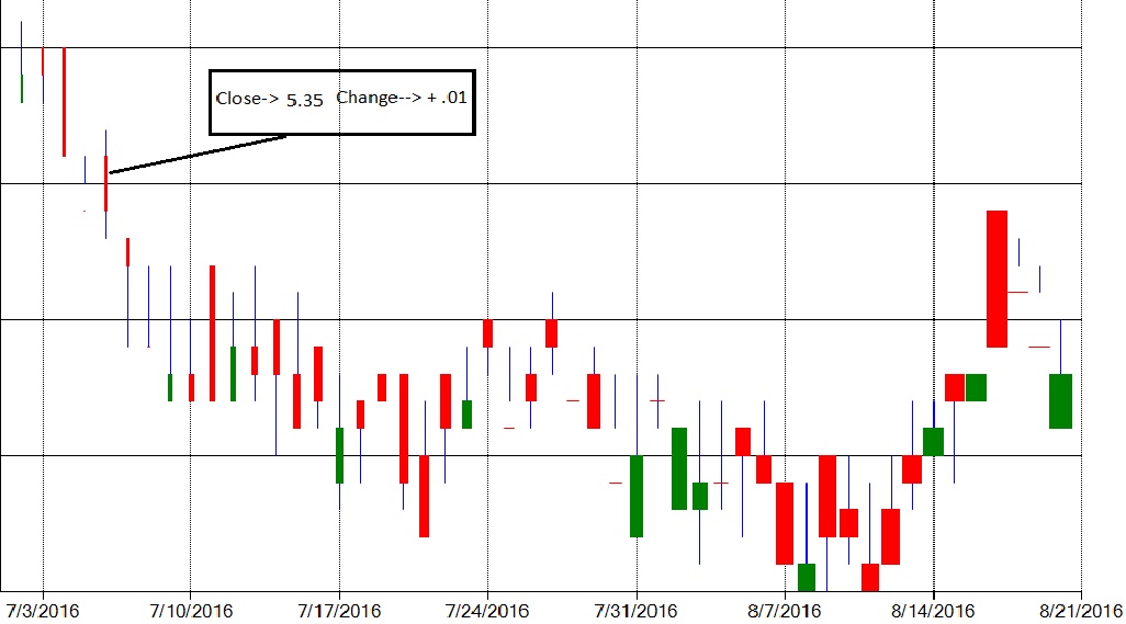
What I would like to see is when you mouse over the
red or Green candle a text box would display the
Close and change for that candle element that the mouse is over.
Charlie Soroka
Thursday, August 18, 2016 3:13 AM ✅Answered
Charlie,
Get this samples environment application it is the best docs there are for this. There are many things you can play around with. Although there is nothing about this exactly in there you can get ideas.
Note how I added the mouse move event code and the single annotation that is updated when we invalidate the chart.
Also notice I put in zooming and scrolling the chart in these examples.
You should start a new question with each different topic to make it easier to search and to have new members looking at each question. Once they are marked answered then few look. There are many way to do things.
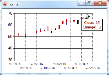
Imports System.Windows.Forms.DataVisualization.Charting

Public Class Form2
    Private CurrentAnnotation As New CalloutAnnotation
    Private Sub Form2_Load(sender As Object, e As EventArgs) Handles Me.Load
        Dim rand As New Random(Now.Millisecond)
        Dim startDate As DateTime = CDate("07-01-2016")
        Dim theDates As New List(Of Date)
        Dim theHighs As New List(Of Single)
        Dim theLows As New List(Of Single)
        Dim theOpens As New List(Of Single)
        Dim theCloses As New List(Of Single)
        Dim theVols As New List(Of Single)
        Dim thisdate As DateTime
        Dim t As Single = 50

        For i = 1 To 20
            thisdate = startDate.AddDays(i)
            theDates.Add(thisdate)
            t += rand.Next(-2, 3)
            If t > 90 Then t = 90
            If t < 30 Then t = 30
            theHighs.Add(t + rand.Next(0, 4))
            theLows.Add(t - rand.Next(0, 4))
            theOpens.Add(t + rand.Next(-3, 4))
            theCloses.Add(t + rand.Next(-2, 1))
            theVols.Add(2 * i)
        Next

        Chart1.ChartAreas.Clear()
        Chart1.ChartAreas.Add("Default")
        Chart1.Series.Clear()

        With Chart1.ChartAreas(0)
            .AxisX.MajorGrid.LineDashStyle = ChartDashStyle.Dot
            .AxisX.ScrollBar.Enabled = True
            .CursorX.IsUserEnabled = True
            .CursorX.IsUserSelectionEnabled = True
            .AxisX.ScaleView.Zoomable = True
            .AxisY.Minimum = 30
        End With

        For i = 0 To theDates.Count - 1
            Chart1.Series.Add(i.ToString)
            With Chart1.Series(i)
                Chart1.Series(i)("PriceUpColor") = "Green"
                Chart1.Series(i)("PriceDownColor") = "Red"
                Chart1.Series(i)("PointWidth") = (theVols(i) / 100).ToString
                .Color = Color.Blue
                .ChartType = DataVisualization.Charting.SeriesChartType.Candlestick
                .IsVisibleInLegend = False
                .Points.AddXY(theDates(i), theHighs(i), theLows(i), theOpens(i), theCloses(i))
            End With
        Next

        Chart1.Annotations.Add(CurrentAnnotation)

    End Sub    Private Sub Chart1_MouseMove(sender As Object, e As MouseEventArgs) Handles Chart1.MouseMove
        Dim result As HitTestResult = Chart1.HitTest(e.X, e.Y)
        If result.ChartElementType = ChartElementType.DataPoint Then
            With CurrentAnnotation
                .CalloutStyle = CalloutStyle.Borderline
                .ForeColor = Color.Maroon
                .Font = New Font("Tahoma", 10)
                .AnchorDataPoint = Chart1.Series(result.Series.Name).Points(result.PointIndex)
                .X = Chart1.Series(result.Series.Name).Points(result.PointIndex).XValue
                .Y = Chart1.Series(result.Series.Name).Points(result.PointIndex).YValues(3)
                .Text = "Close: " & Chart1.Series(result.Series.Name).Points(result.PointIndex).YValues(3) &
                    vbLf & "Change: " &
                    (Chart1.Series(result.Series.Name).Points(result.PointIndex).YValues(3) -
                    Chart1.Series(result.Series.Name).Points(result.PointIndex).YValues(2)).ToString
            End With
            Chart1.Invalidate()
        End If
    End Sub
End Class
Wednesday, August 17, 2016 2:35 AM
Thanks Tommy: The Code look great, I will try with my stock quote DB.
Charlie Soroka
Wednesday, August 17, 2016 8:05 PM
Thank you for your reply, after working with your last code, the only thing that would be great if possible would be a hot spot for each green or red candle body that would display the close & change for that candle.
Charlie Soroka
Wednesday, August 17, 2016 8:54 PM
Thank you for your reply, after working with your last code, the only thing that would be great if possible would be a hot spot for each green or red candle body that would display the close & change for that candle.
Charlie Soroka
Do you mean add the values as text or do you mean drawn on the candlestick symbol somehow?
Show a picture of what you want the symbol to look like. Indicate what values are shown in the image.
Thursday, August 18, 2016 2:50 PM | 1 vote
Tommy:
Thanks for your reply. Your sample code looks fantastic has given me plenty of ideas to work on.
Charlie Soroka