Tutorial: Analyze Apache Spark data using Power BI in HDInsight
In this tutorial, you learn how to use Microsoft Power BI to visualize data in an Apache Spark cluster in Azure HDInsight.
In this tutorial, you learn how to:
- Visualize Spark data using Power BI
If you don't have an Azure subscription, create a free account before you begin.
Prerequisites
Complete the article Tutorial: Load data and run queries on an Apache Spark cluster in Azure HDInsight.
Optional: Power BI trial subscription.
Verify the data
The Jupyter Notebook that you created in the previous tutorial includes code to create an hvac table. This table is based on the CSV file available on all HDInsight Spark clusters at \HdiSamples\HdiSamples\SensorSampleData\hvac\hvac.csv. Use the following procedure to verify the data.
From the Jupyter Notebook, paste the following code, and then press SHIFT + ENTER. The code verifies the existence of the tables.
%%sql
SHOW TABLES
The output looks like:
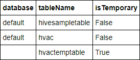
If you closed the notebook before starting this tutorial,
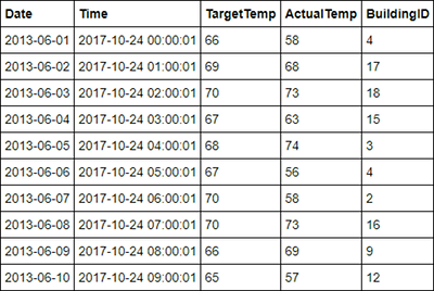
hvactemptableis cleaned up, so it's not included in the output. Only Hive tables that are stored in the metastore (indicated by False under the isTemporary column) can be accessed from the BI tools. In this tutorial, you connect to the hvac table that you created.Paste the following code in an empty cell, and then press SHIFT + ENTER. The code verifies the data in the table.
%%sql
SELECT * FROM hvac LIMIT 10
The output looks like:
From the File menu on the notebook, select Close and Halt. Shut down the notebook to release the resources.
Visualize the data
In this section, you use Power BI to create visualizations, reports, and dashboards from the Spark cluster data.
Create a report in Power BI Desktop
The first steps in working with Spark are to connect to the cluster in Power BI Desktop, load data from the cluster, and create a basic visualization based on that data.
Open Power BI Desktop. Close the start-up splash screen if it opens.
From the Home tab, navigate to Get Data > More...
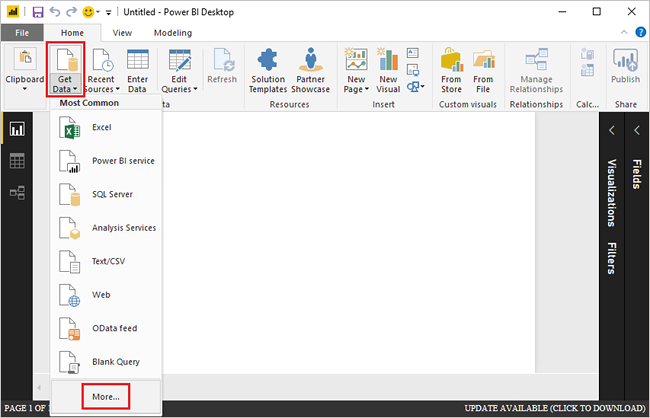
Enter
Sparkin the search box, select Azure HDInsight Spark, and then select Connect.
Enter your cluster URL (in the form
mysparkcluster.azurehdinsight.net) in the Server text box.Under Data connectivity mode, select DirectQuery. Then select OK.
You can use either data connectivity mode with Spark. If you use DirectQuery, changes are reflected in reports without refreshing the entire dataset. If you import data, you must refresh the data set to see changes. For more information on how and when to use DirectQuery, see Using DirectQuery in Power BI.
Enter the HDInsight login account information, then select Connect. The default account name is admin.
Select the
hvactable, wait to see a preview of the data, and then select Load.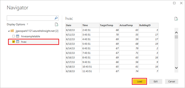
Power BI Desktop has the information it needs to connect to the Spark cluster and load data from the
hvactable. The table and its columns are displayed in the Fields pane.Visualize the variance between target temperature and actual temperature for each building:
In the VISUALIZATIONS pane, select Area Chart.
Drag the BuildingID field to Axis, and drag the ActualTemp and TargetTemp fields to Value.
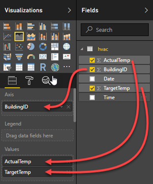
The diagram looks like:
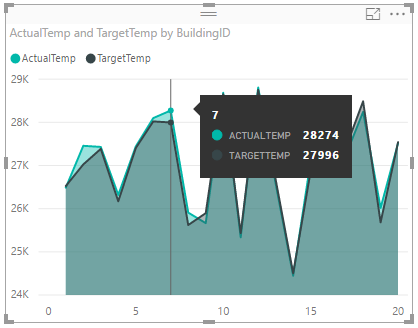
By default the visualization shows the sum for ActualTemp and TargetTemp. Select the down arrow next to ActualTemp and TargetTemp in the Visualizations pane, you can see Sum is selected.
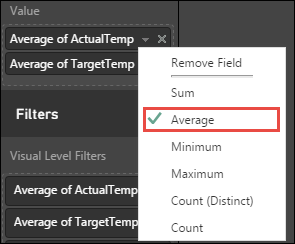
Select the down arrows next to ActualTemp and TargetTemp in the Visualizations pane, select Average to get an average of actual and target temperatures for each building.
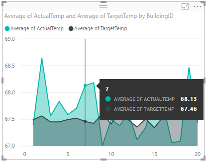
Your data visualization shall be similar to the one in the screenshot. Move your cursor over the visualization to get tool tips with relevant data.
Navigate to File > Save, enter the name
BuildingTemperaturefor the file, then select Save.
Publish the report to the Power BI Service (optional)
The Power BI service allows you to share reports and dashboards across your organization. In this section, you first publish the dataset and the report. Then, you pin the report to a dashboard. Dashboards are typically used to focus on a subset of data in a report. You have only one visualization in your report, but it's still useful to go through the steps.
Open Power BI Desktop.
From the Home tab, select Publish.

Select a workspace to publish your dataset and report to, then select Select. In the following image, the default My Workspace is selected.
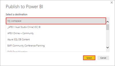
After the publishing is succeeded, select Open 'BuildingTemperature.pbix' in Power BI.
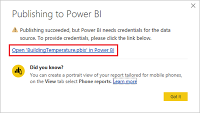
In the Power BI service, select Enter credentials.

Select Edit credentials.

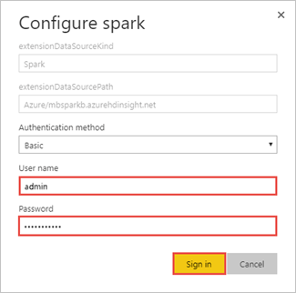
Enter the HDInsight login account information, and then select Sign in. The default account name is admin.
In the left pane, go to Workspaces > My Workspace > REPORTS, then select BuildingTemperature.
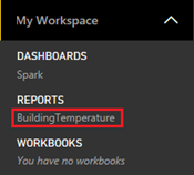
You should also see BuildingTemperature listed under DATASETS in the left pane.
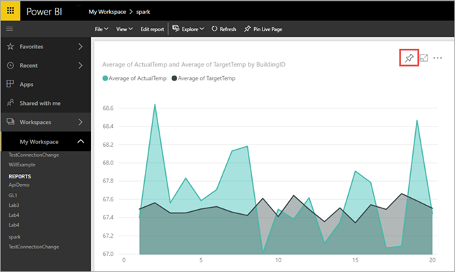
The visual you created in Power BI Desktop is now available in the Power BI service.
Hover your cursor over the visualization, and then select the pin icon on the upper right corner.
Select "New dashboard", enter the name
Building temperature, then select Pin.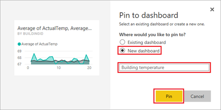
In the report, select Go to dashboard.
Your visual is pinned to the dashboard - you can add other visuals to the report and pin them to the same dashboard. For more information about reports and dashboards, see Reports in Power BI and Dashboards in Power BI.
Clean up resources
After you complete the tutorial, you may want to delete the cluster. With HDInsight, your data is stored in Azure Storage, so you can safely delete a cluster when it isn't in use. You're also charged for an HDInsight cluster, even when it isn't in use. Since the charges for the cluster are many times more than the charges for storage, it makes economic sense to delete clusters when they aren't in use.
To delete a cluster, see Delete an HDInsight cluster using your browser, PowerShell, or the Azure CLI.
Next steps
In this tutorial, you learned how to use Microsoft Power BI to visualize data in an Apache Spark cluster in Azure HDInsight. Advance to the next article to see you can create a machine learning application.