הערה
הגישה לדף זה מחייבת הרשאה. באפשרותך לנסות להיכנס או לשנות מדריכי כתובות.
הגישה לדף זה מחייבת הרשאה. באפשרותך לנסות לשנות מדריכי כתובות.
Use Kernel SHAP (SHapley Additive exPlanations) to explain a tabular classification model. Kernel SHAP is a model-agnostic method that estimates the contribution of each feature to a model's prediction. You train a logistic regression model on the Adult Census Income dataset and then use the SynapseML TabularSHAP transformer to compute feature-level explanations.
Prerequisites
Get a Microsoft Fabric subscription. Or, sign up for a free Microsoft Fabric trial.
Sign in to Microsoft Fabric.
Switch to Fabric by using the experience switcher on the lower-left side of your home page.
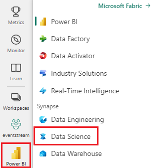
- Create a new notebook in your workspace and attach it to a lakehouse. For more information, see Create a notebook.
SynapseML, PySpark, pandas, and plotly are preinstalled in Fabric notebook environments. No extra package installation is required.
Import packages and define helper UDFs
In your Fabric notebook, paste the following code into a cell and run it. This step imports the required libraries and defines two user-defined functions (UDFs) for extracting vector elements later.
import pyspark
from synapse.ml.explainers import TabularSHAP
from pyspark.ml import Pipeline
from pyspark.ml.classification import LogisticRegression
from pyspark.ml.feature import StringIndexer, OneHotEncoder, VectorAssembler
from pyspark.sql.types import FloatType, ArrayType
from pyspark.sql.functions import col, lit, rand, broadcast, udf
import pandas as pd

vec_access = udf(lambda v, i: float(v[i]), FloatType())
vec2array = udf(lambda vec: vec.toArray().tolist(), ArrayType(FloatType()))
Verify: Run the following code in a new cell. You should see the output TabularSHAP imported successfully.
print("TabularSHAP imported successfully")
print(f"PySpark version: {pyspark.__version__}")
Load data and train a classification model
Load the Adult Census Income dataset from Azure Blob Storage, index the target label, and train a logistic regression pipeline.
df = spark.read.parquet(
    "wasbs://publicwasb@mmlspark.blob.core.windows.net/AdultCensusIncome.parquet"
)

labelIndexer = StringIndexer(
    inputCol="income", outputCol="label", stringOrderType="alphabetAsc"
).fit(df)
print("Label index assignment: " + str(set(zip(labelIndexer.labels, [0, 1]))))

training = labelIndexer.transform(df).cache()

categorical_features = [
    "workclass",
    "education",
    "marital-status",
    "occupation",
    "relationship",
    "race",
    "sex",
    "native-country",
]
categorical_features_idx = [feat + "_idx" for feat in categorical_features]
categorical_features_enc = [feat + "_enc" for feat in categorical_features]
numeric_features = [
    "age",
    "education-num",
    "capital-gain",
    "capital-loss",
    "hours-per-week",
]

strIndexer = StringIndexer(
    inputCols=categorical_features, outputCols=categorical_features_idx
)
onehotEnc = OneHotEncoder(
    inputCols=categorical_features_idx, outputCols=categorical_features_enc
)
vectAssem = VectorAssembler(
    inputCols=categorical_features_enc + numeric_features, outputCol="features"
)
lr = LogisticRegression(featuresCol="features", labelCol="label", weightCol="fnlwgt")
pipeline = Pipeline(stages=[strIndexer, onehotEnc, vectAssem, lr])
model = pipeline.fit(training)
Verify: Run the following cell. You should see row counts for training data and confirmation of pipeline stages.
print(f"Training rows: {training.count()}")
print(f"Pipeline stages: {[type(s).__name__ for s in model.stages]}")
assert training.count() > 30000, "Dataset should contain over 30,000 rows"
print("Model trained successfully")

# Expected output:
#Training rows: 32561
#Pipeline stages: ['StringIndexerModel', 'OneHotEncoderModel', #'VectorAssembler', 'LogisticRegressionModel']
#Model trained successfully
Select observations to explain
Randomly select five observations from the scored training data. These observations are the instances for which you generate SHAP explanations.
explain_instances = (
    model.transform(training).orderBy(rand()).limit(5).repartition(200).cache()
)
display(explain_instances)
Verify: Confirm the sample size.
count = explain_instances.count()
print(f"Explain instances: {count}")
assert count == 5, f"Expected 5 rows, got {count}"
print("Sample selected successfully")
Configure and run TabularSHAP
Create a TabularSHAP explainer and apply it to the selected observations. The key parameters are:
| Parameter | Description |
|---|---|
inputCols |
Feature columns the model uses for prediction. |
outputCol |
Name of the column that contains SHAP output values. |
numSamples |
Number of perturbation samples for Kernel SHAP estimation. Higher values are more accurate but slower. |
model |
The trained pipeline model to explain. |
targetCol |
The model output column to explain. In this example, the column is probability. |
targetClasses |
Class indices to explain. [1] explains class 1 probability only. Use [0, 1] to explain both classes. |
backgroundData |
A sample of training data used as the reference distribution for integrating out features. |
shap = TabularSHAP(
    inputCols=categorical_features + numeric_features,
    outputCol="shapValues",
    numSamples=5000,
    model=model,
    targetCol="probability",
    targetClasses=[1],
    backgroundData=broadcast(training.orderBy(rand()).limit(100).cache()),
)

shap_df = shap.transform(explain_instances)
Note
This step can take several minutes depending on numSamples and cluster size. With numSamples=5000 and five observations, expect 3-10 minutes on a default Fabric Spark cluster.
Verify: Check that the SHAP output column exists.
assert "shapValues" in shap_df.columns, "shapValues column missing"
print(f"SHAP output columns: {shap_df.columns}")
print("TabularSHAP transform completed")
Extract SHAP values
Extract the class 1 probability and SHAP values from the result DataFrame. For each observation, the SHAP values vector starts with the base value (mean output of the background dataset), followed by one value per feature.
shaps = (
    shap_df.withColumn("probability", vec_access(col("probability"), lit(1)))
    .withColumn("shapValues", vec2array(col("shapValues").getItem(0)))
    .select(
        ["shapValues", "probability", "label"] + categorical_features + numeric_features
    )
)

shaps_local = shaps.toPandas()
shaps_local.sort_values("probability", ascending=False, inplace=True, ignore_index=True)
pd.set_option("display.max_colwidth", None)
display(shaps_local)
Verify: Confirm the pandas DataFrame structure.
expected_cols = len(categorical_features) + len(numeric_features) + 3
print(f"DataFrame shape: {shaps_local.shape}")
print(f"Expected columns: {expected_cols}, Actual: {shaps_local.shape[1]}")
assert shaps_local.shape == (5, expected_cols), f"Unexpected shape: {shaps_local.shape}"
print("SHAP values extracted successfully")
Visualize SHAP values
Create a bar chart for each observation that shows how each feature contributes to the predicted probability.
from plotly.subplots import make_subplots
import plotly.graph_objects as go

features = categorical_features + numeric_features
features_with_base = ["Base"] + features

rows = shaps_local.shape[0]

fig = make_subplots(
    rows=rows,
    cols=1,
    subplot_titles="Probability: "
    + shaps_local["probability"].apply("{:.2%}".format)
    + "; Label: "
    + shaps_local["label"].astype(str),
)

for index, row in shaps_local.iterrows():
    feature_values = [0] + [row[feature] for feature in features]
    shap_values = row["shapValues"]
    list_of_tuples = list(zip(features_with_base, feature_values, shap_values))
    shap_pdf = pd.DataFrame(list_of_tuples, columns=["name", "value", "shap"])
    fig.add_trace(
        go.Bar(
            x=shap_pdf["name"],
            y=shap_pdf["shap"],
            hovertext="value: " + shap_pdf["value"].astype(str),
        ),
        row=index + 1,
        col=1,
    )

fig.update_yaxes(range=[-1, 1], fixedrange=True, zerolinecolor="black")
fig.update_xaxes(type="category", tickangle=45, fixedrange=True)
fig.update_layout(height=400 * rows, title_text="SHAP explanations")
fig.show()
Verify: Confirm the plot object was created.
print(f"Figure traces: {len(fig.data)}")
print(f"Figure height: {fig.layout.height}px")
assert len(fig.data) == 5, f"Expected 5 traces, got {len(fig.data)}"
print("Visualization created successfully")
Interpret the results
Each subplot represents one observation. The bars show:
- Base: The average model output across the background dataset (baseline probability).
- Positive SHAP values: Features that push the prediction toward class 1 (income greater than 50K).
- Negative SHAP values: Features that push the prediction toward class 0 (income less than or equal to 50K).
The sum of the base value and all feature SHAP values equals the model's predicted probability for that observation.
Troubleshooting
| Issue | Cause | Resolution |
|---|---|---|
OutOfMemoryError during TabularSHAP |
numSamples is too large for available memory. |
Reduce numSamples, for example to 1,000, or increase Spark executor memory. |
| SHAP transform is slow | High numSamples with many features increases compute time. |
Reduce numSamples to 1,000-2,000 for faster exploratory results. Increase for final analysis. |
FileNotFoundException for parquet |
Network access to mmlspark.blob.core.windows.net is blocked. |
Verify that your Fabric workspace has outbound internet access. Alternatively, upload the dataset to your lakehouse. |
shapValues column contains nulls |
Some observations might fail if feature values are outside the training distribution. | Check for null or unexpected values in input features. Filter nulls from results. |
display() shows no output |
The code is running outside a Fabric notebook environment. | Use shaps_local.head() or print(shaps_local) in standard Python environments. |
Clean up
If you uploaded the dataset to a lakehouse for this tutorial, remove it to free storage:
# Remove cached DataFrames from memory
training.unpersist()
explain_instances.unpersist()
print("Cached DataFrames released")