Building responsive canvas apps
Responsiveness refers to the ability of an app to automatically align to different screen sizes and form factors to use the available screen space sensibly, providing great UI and UX in every device, form factor, and screen size.
Responsiveness allows different elements of the app to specify how they:
Stretch or resize with the screen size changes.
Maintain or change positions with the screen size changes.
Why should you build responsive apps
End users can access your app from different devices such as phones, tablets, laptops, and desktops with large monitors, different screen sizes, and with varied number of pixels.
To ensure great user experience and usability of the app on each form factor and device, designing the app with responsive design principles is necessary. Even if the app is intended to be used only on the web browser or on mobile phones, user device screen sizes can be different, so designing the app with responsive principles is a good idea.
Designing the app with responsiveness principles
Before you start designing the UI for your app, you need to consider the following aspects:
What form factors or devices do you want to support.
How the app should look on each form factor?
What elements of the app need to stretch or resize?
Are the elements hidden on some form factors?
Does the app behave different in some form factors?
Once all these requirements are gathered, you should start thinking about how these different UI layouts can be created in a single application with the responsive tools available in Power Apps.
Before you start using the responsive layouts, you need to do the following:
Go to Power Apps.
Open the app where you want to use the responsive layout.
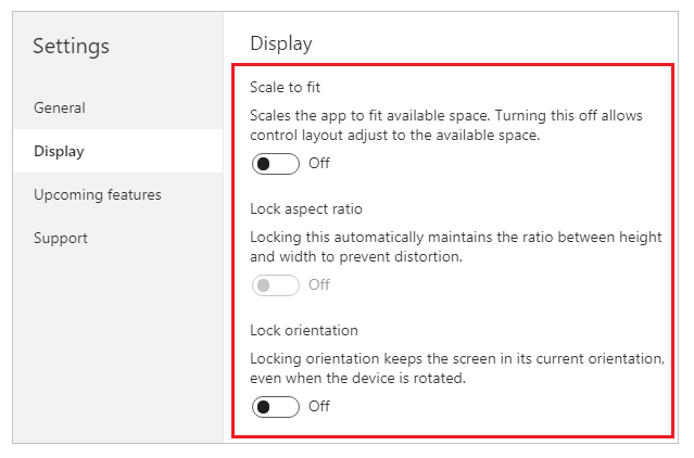
Go to Settings > Display to disable Scale to fit, Lock aspect ratio, and Lock orientation and select Apply.
Responsive layouts
The following responsive layouts can be created by adding a new screen and selecting the appropriate option from the Layout tab:

Note
The new responsive layouts are available to the apps formats but the new screen templates are available only for Tablet format.
Split-screen
The Split-screen layout has two sections, each occupying 50% width of the screen on desktops. On mobile devices, the sections are placed one below the other, each occupying up the entire screen width.
Sidebar
The Sidebar layout has a fixed width sidebar on the left. The main body consists of a fixed height header, and the main section takes up the rest of the screen width. By default, the template has the same behavior on mobile, however some customizations are recommended based on the UI pattern desired for the mobile experience.
Working with containers
Containers are building blocks of all the responsive design. A container can be an auto-layout container in vertical or horizontal direction, or a fixed-layout container, which in the future will support constraints.
Below are some tips for building your app’s UI with containers:
Always create UI elements that form a UI table inside a container.
Allows the container to have its own responsive properties and settings to specify how it is positioned or resized on different screen sizes.
Allows you to change how its child components are laid out with respect to responsiveness.
Choose one of two layout modes for a container: Manual layout or auto-layout (Horizontal or Vertical)
Auto-layout containers
Two controls, Horizontal container and Vertical container can be used to automatically lay out the child components. These containers determine the position of the child components so that you never have to set X, Y for a component inside the container. Also, it can distribute the available space to its child components based on the settings, as well as determines both the vertical and horizontal alignment of the child components.
When to use auto-layout containers
You can use auto-layout containers in the following scenarios:
- UI needs to be responsive to screen size or form factor changes.
- There is more than one child component that needs to resize or move around based on the screen size or form factor changes.
- When you need to stack items vertically or horizontally (regardless of their size).
- When you need to space items evenly on the screen.
Example for auto-layout container
To build a responsive screen:
Create a blank canvas app with Tablet layout.
Select Settings > Display and disable Scale to fit, Lock aspect ratio, and Lock orientation and select Apply.
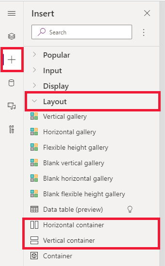
Now from the Insert panes in the left sidebar, under Layout tab, select Horizontal container.
The top-most container needs to be sized to take the entire space with these properties. It will be the same size as the screen as it resizes.
- X = 0
- Y= 0
- Width = Parent.Width
- Height = Parent. Height
Now, from the Insert pane add two Vertical containers into the Horizontal container.
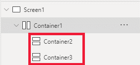
To make the containers, fill the full vertical space, Select Container1 and set the
Align (vertical)property toStretch.
To divide the screen between the content, use the
Fill portionsproperty on the two child containers. The left container will take up 1/4 of the screen space.- Select Container2. You'll see that the
Flexible widthproperty is turned on. Set theFill portionsto 1. - Select Container3. You'll see that the
Flexible widthproperty is turned on. Set theFill portionsto 3.
- Select Container2. You'll see that the
Select Container2. Set the
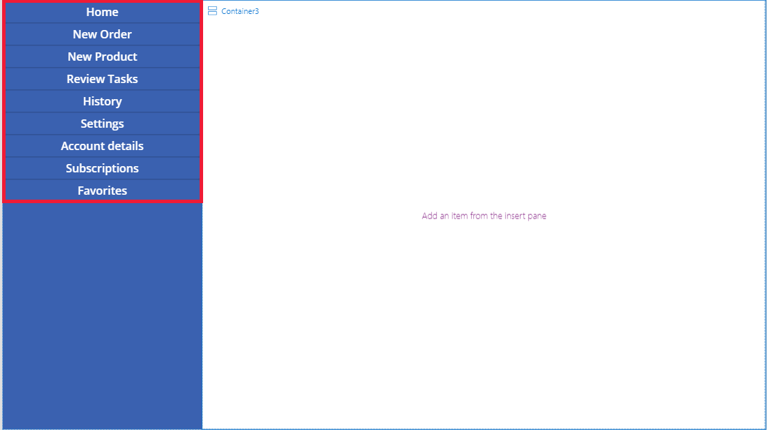
Fill = RGBA(56, 96, 178, 1)property in the formula bar. SetAlign (horizontal)toStretch.Add few buttons to create a menu. Rename the buttons as needed.
Select Container3 and add a Horizontal container and turn off the
Flexible heightproperty. SetHeightto 100. SetAlign (vertical)toStretch.Add some Icons into Container4. Change the icons to be different with the icon property.
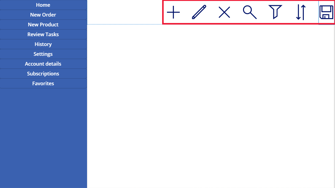
Select Container4. Set the
Justify (horizontal)property toEnd. Set theAlign (vertical)toCenter. SetGapto 40 to create space between the icons.Select Container3. Set
Align (horizontal)toStretch. SetVertical OverflowtoScroll.Add different Label, Inputs, Media until they extend beyond the container. Change the color of the rectangles to be different. You'll see a scroll bar to access the unseen content.
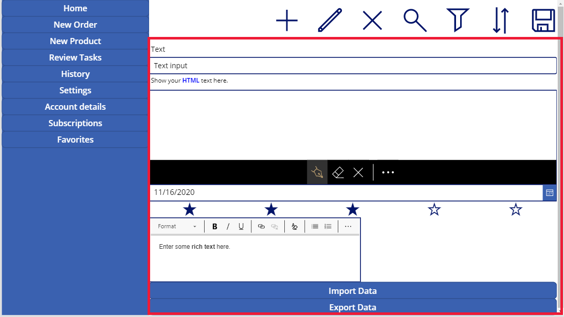
Select Preview or F5. Change the size of the browser window to see how your app adjusts to different screen sizes.
Known issues
Certain combinations of layout container properties are incompatible or can produce undesirable outputs, for example:
- If the container’s
Wrapproperty is enabled, theAlignproperty setting is ignored on child controls. - If the container’s
Wrapproperty is disabled and the container’s primary-axis overflow is set to Scroll (Horizontal Overflow for Horizontal containers or Vertical Overflow for Vertical containers), it is recommended to set theJustifyproperty to either Start or Space Between. - The Center or End options can cause child controls inaccessible when the container is too small to display all the controls, even though the
Overflowproperty is set to Scroll.
- If the container’s
You can’t resize or reposition the controls on the canvas app because the drag & drop controls are disabled in the layout containers. Instead, use the layout container properties to achieve the desired size and positioning. Control ordering can be changed via the Tree view, or by using the arrow keys as shortcuts.
The Data table, Charts, and Add Picture controls are currently not supported in the layout containers.
Some of the layout containers properties are hidden for child controls. The hidden properties can still be accessible via the formula bar or from the advanced panel. However, these properties will be ignored even if they are set in these places.
When controls are moved into a layout container (for example, when copy or pasting the controls), they are inserted into the container by their order in the Tree view.