Tutorial: From Excel workbook to a Power BI report in Microsoft Teams
APPLIES TO: ![]() Power BI Desktop
Power BI Desktop ![]() Power BI service
Power BI service
Your manager wants to see a report on your latest sales and profit figures by the end of the day. However, the latest data is in files on your laptop. In the past, it's taken hours to create a report, and you’re beginning to feel anxious.
No worries. With Power BI, you can create a stunning report and share it in Microsoft Teams in no time!

In this tutorial, we upload an Excel file, create a new report, and share it with colleagues in Microsoft Teams, all from within Power BI. You'll learn how to:
- Prepare your data in Excel.
- Download sample data.
- Build a report in the Power BI service.
- Pin the report visuals to a dashboard.
- Share a link to the dashboard.
- Share the dashboard in Microsoft Teams
Prerequisites
- Sign up for the Power BI service.
- Download the Financial Sample workbook and save it to your computer or to OneDrive for Business.
Prepare data in Excel
Let’s take an Excel file as an example.
Before you can load your Excel file into Power BI, you must organize your data in a flat table. In a flat table, each column contains the same data type; for example, text, date, number, or currency. Your table should have a header row but no columns or rows that display totals.
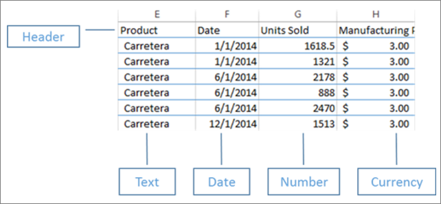
Next, format your data as a table. In Excel, on the Home tab, in the Styles group, select Format as Table.
Select a table style to apply to your worksheet.
Your Excel worksheet is now ready to load into Power BI.
Upload your Excel file to the Power BI service
The Power BI service connects to many data sources, including Excel files that live on your computer.
To get started, sign in to the Power BI service. If you haven’t signed up, you can do so for free.
In My workspace, select New > Report.

Select Excel.

Select Upload file, and drag or browse to the Excel file location.

Now you have a Financial Sample semantic model. Power BI also automatically created a blank dashboard. If you don't see the dashboard, refresh your browser.
If you aren't signed in, you need to sign in before you can upload the Excel file. Select Next.
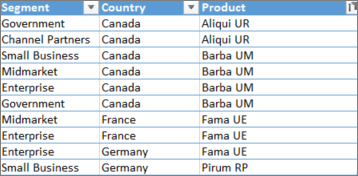
In the Power Query Choose data window, select the financials table in the Excel workbook, and select Create.


Build your report
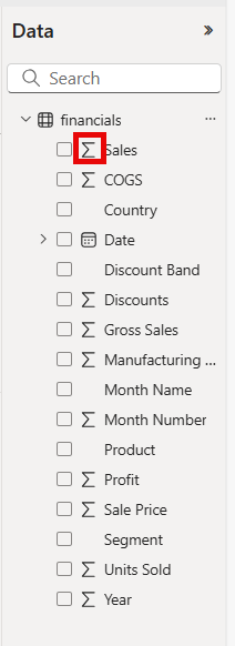
The report opens in Editing view and displays the blank report canvas. On the right are the Filters, Visualizations, and Data panes. Your Excel workbook table data appears in the Data pane. At the top is the name of the table, financials. Under that, Power BI lists the column headings as individual fields.
Notice the Sigma symbols in the Data list? Power BI has detected that those fields are numeric. Power BI can also detect geographic fields and date fields.
To have more room for the report canvas, minimize the Filters pane.
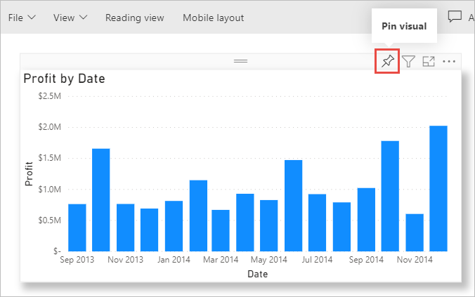
Now you can begin to create visualizations. Let's say your manager wants to see profit over time. In the Data pane, drag Profit to the report canvas.
By default, Power BI displays a column chart with one column.

Drag Date to the column chart.
Power BI updates the column chart to show profit by years.

Hover over the chart and select the forked double arrows to show quarters, then select them again to show months.

December 2014 was the most profitable month.
Tip
If your chart values don't look as you expect, check your aggregations. For example, in the Values well, select the Profit field you just added and make sure the data is being aggregated the way you want. In this example, we're using Sum.
Create a map
Your manager wants to know which countries/regions are the most profitable. Impress your manager with a map visualization.
Select a blank area on your report canvas.
From the Data pane, drag the Country field to your report canvas, then drag the Profit field to the map.
Power BI creates a map visual with bubbles representing the relative profit of each location.

You can see that the European and the North American region profits are about the same.
Create a visual showing sales segments
What about displaying a visual showing sales by product and market segment? That's easy.
Select the blank canvas.
In the Data pane, select the Sales, Product, and Segment fields.
Power BI creates a clustered column chart.

Change the type of chart by choosing one of the icons in the Visualizations menu. For instance, change it to a Stacked column chart.

To sort the chart, select More options (...) > Sort by.

Spruce up the visuals
Make the following changes on the Format tab in the Visualizations pane.

Select the Profit by Year, Quarter, Month, and Day column chart. In the Title section, change Text size to 16 pt. Toggle Shadow to On.
Select the Sales by Product and Segment stacked column chart. In the Title section, change title Text size to 16 pt. Toggle Shadow to On.
Select the Profit by Country map. In the Map styles section, change Theme to Grayscale. In the Title section, change title Text size to 16 pt. Toggle Shadow to On.
Add a report title
Select the Text box option.
Drag the box to the upper-left corner. Type "Worldwide Sales" in the box.

Select the text, and make the Font size 36.

Pin to a dashboard
You can pin all of your visuals to the blank dashboard that Power BI created by default.
Hover over a visual and select Pin visual.
You must save your report before you can pin a visual to the dashboard. Give your report a name and select Save.
Pin each visual to the dashboard that Power BI created, Financial Sample.xlsx.
When you pin the last visual, select Go to dashboard.
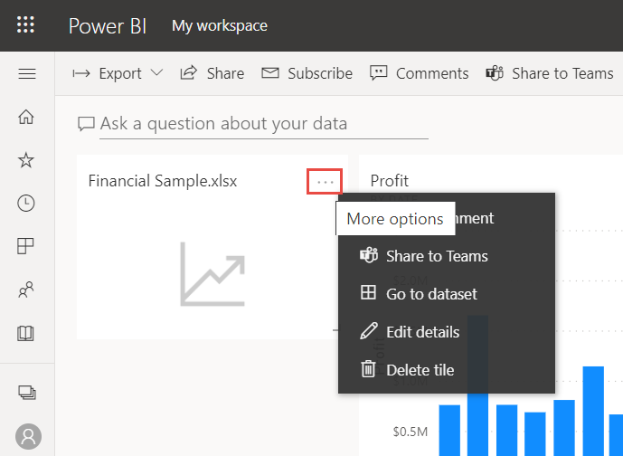
Power BI added a placeholder Financial Sample.xlsx tile to the dashboard automatically. Select More options (...) > Delete tile.
Rearrange and resize the tiles any way you want.
The dashboard and report are ready.
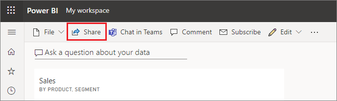
Share a link to your dashboard
Now it's time to share your dashboard with your manager. You can share your dashboard and underlying report with any colleague who has a Power BI account. They can interact with your report, but they can't save changes. If you allow it, they can reshare with others or build a new report based on the underlying semantic model.
To share your report, at the top of the dashboard, select Share.
In the Share dashboard screen, enter the email addresses of the recipients in the Enter a name or email addresses field and add an optional message.
Select the option to Send an email notification. Choose any other options you want:
- Allow recipients to share this dashboard
- Allow recipients to build content with the data associated with this dashboard
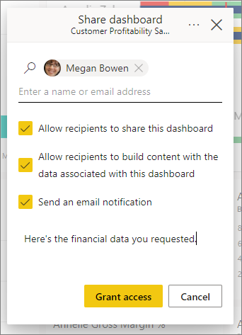
Select Grant access.
Share to Microsoft Teams
You can also share reports and dashboards directly to your colleagues in Microsoft Teams.
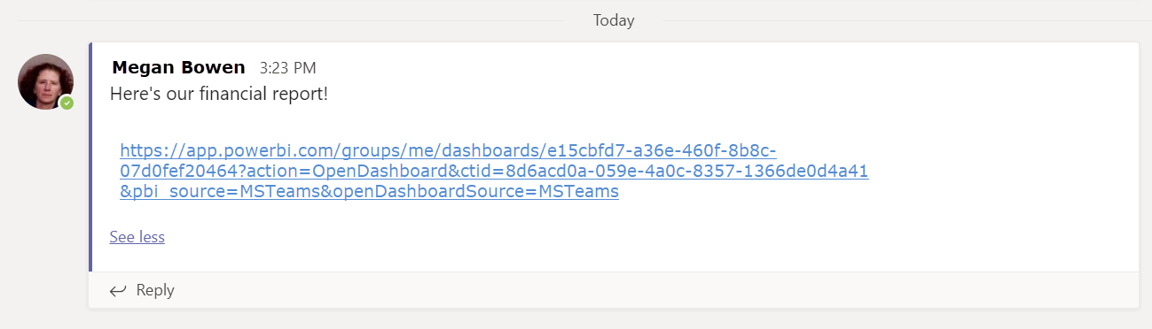
To share in Teams, at the top of the dashboard, select Chat in Teams.
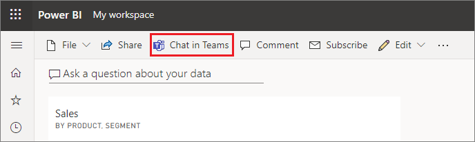
Power BI displays the Share to Teams dialog. Enter the name of a person, group, or channel and select Share.

The link appears in the Posts for that person, group, or channel.
Related content
- Now that you've created a basic report in the Power BI service, how about creating a report in Power BI Desktop? Try the tutorial, From Excel workbook to stunning report in Power BI Desktop.
More questions? Try the Power BI Community.
משוב
בקרוב: במהלך 2024, נפתור בעיות GitHub כמנגנון המשוב לתוכן ונחליף אותו במערכת משוב חדשה. לקבלת מידע נוסף, ראה: https://aka.ms/ContentUserFeedback.
שלח והצג משוב עבור