Introduction: Use natural language to explore data with Power BI Q&A
Sometimes the fastest way to get an answer from your data is to perform a search over your data using natural language. The Q&A features in Power BI let you explore your data in your own words by using natural language. Q&A is interactive, even fun. Often, one question leads to others as the visualizations reveal interesting paths to pursue. Asking the question is just the beginning. Travel through your data, refining or expanding your question, uncovering new information, zeroing in on details, or zooming out for a broader view. The experience is interactive and fast, powered by an in-memory storage.
Power BI Q&A is free and available to all users. Use these links to find the article that you need.
- Use Q&A on a dashboard. Every dashboard has a Q&A field in the upper left corner. Type a natural language question to explore your data.
- Create and save Q&A results to a dashboard or report. Report designers use Q&A to explore data and create visualizations in reports.
- Use a Q&A visual in a report. If a report creator has added a Q&A visual to a report, use and reuse that visual to explore your data.
- Create a Q&A visual in a report and share it with others.
- Use Q&A in mobile apps. Use the Q&A virtual assistant in iOS and the Q&A visual on Android devices.
- If you have edit permission, you can save your Q&A visualization results on a dashboard or in a report.
How to use Q&A

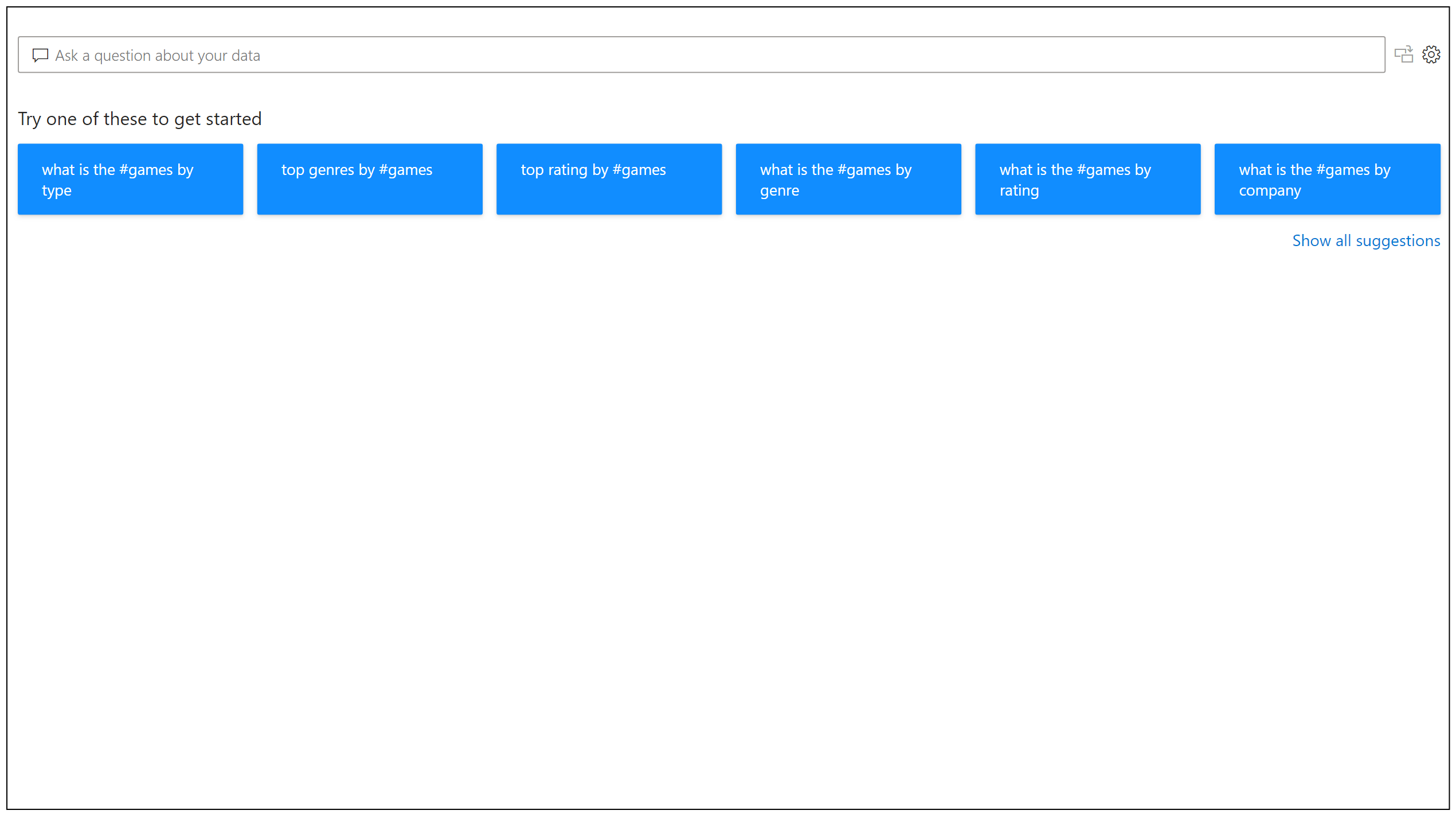
Even before you start typing, Q&A displays a new screen with suggestions to help you form your question. Start from one of the suggested questions or type your own question. Q&A supports a wide range of questions. You can:
- Ask natural questions Which sales has the highest revenue?
- Use relative date filtering Show me sales in the last year
- Return only the top N Top 10 products by sales
- Provide a filter Show me sales in the USA
- Filter on multiple instances of the same entity Which customers bought cheese and wine? (Where cheese and wine come from the same Product entity)
- Provide complex conditions Show me sales where product category is Category 1 or Category 2
- Return a specific visual Show me sales by product as pie chart
- Use complex aggregations Show me median sales by product
- Sort results Show me top 10 countries/regions by sales ordered by country/region code
- Compare data Show me date by total sales vs total cost
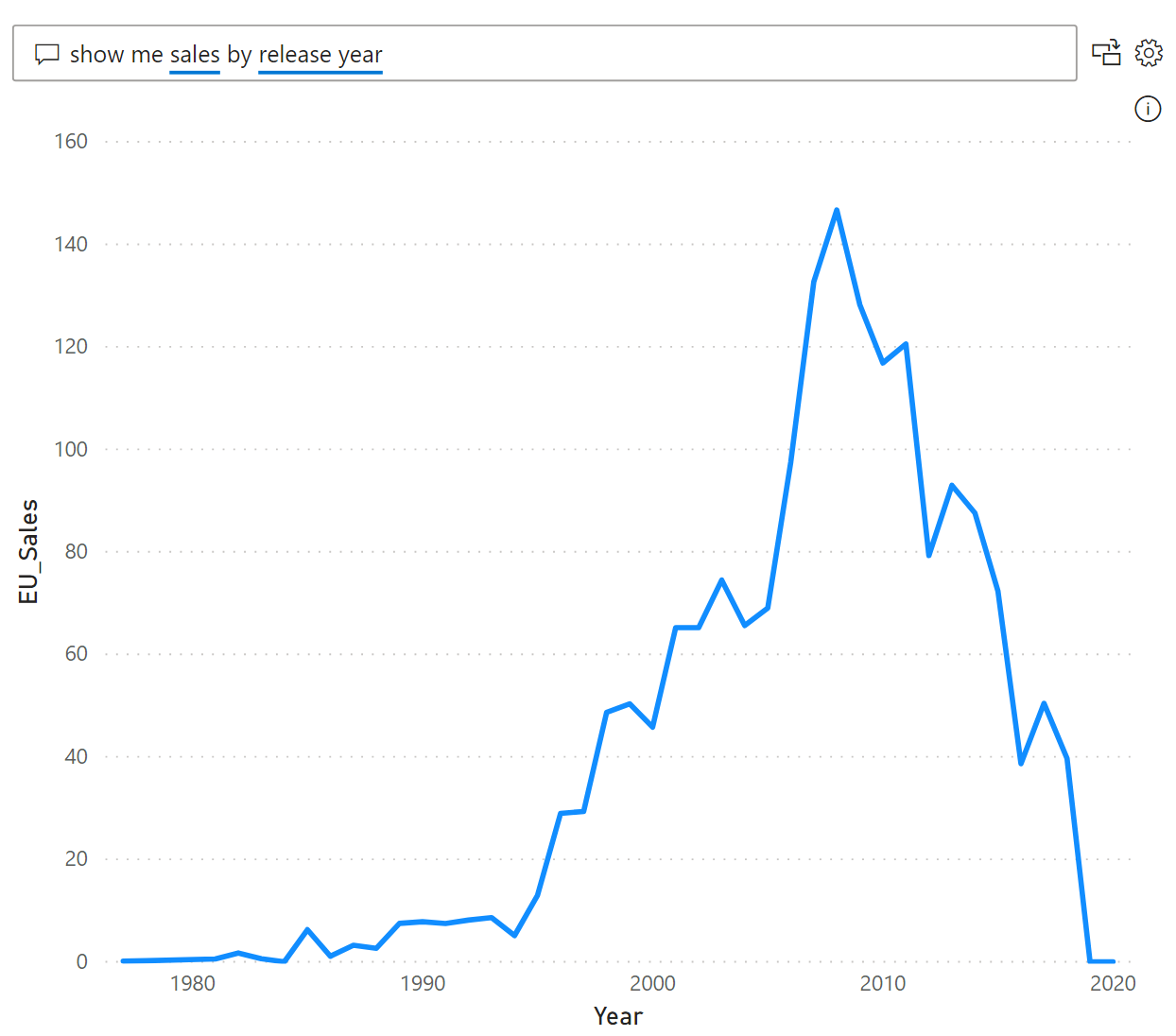
- View trends Show me sales over time
Autocomplete
As you type your question, Power BI Q&A shows relevant and contextual suggestions to help you quickly become productive with natural language. As you type, you get immediate feedback and results. The experience is similar to typing in a search engine.

Red/Blue/Orange underlines
Q&A shows words with underlines to help you see which words the system recognized or didn't recognize. A solid blue underline indicates that the system successfully matched the word to a field or value in the data-model. The following example shows that Q&A recognized the words EU Sales.

An orange dotted underline indicates that the word or phrase is categorized as low confidence. If you enter a vague or ambiguous word, the field is underlined in orange dots. An example could be the word 'Sales'. Multiple fields could contain the word 'Sales', so the system uses an orange dotted underline to prompt you to choose the field you mean. Another example of low confidence could be if you enter the word 'area', but the column it matches is 'region'. Power BI Q&A recognizes words that mean the same thing thanks to the integration with Bing and Office and also interpreting renames from within a report as potential suggestions. Q&A underlines the word with orange dots, so you know it's not a direct match.
A red double-underline means Q&A didn't recognize the word at all. You could encounter this issue by using a domain-specific term that isn't mentioned anywhere in the data, or the data fields are incorrectly named. An example could be using the word 'Costs' if the word doesn't exist anywhere in the data. The word is in the English dictionary, but Q&A marks this term with a red double-underline to indicate it can't find this term in the data.

Note
You can customize the blue/red/orange underline colors in the Q&A Visual formatting pane. Also, the Q&A tooling article explains Teach Q&A, which you use to define terms Q&A didn't recognize.
Visualization results
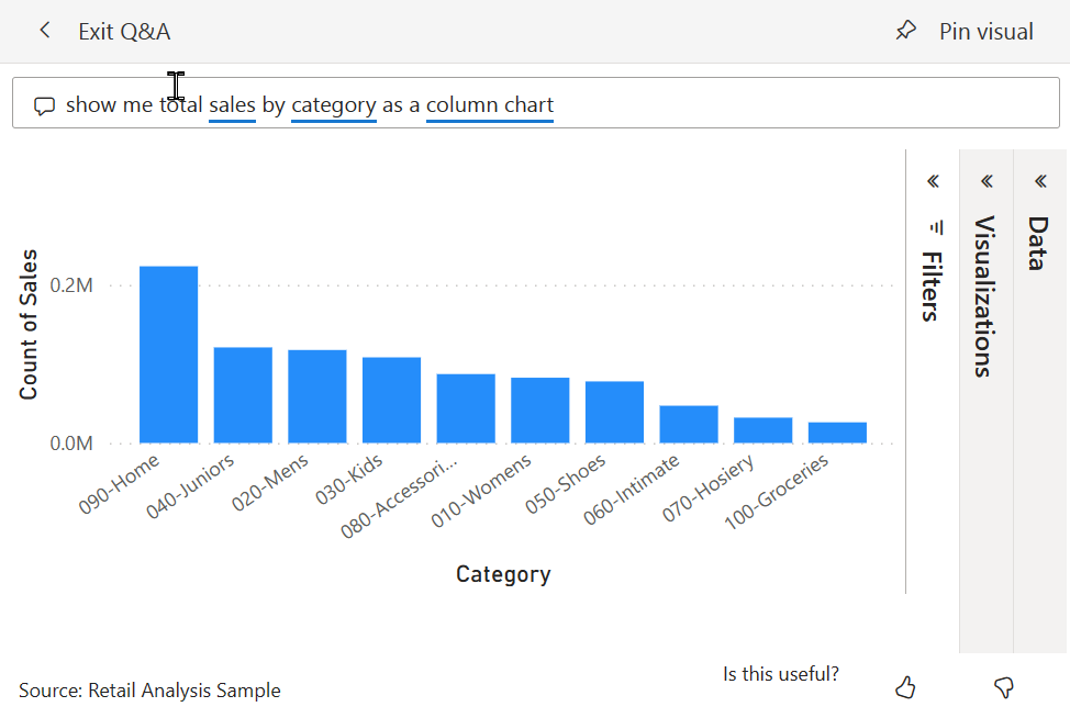
As you enter your question, Q&A tries to instantly interpret and visualize the answer. As part of the latest updates, Q&A now tries to interpret the question and plot the fields automatically to the correct axis. For example, if you enter 'Sales by year', Q&A detects that year is a date field and always prioritizes placing this field on the X axis. If you want to change the visualization type, enter 'as chart type' after the question. Q&A currently supports these types of visualizations:
- Line chart
- Bar chart
- Matrix
- Table
- Card
- Area
- Pie chart
- Scatter/Bubble chart
- Map


Related content
You can integrate natural language in your reports in various ways. For more information, see:
Use Q&A to explore a dashboard. Every dashboard has a Q&A field in the upper left corner. Type a natural language question to explore your data.
Use a Q&A visual in a report. If a report creator has added a Q&A visual to a report, use and reuse that visual to explore your data.
Create and save Q&A results to a dashboard or report. Report designers use Q&A to explore data and create visualizations in reports.
Create a Q&A visual in a report and share it with others.