WinUI 2.4
WinUI 2.4 is the May 2020 release of WinUI.
WinUI is hosted on GitHub where we encourage you to file bug reports, feature requests and community code contributions.
WinUI Releases: GitHub release page
WinUI packages can be added to Visual Studio projects through the NuGet package manager. For more information, see Getting Started with WinUI.
NuGet package download: Microsoft.UI.Xaml
New Features
RadialGradientBrush
A RadialGradientBrush is drawn within an ellipse defined by Center, RadiusX, and RadiusY properties. Colors for the gradient start at the center of the ellipse and end at the radius.

Radial gradient brush
ProgressRing
The ProgressRing control is used for modal interactions where the user is blocked until the ProgressRing disappears. Use this control if an operation requires that most interaction with the app be suspended until the operation is complete.

ProgressRing control
TabView updates
The TabView control updates provide you with more control over how to render tabs.
You can set the width of unselected tabs and show just an icon to save screen space:

TabView control tab sizes
You can also hide the close button on unselected tabs until the user hovers over the tab (in previous versions it was always shown):

TabView control hover to close
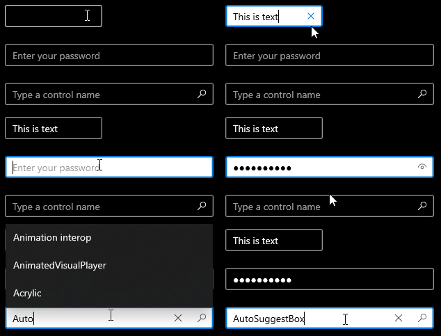
Dark theme updates to TextBox family of controls
When dark theme is enabled, the background color of TextBox family controls remains dark by default on text insertion (in previous versions, the background color changes to white during text insertion).
| Before | After |
|---|---|
 TextBox dark theme updates (before) |
 TextBox dark theme updates (after) |
 TextBox dark theme updates (before) |
 TextBox dark theme updates (after) |
The following are some of the controls included in the TextBox family of controls:
Hierarchical navigation
The NavigationView control now supports hierarchical navigation and includes Left, Top, and LeftCompact display modes. A hierarchical NavigationView is useful for displaying categories of pages, identifying pages with related child-pages, or using within apps that have hub-style pages linking to many other pages.

Hierarchical NavigationView control
Samples
Tip
For more info, design guidance, and code examples, see Design and code Windows apps.
The WinUI 3 Gallery and WinUI 2 Gallery apps include interactive examples of most WinUI 3 and WinUI 2 controls, features, and functionality.
If installed already, open them by clicking the following links: WinUI 3 Gallery or WinUI 2 Gallery.
If they are not installed, you can download the WinUI 3 Gallery and the WinUI 2 Gallery from the Microsoft Store.
You can also get the source code for both from GitHub (use the main branch for WinUI 3 and the winui2 branch for WinUI 2).
Windows developer
