नोट
इस पृष्ठ तक पहुंच के लिए प्राधिकरण की आवश्यकता होती है। आप साइन इन करने या निर्देशिकाएँ बदलने का प्रयास कर सकते हैं।
इस पृष्ठ तक पहुंच के लिए प्राधिकरण की आवश्यकता होती है। आप निर्देशिकाएँ बदलने का प्रयास कर सकते हैं।
The Xamarin.Forms ListView class is used to present scrollable lists, which can be customized through the use of ViewCell elements. A ViewCell element can display text and images, indicate a true/false state, and receive user input.
Built in Cells
Xamarin.Forms comes with built-in cells that work for many applications:
TextCellcontrols are used for displaying text with an optional second line for detail text.ImageCellcontrols are similar toTextCells but include an image to the left of the text.SwitchCellcontrols are used to present and capture on/off or true/false states.EntryCellcontrols are used to present text data that the user can edit.
The SwitchCell and EntryCell controls are more commonly used in the context of a TableView.
TextCell
TextCell is a cell for displaying text, optionally with a second line as detail text. The following screenshot shows TextCell items on iOS and Android:
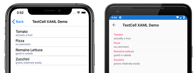
TextCells are rendered as native controls at runtime, so performance is very good compared to a custom ViewCell. TextCells are customizable, allowing you to set the following properties:
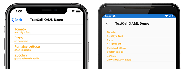
Text– the text that is shown on the first line, in large font.Detail– the text that is shown underneath the first line, in a smaller font.TextColor– the color of the text.DetailColor– the color of the detail text
The following screenshot shows TextCell items with customized color properties:
ImageCell
ImageCell, like TextCell, can be used for displaying text and secondary detail text, and it offers great performance by using each platform's native controls. ImageCell differs from TextCell in that it displays an image to the left of the text.
The following screenshot shows ImageCell items on iOS and Android:
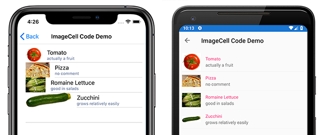
ImageCell is useful when you need to display a list of data with a visual aspect, such as a list of contacts or movies. ImageCells are customizable, allowing you to set:
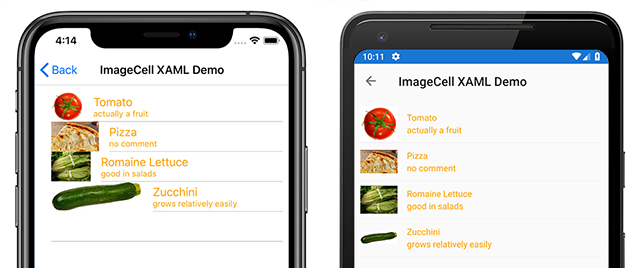
Text– the text that is shown on the first line, in large fontDetail– the text that is shown underneath the first line, in a smaller fontTextColor– the color of the textDetailColor– the color of the detail textImageSource– the image to display next to the text
The following screenshot shows ImageCell items with customized color properties:
Custom Cells
Custom cells allow you to create cell layouts that aren't supported by the built-in cells. For example, you may want to present a cell with two labels that have equal weight. A TextCell would be insufficient because the TextCell has one label that is smaller. Most cell customizations add additional read-only data (such as additional labels, images or other display information).
All custom cells must derive from ViewCell, the same base class that all of the built-in cell types use.
Xamarin.Forms offers a caching behavior on the ListView control which can improve scrolling performance for some types of custom cells.
The following screenshot shows an example of a custom cell:
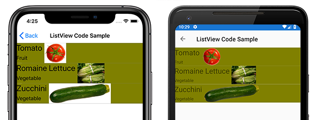
XAML
The custom cell shown in the previous screenshot can be created with the following XAML:
<?xml version="1.0" encoding="UTF-8"?>
<ContentPage xmlns="http://xamarin.com/schemas/2014/forms"
xmlns:x="http://schemas.microsoft.com/winfx/2009/xaml"
x:Class="demoListView.ImageCellPage">
    <ContentPage.Content>
        <ListView  x:Name="listView">
            <ListView.ItemTemplate>
                <DataTemplate>
                    <ViewCell>
                        <StackLayout BackgroundColor="#eee"
                        Orientation="Vertical">
                            <StackLayout Orientation="Horizontal">
                                <Image Source="{Binding image}" />
                                <Label Text="{Binding title}"
                                TextColor="#f35e20" />
                                <Label Text="{Binding subtitle}"
                                HorizontalOptions="EndAndExpand"
                                TextColor="#503026" />
                            </StackLayout>
                        </StackLayout>
                    </ViewCell>
                </DataTemplate>
            </ListView.ItemTemplate>
        </ListView>
    </ContentPage.Content>
</ContentPage>
The XAML works as follows:
- The custom cell is nested inside a
DataTemplate, which is insideListView.ItemTemplate. This is the same process as using any built-in cell. ViewCellis the type of the custom cell. The child of theDataTemplateelement must be of, or derive from, theViewCellclass.- Inside the
ViewCell, layout can be managed by any Xamarin.Forms layout. In this example, layout is managed by aStackLayout, which allows the background color to be customized.
Note
Any property of StackLayout that is bindable can be bound inside a custom cell. However, this capability is not shown in the XAML example.
Code
A custom cell can also be created in code. First, a custom class that derives from ViewCell must be created:
public class CustomCell : ViewCell
    {
        public CustomCell()
        {
            //instantiate each of our views
            var image = new Image ();
            StackLayout cellWrapper = new StackLayout ();
            StackLayout horizontalLayout = new StackLayout ();
            Label left = new Label ();
            Label right = new Label ();

            //set bindings
            left.SetBinding (Label.TextProperty, "title");
            right.SetBinding (Label.TextProperty, "subtitle");
            image.SetBinding (Image.SourceProperty, "image");

            //Set properties for desired design
            cellWrapper.BackgroundColor = Color.FromHex ("#eee");
            horizontalLayout.Orientation = StackOrientation.Horizontal;
            right.HorizontalOptions = LayoutOptions.EndAndExpand;
            left.TextColor = Color.FromHex ("#f35e20");
            right.TextColor = Color.FromHex ("503026");

            //add views to the view hierarchy
            horizontalLayout.Children.Add (image);
            horizontalLayout.Children.Add (left);
            horizontalLayout.Children.Add (right);
            cellWrapper.Children.Add (horizontalLayout);
            View = cellWrapper;
        }
    }
In the page constructor, the ListView's ItemTemplate property is set to a DataTemplate with the CustomCell type specified:
public partial class ImageCellPage : ContentPage
    {
        public ImageCellPage ()
        {
            InitializeComponent ();
            listView.ItemTemplate = new DataTemplate (typeof(CustomCell));
        }
    }
Binding Context Changes
When binding to a custom cell type's BindableProperty instances, the UI controls displaying the BindableProperty values should use the OnBindingContextChanged override to set the data to be displayed in each cell, rather than the cell constructor, as demonstrated in the following code example:
public class CustomCell : ViewCell
{
    Label nameLabel, ageLabel, locationLabel;

    public static readonly BindableProperty NameProperty =
        BindableProperty.Create ("Name", typeof(string), typeof(CustomCell), "Name");
    public static readonly BindableProperty AgeProperty =
        BindableProperty.Create ("Age", typeof(int), typeof(CustomCell), 0);
    public static readonly BindableProperty LocationProperty =
        BindableProperty.Create ("Location", typeof(string), typeof(CustomCell), "Location");

    public string Name
    {
        get { return(string)GetValue (NameProperty); }
        set { SetValue (NameProperty, value); }
    }

    public int Age
    {
        get { return(int)GetValue (AgeProperty); }
        set { SetValue (AgeProperty, value); }
    }

    public string Location
    {
        get { return(string)GetValue (LocationProperty); }
        set { SetValue (LocationProperty, value); }
    }
    ...

    protected override void OnBindingContextChanged ()
    {
        base.OnBindingContextChanged ();

        if (BindingContext != null)
        {
            nameLabel.Text = Name;
            ageLabel.Text = Age.ToString ();
            locationLabel.Text = Location;
        }
    }
}
The OnBindingContextChanged override will be called when the BindingContextChanged event fires, in response to the value of the BindingContext property changing. Therefore, when the BindingContext changes, the UI controls displaying the BindableProperty values should set their data. Note that the BindingContext should be checked for a null value, as this can be set by Xamarin.Forms for garbage collection, which in turn will result in the OnBindingContextChanged override being called.
Alternatively, UI controls can bind to the BindableProperty instances to display their values, which removes the need to override the OnBindingContextChanged method.
Note
When overriding OnBindingContextChanged, ensure that the base class's OnBindingContextChanged method is called so that registered delegates receive the BindingContextChanged event.
In XAML, binding the custom cell type to data can be achieved as shown in the following code example:
<ListView x:Name="listView">
    <ListView.ItemTemplate>
        <DataTemplate>
            <local:CustomCell Name="{Binding Name}" Age="{Binding Age}" Location="{Binding Location}" />
        </DataTemplate>
    </ListView.ItemTemplate>
</ListView>
This binds the Name, Age, and Location bindable properties in the CustomCell instance, to the Name, Age, and Location properties of each object in the underlying collection.
The equivalent binding in C# is shown in the following code example:
var customCell = new DataTemplate (typeof(CustomCell));
customCell.SetBinding (CustomCell.NameProperty, "Name");
customCell.SetBinding (CustomCell.AgeProperty, "Age");
customCell.SetBinding (CustomCell.LocationProperty, "Location");

var listView = new ListView
{
    ItemsSource = people,
    ItemTemplate = customCell
};
On iOS and Android, if the ListView is recycling elements and the custom cell uses a custom renderer, the custom renderer must correctly implement property change notification. When cells are reused their property values will change when the binding context is updated to that of an available cell, with PropertyChanged events being raised. For more information, see Customizing a ViewCell. For more information about cell recycling, see Caching Strategy.