Use Automatic Layout Overview
This topic introduces guidelines for developers on how to write Windows Presentation Foundation (WPF) applications with localizable user interfaces (UIs). In the past, localization of a UI was a time consuming process. Each language that the UI was adapted for required a pixel by pixel adjustment. Today with the right design and right coding standards, UIs can be constructed so that localizers have less resizing and repositioning to do. The approach to writing applications that can be more easily resized and repositioned is called automatic layout, and can be achieved by using WPF application design.
Advantages of Using Automatic Layout
Because the WPF presentation system is powerful and flexible, it provides the ability to layout elements in an application that can be adjusted to fit the requirements of different languages. The following list points out some of the advantages of automatic layout.
UI displays well in any language.
Reduces the need to readjust position and size of controls after text is translated.
Reduces the need to readjust window size.
UI layout renders properly in any language.
Localization can be reduced to the point that it is little more than string translation.
Automatic Layout and Controls
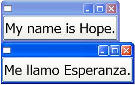
Automatic layout enables an application to adjust the size of a control automatically. For example, a control can change to accommodate the length of a string. This capability enables localizers to translate the string; they no longer need to resize the control to fit the translated text. The following example creates a button with English content.
<Window
    xmlns="http://schemas.microsoft.com/winfx/2006/xaml/presentation"
    xmlns:x="http://schemas.microsoft.com/winfx/2006/xaml"
    x:Class="ButtonLoc.Pane1"
    Name="myWindow"
    SizeToContent="WidthAndHeight"
    >

<DockPanel>
    <Button FontSize="28" Height="50">My name is Hope.</Button>
</DockPanel>
</Window>
In the example, all you have to do to make a Spanish button is change the text. For example,
<Window
    xmlns="http://schemas.microsoft.com/winfx/2006/xaml/presentation"
    xmlns:x="http://schemas.microsoft.com/winfx/2006/xaml"
    x:Class="ButtonLoc.Pane1"
    Name="myWindow"
    SizeToContent="WidthAndHeight"
    >

 <DockPanel>
    <Button FontSize="28" Height="50">Me llamo Esperanza.</Button>
  </DockPanel>
</Window>
The following graphic shows the output of the code samples:

Automatic Layout and Coding Standards
Using the automatic layout approach requires a set of coding and design standards and rules to produce a fully localizable UI. The following guidelines will aid your automatic layout coding.
Do not use absolute positions
Do not use Canvas because it positions elements absolutely.
Use DockPanel, StackPanel, and Grid to position controls.
For a discussion about various types of panels, see Panels Overview.
Do not set a fixed size for a window
Use Window.SizeToContent. For example:
<StackPanel
    xmlns="http://schemas.microsoft.com/winfx/2006/xaml/presentation"
    xmlns:x="http://schemas.microsoft.com/winfx/2006/xaml"
    x:Class="GridLoc.Pane1"
>
Add a FlowDirection
Add a FlowDirection to the root element of your application.
WPF provides a convenient way to support horizontal, bidirectional, and vertical layouts. In presentation framework, the FlowDirection property can be used to define layout. The flow-direction patterns are:
FlowDirection.LeftToRight (LrTb) — horizontal layout for Latin, East Asian, and so forth.
FlowDirection.RightToLeft (RlTb) — bidirectional for Arabic, Hebrew, and so forth.
Use composite fonts instead of physical fonts
With composite fonts, the FontFamily property does not need to be localized.
Developers can use one of the following fonts or create their own.
- Global User Interface
- Global San Serif
- Global Serif
Add xml:lang
Add the
xml:langattribute in the root element of your UI, such asxml:lang="en-US"for an English application.Because composite fonts use
xml:langto determine what font to use, set this property to support multilingual scenarios.
Automatic Layout and Grids
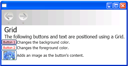
The Grid element, is useful for automatic layout because it enables a developer to position elements. A Grid control is capable of distributing the available space among its child elements, using a column and row arrangement. The UI elements can span multiple cells, and it is possible to have grids within grids. Grids are useful because they enable you to create and position complex UI. The following example demonstrates using a grid to position some buttons and text. Notice that the height and width of the cells are set to Auto; therefore, the cell that contains the button with an image adjusts to fit the image.
<Grid Name="grid" ShowGridLines ="false">
<Grid.ColumnDefinitions>
<ColumnDefinition Width="Auto"/>
<ColumnDefinition Width="*"/>
</Grid.ColumnDefinitions>
<Grid.RowDefinitions>
<RowDefinition Height="Auto"/>
<RowDefinition Height="Auto"/>
<RowDefinition Height="Auto"/>
<RowDefinition Height="Auto"/>
<RowDefinition Height="Auto"/>
</Grid.RowDefinitions>

<TextBlock Margin="10, 10, 5, 5" Grid.Column="0" Grid.Row="0" FontSize="24">Grid
</TextBlock>
<TextBlock Margin="10, 10, 5, 5" Grid.Column="0" Grid.Row="1" FontSize="12"
    Grid.ColumnSpan="2">The following buttons and text are positioned using a Grid.
</TextBlock>
<Button Margin="10, 10, 5, 5" Grid.Column="0" Grid.Row="2" Background="Pink"
    BorderBrush="Black" BorderThickness="10">Button 1
</Button>
<TextBlock Margin="10, 10, 5, 5" Grid.Column="1" Grid.Row="2" FontSize="12"
   VerticalAlignment="Center" TextWrapping="WrapWithOverflow">Sets the background
   color.
</TextBlock>
<Button Margin="10, 10, 5, 5" Grid.Column="0" Grid.Row="3" Foreground="Red">
   Button 2
</Button>
<TextBlock Margin="10, 10, 5, 5" Grid.Column="1" Grid.Row="3" FontSize="12"
   VerticalAlignment="Center" TextWrapping="WrapWithOverflow">Sets the foreground
   color.
</TextBlock>
<Button Margin="10, 10, 5, 5" Grid.Column="0" Grid.Row="4">
   <Image Source="data\flower.jpg"></Image>
</Button>
<TextBlock Margin="10, 10, 5, 5" Grid.Column="1" Grid.Row="4" FontSize="12"
   VerticalAlignment="Center" TextWrapping="WrapWithOverflow">Adds an image as
   the button's content.
</TextBlock>
</Grid>
The following graphic shows the grid produced by the previous code.
 Grid
Grid
Automatic Layout and Grids Using the IsSharedSizeScope Property
A Grid element is useful in localizable applications to create controls that adjust to fit content. However, at times you want controls to maintain a particular size regardless of content. For example, if you have "OK", "Cancel" and "Browse" buttons you probably do not want the buttons sized to fit the content. In this case the Grid.IsSharedSizeScope attached property is useful for sharing the same sizing among multiple grid elements. The following example demonstrates how to share column and row sizing data between multiple Grid elements.
   <StackPanel Orientation="Horizontal" DockPanel.Dock="Top">
       <Button Click="setTrue" Margin="0,0,10,10">Set IsSharedSizeScope="True"</Button>
       <Button Click="setFalse" Margin="0,0,10,10">Set IsSharedSizeScope="False"</Button>
   </StackPanel>

   <StackPanel Orientation="Horizontal" DockPanel.Dock="Top">

   <Grid ShowGridLines="True" Margin="0,0,10,0">
     <Grid.ColumnDefinitions>
       <ColumnDefinition SharedSizeGroup="FirstColumn"/>
       <ColumnDefinition SharedSizeGroup="SecondColumn"/>
     </Grid.ColumnDefinitions>
     <Grid.RowDefinitions>
       <RowDefinition Height="Auto" SharedSizeGroup="FirstRow"/>
     </Grid.RowDefinitions>

       <Rectangle Fill="Silver" Grid.Column="0" Grid.Row="0" Width="200" Height="100"/>
       <Rectangle Fill="Blue" Grid.Column="1" Grid.Row="0" Width="150" Height="100"/>

       <TextBlock Grid.Column="0" Grid.Row="0" FontWeight="Bold">First Column</TextBlock>
       <TextBlock Grid.Column="1" Grid.Row="0" FontWeight="Bold">Second Column</TextBlock>
   </Grid>

   <Grid ShowGridLines="True">
     <Grid.ColumnDefinitions>
       <ColumnDefinition SharedSizeGroup="FirstColumn"/>
       <ColumnDefinition SharedSizeGroup="SecondColumn"/>
     </Grid.ColumnDefinitions>
     <Grid.RowDefinitions>
       <RowDefinition Height="Auto" SharedSizeGroup="FirstRow"/>
     </Grid.RowDefinitions>

       <Rectangle Fill="Silver" Grid.Column="0" Grid.Row="0"/>
       <Rectangle Fill="Blue" Grid.Column="1" Grid.Row="0"/>

       <TextBlock Grid.Column="0" Grid.Row="0" FontWeight="Bold">First Column</TextBlock>
       <TextBlock Grid.Column="1" Grid.Row="0" FontWeight="Bold">Second Column</TextBlock>
   </Grid>

   </StackPanel>

   <TextBlock Margin="10" DockPanel.Dock="Top" Name="txt1"/>
Note
For the complete code sample, see Share Sizing Properties Between Grids.
See also
.NET Desktop feedback
