Designing your personal app for Microsoft Teams
A personal app can be a bot, private workspace, or both. Sometimes it functions as a place to create or view content. Other times, it offers the user a bird’s eye view of everything that's theirs when the app has been configured as a tab in multiple channels.
To guide your app design, the following information describes and illustrates how people can add, use, and manage personal apps in Teams.
Microsoft Teams UI Kit
You can find comprehensive personal app design guidelines, including elements that you can grab and modify as needed, in the Microsoft Teams UI Kit. The UI kit also has essential topics such as accessibility and responsive sizing that aren't covered here.
Add a personal app
Users can add a personal app from the Microsoft Teams Store or app flyout by selecting the More icon on the left side of Teams (shown in the following example).
Use a personal app (private workspace)
With a private workspace, users can view app content that's meaningful to them in a central location without leaving Teams.
(Implementation note: The private workspace is based on the personal tab capability.)
Anatomy: Personal app (private workspace)
Mobile

| Counter | Description |
|---|---|
| A | App attribution: Your app name. |
| B | Tabs: Provides navigation for your personal app. |
| C | More menu: Includes other app options and information. |
| D | Primary navigation: Provides navigation to your app other main Teams features. |
Configure and add multiple actions in NavBar
You can add multiple actions to the upper-right NavBar and build an overflow menu for extra actions in an app. A maximum of five actions can be added in the NavBar, including the overflow menu.

| Counter | Description |
|---|---|
| 1 | NavBar |
| 2 | Overflow menu |
To Configure and add multiple actions in NavBar, call setNavBarMenu API and add the displayMode enum property to MenuItem. The displayMode enum defines how a menu appears in the NavBar. The default value of displayMode enum is set to ifRoom.
Based on the requirements and space available in the NavBar, set displayMode enum considering one of the following.
- If there's room, set
ifRoom = 0to place an item in the NavBar. - If there's no room, set
overflowOnly = 1, so that item would always be placed in the NavBar's overflow menu but not in the NavBar.
The following is an example of configuring the NavBar with an overflow menu for multiple actions:
const menuItems = [item1, item2, item3, item4, item5]
microsoftTeams.menus.setNavBarMenu(menuItems, (id: string) => {
  output(`Clicked ${id}`)
  return true;
})
Note
The setNavBarMenu API doesn't control the Refresh button. It appears by default.


| Counter | Description |
|---|---|
| A | Tabs: Provides navigation for your personal app. |
| 1 | Webview: Displays your app content. |
Desktop
| Counter | Description |
|---|---|
| A | App attribution: Your app logo and name. |
| B | Tabs: Provides navigation for your personal app. |
| C | Popout view: Pushes your app content from a parent window to a standalone child window. |
| D | More menu: Includes other app options and information. (You could alternatively make Settings a tab.) |
| Counter | Description |
|---|---|
| A | Tabs: Provides navigation for your personal app. |
| 1 | iframe: Displays your app content. |
Design with UI templates and advanced components
Use one of the following Teams templates and components to help design your personal tab:
- List: Lists can display related items in a scannable format and allow users to take actions on an entire list or individual items.
- Task board: A task board, sometimes called a kanban board or swim lanes, is a collection of cards often used to track the status of work items or tickets.
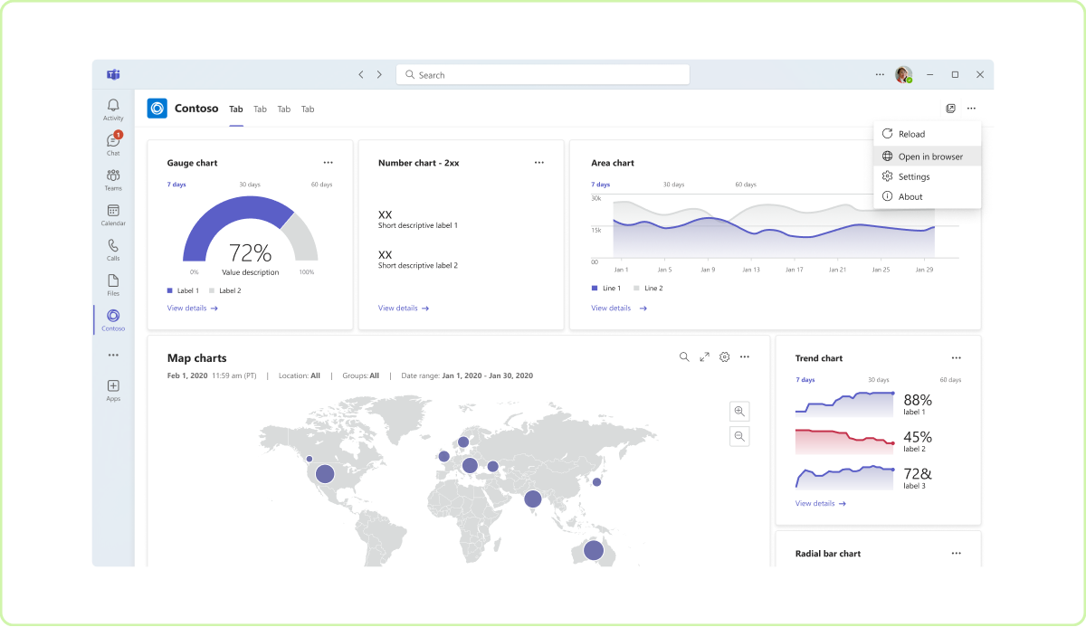
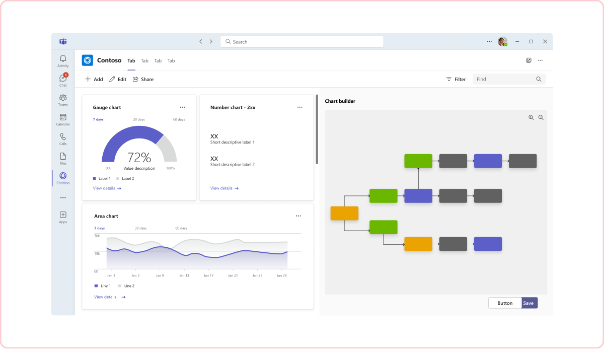
- Dashboard: A dashboard is a canvas containing multiple cards that provide an overview of data or content.
- Form: Forms are for collecting, validating, and submitting user input in a structured way.
- Empty state: The empty state template can be used for many scenarios, including sign in, first-run experiences, error messages, and more.
- Left nav: The left nav component can help if your personal app requires some navigation. In general, you should keep navigation to a minimum.
Use a personal app (bot)
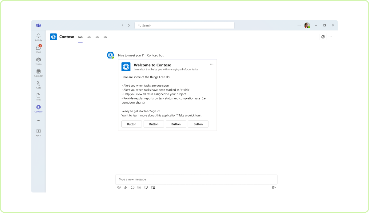
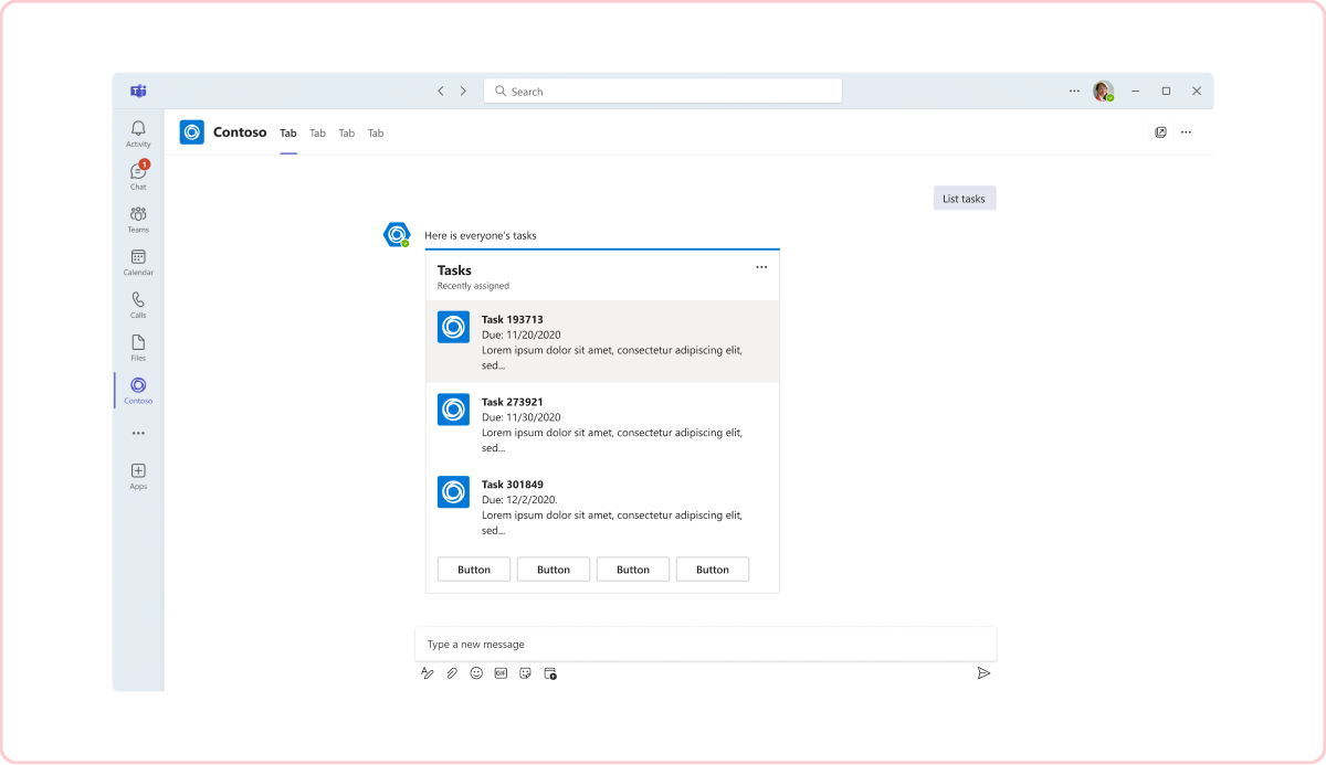
Personal apps can include a bot for one-on-one conversations and private notifications (for instance, when a colleague posts a comment on artboard). Users interact with the bot in a tab you specify.
Anatomy: Personal app (bot)
Mobile

| Counter | Description |
|---|---|
| A | Bot entry point: Entry point for users to access the bot feature in your personal app. |
| B | Back button: Takes users back to the private workspace. |
| C | Bot message: Bots often send messages and notifications in the form of a card (such as an Adaptive Card). |
| D | Compose box: Input field for sending messages to the bot. |
Configure back button
When you select the back button in a Teams app, you return to the Teams platform without navigating inside the app.
To navigate within the app, configure the back button so that when you select the back button, you can go back to previous steps and navigate within the app.
To Configure back button, call registerBackButtonHandler API, which handles the functionality of the back button depending on one of the following conditions:
- When
registerBackButtonHandleris set tofalse, TeamsJS calls thenavigateBackAPI and the Teams platform handles the back button. - When
registerBackButtonHandleris set totrue, the app handles the functionality of back button (you can go back to previous steps and navigate within the app), and the Teams platform takes no further actions.
The following is an example of configuring the back button:
microsoftTeams.registerBackButtonHandler(() => {
  const selectOption = registerBackReturn.options[registerBackReturn.selectedIndex].value
  var isHandled = false
  if (selectOption == 'true')
    isHandled = true;
  output(`onBack isHandled ${isHandled}`)
  return isHandled;
})
Desktop
| Counter | Description |
|---|---|
| A | Bot tab: For example, include a Chat tab to access bot conversations and notifications. |
| B | Bot message: Bots often send messages and notifications in the form of a card (such as an Adaptive Card). |
| C | Compose box: Input field for sending messages to the bot. |
Manage a personal tab
On the left side of Teams, users can right-click the personal app to pin, remove, and configure other app options.
Best practices
Use these recommendations to create a quality app experience.
Desktop
Tab priority
Do: Show the most relevant content in the first tab
With responsive sizing, tabs on the right may become truncated or out of view.

Don’t: Lead with secondary content or metadata
Like a standard web app, tab navigation should progress in an order that helps make sense of your app’s primary features.

Tab hierarchy
Do: Tabs should be of equal hierarchy and represent key app pages
Your tabs should categorize your app’s primary features and content. With responsive sizing, content on the right may become truncated or out of view.

Don't: Include different levels of hierarchy
Your content should progress in a logical order that helps users make sense of it. If you have two tabs that are closely related, consider combining them into one tab.

First-run experience
Do: Include a first-run experience
There should be at least a welcome screen the first time you use a personal app. For bots, describe what your bot can do and provide quick actions, such as a sign in.


Don't: Start with a blank screen
Users might be confused if nothing displays the first time they run your app.

Personalized content
Do: Aggregate app content relevant to a user
Whether it's a personal tab or bot, display content related to only a user's activity in your app.


Don’t: Show unrelated or overly broad content
In personal contexts, don’t display content for teams a user isn't part of. Personal bot content should focus on the individual—not a group.


Complex app features
Do: Allow users to access complex features in a browser
Your app should focus on core tasks in Teams, but you can still view the full, standalone app in a browser.

Don’t: Include your entire app
Unless you created your app specifically for Teams, you probably have features that don’t make sense in a collaboration tool.

Mobile

Code sample
| Sample name | Description | TypeScript |
|---|---|---|
| Meeting app | Sample to show navbar-menu in personal tab app. | View |
See also
These other design guidelines may help depending on the scope of your personal app:
Platform Docs


