Nóta
Aðgangur að þessari síðu krefst heimildar. Þú getur prófað aðskrá þig inn eða breyta skráasöfnum.
Aðgangur að þessari síðu krefst heimildar. Þú getur prófað að breyta skráasöfnum.
This article shows you how to add a custom HTML such as an image file to the map as an HTML Marker.
Note
HTML Markers do not connect to data sources. Instead position information is added directly to the marker and the marker is added to the maps markers property which is a HtmlMarkerManager.
Important
Unlike most layers in the Azure Maps Web control which use WebGL for rendering, HTML Markers use traditional DOM elements for rendering. As such, the more HTML markers added to a page, the more DOM elements there are. Performance can degrade after adding a few hundred HTML markers. For larger data sets consider either clustering your data or using a Symbol or Bubble layer.
Add an HTML marker
The HtmlMarker class has a default style. You can customize the marker by setting the color and text options of the marker. The default style of the HTML marker class is an SVG template that has a {color} and {text} placeholder. Set the color and text properties in the HTML marker options for a quick customization.
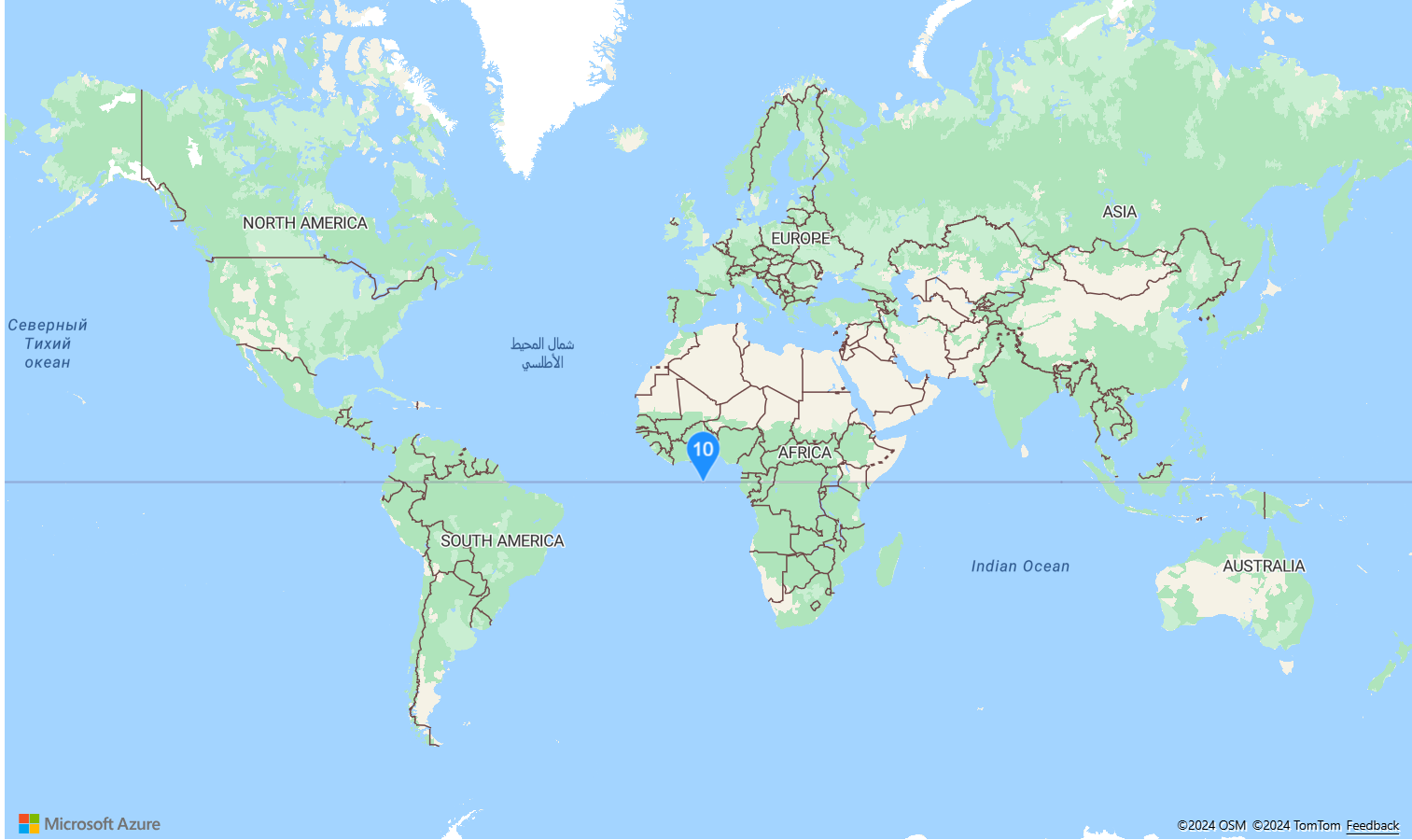
The following code creates an HTML marker, and sets the color property to DodgerBlue and the text property to 10. A popup is attached to the marker and click event is used to toggle the visibility of the popup.
//Create an HTML marker and add it to the map.
var marker = new atlas.HtmlMarker({
    color: 'DodgerBlue',
    text: '10',
    position: [0, 0],
    popup: new atlas.Popup({
        content: '<div style="padding:10px">Hello World</div>',
        pixelOffset: [0, -30]
    })
});

map.markers.add(marker);

//Add a click event to toggle the popup.
map.events.add('click',marker, () => {
    marker.togglePopup();
});
For a complete working sample of how to add an HTML marker, see Simple HTML Marker in the Azure Maps Samples. For the source code for this sample, see Simple HTML Marker source code.
Create SVG templated HTML marker
The default htmlContent of an Html marker is an SVG template with place folders {color} and {text} in it. You can create custom SVG strings and add these same placeholders into your SVG such that setting the color and text options of the marker update these placeholders in your SVG.
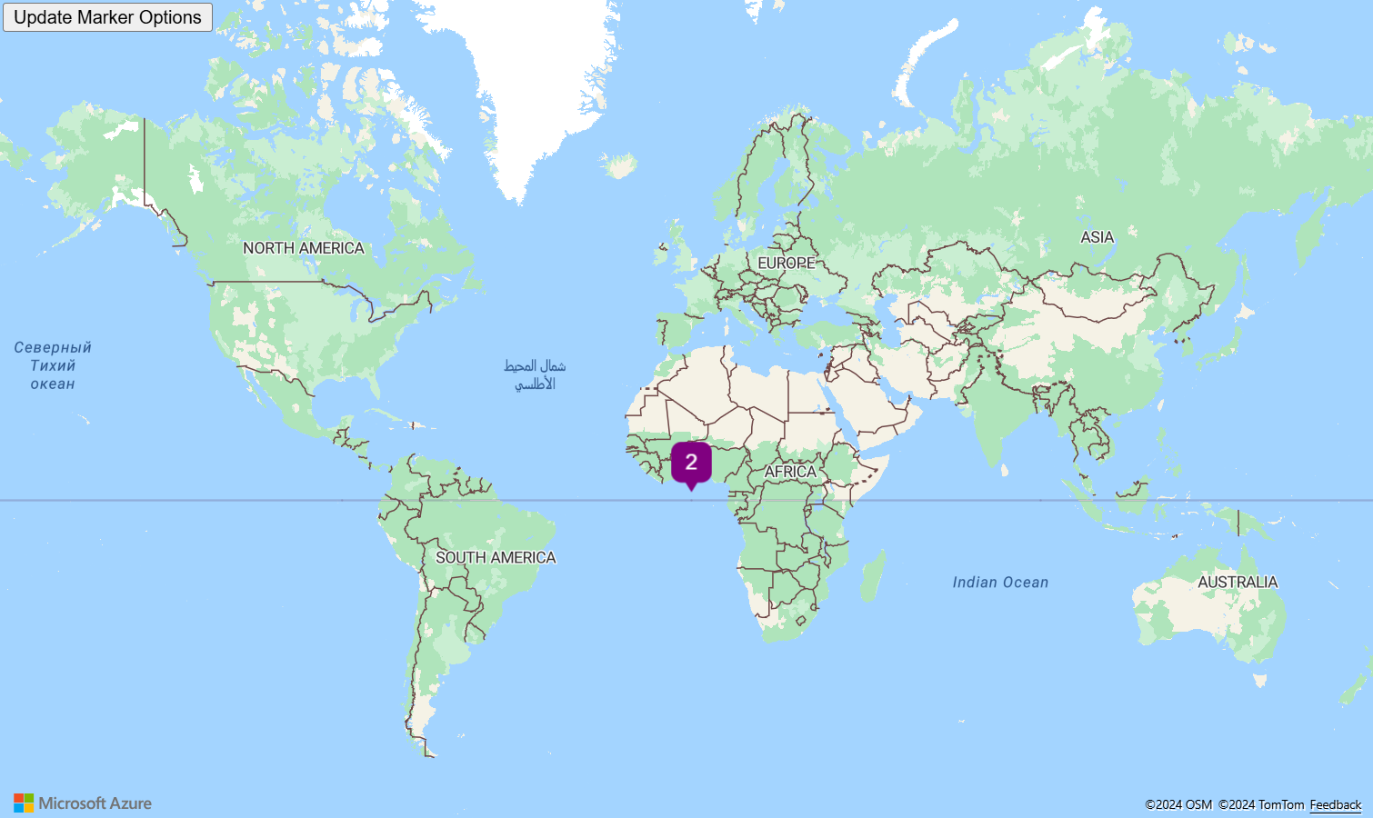
For a complete working sample of how to create a custom SVG template and use it with the HtmlMarker class, see HTML Marker with Custom SVG Template in the Azure Maps Samples. When running this sample, select the button in the upper left hand side of the window labeled Update Marker Options to change the color and text options from the SVG template used in the HtmlMarker. For the source code for this sample, see HTML Marker with Custom SVG Template source code.
Tip
The Azure Maps Web SDK provides several SVG image templates that can be used with HTML markers. For more information, see the How to use image templates document.
Add a CSS styled HTML marker
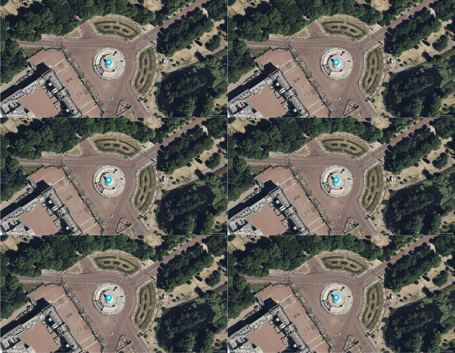
One of the benefits of HTML markers is that there are many great customizations that can be achieved using CSS. In the following sample, the content of the HtmlMarker consists of HTML and CSS that create an animated pin that drops into place and pulses.
//Wait until the map resources are ready.
map.events.add('ready', function () {
    //Create a HTML marker and add it to the map.
    map.markers.add(new atlas.HtmlMarker({
        htmlContent: "<div><div class='pin bounce'></div><div class='pulse'></div></div>",
        position: [-0.1406, 51.5018],
        pixelOffset: [5, -18]
    }));
});
The CSS:
    <style>
        .pin {
            width: 30px;
            height: 30px;
            border-radius: 50% 50% 50% 0;
            background: #00cae9;
            position: absolute;
            transform: rotate(-45deg);
            left: 50%;
            top: 50%;
            margin: -20px 0 0 -20px;
        }

            .pin:after {
                content: "";
                width: 14px;
                height: 14px;
                margin: 8px 0 0 8px;
                background: #e6e6e6;
                position: absolute;
                border-radius: 50%;
            }

        .bounce {
            animation-name: bounce;
            animation-fill-mode: both;
            animation-duration: 1s;
        }

        .pulse {
            background: #d6d4d4;
            border-radius: 50%;
            height: 14px;
            width: 14px;
            position: absolute;
            left: 50%;
            top: 50%;
            margin: 11px 0px 0px -12px;
            transform: rotateX(55deg);
            z-index: -2;
        }

            .pulse:after {
                content: "";
                border-radius: 50%;
                height: 40px;
                width: 40px;
                position: absolute;
                margin: -13px 0 0 -13px;
                animation: pulsate 1s ease-out;
                animation-iteration-count: infinite;
                opacity: 0;
                box-shadow: 0 0 1px 2px #00cae9;
                animation-delay: 1.1s;
            }

        @keyframes pulsate {
            0% {
                transform: scale(0.1, 0.1);
                opacity: 0;
            }

            50% {
                opacity: 1;
            }

            100% {
                transform: scale(1.2, 1.2);
                opacity: 0;
            }
        }

        @keyframes bounce {
            0% {
                opacity: 0;
                transform: translateY(-2000px) rotate(-45deg);
            }

            60% {
                opacity: 1;
                transform: translateY(30px) rotate(-45deg);
            }

            80% {
                transform: translateY(-10px) rotate(-45deg);
            }

            100% {
                transform: translateY(0) rotate(-45deg);
            }
        }
    </style>
For a complete working sample of how to use CSS and HTML to create a marker on the map, see CSS Styled HTML Marker in the Azure Maps Samples. For the source code for this sample, see CSS Styled HTML Marker source code.
Draggable HTML markers
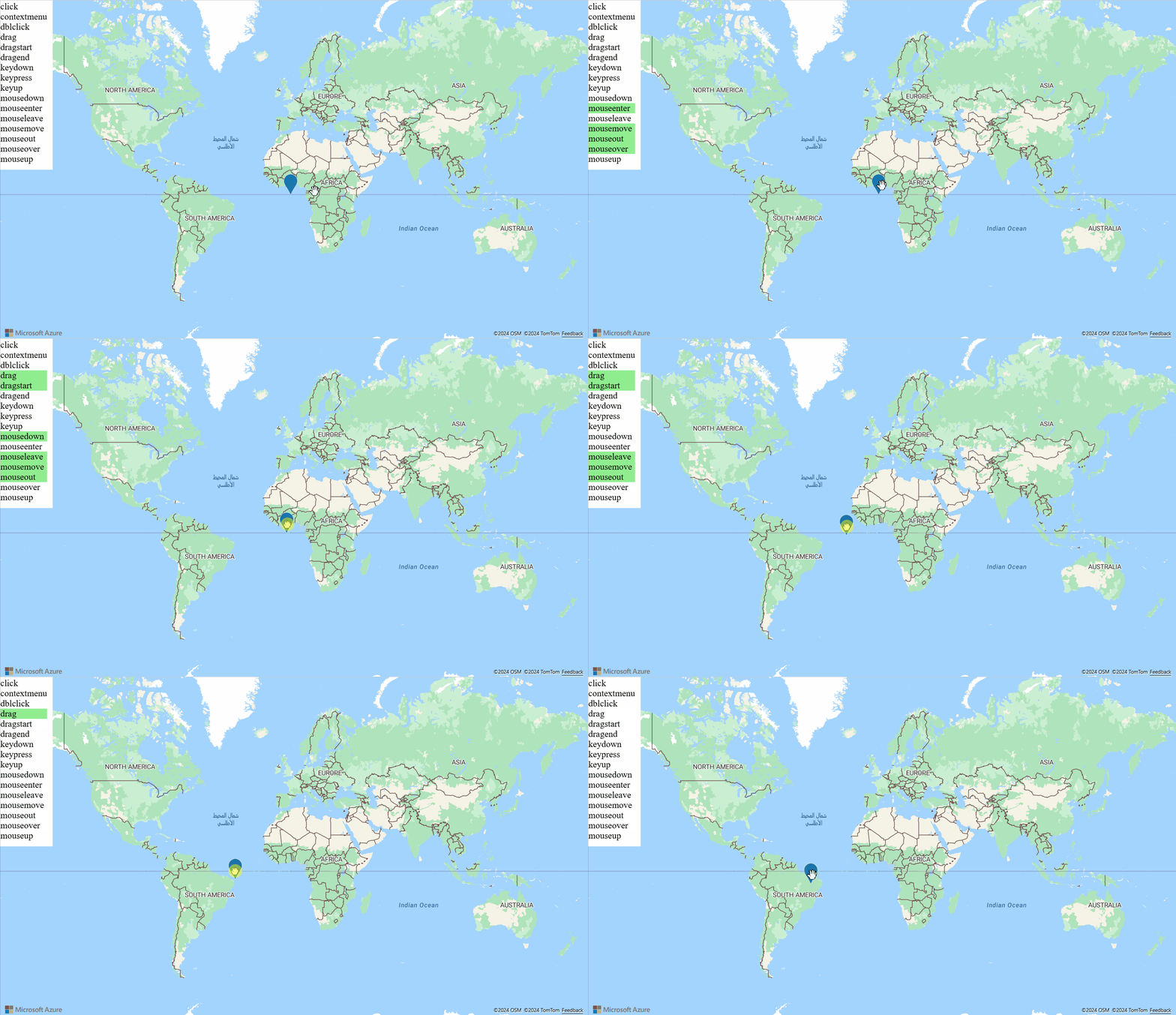
This sample shows how to make an HTML marker draggable. HTML markers support drag, dragstart, and dragend events.
For a complete working sample of how to use CSS and HTML to create a marker on the map, see Draggable HTML Marker in the Azure Maps Samples. For the source code for this sample, see Draggable HTML Marker source code.
Add mouse events to HTML markers
For a complete working sample of how to add mouse and drag events to an HTML marker, see HTML Marker events in the Azure Maps Samples. For the source code for this sample, see HTML Marker events source code.
Next steps
Learn more about the classes and methods used in this article:
For more code examples to add to your maps, see the following articles:


