Usage analysis with Application Insights
Which features of your web or mobile app are most popular? Do your users achieve their goals with your app? Do they drop out at particular points, and do they return later?
Application Insights is a powerful tool for monitoring the performance and usage of your applications. It provides insights into how users interact with your app, identifies areas for improvement, and helps you understand the impact of changes. With this knowledge, you can make data-driven decisions about your next development cycles.
This article covers the following areas:
- Users, Sessions & Events - Track and analyze user interaction with your application, session trends, and specific events to gain insights into user behavior and app performance.
- Funnels - Understand how users progress through a series of steps in your application and where they might be dropping off.
- User Flows - Visualize user paths to identify the most common routes and pinpointing areas where users are most engaged users or may encounter issues.
- Cohorts - Group users or events by common characteristics to analyze behavior patterns, feature usage, and the impact of changes over time.
- Impact Analysis - Analyze how application performance metrics, like load times, influence user experience and behavior, to help you to prioritize improvements.
- HEART - Utilize the HEART framework to measure and understand user Happiness, Engagement, Adoption, Retention, and Task success.
Send telemetry from your application
To optimize your experience, consider integrating Application Insights into both your app server code and your webpages. This dual implementation enables telemetry collection from both the client and server components of your application.
Server code: Install the appropriate module for your ASP.NET, Azure, Java, Node.js, or other app.
If you don't want to install server code, create an Application Insights resource.
Webpage code: Use the JavaScript SDK to collect data from webpages, see Get started with the JavaScript SDK.
Note
On March 31, 2025, support for instrumentation key ingestion will end. Instrumentation key ingestion will continue to work, but we'll no longer provide updates or support for the feature. Transition to connection strings to take advantage of new capabilities.
To learn more advanced configurations for monitoring websites, check out the JavaScript SDK reference article.
Mobile app code: Use the App Center SDK to collect events from your app. Then send copies of these events to Application Insights for analysis by following this guide.
Get telemetry: Run your project in debug mode for a few minutes. Then look for results in the Overview pane in Application Insights.
Publish your app to monitor your app's performance and find out what your users are doing with your app.
Users, Sessions, and Events - Analyze telemetry from three perspectives
Three of the Usage panes use the same tool to slice and dice telemetry from your web app from three perspectives. By filtering and splitting the data, you can uncover insights about the relative use of different pages and features.
Users tool: How many people used your app and its features? Users are counted by using anonymous IDs stored in browser cookies. A single person using different browsers or machines will be counted as more than one user.
Sessions tool: How many sessions of user activity have included certain pages and features of your app? A session is reset after half an hour of user inactivity, or after 24 hours of continuous use.
Events tool: How often are certain pages and features of your app used? A page view is counted when a browser loads a page from your app, provided you've instrumented it.
A custom event represents one occurrence of something happening in your app. It's often a user interaction like a button selection or the completion of a task. You insert code in your app to generate custom events or use the Click Analytics extension.
Note
For information on an alternatives to using anonymous IDs and ensuring an accurate count, see the documentation for authenticated IDs.
Clicking View More Insights displays the following information:
- Application Performance: Sessions, Events, and a Performance evaluation related to users' perception of responsiveness.
- Properties: Charts containing up to six user properties such as browser version, country or region, and operating system.
- Meet Your Users: View timelines of user activity.
Explore usage demographics and statistics
Find out when people use your web app, what pages they're most interested in, where your users are located, and what browsers and operating systems they use. Analyze business and usage telemetry by using Application Insights.

The Users report counts the numbers of unique users that access your pages within your chosen time periods. For web apps, users are counted by using cookies. If someone accesses your site with different browsers or client machines, or clears their cookies, they're counted more than once.
The Sessions report tabulates the number of user sessions that access your site. A session represents a period of activity initiated by a user and concludes with a period of inactivity exceeding half an hour.
Query for certain users
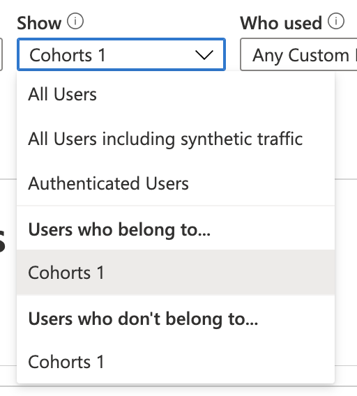
Explore different groups of users by adjusting the query options at the top of the Users pane:
| Option | Description |
|---|---|
| During | Choose a time range. |
| Show | Choose a cohort of users to analyze. |
| Who used | Choose custom events, requests, and page views. |
| Events | Choose multiple events, requests, and page views that will show users who did at least one, not necessarily all, of the selected options. |
| By value x-axis | Choose how to categorize the data, either by time range or by another property, such as browser or city. |
| Split By | Choose a property to use to split or segment the data. |
| Add Filters | Limit the query to certain users, sessions, or events based on their properties, such as browser or city. |
Meet your users
The Meet your users section shows information about five sample users matched by the current query. Exploring the behaviors of individuals and in aggregate can provide insights about how people use your app.
User retention analysis
The Application Insights retention feature provides valuable insights into user engagement by tracking the frequency and patterns of users returning to your app and their interactions with specific features. It enables you to compare user behaviors, such as the difference in return rates between users who win or lose a game, offering actionable data to enhance user experience and inform business strategies.
By analyzing cohorts of users based on their actions within a given timeframe, you can identify which features drive repeat usage. This knowledge can help you:
- Understand what specific features cause users to come back more than others.
- Determine whether retention is a problem in your product.
- Form hypotheses based on real user data to help you improve the user experience and your business strategy.

You can use the retention controls on top to define specific events and time ranges to calculate retention. The graph in the middle gives a visual representation of the overall retention percentage by the time range specified. The graph on the bottom represents individual retention in a specific time period. This level of detail allows you to understand what your users are doing and what might affect returning users on a more detailed granularity.
For more information about the Retention workbook, see the section below.
The retention workbook
To use the retention workbook in Application Insights, navigate to the Workbooks pane, select Public Templates at the top, and locate the User Retention Analysis workbook listed under the Usage category.

Workbook capabilities:
By default, retention shows all users who did anything and then came back and did anything else over a defined period. You can select different combinations of events to narrow the focus on specific user activities.
To add one or more filters on properties, select Add Filters. For example, you can focus on users in a particular country or region.
The Overall Retention chart shows a summary of user retention across the selected time period.
The grid shows the number of users retained. Each row represents a cohort of users who performed any event in the time period shown. Each cell in the row shows how many of that cohort returned at least once in a later period. Some users might return in more than one period.
The insights cards show the top five initiating events and the top five returned events. This information gives users a better understanding of their retention report.


Use business events to track retention
You should measure events that represent significant business activities to get the most useful retention analysis.
For more information and example code, see the section below.
Track user interactions with custom events
To understand user interactions in your app, insert code lines to log custom events. These events track various user actions, like button selections, or important business events, such as purchases or game victories.
You can also use the Click Analytics Autocollection plug-in to collect custom events.
Tip
When you design each feature of your app, consider how you're going to measure its success with your users. Decide what business events you need to record, and code the tracking calls for those events into your app from the start.
In some cases, page views can represent useful events, but it isn't true in general. A user can open a product page without buying the product.
With specific business events, you can chart your users' progress through your site. You can find out their preferences for different options and where they drop out or have difficulties. With this knowledge, you can make informed decisions about the priorities in your development backlog.
Events can be logged from the client side of the app:
appInsights.trackEvent({name: "incrementCount"});
Or events can be logged from the server side:
var tc = new Microsoft.ApplicationInsights.TelemetryClient();
tc.TrackEvent("CreatedAccount", new Dictionary<string,string> {"AccountType":account.Type}, null);
...
tc.TrackEvent("AddedItemToCart", new Dictionary<string,string> {"Item":item.Name}, null);
...
tc.TrackEvent("CompletedPurchase");
You can attach property values to these events so that you can filter or split the events when you inspect them in the portal. A standard set of properties is also attached to each event, such as anonymous user ID, which allows you to trace the sequence of activities of an individual user.
Learn more about custom events and properties.
Slice and dice events
In the Users, Sessions, and Events tools, you can slice and dice custom events by user, event name, and properties.

Whenever you’re in any usage experience, select the Open the last run query icon to take you back to the underlying query.
![]()
You can then modify the underlying query to get the kind of information you’re looking for.
Here’s an example of an underlying query about page views. Go ahead and paste it directly into the query editor to test it out.
// average pageView duration by name
let timeGrain=5m;
let dataset=pageViews
// additional filters can be applied here
| where timestamp > ago(1d)
| where client_Type == "Browser" ;
// calculate average pageView duration for all pageViews
dataset
| summarize avg(duration) by bin(timestamp, timeGrain)
| extend pageView='Overall'
// render result in a chart
| render timechart
Determine feature success with A/B testing
If you're unsure which feature variant is more successful, release both and let different users access each variant. Measure the success of each variant, and then transition to a unified version.
In this technique, you attach unique property values to all the telemetry sent by each version of your app. You can do it by defining properties in the active TelemetryContext. These default properties get included in every telemetry message sent by the application. It includes both custom messages and standard telemetry.
In the Application Insights portal, filter and split your data on the property values so that you can compare the different versions.
To do this step, set up a telemetry initializer:
// Telemetry initializer class
public class MyTelemetryInitializer : ITelemetryInitializer
{
    // In this example, to differentiate versions, we use the value specified in the AssemblyInfo.cs
    // for ASP.NET apps, or in your project file (.csproj) for the ASP.NET Core apps. Make sure that
    // you set a different assembly version when you deploy your application for A/B testing.
    static readonly string _version =
        System.Reflection.Assembly.GetExecutingAssembly().GetName().Version.ToString();

    public void Initialize(ITelemetry item)
    {
        item.Context.Component.Version = _version;
    }
}
For ASP.NET Core applications, add a new telemetry initializer to the Dependency Injection service collection in the Program.cs class:
using Microsoft.ApplicationInsights.Extensibility;

builder.Services.AddSingleton<ITelemetryInitializer, MyTelemetryInitializer>();
Funnels - Discover how customers use your application
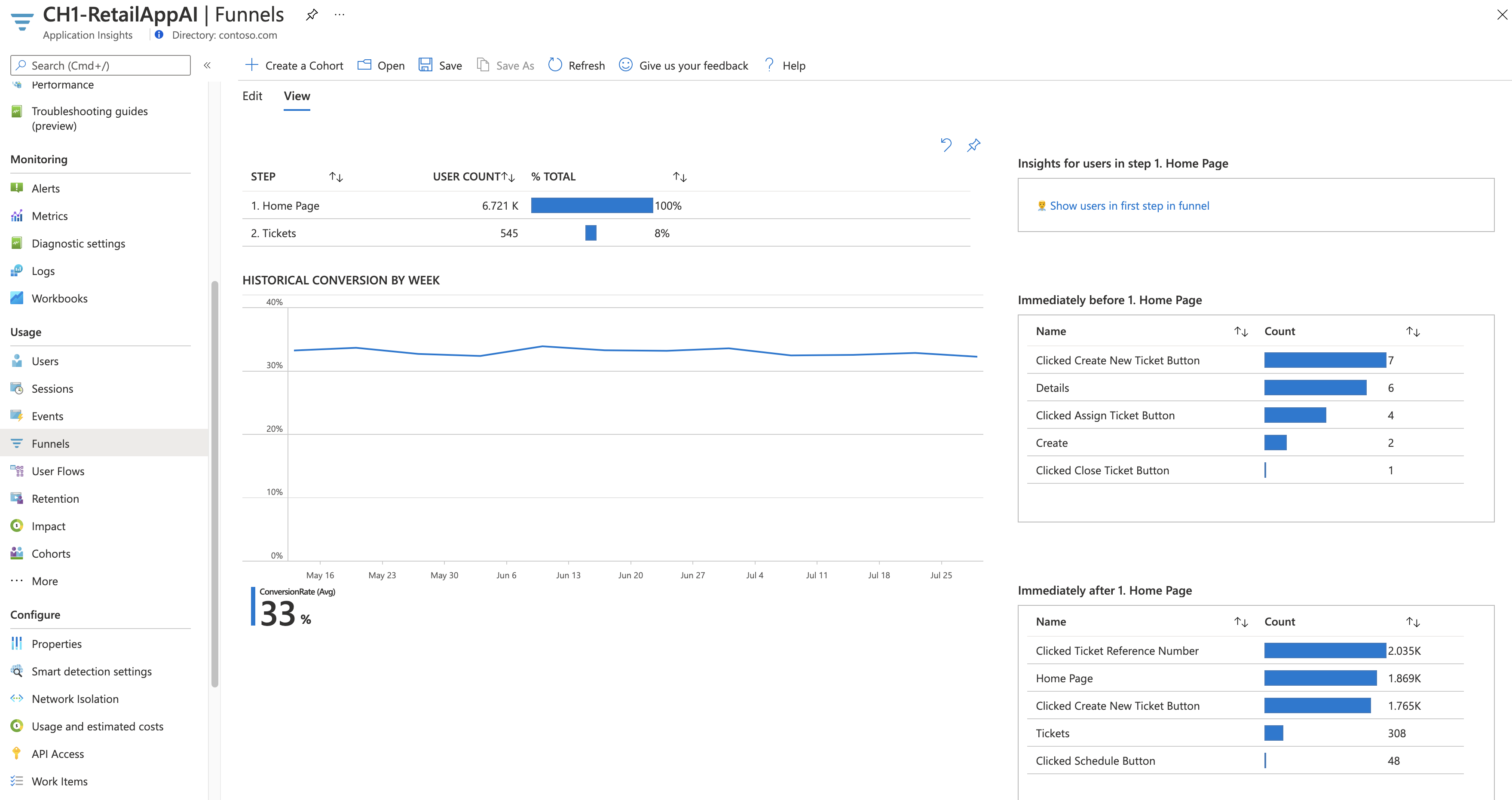
Understanding the customer experience is of great importance to your business. If your application involves multiple stages, you need to know if customers are progressing through the entire process or ending the process at some point. The progression through a series of steps in a web application is known as a funnel. You can use Application Insights funnels to gain insights into your users and monitor step-by-step conversion rates.
Funnel features:
- If your app is sampled, you'll see a banner. Selecting it opens a context pane that explains how to turn off sampling.
- Select a step to see more details on the right.
- The historical conversion graph shows the conversion rates over the last 90 days.
- Understand your users better by accessing the users tool. You can use filters in each step.
Create a funnel
Prerequisites
Before you create a funnel, decide on the question you want to answer. For example, you might want to know how many users view the home page, view a customer profile, and create a ticket.
Get started
To create a funnel:
On the Funnels tab, select Edit.
Choose your Top Step.
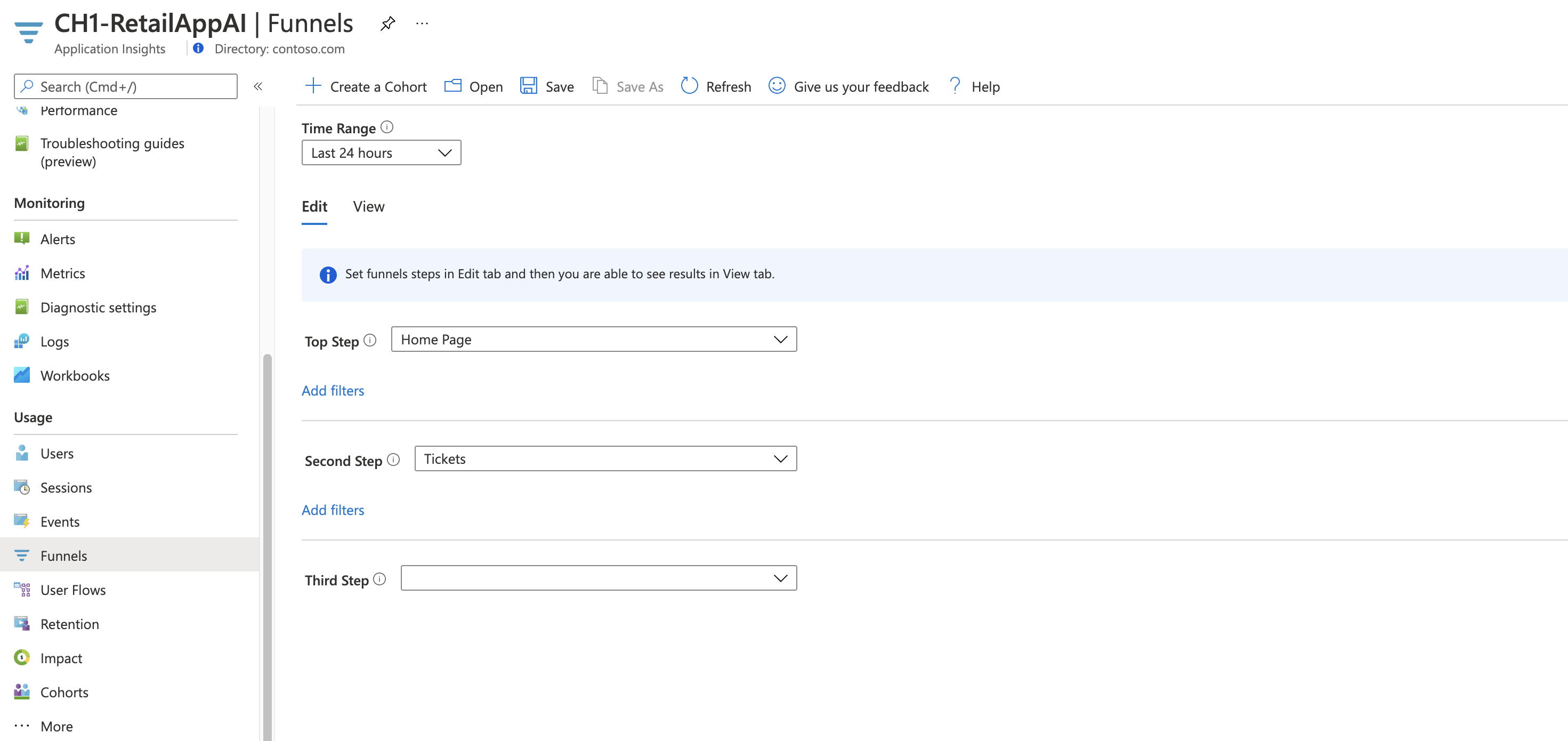
To apply filters to the step, select Add filters. This option appears after you choose an item for the top step.
Then choose your Second Step and so on.
Note
Funnels are limited to a maximum of six steps.
Select the View tab to see your funnel results.
To save your funnel to view at another time, select Save at the top. Use Open to open your saved funnels.


User Flows - Analyze user navigation patterns

The User Flows tool visualizes how users move between the pages and features of your site. It's great for answering questions like:
- How do users move away from a page on your site?
- What do users select on a page on your site?
- Where are the places that users churn most from your site?
- Are there places where users repeat the same action over and over?
The User Flows tool starts from an initial custom event, exception, dependency, page view or request that you specify. From this initial event, User Flows shows the events that happened before and after user sessions. Lines of varying thickness show how many times users followed each path. Special Session Started nodes show where the subsequent nodes began a session. Session Ended nodes show how many users sent no page views or custom events after the preceding node, highlighting where users probably left your site.
Note
Your Application Insights resource must contain page views or custom events to use the User Flows tool. Learn how to set up your app to collect page views automatically with the Application Insights JavaScript SDK.
Choose an initial event

To begin answering questions with the User Flows tool, choose an initial custom event, exception, dependency, page view or request to serve as the starting point for the visualization:
- Select the link in the What do users do after? title or select Edit.
- Select a custom event, exception, dependency, page view or request from the Initial event dropdown list.
- Select Create graph.
The Step 1 column of the visualization shows what users did most frequently after the initial event. The items are ordered from top to bottom and from most to least frequent. The Step 2 and subsequent columns show what users did next. The information creates a picture of all the ways that users moved through your site.
By default, the User Flows tool randomly samples only the last 24 hours of page views and custom events from your site. You can increase the time range and change the balance of performance and accuracy for random sampling on the Edit menu.
If some of the page views, custom events, and exceptions aren't relevant to you, select X on the nodes you want to hide. After you've selected the nodes you want to hide, select Create graph. To see all the nodes you've hidden, select Edit and look at the Excluded events section.
If page views or custom events you expect to see in the visualization are missing that:
- Check the Excluded events section on the Edit menu.
- Use the plus buttons on Others nodes to include less-frequent events in the visualization.
- If the page view or custom event you expect is sent infrequently by users, increase the time range of the visualization on the Edit menu.
- Make sure the custom event, exception, dependency, page view or request you expect is set up to be collected by the Application Insights SDK in the source code of your site.
If you want to see more steps in the visualization, use the Previous steps and Next steps dropdown lists above the visualization.
After users visit a page or feature, where do they go and what do they select?

If your initial event is a page view, the first column (Step 1) of the visualization is a quick way to understand what users did immediately after they visited the page.
Open your site in a window next to the User Flows visualization. Compare your expectations of how users interact with the page to the list of events in the Step 1 column. Often, a UI element on the page that seems insignificant to your team can be among the most used on the page. It can be a great starting point for design improvements to your site.
If your initial event is a custom event, the first column shows what users did after they performed that action. As with page views, consider if the observed behavior of your users matches your team's goals and expectations.
If your selected initial event is Added Item to Shopping Cart, for example, look to see if Go to Checkout and Completed Purchase appear in the visualization shortly thereafter. If user behavior is different from your expectations, use the visualization to understand how users are getting "trapped" by your site's current design.
Where are the places that users churn most from your site?
Watch for Session Ended nodes that appear high up in a column in the visualization, especially early in a flow. This positioning means many users probably churned from your site after they followed the preceding path of pages and UI interactions.
Sometimes churn is expected. For example, it's expected after a user makes a purchase on an e-commerce site. But usually churn is a sign of design problems, poor performance, or other issues with your site that can be improved.
Keep in mind that Session Ended nodes are based only on telemetry collected by this Application Insights resource. If Application Insights doesn't receive telemetry for certain user interactions, users might have interacted with your site in those ways after the User Flows tool says the session ended.
Are there places where users repeat the same action over and over?
Look for a page view or custom event that's repeated by many users across subsequent steps in the visualization. This activity usually means that users are performing repetitive actions on your site. If you find repetition, think about changing the design of your site or adding new functionality to reduce repetition. For example, you might add bulk edit functionality if you find users performing repetitive actions on each row of a table element.
Cohorts - Analyze a specific set of users, sessions, events, or operations
A cohort is a set of users, sessions, events, or operations that have something in common. In Application Insights, cohorts are defined by an analytics query. In cases where you have to analyze a specific set of users or events repeatedly, cohorts can give you more flexibility to express exactly the set you're interested in.
Cohorts vs basic filters
You can use cohorts in ways similar to filters. But cohorts' definitions are built from custom analytics queries, so they're much more adaptable and complex. Unlike filters, you can save cohorts so that other members of your team can reuse them.
You might define a cohort of users who have all tried a new feature in your app. You can save this cohort in your Application Insights resource. It's easy to analyze this saved group of specific users in the future.
Note
After cohorts are created, they're available from the Users, Sessions, Events, and User Flows tools.
Example: Engaged users
Your team defines an engaged user as anyone who uses your app five or more times in a given month. In this section, you define a cohort of these engaged users.
Select Create a Cohort.
Select the Template Gallery tab to see a collection of templates for various cohorts.
Select Engaged Users -- by Days Used.
There are three parameters for this cohort:
- Activities: Where you choose which events and page views count as usage.
- Period: The definition of a month.
- UsedAtLeastCustom: The number of times users need to use something within a period to count as engaged.
Change UsedAtLeastCustom to 5+ days. Leave Period set as the default of 28 days.
Now this cohort represents all user IDs sent with any custom event or page view on 5 separate days in the past 28 days.
Select Save.
Tip
Give your cohort a name, like Engaged Users (5+ Days). Save it to My reports or Shared reports, depending on whether you want other people who have access to this Application Insights resource to see this cohort.
Select Back to Gallery.
What can you do by using this cohort?
Open the Users tool. In the Show dropdown box, choose the cohort you created under Users who belong to.
Important points to notice:
- You can't create this set through normal filters. The date logic is more advanced.
- You can further filter this cohort by using the normal filters in the Users tool. Although the cohort is defined on 28-day windows, you can still adjust the time range in the Users tool to be 30, 60, or 90 days.
These filters support more sophisticated questions that are impossible to express through the query builder. An example is people who were engaged in the past 28 days. How did those same people behave over the past 60 days?
Example: Events cohort
You can also make cohorts of events. In this section, you define a cohort of events and page views. Then you see how to use them from the other tools. This cohort might define a set of events that your team considers active usage or a set related to a certain new feature.
- Select Create a Cohort.
- Select the Template Gallery tab to see a collection of templates for various cohorts.
- Select Events Picker.
- In the Activities dropdown box, select the events you want to be in the cohort.
- Save the cohort and give it a name.
Example: Active users where you modify a query
The previous two cohorts were defined by using dropdown boxes. You can also define cohorts by using analytics queries for total flexibility. To see how, create a cohort of users from the United Kingdom.
Open the Cohorts tool, select the Template Gallery tab, and select Blank Users cohort.

There are three sections:
- Markdown text: Where you describe the cohort in more detail for other members on your team.
- Parameters: Where you make your own parameters, like Activities, and other dropdown boxes from the previous two examples.
- Query: Where you define the cohort by using an analytics query.
In the query section, you write an analytics query. The query selects the certain set of rows that describe the cohort you want to define. The Cohorts tool then implicitly adds a
| summarize by user_Idclause to the query. This data appears as a preview underneath the query in a table, so you can make sure your query is returning results.Note
If you don't see the query, resize the section to make it taller and reveal the query.
Copy and paste the following text into the query editor:
union customEvents, pageViews
| where client_CountryOrRegion == "United Kingdom"
Select Run Query. If you don't see user IDs appear in the table, change to a country/region where your application has users.
Save and name the cohort.

Impact Analysis - Discover how different properties influence conversion rates
Impact Analysis discovers how any dimension of a page view, custom event, or request affects the usage of a different page view or custom event.
One way to think of Impact is as the ultimate tool for settling arguments with someone on your team about how slowness in some aspect of your site is affecting whether users stick around. Users might tolerate some slowness, but Impact gives you insight into how best to balance optimization and performance to maximize user conversion.
Analyzing performance is only a subset of Impact's capabilities. Impact supports custom events and dimensions, so you can easily answer questions like, How does user browser choice correlate with different rates of conversion?
Note
Your Application Insights resource must contain page views or custom events to use the Impact analysis workbook. Learn how to set up your app to collect page views automatically with the Application Insights JavaScript SDK. Also, because you're analyzing correlation, sample size matters.
Impact analysis workbook
To use the Impact analysis workbook, in your Application Insights resources go to Usage > More and select User Impact Analysis Workbook. Or on the Workbooks tab, select Public Templates. Then under Usage, select User Impact Analysis.

Use the workbook

- From the Selected event dropdown list, select an event.
- From the analyze how its dropdown list, select a metric.
- From the Impacting event dropdown list, select an event.
- To add a filter, use the Add selected event filters tab or the Add impacting event filters tab.
Is page load time affecting how many people convert on my page?
To begin answering questions with the Impact workbook, choose an initial page view, custom event, or request.
From the Selected event dropdown list, select an event.
Leave the analyze how its dropdown list on the default selection of Duration. (In this context, Duration is an alias for Page Load Time.)
From the Impacting event dropdown list, select a custom event. This event should correspond to a UI element on the page view you selected in step 1.


What if I'm tracking page views or load times in custom ways?
Impact supports both standard and custom properties and measurements. Use whatever you want. Instead of duration, use filters on the primary and secondary events to get more specific.
Do users from different countries or regions convert at different rates?
From the Selected event dropdown list, select an event.
From the analyze how its dropdown list, select Country or region.
From the Impacting event dropdown list, select a custom event that corresponds to a UI element on the page view you chose in step 1.


How does the Impact analysis workbook calculate these conversion rates?
Under the hood, the Impact analysis workbook relies on the Pearson correlation coefficient. Results are computed between -1 and 1. The coefficient -1 represents a negative linear correlation and 1 represents a positive linear correlation.
The basic breakdown of how Impact analysis works is listed here:
- Let A = the main page view, custom event, or request you select in the Selected event dropdown list.
- Let B = the secondary page view or custom event you select in the impacts the usage of dropdown list.
Impact looks at a sample of all the sessions from users in the selected time range. For each session, it looks for each occurrence of A.
Sessions are then broken into two different kinds of subsessions based on one of two conditions:
- A converted subsession consists of a session ending with a B event and encompasses all A events that occur prior to B.
- An unconverted subsession occurs when all As occur without a terminal B.
How Impact is ultimately calculated varies based on whether we're analyzing by metric or by dimension. For metrics, all As in a subsession are averaged. For dimensions, the value of each A contributes 1/N to the value assigned to B, where N is the number of As in the subsession.
HEART - Five dimensions of customer experience
This article describes how to enable and use the Heart Workbook on Azure Monitor. The HEART workbook is based on the HEART measurement framework, which was originally introduced by Google. Several Microsoft internal teams use HEART to deliver better software.
Overview
HEART is an acronym that stands for happiness, engagement, adoption, retention, and task success. It helps product teams deliver better software by focusing on five dimensions of customer experience:
- Happiness: Measure of user attitude
- Engagement: Level of active user involvement
- Adoption: Target audience penetration
- Retention: Rate at which users return
- Task success: Productivity empowerment
These dimensions are measured independently, but they interact with each other.
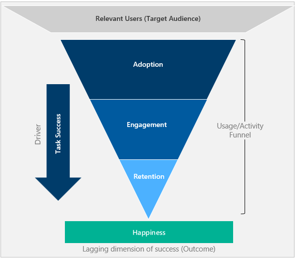
Adoption, engagement, and retention form a user activity funnel. Only a portion of users who adopt the tool come back to use it.
Task success is the driver that progresses users down the funnel and moves them from adoption to retention.
Happiness is an outcome of the other dimensions and not a stand-alone measurement. Users who have progressed down the funnel and are showing a higher level of activity are ideally happier.
Get started
Prerequisites
Azure subscription: Create an Azure subscription for free
Application Insights resource: Create an Application Insights resource
Click Analytics: Set up the Click Analytics Autocollection plug-in.
Specific attributes: Instrument the following attributes to calculate HEART metrics.
Source Attribute Description customEvents session_Id Unique session identifier customEvents appName Unique Application Insights app identifier customEvents itemType Category of customEvents record customEvents timestamp Datetime of event customEvents operation_Id Correlate telemetry events customEvents user_Id Unique user identifier customEvents ¹ parentId Name of feature customEvents ¹ pageName Name of page customEvents ¹ actionType Category of Click Analytics record pageViews user_AuthenticatedId Unique authenticated user identifier pageViews session_Id Unique session identifier pageViews appName Unique Application Insights app identifier pageViews timestamp Datetime of event pageViews operation_Id Correlate telemetry events pageViews user_Id Unique user identifier If you're setting up the authenticated user context, instrument the below attributes:
| Source | Attribute | Description |
|---|---|---|
| customEvents | user_AuthenticatedId | Unique authenticated user identifier |
Footnotes
¹: To emit these attributes, use the Click Analytics Autocollection plug-in via npm.
Tip
To understand how to effectively use the Click Analytics plug-in, see Feature extensions for the Application Insights JavaScript SDK (Click Analytics).
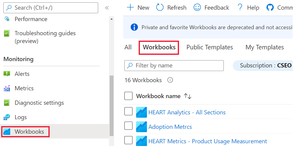
Open the workbook
You can find the workbook in the gallery under Public Templates. The workbook appears in the section Product Analytics using the Click Analytics Plugin.
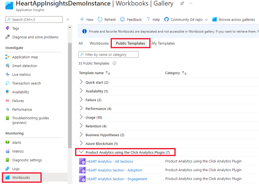
There are seven workbooks.
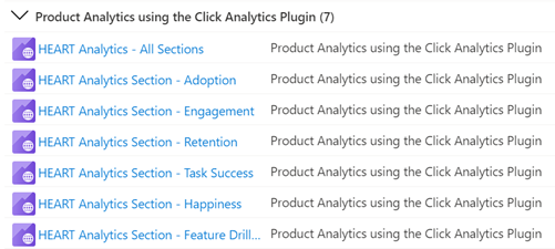
You only have to interact with the main workbook, HEART Analytics - All Sections. This workbook contains the other six workbooks as tabs. You can also access the individual workbooks related to each tab through the gallery.
Confirm that data is flowing
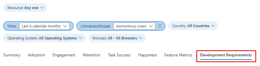
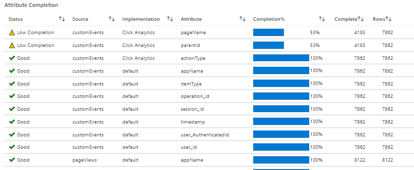
To validate that data is flowing as expected to light up the metrics accurately, select the Development Requirements tab.
Important
Unless you set the authenticated user context, you must select Anonymous Users from the ConversionScope dropdown to see telemetry data.
If data isn't flowing as expected, this tab shows the specific attributes with issues.
Workbook structure
The workbook shows metric trends for the HEART dimensions split over seven tabs. Each tab contains descriptions of the dimensions, the metrics contained within each dimension, and how to use them.
The tabs are:
- Summary: Summarizes usage funnel metrics for a high-level view of visits, interactions, and repeat usage.
- Adoption: Helps you understand the penetration among the target audience, acquisition velocity, and total user base.
- Engagement: Shows frequency, depth, and breadth of usage.
- Retention: Shows repeat usage.
- Task success: Enables understanding of user flows and their time distributions.
- Happiness: We recommend using a survey tool to measure customer satisfaction score (CSAT) over a five-point scale. On this tab, we've provided the likelihood of happiness via usage and performance metrics.
- Feature metrics: Enables understanding of HEART metrics at feature granularity.
Warning
The HEART workbook is currently built on logs and effectively are log-based metrics. The accuracy of these metrics are negatively affected by sampling and filtering.
How HEART dimensions are defined and measured
Happiness
Happiness is a user-reported dimension that measures how users feel about the product offered to them.
A common approach to measure happiness is to ask users a CSAT question like How satisfied are you with this product? Users' responses on a three- or a five-point scale (for example, no, maybe, and yes) are aggregated to create a product-level score that ranges from 1 to 5. Because user-initiated feedback tends to be negatively biased, HEART tracks happiness from surveys displayed to users at predefined intervals.
Common happiness metrics include values such as Average Star Rating and Customer Satisfaction Score. Send these values to Azure Monitor by using one of the custom ingestion methods described in Custom sources.
Engagement
Engagement is a measure of user activity. Specifically, user actions are intentional, such as clicks. Active usage can be broken down into three subdimensions:
Activity frequency: Measures how often a user interacts with the product. For example, users typically interact daily, weekly, or monthly.
Activity breadth: Measures the number of features users interact with over a specific time period. For example, users interacted with a total of five features in June 2021.
Activity depth: Measures the number of features users interact with each time they launch the product. For example, users interacted with two features on every launch.
Measuring engagement can vary based on the type of product being used. For example, a product like Microsoft Teams is expected to have a high daily usage, which makes it an important metric to track. But for a product like a paycheck portal, measurement might make more sense at a monthly or weekly level.
Important
A user who performs an intentional action, such as clicking a button or typing an input, is counted as an active user. For this reason, engagement metrics require the Click Analytics plug-in for Application Insights to be implemented in the application.
Adoption
Adoption enables understanding of penetration among the relevant users, who you're gaining as your user base, and how you're gaining them. Adoption metrics are useful for measuring:
- Newly released products.
- Newly updated products.
- Marketing campaigns.
Retention
A retained user is a user who was active in a specified reporting period and its previous reporting period. Retention is typically measured with the following metrics.
| Metric | Definition | Question answered |
|---|---|---|
| Retained users | Count of active users who were also active the previous period | How many users are staying engaged with the product? |
| Retention | Proportion of active users from the previous period who are also active this period | What percent of users are staying engaged with the product? |
Important
Because active users must have at least one telemetry event with an action type, retention metrics require the Click Analytics plug-in for Application Insights to be implemented in the application.
Task success
Task success tracks whether users can do a task efficiently and effectively by using the product's features. Many products include structures that are designed to funnel users through completing a task. Some examples include:
- Adding items to a cart and then completing a purchase.
- Searching a keyword and then selecting a result.
- Starting a new account and then completing account registration.
A successful task meets three requirements:
- Expected task flow: The intended task flow of the feature was completed by the user and aligns with the expected task flow.
- High performance: The intended functionality of the feature was accomplished in a reasonable amount of time.
- High reliability: The intended functionality of the feature was accomplished without failure.
A task is considered unsuccessful if any of the preceding requirements isn't met.
Important
Task success metrics require the Click Analytics plug-in for Application Insights to be implemented in the application.
Set up a custom task by using the following parameters.
| Parameter | Description |
|---|---|
| First step | The feature that starts the task. In the cart/purchase example, Adding items to a cart is the first step. |
| Expected task duration | The time window to consider a completed task a success. Any tasks completed outside of this constraint are considered a failure. Not all tasks necessarily have a time constraint. For such tasks, select No Time Expectation. |
| Last step | The feature that completes the task. In the cart/purchase example, Purchasing items from the cart is the last step. |
Frequently asked questions
Does the initial event represent the first time the event appears in a session or any time it appears in a session?
The initial event on the visualization only represents the first time a user sent that page view or custom event during a session. If users can send the initial event multiple times in a session, then the Step 1 column only shows how users behave after the first instance of an initial event, not all instances.
Some of the nodes in my visualization have a level that's too high. How can I get more detailed nodes?
Use the Split by options on the Edit menu:
Select the event you want to break down on the Event menu.
Select a dimension on the Dimension menu. For example, if you have an event called Button Clicked, try a custom property called Button Name.
I defined a cohort of users from a certain country/region. When I compare this cohort in the Users tool to setting a filter on that country/region, why do I see different results?
Cohorts and filters are different. Suppose you have a cohort of users from the United Kingdom (defined like the previous example), and you compare its results to setting the filter Country or region = United Kingdom:
The cohort version shows all events from users who sent one or more events from the United Kingdom in the current time range. If you split by country or region, you likely see many countries and regions.
The filters version only shows events from the United Kingdom. If you split by country or region, you see only the United Kingdom.
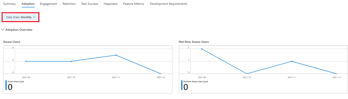
How do I view the data at different grains (daily, monthly, or weekly)?
You can select the Date Grain filter to change the grain. The filter is available across all the dimension tabs.
How do I access insights from my application that aren't available on the HEART workbooks?
You can dig into the data that feeds the HEART workbook if the visuals don't answer all your questions. To do this task, under the Monitoring section, select Logs and query the customEvents table. Some of the Click Analytics attributes are contained within the customDimensions field. A sample query is shown here.
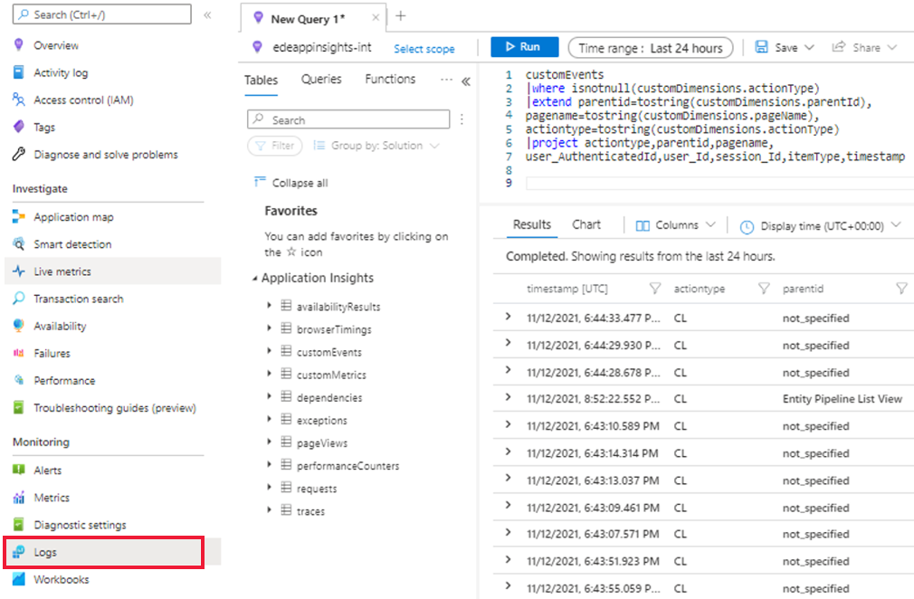
To learn more about Logs in Azure Monitor, see Azure Monitor Logs overview.
Can I edit visuals in the workbook?
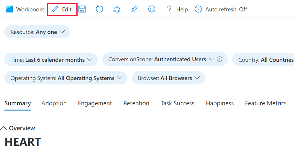
Yes. When you select the public template of the workbook:
Select Edit and make your changes.
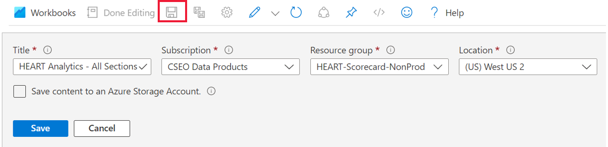
After you make your changes, select Done Editing, and then select the Save icon.
To view your saved workbook, under Monitoring, go to the Workbooks section and then select the Workbooks tab. A copy of your customized workbook appears there. You can make any further changes you want in this copy.
For more on editing workbook templates, see Azure Workbooks templates.
Next steps
- Check out the GitHub repository and npm Package for the Click Analytics Autocollection plug-in.
- Learn more about the Google HEART framework.
- To learn more about workbooks, see the Workbooks overview.
Athugasemdir
Væntanlegt: Á árinu 2024 munum við hætta með GitHub-mál sem ábendingaleið fyrir efni og skipta því út fyrir nýtt ábendingakerfi. Frekari upplýsingar er að finna hér: https://aka.ms/ContentUserFeedback.
Senda inn og skoða endurgjöf fyrir