.NET Multi-Platform App UI (.NET MAUI) Button は、テキストを表示し、タップまたはクリックに応答して、タスクを実行するようアプリに指示します。 通常、Button にはコマンドを示す短いテキスト文字列が表示されますが、ビットマップ画像や、テキストと画像の組み合わせを表示することもできます。 Button を指で押すか、マウスでクリックすると、そのコマンド開始されます。
Button には、次のプロパティが定義されています。
- Color 型の
BorderColorは、ボタンの境界線の色を表します。 double型のBorderWidthは、ボタンの境界線の幅を定義します。double型のCharacterSpacingは、ボタンのテキストの文字間の間隔を定義します。- ICommand 型の
Commandは、ボタンがタップされたときに実行するコマンドを定義します。 object型のCommandParameterは、Commandに渡されるパラメーターです。ButtonContentLayout型のContentLayoutは、ボタン画像の位置と、ボタンの画像とテキストの間隔を制御するオブジェクトを定義します。int型のCornerRadiusは、ボタンの境界線の角の半径を表しますFontAttributes型のFontAttributesは、テキストのスタイルを指定します。bool型のFontAutoScalingEnabledは、オペレーティング システムで設定されたスケーリング設定をボタン テキストに反映するかどうかを定義します。 このプロパティの既定値はtrueです。string型のFontFamilyは、フォント ファミリを定義します。double型のFontSizeは、フォント サイズを定義します。- ImageSource 型の ImageSource は、ボタンの内容として表示するビットマップ画像を指定します。
LineBreakMode型のLineBreakModeは、1 行に収まらない場合のテキストの処理方法を決定します。Thickness型のPaddingは、ボタンのパディングを決定します。string型のTextは、ボタンの内容として表示するテキストを定義します。- Color 型の
TextColorは、ボタンのテキストの色を表します。 TextTransform型のTextTransformは、ボタンのテキストの大文字と小文字を定義します。
これらのプロパティは、BindableProperty オブジェクトが基になっています。つまり、これらは、データ バインディングの対象にすることができ、スタイルを設定できます。
Note
Button で ImageSource プロパティを定義しますが、このプロパティを使用して Button に画像を表示できます。このプロパティは、Button テキストの横に小さなアイコンを表示するために使用します。
さらに、Button は Clicked、Pressed、Released の各イベントを定義します。 Clicked イベントは、指またはマウス ポインターを使った Button のタップがボタンの表面から離されると発生します。 Pressed イベントは、指で Button を押すか、ポインターが Button の上に置かれた状態でマウス ボタンが押されたときに発生します。 Released イベントは、指またはマウス ボタンが離されると発生します。 通常、Clicked イベントは Released イベントと同時に発生しますが、指またはマウス ポインターが放される前に Button の表面からスライドすると、Clicked イベントが発生しない可能性があります。
重要
Button がタップに応答するには、その IsEnabled プロパティが true に設定されている必要があります。
ボタンを作成する
ボタンを作成するには、Button オブジェクトを作成し、その Clicked イベントを処理します。
次の XAML の例は、Button を作成する方法を示しています。
<ContentPage xmlns="http://schemas.microsoft.com/dotnet/2021/maui"
xmlns:x="http://schemas.microsoft.com/winfx/2009/xaml"
x:Class="ButtonDemos.BasicButtonClickPage"
Title="Basic Button Click">
<StackLayout>
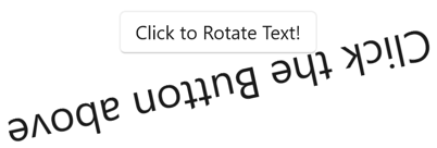
<Button Text="Click to Rotate Text!"
VerticalOptions="Center"
HorizontalOptions="Center"
Clicked="OnButtonClicked" />
<Label x:Name="label"
Text="Click the Button above"
FontSize="18"
VerticalOptions="Center"
HorizontalOptions="Center" />
</StackLayout>
</ContentPage>
Text プロパティでは、Button に表示するテキストを指定します。 Clicked イベントは、OnButtonClicked という名前のイベント ハンドラーに設定されます。 このハンドラーは、分離コード ファイルにあります。
public partial class BasicButtonClickPage : ContentPage
{
    public BasicButtonClickPage ()
    {
        InitializeComponent ();
    }

    async void OnButtonClicked(object sender, EventArgs args)
    {
        await label.RelRotateTo(360, 1000);
    }
}
public partial class BasicButtonClickPage : ContentPage
{
    public BasicButtonClickPage ()
    {
        InitializeComponent ();
    }

    async void OnButtonClicked(object sender, EventArgs args)
    {
        await label.RelRotateToAsync(360, 1000);
    }
}
この例では、Button をタップすると、OnButtonClicked メソッドが実行されます。 sender 引数は、このイベントを発生させる Button オブジェクトです。 これを使用して、Button オブジェクトにアクセスしたり、同じ Clicked イベントを共有する複数の Button オブジェクトを区別したりできます。 Clicked ハンドラーは、Label を 1000 ミリ秒で 360 度回転させるアニメーション関数を呼び出します。
Button を作成する同等の C# コードは次のとおりです。
Button button = new Button
{
    Text = "Click to Rotate Text!",
    VerticalOptions = LayoutOptions.Center,
    HorizontalOptions = LayoutOptions.Center
};
button.Clicked += async (sender, args) => await label.RelRotateTo(360, 1000);
Button button = new Button
{
    Text = "Click to Rotate Text!",
    VerticalOptions = LayoutOptions.Center,
    HorizontalOptions = LayoutOptions.Center
};
button.Clicked += async (sender, args) => await label.RelRotateToAsync(360, 1000);
コマンド インターフェイスを使用する
アプリは、Clicked イベントを処理せずに Button のタップに応答できます。 Button は、コマンド インターフェイスまたはコマンド実行インターフェイスと呼ばれる別の通知メカニズムを実装します。 これは、次の 2 つのプロパティで構成されます。
- ICommand 型の
Command(System.Windows.Input名前空間で定義されたインターフェイス) Object型のCommandParameterプロパティ。
この方法は、データ バインディングに関連して、特に Model-View-ViewModel (MVVM) パターンを実装する場合に適しています。 MVVM アプリケーションでは、ビューモデルは、データ バインディングを使用して Button オブジェクトに接続される ICommand 型のプロパティを定義します。 .NET MAUI では、ICommand インターフェイスを実装し、ICommand 型のプロパティを定義するビューモデルを支援する Command と Command<T> クラスも定義されています。 コマンドの詳細については、「コマンド」をご覧ください。
次の例は、名前付き Number の double 型のプロパティを定義する単純なビューモデル クラスと、名前付き MultiplyBy2Command の ICommand 型と DivideBy2Command 型の 2 つのプロパティを示しています。
public class CommandDemoViewModel : INotifyPropertyChanged
{
    double number = 1;

    public event PropertyChangedEventHandler PropertyChanged;

    public ICommand MultiplyBy2Command { get; private set; }
    public ICommand DivideBy2Command { get; private set; }

    public CommandDemoViewModel()
    {
        MultiplyBy2Command = new Command(() => Number *= 2);
        DivideBy2Command = new Command(() => Number /= 2);
    }

    public double Number
    {
        get
        {
            return number;
        }
        set
        {
            if (number != value)
            {
                number = value;
                PropertyChanged?.Invoke(this, new PropertyChangedEventArgs("Number"));
            }
        }
    }
}
この例では、クラスのコンストラクターで 2 つの ICommand プロパティが Command 型の 2 つのオブジェクトで初期化されます。 Command コンストラクターには、Number プロパティの値を 2 倍または半分にする小さな関数 (execute コンストラクター引数と呼ばれます) が含まれます。
次の XAML の例では、CommandDemoViewModel クラスを使用しています。
<ContentPage xmlns="http://schemas.microsoft.com/dotnet/2021/maui"
             xmlns:x="http://schemas.microsoft.com/winfx/2009/xaml"
             xmlns:local="clr-namespace:ButtonDemos"
             x:Class="ButtonDemos.BasicButtonCommandPage"
             Title="Basic Button Command"
             x:DataType="local:CommandDemoViewModel">
    <ContentPage.BindingContext>
        <local:CommandDemoViewModel />
    </ContentPage.BindingContext>

    <StackLayout>
        <Label Text="{Binding Number, StringFormat='Value is now {0}'}"
               FontSize="18"
               VerticalOptions="Center"
               HorizontalOptions="Center" />
        <Button Text="Multiply by 2"
                VerticalOptions="Center"
                HorizontalOptions="Center"
                Command="{Binding MultiplyBy2Command}" />
        <Button Text="Divide by 2"
                VerticalOptions="Center"
                HorizontalOptions="Center"
                Command="{Binding DivideBy2Command}" />
    </StackLayout>
</ContentPage>
この例では、Label 要素と 2 つの Button オブジェクトに、CommandDemoViewModel クラスの 3 つのプロパティへのバインドが含まれています。 2 つの Button オブジェクトがタップされると、コマンドが実行され、数値が変更されます Clicked ハンドラーの利点を上回るこのアプローチの利点は、このページの機能を含むすべてのロジックが分離コード ファイルではなくビューモデルに配置され、ビジネス ロジックからユーザー インターフェイスをより適切に分離できる点です。
また、Command オブジェクトで Button オブジェクトの有効化と無効化を制御することもできます。 たとえば、数値の範囲を 210 と 2-10 の範囲に制限するとします。 Button を有効にする必要がある場合に true を返す別の関数をコンストラクター (canExecute 引数と呼ばれます) に追加できます。
public class CommandDemoViewModel : INotifyPropertyChanged
{
    ···
    public CommandDemoViewModel()
    {
        MultiplyBy2Command = new Command(
            execute: () =>
            {
                Number *= 2;
                ((Command)MultiplyBy2Command).ChangeCanExecute();
                ((Command)DivideBy2Command).ChangeCanExecute();
            },
            canExecute: () => Number < Math.Pow(2, 10));

        DivideBy2Command = new Command(
            execute: () =>
            {
                Number /= 2;
                ((Command)MultiplyBy2Command).ChangeCanExecute();
                ((Command)DivideBy2Command).ChangeCanExecute();
            },
            canExecute: () => Number > Math.Pow(2, -10));
    }
    ···
}
この例では、Command の ChangeCanExecute メソッドへの呼び出しは、Command メソッドが canExecute メソッドを呼び出すことで、Button を無効にするかどうかを判断できるようにするために必要です。 このコード変更により、数値が制限に達すると、Button は無効になります。
2 つ以上の Button 要素を同じ ICommand プロパティにバインドすることもできます。 Button 要素は、Button の CommandParameter プロパティを使用して区別できます。 この場合は、ジェネリック Command<T> クラスを使用します。 CommandParameter オブジェクトは、引数として execute と canExecute のメソッドに渡されます。 詳細については、「コマンド」をご覧ください。
ボタンを押して離す
Pressed イベントは、指で Button を押すか、ポインターが Button の上に置かれた状態でマウス ボタンが押されたときに発生します。 Released イベントは、指またはマウス ボタンが離されると発生します。 一般に、Clicked イベントは Released イベントと同時に発生しますが、指またはマウス ポインターが Button の表面をスライドしてから離されると、Clicked イベントが発生しない可能性があります。
次の XAML の例は、Pressed および Released イベントにハンドラーがアタッチされた、Label と Button を示しています。
<ContentPage xmlns="http://schemas.microsoft.com/dotnet/2021/maui"
             xmlns:x="http://schemas.microsoft.com/winfx/2009/xaml"
             x:Class="ButtonDemos.PressAndReleaseButtonPage"
             Title="Press and Release Button">
    <StackLayout>
        <Button Text="Press to Rotate Text!"
                VerticalOptions="Center"
                HorizontalOptions="Center"
                Pressed="OnButtonPressed"
                Released="OnButtonReleased" />
        <Label x:Name="label"
               Text="Press and hold the Button above"
               FontSize="18"
               VerticalOptions="Center"
               HorizontalOptions="Center" />
    </StackLayout>
</ContentPage>
分離ファイルは、Pressed イベントが発生すると Label をアニメーション化させますが、Released イベントが発生するとローテーションを中断します。
public partial class PressAndReleaseButtonPage : ContentPage
{
    IDispatcherTimer timer;
    Stopwatch stopwatch = new Stopwatch();

    public PressAndReleaseButtonPage()
    {
        InitializeComponent();

        timer = Dispatcher.CreateTimer();
        timer.Interval = TimeSpan.FromMilliseconds(16);
        timer.Tick += (s, e) =>
        {
            label.Rotation = 360 * (stopwatch.Elapsed.TotalSeconds % 1);
        };
    }

    void OnButtonPressed(object sender, EventArgs args)
    {
        stopwatch.Start();
        timer.Start();
    }

    void OnButtonReleased(object sender, EventArgs args)
    {
        stopwatch.Stop();
        timer.Stop();
    }
}
その結果、Label は指が Button に接触している間だけ回転し、指を離すと停止します。
ボタンの表示状態
Button には Pressed VisualState があり、これが有効な場合、押されると Button への視覚的変更を開始するために使用できます。
次の XAML の例は、Pressed 状態の表示状態を定義する方法を示しています。
<Button Text="Click me!"
        ...>
    <VisualStateManager.VisualStateGroups>
        <VisualStateGroupList>
            <VisualStateGroup x:Name="CommonStates">
                <VisualState x:Name="Normal">
                    <VisualState.Setters>
                        <Setter Property="Scale"
                                Value="1" />
                    </VisualState.Setters>
                </VisualState>
                <VisualState x:Name="Pressed">
                    <VisualState.Setters>
                        <Setter Property="Scale"
                                Value="0.8" />
                    </VisualState.Setters>
                </VisualState>
                <VisualState x:Name="PointerOver" />
            </VisualStateGroup>
        </VisualStateGroupList>
    </VisualStateManager.VisualStateGroups>
</Button>
この例では、Pressed VisualState は Button が押された場合に、その Scale プロパティがその既定値の 1 から 0.8 に変更されることを指定します。 Normal VisualState は Button が通常状態の場合、その Scale プロパティが 1 に設定されることを指定します。 したがって、全体的な効果は、Button が押されると、少し小さいサイズに再スケーリングされ、Button が離されると既定のサイズに再スケーリングされることです。
重要
Button が Normal 状態に戻るには、VisualStateGroup に PointerOver 状態も定義されている必要があります。 .NET MAUI アプリ プロジェクト テンプレートによって作成された ResourceDictionary スタイルを使用する場合は、PointerOver 状態が定義されている暗黙的な Button スタイルが既にあります。
表示状態の詳細については、「表示状態」をご覧ください。
ボタンにビットマップを使用する
Button クラスは、単独で、またはテキストと組み合わせて、小さなビットマップ画像を Button で表示できる ImageSource プロパティを定義します。 テキストと画像の配置方法を指定することもできます。 ImageSource 型の ImageSource プロパティは、ビットマップをファイル、埋め込みリソース、URI、またはストリームから読み込むことができることを意味します
ビットマップは Button に合わせて拡大縮小されるわけではありません。 最適なサイズは、ビットマップの大きさにもよりますが、通常 32 から 64 の、デバイスに依存しない単位です。
Button の ContentLayout プロパティを使って、Button 上の Text プロパティと ImageSource プロパティの配置を指定することができます。 このプロパティは ButtonContentLayout 型であり、コンストラクターには 2 つの引数があります。
ImagePosition列挙型のメンバーLeft、Top、Right、Bottomのいずれかで、テキストに対してどのようにビットマップが表示されるかを示します。- ビットマップとテキストの間隔を表す
doubleの値。
XAML では、Button を作成し、ContentLayout プロパティを設定するには、列挙メンバーのみ、または間隔のみ、または両方をカンマで区切って任意の順序で指定します。
<Button Text="Button text"
        ImageSource="button.png"
        ContentLayout="Right, 20" />
同等の C# コードを次に示します。
Button button = new Button
{
    Text = "Button text",
    ImageSource = new FileImageSource
    {
        File = "button.png"
    },
    ContentLayout = new Button.ButtonContentLayout(Button.ButtonContentLayout.ImagePosition.Right, 20)
};
Note
Buttonにテキストと画像が含まれている場合は、ボタン内のすべてのコンテンツを収められない可能性があるため、目的のレイアウトを実現するには、画像のサイズを手動で設定する必要があります。
ボタンを無効にする
アプリは、Button クリックが有効な操作ではない状態になることがあります。 このような場合は、その IsEnabled プロパティを false に設定することで、Button を無効にすることができます。
GitHub で Microsoft と共同作業する
このコンテンツのソースは GitHub にあります。そこで、issue や pull request を作成および確認することもできます。 詳細については、共同作成者ガイドを参照してください。
.NET MAUI