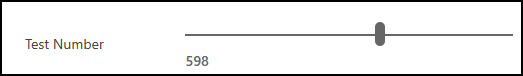
このチュートリアルでは、ユーザーが列に値を入力するのではなく、ビジュアル スライダーを使用して数値を変更するために使用できる線形スライダー コード コンポーネントを構築します。
完成した線形スライダー コード コンポーネントのサンプル コードは 、PowerApps-Samples/component-framework/LinearInputControl/ にあります。
線形スライダー コード コンポーネントをビルドするには、次の手順を実行します。
- 新しいコンポーネント プロジェクトを作成する
- マニフェストを実装する
- TypeScript を使ってコンポーネント ロジックを実装する
- コード コンポーネントにスタイルを追加する
- コード コンポーネントを構築する
- コード コンポーネントをパッケージ化する
- コード コンポーネントをアプリに追加する
前提条件
このチュートリアルでは、次のコンポーネントをインストールします。
- Visual Studio Code (VSCode) ( [ パスに追加 ] オプションが選択されていることを確認します)
- Node.js (LTS バージョンをお勧めします)
- Microsoft Power Platform CLI (power Platform Tools for Visual Studio Code または Power Platform CLI for Windowsを使用)
- .NET次のいずれかのオプションをインストールして、ツールをビルドします。 少なくとも、ワークロード
.NET build toolsを選択します。- Visual Studio 2022
Visual Studio 2022 for Windows &Mac 。- Build Tools for Visual Studio 2022。
- Visual Studio 2019
- Visual Studio 2022
Note
Visual Studio用ビルド ツールの代わりに、.NET 6.x SDK を使用することをお選びになる場合があります。 この場合、 msbuildを使用する代わりに、 dotnet buildを使用します。
新しいコンポーネント プロジェクトを作成する
このチュートリアルでは、 C:\reposにあるフォルダーから始めますが、任意のフォルダーを使用できます。 コードをチェックインするフォルダーを選択します。
LinearInputという名前の新しいフォルダーを作成します。Visual Studio Code を使用して
LinearInputフォルダーを開きます。最も簡単な開始方法は、コマンド プロンプト ウィンドウを使用することです。
LinearInputフォルダーに移動し、「code .」と入力します。c:\repos\LinearInput>code .このコマンドを実行すると、コンポーネント プロジェクトがVisual Studio Codeで開きます。
ターミナル ->New ターミナルを使用して、Visual Studio Code 内で新しいターミナルを開きます。
ターミナル プロンプトで、 pac pcf init コマンドを使用して基本パラメーターを渡して、新しいコンポーネント プロジェクトを作成します。
pac pcf init --namespace SampleNamespace --name LinearInputControl --template field --run-npm-installまた、
npm installコマンドを実行して、プロジェクトビルドツールを設定します。Running 'npm install' for you...Note
エラー
The term 'npm' is not recognized as the name of a cmdlet, function, script file, or operable program.が発生した場合は、 node.js (LTS バージョンをお勧めします) とその他のすべての前提条件をインストールしてください。
マニフェストの実装
コントロール マニフェストは、コード コンポーネントのメタデータを含む XML ファイルです。 また、コード コンポーネントの動作も定義します。 このチュートリアルでは、このマニフェスト ファイルを LinearInputControl サブフォルダーの下に作成します。 Visual Studio Code で ControlManifest.Input.xml ファイルを開くと、マニフェスト ファイルが一部のプロパティで事前に定義されていることがわかります。 詳細については、「 マニフェスト」を参照してください。
コントロール ノードは、コード コンポーネントの名前空間、バージョン、および表示名を定義します。
ツールによって コントロール 要素が生成されます。 コントロールの開始点として適しています。
ヒント
属性が別々の行に表示されるように XMLをフォーマットすると、読みやすくなる場合があります。 Visual Studio Code Marketplace で選択した XML 書式設定ツールを検索してインストールします: xml 書式設定拡張機能の検索。
以下の例は、読みやすくするために、属性を別々の行にしたフォーマットにしています。
| 特性 | 説明 |
|---|---|
namespace |
コード コンポーネントの名前空間。 |
constructor |
コード コンポーネントのコンストラクター。 |
version |
コンポーネントのバージョン。 コンポーネントを更新するたびに、バージョンを更新してランタイムの最新の変更を確認します。 |
display-name-key |
UI に表示されるコード コンポーネントの名前。 |
description-key |
UI に表示されるコード コンポーネントの説明。 |
control-type |
コード コンポーネントの種類。 この値は、 standard コントロールです。 |
コメントされた領域を無視してドキュメントの書式を設定すると、自動的に生成されたマニフェストが表示されます。
<?xml version="1.0" encoding="utf-8" ?>
<manifest>
<control namespace="SampleNamespace"
   constructor="LinearInputControl"
   version="0.0.1"
   display-name-key="LinearInputControl"
   description-key="LinearInputControl description"
   control-type="standard">
   <external-service-usage enabled="false">
   </external-service-usage>
   <property name="sampleProperty"
      display-name-key="Property_Display_Key"
      description-key="Property_Desc_Key"
      of-type="SingleLine.Text"
      usage="bound"
      required="true" />
   <resources>
      <code path="index.ts"
         order="1" />
   </resources>
</control>
</manifest>
この開始点から、次の変更を行います:
type-group 要素の追加
内要素に numbers 要素という名前のcontrolの定義を追加します。 この要素はコンポーネント値を指定し、整数、通貨、浮動小数点、または 10 進数値を含めることができます。
external-service-usage機能はこのコントロールで使用されないため、type-group要素をexternal-service-usage要素に置き換えます。
<control namespace="SampleNamespace"
   constructor="LinearInputControl"
   version="0.0.1"
   display-name-key="LinearInputControl"
   description-key="LinearInputControl description"
   control-type="standard">
   <external-service-usage enabled="false">
   </external-service-usage>
   <property name="sampleProperty"
      display-name-key="Property_Display_Key"
      description-key="Property_Desc_Key"
      of-type="SingleLine.Text"
      usage="bound"
      required="true" />
   <resources>
      <code path="index.ts"
         order="1" />
   </resources>
   </control>
プロパティ要素を編集する
sampleProperty 要素内で生成された プロパティ 要素を編集します。 この要素は、列のデータ型など、コード コンポーネントのプロパティを定義します。
| 特性 | 説明 |
|---|---|
name |
プロパティの名前。 |
display-name-key |
UI に表示されるプロパティの表示名。 |
description-key |
UI に表示されるプロパティの説明。 |
of-type-group |
of-type-group属性を使用して、特定の型グループの名前を参照します。 この場合は、前の手順で作成したtype-groupという名前のnumbersを参照してください。 |
usage |
bound と input の 2 つのプロパティがあります。- バインドされたプロパティは、列の値にのみバインドされます。 - 入力プロパティは、列にバインドされるか、静的な値を許可します。 |
required |
プロパティが必須かどうかを定義します。 |
次のコードに示すように 、プロパティ ノードを編集します。
<property name="sampleProperty"
   display-name-key="Property_Display_Key"
   description-key="Property_Desc_Key"
   of-type="SingleLine.Text"
   usage="bound"
   required="true" />
resources 要素の編集
リソースノードは、コード コンポーネントのビジュアル化を定義します。 これはコード コンポーネントのビジュアル化とスタイル化を構築するすべてのリソースが含まれています。 コード は、リソース要素下で子要素として指定されます。
生成されたマニフェストには、コード要素の定義がすでに含まれており、path と order の属性値が設定されています。 これらの値を使用します。 次の 「コード コンポーネントにスタイルを追加する 」セクションでは、コントロールの CSS スタイルを追加します。 その手順をサポートするには、マニフェストを編集して、開いている間に追加します。
resources ノードを編集し、以下の css 要素 を追加します:
完成したマニフェスト
完了したマニフェスト ファイルは、次のようになります:
<?xml version="1.0" encoding="utf-8" ?>
<manifest>
<control namespace="SampleNamespace"
constructor="LinearInputControl"
version="0.0.1"
display-name-key="LinearInputControl"
description-key="LinearInputControl description"
control-type="standard">
<type-group name="numbers">
<type>Whole.None</type>
<type>Currency</type>
<type>FP</type>
<type>Decimal</type>
</type-group>
<property name="controlValue"
   display-name-key="Control Value"
   description-key="Control value description."
   of-type-group="numbers"
   usage="bound"
   required="true" />
<resources>
   <code path="index.ts"
   order="1" />
   <css path="css/LinearInputControl.css"
   order="1" />
</resources>
</control>
</manifest>
変更を
ControlManifest.Input.xmlファイルに保存します。次のコマンド
ManifestDesignTypes.d.ts使用してファイルを生成します。npm run refreshTypes出力は次のようになります。
PS C:\repos\LinearInput> npm run refreshTypes

> pcf-project@1.0.0 refreshTypes
> pcf-scripts refreshTypes

[12:38:06 PM] [refreshTypes]  Initializing...
[12:38:06 PM] [refreshTypes]  Generating manifest types...
[12:38:06 PM] [refreshTypes]  Generating design types...
[12:38:06 PM] [refreshTypes]  Succeeded
結果を確認するには、
C:\repos\LinearInput\LinearInputControl\generated\ManifestTypes.d.tsファイルを開いて、生成された型を確認します:/* *This is auto generated from the ControlManifest.Input.xml file */ // Define IInputs and IOutputs Type. They should match with ControlManifest. export interface IInputs { controlValue: ComponentFramework.PropertyTypes.NumberProperty; } export interface IOutputs { controlValue?: number; }
コンポーネント ロジックの実装
マニフェスト ファイルを実装した後、TypeScript を使用してコンポーネント ロジックを実装します。
index.ts ファイル内にコンポーネント ロジックを実装します。 Visual Studio Code で index.ts ファイルを開くと、4 つの重要な関数 (init、 updateView、 getOutputs、および destroy) が定義済みであることがわかります。 次に、コード コンポーネントのロジックを実装します。
任意のコード エディターで index.ts ファイルを開き、次の変更を行います:
- コントロールのプロパティを追加する
-
refreshData関数をイベント ハンドラーとして追加する -
init関数を更新する -
updateView関数を編集する -
getOutputs関数を編集する -
destroy関数を編集する
コントロールのプロパティを追加する
export class LinearInputControl
implements ComponentFramework.StandardControl<IInputs, IOutputs>
{
/**
   * Empty constructor.
*/
constructor() {}
refreshData 関数をイベント ハンドラーとして追加する
public refreshData(evt: Event): void {
this._value = this.inputElement.value as any as number;
this.labelElement.innerHTML = this.inputElement.value;
this._notifyOutputChanged();
}
init 関数を更新する
public init(
context: ComponentFramework.Context<IInputs>,
notifyOutputChanged: () => void,
state: ComponentFramework.Dictionary,
container: HTMLDivElement
): void {
// Add control initialization code
}
updateView 関数を編集する
public updateView(context: ComponentFramework.Context<IInputs>): void {
// Add code to update control view
}
getOutputs 関数を編集する
destroy 関数を編集する
完成した index.ts ファイルは次のようになります:
import { IInputs, IOutputs } from "./generated/ManifestTypes";
export class LinearInputControl
implements ComponentFramework.StandardControl<IInputs, IOutputs>
{
private _value: number;
private _notifyOutputChanged: () => void;
private labelElement: HTMLLabelElement;
private inputElement: HTMLInputElement;
private _container: HTMLDivElement;
private _context: ComponentFramework.Context<IInputs>;
private _refreshData: EventListenerOrEventListenerObject;
/**
   * Empty constructor.
*/
constructor() {}
/**
* Used to initialize the control instance. Controls can kick off remote server calls
and other initialization actions here.
* Data-set values are not initialized here, use updateView.
* @param context The entire property bag available to control via Context Object;
It contains values as set up by the customizer mapped to property names defined
in the manifest, as well as utility functions.
* @param notifyOutputChanged A callback method to alert the framework that the
control has new outputs ready to be retrieved asynchronously.
* @param state A piece of data that persists in one session for a single user.
Can be set at any point in a controls life cycle by calling 'setControlState'
in the Mode interface.
* @param container If a control is marked control-type='standard', it will receive
an empty div element within which it can render its content.
*/
public init(
context: ComponentFramework.Context<IInputs>,
notifyOutputChanged: () => void,
state: ComponentFramework.Dictionary,
container: HTMLDivElement
): void {
// Add control initialization code
this._context = context;
this._container = document.createElement("div");
this._notifyOutputChanged = notifyOutputChanged;
this._refreshData = this.refreshData.bind(this);
// creating HTML elements for the input type range and binding it to the function which
// refreshes the control data
this.inputElement = document.createElement("input");
this.inputElement.setAttribute("type", "range");
this.inputElement.addEventListener("input", this._refreshData);
//setting the max and min values for the control.
this.inputElement.setAttribute("min", "1");
this.inputElement.setAttribute("max", "1000");
this.inputElement.setAttribute("class", "linearslider");
this.inputElement.setAttribute("id", "linearrangeinput");
// creating a HTML label element that shows the value that is set on the linear range control
this.labelElement = document.createElement("label");
this.labelElement.setAttribute("class", "LinearRangeLabel");
this.labelElement.setAttribute("id", "lrclabel");
// retrieving the latest value from the control and setting it to the HTMl elements.
this._value = context.parameters.controlValue.raw!;
this.inputElement.setAttribute(
"value",
context.parameters.controlValue.formatted
? context.parameters.controlValue.formatted
: "0"
);
this.labelElement.innerHTML = context.parameters.controlValue.formatted
? context.parameters.controlValue.formatted
: "0";
// appending the HTML elements to the control's HTML container element.
this._container.appendChild(this.inputElement);
this._container.appendChild(this.labelElement);
container.appendChild(this._container);
}
public refreshData(evt: Event): void {
   this._value = this.inputElement.value as any as number;
   this.labelElement.innerHTML = this.inputElement.value;
   this._notifyOutputChanged();
}
/**
* Called when any value in the property bag has changed. This includes field values,
data-sets, global values such as container height and width, offline status, control
metadata values such as label, visible, etc.
* @param context The entire property bag available to control via Context Object;
It contains values as set up by the customizer mapped to names defined in the manifest,
as well as utility functions
*/
public updateView(context: ComponentFramework.Context<IInputs>): void {
   // Add code to update control view
   // storing the latest context from the control.
   this._value = context.parameters.controlValue.raw!;
   this._context = context;
   this.inputElement.setAttribute(
      "value",
      context.parameters.controlValue.formatted
      ? context.parameters.controlValue.formatted
      : ""
   );
   this.labelElement.innerHTML = context.parameters.controlValue.formatted
      ? context.parameters.controlValue.formatted
      : "";
}
/**
* It is called by the framework prior to a control receiving new data.
* @returns an object based on nomenclature defined in manifest,
expecting object[s] for property marked as "bound" or "output"
*/
public getOutputs(): IOutputs {
   return {
      controlValue: this._value,
   };
}
/**
* Called when the control is to be removed from the DOM tree.
Controls should use this call for cleanup.
* i.e. cancelling any pending remote calls, removing listeners, etc.
*/
public destroy(): void {
   // Add code to cleanup control if necessary
   this.inputElement.removeEventListener("input", this._refreshData);
   }
}
完了したら、変更を index.ts ファイルに保存します。
コード コンポーネントにスタイルを追加する
開発者とアプリ作成者は、CSS を使用してコード コンポーネントを視覚的に表すスタイルを定義できます。 CSS を使用すると、開発者は、スタイル、色、レイアウト、フォントなど、コード コンポーネントのプレゼンテーションを記述できます。 線形入力コンポーネントの init メソッドは、入力の要素を作成し、クラス属性を linearslider に設定します。
linearslider クラスのスタイルは、別の CSS ファイルで定義されます。 追加のカスタマイズをサポートするために、CSS ファイルなどの追加のコンポーネント リソースをコード コンポーネントに含めることができます。
Important
CSS を使用してコード コンポーネントにスタイルを実装する場合は、コンポーネントのコンテナー DIV 要素に適用される自動的に生成された CSS クラスを使用して、CSS のスコープがコントロールに設定されていることを確認します。
CSS のスコープがグローバルに設定されている場合、コード コンポーネントがレンダリングされるフォームまたは画面の既存のスタイルが壊れる可能性があります。
サードパーティの CSS フレームワークを使用している場合は、既に名前空間が設定されているフレームワークのバージョンを使用するか、手動で、または CSS プリプロセッサを使用して、そのフレームワークを名前空間にラップします。
cssフォルダの下に新しいLinearInputControlサブフォルダを作成します。LinearInputControl.cssサブ フォルダの中に新しいcssファイルを作成します。以下のスタイル コンテンツを
LinearInputControl.cssファイルに追加します:.SampleNamespace\.LinearInputControl input[type=range].linearslider { margin: 1px 0; background:transparent; -webkit-appearance:none; width:100%;padding:0; height:24px; -webkit-tap-highlight-color:transparent } .SampleNamespace\.LinearInputControl input[type=range].linearslider:focus { outline: none; } .SampleNamespace\.LinearInputControl input[type=range].linearslider::-webkit-slider-runnable-track { background: #666; height:2px; cursor:pointer } .SampleNamespace\.LinearInputControl input[type=range].linearslider::-webkit-slider-thumb { background: #666; border:0 solid #f00; height:24px; width:10px; border-radius:48px; cursor:pointer; opacity:1; -webkit-appearance:none; margin-top:-12px } .SampleNamespace\.LinearInputControl input[type=range].linearslider::-moz-range-track { background: #666; height:2px; cursor:pointer } .SampleNamespace\.LinearInputControl input[type=range].linearslider::-moz-range-thumb { background: #666; border:0 solid #f00; height:24px; width:10px; border-radius:48px; cursor:pointer; opacity:1; -webkit-appearance:none; margin-top:-12px } .SampleNamespace\.LinearInputControl input[type=range].linearslider::-ms-track { background: #666; height:2px; cursor:pointer } .SampleNamespace\.LinearInputControl input[type=range].linearslider::-ms-thumb { background: #666; border:0 solid #f00; height:24px; width:10px; border-radius:48px; cursor:pointer; opacity:1; -webkit-appearance:none; }LinearInputControl.cssファイルを保存します。ControlManifest.Input.xmlファイルには、リソース要素内にcssリソース ファイルが既に含まれています。これは、前の「マニフェストの実装」セクションでその手順が完了したためです。<resources> <code path="index.ts" order="1" /> <css path="css/LinearInputControl.css" order="1" /> </resources>
Note
Power Appsコンポーネント フレームワークでは、RESX Web リソースを使用して、任意のユーザー インターフェイスに表示されるローカライズされた文字列を管理します。
resources ノードには、ローカライズをサポートするリソースも登録されています。
この最初のチュートリアルには、ローカライズ機能は含まれていません。 ローカライズは他のチュートリアルに含まれています。
resx Web リソースを使用してコード コンポーネントをローカライズする方法については、ローカリゼーション API のサンプルを参照してください。
コード コンポーネントを構築する
マニフェスト、コンポーネント ロジック、およびスタイル設定の追加が完了したら、次のコマンドを使用してコード コンポーネントをビルドします。
npm run build
出力は次の結果のようになります。
> pcf-project@1.0.0 build
> pcf-scripts build

[2:05:41 PM] [build]  Initializing...
[2:05:41 PM] [build]  Validating manifest...
[2:05:41 PM] [build]  Validating control...
[2:05:42 PM] [build]  Running ESLint...
[2:05:43 PM] [build]  Generating manifest types...
[2:05:43 PM] [build]  Generating design types...
[2:05:43 PM] [build]  Compiling and bundling control...
[Webpack stats]:
asset bundle.js 6.56 KiB [emitted] (name: main)
./LinearInputControl/index.ts 4.9 KiB [built] [code generated]
webpack 5.75.0 compiled successfully in 2049 ms
[2:05:45 PM] [build]  Generating build outputs...
[2:05:45 PM] [build]  Succeeded
PS C:\repos\LinearInput\LinearInputcontrol>
ビルドは、LinearInputControl/generated フォルダーの TypeScript 型の宣言ファイルを作成および更新します。
コンポーネントは out/controls/LinearInputControl フォルダにコンパイルされます。 ビルド成果物には次のものが含まれます。
-
bundle.js– バンドルされたコンポーネントのソース コード。 -
ControlManifest.xml– Microsoft Dataverse 組織にアップロードする実際のコンポーネント マニフェスト ファイル。
Note
eslint ルールは、構成方法に応じて、ビルドに影響を与える可能性があります。 ビルド中にエラーが発生した場合:
[12:58:30 PM] [build]  Failed:
[pcf-1065] [Error] ESLint validation error:
C:\project\LinearInput\LinearInputControl\index.ts
  10:26  error  'EventListenerOrEventListenerObject' is not defined  no-undef
.eslintrc.json で eslint ルールを確認し、リンティング ルールを ["warn"] に設定します。 エラーが表示された場合など:
error 'EventListenerOrEventListenerObject' is not defined no-undef
.eslintrc.json を開いてルールを編集し、["warn"] 値をルール no-undef に追加します:
    "rules": {
      "no-unused-vars": "off",
      "no-undef": ["warn"]
    }
eslint ルールを更新した後は、エラーなしでコントロールをビルドする必要があります。
コード コンポーネントをデバッグする
コード コンポーネント ロジックの実装が完了したら、次のコマンドを実行してデバッグ プロセスを開始します。 詳細については、「 コード コンポーネントのデバッグ」を参照してください。
npm start watch
出力は次の結果のようになります。
> pcf-project@1.0.0 start
> pcf-scripts start "watch"

[2:09:10 PM] [start] [watch] Initializing...
[2:09:10 PM] [start] [watch] Validating manifest...
[2:09:10 PM] [start] [watch] Validating control...
[2:09:11 PM] [start] [watch] Generating manifest types...
[2:09:11 PM] [start] [watch] Generating design types...
[2:09:11 PM] [start] [watch] Compiling and bundling control...
[Webpack stats]:
asset bundle.js 6.56 KiB [emitted] (name: main)
./LinearInputControl/index.ts 4.9 KiB [built] [code generated]
webpack 5.75.0 compiled successfully in 2060 ms
[2:09:13 PM] [start] [watch] Generating build outputs...
[2:09:13 PM] [start] [watch] Starting control harness...

Starting control harness...

[Browsersync] Access URLs:

 ----------------------------
 Local: http://localhost:8181
 ----------------------------

[Browsersync] Serving files from: C:\repos\LinearInput\out\controls\LinearInputControl

[Browsersync] Watching files...
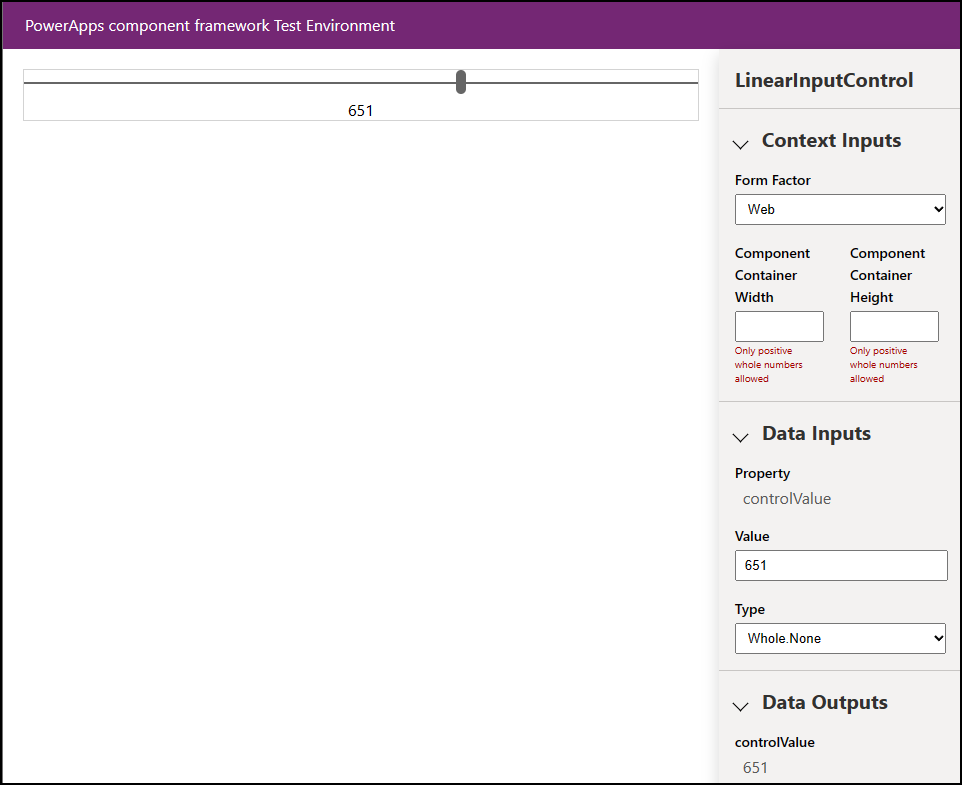
また、ブラウザーが PCF コントロール サンドボックスに表示されるので、コントロールを確認してテストできます。
コード コンポーネントのパッケージ化
ソリューション ファイルを作成してインポートするには、次の手順に従います:
LinearInputControl フォルダー内に Solutions という名前の新しいフォルダーを作成し、新しいフォルダーに移動します。
  mkdir Solutions
  cd Solutions
pac solution init コマンドを使用して LinearInputControl フォルダーに新しいソリューション プロジェクトを作成します。
pac solution init --publisher-name Samples --publisher-prefix samplesNote
パブリッシャー名とパブリッシャープレフィックスの値は、既存のソリューションパブリッシャーまたはターゲット環境で作成する新しいパブリッシャーのいずれかと一致する必要があります。
現在の値の一覧を取得するには、ターゲット環境で次のクエリを実行します。
[Environment URI]/api/data/v9.2/publishers?$select=uniquename,customizationprefix詳細については、「 Web API を使用したデータのクエリ」を参照してください。
pac solution init コマンドの出力は次のようになります。
Dataverse solution project with name 'solutions' created successfully in: 'C:\repos\LinearInput\linearinputcontrol\solutions'
Dataverse solution files were successfully created for this project in the sub-directory Other, using solution name solutions, publisher name Samples, and customization prefix samples.
Please verify the publisher information and solution name found in the Solution.xml file.
PS C:\repos\LinearInput\linearinputcontrol\solutions>
新しいソリューション プロジェクトを作成した後、作成されたコンポーネントの場所への参照を追加します。 次のコマンドを使用します。
pac solution add-reference --path ..\..\Note
指定したパスは、LinearInputControl フォルダーの下に作成した現在のソリューション フォルダーに関連付けられます。 また、絶対パスも提供できます。
コマンドの出力は次のようになります。
Project reference successfully added to Dataverse solution project.ソリューション プロジェクトから zip ファイルを生成するには、
cdsprojソリューション プロジェクト ディレクトリ内で次のコマンドを使用します。msbuild /t:restoreまたは、.NET 6 SDK をインストールした場合は、次のコマンドを使用します。
dotnet build再度、次のコマンドを実行します:
msbuildNote
エラー
Missing required tool: MSBuild.exe/dotnet.exeが発生した場合は、Path 環境変数にMSBuild.exe/dotnet.exeを追加するか、Developer Command Prompt for Visual Studio Codeを使用します。 Prerequisites で説明したように、ビルド ツール.NETインストールする必要があります。ヒント
evalコマンドを使用してソリューション ファイルをビルドし、Dataverse にインポートしてソリューション チェッカーを実行すると、msbuildというメッセージが表示されます。 コマンドmsbuild/property:configuration=Releaseを使用して、ソリューション ファイルをリビルドします。 ソリューションを Dataverse に再インポートし、ソリューション チェッカーを実行します。 詳細については、「 コード コンポーネントのデバッグ」を参照してください。生成されたソリューションの zip ファイルは、
Solution\bin\debugフォルダーにあります。zip ファイルの準備ができたら、Power Apps を使用して手動でソリューションを Dataverse にインポートするか、または Microsoft Power Platform Build Tools を使用して自動的にインポートします。
Note
アンマネージド ソリューションをインポートする場合は、カスタマイズを手動で発行します。
コード コンポーネントをアプリに追加する
アプリにコード コンポーネントを追加するには、次の記事の手順に従います:
参照
サンプル コンポーネントをダウンロード
Power Apps コンポーネント フレームワークについて学習する
ALM で使用されるツールとアプリの概要
Power Apps コンポーネント フレームワーク API リファレンス
Power Apps コンポーネント フレームワークの概要
コード コンポーネントのデバッグ