One of the OpenType format's most important features is its ability to support increased typographic complexity within a single font. From multiple styles of figures to complex script-specific ligatures, OpenType allows for typographic richness that was previously quite difficult to achieve. OpenType fonts do this by storing extra data that can be exposed by OpenType-aware operating systems and applications. While OpenType fonts are backward-compatible with pre-OpenType programs (OpenType supersets both TrueType and Adobe Type 1 formats), the new layout features will not work with older programs.
Step 1: Getting started
Opening a file
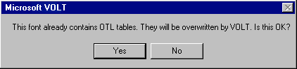
Before any layout features can be added to a font in VOLT, a few things must be taken care of. When opening a font for the first time, the dialog box below may appear:
Adding scripts and languages
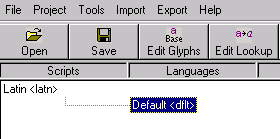
The next step is to add a script and language pair that will contain our OTL features. This tutorial focuses on Latin-based fonts, so after clicking the 'Add Script' button at the bottom of the window, specify the OpenType script name <latn>. VOLT then automatically creates an associated 'default' language (see graphic above) — this is the language we will be adding our OTL features to.
The 'Edit Glyphs' window
Now that we have our script and lanuguage created, it is useful to become familiar with VOLT's 'Edit Glyphs' window (click on the 'Edit Glyphs' button). In this window, the user is able to navigate and search through the font's complete set of glyphs. Each glyph has its own box, which lists the VOLT glyph name (which you can change) and the code point determined by the font's encoding. As you will see, this window will become useful as we begin creating our OTL features.
Step 2: Adding ligatures
While certain basic ligatures have traditionally been included with most fonts, making use of them in documents has rarely been easy. Most programs provide no easy way to access the ligatures, often ligatures are not mapped in the font properly, or programs that do offer support do so without abstracting the glyphs from the letters (causing problems with tools like spell-checkers). But, by using a correctly constructed OpenType font in InDesign, a typographer can properly and easily implement ligatures — whether basic (like 'fi') or more specialized (like 'fj').
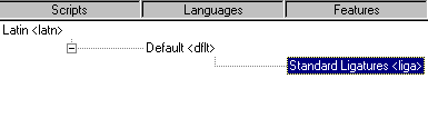
The first step is to create a <liga> feature under our 'Default' language. Select the 'Default' language with a single-click, and then click the 'Add Feature' button at the bottom of the VOLT window. Type in <liga> and press ENTER. VOLT will then recognize the command and label it 'Standard Ligatures' (see graphic below).
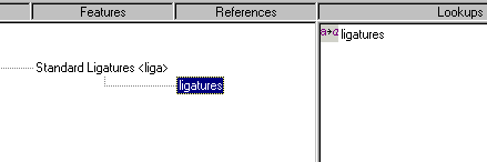
Next, we add a lookup in the pane to the right of the pane we've been working in, which will become associated with the <liga> feature we've created. Clicking the 'Add Subsitution' button at the bottom of the VOLT window will create a new subsitution feature. The name you give this new lookup is not important, though it is always useful to give things descriptive and concise labels. Since we will only be creating one ligature lookup (which can hold multiple ligatures, as you'll see), we will simply name the lookup 'ligatures'. After typing the name and hitting ENTER, we must link the lookup to the <liga> feature we created. This can be done by clicking on the 'ligatures' lookup and dragging it to the <liga> feature labeled 'Standard Ligatures.' Once this is done, you should see the 'ligatures' lookup listed below the 'Standard Ligatures' feature (see graphic below).
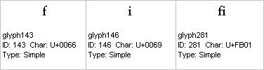
Now we can begin adding the actual substitutions to our 'ligatures' lookup. Double-click on the 'ligatures' lookup and the lookup editing window will pop up. This is where we specify which letter combinations should have ligatures substituted in their place when ligatures are turned on in InDesign. We can start by adding the most common ligature, which almost all fonts support — 'fi'. To do this, we must determine the names of three glyphs: f, i, and the 'fi' glyph. As you'll see, VOLT references glyphs by an associated Glyph Name, which can be found in the 'Edit Glyphs' window as seen previously. Note that Glyph Names will often differ from font to font.
Open the 'Edit Glyphs' window and scroll through your font until you've found all three glyphs (as you go through, note their names — you can of course rename them if you'd like). Here are the three glyphs from an example font:
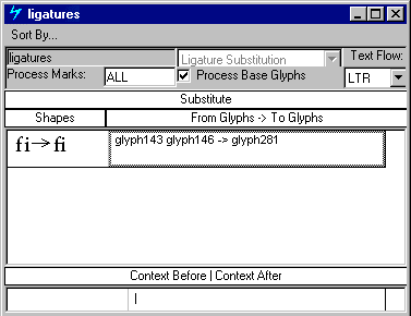
Now that we know which glyphs to work with, we return to the editing window for the 'ligatures' lookup. Click in the box under the 'From Glyphs -> To Glyphs' column and type the following, substituting in the proper glyph names for your font:
glyph_name_f glyph_name_i -> glyph_name_fi
and then hit ENTER. The 'fi' ligature will be added, and your window should look something like this:
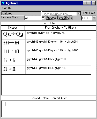
To add more ligatures to the same lookup, you add additional rows by hitting ENTER after the current row. By keeping all of your ligatures in one lookup, the font will be more efficient when it comes time to interpreting the substitutions. Other common ligatures that your font may support include 'ffi', 'fl', 'ffl'. Some fonts support extra ligatures such as 'Qu' or 'fj' or the anachronistic ligatures like 'st' or 'ct'. Here is how our 'ligatures' lookup appears after we've added more ligatures:
When you are done adding ligatures, close the 'ligatures' lookup-editing window and return to the main VOLT window.
Step 3: Adding small caps
For features that process sets of multiple glyphs (such as small caps), VOLT provides the ability to create "glyph groups." Once glyph groups are constructed, they allow the VOLT user to perform certain tasks with more ease and speed. If a font designer is creating features to add to multiple fonts, glyph groups can be exported from one font to another, making it easier to add layout support to similar fonts. The same glyph groups can also be used by different layout features within a font — another time saver.
Creating glyph groups
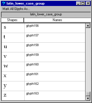
For a small caps substitution, we'll want to create two groups: one containing the lowercase letters (which will be substituted when small caps are turned on) and one containing the small capital letters (to be substituted in). To create the first group, click the 'Add Glyph Group' button in the bottom right-hand corner of the main VOLT window. Though the name need not be anything in particular, it helps to give the group a descriptive name. We'll call this group 'latin_lower_case_group'. Hit ENTER and then double-click on the new group you've created.
We can now specify the glyphs we'd like to include in the group in the editing window. Click in the first row of the 'Names' column and type the name of the first glyph to add — in this case, lowercase 'a'. Hitting ENTER should make the 'a' appear in the adjacent 'Shapes' column. Continue in sequence, adding each lowercase letter (giving each glyph its own row in the group) until you've reached 'z'. Scrolling to the bottom, your window should look something like this:
Now that we've done the lowercase, we need to create the small caps glyph group. Repeat the steps above, but instead of adding lowercase letters, add your font's small caps in sequence (from 'A' to 'Z'). Call this group something like "small_caps_group".
Adding the 'smcp' feature and associated lookup
With our glyph groups in place, we now must create the small caps lookup feature (smcp) in VOLT. In the script/language pane, highlight the 'Default' language and click the 'Add Feature' button at the bottom of the VOLT window. Type in <smcp> and hit ENTER. VOLT should then label the feature 'Small Capitals'.
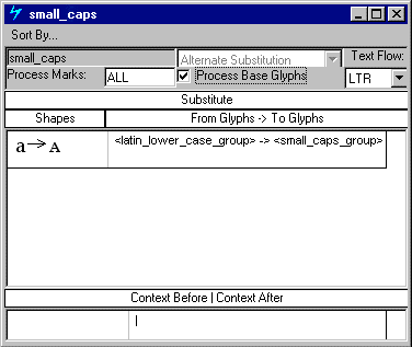
Next, in the 'Lookups' pane to the right, we add a new substitution feature by clicking the 'Add Substitution' button at the bottom of the window. Give this lookup a name like 'small_caps' and hit ENTER. Double-clicking on the new group will then bring up the editing window; this is where we tell VOLT to substitute the small caps group for the lowercase group. This is similar to how we did the 'fi' ligature substitution, with one important difference: glyph groups are named using angle brackets (< and >). So, in the 'From Glyphs -> To Glyphs' column, we type:
<latin_lower_case_group> -> <small_caps_group>
and hit ENTER. Your window should then look like this:
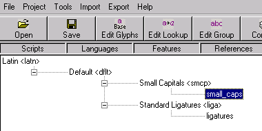
Now that the lookup is done, return to the main VOLT window. Highlight the 'small_caps' lookup we've created and drag it to the 'Small Capitals' feature in the scripts/languages pane. It should then appear as a branch under the 'Small Capitals' feature (see graphic below). The small caps substitution is now in place.
Note
The vertical ordering of lookups in VOLT's 'Lookups' pane does affect the way the lookups execute in programs like InDesign. If a given lookup is higher up in the list than another, it will take precedence (you can change the order by clicking on a lookup and dragging it either up or down). This is important in fonts that have features that perform layout operations on the same glyphs. An example of this in our font is the small caps feature and the 'fi' ligature we'e created: both affect the lowercase letters 'f' and 'i'. So, it is important that the small caps feature we've created is above the ligature feature — this way, InDesign will know that the small caps should supercede the ligatures and the 'fi' ligature will not appear in the small caps word with 'f' and 'i' next to each other.
Step 4: Adding old style numerals
Old style numerals (or figures) — the more traditional sort of numerals which are sometimes referred to as 'lowercase' — have long been a problem in digital typography. Most fonts simply didn't provide the option of old style figures, while the ones that did usually came with lining (full capital height) figures, with the old style in an auxillary (or 'expert') font. Though old style numerals are preferred in fine text typography for their elegance and more harmonious appearance, with surrounding letters, easy access to them has long been problematic.
Now, with a properly done OpenType font, typographers can have seamless access to both lining and old style numerals (by simply toggling the 'Old Style' menu option in InDesign). To add support for this feature, we will use the OpenType layout feature <onum>.
Creating the glyph groups
As with small caps, creating glyph groups for this feature will be useful: again, we are simply substituting one set of glyphs for another. However, since we're now familiar with the glyph group concept, this time we can take a small short cut. Instead of specifying each glyph in the group individually on its own line, we can use VOLT's ability to specify a range of glyphs with square brackets ([ and ]).
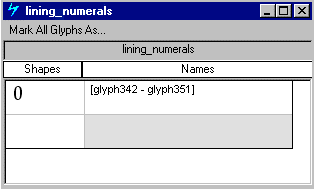
First, we'll add the lining numerals group (which will be replaced by the old style group when the 'Old Style Numerals' feature is turned on in InDesign). Add a new group, just as we've done before, and name it something like 'lining_numerals'. Then, in the group editing window, we'll input the range of glyphs for the group. In the 'Edit Glyphs' window, find the glyph name of your first lining numeral ('0') and the glyph name of the last one ('9'). Then, in the first line of group editing window, type:
[glyph_name_0 - glyph_name_9]
and replace the two glyph names with the corresponding names in your font. After hitting ENTER, your window should look something like this:
Next, create another glyph group (named something like 'os_numerals') for the old style figures, again specifying the 0 to 9 range.
Creating the 'onum' feature and associated lookup
Once both groups are created, we can add the <onum> feature — highlight the 'Default' language and click the 'Add Feature' button. Type in <onum> and hit ENTER. VOLT will label the new feature 'Old Style Numerals'. For the final step, we must create the lookup that will perform the substitution, and then link it to the <onum> feature we created.
Click the 'Add Substitution' button and name the new lookup something like 'old_style'. In the edit window, type:
<lining_numerals> -> <os_numerals>
and hit ENTER. Returning to the main VOLT window, click the 'old_style' lookup we've created and drag it to the 'Old Style Numerals' feature in the scripts/languages pane. The old style numerals layout feature is now complete.
Step 5: Add case-sensitive features
One of the more frequently overlooked details of fine typography is the adjustment of certain letter placements, based on their context. The most common situation is with text set in ALL CAPS. When characters like square brackets and parentheses are used with text set in all caps, they usually appear too low (since they are vertically aligned to work with lower case letters).
Though desktop typographers can often manually adjust character baselines when necessary, the task is somewhat daunting when confronted with many of these situations (as might occur when setting the text of book). But, using a combination of the OpenType layout feature <case> and InDesign's 'All Caps' menu option, these case-sensitive adjustments can be done automatically. In this example, we'll create a <case> lookup to substitute vertically-adjusted square brackets for normal square brackets when 'All Caps' is turned on.
Creating the <case> feature and associated lookup
In the main VOLT window, highlight the 'Default' language and click the 'Add Feature' button, then type in <case> and hit ENTER. VOLT will label the new feature 'Case-Sensitive Forms'. Next, go to the 'Lookups' pane to the right and click 'Add Substitution'. Give the new lookup a name like 'all_caps_brackets'. After finding and noting the glyph names of the brackets to be replaced and the adjusted brackets (four glyphs total), enter in two substitution lines in the edit window:
glyph_name_left_bracket -> glyph_name_left_bracket_adjusted
and
glyph_name_right_bracket -> glyph_name_right_bracket_adjusted
Once you've added these two lines to the lookup, go back to the main VOLT window and drag the 'all_caps_brackets' lookup to the 'Case-Sensitive Forms' feature. You can, of course, add as many adjustments to your <case> lookup as you'd like — parentheses and certain punctuation marks can often benefit from being vertically adjusted in all caps settings.
Step 6: Compile and test your font
Now that we've added all of our OpenType layout features, we can use VOLT to test, or 'proof,' the font. But testing can begin, VOLT must first compile the font: click the 'Compile' button on the toolbar. If there are any problems with the features you've added, VOLT will notify you at this point. Once the font has been successfully compiled, we can proceed to the proofing tool.
To access VOLT's built-in testing facility, click the 'Proofing Tool' button in the VOLT toolbar. First select 'Latin' in the 'Script' drop-down box and then select 'Default' in the 'Language' drop-down box. We'll start off testing the first feature we added: the 'fi' ligature. First, type in the name of your font's 'f' glyph, a space, and then the name of the 'i' glyph. Here's how your Proofing Tool window should look:
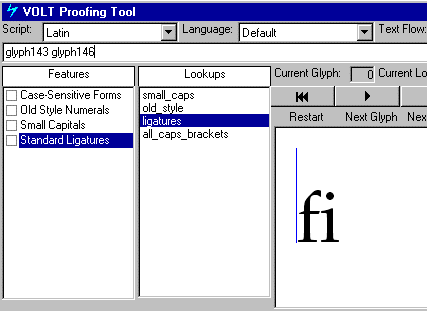
To test the 'fi' ligature, highlight the glyph names you typed into proofing tool, click the 'Standard Ligatures' check box, and then click the 'Complete' button in the right-hand pane. If you've created the lookup correctly, you should see your 'f' and 'i' turn into an 'fi' ligature.

Repeat this process with your other features, typing in the relevant glyph names, selecting the appropriate 'Feature' check box, and hitting 'Complete'.
Compiling and installing your font
Once you've verified that the OpenType layout features are working correctly, do a final 'Compile' and 'Save', and then exit VOLT. Find the font file and install it in your Windows Fonts folder in the Control Panel.
Step 7: Test your font in InDesign
Once the font is installed on your system, fire up InDesign and create a new document with a blank text box. In the character palette, select your font and type some text.
Type 'fi' and highlight it (then select 'Ligatures'):

Small caps (select 'Small Caps'):

Old style numerals (select 'Old Style'):

The all caps-adjusted brackets (select 'All Caps'):

Now that your OpenType layout-enabled font appears to be ready, open it back up in VOLT and choose 'Ship Font' from the 'File' menu. This will remove the private VOLT data, making the font ready for distribution and use (be sure to save a pre-shipped version of the font file so you can modify your layout features in the future).