자습서: Visual Studio 2019에서 첫 번째 WPF 애플리케이션 만들기
이 문서에서는 XAML(Extensible Application Markup Language) 태그, 코드 숨김, 애플리케이션 정의, 컨트롤, 레이아웃, 데이터 바인딩 및 스타일 등 대부분의 WPF 애플리케이션에 공통적인 요소를 포함하는 WPF(Windows Presentation Foundation) 데스크톱 애플리케이션을 개발하는 방법을 보여줍니다. 애플리케이션 개발에는 Visual Studio를 사용합니다.
중요
이 문서는 .NET Framework용으로 작성되었습니다. .NET 7을 시작하려면 자습서: 새 WPF 앱 만들기(WPF .NET)를 참조하세요.
이 자습서에서는 다음 작업 방법을 알아봅니다.
- WPF 프로젝트 만들기
- XAML을 사용하여 애플리케이션의 UI(사용자 인터페이스) 모양 디자인
- 코드를 작성하여 애플리케이션의 동작 빌드
- 애플리케이션 정의를 만들어 애플리케이션 관리
- 컨트롤을 추가하고 레이아웃을 만들어 애플리케이션 UI 작성
- 애플리케이션 UI 전체에서 일관된 모양을 유지하는 스타일 만들기
- UI에 데이터를 채우고 UI를 동기화된 상태로 유지하도록 데이터에 UI 바인딩
이 자습서를 마치면 사용자가 선택한 사람의 비용 보고서를 볼 수 있는 독립형 Windows 애플리케이션이 빌드됩니다. 이 애플리케이션은 브라우저 스타일 창에 호스트되는 여러 WPF 페이지로 구성됩니다.
팁
이 자습서에서 사용하는 샘플 코드는 자습서 WPF 앱 샘플 코드에서 Visual Basic 및 C#용으로 제공됩니다.
이 페이지 맨 위에 있는 언어 선택기를 사용하여 C# 및 Visual Basic 간에 샘플 코드의 코드 언어를 전환할 수 있습니다.
사전 요구 사항
.NET 데스크톱 개발 워크로드가 설치된 Visual Studio 2019.
최신 버전의 Visual Studio 설치에 대한 자세한 내용은 Visual Studio 설치를 참조하세요.
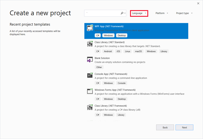
애플리케이션 프로젝트 만들기
첫 번째 단계는 애플리케이션 정의, 두 페이지 및 이미지를 포함하는 애플리케이션 인프라를 만드는 것입니다.
Visual Basic 또는 Visual C#에서
ExpenseIt라는 새 WPF 애플리케이션 프로젝트를 만듭니다.Visual Studio를 열고 시작 메뉴에서 새 프로젝트 만들기를 선택합니다.
새 프로젝트 만들기 대화 상자가 열립니다.
언어 드롭다운에서 C# 또는 Visual Basic을 선택합니다.
WPF 앱(.NET Framework) 템플릿을 선택하고 다음을 선택합니다.
새 프로젝트 구성 대화 상자가 열립니다.
프로젝트 이름으로
ExpenseIt를 입력하고 만들기를 선택합니다.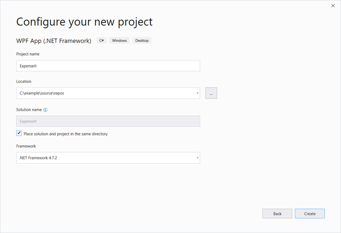
Visual Studio에서 프로젝트를 만들고 MainWindow.xaml이라는 기본 애플리케이션 창에 대한 디자이너를 엽니다.
Application.xaml(Visual Basic) 또는 App.xaml(C#)을 엽니다.
이 XAML 파일은 WPF 애플리케이션 및 애플리케이션 리소스를 정의합니다. 이 파일을 사용하여 애플리케이션 시작 시 자동으로 표시되는 UI(이 예에서는 MainWindow.xaml)를 지정할 수도 있습니다.
XAML은 Visual Basic에서 다음과 같이 표시됩니다.
<Application x:Class="Application"
    xmlns="http://schemas.microsoft.com/winfx/2006/xaml/presentation"
    xmlns:x="http://schemas.microsoft.com/winfx/2006/xaml"
    StartupUri="MainWindow.xaml">
    <Application.Resources>

    </Application.Resources>
</Application>
C#은 다음과 같습니다.
<Application x:Class="ExpenseIt.App" xmlns="http://schemas.microsoft.com/winfx/2006/xaml/presentation" xmlns:x="http://schemas.microsoft.com/winfx/2006/xaml" StartupUri="MainWindow.xaml"> <Application.Resources> </Application.Resources> </Application>MainWindow.xaml을 엽니다.
이 XAML 파일은 애플리케이션의 주 창이고 페이지에 만들어진 콘텐츠를 표시합니다. Window 클래스는 제목, 크기 또는 아이콘과 같은 창의 속성을 정의하고 닫기 또는 숨기기와 같은 이벤트를 처리합니다.
다음 XAML처럼 Window 요소를 NavigationWindow로 변경합니다.
<NavigationWindow x:Class="ExpenseIt.MainWindow"
     xmlns="http://schemas.microsoft.com/winfx/2006/xaml/presentation"
     xmlns:x="http://schemas.microsoft.com/winfx/2006/xaml"
     ...
</NavigationWindow>
이 앱은 사용자 입력에 따라 다른 콘텐츠로 이동합니다. 따라서 기본 Window를 NavigationWindow로 변경해야 합니다. NavigationWindow는 Window의 모든 속성을 상속합니다. XAML 파일의 NavigationWindow 요소는 NavigationWindow 클래스의 인스턴스를 만듭니다. 자세한 내용은 탐색 개요를 참조하세요.
NavigationWindow 태그 사이에서 Grid 요소를 제거합니다.
NavigationWindow 요소에 대한 XAML 코드에서 다음 속성을 변경합니다.
Visual Basic은 XAML이 다음과 비슷하게 됩니다.
<NavigationWindow x:Class="MainWindow"
    xmlns="http://schemas.microsoft.com/winfx/2006/xaml/presentation"
    xmlns:x="http://schemas.microsoft.com/winfx/2006/xaml"
    Title="ExpenseIt" Height="350" Width="500">

</NavigationWindow>
C#은 다음과 비슷합니다.
<NavigationWindow x:Class="ExpenseIt.MainWindow"
    xmlns="http://schemas.microsoft.com/winfx/2006/xaml/presentation"
    xmlns:x="http://schemas.microsoft.com/winfx/2006/xaml"
    Title="ExpenseIt" Height="350" Width="500">

</NavigationWindow>
MainWindow.xaml.vb 또는 MainWindow.xaml.cs를 엽니다.
이 파일은 MainWindow.xaml에 선언된 이벤트를 처리할 코드를 포함하는 코드 숨김 파일입니다. 이 파일에는 XAML에 정의된 창의 부분 클래스가 포함되어 있습니다.
C#을 사용하는 경우 NavigationWindow에서 파생되도록
MainWindow클래스를 변경합니다. (Visual Basic에서는 XAML에서 창을 변경하면 자동으로 이와 같이 변경됩니다.) 이제 C# 코드가 다음과 비슷하게 됩니다.using System; using System.Collections.Generic; using System.Linq; using System.Text; using System.Windows; using System.Windows.Controls; using System.Windows.Data; using System.Windows.Documents; using System.Windows.Input; using System.Windows.Media; using System.Windows.Media.Imaging; using System.Windows.Navigation; using System.Windows.Shapes; namespace ExpenseIt { /// <summary> /// Interaction logic for MainWindow.xaml /// </summary> public partial class MainWindow : NavigationWindow { public MainWindow() { InitializeComponent(); } } }
애플리케이션에 파일 추가
이 섹션에서는 애플리케이션에 두 페이지와 이미지를 추가합니다.
프로젝트에 새 페이지를 추가하고 이름을
ExpenseItHome.xaml로 지정합니다.솔루션 탐색기에서
ExpenseIt프로젝트 노드를 마우스 오른쪽 단추로 클릭하고 추가>페이지를 선택합니다.새 항목 추가 대화 상자에서 Page(WPF) 템플릿이 이미 선택되어 있습니다. 이름
ExpenseItHome을 입력하고 추가를 선택합니다.
이 페이지는 애플리케이션이 시작될 때 표시되는 첫 번째 페이지입니다. 이 페이지에서는 비용 보고서를 표시할 사람을 선택할 수 있는 사람 목록을 보여줍니다.
ExpenseItHome.xaml를 엽니다.Title을 “
ExpenseIt - Home”로 설정합니다.DesignHeight를 350픽셀로,DesignWidth를 500픽셀로 설정합니다.이제 Visual Basic은 XAML이 다음과 비슷하게 됩니다.
<Page x:Class="ExpenseItHome"
  xmlns="http://schemas.microsoft.com/winfx/2006/xaml/presentation"
  xmlns:x="http://schemas.microsoft.com/winfx/2006/xaml"
  xmlns:mc="http://schemas.openxmlformats.org/markup-compatibility/2006"
  xmlns:d="http://schemas.microsoft.com/expression/blend/2008"
  mc:Ignorable="d"
  d:DesignHeight="350" d:DesignWidth="500"
  Title="ExpenseIt - Home">
    <Grid>

    </Grid>
</Page>
C#은 다음과 비슷합니다.
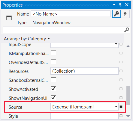
<Page x:Class="ExpenseIt.ExpenseItHome" xmlns="http://schemas.microsoft.com/winfx/2006/xaml/presentation" xmlns:x="http://schemas.microsoft.com/winfx/2006/xaml" xmlns:mc="http://schemas.openxmlformats.org/markup-compatibility/2006" xmlns:d="http://schemas.microsoft.com/expression/blend/2008" mc:Ignorable="d" d:DesignHeight="350" d:DesignWidth="500" Title="ExpenseIt - Home"> <Grid> </Grid> </Page>MainWindow.xaml을 엽니다.
Source 속성을 NavigationWindow 요소에 추가하고 "
ExpenseItHome.xaml"로 설정합니다.이렇게 하면
ExpenseItHome.xaml이 애플리케이션을 시작할 때 열리는 첫 페이지로 설정됩니다.다음은 Visual Basic의 XAML 예제입니다.
<NavigationWindow x:Class="MainWindow"
    xmlns="http://schemas.microsoft.com/winfx/2006/xaml/presentation"
    xmlns:x="http://schemas.microsoft.com/winfx/2006/xaml"
    Title="ExpenseIt" Height="350" Width="500" Source="ExpenseItHome.xaml">

</NavigationWindow>
다음은 C# 예제입니다.
<NavigationWindow x:Class="ExpenseIt.MainWindow"
    xmlns="http://schemas.microsoft.com/winfx/2006/xaml/presentation"
    xmlns:x="http://schemas.microsoft.com/winfx/2006/xaml"
    Title="ExpenseIt" Height="350" Width="500" Source="ExpenseItHome.xaml">

</NavigationWindow>
팁
속성 창의 기타 범주에서 원본 속성을 설정할 수도 있습니다.
프로젝트에 또 다른 새 WPF 페이지를 추가하고 이름을 ExpenseReportPage.xaml로 지정합니다.
솔루션 탐색기에서
ExpenseIt프로젝트 노드를 마우스 오른쪽 단추로 클릭하고 추가>페이지를 선택합니다.새 항목 추가 대화 상자에서 Page(WPF) 템플릿을 선택합니다. 이름으로 ExpenseReportPage를 입력하고 추가를 선택합니다.
이 페이지는
ExpenseItHome페이지에서 선택한 사람의 비용 보고서를 표시합니다.ExpenseReportPage.xaml을 엽니다.
Title을 "
ExpenseIt - View Expense"로 설정합니다.DesignHeight를 350픽셀로,DesignWidth를 500픽셀로 설정합니다.이제 Visual Basic에서는 ExpenseReportPage.xaml이 다음과 같습니다.
<Page x:Class="ExpenseReportPage"
      xmlns="http://schemas.microsoft.com/winfx/2006/xaml/presentation"
      xmlns:x="http://schemas.microsoft.com/winfx/2006/xaml"
      xmlns:mc="http://schemas.openxmlformats.org/markup-compatibility/2006"
      xmlns:d="http://schemas.microsoft.com/expression/blend/2008"
      mc:Ignorable="d"
      d:DesignHeight="350" d:DesignWidth="500"
      Title="ExpenseIt - View Expense">
    <Grid>

    </Grid>
</Page>
C#은 다음과 같습니다.
<Page x:Class="ExpenseIt.ExpenseReportPage"
      xmlns="http://schemas.microsoft.com/winfx/2006/xaml/presentation"
      xmlns:x="http://schemas.microsoft.com/winfx/2006/xaml"
      xmlns:mc="http://schemas.openxmlformats.org/markup-compatibility/2006"
      xmlns:d="http://schemas.microsoft.com/expression/blend/2008"
      mc:Ignorable="d"
      d:DesignHeight="350" d:DesignWidth="500"
    Title="ExpenseIt - View Expense">

    <Grid>

    </Grid>
</Page>
ExpenseItHome.xaml.vb 및 ExpenseReportPage.xaml.vb를 열거나 ExpenseItHome.xaml.cs 및 ExpenseReportPage.xaml.cs를 엽니다.
새 Page 파일을 만들면 Visual Studio에서 자동으로 코드 숨김 파일을 만듭니다. 이러한 코드 숨김 파일은 사용자 입력에 응답하기 위한 논리를 처리합니다.
ExpenseItHome에 대한 이 코드는 다음과 같습니다.using System; using System.Collections.Generic; using System.Linq; using System.Text; using System.Windows; using System.Windows.Controls; using System.Windows.Data; using System.Windows.Documents; using System.Windows.Input; using System.Windows.Media; using System.Windows.Media.Imaging; using System.Windows.Navigation; using System.Windows.Shapes; namespace ExpenseIt { /// <summary> /// Interaction logic for ExpenseItHome.xaml /// </summary> public partial class ExpenseItHome : Page { public ExpenseItHome() { InitializeComponent(); } } }Class ExpenseItHome End ClassExpenseReportPage의 경우 다음과 같습니다.
using System;
using System.Collections.Generic;
using System.Linq;
using System.Text;
using System.Windows;
using System.Windows.Controls;
using System.Windows.Data;
using System.Windows.Documents;
using System.Windows.Input;
using System.Windows.Media;
using System.Windows.Media.Imaging;
using System.Windows.Navigation;
using System.Windows.Shapes;

namespace ExpenseIt
{
    /// <summary>
    /// Interaction logic for ExpenseReportPage.xaml
    /// </summary>
    public partial class ExpenseReportPage : Page
    {
        public ExpenseReportPage()
        {
            InitializeComponent();
        }
    }
}
Class ExpenseReportPage End Classwatermark.png라는 이미지를 프로젝트에 추가합니다. 사용자 고유의 이미지를 만들거나, 샘플 코드에서 파일을 복사하거나, microsoft/WPF 샘플 GitHub 리포지토리에서 받을 수 있습니다.
프로젝트 노드를 마우스 오른쪽 단추로 클릭하고 추가>기존 항목을 선택하거나 Shift+Alt+A 키를 누릅니다.
기존 항목 추가 대화 상자에서 파일 필터를 모든 파일 또는 이미지 파일로 설정하고 사용하려는 이미지 파일로 이동한 다음, 추가를 선택합니다.
솔루션 탐색기에서 이미지 파일을 선택한 다음, 속성 창에서 빌드 작업을 리소스로 설정합니다.
애플리케이션 빌드 및 실행
애플리케이션을 빌드하고 실행하려면 F5 키를 누르거나 디버그 메뉴에서 디버깅 시작을 선택합니다.
다음 그림에서는 NavigationWindow 단추가 있는 애플리케이션을 보여줍니다.
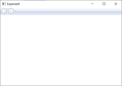
Visual Studio로 돌아가려면 애플리케이션을 닫습니다.
레이아웃 만들기
레이아웃은 UI 요소를 배치하는 순서가 지정된 방법을 제공하며 UI 크기를 조정할 때 해당 요소의 크기와 위치도 관리합니다. 일반적으로 다음 레이아웃 컨트롤 중 하나를 사용하여 레이아웃을 만듭니다.
- Canvas - 캔버스 영역에 비례하는 좌표를 사용하여 자식 요소의 위치를 명시적으로 지정할 수 있는 영역을 정의합니다.
- DockPanel - 자식 요소를 서로 맞춰 가로 또는 세로로 정렬할 수 있는 영역을 정의합니다.
- Grid - 열 및 행으로 구성되는 유연한 모눈 영역을 정의합니다.
- StackPanel - 가로 또는 세로 방향으로 한 줄로 자식 요소를 정렬합니다.
- VirtualizingStackPanel - 가로 또는 세로 방향으로 한 줄로 콘텐츠를 정렬하고 가상화합니다.
- WrapPanel - 콘텐츠를 컨테이너의 가장자리에서 다음 줄로 나눠 왼쪽에서 오른쪽으로 자식 요소의 위치를 지정합니다. 이후에는 Orientation 속성 값에 따라 순서가 위에서 아래로 또는 오른쪽에서 왼쪽으로 순차적으로 지정됩니다.
이러한 레이아웃 컨트롤은 각각 자식 요소의 특정 레이아웃 형식을 지원합니다. ExpenseIt 페이지는 크기를 조정할 수 있으며, 각 페이지의 요소는 다른 요소와 함께 가로 및 세로 방향으로 정렬됩니다. 이 예제에서는 Grid를 애플리케이션의 레이아웃 요소로 사용합니다.
이 섹션에서는 ExpenseItHome.xaml의 Grid에 열과 행 정의를 추가하여 3개의 행이 있고 여백이 10픽셀인 단일 열 테이블을 만듭니다.
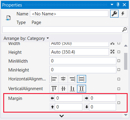
ExpenseItHome.xaml에서 Grid 요소의 Margin 속성을 "10,0,10,10"으로 설정합니다. 각 숫자는 왼쪽, 위쪽, 오른쪽, 아래쪽 여백입니다.<Grid Margin="10,0,10,10">팁
속성 창의 레이아웃 범주에서 여백 값을 설정할 수도 있습니다.
다음 XAML 코드를 Grid 태그 사이에 추가하여 행 및 열 정의를 만듭니다.
<Grid.ColumnDefinitions>
    <ColumnDefinition />
</Grid.ColumnDefinitions>
<Grid.RowDefinitions>
    <RowDefinition Height="Auto"/>
    <RowDefinition />
    <RowDefinition Height="Auto"/>
</Grid.RowDefinitions>
두 행의 Height는 행의 내용에 따라 행 크기가 자동으로 조정되는 Auto로 설정됩니다. 기본 Height는 사용 가능한 공간에 비례하여 행의 높이가 결정되는 Star 크기 조정입니다. 예를 들어 두 행의 Height가 각각 "*"이면 이 두 행은 사용 가능한 공간의 절반에 해당하는 높이를 가지게 됩니다.
이제 Grid에 다음 XAML이 포함됩니다.
<Grid Margin="10,0,10,10">
    <Grid.ColumnDefinitions>
        <ColumnDefinition />
    </Grid.ColumnDefinitions>
    <Grid.RowDefinitions>
        <RowDefinition Height="Auto"/>
        <RowDefinition />
        <RowDefinition Height="Auto"/>
    </Grid.RowDefinitions>
</Grid>
컨트롤 추가
이 섹션에서는 사람 목록을 표시하도록 홈페이지 UI를 업데이트합니다. 여기서 한 사람을 선택하여 지출 보고서를 표시합니다. 컨트롤은 사용자가 애플리케이션과 상호 작용할 수 있게 하는 UI 개체입니다. 자세한 내용은 컨트롤을 참조하세요.
이 UI를 만들려면 다음 요소를 ExpenseItHome.xaml에 추가합니다.
각 컨트롤은 연결된 속성 Grid.Row를 설정하여 Grid의 행에 배치됩니다. 연결된 속성에 대한 자세한 내용은 연결된 속성 개요를 참조하세요.
ExpenseItHome.xaml에서 Grid 태그 사이에 다음 XAML을 추가합니다.<!-- People list --> <Border Grid.Column="0" Grid.Row="0" Height="35" Padding="5" Background="#4E87D4"> <Label VerticalAlignment="Center" Foreground="White">Names</Label> </Border> <ListBox Name="peopleListBox" Grid.Column="0" Grid.Row="1"> <ListBoxItem>Mike</ListBoxItem> <ListBoxItem>Lisa</ListBoxItem> <ListBoxItem>John</ListBoxItem> <ListBoxItem>Mary</ListBoxItem> </ListBox> <!-- View report button --> <Button Grid.Column="0" Grid.Row="2" Margin="0,10,0,10" Width="125" Height="25" HorizontalAlignment="Right">View</Button>팁
도구 상자 창의 컨트롤을 디자인 창으로 끌어다 놓고 속성 창에서 속성을 설정하여 컨트롤을 만들 수도 있습니다.
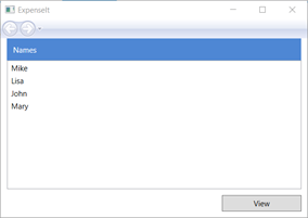
애플리케이션을 빌드 및 실행합니다.
다음 그림은 앞에서 만든 컨트롤을 보여줍니다.
이미지 및 제목 추가
이 섹션에서는 홈페이지 UI를 이미지와 페이지 제목으로 업데이트합니다.
ExpenseItHome.xaml에서 Width가 230픽셀로 고정된 ColumnDefinitions에 다른 열을 추가합니다.<Grid.ColumnDefinitions> <ColumnDefinition Width="230" /> <ColumnDefinition /> </Grid.ColumnDefinitions>RowDefinitions에 또 다른 행을 추가합니다. 그러면 총 4개의 행이 있습니다.
<Grid.RowDefinitions>
    <RowDefinition/>
    <RowDefinition Height="Auto"/>
    <RowDefinition />
    <RowDefinition Height="Auto"/>
</Grid.RowDefinitions>
세 개의 컨트롤(Border, ListBox 및 Button)에서 Grid.Column 속성을 각각 1로 설정하여 컨트롤을 두 번째 열로 이동합니다.
세 개의 컨트롤(Border, ListBox 및 Button)과 Border 요소의 Grid.Row 값을 각각 1씩 높여서 각 컨트롤을 한 행 아래로 이동합니다.
이제 세 컨트롤의 XAML은 다음과 같습니다.
<Border Grid.Column="1" Grid.Row="1" Height="35" Padding="5" Background="#4E87D4"> <Label VerticalAlignment="Center" Foreground="White">Names</Label> </Border> <ListBox Name="peopleListBox" Grid.Column="1" Grid.Row="2"> <ListBoxItem>Mike</ListBoxItem> <ListBoxItem>Lisa</ListBoxItem> <ListBoxItem>John</ListBoxItem> <ListBoxItem>Mary</ListBoxItem> </ListBox> <!-- View report button --> <Button Grid.Column="1" Grid.Row="3" Margin="0,10,0,0" Width="125" Height="25" HorizontalAlignment="Right">View</Button><Grid>태그와</Grid>태그 사이 아무 위치에 다음 XAML을 추가하여 Background 속성을 watermark.png 이미지 파일로 설정합니다.<Grid.Background> <ImageBrush ImageSource="watermark.png"/> </Grid.Background>Border 요소 앞에 콘텐츠가 "지출 보고서 보기"인 Label을 추가합니다. 이 레이블은 페이지의 제목입니다.
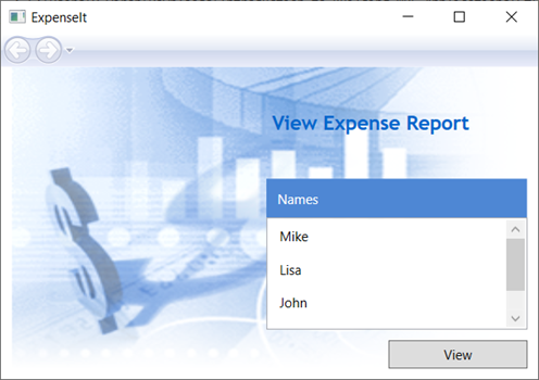
<Label Grid.Column="1" VerticalAlignment="Center" FontFamily="Trebuchet MS"
        FontWeight="Bold" FontSize="18" Foreground="#0066cc">
    View Expense Report
</Label>
애플리케이션을 빌드 및 실행합니다.
다음 그림에서는 방금 추가한 내용의 결과를 보여줍니다.
이벤트를 처리하는 코드 추가
ExpenseItHome.xaml에서 Button 요소에 Click 이벤트 처리기를 추가합니다. 자세한 내용은 방법: 단순한 이벤트 처리기 만들기를 참조하세요.<!-- View report button --> <Button Grid.Column="1" Grid.Row="3" Margin="0,10,0,0" Width="125" Height="25" HorizontalAlignment="Right" Click="Button_Click">View</Button>ExpenseItHome.xaml.vb또는ExpenseItHome.xaml.cs를 엽니다.ExpenseItHome클래스에 다음 코드를 추가하여 단추 클릭 이벤트 처리기를 추가합니다. 이벤트 처리기가 ExpenseReportPage 페이지를 엽니다.private void Button_Click(object sender, RoutedEventArgs e) { // View Expense Report ExpenseReportPage expenseReportPage = new ExpenseReportPage(); this.NavigationService.Navigate(expenseReportPage); }Private Sub Button_Click(ByVal sender As Object, ByVal e As RoutedEventArgs) ' View Expense Report Dim expenseReportPage As New ExpenseReportPage() Me.NavigationService.Navigate(expenseReportPage) End Sub
ExpenseReportPage의 UI 만들기
ExpenseReportPage.xaml은 ExpenseItHome에서 선택한 사람의 지출 보고서를 보여줍니다. 이 섹션에서는 ExpenseReportPage의 UI를 만듭니다. 또한 다양한 UI 요소에 배경을 추가하고 색을 채울 것입니다.
ExpenseReportPage.xaml을 엽니다.
다음 XAML을 Grid 태그 사이에 추가합니다.
 <Grid.Background>
     <ImageBrush ImageSource="watermark.png" />
 </Grid.Background>
 <Grid.ColumnDefinitions>
     <ColumnDefinition Width="230" />
     <ColumnDefinition />
 </Grid.ColumnDefinitions>
 <Grid.RowDefinitions>
     <RowDefinition Height="Auto" />
     <RowDefinition />
 </Grid.RowDefinitions>


 <Label Grid.Column="1" VerticalAlignment="Center" FontFamily="Trebuchet MS"
 FontWeight="Bold" FontSize="18" Foreground="#0066cc">
     Expense Report For:
 </Label>
 <Grid Margin="10" Grid.Column="1" Grid.Row="1">

     <Grid.ColumnDefinitions>
         <ColumnDefinition />
         <ColumnDefinition />
     </Grid.ColumnDefinitions>
     <Grid.RowDefinitions>
         <RowDefinition Height="Auto" />
         <RowDefinition Height="Auto" />
         <RowDefinition />
     </Grid.RowDefinitions>

     <!-- Name -->
     <StackPanel Grid.Column="0" Grid.ColumnSpan="2" Grid.Row="0" Orientation="Horizontal">
         <Label Margin="0,0,0,5" FontWeight="Bold">Name:</Label>
         <Label Margin="0,0,0,5" FontWeight="Bold"></Label>
     </StackPanel>

     <!-- Department -->
     <StackPanel Grid.Column="0" Grid.ColumnSpan="2" Grid.Row="1" Orientation="Horizontal">
         <Label Margin="0,0,0,5" FontWeight="Bold">Department:</Label>
         <Label Margin="0,0,0,5" FontWeight="Bold"></Label>
     </StackPanel>

     <Grid Grid.Column="0" Grid.ColumnSpan="2" Grid.Row="2" VerticalAlignment="Top"
           HorizontalAlignment="Left">
         <!-- Expense type and Amount table -->
         <DataGrid  AutoGenerateColumns="False" RowHeaderWidth="0" >
             <DataGrid.ColumnHeaderStyle>
                 <Style TargetType="{x:Type DataGridColumnHeader}">
                     <Setter Property="Height" Value="35" />
                     <Setter Property="Padding" Value="5" />
                     <Setter Property="Background" Value="#4E87D4" />
                     <Setter Property="Foreground" Value="White" />
                 </Style>
             </DataGrid.ColumnHeaderStyle>
             <DataGrid.Columns>
                 <DataGridTextColumn Header="ExpenseType" />
                 <DataGridTextColumn Header="Amount"  />
             </DataGrid.Columns>
         </DataGrid>
     </Grid>
 </Grid>
이 UI는 보고서 데이터가 DataGrid에 표시된다는 점을 제외하면
ExpenseItHome.xaml에서 만든 UI와 비슷합니다.애플리케이션을 빌드 및 실행합니다.
보기 단추를 선택합니다.
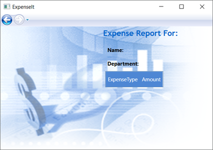
경비 보고서 페이지가 나타납니다. 뒤로 탐색 단추를 사용할 수 있습니다.
다음 그림에서는 ExpenseReportPage.xaml에 UI 요소가 추가된 것을 보여줍니다.
스타일 컨트롤
UI에서는 형식이 같은 모든 요소의 모양이 동일한 경우가 많습니다. UI에서는 스타일을 사용하여 여러 요소 간에 모양을 다시 사용할 수 있습니다. 스타일을 재사용할 수 있으므로 XAML 만들기와 관리가 간단해집니다. 이 섹션에서는 이전 단계에서 정의된 요소별 특성을 스타일로 바꿉니다.
Application.xaml 또는 App.xaml을 엽니다.
다음 XAML을 Application.Resources 태그 사이에 추가합니다.
<!-- Header text style -->
<Style x:Key="headerTextStyle">
    <Setter Property="Label.VerticalAlignment" Value="Center"></Setter>
    <Setter Property="Label.FontFamily" Value="Trebuchet MS"></Setter>
    <Setter Property="Label.FontWeight" Value="Bold"></Setter>
    <Setter Property="Label.FontSize" Value="18"></Setter>
    <Setter Property="Label.Foreground" Value="#0066cc"></Setter>
</Style>

<!-- Label style -->
<Style x:Key="labelStyle" TargetType="{x:Type Label}">
    <Setter Property="VerticalAlignment" Value="Top" />
    <Setter Property="HorizontalAlignment" Value="Left" />
    <Setter Property="FontWeight" Value="Bold" />
    <Setter Property="Margin" Value="0,0,0,5" />
</Style>

<!-- DataGrid header style -->
<Style x:Key="columnHeaderStyle" TargetType="{x:Type DataGridColumnHeader}">
    <Setter Property="Height" Value="35" />
    <Setter Property="Padding" Value="5" />
    <Setter Property="Background" Value="#4E87D4" />
    <Setter Property="Foreground" Value="White" />
</Style>

<!-- List header style -->
<Style x:Key="listHeaderStyle" TargetType="{x:Type Border}">
    <Setter Property="Height" Value="35" />
    <Setter Property="Padding" Value="5" />
    <Setter Property="Background" Value="#4E87D4" />
</Style>

<!-- List header text style -->
<Style x:Key="listHeaderTextStyle" TargetType="{x:Type Label}">
    <Setter Property="Foreground" Value="White" />
    <Setter Property="VerticalAlignment" Value="Center" />
    <Setter Property="HorizontalAlignment" Value="Left" />
</Style>

<!-- Button style -->
<Style x:Key="buttonStyle" TargetType="{x:Type Button}">
    <Setter Property="Width" Value="125" />
    <Setter Property="Height" Value="25" />
    <Setter Property="Margin" Value="0,10,0,0" />
    <Setter Property="HorizontalAlignment" Value="Right" />
</Style>
이 XAML은 다음 스타일을 추가합니다.
headerTextStyle: 페이지 제목 Label의 형식을 지정합니다.labelStyle: Label 컨트롤의 형식을 지정합니다.columnHeaderStyle: DataGridColumnHeader의 형식을 지정합니다.listHeaderStyle: 목록 헤더 Border 컨트롤의 형식을 지정합니다.listHeaderTextStyle: 목록 헤더 Label의 형식을 지정합니다.buttonStyle:ExpenseItHome.xaml의 Button 형식을 지정합니다.
스타일은 Application.Resources 속성 요소의 자식이며 리소스입니다. 이 위치에서 스타일은 애플리케이션의 모든 요소에 적용됩니다. .NET 앱 리소스를 사용하는 예제는 애플리케이션 리소스 사용을 참조하세요.
ExpenseItHome.xaml에서 Grid 사이에 있는 모든 내용을 다음 XAML로 바꿉니다.<Grid.Background> <ImageBrush ImageSource="watermark.png" /> </Grid.Background> <Grid.ColumnDefinitions> <ColumnDefinition Width="230" /> <ColumnDefinition /> </Grid.ColumnDefinitions> <Grid.RowDefinitions> <RowDefinition/> <RowDefinition Height="Auto"/> <RowDefinition /> <RowDefinition Height="Auto"/> </Grid.RowDefinitions> <!-- People list --> <Label Grid.Column="1" Style="{StaticResource headerTextStyle}" > View Expense Report </Label> <Border Grid.Column="1" Grid.Row="1" Style="{StaticResource listHeaderStyle}"> <Label Style="{StaticResource listHeaderTextStyle}">Names</Label> </Border> <ListBox Name="peopleListBox" Grid.Column="1" Grid.Row="2"> <ListBoxItem>Mike</ListBoxItem> <ListBoxItem>Lisa</ListBoxItem> <ListBoxItem>John</ListBoxItem> <ListBoxItem>Mary</ListBoxItem> </ListBox> <!-- View report button --> <Button Grid.Column="1" Grid.Row="3" Click="Button_Click" Style="{StaticResource buttonStyle}">View</Button>스타일을 적용하면 각 컨트롤의 모양을 정의하는 VerticalAlignment 및 FontFamily 와 같은 속성이 제거되고 바뀝니다. 예를 들어
headerTextStyle은 "지출 보고서 보기" Label에 적용됩니다.ExpenseReportPage.xaml을 엽니다.
Grid 사이에 있는 모든 내용을 다음 XAML로 바꿉니다.
<Grid.Background> <ImageBrush ImageSource="watermark.png" /> </Grid.Background> <Grid.ColumnDefinitions> <ColumnDefinition Width="230" /> <ColumnDefinition /> </Grid.ColumnDefinitions> <Grid.RowDefinitions> <RowDefinition Height="Auto" /> <RowDefinition /> </Grid.RowDefinitions> <Label Grid.Column="1" Style="{StaticResource headerTextStyle}"> Expense Report For: </Label> <Grid Margin="10" Grid.Column="1" Grid.Row="1"> <Grid.ColumnDefinitions> <ColumnDefinition /> <ColumnDefinition /> </Grid.ColumnDefinitions> <Grid.RowDefinitions> <RowDefinition Height="Auto" /> <RowDefinition Height="Auto" /> <RowDefinition /> </Grid.RowDefinitions> <!-- Name --> <StackPanel Grid.Column="0" Grid.ColumnSpan="2" Grid.Row="0" Orientation="Horizontal"> <Label Style="{StaticResource labelStyle}">Name:</Label> <Label Style="{StaticResource labelStyle}"></Label> </StackPanel> <!-- Department --> <StackPanel Grid.Column="0" Grid.ColumnSpan="2" Grid.Row="1" Orientation="Horizontal"> <Label Style="{StaticResource labelStyle}">Department:</Label> <Label Style="{StaticResource labelStyle}"></Label> </StackPanel> <Grid Grid.Column="0" Grid.ColumnSpan="2" Grid.Row="2" VerticalAlignment="Top" HorizontalAlignment="Left"> <!-- Expense type and Amount table --> <DataGrid ColumnHeaderStyle="{StaticResource columnHeaderStyle}" AutoGenerateColumns="False" RowHeaderWidth="0" > <DataGrid.Columns> <DataGridTextColumn Header="ExpenseType" /> <DataGridTextColumn Header="Amount" /> </DataGrid.Columns> </DataGrid> </Grid> </Grid>애플리케이션을 빌드 및 실행합니다. 창 모양은 이전과 동일합니다.
Visual Studio로 돌아가려면 애플리케이션을 닫습니다.
데이터를 컨트롤에 바인딩
이 섹션에서는 다양한 컨트롤에 바인딩되는 XML 데이터를 만듭니다.
ExpenseItHome.xaml에서 Grid 요소를 열고, 다음 XAML을 추가하여 각 사람에 대한 데이터를 포함하는 XmlDataProvider를 만듭니다.<Grid.Resources> <!-- Expense Report Data --> <XmlDataProvider x:Key="ExpenseDataSource" XPath="Expenses"> <x:XData> <Expenses xmlns=""> <Person Name="Mike" Department="Legal"> <Expense ExpenseType="Lunch" ExpenseAmount="50" /> <Expense ExpenseType="Transportation" ExpenseAmount="50" /> </Person> <Person Name="Lisa" Department="Marketing"> <Expense ExpenseType="Document printing" ExpenseAmount="50"/> <Expense ExpenseType="Gift" ExpenseAmount="125" /> </Person> <Person Name="John" Department="Engineering"> <Expense ExpenseType="Magazine subscription" ExpenseAmount="50"/> <Expense ExpenseType="New machine" ExpenseAmount="600" /> <Expense ExpenseType="Software" ExpenseAmount="500" /> </Person> <Person Name="Mary" Department="Finance"> <Expense ExpenseType="Dinner" ExpenseAmount="100" /> </Person> </Expenses> </x:XData> </XmlDataProvider> </Grid.Resources>데이터는 Grid 리소스로 만들어집니다. 일반적으로 이 데이터는 파일로 로드되지만, 편의상 데이터가 인라인으로 추가됩니다.
<Grid.Resources>요소 내에서 다음<xref:System.Windows.DataTemplate>요소를 추가합니다. 이 요소는<XmlDataProvider>요소 뒤에 ListBox 데이터를 표시하는 방법을 정의합니다.<Grid.Resources> <!-- Name item template --> <DataTemplate x:Key="nameItemTemplate"> <Label Content="{Binding XPath=@Name}"/> </DataTemplate> </Grid.Resources>데이터 템플릿에 대한 자세한 내용은 데이터 템플릿 지정 개요를 참조하세요.
기존 ListBox를 다음 XAML로 바꿉니다.
<ListBox Name="peopleListBox" Grid.Column="1" Grid.Row="2"
         ItemsSource="{Binding Source={StaticResource ExpenseDataSource}, XPath=Person}"
         ItemTemplate="{StaticResource nameItemTemplate}">
</ListBox>
이 XAML은 ListBox의 ItemsSource 속성을 데이터 원본에 바인딩하고 데이터 템플릿을 ItemTemplate으로 적용합니다.
컨트롤에 데이터 연결
다음으로, ExpenseItHome 페이지에서 선택한 이름을 검색하여 ExpenseReportPage의 생성자에 전달하는 코드를 추가합니다. ExpenseReportPage는 ExpenseReportPage.xaml에 정의된 컨트롤이 바인딩되는 전달된 항목으로 데이터 컨텍스트를 설정합니다.
ExpenseReportPage.xaml.vb 또는 ExpenseReportPage.xaml.cs를 엽니다.
선택한 사람의 비용 보고서 데이터를 전달할 수 있도록 개체를 사용하는 생성자를 추가합니다.
public partial class ExpenseReportPage : Page
{
    public ExpenseReportPage()
    {
        InitializeComponent();
    }

    // Custom constructor to pass expense report data
    public ExpenseReportPage(object data):this()
    {
        // Bind to expense report data.
        this.DataContext = data;
    }
}
Partial Public Class ExpenseReportPage Inherits Page Public Sub New() InitializeComponent() End Sub ' Custom constructor to pass expense report data Public Sub New(ByVal data As Object) Me.New() ' Bind to expense report data. Me.DataContext = data End Sub End ClassExpenseItHome.xaml.vb또는ExpenseItHome.xaml.cs를 엽니다.선택한 사람의 지출 보고서 데이터를 전달하는 새로운 생성자를 호출하도록 Click 이벤트 처리기를 변경합니다.
private void Button_Click(object sender, RoutedEventArgs e)
{
    // View Expense Report
    ExpenseReportPage expenseReportPage = new ExpenseReportPage(this.peopleListBox.SelectedItem);
    this.NavigationService.Navigate(expenseReportPage);
}
Private Sub Button_Click(ByVal sender As Object, ByVal e As RoutedEventArgs) ' View Expense Report Dim expenseReportPage As New ExpenseReportPage(Me.peopleListBox.SelectedItem) Me.NavigationService.Navigate(expenseReportPage) End Sub
데이터 템플릿을 사용하여 데이터 스타일 지정
이 섹션에서는 데이터 템플릿을 사용하여 데이터 바인딩된 목록의 각 항목에 대한 UI를 업데이트합니다.
ExpenseReportPage.xaml을 엽니다.
"Name" 및 "Department" Label 요소의 콘텐츠를 적절한 데이터 원본 속성에 바인딩합니다. 데이터 바인딩에 대한 자세한 내용은 데이터 바인딩 개요를 참조하세요.
<!-- Name -->
<StackPanel Grid.Column="0" Grid.ColumnSpan="2" Grid.Row="0" Orientation="Horizontal">
    <Label Style="{StaticResource labelStyle}">Name:</Label>
    <Label Style="{StaticResource labelStyle}" Content="{Binding XPath=@Name}"></Label>
</StackPanel>

<!-- Department -->
<StackPanel Grid.Column="0" Grid.ColumnSpan="2" Grid.Row="1" Orientation="Horizontal">
    <Label Style="{StaticResource labelStyle}">Department:</Label>
    <Label Style="{StaticResource labelStyle}" Content="{Binding XPath=@Department}"></Label>
</StackPanel>
Grid 요소를 열고, 지출 보고서 데이터를 표시하는 방법을 정의하는 다음 데이터 템플릿을 추가합니다.
<!--Templates to display expense report data-->
<Grid.Resources>
    <!-- Reason item template -->
    <DataTemplate x:Key="typeItemTemplate">
        <Label Content="{Binding XPath=@ExpenseType}"/>
    </DataTemplate>
    <!-- Amount item template -->
    <DataTemplate x:Key="amountItemTemplate">
        <Label Content="{Binding XPath=@ExpenseAmount}"/>
    </DataTemplate>
</Grid.Resources>
DataGridTextColumn 요소를 DataGrid 요소 아래의 DataGridTemplateColumn으로 바꾸고 템플릿을 적용합니다. 또한
DataGrid요소에서ItemsSource특성을 해당 값으로 지정합니다.<!-- Expense type and Amount table --> <DataGrid ItemsSource="{Binding XPath=Expense}" ColumnHeaderStyle="{StaticResource columnHeaderStyle}" AutoGenerateColumns="False" RowHeaderWidth="0" > <DataGrid.Columns> <DataGridTemplateColumn Header="ExpenseType" CellTemplate="{StaticResource typeItemTemplate}" /> <DataGridTemplateColumn Header="Amount" CellTemplate="{StaticResource amountItemTemplate}" /> </DataGrid.Columns> </DataGrid>애플리케이션을 빌드 및 실행합니다.
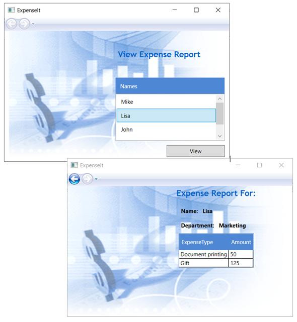
사람을 선택하고 보기 단추를 선택합니다.
다음 그림에서는 컨트롤, 레이아웃, 스타일, 데이터 바인딩 및 데이터 템플릿이 적용된 ExpenseIt 애플리케이션의 두 페이지를 보여줍니다.
참고 항목
이 샘플은 WPF의 특정 기능을 보여주며 보안, 지역화 및 접근성과 같은 모든 모범 사례를 따르지는 않습니다. WPF 및 .NET 앱 개발 모범 사례에 대한 자세한 내용은 다음 토픽을 참조하세요.
다음 단계
이 연습에서는 WPF(Windows Presentation Foundation)를 사용하여 UI를 만드는 다양한 기술을 배웠습니다. 이제 데이터 바인딩된 .NET 앱의 구성 요소에 대해 기본적인 내용을 이해하고 있을 것입니다. WPF 아키텍처 및 프로그래밍 모델에 대한 자세한 내용은 다음 항목을 참조하세요.
애플리케이션을 만드는 방법에 대한 자세한 내용은 다음 항목을 참조하세요.
참고 항목
.NET Desktop feedback
피드백
출시 예정: 2024년 내내 콘텐츠에 대한 피드백 메커니즘으로 GitHub 문제를 단계적으로 폐지하고 이를 새로운 피드백 시스템으로 바꿀 예정입니다. 자세한 내용은 다음을 참조하세요. https://aka.ms/ContentUserFeedback
다음에 대한 사용자 의견 제출 및 보기