Microsoft Fabric은 데이터 웨어하우스 및 빅 데이터 시스템 전반에서 인사이트에 대한 시간을 가속화하는 통합 분석 서비스입니다. Notebook의 데이터 시각화는 사용자가 패턴, 추세 및 이상값을 쉽게 식별할 수 있도록 데이터에 대한 인사이트를 얻을 수 있는 주요 기능입니다.
패브릭에서 Apache Spark를 사용하는 경우 패브릭 Notebook 차트 기능 및 인기 있는 오픈 소스 라이브러리에 대한 액세스를 포함하여 데이터를 시각화하는 기본 제공 옵션이 있습니다.
패브릭 Notebook을 사용하면 코드를 작성하지 않고도 테이블 형식 결과를 사용자 지정 차트로 변환할 수 있으므로 보다 직관적이고 원활한 데이터 탐색 환경을 사용할 수 있습니다.
기본 제공 시각화 명령 - display() 함수
Fabric 기본 제공 시각화 함수를 사용하면 Apache Spark DataFrames, Pandas DataFrames 및 SQL 쿼리 결과를 풍부한 대화형 데이터 시각화로 변환할 수 있습니다.
표시 함수를 사용하여 PySpark 및 Scala Spark DataFrames 또는 RDD(탄력적 분산 데이터 세트)를 동적 테이블 또는 차트로 렌더링할 수 있습니다.
렌더링되는 데이터 프레임의 행 수를 지정할 수 있습니다. 기본값은 1000. Notebook 표시 출력 위젯은 데이터 프레임의 최대 10000개의 행을 보고 프로파일하는 것을 지원합니다.

전역 도구 모음에서 필터 함수를 사용하여 데이터에 사용자 지정된 규칙을 적용할 수 있습니다. 필터 조건은 지정된 열에 적용되며 결과는 테이블 및 차트 뷰 모두에 반영됩니다.

SQL 문의 출력은 기본적으로 display()과 동일한 출력 위젯을 사용합니다.
리치 데이터 프레임 테이블 뷰
테이블 보기에서 무료 선택 지원
기본적으로 테이블 뷰 는 Fabric Notebook에서 display() 명령을 사용할 때 렌더링됩니다. 풍부한 데이터 프레임 미리 보기는 유연하고 대화형 선택 옵션을 사용하도록 설정하여 데이터 분석 환경을 향상시키도록 설계된 직관적인 무료 선택 기능을 제공합니다. 이 기능을 사용하면 사용자가 데이터 프레임을 쉽게 탐색하고 탐색할 수 있습니다.
열 선택
- 단일 열: 열 머리글을 클릭하여 전체 열을 선택합니다.
- 여러 열: 단일 열을 선택한 후 'Shift' 키를 길게 누른 다음 다른 열 머리글을 클릭하여 여러 열을 선택합니다.
행 선택
- 단일 행: 행 머리글을 클릭하여 전체 행을 선택합니다.
- 여러 행
: 한 행을 선택한 후 'Shift' 키를 길게 누른 다음 다른 행 머리글을 클릭하여 여러 행을 선택합니다.
셀 콘텐츠 미리 보기: 추가 코드를 작성할 필요 없이 데이터를 빠르고 상세하게 볼 수 있도록 개별 셀의 콘텐츠를 미리 봅니다.
열 요약: 데이터 분포 및 주요 통계를 포함하여 각 열의 요약을 가져와서 데이터의 특성을 빠르게 이해합니다.
자유 영역 선택: 선택한 전체 셀과 선택한 영역의 숫자 값에 대한 개요를 보려면 표의 연속 세그먼트를 선택합니다.
선택한 콘텐츠 복사
: 모든 선택 사례에서 'Ctrl + C' 바로 가기를 사용하여 선택한 콘텐츠를 빠르게 복사할 수 있습니다. 선택한 데이터는 CSV 형식으로 복사되므로 다른 애플리케이션에서 쉽게 처리할 수 있습니다. 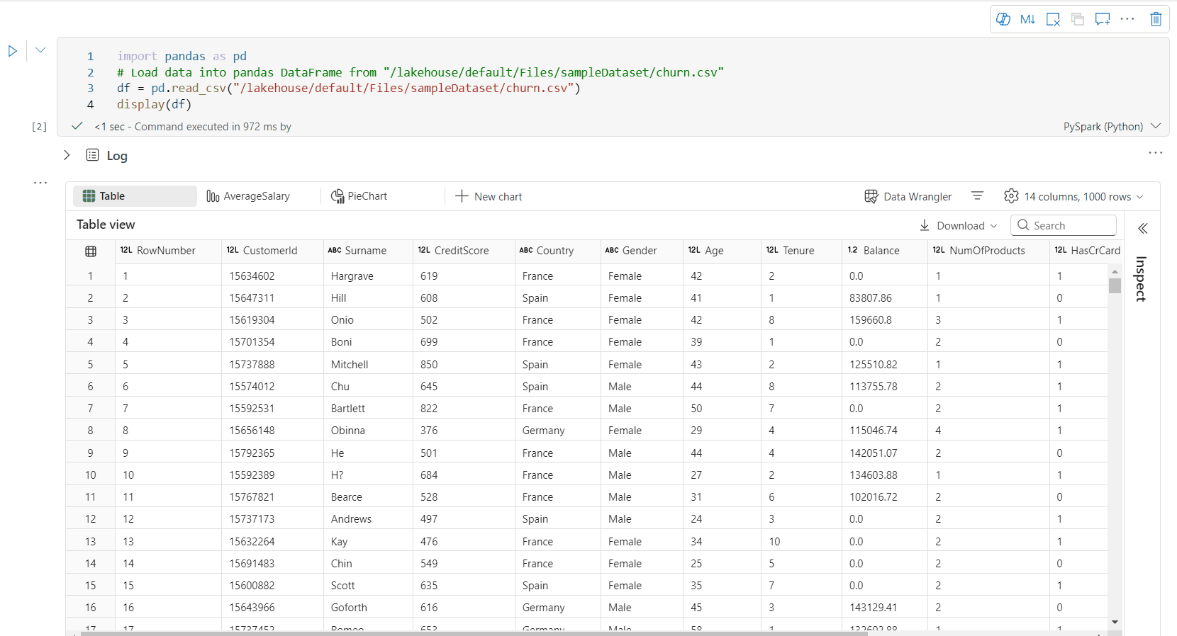

검사 창을 통한 데이터 프로파일링 지원

검사 단추를 클릭하여 데이터 프레임을 프로파일링할 수 있습니다. 요약된 데이터 분포를 제공하고 각 열의 통계를 표시합니다.
"검사" 쪽 창의 각 카드는 데이터 프레임의 열에 매핑됩니다. 카드를 클릭하거나 테이블에서 열을 선택하여 자세한 내용을 볼 수 있습니다.
표의 셀을 클릭하여 셀 세부 정보를 볼 수 있습니다. 이 기능은 데이터 프레임에 긴 문자열 형식의 콘텐츠가 포함된 경우에 유용합니다.
향상된 리치 데이터 프레임 차트 보기
디스플레이() 명령의 향상된 차트 보기는 데이터를 시각화하는 보다 직관적이고 역동적인 방법을 제공합니다.
주요 향상된 기능:
다중 차트 지원: 새 차트를 선택하여 단일 디스플레이() 출력 위젯 내에 최대 5개의차트를 추가하여 여러 열에서 쉽게 비교할 수 있습니다.
스마트 차트 권장 사항: DataFrame을 기반으로 제안된 차트 목록을 가져옵니다. 권장 시각화를 편집하거나 처음부터 사용자 지정 차트를 만들도록 선택합니다.

유연한 사용자 지정: 선택한 차트 종류에 따라 조정 가능한 설정을 사용하여 시각화를 개인 설정합니다.
범주 기본 설정 설명 차트 종류 표시 함수는 가로 막대형 차트, 산점도, 꺾은선형 그래프, 피벗 테이블 등 다양한 차트 종류를 지원합니다. 타이틀 타이틀 차트의 제목입니다. 타이틀 부제목 자세한 설명이 포함된 차트의 부제입니다. 데이터 X축 차트의 키를 지정합니다. 데이터 Y축 차트의 값을 지정합니다. 범례 범례 표시 범례를 사용/사용 안함으로 설정합니다 범례 위치 범례의 위치를 사용자 지정합니다. 기타 계열 그룹 이 구성을 사용하여 집계를 위한 그룹을 결정합니다. 기타 집계 이 방법을 사용하여 시각화에서 데이터를 집계합니다. 기타 누적 결과의 표시 스타일을 구성합니다. 기타 누락 및 NULL 값 누락 또는 NULL 차트 값이 표시되는 방식을 구성합니다. 참고 항목
또한 기본 설정이 1,000인 행 수를 지정할 수 있습니다. Notebook 디스플레이 출력 위젯은 최대 10,000개의 DataFrame 행 보기 및 프로파일링을 지원합니다. 모든 결과에 대한 집계를 선택한 다음 적용을 선택하여 전체 데이터 프레임에서 차트 생성을 적용합니다. Spark 작업은 차트 설정이 변경될 때 트리거됩니다. 계산을 완료하고 차트를 렌더링하는 데 몇 분 정도 걸릴 수 있습니다.
범주 고급 설정 설명 색 테마 차트의 테마 색 집합을 정의합니다. X축 레이블 X축에 레이블을 지정합니다. X축 규모 X축의 배율 함수를 지정합니다. X축 범위 값 범위 X축을 지정합니다. Y축 레이블 Y축에 레이블을 지정합니다. Y축 규모 Y축의 배율 함수를 지정합니다. Y축 범위 값 범위 Y축을 지정합니다. 표시 레이블 표시 차트에서 결과 레이블을 표시/숨깁니다. 구성 변경 내용은 즉시 적용되며 모든 구성은 Notebook 콘텐츠에 자동으로 저장됩니다.
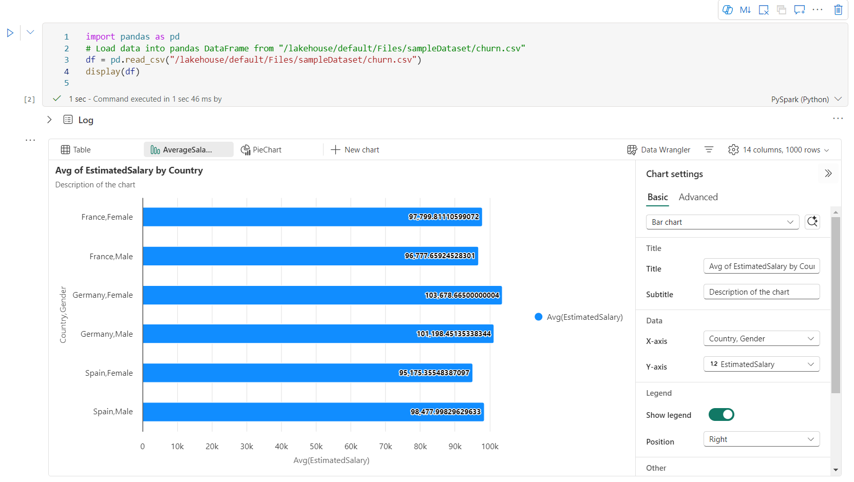
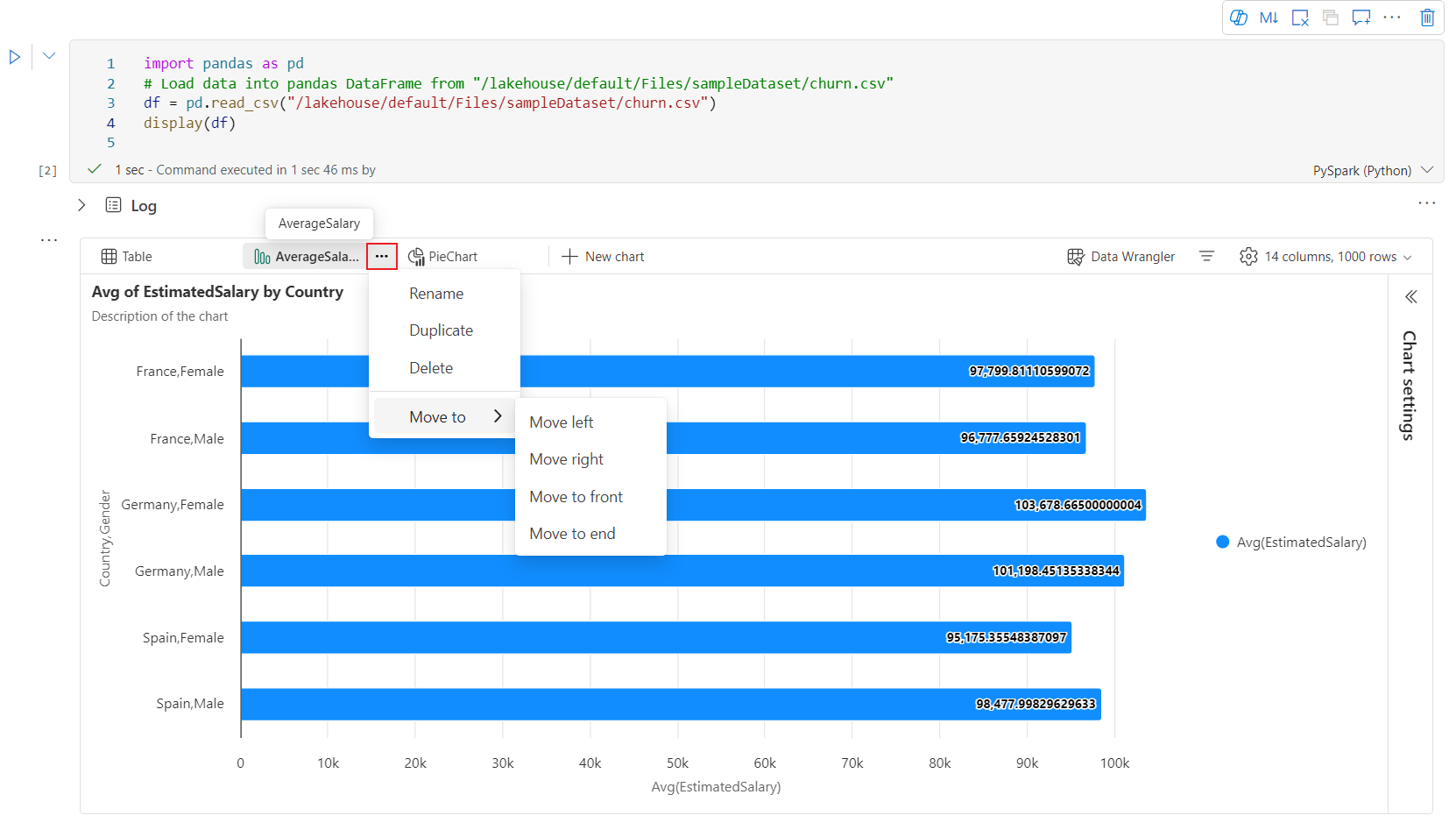
차트 탭 메뉴에서 차트 의 이름을 쉽게 바꾸거나, 복제하거나, 삭제하거나, 이동할 수 있습니다. 탭을 끌어서 놓아 순서를 변경할 수도 있습니다. 전자 필기장을 열면 첫 번째 탭이 기본값으로 표시됩니다.
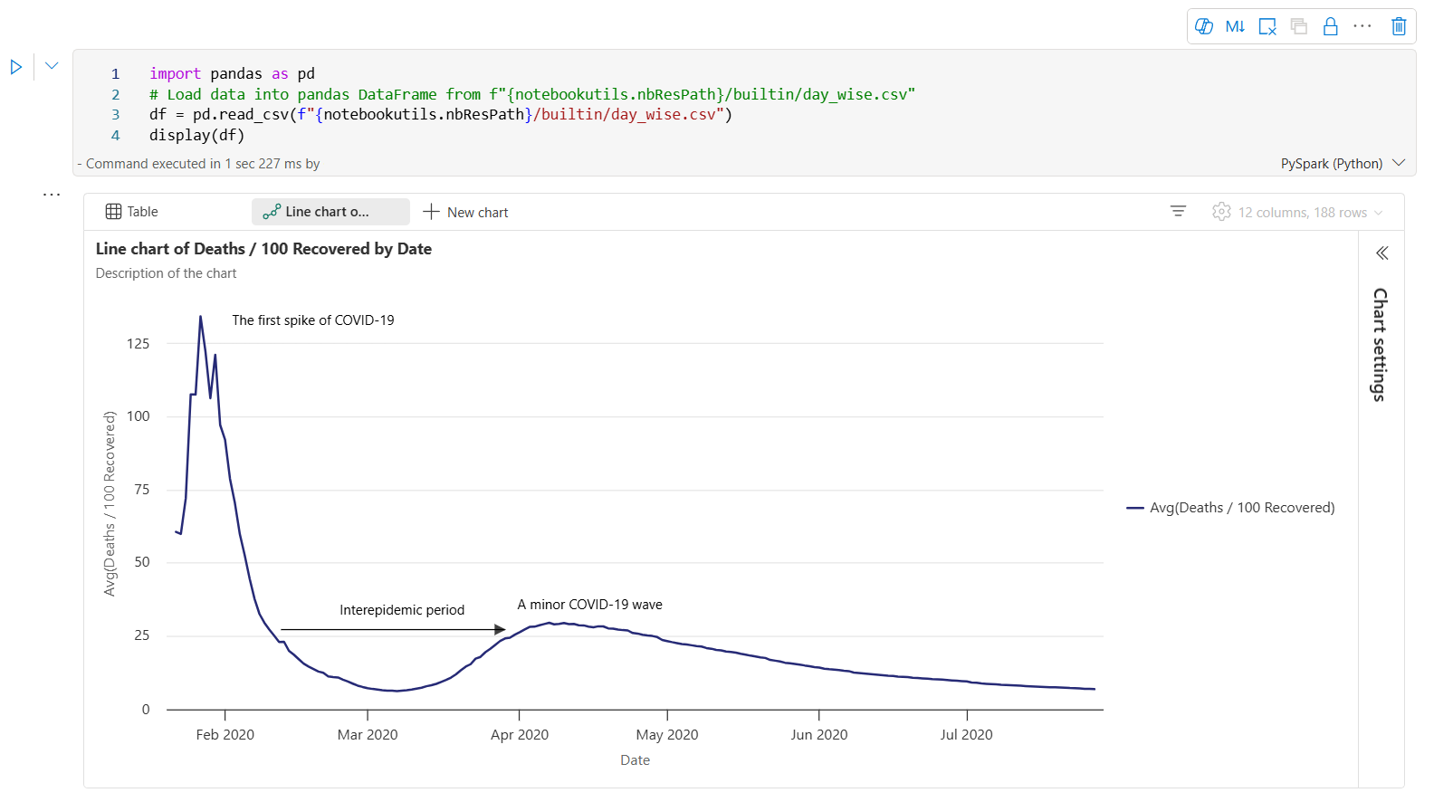
대화형 도구 모음은 사용자가 차트를 가리키면 새 차트 환경에서 사용할 수 있습니다. 확대, 축소, 확대/축소 선택, 다시 설정, 이동, 주석 편집 등과 같은 작업을 지원합니다.
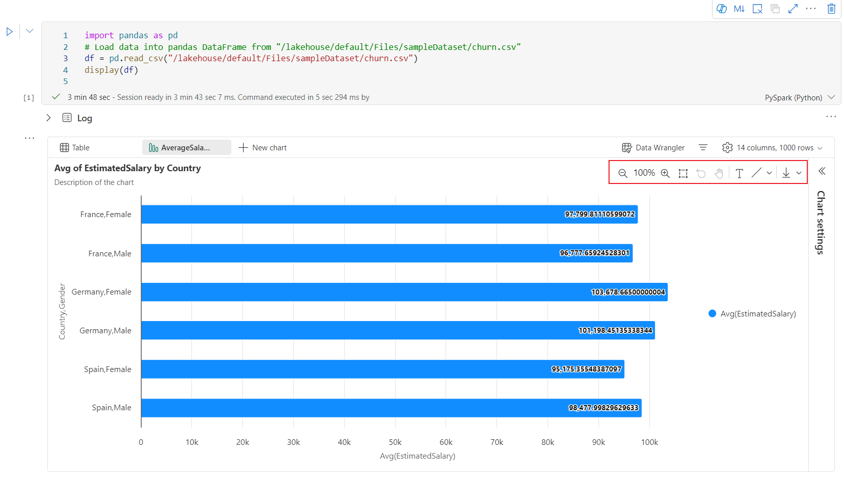
다음은 차트 주석의 예입니다.


display() 요약 보기
display(df, summary = true)를 사용하여 지정된 Apache Spark DataFrame의 통계 요약을 확인합니다. 요약에는 열 이름, 열 형식, 고유 값 및 각 열에 대한 누락된 값이 포함됩니다. 특정 열을 선택하여 최소값, 최대값, 평균값, 표준 편차를 확인할 수도 있습니다.

displayHTML() 옵션
Fabric Notebook은 displayHTML 함수를 사용하여 HTML 그래픽을 지원합니다.
다음 이미지는 D3.js를 사용하여 시각화를 만드는 방법의 예제입니다.

다음 코드를 실행하여 시각화를 만듭니다.
displayHTML("""<!DOCTYPE html>
<meta charset="utf-8">

<!-- Load d3.js -->
<script src="https://d3js.org/d3.v4.js"></script>

<!-- Create a div where the graph will take place -->
<div id="my_dataviz"></div>
<script>

// set the dimensions and margins of the graph
var margin = {top: 10, right: 30, bottom: 30, left: 40},
  width = 400 - margin.left - margin.right,
  height = 400 - margin.top - margin.bottom;

// append the svg object to the body of the page
var svg = d3.select("#my_dataviz")
.append("svg")
  .attr("width", width + margin.left + margin.right)
  .attr("height", height + margin.top + margin.bottom)
.append("g")
  .attr("transform",
        "translate(" + margin.left + "," + margin.top + ")");

// Create Data
var data = [12,19,11,13,12,22,13,4,15,16,18,19,20,12,11,9]

// Compute summary statistics used for the box:
var data_sorted = data.sort(d3.ascending)
var q1 = d3.quantile(data_sorted, .25)
var median = d3.quantile(data_sorted, .5)
var q3 = d3.quantile(data_sorted, .75)
var interQuantileRange = q3 - q1
var min = q1 - 1.5 * interQuantileRange
var max = q1 + 1.5 * interQuantileRange

// Show the Y scale
var y = d3.scaleLinear()
  .domain([0,24])
  .range([height, 0]);
svg.call(d3.axisLeft(y))

// a few features for the box
var center = 200
var width = 100

// Show the main vertical line
svg
.append("line")
  .attr("x1", center)
  .attr("x2", center)
  .attr("y1", y(min) )
  .attr("y2", y(max) )
  .attr("stroke", "black")

// Show the box
svg
.append("rect")
  .attr("x", center - width/2)
  .attr("y", y(q3) )
  .attr("height", (y(q1)-y(q3)) )
  .attr("width", width )
  .attr("stroke", "black")
  .style("fill", "#69b3a2")

// show median, min and max horizontal lines
svg
.selectAll("toto")
.data([min, median, max])
.enter()
.append("line")
  .attr("x1", center-width/2)
  .attr("x2", center+width/2)
  .attr("y1", function(d){ return(y(d))} )
  .attr("y2", function(d){ return(y(d))} )
  .attr("stroke", "black")
</script>

"""
)
Notebook에 Power BI 보고서 포함
중요한
이 기능은 프리뷰 상태입니다.
이제 Powerbiclient Python 패키지는 Fabric Notebook에서 기본적으로 지원됩니다. Fabric Notebook Spark 런타임 3.4에서 추가 설정(예: 인증 프로세스)을 수행할 필요가 없습니다.
powerbiclient를 가져와서 탐색을 계속하기만 하면 됩니다. powerbiclient 패키지를 사용하는 방법에 대한 자세한 내용은 powerbiclient 설명서를 참조하세요.
Powerbiclient는 다음과 같은 주요 기능을 지원합니다.
기존 Power BI 보고서 렌더링
몇 줄의 코드만으로 Notebook에서 Power BI 보고서를 쉽게 포함하고 상호 작용할 수 있습니다.
다음 이미지는 기존 Power BI 보고서를 렌더링하는 예제입니다.

다음 코드를 실행하여 기존 Power BI 보고서를 렌더링합니다.
from powerbiclient import Report

report_id="Your report id"
report = Report(group_id=None, report_id=report_id)

report
Spark DataFrame에서 보고서 시각적 개체 만들기
Notebook에서 Spark DataFrame을 사용하여 통찰력 있는 시각화를 신속하게 생성할 수 있습니다. 포함된 보고서에서 저장을 선택하여 대상 작업 영역에서 보고서 항목을 만들 수도 있습니다.
다음 이미지는 Spark DataFrame의 QuickVisualize()의 예제입니다.

다음 코드를 실행하여 Spark DataFrame에서 보고서를 렌더링합니다.
# Create a spark dataframe from a Lakehouse parquet table
sdf = spark.sql("SELECT * FROM testlakehouse.table LIMIT 1000")

# Create a Power BI report object from spark data frame
from powerbiclient import QuickVisualize, get_dataset_config
PBI_visualize = QuickVisualize(get_dataset_config(sdf))

# Render new report
PBI_visualize
pandas DataFrame에서 보고서 시각적 개체 만들기
Notebook에서 pandas DataFrame을 기반으로 보고서를 만들 수도 있습니다.
다음 이미지는 pandas DataFrame의 QuickVisualize()의 예입니다.

다음 코드를 실행하여 Spark DataFrame에서 보고서를 렌더링합니다.
import pandas as pd

# Create a pandas dataframe from a URL
df = pd.read_csv("https://raw.githubusercontent.com/plotly/datasets/master/fips-unemp-16.csv")

# Create a pandas dataframe from a Lakehouse csv file
from powerbiclient import QuickVisualize, get_dataset_config

# Create a Power BI report object from your data
PBI_visualize = QuickVisualize(get_dataset_config(df))

# Render new report
PBI_visualize
인기 있는 라이브러리
데이터 시각화와 관련하여 Python은 다양한 기능이 포함된 여러 그래프 라이브러리를 제공합니다. 기본적으로 Fabric의 모든 Apache Spark 풀에는 엄선된 인기 오픈 소스 라이브러리 세트가 포함되어 있습니다.
Matplotlib
각 라이브러리에 기본 제공되는 렌더링 함수를 사용하여 Matplotlib 같은 표준 그리기 라이브러리를 렌더링할 수 있습니다.
다음 이미지는 Matplotlib를 사용하여 막대형 차트를 만드는 방법의 예제입니다.


다음 샘플 코드를 실행하여 이 가로 막대 차트를 그립니다.
# Bar chart

import matplotlib.pyplot as plt

x1 = [1, 3, 4, 5, 6, 7, 9]
y1 = [4, 7, 2, 4, 7, 8, 3]

x2 = [2, 4, 6, 8, 10]
y2 = [5, 6, 2, 6, 2]

plt.bar(x1, y1, label="Blue Bar", color='b')
plt.bar(x2, y2, label="Green Bar", color='g')
plt.plot()

plt.xlabel("bar number")
plt.ylabel("bar height")
plt.title("Bar Chart Example")
plt.legend()
plt.show()
보케 (Bokeh)
displayHTML(df)를 사용하여 HTML 또는 Bokeh와 같은 인터랙티브 라이브러리를 렌더링할 수 있습니다.
다음 이미지는 빛망울을 사용하여 지도 위에 문자 모양을 그리는 예입니다.

이 이미지를 그리려면 다음 샘플 코드를 실행합니다.
from bokeh.plotting import figure, output_file
from bokeh.tile_providers import get_provider, Vendors
from bokeh.embed import file_html
from bokeh.resources import CDN
from bokeh.models import ColumnDataSource

tile_provider = get_provider(Vendors.CARTODBPOSITRON)

# range bounds supplied in web mercator coordinates
p = figure(x_range=(-9000000,-8000000), y_range=(4000000,5000000),
           x_axis_type="mercator", y_axis_type="mercator")
p.add_tile(tile_provider)

# plot datapoints on the map
source = ColumnDataSource(
    data=dict(x=[ -8800000, -8500000 , -8800000],
              y=[4200000, 4500000, 4900000])
)

p.circle(x="x", y="y", size=15, fill_color="blue", fill_alpha=0.8, source=source)

# create an html document that embeds the Bokeh plot
html = file_html(p, CDN, "my plot1")

# display this html
displayHTML(html)
플롯(Plotly)
displayHTML()을 사용하여 Plotly 같은 대화형 라이브러리 또는 HTML을 렌더링할 수 있습니다.
이 이미지를 그리려면 다음 샘플 코드를 실행합니다.

from urllib.request import urlopen
import json
with urlopen('https://raw.githubusercontent.com/plotly/datasets/master/geojson-counties-fips.json') as response:
    counties = json.load(response)

import pandas as pd
df = pd.read_csv("https://raw.githubusercontent.com/plotly/datasets/master/fips-unemp-16.csv",
                   dtype={"fips": str})

import plotly
import plotly.express as px

fig = px.choropleth(df, geojson=counties, locations='fips', color='unemp',
                           color_continuous_scale="Viridis",
                           range_color=(0, 12),
                           scope="usa",
                           labels={'unemp':'unemployment rate'}
                          )
fig.update_layout(margin={"r":0,"t":0,"l":0,"b":0})

# create an html document that embeds the Plotly plot
h = plotly.offline.plot(fig, output_type='div')

# display this html
displayHTML(h)
팬더
pandas DataFrames의 HTML 출력을 기본 출력으로 볼 수 있습니다. Fabric Notebook은 스타일이 지정된 HTML 콘텐츠를 자동으로 표시합니다.

import pandas as pd
import numpy as np

df = pd.DataFrame([[38.0, 2.0, 18.0, 22.0, 21, np.nan],[19, 439, 6, 452, 226,232]],

                  index=pd.Index(['Tumour (Positive)', 'Non-Tumour (Negative)'], name='Actual Label:'),

                  columns=pd.MultiIndex.from_product([['Decision Tree', 'Regression', 'Random'],['Tumour', 'Non-Tumour']], names=['Model:', 'Predicted:']))

df