Designing your Microsoft Teams app with UI templates
Design your Microsoft Teams app faster with UI templates. The templates are a collection of Fluent UI-based components that work across common Teams use cases, giving you more time to figure out the best experience for your users.
Getting started with tools and samples
The following resources can help you design and develop your app using UI templates.
Microsoft Teams UI Kit
Grab UI templates for your app design from the Microsoft Teams UI Kit, which also includes extensive information about usage, anatomy, accessibility, and best practices.
The app playbooks and UI templates are also available to help you get started for the apps extended across Microsoft 365.
Fluent UI React components
View and test individual Fluent UI React components in your browser.
Sample app
Install a sample app to see how UI templates look and behave within Teams contexts.
Calendar
In Teams, a calendar is where a user views, schedules, and manages upcoming and past events for themselves or a group.
Top use cases
- Schedule meetings and events
- Get reminders of upcoming meetings and events
- View schedules
Desktop
Dashboard
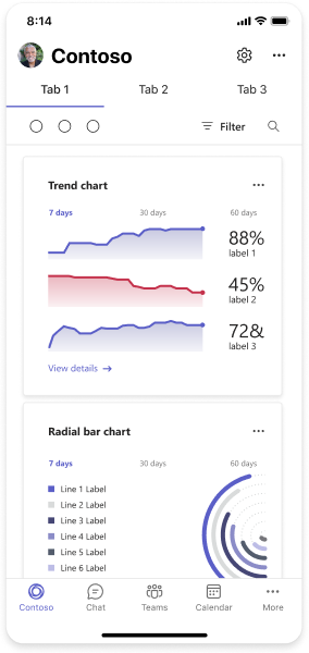
A dashboard displays different types of content in a central location (such as a Teams personal app or tab). Users should be able to customize at least some of what they see on a dashboard.
Top use cases
- Analyze data
- Report metrics
- Organize different information in one place
Mobile
Desktop
Data visualization
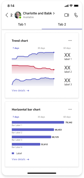
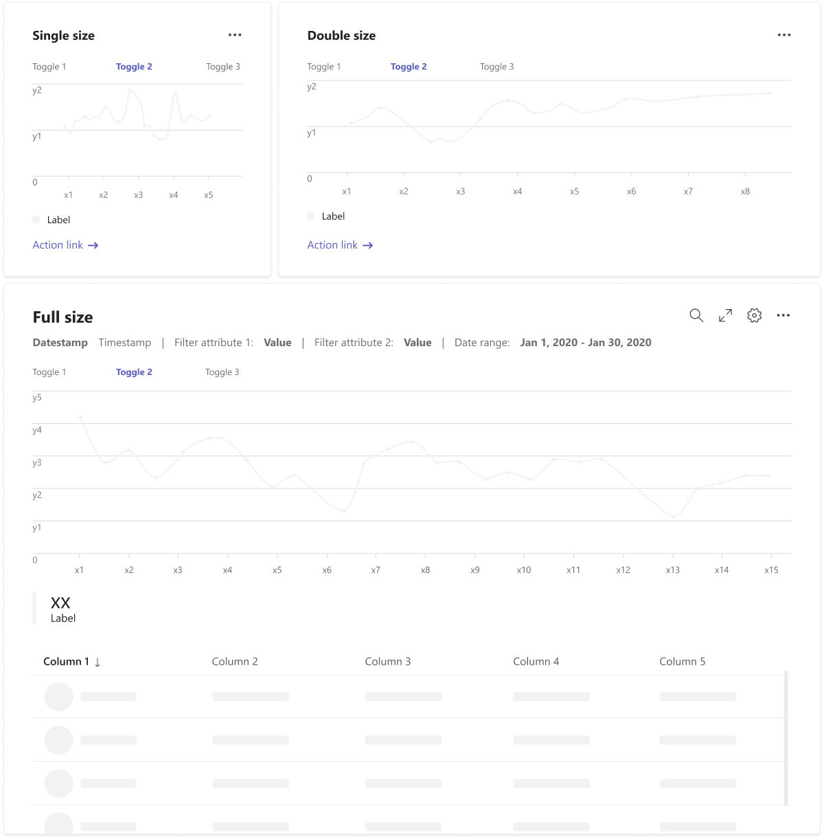
You can use different card sizes (single, double, and full) to stack and organize data visualizations on the same page. The cards scale to fit the column layout and fill in blank spaces.
Top use cases
- Display complex information
- Create a dashboard
Mobile
Desktop
Empty state
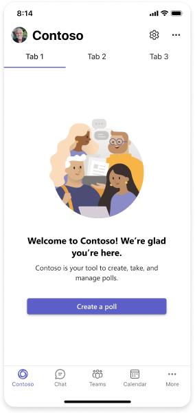
The empty state template can be used for many scenarios, including sign in, first-run experiences, error messages, and more. It's highly flexible—adapt it to use one, a few, or all of the components in the following design.
Top use cases
- Sign in
- Welcome messages and first-run experiences
- Success messages
- Error messages
Mobile
Desktop
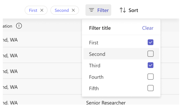
Filter
A filter allows you to reduce the information you see based on the criteria selected. You can include filters with tables, lists, cards, and other components that organize content.
Top use cases
Organizing content in:
- Lists
- Tables
- Dashboards
- Data visualization
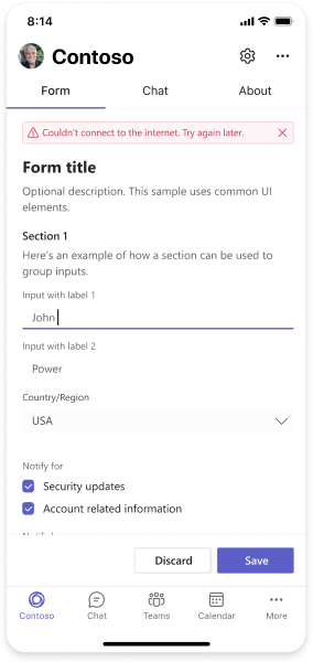
Form
Forms are used to collect, validate, and submit user input in a structured way. Clear labeling and logical groupings of input fields are critical for a good user experience.
Top use cases
- Sign in
- User profiles
- Settings
- User input collection
Mobile
Desktop
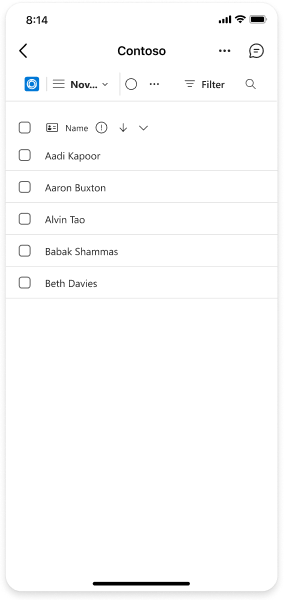
List
You can use a list to display related items in a scannable format and allow users to take actions on an entire list or individual items.
Top use cases
- Display data
- Contextual actions on app content
Mobile
Desktop
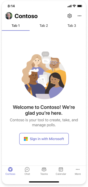
Sign in
You can design app sign-in flows for different Teams contexts and identity providers. The following example includes single sign-on (SSO), which we recommend for the simplest authentication experience.
Top use case
Authenticate users
Mobile
Desktop
Settings
Settings screens are where users can configure their preferences with your app.
Note
Settings is a container for basic UI components.
Top use case
Manage app features
Task board
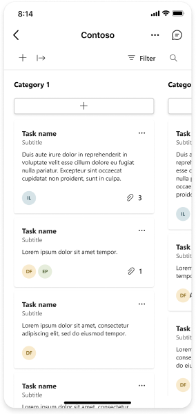
A task board, sometimes called a kanban board or swim lanes, is a collection of cards often used to track the status of work items or tickets. It can also be used to sort any type of content into categories. You can edit and move the cards between columns.
Top use cases
- Project management. Assigning tasks and tracking status.
- Brainstorming. Adding ideas in different categories.
- Sorting exercises. Organizing any kind of information into buckets.
Mobile
Desktop
Wizard
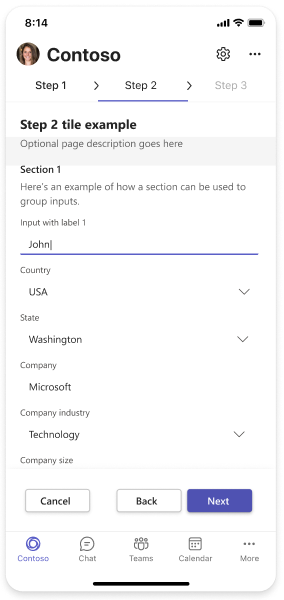
A wizard guides a user through several screens to complete a task (such as a setup process).
Top use cases
- Setup
- Onboarding
- First-run experiences
Mobile
Desktop
See also
Platform Docs


