Design your tab for Microsoft Teams
A tab is a large canvas for your app content. To guide your app design, the following information describes and illustrates how people can add, use, and manage tabs in Teams.
Microsoft Teams UI Kit
You can find comprehensive tab design guidelines, including elements that you can grab and modify as needed, in the Microsoft Teams UI Kit. The UI kit also has essential topics such as accessibility and responsive sizing that aren't covered here.
Add a tab
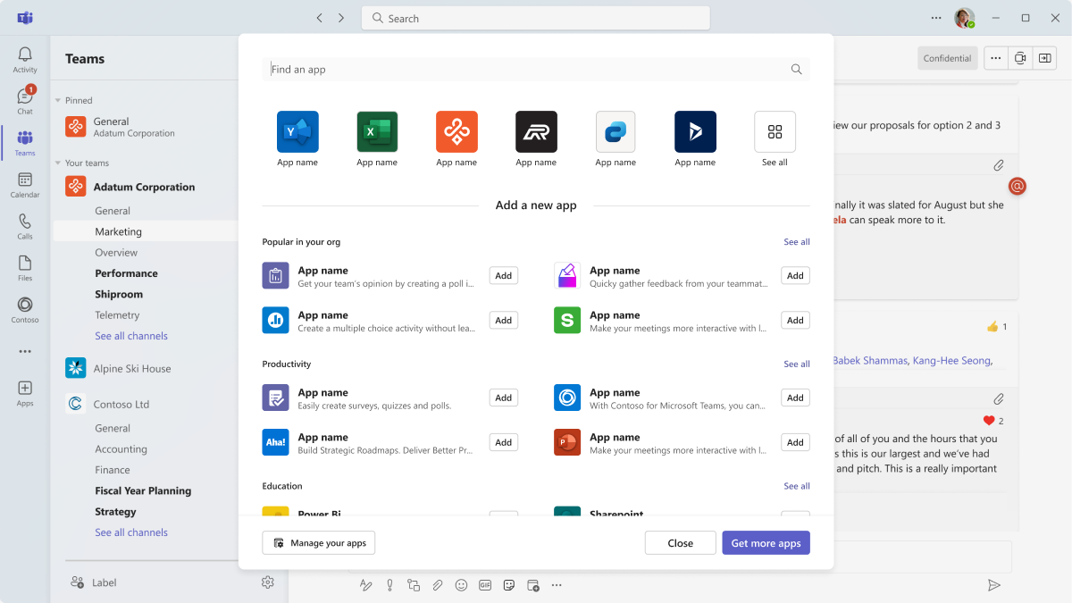
You can add a tab from the Microsoft Teams Store (AppSource) or in one of the following contexts:
- Chat
- Channel
- Meeting (before, during, or after the meeting)
Mobile
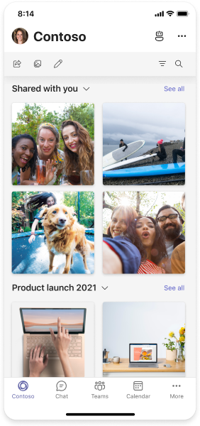
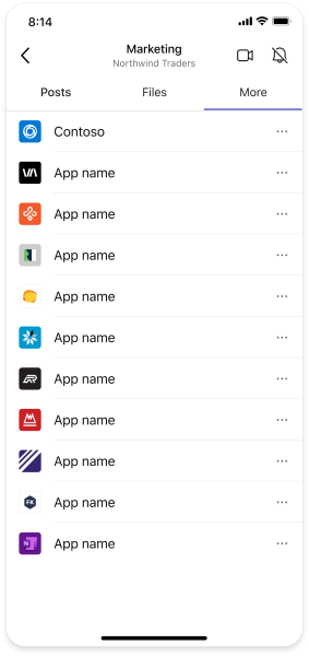
Users can access tabs by selecting the More button in the channel (example below) or chat in which they've been added.
Desktop
The following example shows how users can add a tab in a channel.
Set up a tab
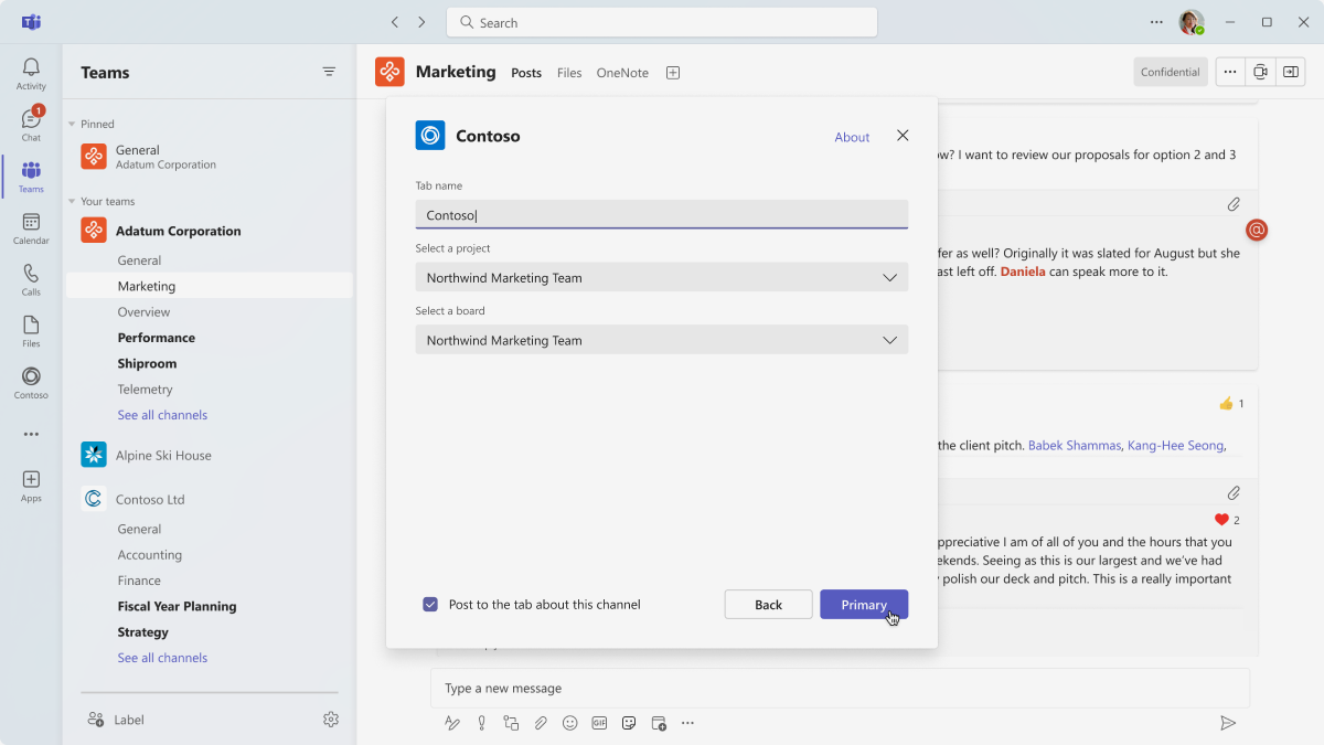
There's a short setup process to add an app as a channel, chat, or meeting tab. The experience is largely up to you. For example, you could have a description of how to use the app and some optional settings. Include a sign-in step here if you need to authenticate users.
Tab configuration dialog
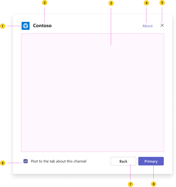
Anatomy: Tab configuration dialog
| Counter | Description |
|---|---|
| 1 | App logo: Full color app logo of your app. |
| 2 | App name: Full name of your app. |
| 3 | iframe: Responsive space for your app’s content (for example, tab settings or authentication). |
| 4 | About link: Opens a dialog showing more information about the app, such as a full description, permissions required by the app, and links to your privacy policy and terms of service. |
| 5 | Close button: Closes the dialog. |
| 6 | Notify team members option: The dialog asks users if they want to create a post letting others know they added a tab. |
| 7 | Back button: Goes to the previous step based on where the dialog opened. |
| 8 | Save button: Completes tab setup. |
Tab authentication with single sign-on
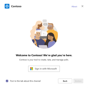
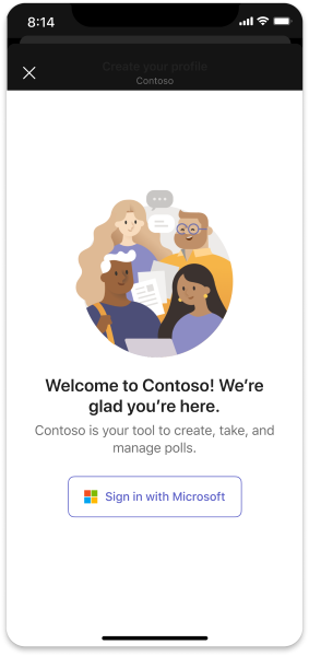
You can add a step in which users must first sign in with their Microsoft credentials. This authentication method is called single sign-on (SSO).
Desktop
Mobile
Design a tab setup with UI templates
Use one of the following Teams UI templates to help design your tab setup experience:
- List: Lists can display related items in a scannable format and allow users to take actions on an entire list or individual items.
- Form: Forms are for collecting, validating, and submitting user input in a structured way.
- Empty state: The empty state template can be used for many scenarios, including sign in, first-run experiences, error messages, and more.
View a tab
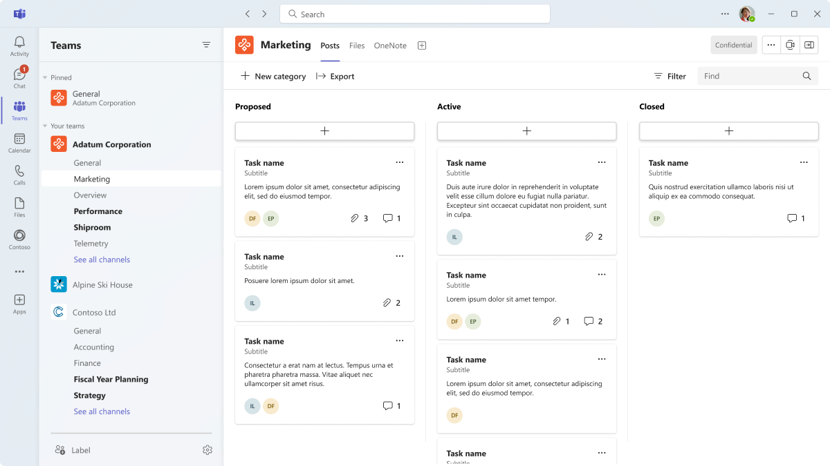
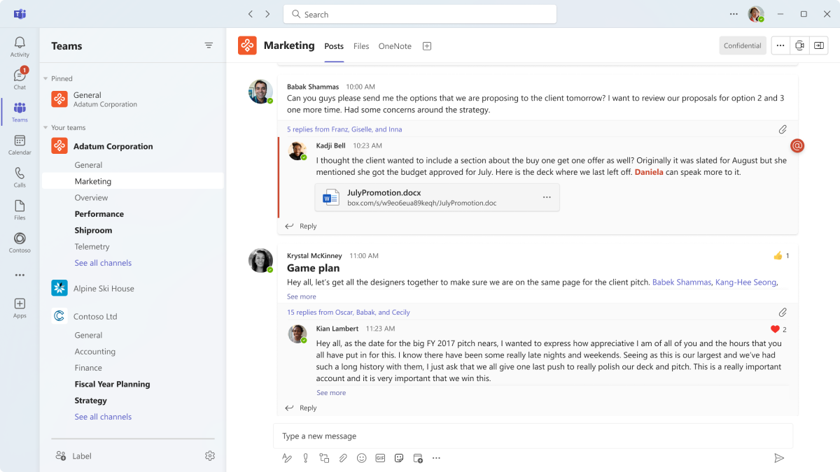
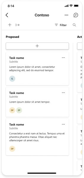
Tabs provide a full-screen web experience in Teams where you can display collaborative content—such task boards and dashboards—and important information.
Mobile
Desktop
Anatomy: Tab
Mobile
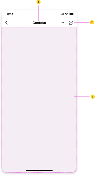
| Counter | Description |
|---|---|
| 1 | Tab name: Navigation label for your tab. |
| 2 | Tab chat: Opens a chat that allows users to have a conversation next to the content. |
| 3 | webview: Displays your app content. |
Desktop
| Counter | Description |
|---|---|
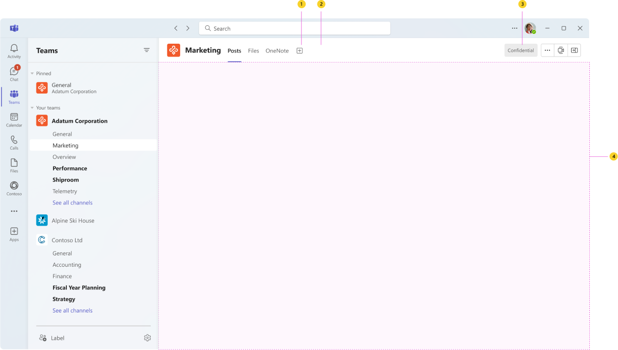
| 1 | Tab name: Navigation label for your tab. |
| 2 | Tab overflow: Opens tab actions, such as rename and remove. |
| 3 | Tab chat: Opens a chat to the right, allowing users to have a conversation next to the content. |
| 4 | iframe: Displays your app content. |
Design a tab with UI templates and advanced components
Use one of the following Teams templates and components to help design your tab experience:
- List: Lists can display related items in a scannable format and allow users to take actions on an entire list or individual items.
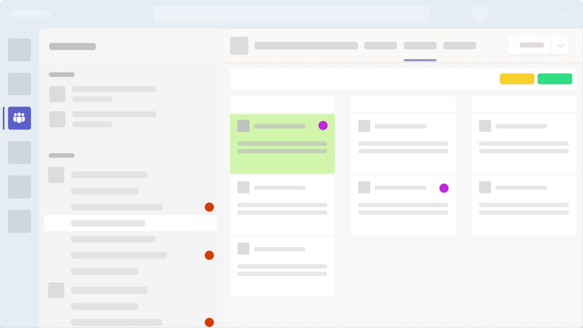
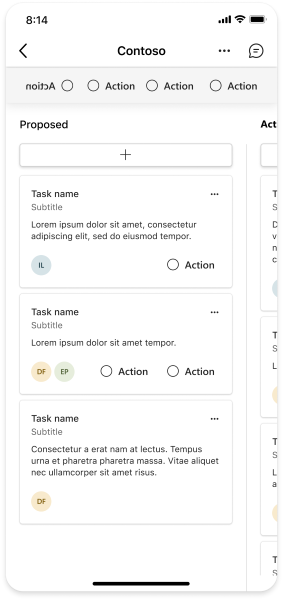
- Task board: A task board, sometimes called a kanban board or swim lanes, is a collection of cards often used to track the status of work items or tickets.
- Dashboard: A dashboard is a canvas containing multiple cards that provide an overview of data or content.
- Form: Forms are for collecting, validating, and submitting user input in a structured way.
- Empty state: The empty state template can be used for many scenarios, including sign in, first-run experiences, error messages, and more.
- Left nav: The left nav component can help if your tab requires some navigation. In general, you should keep tab navigation to a minimum.
Use a tab to collaborate
Tabs help facilitate conversations about content in a central location.
Thread discussion
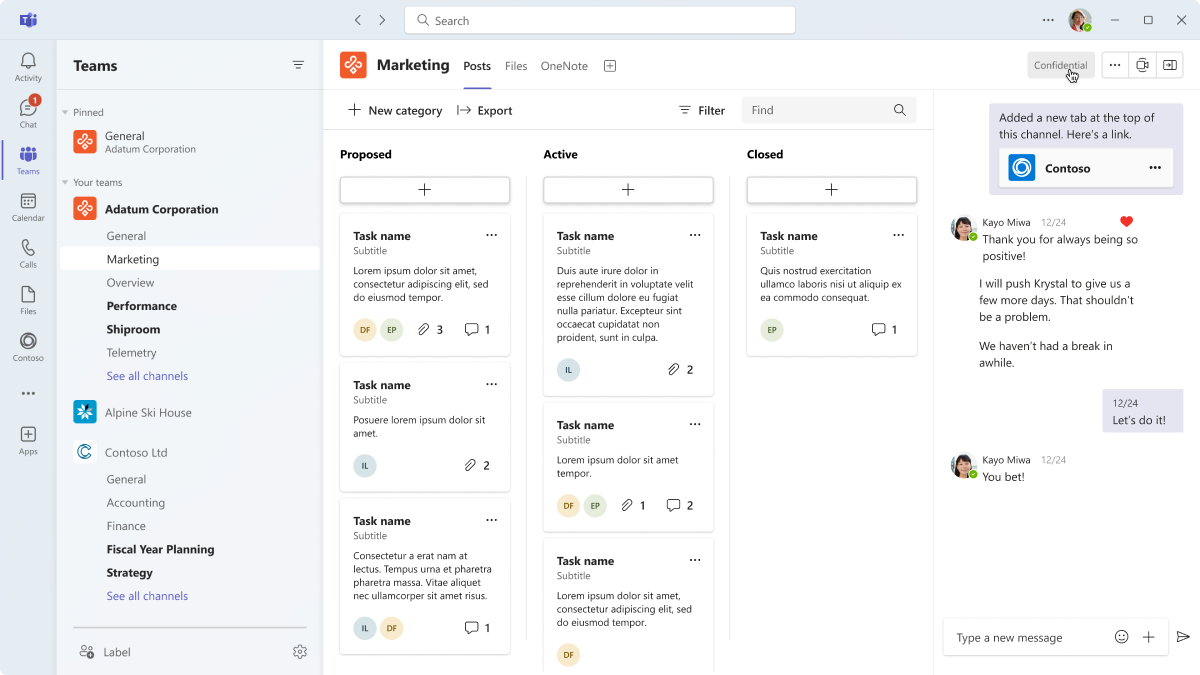
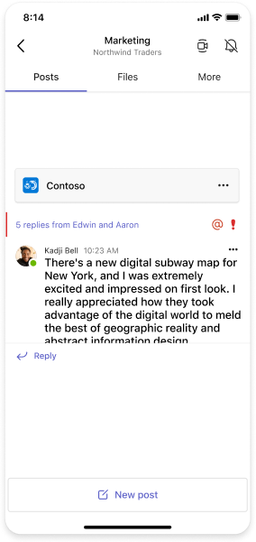
Users can automatically post to a channel or chat once they’ve added a new tab. This not only notifies team members of the new content and provides a link to tab, it allows people to start talking about the tab.
Mobile
Desktop
Tab chat
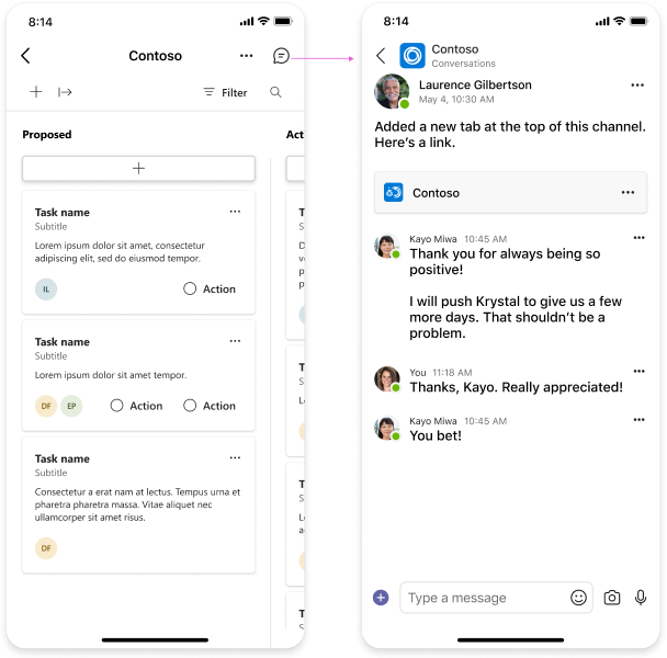
Users can have a conversation next to the tab content they're viewing. On desktop, the chat opens to the side of the app content.
Mobile
Desktop
Permissions and role-based views
The tab experience may be different for users depending on their permissions. For example, one user can access the tab without having to sign in. Another user, however, must sign in and see slightly different content.
Manage a tab
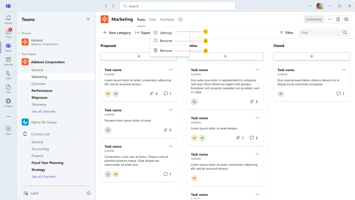
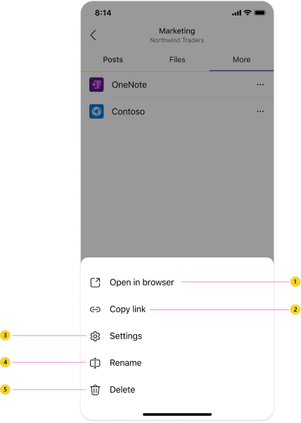
You can include options to rename, remove, or modify a tab.
Anatomy: Tab menu
Mobile
| Counter | Description |
|---|---|
| 1 | Open in browser: Opens the app in the device’s default browser. |
| 2 | Copy link: Users can copy and share a link to the tab. |
| 3 | Settings: (Optional) Modify a tab’s settings after it's been added. |
| 4 | Rename: Users can give the tab a name that's meaningful to the channel, chat, or meeting. |
| 5 | Delete: Removes the tab from the channel, chat, or meeting. |
Desktop
| Counter | Description |
|---|---|
| 1 | Settings: (Optional) Allows users to modify a tab’s settings after it’s been added. |
| 2 | Rename: Users can give the tab a name that’s meaningful to the channel, chat, or meeting. |
| 3 | Remove: Removes the tab from the channel, chat, or meeting. |
Tab notifications and deep linking
You can send a message with a deep link to your tab. For example, a card shows a summary of bug data a user can select to see the entire bug in a tab. Sending messages about tab activity increases awareness without explicitly notifying everyone (i.e., activity without noise). You also can @mention specific users if needed.
Notify users of tab activity one of the following ways:
- Bot: This method is preferred especially if the tab thread is targeted. The tab’s threaded conversation is moved into view as recently active. This method also allows for some sophistication in how the notification is sent.
- Message: A message shows up in the user’s activity feed with a deep link to the tab.
Best practices
Use these recommendations to create a quality app experience:
Desktop
Collaboration
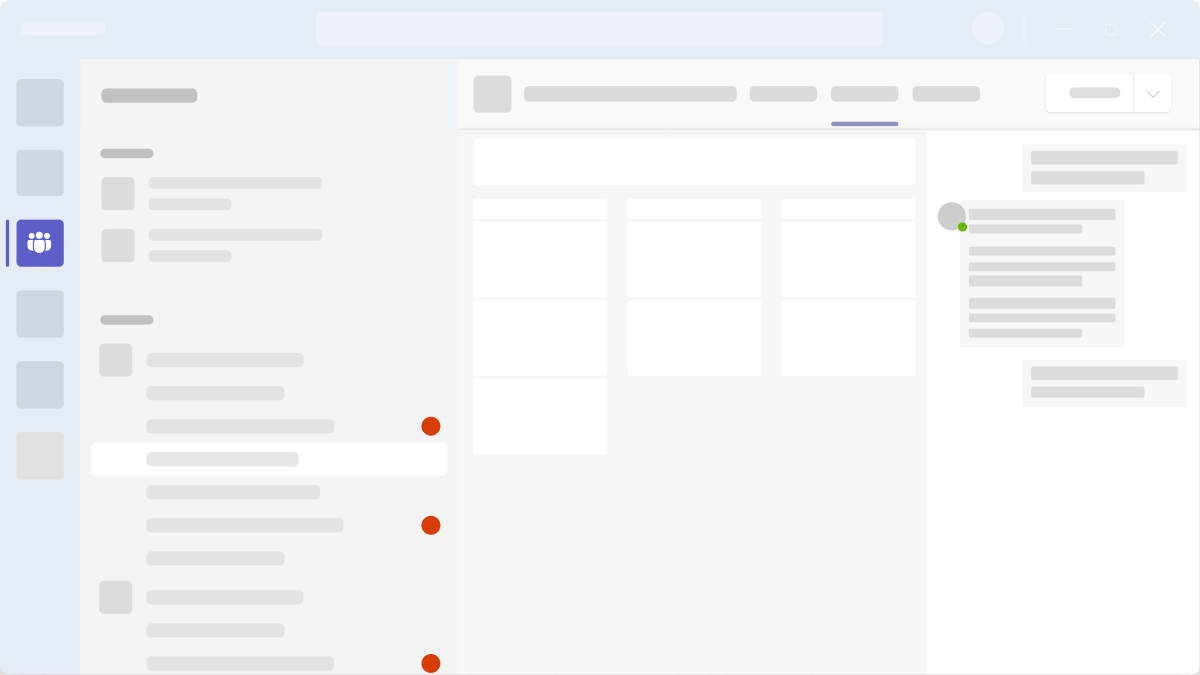
Do: Facilitate conversation
Include content and components people can talk about. If it doesn’t fit within the context of a chat, channel, or meeting, it doesn’t belong in your tab.
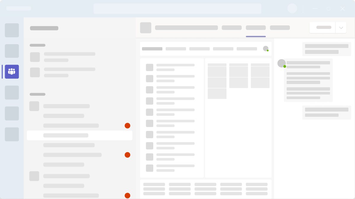
Don't: Treat your tab like any other webpage
A tab isn’t a webpage someone might view once. A tab should display your most important, relevant content that people need to accomplish something together.
Navigation
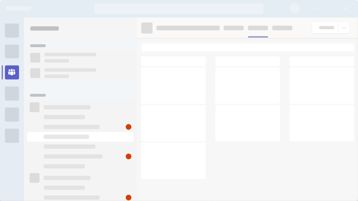
Do: Limit tasks and data
Tabs work best when they address specific needs. Include a limited set of tasks and data relevant to the team or group.
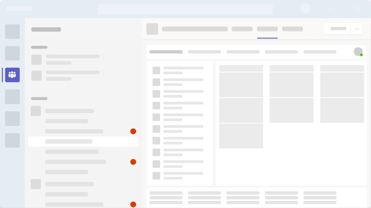
Don't: Embed your entire app
Using a tab to display an entire app with multi-level navigation and complex interactions leads to information overload.
Setup
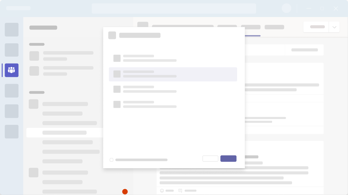
Do: Keep it simple
If your app requires authentication, try integrating Microsoft single sign-on (SSO) for a more seamless sign-in experience. Also, only include essential information and steps to add the tab.
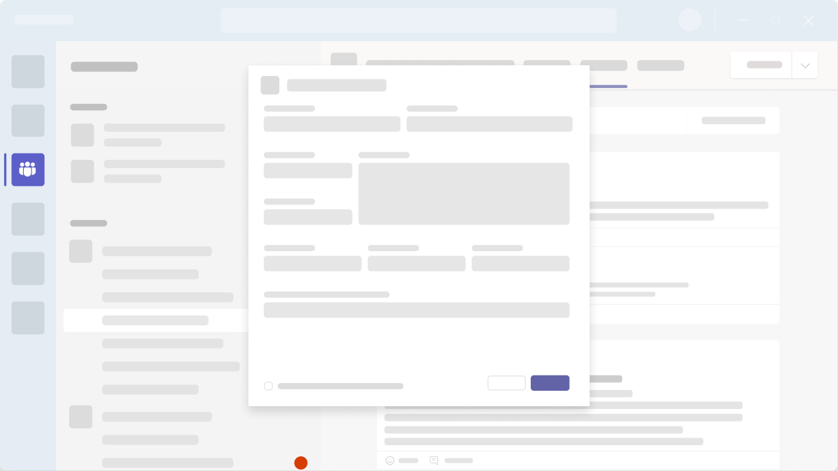
Don't: Have too many steps
Remove any unnecessary steps for adding a tab.
Theming
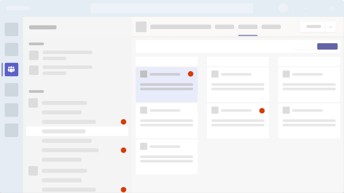
Do: Take advantage of Teams color tokens
Each Teams theme has its own color scheme. To handle theme changes automatically, use color tokens (Fluent UI) in your design.
Don't: Hard code color values
If you don’t use Teams color tokens, your designs will be less scalable and take more time to manage.
Mobile

See also
Platform Docs
