이 항목에서는 Windows 애플리케이션의 명령에 대해 설명합니다. 특히 사용 중인 디바이스 및 입력 형식에 관계없이 XamlUICommand 및 StandardUICommand 클래스(ICommand 인터페이스와 함께)를 사용하여 다양한 컨트롤 형식에서 명령을 공유하고 관리하는 방법에 대해 설명합니다.
디바이스 및 입력 유형에 관계없이 다양한 컨트롤에서 명령 공유
중요 API
개요
단추를 클릭하거나 상황에 맞는 메뉴에서 항목을 선택하는 것과 같은 UI 상호 작용을 통해 명령을 직접 호출할 수 있습니다. 키보드 가속기, 제스처, 음성 인식 또는 자동화/접근성 도구와 같은 입력 디바이스를 통해 간접적으로 호출할 수도 있습니다. 호출되면 컨트롤(편집 컨트롤의 텍스트 탐색), 창(뒤로 탐색) 또는 애플리케이션(종료)에서 명령을 처리할 수 있습니다.
명령은 텍스트 삭제 또는 작업 실행 취소와 같은 앱 내의 특정 컨텍스트에서 작동하거나 오디오 음소거 또는 밝기 조정과 같은 컨텍스트가 없을 수 있습니다.
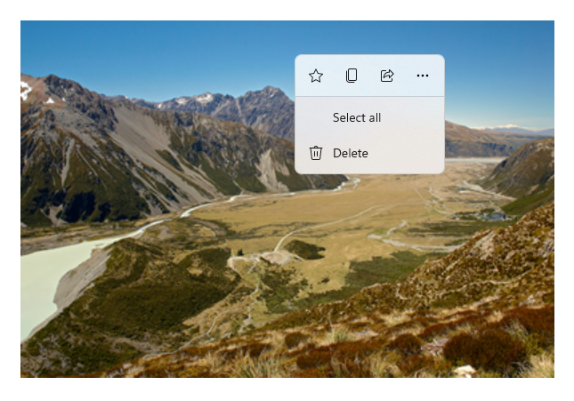
다음 이미지는 동일한 명령 중 일부를 공유하는 두 개의 명령 인터페이스( CommandBar 및 부동 컨텍스트 CommandBarFlyout)를 보여 줍니다.
명령 모음
Microsoft 사진 갤러리의 상황에 맞는 메뉴
명령 상호 작용
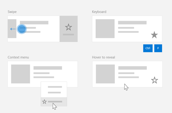
명령이 호출되는 방식에 영향을 줄 수 있는 다양한 디바이스, 입력 형식 및 UI 화면으로 인해 가능한 한 많은 명령 화면을 통해 명령을 노출하는 것이 좋습니다. 살짝 밀기, 메뉴 바, 명령 모음, 명령 모음 플라이아웃, 및 기존 상황에 맞는 메뉴의 조합이 포함될 수 있습니다.
중요한 명령의 경우 입력별 가속기를 사용합니다. 입력 가속기를 사용하면 사용자가 사용 중인 입력 디바이스에 따라 작업을 더 빠르게 수행할 수 있습니다.
다음은 다양한 입력 형식에 대한 몇 가지 일반적인 입력 가속기입니다.
- 포인터 - 마우스 및 펜 가리키기 단추
- 키보드 - 바로 가기 키(액세스 키 및 액셀러레이터 키)
- 터치 - 스와이프
- 터치 - 데이터를 새로 고치려면 끌어오기
애플리케이션의 기능을 범용으로 액세스할 수 있도록 하려면 입력 유형 및 사용자 환경을 고려해야 합니다. 예를 들어 컬렉션(특히 사용자가 편집할 수 있는 컬렉션)에는 일반적으로 입력 디바이스에 따라 매우 다르게 수행되는 다양한 특정 명령이 포함됩니다.
다음 표에서는 몇 가지 일반적인 컬렉션 명령 및 이러한 명령을 노출하는 방법을 보여 줍니다.
| Command | 입력에 구애받지 않습니다. | 마우스 가속기 | 키보드 가속기 | 터치 가속기 |
|---|---|---|---|---|
| 항목 삭제 | 상황에 맞는 메뉴 | 호버 버튼 | DEL 키 | 살짝 밀어 삭제 |
| 플래그 항목 | 상황에 맞는 메뉴 | 호버 버튼 | Ctrl+Shift+G | 플래그로 표시하려면 스와이프하세요 |
| 데이터 새로 고침 | 상황에 맞는 메뉴 | N/A | F5 키 | 당겨서 새로 고침 |
| 항목 즐겨찾기 | 상황에 맞는 메뉴 | 호버 버튼 | F, Ctrl+S | 즐겨찾기로 스와이프 |
항상 상황에 맞는 메뉴 제공 모든 입력 형식에 대해 모두 지원되기 때문에 기존의 상황에 맞는 메뉴 또는 CommandBarFlyout에 모든 관련 컨텍스트 명령을 포함하는 것이 좋습니다. 예를 들어 포인터 가리키기 이벤트 중에만 명령이 노출되면 터치 전용 디바이스에서 사용할 수 없습니다.
Windows 애플리케이션의 명령
Windows 애플리케이션에서 명령 환경을 공유하고 관리할 수 있는 몇 가지 방법이 있습니다. 코드 숨김(UI의 복잡성에 따라 매우 비효율적일 수 있음)에서 Click과 같은 표준 상호 작용에 대한 이벤트 처리기를 정의하거나, 표준 상호 작용에 대한 이벤트 수신기를 공유 처리기에 바인딩하거나, 컨트롤의 Command 속성을 명령 논리를 설명하는 ICommand 구현에 바인딩할 수 있습니다.
명령 화면에서 효율적이고 최소한의 코드 중복으로 풍부하고 포괄적인 사용자 환경을 제공하려면 이 항목에 설명된 명령 바인딩 기능을 사용하는 것이 좋습니다(표준 이벤트 처리의 경우 개별 이벤트 항목 참조).
컨트롤을 공유 명령 리소스에 바인딩하려면 ICommand 인터페이스를 직접 구현하거나 XamlUICommand 기본 클래스 또는 StandardUICommand 파생 클래스에서 정의한 플랫폼 명령 중 하나에서 명령을 빌드할 수 있습니다.
- ICommand 인터페이스(Windows.UI.Xaml.Input.ICommand 또는 System.Windows.Input.ICommand)를 사용하면 앱 전체에서 완전히 사용자 지정되고 재사용 가능한 명령을 만들 수 있습니다.
- 또한 XamlUICommand 는 이 기능을 제공하지만 명령 동작, 바로 가기 키(액세스 키 및 액셀러레이터 키), 아이콘, 레이블 및 설명과 같은 기본 제공 명령 속성 집합을 노출하여 개발을 간소화합니다.
- StandardUICommand 는 미리 정의된 속성이 있는 표준 플랫폼 명령 집합 중에서 선택할 수 있도록 하여 작업을 더욱 간소화합니다.
중요합니다
WinUI 애플리케이션에서 명령은 선택한 언어 프레임워크에 따라 Windows.UI.Xaml.Input.ICommand (C++) 또는 System.Windows.Input.ICommand (C#) 인터페이스의 구현입니다.
StandardUICommand 클래스를 사용하는 명령 환경
XamlUICommand(C++용 Windows.UI.Xaml.Input.ICommand 또는 C#용 System.Windows.Input.ICommand에서 파생됨)에서 파생된 StandardUICommand 클래스는 아이콘, 키보드 가속기 및 설명과 같은 미리 정의된 속성이 있는 표준 플랫폼 명령 집합을 노출합니다.
StandardUICommand는 다음과 같은 SaveDelete일반적인 명령을 정의할 수 있는 빠르고 일관된 방법을 제공합니다. execute 및 canExecute 함수만 제공하면 됩니다.
예시
StandardUICommandSample
| 이 예제의 코드 다운로드 |
|---|
| 명령 수행 샘플(StandardUICommand) |
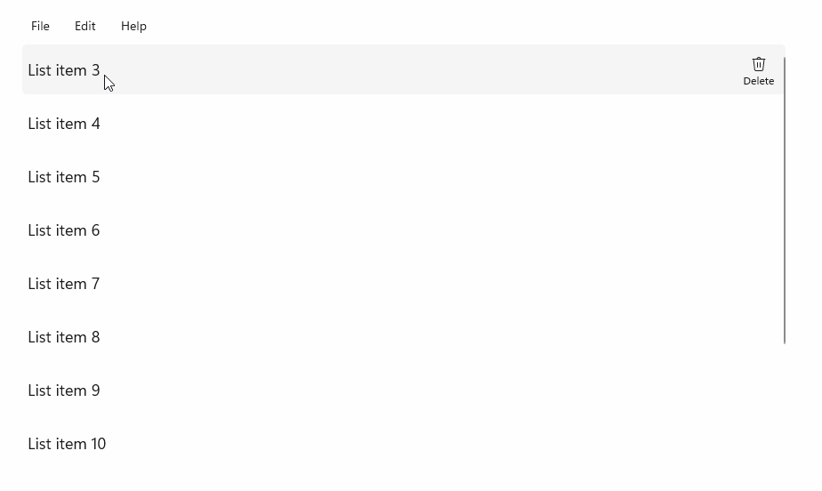
이 예제에서는 StandardUICommand 클래스를 통해 구현된 항목 삭제 명령을 사용하여 기본 ListView를 개선하는 동시에 MenuBar, 살짝 밀기 컨트롤, 가리키기 단추 및 상황에 맞는 메뉴를 사용하여 다양한 입력 형식에 대한 사용자 환경을 최적화하는 방법을 보여 줍니다.
Xaml:
샘플 UI에는 5개 항목의 ListView 가 포함되어 있습니다. StandardUICommand 삭제는 MenuBarItem, SwipeItem, AppBarButton 및 ContextFlyout 메뉴에 바인딩됩니다.
<Page
    x:Class="StandardUICommandSample.MainPage"
    xmlns="http://schemas.microsoft.com/winfx/2006/xaml/presentation"
    xmlns:x="http://schemas.microsoft.com/winfx/2006/xaml"
    xmlns:local="using:StandardUICommandSample"
    xmlns:d="http://schemas.microsoft.com/expression/blend/2008"
    xmlns:mc="http://schemas.openxmlformats.org/markup-compatibility/2006"
    xmlns:muxcontrols="using:Microsoft.UI.Xaml.Controls"
    mc:Ignorable="d"
    Background="{ThemeResource ApplicationPageBackgroundThemeBrush}">

    <Page.Resources>
        <Style x:Key="HorizontalSwipe"
               TargetType="ListViewItem"
               BasedOn="{StaticResource ListViewItemRevealStyle}">
            <Setter Property="Height" Value="60"/>
            <Setter Property="Padding" Value="0"/>
            <Setter Property="HorizontalContentAlignment" Value="Stretch"/>
            <Setter Property="VerticalContentAlignment" Value="Stretch"/>
            <Setter Property="BorderThickness" Value="0"/>
        </Style>
    </Page.Resources>

    <Grid Loaded="ControlExample_Loaded">
        <Grid.RowDefinitions>
            <RowDefinition Height="Auto" />
            <RowDefinition Height="Auto" />
            <RowDefinition Height="*"/>
        </Grid.RowDefinitions>

        <StackPanel Grid.Row="0"
                    Padding="10"
                    BorderThickness="0,0,0,1"
                    BorderBrush="LightBlue"
                    Background="AliceBlue">
            <TextBlock Style="{StaticResource HeaderTextBlockStyle}">
                StandardUICommand sample
            </TextBlock>
            <TextBlock Style="{StaticResource SubtitleTextBlockStyle}" Margin="0,0,0,10">
                This sample shows how to use the StandardUICommand class to
                share a platform command and consistent user experiences
                across various controls.
            </TextBlock>
            <TextBlock Style="{StaticResource SubtitleTextBlockStyle}" Margin="0,0,0,0">
                Specifically, we define a standard delete command and add it
                to a variety of command surfaces, all of which share a common
                icon, label, keyboard accelerator, and description.
            </TextBlock>
        </StackPanel>

        <muxcontrols:MenuBar Grid.Row="1" Padding="10">
            <muxcontrols:MenuBarItem Title="File">
            </muxcontrols:MenuBarItem>
            <muxcontrols:MenuBarItem Title="Edit">
                <MenuFlyoutItem x:Name="DeleteFlyoutItem"/>
            </muxcontrols:MenuBarItem>
            <muxcontrols:MenuBarItem Title="Help">
            </muxcontrols:MenuBarItem>
        </muxcontrols:MenuBar>

        <ListView x:Name="ListViewRight" Grid.Row="2"
                  Loaded="ListView_Loaded"
                  IsItemClickEnabled="True"
                  SelectionMode="Single"
                  SelectionChanged="ListView_SelectionChanged"
                  ItemContainerStyle="{StaticResource HorizontalSwipe}">
            <ListView.ItemTemplate>
                <DataTemplate x:DataType="local:ListItemData">
                    <UserControl PointerEntered="ListViewSwipeContainer_PointerEntered"
                                 PointerExited="ListViewSwipeContainer_PointerExited">
                        <UserControl.ContextFlyout>
                            <MenuFlyout>
                                <MenuFlyoutItem
                                    Command="{x:Bind Command}"
                                    CommandParameter="{x:Bind Text}" />
                            </MenuFlyout>
                        </UserControl.ContextFlyout>
                        <Grid AutomationProperties.Name="{x:Bind Text}">
                            <VisualStateManager.VisualStateGroups>
                                <VisualStateGroup x:Name="HoveringStates">
                                    <VisualState x:Name="HoverButtonsHidden" />
                                    <VisualState x:Name="HoverButtonsShown">
                                        <VisualState.Setters>
                                            <Setter Target="HoverButton.Visibility"
                                                    Value="Visible" />
                                        </VisualState.Setters>
                                    </VisualState>
                                </VisualStateGroup>
                            </VisualStateManager.VisualStateGroups>
                            <SwipeControl x:Name="ListViewSwipeContainer" >
                                <SwipeControl.RightItems>
                                    <SwipeItems Mode="Execute">
                                        <SwipeItem x:Name="DeleteSwipeItem"
                                                   Background="Red"
                                                   Command="{x:Bind Command}"
                                                   CommandParameter="{x:Bind Text}"/>
                                    </SwipeItems>
                                </SwipeControl.RightItems>
                                <Grid VerticalAlignment="Center">
                                    <TextBlock Text="{x:Bind Text}"
                                               Margin="10"
                                               FontSize="18"
                                               HorizontalAlignment="Left"
                                               VerticalAlignment="Center"/>
                                    <AppBarButton x:Name="HoverButton"
                                                  IsTabStop="False"
                                                  HorizontalAlignment="Right"
                                                  Visibility="Collapsed"
                                                  Command="{x:Bind Command}"
                                                  CommandParameter="{x:Bind Text}"/>
                                </Grid>
                            </SwipeControl>
                        </Grid>
                    </UserControl>
                </DataTemplate>
            </ListView.ItemTemplate>
        </ListView>
    </Grid>
</Page>
코드 숨김
- 먼저 ListView의
ListItemData각 ListViewItem에 대한 텍스트 문자열과 ICommand를 포함하는 클래스를 정의합니다.
public class ListItemData
{
    public String Text { get; set; }
    public ICommand Command { get; set; }
}
- MainPage 클래스에서는
ListItemDataItemTemplate의 DataTemplate에 대한 개체 컬렉션을 정의합니다. 그런 다음, 5개 항목의 초기 컬렉션(텍스트 및 연결된 StandardUICommand Delete 포함)으로 채웁니다.
/// <summary>
/// ListView item collection.
/// </summary>
ObservableCollection<ListItemData> collection =
    new ObservableCollection<ListItemData>();

/// <summary>
/// Handler for the layout Grid control load event.
/// </summary>
/// <param name="sender">Source of the control loaded event</param>
/// <param name="e">Event args for the loaded event</param>
private void ControlExample_Loaded(object sender, RoutedEventArgs e)
{
    // Create the standard Delete command.
    var deleteCommand = new StandardUICommand(StandardUICommandKind.Delete);
    deleteCommand.ExecuteRequested += DeleteCommand_ExecuteRequested;

    DeleteFlyoutItem.Command = deleteCommand;

    for (var i = 0; i < 5; i++)
    {
        collection.Add(
            new ListItemData {
                Text = "List item " + i.ToString(),
                Command = deleteCommand });
    }
}

/// <summary>
/// Handler for the ListView control load event.
/// </summary>
/// <param name="sender">Source of the control loaded event</param>
/// <param name="e">Event args for the loaded event</param>
private void ListView_Loaded(object sender, RoutedEventArgs e)
{
    var listView = (ListView)sender;
    // Populate the ListView with the item collection.
    listView.ItemsSource = collection;
}
- 다음으로 항목 삭제 명령을 구현하는 ICommand ExecuteRequested 처리기를 정의합니다.
/// <summary>
/// Handler for the Delete command.
/// </summary>
/// <param name="sender">Source of the command event</param>
/// <param name="e">Event args for the command event</param>
private void DeleteCommand_ExecuteRequested(
    XamlUICommand sender, ExecuteRequestedEventArgs args)
{
    // If possible, remove specified item from collection.
    if (args.Parameter != null)
    {
        foreach (var i in collection)
        {
            if (i.Text == (args.Parameter as string))
            {
                collection.Remove(i);
                return;
            }
        }
    }
    if (ListViewRight.SelectedIndex != -1)
    {
        collection.RemoveAt(ListViewRight.SelectedIndex);
    }
}
- 마지막으로 PointerEntered, PointerExited 및 SelectionChanged 이벤트를 비롯한 다양한 ListView 이벤트에 대한 처리기를 정의합니다. 포인터 이벤트 처리기는 각 항목에 대한 삭제 단추를 표시하거나 숨기는 데 사용됩니다.
/// <summary>
/// Handler for the ListView selection changed event.
/// </summary>
/// <param name="sender">Source of the selection changed event</param>
/// <param name="e">Event args for the selection changed event</param>
private void ListView_SelectionChanged(object sender, SelectionChangedEventArgs e)
{
    if (ListViewRight.SelectedIndex != -1)
    {
        var item = collection[ListViewRight.SelectedIndex];
    }
}

/// <summary>
/// Handler for the pointer entered event.
/// Displays the delete item "hover" buttons.
/// </summary>
/// <param name="sender">Source of the pointer entered event</param>
/// <param name="e">Event args for the pointer entered event</param>
private void ListViewSwipeContainer_PointerEntered(
    object sender, PointerRoutedEventArgs e)
{
    if (e.Pointer.PointerDeviceType ==
        Windows.Devices.Input.PointerDeviceType.Mouse ||
        e.Pointer.PointerDeviceType ==
        Windows.Devices.Input.PointerDeviceType.Pen)
    {
        VisualStateManager.GoToState(
            sender as Control, "HoverButtonsShown", true);
    }
}

/// <summary>
/// Handler for the pointer exited event.
/// Hides the delete item "hover" buttons.
/// </summary>
/// <param name="sender">Source of the pointer exited event</param>
/// <param name="e">Event args for the pointer exited event</param>

private void ListViewSwipeContainer_PointerExited(
    object sender, PointerRoutedEventArgs e)
{
    VisualStateManager.GoToState(
        sender as Control, "HoverButtonsHidden", true);
}
XamlUICommand 클래스를 사용하는 명령 환경
StandardUICommand 클래스에서 정의되지 않은 명령을 만들어야 하거나 명령 모양을 더 자세히 제어하려는 경우 XamlUICommand 클래스는 ICommand 인터페이스에서 파생되어 다양한 UI 속성(예: 아이콘, 레이블, 설명 및 바로 가기 키), 메서드 및 이벤트를 추가하여 사용자 지정 명령의 UI 및 동작을 빠르게 정의합니다.
XamlUICommand 를 사용하면 개별 속성을 설정하지 않고도 아이콘, 레이블, 설명 및 바로 가기 키(액세스 키와 키보드 가속기 모두)와 같은 컨트롤 바인딩을 통해 UI를 지정할 수 있습니다.
예시
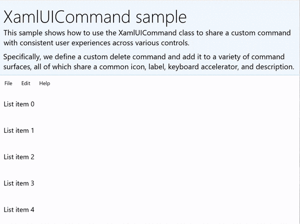
XamlUICommandSample
| 이 예제의 코드 다운로드 | | -------------------- | | WinUI 명령 샘플(XamlUICommand) | | 이 예제의 코드 다운로드 | | -------------------- | | 명령 샘플(XamlUICommand) | 많은 플랫폼 컨트롤은 이전 섹션의 StandardUICommand 예제와 마찬가지로 XamlUICommand 속성을 사용합니다.
Xaml:
샘플 UI에는 5개 항목의 ListView 가 포함되어 있습니다. 사용자 지정 XamlUICommand CustomXamlUICommand는 MenuBarItem, SwipeItem, AppBarButton 및 ContextFlyout 메뉴에 바인딩됩니다.
<Page
x:Class="XamlUICommand_Sample.MainPage"
xmlns="http://schemas.microsoft.com/winfx/2006/xaml/presentation"
xmlns:x="http://schemas.microsoft.com/winfx/2006/xaml"
xmlns:local="using:XamlUICommand_Sample"
xmlns:d="http://schemas.microsoft.com/expression/blend/2008"
xmlns:mc="http://schemas.openxmlformats.org/markup-compatibility/2006"
xmlns:muxcontrols="using:Microsoft.UI.Xaml.Controls"
mc:Ignorable="d"
Background="{ThemeResource ApplicationPageBackgroundThemeBrush}">
<Page.Resources>
<XamlUICommand x:Name="CustomXamlUICommand"
ExecuteRequested="DeleteCommand_ExecuteRequested"
Description="Custom XamlUICommand"
Label="Custom XamlUICommand">
<XamlUICommand.IconSource>
<FontIconSource FontFamily="Wingdings" Glyph="M"/>
</XamlUICommand.IconSource>
<XamlUICommand.KeyboardAccelerators>
<KeyboardAccelerator Key="D" Modifiers="Control"/>
</XamlUICommand.KeyboardAccelerators>
</XamlUICommand>
<Style x:Key="HorizontalSwipe"
TargetType="ListViewItem"
BasedOn="{StaticResource ListViewItemRevealStyle}">
<Setter Property="Height" Value="70"/>
<Setter Property="Padding" Value="0"/>
<Setter Property="HorizontalContentAlignment" Value="Stretch"/>
<Setter Property="VerticalContentAlignment" Value="Stretch"/>
<Setter Property="BorderThickness" Value="0"/>
</Style>
</Page.Resources>
<Grid Loaded="ControlExample_Loaded" Name="MainGrid">
<Grid.RowDefinitions>
<RowDefinition Height="Auto" />
<RowDefinition Height="Auto" />
<RowDefinition Height="*"/>
</Grid.RowDefinitions>
<StackPanel Grid.Row="0"
Padding="10"
BorderThickness="0,0,0,1"
BorderBrush="LightBlue"
Background="AliceBlue">
<TextBlock Style="{StaticResource HeaderTextBlockStyle}">
XamlUICommand sample
</TextBlock>
<TextBlock Style="{StaticResource SubtitleTextBlockStyle}" Margin="0,0,0,10">
This sample shows how to use the XamlUICommand class to
share a custom command with consistent user experiences
across various controls.
</TextBlock>
<TextBlock Style="{StaticResource SubtitleTextBlockStyle}" Margin="0,0,0,0">
Specifically, we define a custom delete command and add it
to a variety of command surfaces, all of which share a common
icon, label, keyboard accelerator, and description.
</TextBlock>
</StackPanel>
<muxcontrols:MenuBar Grid.Row="1">
<muxcontrols:MenuBarItem Title="File">
</muxcontrols:MenuBarItem>
<muxcontrols:MenuBarItem Title="Edit">
<MenuFlyoutItem x:Name="DeleteFlyoutItem"
Command="{StaticResource CustomXamlUICommand}"/>
</muxcontrols:MenuBarItem>
<muxcontrols:MenuBarItem Title="Help">
</muxcontrols:MenuBarItem>
</muxcontrols:MenuBar>
<ListView x:Name="ListViewRight" Grid.Row="2"
Loaded="ListView_Loaded"
IsItemClickEnabled="True"
SelectionMode="Single"
SelectionChanged="ListView_SelectionChanged"
ItemContainerStyle="{StaticResource HorizontalSwipe}">
<ListView.ItemTemplate>
<DataTemplate x:DataType="local:ListItemData">
<UserControl PointerEntered="ListViewSwipeContainer_PointerEntered"
PointerExited="ListViewSwipeContainer_PointerExited">
<UserControl.ContextFlyout>
<MenuFlyout>
<MenuFlyoutItem
Command="{x:Bind Command}"
CommandParameter="{x:Bind Text}" />
</MenuFlyout>
</UserControl.ContextFlyout>
<Grid AutomationProperties.Name="{x:Bind Text}">
<VisualStateManager.VisualStateGroups>
<VisualStateGroup x:Name="HoveringStates">
<VisualState x:Name="HoverButtonsHidden" />
<VisualState x:Name="HoverButtonsShown">
<VisualState.Setters>
<Setter Target="HoverButton.Visibility"
Value="Visible" />
</VisualState.Setters>
</VisualState>
</VisualStateGroup>
</VisualStateManager.VisualStateGroups>
<SwipeControl x:Name="ListViewSwipeContainer">
<SwipeControl.RightItems>
<SwipeItems Mode="Execute">
<SwipeItem x:Name="DeleteSwipeItem"
Background="Red"
Command="{x:Bind Command}"
CommandParameter="{x:Bind Text}"/>
</SwipeItems>
</SwipeControl.RightItems>
<Grid VerticalAlignment="Center">
<TextBlock Text="{x:Bind Text}"
Margin="10"
FontSize="18"
HorizontalAlignment="Left"
VerticalAlignment="Center"/>
<AppBarButton x:Name="HoverButton"
IsTabStop="False"
HorizontalAlignment="Right"
Visibility="Collapsed"
Command="{x:Bind Command}"
CommandParameter="{x:Bind Text}"/>
</Grid>
</SwipeControl>
</Grid>
</UserControl>
</DataTemplate>
</ListView.ItemTemplate>
</ListView>
</Grid>
</Page>
코드 숨김
- 먼저 ListView의
ListItemData각 ListViewItem에 대한 텍스트 문자열과 ICommand를 포함하는 클래스를 정의합니다.
public class ListItemData
{
    public String Text { get; set; }
    public ICommand Command { get; set; }
}
- MainPage 클래스에서는
ListItemDataItemTemplate의 DataTemplate에 대한 개체 컬렉션을 정의합니다. 그런 다음, 5개 항목의 초기 컬렉션(텍스트 및 연결된 XamlUICommand 포함)으로 채웁니다.
ObservableCollection<ListItemData> collection = new ObservableCollection<ListItemData>();

private void ControlExample_Loaded(object sender, RoutedEventArgs e)
{
    for (var i = 0; i < 5; i++)
    {
        collection.Add(
           new ListItemData { Text = "List item " + i.ToString(), Command = CustomXamlUICommand });
    }
}

private void ListView_Loaded(object sender, RoutedEventArgs e)
{
    var listView = (ListView)sender;
    listView.ItemsSource = collection;
}
- 다음으로 항목 삭제 명령을 구현하는 ICommand ExecuteRequested 처리기를 정의합니다.
private void DeleteCommand_ExecuteRequested(
   XamlUICommand sender, ExecuteRequestedEventArgs args)
{
    if (args.Parameter != null)
    {
        foreach (var i in collection)
        {
            if (i.Text == (args.Parameter as string))
            {
                collection.Remove(i);
                return;
            }
        }
    }
    if (ListViewRight.SelectedIndex != -1)
    {
        collection.RemoveAt(ListViewRight.SelectedIndex);
    }
}
- 마지막으로 PointerEntered, PointerExited 및 SelectionChanged 이벤트를 비롯한 다양한 ListView 이벤트에 대한 처리기를 정의합니다. 포인터 이벤트 처리기는 각 항목에 대한 삭제 단추를 표시하거나 숨기는 데 사용됩니다.
private void ListView_SelectionChanged(object sender, SelectionChangedEventArgs e)
{
    if (ListViewRight.SelectedIndex != -1)
    {
        var item = collection[ListViewRight.SelectedIndex];
    }
}

private void ListViewSwipeContainer_PointerEntered(object sender, PointerRoutedEventArgs e)
{
    if (e.Pointer.PointerDeviceType ==
        Windows.Devices.Input.PointerDeviceType.Mouse ||
        e.Pointer.PointerDeviceType == Windows.Devices.Input.PointerDeviceType.Pen)
    {
        VisualStateManager.GoToState(sender as Control, "HoverButtonsShown", true);
    }
}

private void ListViewSwipeContainer_PointerExited(object sender, PointerRoutedEventArgs e)
{
    VisualStateManager.GoToState(sender as Control, "HoverButtonsHidden", true);
}
ICommand 인터페이스를 사용하는 명령 환경
표준 WinUI 컨트롤(단추, 목록, 선택, 달력, 예측 텍스트)은 많은 일반적인 명령 환경의 기초를 제공합니다. 컨트롤 형식의 전체 목록은 Windows 앱의 컨트롤 및 패턴을 참조하세요.
구조적 명령 환경을 지원하는 가장 기본적인 방법은 ICommand 인터페이스(C++용 Windows.UI.Xaml.Input.ICommand 또는 C#용 System.Windows.Input.ICommand )의 구현을 정의하는 것입니다. 그런 다음 이 ICommand 인스턴스를 단추와 같은 컨트롤에 바인딩할 수 있습니다.
비고
경우에 따라 메서드를 Click 이벤트에 바인딩하고 속성을 IsEnabled 속성에 바인딩하는 것이 효율적일 수 있습니다. 표준 WinUI 컨트롤(단추, 목록, 선택, 달력, 예측 텍스트)은 많은 일반적인 명령 환경의 기초를 제공합니다. 컨트롤 형식의 전체 목록은 Windows 앱의 컨트롤 및 패턴을 참조하세요.
예시
ICommand 예제
| 이 예제의 코드 다운로드 |
|---|
| 명령 작성 샘플(ICommand) |
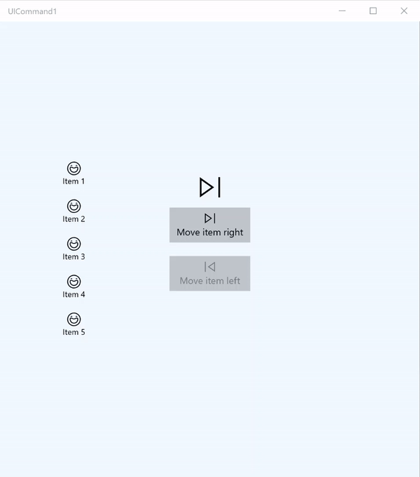
이 기본 예제에서는 단추 클릭, 키보드 가속기 및 마우스 휠 회전을 사용하여 단일 명령을 호출하는 방법을 보여 줍니다.
| 이 예제의 코드 다운로드 |
|---|
| 명령 인터페이스 샘플(ICommand) |
<Page
x:Class="UICommand1.View.MainPage"
xmlns="http://schemas.microsoft.com/winfx/2006/xaml/presentation"
xmlns:x="http://schemas.microsoft.com/winfx/2006/xaml"
xmlns:vm="using:UICommand1.ViewModel"
xmlns:d="http://schemas.microsoft.com/expression/blend/2008"
xmlns:mc="http://schemas.openxmlformats.org/markup-compatibility/2006"
mc:Ignorable="d"
Background="{ThemeResource ApplicationPageBackgroundThemeBrush}">
<Page.Resources>
<vm:OpacityConverter x:Key="opaque" />
</Page.Resources>
<Grid Name="ItemGrid"
Background="AliceBlue"
PointerWheelChanged="Page_PointerWheelChanged">
<Grid.ColumnDefinitions>
<ColumnDefinition Width="*"/>
<ColumnDefinition Width="2*"/>
<ColumnDefinition Width="*"/>
</Grid.ColumnDefinitions>
<ListView Grid.Column="0" VerticalAlignment="Center"
x:Name="CommandListView"
ItemsSource="{x:Bind Path=ViewModel.ListItemLeft}"
SelectionMode="None" IsItemClickEnabled="False"
HorizontalAlignment="Right">
<ListView.ItemTemplate>
<DataTemplate x:DataType="vm:ListItemData">
<Grid VerticalAlignment="Center">
<AppBarButton Label="{x:Bind ListItemText}">
<AppBarButton.Icon>
<SymbolIcon Symbol="{x:Bind ListItemIcon}"/>
</AppBarButton.Icon>
</AppBarButton>
</Grid>
</DataTemplate>
</ListView.ItemTemplate>
</ListView>
<Grid Grid.Column="1" Margin="0,0,0,0"
HorizontalAlignment="Center"
VerticalAlignment="Center">
<Grid.RowDefinitions>
<RowDefinition Height="*"/>
<RowDefinition Height="*"/>
<RowDefinition Height="*"/>
</Grid.RowDefinitions>
<StackPanel Grid.Row="1">
<FontIcon FontFamily="{StaticResource SymbolThemeFontFamily}"
FontSize="40" Glyph=""
Opacity="{x:Bind Path=ViewModel.ListItemLeft.Count,
Mode=OneWay, Converter={StaticResource opaque}}"/>
<Button Name="MoveItemRightButton"
Margin="0,10,0,10" Width="120" HorizontalAlignment="Center"
Command="{x:Bind Path=ViewModel.MoveRightCommand}">
<Button.KeyboardAccelerators>
<KeyboardAccelerator
Modifiers="Control"
Key="Add" />
</Button.KeyboardAccelerators>
<StackPanel>
<SymbolIcon Symbol="Next"/>
<TextBlock>Move item right</TextBlock>
</StackPanel>
</Button>
<Button Name="MoveItemLeftButton"
Margin="0,10,0,10" Width="120" HorizontalAlignment="Center"
Command="{x:Bind Path=ViewModel.MoveLeftCommand}">
<Button.KeyboardAccelerators>
<KeyboardAccelerator
Modifiers="Control"
Key="Subtract" />
</Button.KeyboardAccelerators>
<StackPanel>
<SymbolIcon Symbol="Previous"/>
<TextBlock>Move item left</TextBlock>
</StackPanel>
</Button>
<FontIcon FontFamily="{StaticResource SymbolThemeFontFamily}"
FontSize="40" Glyph=""
Opacity="{x:Bind Path=ViewModel.ListItemRight.Count,
Mode=OneWay, Converter={StaticResource opaque}}"/>
</StackPanel>
</Grid>
<ListView Grid.Column="2"
x:Name="CommandListViewRight"
VerticalAlignment="Center"
IsItemClickEnabled="False"
SelectionMode="None"
ItemsSource="{x:Bind Path=ViewModel.ListItemRight}"
HorizontalAlignment="Left">
<ListView.ItemTemplate>
<DataTemplate x:DataType="vm:ListItemData">
<Grid VerticalAlignment="Center">
<AppBarButton Label="{x:Bind ListItemText}">
<AppBarButton.Icon>
<SymbolIcon Symbol="{x:Bind ListItemIcon}"/>
</AppBarButton.Icon>
</AppBarButton>
</Grid>
</DataTemplate>
</ListView.ItemTemplate>
</ListView>
</Grid>
</Page>
여기에 앞서 언급된 UI에 대한 code-behind가 있습니다.
코드 비하인드에서 명령 코드가 포함된 뷰 모델에 연결합니다. 우리는 또한 명령 코드를 연결하는 마우스 휠 입력 처리기를 정의합니다.
using Windows.UI.Xaml;
using Windows.UI.Xaml.Input;
using Windows.UI.Xaml.Controls;
using UICommand1.ViewModel;
using Windows.System;
using Windows.UI.Core;

namespace UICommand1.View
{
    /// <summary>
    /// An empty page that can be used on its own or navigated to within a Frame.
    /// </summary>
    public sealed partial class MainPage : Page
    {
        // Reference to our view model.
        public UICommand1ViewModel ViewModel { get; set; }

        // Initialize our view and view model.
        public MainPage()
        {
            this.InitializeComponent();
            ViewModel = new UICommand1ViewModel();
        }

        /// <summary>
        /// Handle mouse wheel input and assign our
        /// commands to appropriate direction of rotation.
        /// </summary>
        /// <param name="sender"></param>
        /// <param name="e"></param>
        private void Page_PointerWheelChanged(object sender, PointerRoutedEventArgs e)
        {
            var props = e.GetCurrentPoint(sender as UIElement).Properties;

            // Require CTRL key and accept only vertical mouse wheel movement
            // to eliminate accidental wheel input.
            if ((Window.Current.CoreWindow.GetKeyState(VirtualKey.Control) !=
                CoreVirtualKeyStates.None) && !props.IsHorizontalMouseWheel)
            {
                bool delta = props.MouseWheelDelta < 0 ? true : false;

                switch (delta)
                {
                    case true:
                        ViewModel.MoveRight();
                        break;
                    case false:
                        ViewModel.MoveLeft();
                        break;
                    default:
                        break;
                }
            }
        }
    }
}
보기 모델의 코드는 다음과 같습니다.
보기 모델은 앱에서 두 명령에 대한 실행 세부 정보를 정의하고, 하나의 ListView를 채우고, 각 ListView의 항목 수에 따라 일부 추가 UI를 숨기거나 표시하기 위한 불투명도 값 변환기를 제공하는 위치입니다.
using System;
using System.Collections.ObjectModel;
using System.ComponentModel;
using Windows.UI.Xaml.Controls;
using Windows.UI.Xaml.Data;

namespace UICommand1.ViewModel
{
    /// <summary>
    /// UI properties for our list items.
    /// </summary>
    public class ListItemData
    {
        /// <summary>
        /// Gets and sets the list item content string.
        /// </summary>
        public string ListItemText { get; set; }
        /// <summary>
        /// Gets and sets the list item icon.
        /// </summary>
        public Symbol ListItemIcon { get; set; }
    }

    /// <summary>
    /// View Model that sets up a command to handle invoking the move item buttons.
    /// </summary>
    public class UICommand1ViewModel
    {
        /// <summary>
        /// The command to invoke when the Move item left button is pressed.
        /// </summary>
        public RelayCommand MoveLeftCommand { get; private set; }

        /// <summary>
        /// The command to invoke when the Move item right button is pressed.
        /// </summary>
        public RelayCommand MoveRightCommand { get; private set; }

        // Item collections
        public ObservableCollection<ListItemData> ListItemLeft { get; } =
           new ObservableCollection<ListItemData>();
        public ObservableCollection<ListItemData> ListItemRight { get; } =
           new ObservableCollection<ListItemData>();

        public ListItemData listItem;

        /// <summary>
        /// Sets up a command to handle invoking the move item buttons.
        /// </summary>
        public UICommand1ViewModel()
        {
            MoveLeftCommand =
               new RelayCommand(new Action(MoveLeft), CanExecuteMoveLeftCommand);
            MoveRightCommand =
               new RelayCommand(new Action(MoveRight), CanExecuteMoveRightCommand);

            LoadItems();
        }

        /// <summary>
        ///  Populate our list of items.
        /// </summary>
        public void LoadItems()
        {
            for (var x = 0; x <= 4; x++)
            {
                listItem = new ListItemData();
                listItem.ListItemText = "Item " + (ListItemLeft.Count + 1).ToString();
                listItem.ListItemIcon = Symbol.Emoji;
                ListItemLeft.Add(listItem);
            }
        }

        /// <summary>
        /// Move left command valid when items present in the list on right.
        /// </summary>
        /// <returns>True, if count is greater than 0.</returns>
        private bool CanExecuteMoveLeftCommand()
        {
            return ListItemRight.Count > 0;
        }

        /// <summary>
        /// Move right command valid when items present in the list on left.
        /// </summary>
        /// <returns>True, if count is greater than 0.</returns>
        private bool CanExecuteMoveRightCommand()
        {
            return ListItemLeft.Count > 0;
        }

        /// <summary>
        /// The command implementation to execute when the Move item right button is pressed.
        /// </summary>
        public void MoveRight()
        {
            if (ListItemLeft.Count > 0)
            {
                listItem = new ListItemData();
                ListItemRight.Add(listItem);
                listItem.ListItemText = "Item " + ListItemRight.Count.ToString();
                listItem.ListItemIcon = Symbol.Emoji;
                ListItemLeft.RemoveAt(ListItemLeft.Count - 1);
                MoveRightCommand.RaiseCanExecuteChanged();
                MoveLeftCommand.RaiseCanExecuteChanged();
            }
        }

        /// <summary>
        /// The command implementation to execute when the Move item left button is pressed.
        /// </summary>
        public void MoveLeft()
        {
            if (ListItemRight.Count > 0)
            {
                listItem = new ListItemData();
                ListItemLeft.Add(listItem);
                listItem.ListItemText = "Item " + ListItemLeft.Count.ToString();
                listItem.ListItemIcon = Symbol.Emoji;
                ListItemRight.RemoveAt(ListItemRight.Count - 1);
                MoveRightCommand.RaiseCanExecuteChanged();
                MoveLeftCommand.RaiseCanExecuteChanged();
            }
        }

        /// <summary>
        /// Views subscribe to this event to get notified of property updates.
        /// </summary>
        public event PropertyChangedEventHandler PropertyChanged;

        /// <summary>
        /// Notify subscribers of updates to the named property
        /// </summary>
        /// <param name="propertyName">The full, case-sensitive, name of a property.</param>
        protected void NotifyPropertyChanged(string propertyName)
        {
            PropertyChangedEventHandler handler = this.PropertyChanged;
            if (handler != null)
            {
                PropertyChangedEventArgs args = new PropertyChangedEventArgs(propertyName);
                handler(this, args);
            }
        }
    }

    /// <summary>
    /// Convert a collection count to an opacity value of 0.0 or 1.0.
    /// </summary>
    public class OpacityConverter : IValueConverter
    {
        /// <summary>
        /// Converts a collection count to an opacity value of 0.0 or 1.0.
        /// </summary>
        /// <param name="value">The count passed in</param>
        /// <param name="targetType">Ignored.</param>
        /// <param name="parameter">Ignored</param>
        /// <param name="language">Ignored</param>
        /// <returns>1.0 if count > 0, otherwise returns 0.0</returns>
        public object Convert(object value, Type targetType, object parameter, string language)
        {
            return ((int)value > 0 ? 1.0 : 0.0);
        }

        /// <summary>
        /// Not used, converter is not intended for two-way binding.
        /// </summary>
        /// <param name="value">Ignored</param>
        /// <param name="targetType">Ignored</param>
        /// <param name="parameter">Ignored</param>
        /// <param name="language">Ignored</param>
        /// <returns></returns>
        public object ConvertBack(object value, Type targetType, object parameter, string language)
        {
            throw new NotImplementedException();
        }
    }
}
마지막으로 ICommand 인터페이스의 구현은 다음과 같습니다.
여기서는 ICommand 인터페이스를 구현하고 해당 기능을 다른 개체에 릴레이하는 명령을 정의합니다.
using System;
using System.Windows.Input;

namespace UICommand1
{
    /// <summary>
    /// A command whose sole purpose is to relay its functionality
    /// to other objects by invoking delegates.
    /// The default return value for the CanExecute method is 'true'.
    /// <see cref="RaiseCanExecuteChanged"/> needs to be called whenever
    /// <see cref="CanExecute"/> is expected to return a different value.
    /// </summary>
    public class RelayCommand : ICommand
    {
        private readonly Action _execute;
        private readonly Func<bool> _canExecute;

        /// <summary>
        /// Raised when RaiseCanExecuteChanged is called.
        /// </summary>
        public event EventHandler CanExecuteChanged;

        /// <summary>
        /// Creates a new command that can always execute.
        /// </summary>
        /// <param name="execute">The execution logic.</param>
        public RelayCommand(Action execute)
            : this(execute, null)
        {
        }

        /// <summary>
        /// Creates a new command.
        /// </summary>
        /// <param name="execute">The execution logic.</param>
        /// <param name="canExecute">The execution status logic.</param>
        public RelayCommand(Action execute, Func<bool> canExecute)
        {
            if (execute == null)
                throw new ArgumentNullException("execute");
            _execute = execute;
            _canExecute = canExecute;
        }

        /// <summary>
        /// Determines whether this <see cref="RelayCommand"/> can execute in its current state.
        /// </summary>
        /// <param name="parameter">
        /// Data used by the command. If the command does not require
        /// data to be passed, this object can be set to null.
        /// </param>
        /// <returns>true if this command can be executed; otherwise, false.</returns>
        public bool CanExecute(object parameter)
        {
            return _canExecute == null ? true : _canExecute();
        }

        /// <summary>
        /// Executes the <see cref="RelayCommand"/> on the current command target.
        /// </summary>
        /// <param name="parameter">
        /// Data used by the command. If the command does not require
        /// data to be passed, this object can be set to null.
        /// </param>
        public void Execute(object parameter)
        {
            _execute();
        }

        /// <summary>
        /// Method used to raise the <see cref="CanExecuteChanged"/> event
        /// to indicate that the return value of the <see cref="CanExecute"/>
        /// method has changed.
        /// </summary>
        public void RaiseCanExecuteChanged()
        {
            var handler = CanExecuteChanged;
            if (handler != null)
            {
                handler(this, EventArgs.Empty);
            }
        }
    }
}
요약
WinUI는 제어 유형, 디바이스 및 입력 형식에서 명령을 공유하고 관리하는 앱을 빌드할 수 있는 강력하고 유연한 명령 시스템을 제공합니다.
Windows 앱에 대한 명령을 빌드할 때 다음 방법을 사용합니다.
- XAML/코드 비하인드에서 이벤트를 수신하고 처리하기
- Click WinUI와 같은 이벤트 처리 메서드에 바인딩하면 제어 유형, 디바이스 및 입력 형식에서 명령을 공유하고 관리하는 앱을 빌드할 수 있는 강력하고 유연한 명령 시스템을 제공합니다.
- 미리 정의된 속성 집합에 대한 고유한 값을 사용하여 XamlUICommand 개체 만들기
- 미리 정의된 플랫폼 속성 및 값 집합을 사용하여 StandardUICommand 개체 만들기
다음 단계
참고하십시오
Samples
토픽 샘플
기타 샘플
GitHub에서 Microsoft와 공동 작업
이 콘텐츠의 원본은 GitHub에서 찾을 수 있으며, 여기서 문제와 끌어오기 요청을 만들고 검토할 수도 있습니다. 자세한 내용은 참여자 가이드를 참조하세요.

Windows developer