Nata
Norint pasiekti šį puslapį, reikalingas leidimas. Galite pabandyti prisijungti arba pakeisti katalogus.
Norint pasiekti šį puslapį, reikalingas leidimas. Galite pabandyti pakeisti katalogus.
Developers can create and manage app side panes within a model-driven app by using the Xrm.App.sidePanes API, which represents the collection of side panes. Calling the createPane method adds a new pane that allows navigation to any model-driven app form or custom page. Pages displayed in the side pane must fit within the minimum width of 300 pixels and resize to larger widths based on the pane width.
Tabs are listed in the side pane in two groups: nonclosable and closable. Within each group, the tabs are listed in the order they were created in. The top group contains the panes that a user can't close, and the bottom group has user-closable panes. The nonclosable group is populated when the app is opened, whereas the closable group is added based on user actions within the app.
You can use a platform-provided header with the title and Close button, or you can use a custom header.
You can add a badge to the side pane to indicate to the user that a change needs attention. The badge supports three modes: a simple dot, a count, or an image. By default, the badge is cleared when the user switches to the pane. You can control when the badge is cleared.
App side panes are only supported in web browsers and are prevented within native players.
Note
This API is not available for Dynamics 365 Customer Engagement on-premise deployments. More information: Client APIs not supported in Customer Engagement (on-premises)
Examples
Showing a default view in the side pane
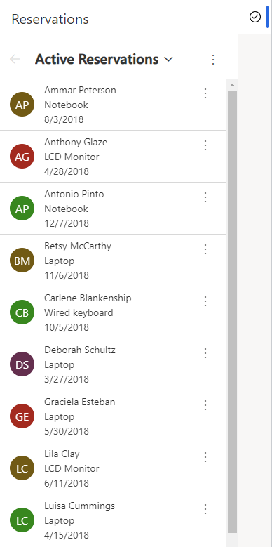
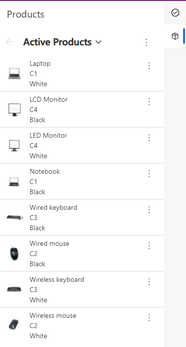
The examples in this section show how to display the default view of a table in the app side pane. A reservation list and product list are opened as nonclosable panes.
Xrm.App.sidePanes.createPane({
    title: "Reservations",
    imageSrc: "WebResources/sample_reservation_icon",
    paneId: "ReservationList",
    canClose: false
}).then((pane) => {
    pane.navigate({
        pageType: "entitylist",
        entityName: "sample_reservation",
    })
});

Xrm.App.sidePanes.createPane({
    title: "Products",
    imageSrc: "WebResources/sample_product_icon",
    paneId: "ProductList",
    canClose: false
}).then((pane) => {
    pane.navigate({
        pageType: "entitylist",
        entityName: "sample_product",
    })
});

Showing a table row
This example shows how to display a row in the side pane. A reservation row is opened in a side pane where the default header is hidden and the width is customized to 600 pixels.
Xrm.App.sidePanes.createPane({
    title: "Reservation: Ammar Peterson",
    imageSrc: "WebResources/sample_reservation_icon",
    hideHeader: true,
    canClose: true,
    width: 600
}).then((pane) => {
    pane.navigate({
        pageType: "entityrecord",
        entityName: "sample_reservation",
        entityId: "00aa00aa-bb11-cc22-dd33-44ee44ee44ee",
    })
});

Showing a web resource
This example shows how to display a webresource in the side pane. A custom html page is opened in a side pane where the default header is visible & close button is hidden.
Xrm.App.sidePanes.createPane({
                        title: "Registration Page",
                        imageSrc: "WebResources/msfp_SurveyIcon_32",
                        paneId: "RegistrationPage",
                        canClose: false
                    }).then((pane) => {
                        //navigate to webresource
                        pane.navigate({
                            pageType: "webresource",
                            webresourceName: "new_RegistrationPage",
                        })
                    });
Managing side panes
In addition to creating side panes and showing rows or views within the side pane, you can also:
Use the
statemethod to collapse the side pane programmatically:Xrm.App.sidePanes.state = 0;Use the
statemethod to expand the side pane programmatically:Xrm.App.sidePanes.state = 1;Change properties by retrieving the selected pane:
var lastPane = Xrm.App.sidePanes.getSelectedPane();
lastPane.width = 400;Retrieve a specific pane by using the
paneIdparameter:var reservationPane = Xrm.App.sidePanes.getPane("ReservationList");
reservationPane.close();Enable the badge property on a pane:
Xrm.App.sidePanes.getSelectedPane().badge = 1;
Use with Xrm.App.panels.loadPanel
The Xrm.Panels.loadPanel API is being replaced with Xrm.App.sidePanes.createPane because the former only supports a single pane while the latter supports multiple panes. To enable transitioning from loadPanel to createPane, the two can work together with some limitations. If only loadPanel is used within a model-driven app, then the experience remains the same. However if both loadPanel and createPane are used, the first limitation is that a placeholder icon is shown for the loadPanel. The second limitation is that when the user switches from the loadPanel to the createPane, the loadPanel content is unloaded to save memory and is reloaded on switch back without the state. This tab switch behavior is the same used within the multi-session app mode to manage the memory used by the app. Most page types restore correctly however when an external site or web resource is opened the state isn't restored.
By switching to use createPane, both limitations can be avoided by providing an icon and by enabling alwaysRender. The alwaysRender keeps the pane content when the user switches but does take more memory so should be used sparingly.
Related articles
sidePanes (Client API reference)
loadPanel (Client API Reference)
Walkthrough: Write your first client script