Piezīmes
Lai piekļūtu šai lapai, ir nepieciešama autorizācija. Varat mēģināt pierakstīties vai mainīt direktorijus.
Lai piekļūtu šai lapai, ir nepieciešama autorizācija. Varat mēģināt mainīt direktorijus.
Applies to: ✅ Power BI Desktop and Power BI service
Conditional formatting in Power BI lets you dynamically change the appearance of your visuals based on data values. Instead of using static colors and styles, you can set colors to change based on field values, rules you define, or color scales that map values to a gradient. This capability helps you highlight important data points, show status indicators, or create heat map effects within your visuals. You can also create dynamic, expression-based titles and subtitles, and apply rich formatting options to tables and matrices.
With conditional formatting, your reports become more intuitive and easier to interpret. Viewers can quickly identify trends, outliers, and key insights without needing to analyze raw numbers.
Supported visuals and formatting options
Conditional formatting is available for many Power BI visuals, though the specific formatting options vary by visual type.
| Visual type | Supported formatting options |
|---|---|
| Tables | Background color, font color, data bars, icons, web URLs, column width |
| Matrices | Background color, font color, data bars, icons, web URLs, column width |
| Column charts | Column colors (gradient, rules, field value), legend colors |
| Bar charts | Bar colors (gradient, rules, field value), legend colors |
| Stacked charts | Bar and column colors, legend colors |
| Line charts | Line colors (gradient, rules, field value), legend colors |
| Pie and donut charts | Slice colors (gradient, rules, field value), legend colors |
| Treemaps | Rectangle colors (gradient, rules, field value), legend colors |
| Button slicers | Button backgrounds, borders, callout values, callout labels, button effects |
| Cards | Callout values, labels, and other card elements |
| Gauges | Target colors, callout values |
| KPIs | Indicator colors, goal colors |
| Most visuals | Titles, subtitles (expression-based) |
Note
Some visuals offer fewer conditional formatting options than others.
Customize visual titles and subtitles
You can use conditional formatting to create dynamic, expression-based titles and subtitles for your visuals. By creating DAX expressions based on fields, variables, or other programmatic elements, your visual titles and subtitles can automatically adjust based on filters, selections, or other user interactions.
For detailed instructions on creating expression-based titles, see Expression-based titles in Power BI Desktop.
Access conditional formatting
You can access conditional formatting in two ways, depending on the visual type.
Use the fx button in the Format pane
For most visuals, you access conditional formatting through the Format pane:
- Select the visual you want to format.
- In the Visualizations pane, select the Format visual icon (paint brush).
- Expand the formatting card for the element you want to format (such as Columns for a column chart).
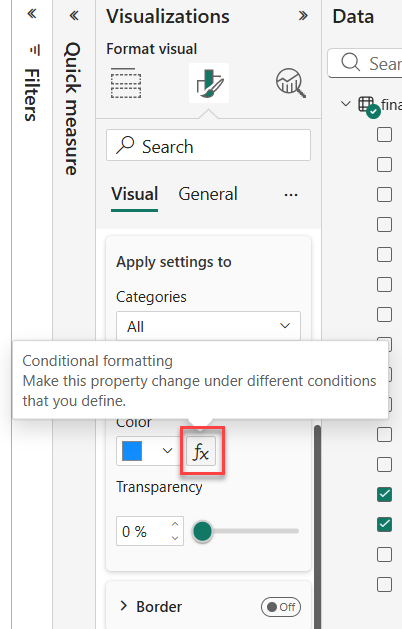
- Look for the fx button next to the color or formatting option.
- Select the fx button to open the conditional formatting dialog.
Use the right-click menu for tables and matrices
For tables and matrices, you can also access conditional formatting by right-clicking on a field:
- Select a Table or Matrix visualization.
- In the Visualizations pane, right-click or select the down-arrow next to the field you want to format.
- Select Conditional formatting, then choose the type of formatting to apply.
For detailed instructions on table and matrix conditional formatting, see Apply conditional formatting in tables and matrices.
Format styles
Power BI offers three format styles for conditional formatting. Each style provides a different way to map your data values to visual formatting.
Gradient
Gradient formatting applies a color scale that visually represents the range of values. This style helps you quickly understand the distribution and magnitude of data.
- Define Minimum and Maximum colors for the lowest and highest values.
- Optionally add a Center color for a diverging color scale.
- Choose whether to base the gradient on the lowest and highest field values or custom values you specify.
Gradient formatting works well for continuous numeric data where you want to show relative differences across a range of values.
Rules
Rules-based formatting applies specific colors based on conditions you define. This style is useful when you want to categorize data into discrete groups.
- Create one or more rules with value ranges.
- Assign a specific color to each rule.
- Use percentage-based rules or number-based rules depending on your needs.
For example, you might use rules to color sales data green for values that exceed a target, yellow for values close to the target, and red for values that fall short of the target.
Tip
When formatting fields that contain percentages, enter rule values as decimals (such as 0.25 for 25%) and select Number for the format, not Percent.
Field value
Field value formatting uses color values stored directly in your data. This style gives you complete control over formatting by defining colors in your data model.
- Create a field or measure that returns color values (color names or hex codes).
- The field can return any color value listed in the CSS color spec, including:
- Hex codes (such as #3E4AFF)
- RGB or RGBA values (such as RGBA(234, 234, 234, 0.5))
- HSL or HSLA values
- Color names (such as Green, SkyBlue, PeachPuff)
Use field value formatting when you want to apply custom color logic or when your data source already contains color values.
Create a color measure for conditional formatting
You can create a DAX measure that returns color values based on your business logic. This approach is often faster than creating multiple rules in the conditional formatting dialog.
Note
When using a DAX measure for field value formatting, the measure's data type must be text. Data types can become variant when you add a calculation group or when the measure's output doesn't clearly indicate a data type. If conditional formatting isn't working as expected, verify that your measure explicitly returns a text value.
StatusColor = SWITCH(
    'Table'[Status],
    "Accepted", "blue",
    "Declined", "red",
    "None", "grey"
)
After creating the measure, select Field value as the format style and choose your color measure as the field to base the formatting on.
Troubleshoot field errors in conditional formatting
When a field used by conditional formatting is no longer available or is in an error state, Power BI displays visual indicators to help you identify and fix the issue.
When you edit a visual with a conditional formatting error:
- A warning icon appears in the visual header.
- The Format pane shows a warning icon next to the section that contains the affected formatting option.
- The specific formatting option displays an error message, such as "To fix the problem, pick a different field."
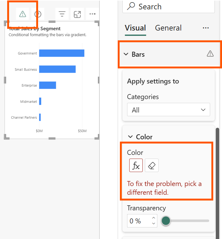
Field errors typically occur when:
- The field used for conditional formatting is deleted from the semantic model.
- The field is renamed, breaking the reference. Broken references can occur when you create a report using a live connection to a semantic model.
- A measure used for conditional formatting contains an error.
To resolve a field error, open the conditional formatting dialog and select a different, valid field. You can also remove the conditional formatting entirely and reapply it with a new field.
Format visuals with legends
You can apply conditional formatting to visuals that use legends, including bar charts, column charts, line charts, pie charts, donut charts, and treemaps. When a visual has a legend, you can conditionally format colors for each category in the legend.
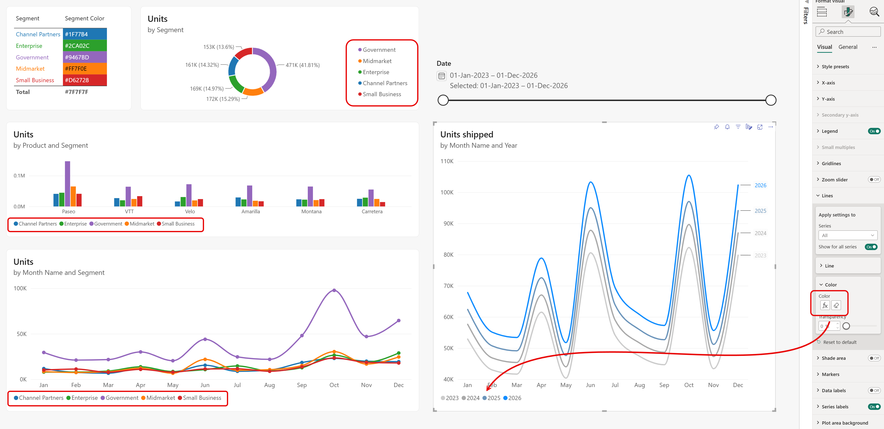
This capability is useful for ensuring consistent category colors across your entire report. For example, if multiple visuals use Segment as their legend, you can color each segment using a single DAX measure. Every visual displays the same color for the same category. When you need to change a segment's color, update the measure once and all visuals reflect the new color.
The following DAX measure returns a hex color code based on the selected segment. This example uses the Financial sample data available in Power BI Desktop:
Segment Color =
SWITCH (
    SELECTEDVALUE ( financials[Segment] ),
    "Channel Partners", "#1F77B4",
    "Enterprise",       "#2CA02C",
    "Government",       "#9467BD",
    "Midmarket",        "#FF7F0E",
    "Small Business",   "#D62728",
    "#7F7F7F"
)
When you apply background colors to tables and matrices, you might also need to adjust font colors to maintain readability. Most visual data labels automatically adjust their font color based on the background, but tables and matrices require you to specify both background and font colors with conditional formatting. The following DAX user-defined function returns black or white based on the background color's luminance. Run this query in DAX query view in Power BI Desktop to create the function, then use it in a measure for font color conditional formatting:
DEFINE
    /// Returns black or white font color based on hex background luminance
    /// @param {STRING} hexColor - Hex color code (e.g., "#117865")
    /// @returns "#000000" for light backgrounds, "#FFFFFF" for dark backgrounds
    FUNCTION GetFontColor = ( hexColor : STRING ) =>
        VAR CleanHex = UPPER(SUBSTITUTE(hexColor, "#", ""))
        VAR R = (FIND(MID(CleanHex,1,1), "0123456789ABCDEF") - 1) * 16
              + (FIND(MID(CleanHex,2,1), "0123456789ABCDEF") - 1)
        VAR G = (FIND(MID(CleanHex,3,1), "0123456789ABCDEF") - 1) * 16
              + (FIND(MID(CleanHex,4,1), "0123456789ABCDEF") - 1)
        VAR B = (FIND(MID(CleanHex,5,1), "0123456789ABCDEF") - 1) * 16
              + (FIND(MID(CleanHex,6,1), "0123456789ABCDEF") - 1)
        VAR Luminance = (0.299 * R + 0.587 * G + 0.114 * B) / 255
        RETURN IF(LEN(CleanHex) = 6, IF(Luminance > 0.5, "#000000", "#FFFFFF"), "#000000")

EVALUATE
    {
        GetFontColor([Segment Color])
    }
For line charts, you can also format line colors using a gradient based on the total value of each line, or by the category it represents. For example, when overlaying multiple years by month, apply a gradient that displays the most recent year in blue while older years fade to lighter shades of grey. Markers and series labels automatically inherit the conditional formatting until you choose to color them differently.
Considerations and limitations
Keep these considerations in mind when working with conditional formatting:
Numeric data required for gradients: Gradient formatting requires numeric values. You can't apply gradient formatting directly to text fields without first creating a measure that maps text to numbers or colors. Rules-based formatting, however, supports both numeric and text values.
NaN values: You can't apply gradient formatting with automatic maximum/minimum values, or rule-based formatting with percentage rules, if your data contains NaN (not a number) values. Use the DIVIDE() DAX function to avoid divide-by-zero errors that cause NaN values.
Aggregation required: Conditional formatting needs an aggregation or measure to be applied to the value. If you're working with an Analysis Service multidimensional cube, you can't use an attribute for conditional formatting unless the cube owner builds a measure that provides the value.
Printing: When printing a report that includes data bars and background colors, enable Background graphics in the browser's print settings for the formatting to print properly.