Use the Analytics pane in Power BI Desktop
With the Analytics pane in Power BI Desktop, you can add dynamic reference lines to visuals, and provide focus for important trends or insights. The Analytics icon and pane is found in the Visualizations area of Power BI Desktop.

Note
The Analytics pane only appears when you select a visual on the Power BI Desktop canvas.
Search within the Analytics pane
You can search within the Analytics pane, which is a subsection of the Visualizations pane. The search box appears when you select the Analytics icon.

Use the Analytics pane
With the Analytics pane, you can create the following types of dynamic reference lines:
- X-Axis constant line
- Y-Axis constant line
- Min line
- Max line
- Average line
- Median line
- Percentile line
- Symmetry shading
Note
Not all lines are available for all visual types.
The following sections show how you can use the Analytics pane and dynamic reference lines in your visualizations.
To view the available dynamic reference lines for a visual, follow these steps:
Select or create a visual, then select the Analytics icon from the Visualizations section.

Select the type of line you want to create to expand its options. This example shows Average line selected.

To create a new line, select + Add. Then you can name the line. Double-click the text box and enter your name.
Now you have all sorts of options for your line. You can specify its Color, Transparency percentage, Line style, and Position (compared to the visual's data elements). You might also choose whether to include the Data label. To specify the visual measure to base your line upon, select the Measure dropdown list, which is automatically populated with data elements from the visual. This example selects Culture as the measure, and labels it Average of Culture. You'll see how to customize a few of the other options in the later steps.

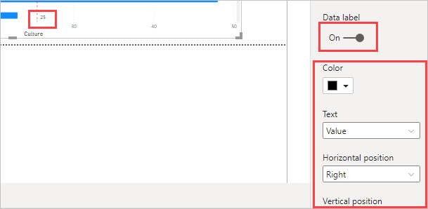
If you want to have a data label appear, change Data label from Off to On. When you do so, you get many more options for your data label.

Notice the number that appears next to the Average line item in the Analytics pane. That tells you how many dynamic lines you currently have on your visual, and of which type. If we add a Max line for Affordability, the Analytics pane shows that we now also have a Max line dynamic reference line applied to this visual.

If the visual you've selected can't have dynamic reference lines applied to it (in this case, a Map visual), you'll see the following message when you select the Analytics pane.

You can highlight many interesting insights by creating dynamic reference lines with the Analytics pane.
More features and capabilities are being planned, including expanding which visuals can have dynamic reference lines applied to them. Check back often to see what's new.
Apply forecasting
If you have time data in your data source, you can use the forecasting feature. Select a visual, then expand the Forecast section of the Analytics pane. You might specify many inputs to modify the forecast, such as the Forecast length or the Confidence interval. The following image shows a basic line visual with forecasting applied. Use your imagination (and play around with forecasting) to see how it might apply to your models.

Note
The forecasting feature is only available for line chart visuals.
For an example of how forecasting can be applied, see the (dated, but still relevant) article about forecasting capabilities.
Considerations and limitations
The ability to use dynamic reference lines is based on the type of visual being used. The following lists describe these limitations more specifically.
You might use x-axis constant line, y-axis constant line, and symmetry shading on the following visual:
- Scatter chart
Use of constant line, min line, max line, average line, median line, and percentile line is available on these visuals:
- Area chart
- Clustered bar chart
- Clustered column chart
- Line chart
- Scatter chart
The following visuals can use only a constant line from the Analytics pane:
- Stacked area chart
- Stacked bar chart
- Stacked column chart
- Waterfall chart
- 100% Stacked bar chart
- 100% Stacked column chart
The following visuals can use a trend line if there's time data:
- Area chart
- Clustered column chart
- Line chart
- Line and clustered column chart
- Scatter chart
You can't apply any dynamic lines to these visuals:
- Funnel
- Line and clustered column chart
- Line and stacked column chart
- Ribbon chart
- Non-Cartesian visuals, such as Donut chart, Gauge, Matrix, Pie chart, and Table
The percentile line is only available when using imported data in Power BI Desktop or when connected live to a model on a server that's running Analysis Service 2016 or later, Azure Analysis Services, or a semantic model on the Power BI service.
Related content
You can do all sorts of things with Power BI Desktop. For more information on its capabilities, see the following resources: