Note
Access to this page requires authorization. You can try signing in or changing directories.
Access to this page requires authorization. You can try changing directories.
In the Elements tool, use badges in the DOM tree to show or hide various overlays and speed up DOM tree navigation.
Some badges include a link icon ( ), indicating that clicking the badge navigates in the DOM.
Show or hide badges
To show or hide badges:
Go to a webpage, such as the Badges in the Elements tool demo.
Right-click the webpage, and then select Inspect.
DevTools opens, with the Elements tool selected.
Right-click anywhere in the DOM tree, and then select one or several badges in the Badge settings submenu, so that check marks appear in the submenu:
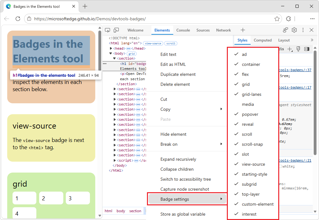
The Elements tool shows the badges next to elements in the DOM tree.
The following sections explain each badge.
The view-source badge
To view the source of your page in the Sources tool, click the view-source badge ( ). For example, the
view-source badge is next to the <html> tag at the root of the HTML page.
The view-source badge provides an alternative to selecting the View page source menuitem in the webpage's right-click menu (context menu).
To use the view-source badge:
Go to a webpage, such as the Badges in the Elements tool demo.
Right-click the webpage, and then select Inspect.
DevTools opens, with the Elements tool selected.
In the DOM tree, next to the
<html>tag, click theview-sourcebadge ():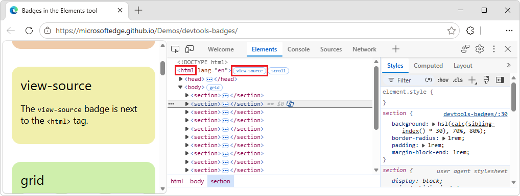
The Sources tool opens, displaying the source file, such as
index.html: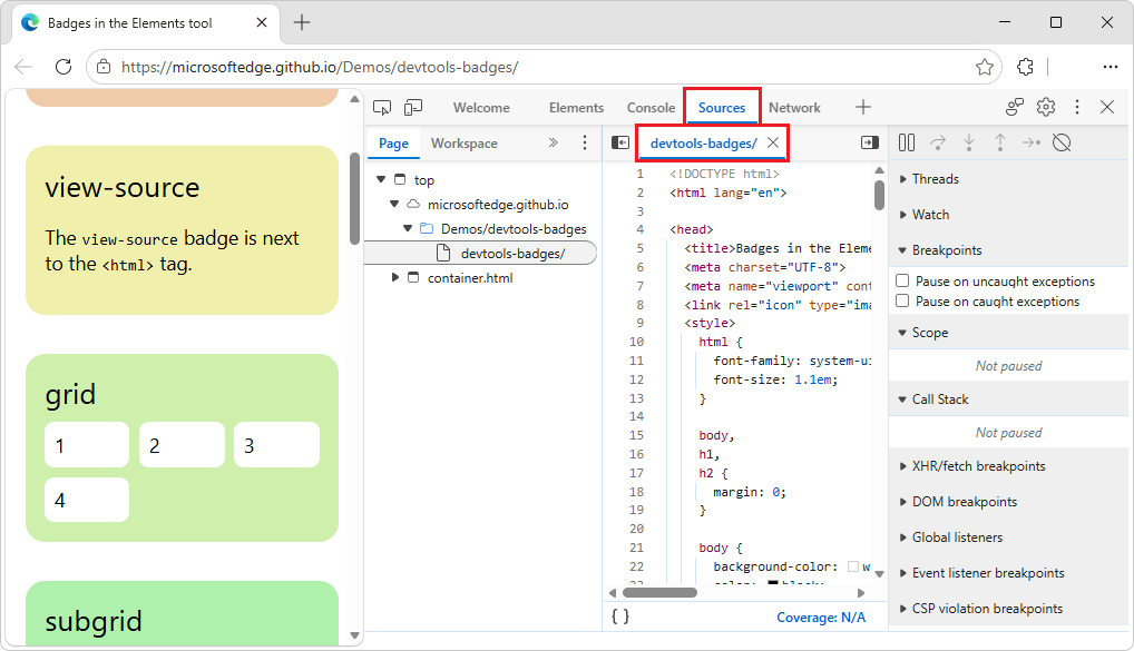
The grid badge
An HTML element is a grid container if its display CSS property is set to grid or inline-grid. Such an element has a grid badge ( ) next to it that toggles the corresponding overlay.
To use the grid badge:
Go to a webpage, such as the Badges in the Elements tool demo.
Right-click the grid box, and then select Inspect.
DevTools opens, with the Elements tool selected.
In the DOM tree, next to the
<div class="grid">element, click thegridbadge ().The
gridbadge changes color, and a grid overlay is displayed on the rendered webpage, showing columns, rows, their numbers, and gaps: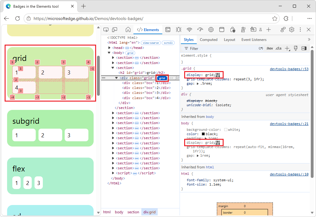
In the DOM tree, click the
gridbadge again.The grid overlay is removed from the webpage.
See also:
The subgrid badge
A subgrid is a nested grid that uses the same tracks as its parent grid. An element is a subgrid container if one or both of its grid-template-columns, grid-template-rows properties are set to subgrid. Such an element has a subgrid badge ( ) next to it that toggles the corresponding overlay.
To use the subgrid badge:
Go to a webpage, such as the Badges in the Elements tool demo.
Right-click the subgrid box, and then select Inspect.
DevTools opens, with the Elements tool selected.
In the DOM tree, expand the tree to show the
<div class="subgrid">element, and then click thesubgridbadge ().The
subgridbadge changes color, and a subgrid overlay is displayed on the rendered webpage, showing columns, rows, their numbers, and gaps: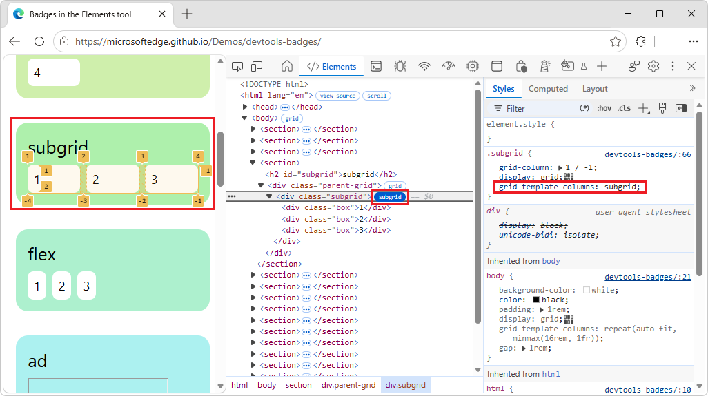
In the DOM tree, click the
subgridbadge again.The subgrid overlay is removed from the webpage.
See also:
- Subgrid at MDN.
The flex badge
An HTML element is a flex container if its display CSS property is set to flex or inline-flex. Such an element has a flex badge ( ) next to it that toggles the corresponding overlay.
To use the flex badge:
Go to a webpage, such as the Badges in the Elements tool demo.
Right-click the flex box, and then select Inspect.
DevTools opens, with the Elements tool selected.
In the DOM tree, expand the tree to show the
<div class="flex">element, and then click theflexbadge ().The
flexbadge changes color, and a flexbox overlay is displayed on the rendered webpage, showing child element positions: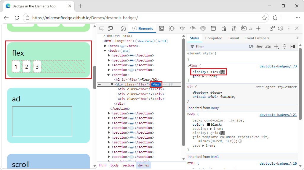
In the DOM tree, click the
flexbadge again.The flexbox overlay is removed from the webpage.
See also:
- CSS flexible box layout at MDN.
- Inspect and debug CSS flexbox in Chrome docs.
The ad badge
DevTools can detect some ad frames and tag them. Such a frame has an ad badge ( ) next to it.
A tooltip provides context on why the element was identified as an ad. The ad badge is not clickable.
To use the ad badge:
Go to a webpage, such as the Badges in the Elements tool demo.
Right-click the ad box, and then select Inspect.
DevTools opens, with the Elements tool selected.
In the DOM tree, expand the tree to show the
<iframe>element, and then hover over theadbadge ().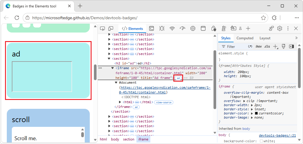
A tooltip provides context on why the element was identified as an ad. Possible content of the tooltip:
Script ancestry: Which scripts were involved in creating the element.
Filter list rules: The specific rule from a filter list (for example,
EasyList) that matched the element or the resource it loaded.
See also:
The scroll badge
An HTML element is a scroll container if its overflow CSS property is set to scroll, or auto when there's enough content to cause overflow. Such an element has a scroll badge ( ) next to it.
To view the scroll badge:
Go to a webpage, such as the Badges in the Elements tool demo.
Right-click the scroll box, and then select Inspect.
DevTools opens, with the Elements tool selected.
In the DOM tree, expand the tree to show the
<div class="flex">element.The
scrollbadge () is shown next to the element: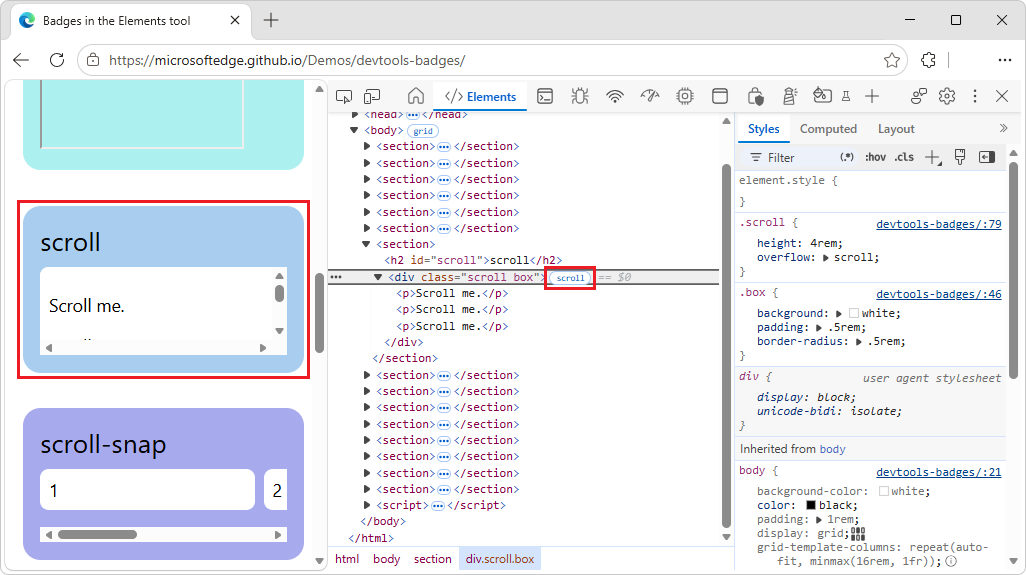
Clicking the badge doesn't have any effect.
See also:
- Scroll container at MDN.
The scroll-snap badge
Scroll containers can have CSS properties that configure snap points. A scroll container element has a scroll-snap badge ( ) next to it that displays or hides the corresponding overlay.
To use the scroll-snap badge:
Go to a webpage, such as the Badges in the Elements tool demo.
Right-click the scroll-snap box, and then select Inspect.
DevTools opens, with the Elements tool selected.
In the DOM tree, expand the tree to show the
<div class="scroll-snap">element, and then click thescroll-snapbadge ().The
scroll-snapbadge changes color, and a scroll-snap overlay shows element positions and snap points: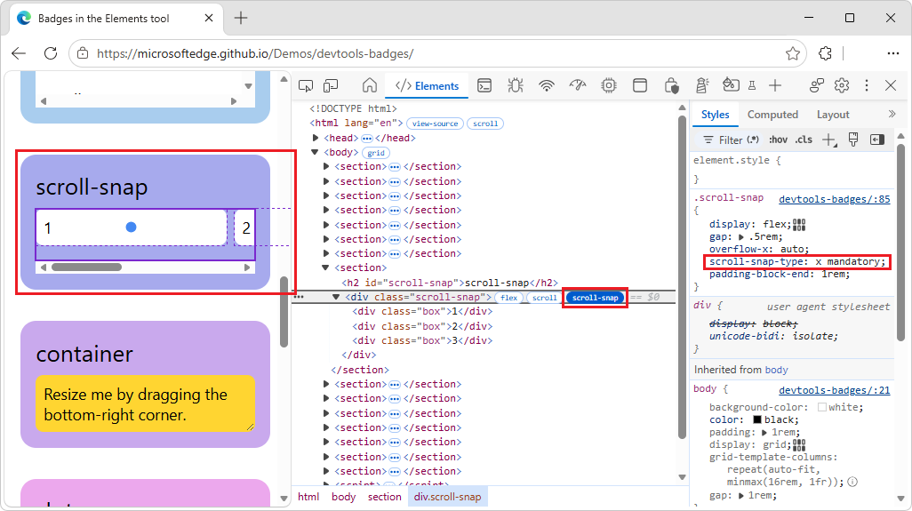
In the rendered webpage, drag the horizontal scroll bar to the right.
The scroll-snap overlay continues to show element positions and snap points.
In the DOM tree, click the
scroll-snapbadge again.The scroll-snap overlay is removed from the webpage.
See also:
- CSS scroll snap at MDN.
The size and inline-size badges
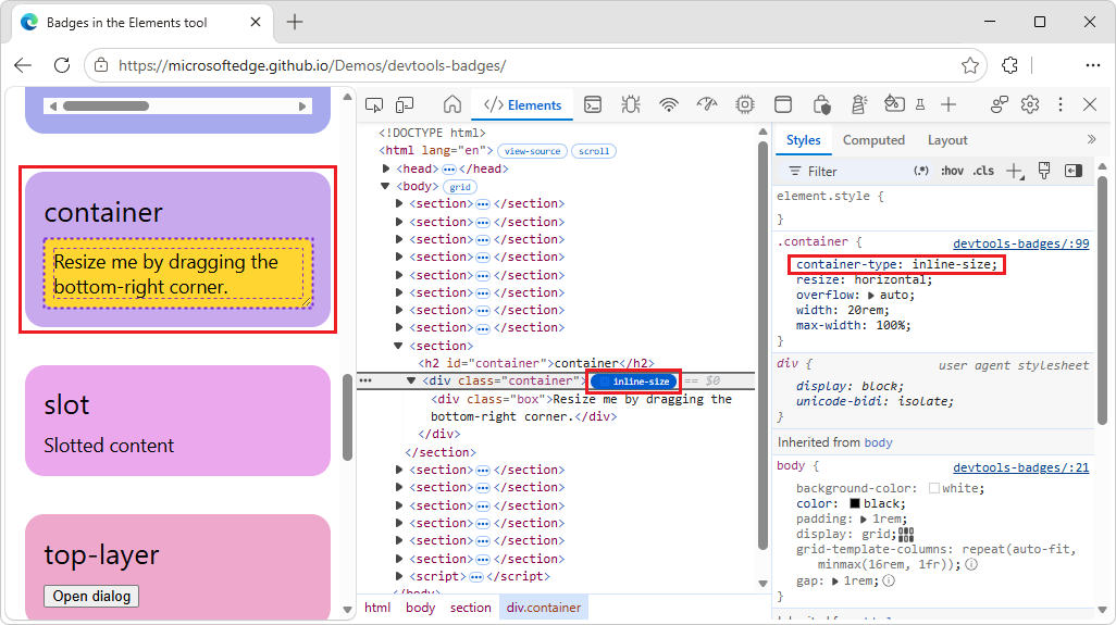
An HTML element is a container if it has the container-type CSS property. Such an element has a specific type of container badge next to it, that displays or hides the corresponding overlay.
There are two types of container badges:
- The inline-size container badge (
 ), used for
container-type: inline-size. - The size container badge (
 ), used for
container-type: size.
To use the inline-size badge:
Go to a webpage, such as the Badges in the Elements tool demo.
Right-click the container box, and then select Inspect.
DevTools opens, with the Elements tool selected.
In the DOM tree, expand the tree to show the
<div class="container">element, and then click theinline-sizebadge ().In the rendered webpage, within the container box, resize the box by dragging its bottom-right corner left or right.
The layout of the box changes, and the overlay shows the element's position and the position of any child elements:
In the DOM tree, click the
inline-sizebadge again.The container overlay is removed from the webpage.
See also:
- Inspect and debug CSS container queries
- Highlight a container and its descendants in Inspect and debug CSS container queries.
- CSS container queries at MDN.
The slot badge
The <slot> HTML element is a placeholder that you can fill with your own content. Together with the <template> element, <slot> lets you create separate DOM trees and present them together.
- A slot content element has a
slotbadge ( ) next to it that serves as a link to the corresponding
<slot>element. - The
slotbadge has a pairedrevealbadge ( ) that takes you back.
To use the slot badge:
Go to a webpage, such as the Badges in the Elements tool demo.
Right-click the slot box, and then select Inspect.
DevTools opens, with the Elements tool selected.
In the DOM tree, expand the tree to show the
<span slot="content">element, and then click theslotbadge ().The corresponding
<slot>element is highlighted in the DOM tree: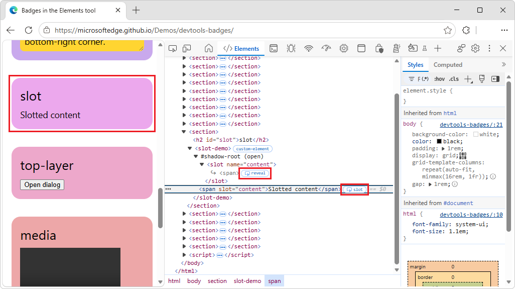
Next to the
<slot>element, click therevealbadge ().The slot's content is highlighted in the DOM tree.
See also:
The reveal badge
The reveal badge () is paired with the following badges:
- The
slotbadge (). See The slot badge, above. - The
top-layerbadge ( ). See The
top-layerbadge, below.
The top-layer badge
The top-layer badge () helps you understand the concept of the top layer and visualize it. The top layer renders content on top of all other layers, regardless of z-index. When you open a <dialog> element by using the .showModal() method, the browser puts it into the top layer.
To help you visualize top layer elements, the Elements tool adds a #top-layer container to the DOM tree after the closing </html> tag.
A top-layer element has a top-layer (N) badge () next to it, where N is the element's index number. The badge is a link to the corresponding element in the #top-layer container.
The top-layer badge has a paired reveal badge () that takes you back.
To use the top-layer badge:
Go to a webpage, such as the Badges in the Elements tool demo.
In the top-layer box, click the Open dialog button.
A dialog opens in the top layer, displaying the message This dialog is in the top layer.
Right-click the dialog, and then select Inspect.
DevTools opens, with the Elements tool selected. Next to the
<dialog>element is atop-layerbadge.In the DOM tree, expand the
<dialog>element.In the DOM tree, next to the
<dialog>element, click thetop-layerbadge ().At the bottom of the DOM tree, the corresponding
#top-layercontainer node is expanded to show thedialognode, which has arevealbadge () next to it: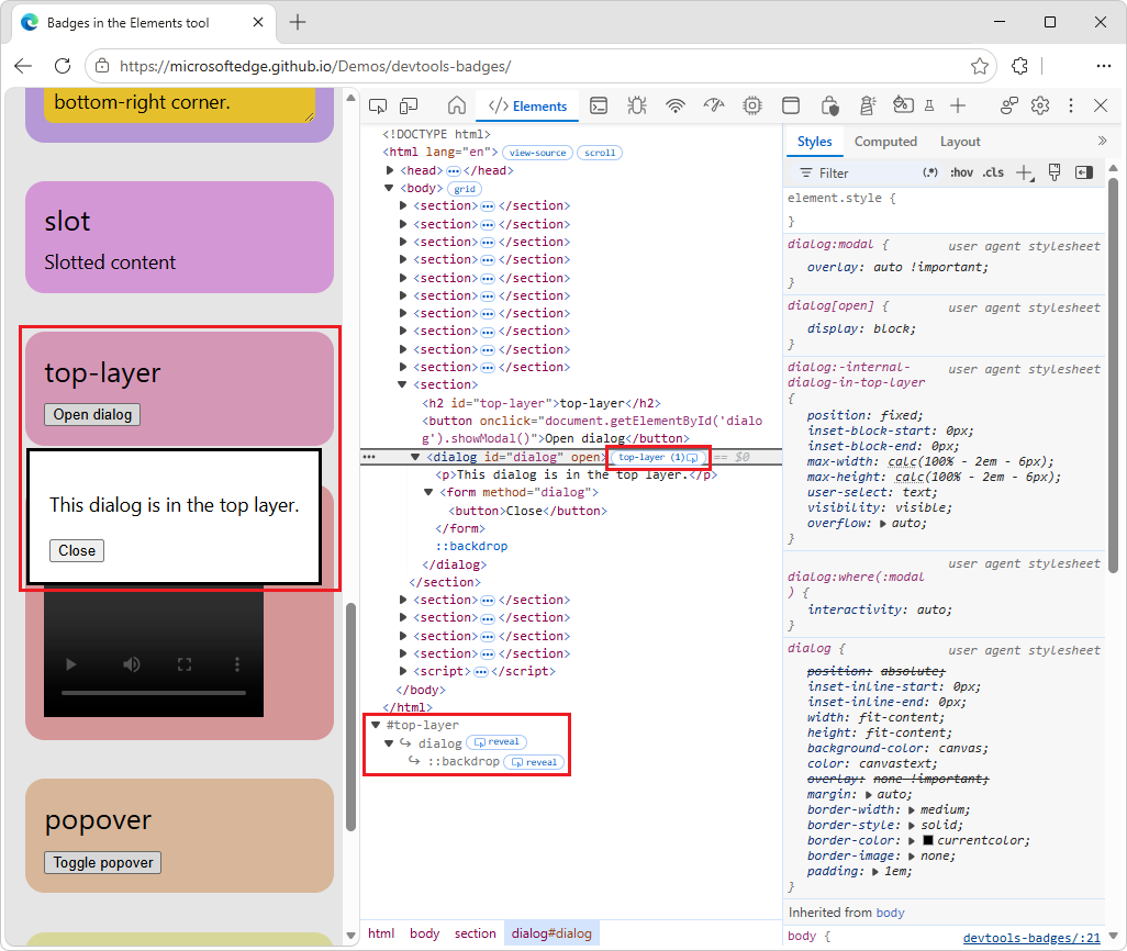
Fully expand the
#top-layercontainer node.Child nodes are displayed:
- A
dialognode, with arevealbadge next to it.- A
::backdropnode, with arevealbadge next to it.
- A
- A
Next to the
#top-layernode's childdialognode, click therevealbadge ().The DOM tree highlights the corresponding
<dialog>element.Next to the
#top-layernode's child::backdropnode, click therevealbadge ().The DOM tree highlights the corresponding
::backdropnode within the<form>element within the<dialog>element.In the rendered webpage, in the This dialog is in the top layer dialog, click the Close button.
In the DOM tree, the node changes from
<dialog id="dialog" open>with atop-layerbadge next to it, to a<dialog id="dialog">element without atop-layerbadge next to it.
See also:
- Top layer at MDN.
<dialog>HTML dialog element at MDN.- HTMLDialogElement: showModal() method at MDN.
The media badge
Click the media badge ( ) to open the Media tool and debug your media. The
media badge is turned off by default. When turned on, the media badge appears next to <audio> and <video> elements.
To turn on the media badge, right-click the DOM tree, and then in the Badge settings submenu, select the Media menuitem.
To use the media badge:
Go to a webpage, such as the Badges in the Elements tool demo.
In the media box, right-click the media player and then select Inspect.
DevTools opens, with the Elements tool selected, with the
<video>element selected.Right-click the DOM tree, and then in the Badge settings submenu, select the media menuitem.
In the DOM tree, the
mediabadge () is added next to the <video>element: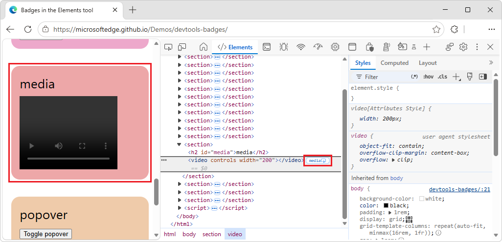
If you click the
mediabadge, the Media tool opens, displaying details. In this demo, the Media tool is empty, because the demo includes an empty<video>element.
See also:
The popover badge
A popover is any element that has a popover attribute. A popover is useful for a wide range of interactive patterns, including:
- Tooltips
- Alerts
- Toasts
- And more.
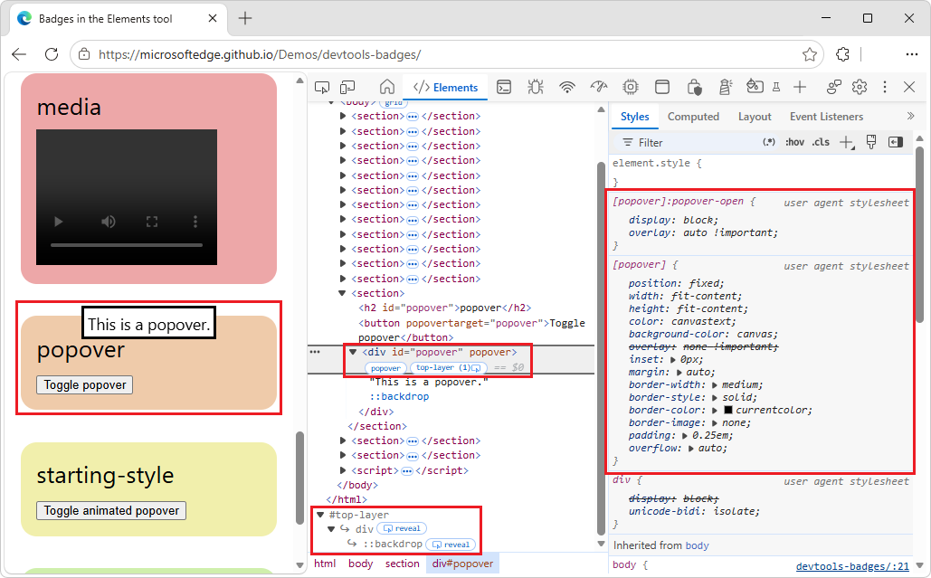
A popover element has a popover badge ( ) next to it. Clicking the
popover badge shows or hides a top-layer badge next to it that links to the corresponding element in the #top-layer container.
To use the popover badge:
Go to a webpage, such as the Badges in the Elements tool demo.
In the popover box, click the Toggle popover button.
A popover opens, showing the message "This is a popover."
Right-click the popover opens, and then select Inspect.
DevTools opens, with the Elements tool selected.
- In the DOM tree, the
<div id="popover" popover>element is displayed, with apopoverbadge next to the element. - At the bottom of the DOM tree, the
#top-layercontainer is displayed:
- In the DOM tree, the
Click the
popoverbadge (), and then move the mouse pointer away from the <div id="popover" popover>element.The
popoverbadge changes color to indicate that it's selected.In the DOM tree, next to the
popoverbadge, click thetop-layerbadge ().At the bottom of the DOM tree, the corresponding
#top-layercontainer node is expanded to show thedivnode, which has arevealbadge () next to it.Fully expand the
#top-layercontainer node.Child nodes are displayed:
- A
divnode, with arevealbadge () next to it. - A
::backdropnode, with arevealbadge () next to it.
- A
Next to the
#top-layernode'sdivnode, click therevealbadge ().The DOM tree highlights the corresponding
<div id="popover" popover>element.Next to the
#top-layernode's child::backdropnode, click therevealbadge.The DOM tree highlights the corresponding
::backdropnode within the<div id="popover" popover>element.Next to the
<div id="popover" popover>element, click thepopoverbadge, and then move the mouse pointer away from the element.The popover changes color to indicate that it's not selected. In the rendered webpage, the popover disappears.
See also:
- The
top-layerbadge, above. - Using the Popover API at MDN.
The starting-style badge
The @starting-style rule defines the initial styles on an element before it's rendered on the page. This is required for elements that animate-in from display: none, because such elements need a state from which to animate in. Such an element has a starting-style badge ( ) next to it.
The starting-style badge toggles the styles in the @starting-style rule, so that you can see the animation in action.
To use the starting-style badge:
Go to a webpage, such as the Badges in the Elements tool demo.
In the starting-style box, click the Toggle animated popover button.
A popover dialog fades-in over the course of 1 second, reading: "This popover fades in."
Right-click the popover dialog, and then select Inspect.
DevTools opens, with the Elements tool selected. In the DOM tree, the
<div id="animated-popover" popover>element is selected. Next to the element is astarting-stylebadge.Click the
starting-stylebadge ().The animated popover fades out. The
starting-stylebadge changes color to indicate that it is selected. In the Styles tab, the@starting-styleCSS selector is displayed: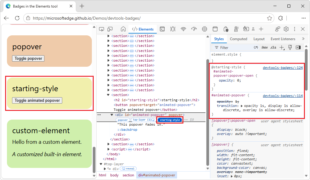
Click the
starting-stylebadge again.The
starting-stylebadge changes color to indicate that it is not selected, and in the Styles tab, the@starting-styleCSS selector is no longer displayed.In the rendered page, click the Toggle animated popover button.
The popover fades out.
See also:
@starting-styleCSS at-rule at MDN.- Transitioning a popover in Using the Popover API at MDN.
The custom-element badge
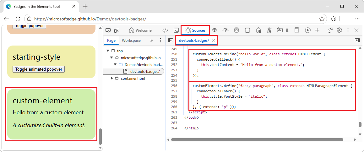
A custom HTML element is identified by either:
- A hyphenated element name, such as
<hello-world>. - An
isattribute added to a built-in element, such as<p is="fancy-paragraph">.
A custom HTML element has a custom-element badge ( ) next to it in the DOM tree. Clicking the
custom-element badge displays the source code for the element.
To use the custom-element badge:
Go to a webpage, such as the Badges in the Elements tool demo.
Right-click the custom-element box, and then select Inspect.
DevTools opens, with the Elements tool selected, with the
<hello-world>or<p is="fancy-paragraph">element selected in the DOM tree. The<hello-world>element and the<p is="fancy-paragraph">element have acustom-elementbadge () next to them: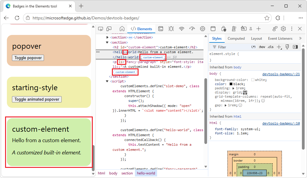
Next to the
<hello-world>element or the<p is="fancy-paragraph">element, click thecustom-elementbadge.The Sources tool opens, showing the relevant code:
See also:
- Using custom elements at MDN.
See also
- Inspect CSS Grid layouts
- Inspect and debug CSS container queries
- View and debug media player information (Media tool)
Chrome docs:
- Open the Elements panel to inspect the DOM or CSS in Open Chrome DevTools.
- Inspect and debug CSS flexbox
Chromium:
MDN:
- CSS grid layout
- Subgrid
- CSS flexible box layout
- Scroll container
- CSS scroll snap
- CSS container queries
<slot>HTML web component slot element- Top layer
<dialog>HTML dialog element- HTMLDialogElement: showModal() method
- Using custom elements
- Using the Popover API at MDN.
@starting-styleCSS at-rule at MDN.- Transitioning a popover in Using the Popover API at MDN.
GitHub:
- Badges in the Elements tool - demo.
- /devtools-badges/ - source code.
Note
Portions of this page are modifications based on work created and shared by Google and used according to terms described in the Creative Commons Attribution 4.0 International License. The original page is found here and is authored by Sofia Emelianova.
 This work is licensed under a Creative Commons Attribution 4.0 International License.