Build a dashboard tab app
A dashboard is a tool to track, analyze, and display data to gain insight of an organization or a specific process. Dashboards in Teams allow you to monitor and view important metrics.
The dashboard tab template from Teams Toolkit allows you to get started with integrating a canvas with multiple cards that provide an overview of content in Teams. You can:
- Use widgets to display content from apps and services within your dashboard tab.
- Integrate your app with Graph API to visualize details about the implementation of the selected data.
- Create customizable dashboards that allow your business to set specific goals that help you track the information you need to view in multiple areas and across departments.
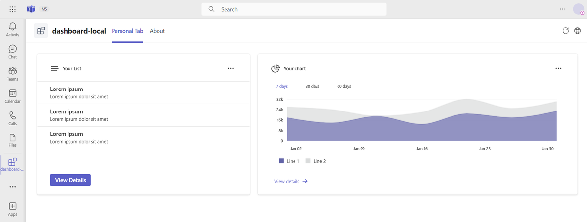
Your team can get the latest updates from different sources in Teams using the Teams dashboard tab app. Use dashboard tab apps to connect numerous metrics, data sources, APIs, and services. Dashboard tab apps help your business extract relevant information from the sources and present it to the users. For more information about creating a dashboard tab app, see step-by-step guide.
Add a new dashboard
After you've created a dashboard tab app, you can add a new dashboard.
To add a new dashboard, follow these steps:
- Create a dashboard class
- Override methods to customize dashboard tab app
- Add a route for the new dashboard tab app
- Modify manifest to add a new dashboard tab app
Create a dashboard class
Create a file with the .tsx extension for your dashboard in the src/dashboards directory, for example, YourDashboard.tsx. Then, create a class that extends the BaseDashboard class from
@microsoft/teamsfx-react.
//YourDashboard.tsx
import { BaseDashboard } from "@microsoft/teamsfx-react";

export default class YourDashboard extends BaseDashboard<any, any> {}
Note
All methods are optional. If you don't override any method, the default dashboard layout is used.
Override methods to customize dashboard tab app
The BaseDashboard class provides few methods that you can override to customize the dashboard layout. The following table lists the methods that you can override:
| Methods | Function |
|---|---|
styling() |
Customize the style of the dashboard. |
layout() |
Define widgets layout. |
The following code is an example to customize the dashboard layout:
.your-dashboard-layout {
  grid-template-columns: 6fr 4fr;
}
import { BaseDashboard } from "@microsoft/teamsfx-react";
import ListWidget from "../widgets/ListWidget";
import ChartWidget from "../widgets/ChartWidget";

export default class YourDashboard extends BaseDashboard<any, any> {
  override styling(): string {
    return "your-dashboard-layout";
  }

  override layout(): JSX.Element | undefined {
    return (
      <>
        <ListWidget />
        <ChartWidget />
      </>
    );
  }
}
Add a route for the new dashboard tab app
You must link your widget to a data source file. The widget picks up the data that's presented in the dashboard from the source file.
Open the src/App.tsx file and add a route for the new dashboard. Here's an example:
import YourDashboard from "./dashboards/YourDashboard";

export default function App() {
  ...
  <Route path="/yourdashboard" element={<YourDashboard />} />
  ...
}
Modify manifest to add a new dashboard tab app
Open the appPackage/manifest.json file and add a new dashboard tab under staticTabs. For more information, see app manifest. Here's an example:
{
  "entityId": "index1",
  "name": "Your Dashboard",
  "contentUrl": "${{TAB_ENDPOINT}}/index.html#/yourdashboard",
  "websiteUrl": "${{TAB_ENDPOINT}}/index.html#/yourdashboard",
  "scopes": ["personal"]
}
Customize the dashboard layout
TeamsFx provides convenient methods to define and modify the layout of the dashboard. The following are the methods:
Three widgets in a row with the height of 350 px occupying 20 percent, 60 percent, and 20 percent of the width, respectively.
.customize-class-name {
  grid-template-rows: 350px;
  grid-template-columns: 2fr 6fr 2fr;
}
export default class SampleDashboard extends BaseDashboard<any, any> { override styling(): string { return "customize-class-name"; } override layout(): JSX.Element | undefined { return ( <> <ListWidget /> <ChartWidget /> <NewsWidget /> </> ); } }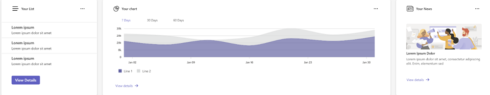
Two widgets in a row with a width of 600 px and 1100 px. The height of the first line is the maximum height of its content, and the height of the second line is 400 px.
.customize-class-name {
  grid-template-rows: max-content 400px;
  grid-template-columns: 600px 1100px;
}
export default class SampleDashboard extends Dashboard { override styling(): string { return "customize-class-name"; } override layout(): JSX.Element | undefined { return ( <> <ListWidget /> <ChartWidget /> <NewsWidget /> </> ); } }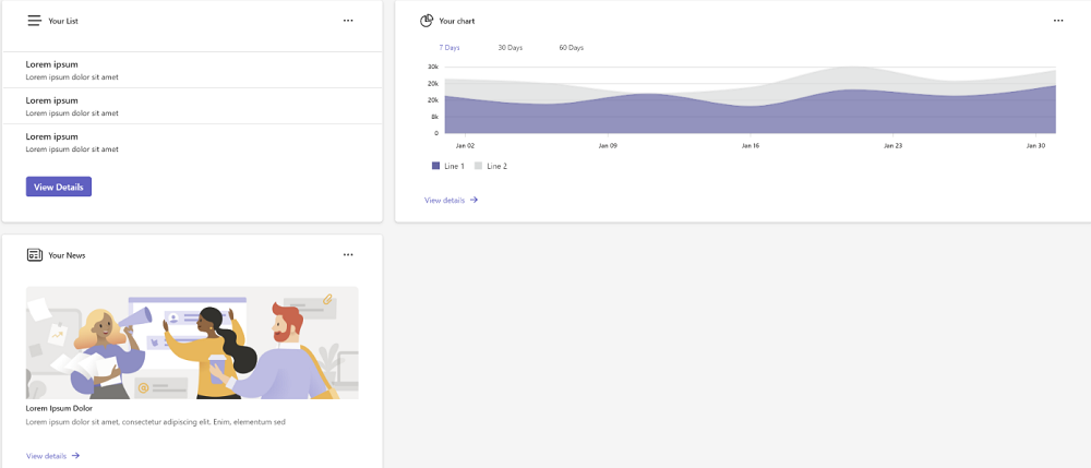
Arrange two widgets in a column.
.one-column {
    display: grid;
    gap: 20px;
    grid-template-rows: 1fr 1fr;
  }
export default class SampleDashboard extends BaseDashboard<any, any> { override layout(): JSX.Element | undefined { return ( <> <NewsWidget /> <div className="one-column"> <ListWidget /> <ChartWidget /> </div> </> ); } }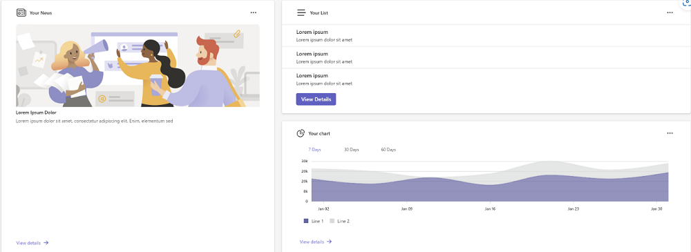
Dashboard tab app abstraction
To adjust the layout of the dashboard, TeamsFx provides a BaseDashboard class for the developers to implement a dashboard.
The following code is an example of a BaseDashboard class:
function dashboardStyle(isMobile?: boolean) {
  return mergeStyles({
    display: "grid",
    gap: "20px",
    padding: "20px",
    gridTemplateRows: "1fr",
    gridTemplateColumns: "4fr 6fr",
    ...(isMobile === true ? { gridTemplateColumns: "1fr", gridTemplateRows: "1fr" } : {}),
  });
}

interface BaseDashboardState {
  isMobile?: boolean;
  showLogin?: boolean;
  observer?: ResizeObserver;
}

export class BaseDashboard<P, S> extends Component<P, S & BaseDashboardState> {
  private ref: React.RefObject<HTMLDivElement>;

  public constructor(props: Readonly<P>) {
    super(props);
    this.state = {
      isMobile: undefined,
      showLogin: undefined,
      observer: undefined,
    } as S & BaseDashboardState;
    this.ref = React.createRef<HTMLDivElement>();
  }

  public async componentDidMount() {
    const observer = new ResizeObserver((entries) => {
      for (const entry of entries) {
        if (entry.target === this.ref.current) {
          const { width } = entry.contentRect;
          this.setState({ isMobile: width < 600 } as S & BaseDashboardState);
        }
      }
    });
    observer.observe(this.ref.current!);
  }

  public componentWillUnmount(): void {
    if (this.state.observer && this.ref.current) {
      this.state.observer.unobserve(this.ref.current);
    }
  }

  public render() {
    return (
      <div
        ref={this.ref}
        className={mergeStyles(dashboardStyle(this.state.isMobile), this.styling())}
      >
        {this.layout()}
      </div>
    );
  }

  protected layout(): JSX.Element | undefined {
    return undefined;
  }

  protected styling(): string {
    return null;
  }
}
In the BaseDashboard class, TeamsFx provides basic layouts with customizable methods. The dashboard is still a react component, and TeamsFx provides basic implementations of functions based on the lifecycle of react components, such as:
- Implementing a basic render logic based on the grid layout.
- Adding an observer to automatically adapt to mobile devices.
The following are the customizable methods to override:
| Methods | Function | Recommend to override |
|---|---|---|
constructor() |
Initializes the dashboard state and variables. | No |
componentDidMount() |
Invokes after a component is mounted. | No |
componentWillUnmount() |
Invokes when a component is unmounted. | No |
render() |
Invokes when there's an update. The dashboard default layout is defined in this method. | No |
layout |
Defines the layout of the widget in the dashboard. You can override this method. | Yes |
styling() |
To customize the style of the dashboard. You can override this method. | Yes |
Use a widget in your dashboard
Widgets display configurable information and charts on dashboards. They appear on the widget board where you can pin, unpin, arrange, resize, and customize widgets to reflect your interests. Your widget board is optimized to show relevant widgets and personalized content based on your usage.
Customize the widget
You can customize the widget by overriding the following methods in the BaseWidget class:
Override
header(),body(), andfooter()to customize the widget.export class NewsWidget extends BaseWidget<any, any> { override header(): JSX.Element | undefined { return ( <div> <News28Regular /> <Text>Your News</Text> <Button icon={<MoreHorizontal32Regular />} appearance="transparent" /> </div> ); } override body(): JSX.Element | undefined { return ( <div> <Image src="image.svg" /> <Text>Lorem Ipsum Dolor</Text> <Text> Lorem ipsum dolor sit amet, consectetur adipiscing elit. Enim, elementum sed </Text> </div> ); } override footer(): JSX.Element | undefined { return ( <Button appearance="transparent" icon={<ArrowRight16Filled />} iconPosition="after" size="small" > View details </Button> ); } }
Override
body()andfooter()to customize the widget.export class NewsWidget extends BaseWidget<any, any> { override body(): JSX.Element | undefined { return ( <div> <Image src="image.svg" /> <Text>Lorem Ipsum Dolor</Text> <Text> Lorem ipsum dolor sit amet, consectetur adipiscing elit. Enim, elementum sed </Text> </div> ); } override footer(): JSX.Element | undefined { return ( <Button appearance="transparent" icon={<ArrowRight16Filled />} iconPosition="after" size="small" > View details </Button> ); } }
Override
body()to customize the widget.export class NewsWidget extends BaseWidget<any, any> { override body(): JSX.Element | undefined { return ( <div> <Image src="image.svg" /> <Text>Lorem Ipsum Dolor</Text> <Text> Lorem ipsum dolor sit amet, consectetur adipiscing elit. Enim, elementum sed </Text> </div> ); } }
Include a data loader
If you want to include a data loader to your widget before the widget is loaded, you can add a property to the state of the widget to indicate that the data loader is loading(). You can use this property to show a loading indicator to the user.
Example:
    override loading(): JSX.Element | undefined {
     return (
      <div className="loading">
       <Spinner label="Loading..." labelPosition="below" />
      </div>
     );
    }
Now, the loading spinner is shown while the data is loading. When the data is loaded, the loading spinner is hidden, and the list data and footer button are shown.
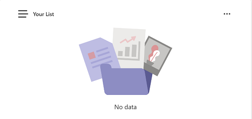
Handle empty state
You can display a specific content in your widget when the data is empty. To do so, you need to modify the body method in your widget file to adopt different states of the data.
The following example shows how to display an empty image when the data of ListWidget is empty.
override body(): JSX.Element | undefined {
  let hasData = this.state.data && this.state.data.length > 0;
  return (
    <div>
      {hasData ? (
        <>
          {this.state.data?.map((t: ListModel) => {
            ...
          })}
        </>
      ) : (
        <div>
          <Image src="empty-default.svg" height="150px" />
          <Text align="center">No data</Text>
        </div>
      )}
    </div>
  );
}
You can use a similar approach to remove the footer content of your widget when the data is empty.
  override footer(): JSX.Element | undefined {
    let hasData = this.state.data && this.state.data.length > 0;
    if (hasData) {
      return <Button>...</Button>;
    }
  }
When data is empty, your list widget appears as follows:
Refresh data as scheduled
The following example shows how to display real-time data in a widget. The widget displays the current time and updates.
interface IRefreshWidgetState {
  data: string;
}

export class RefreshWidget extends BaseWidget<any, IRefreshWidgetState> {
  override body(): JSX.Element | undefined {
    return <>{this.state.data}</>;
  }

  async componentDidMount() {
    setInterval(() => {
      this.setState({ data: new Date().toLocaleTimeString() });
    }, 1000);
  }
}
You can modify setInterval method to call your own function to refresh data like this setInterval(() => yourGetDataFunction(), 1000).
Widget abstraction
To simplify the development of a widget, TeamsFx SDK provides a BaseWidget class for developers to inherit to implement a widget that meets their needs without paying much attention to implement the widget layout.
The following code is an example of BaseWidget class:
export interface IWidgetClassNames {
  root?: string;
  header?: string;
  body?: string;
  footer?: string;
}

const classNames: IWidgetClassNames = mergeStyleSets({
  root: {
    display: "grid",
    padding: "1.25rem 2rem 1.25rem 2rem",
    backgroundColor: tokens.colorNeutralBackground1,
    border: "1px solid var(--colorTransparentStroke)",
    boxShadow: tokens.shadow4,
    borderRadius: tokens.borderRadiusMedium,
    gap: tokens.spacingHorizontalL,
    gridTemplateRows: "max-content 1fr max-content",
  },
  header: {
    display: "grid",
    height: "max-content",
    "& div": {
      display: "grid",
      gap: tokens.spacingHorizontalS,
      alignItems: "center",
      gridTemplateColumns: "min-content 1fr min-content",
    },
    "& svg": {
      height: "1.5rem",
      width: "1.5rem",
    },
    "& span": {
      fontWeight: tokens.fontWeightSemibold,
      lineHeight: tokens.lineHeightBase200,
      fontSize: tokens.fontSizeBase200,
    },
  },
  footer: {
    "& button": {
      width: "fit-content",
    },
  },
});

interface BaseWidgetState {
  loading?: boolean;
}

export class BaseWidget<P, S> extends Component<P, S & BaseWidgetState> {
  public constructor(props: Readonly<P>) {
    super(props);
    this.state = { loading: undefined } as S & BaseWidgetState;
  }

  public async componentDidMount() {
    this.setState({ ...(await this.getData()), loading: false });
  }

  public render() {
    const { root, header, body, footer } = this.styling();
    const showLoading = this.state.loading !== false && this.loading() !== undefined;
    return (
      <div className={mergeStyles(classNames.root, root)}>
        {this.header() && (
          <div className={mergeStyles(classNames.header, header)}>{this.header()}</div>
        )}
        {showLoading ? (
          this.loading()
        ) : (
          <>
            {this.body() !== undefined && <div className={body}>{this.body()}</div>}
            {this.footer() !== undefined && (
              <div className={mergeStyles(classNames.footer, footer)}>{this.footer()}</div>
            )}
          </>
        )}
      </div>
    );
  }

  protected async getData(): Promise<S> {
    return undefined;
  }

  protected header(): JSX.Element | undefined {
    return undefined;
  }

  protected body(): JSX.Element | undefined {
    return undefined;
  }

  protected footer(): JSX.Element | undefined {
    return undefined;
  }

  protected loading(): JSX.Element | undefined {
    return undefined;
  }

  protected styling(): IWidgetClassNames {
    return {};
  }
}
The following are the recommended methods to override:
| Methods | Function | Recommend to override |
|---|---|---|
constructor() |
Invokes the initial this.state and calls the constructor of the super class React.Component. |
No |
componentDidMount() |
Invokes after a component is mounted and assigns a value to the data property of the state by calling the getData() method. |
No |
render() |
Invokes whenever there's an update. The dashboard default layout is defined in this method. | No |
getData() |
Invokes the data needed by the widget. The value returned by this method is set to this.state.data. |
Yes |
header() |
Invokes what the widget header looks like. You can choose to override this method to customize a widget or not, if not, the widget won't have a header. | Yes |
body() |
Invokes what the widget body looks like. You can choose to override this method to customize a widget or not, if not, the widget won't have a body. | Yes |
footer() |
Invokes what the widget footer looks like. You can choose to override this method to customize a widget or not, if not, the widget won't have a footer. | Yes |
loading() |
Invokes when the widget is in the process of fetching data. If a loading indicator is required, the method can return a JSX.Element that contains the necessary components to render the loading indicator. |
Yes |
style() |
Invokes an object that defines the class names for the different parts of the widget. | Yes |
Microsoft Graph Toolkit as widget content
Microsoft Graph Toolkit is a set of renewable, framework-agnostic web components, which helps accessing and working with Microsoft Graph. You can use the Microsoft Graph Toolkit with any web framework or without a framework.
To use Microsoft Graph Toolkit as your widget content, follow these steps:
Add SSO feature to your Teams app: Microsoft Teams provides single sign-on (SSO) function for an app to obtain signed in Teams user token to access Microsoft Graph. For more information, refer SSO feature to your Teams app.
Install required
npmpackages.Run the following command in your project
tabsfolder to install the requirednpmpackages:npm install @microsoft/mgt-react @microsoft/mgt-teamsfx-providerAdd a new Graph Toolkit widget: Create a new widget file in your project
src/views/widgetsfolder, for example,GraphWidget.tsx. In this widget, we'll guide users to consent our app to access Microsoft Graph and then show the user's Todo list by using Microsoft Graph Toolkit.The following code is an example of using Todo component from Microsoft Graph Toolkit in widget:
import { Providers, ProviderState, Todo } from "@microsoft/mgt-react";
import { TeamsFxProvider } from "@microsoft/mgt-teamsfx-provider";

import { loginAction } from "../../internal/login";
import { TeamsUserCredentialContext } from "../../internal/singletonContext";
import { BaseWidget } from "@microsoft/teamsfx-react";

interface IGraphWidgetState {
  needLogin: boolean;
}

export class GraphWidget extends Widget<any, IGraphWidgetState> {
  override body(): JSX.Element | undefined {
    return <div>{this.state.needLogin === false && <Todo />}</div>;
  }

  async componentDidMount() {
    super.componentDidMount();

    // Initialize TeamsFx provider
    const provider = new TeamsFxProvider(TeamsUserCredentialContext.getInstance().getCredential(), [
     "Tasks.ReadWrite",
]);
    Providers.globalProvider = provider;

    // Check if user is signed in
    if (await this.checkIsConsentNeeded()) {
      await loginAction(["Tasks.ReadWrite"]);
}

// Update signed in state
Providers.globalProvider.setState(ProviderState.SignedIn);
this.setState({ needLogin: false });

  }

  /**

  * Check if user needs to consent
  * @returns true if user needs to consent
  */

  async checkIsConsentNeeded() {
    let needConsent = false;
    try {
      await TeamsUserCredentialContext.getInstance().getCredential().getToken(["Tasks.ReadWrite"]);
    } catch (error) {
      needConsent = true;
    }
    return needConsent;
  }
}
You can use alternative Microsoft Graph Toolkit components within your widget. For more information, see Microsoft Graph Toolkit.
Add the widget to dashboard layout. Include the new widget in your dashboard file.
...
export default class YourDashboard extends BaseDashboard<any, any> {
  ...
  override layout(): undefined | JSX.Element {
    return (
      <>
        <GraphWiget />
      </>
    );
  }
  ...
}
Now, launch or refresh your Teams app, you'll see the new widget using Microsoft Graph Toolkit.
Graph API call
Microsoft Graph API is a web API that you can use to communicate with Microsoft cloud and other services. Custom applications can use the Microsoft Graph API to connect to data and use it in custom applications to enhance organizational productivity.
Before implementing your Graph API call logic, it's necessary to enable SSO for your dashboard project. For more information, see Add single sign-on to Teams app.
To add a Graph API call:
- Call Graph API from the front-end (use delegated permissions)
- Call Graph API from the back-end (use application permissions)
Call Graph API from the front-end (use delegated permissions)
If you want to call a Graph API from the front-end tab, follow these steps:
To obtain the name of the permission scope associated with the Graph API you intend to invoke, see Graph API.
Create a Graph client by adding the scope related to the Graph API you want to call.
let credential: TeamsUserCredential;
credential = TeamsUserCredentialContext.getInstance().getCredential();
const graphClient: Client = createMicrosoftGraphClientWithCredential(credential, scope);
Call the Graph API and parse the response into a certain model.
try {
  const graphApiResult = await graphClient.api("<GRAPH_API_PATH>").get();
  // Parse the graphApiResult into a Model you defined, used by the front-end.
} catch (e) {}
Call Graph API from the back-end (use application permissions)
If you want to call a Graph API from the back-end, follow these steps:
- Consent application permissions
- Add an Azure function
- Add your logic in Azure function
- Call the Azure function from the front-end
Consent application permissions
To consent application permissions, follow these steps:
- Go to Azure portal.
- Select Microsoft Entra ID.
- Select App registrations in the left pane.
- Select your dashboard app.
- Select API permissions in the left pane.
- Select Add permission.
- Select Microsoft Graph.
- Select Application permissions.
- Find the permissions you need.
- Select the Add permissions button at the bottom.
- Select ✔Grant admin consent.
- Select the Yes button to finish the admin consent.
Add an Azure function
In the left pane of the Visual Studio Code, go to Teams Toolkit > Adding features > Azure Functions and enter the function name.
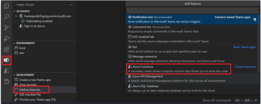
For more information on how to add an Azure Function to your project, see integrate Azure Functions with your Teams app.
Add your logic in Azure function
In the index.ts/index.ts under the folder named Azure Function, you can add your logic that contains back-end Graph API calling with application permissions. Refer to the following code snippet:
/**
 * This function handles requests from teamsfx client.
 * The HTTP request should contain an SSO token queried from Teams in the header.
 * Before triggering this function, teamsfx binding would process the SSO token and generate teamsfx configuration.
 *
 * You should initializes the teamsfx SDK with the configuration and calls these APIs.
 *
 * The response contains multiple message blocks constructed into a JSON object, including:
 * - An echo of the request body.
 * - The display name encoded in the SSO token.
 * - Current user's Microsoft 365 profile if the user has consented.
 *
 * @param {Context} context - The Azure Functions context object.
 * @param {HttpRequest} req - The HTTP request.
 * @param {teamsfxContext} TeamsfxContext - The context generated by teamsfx binding.
 */
export default async function run(
  context: Context,
  req: HttpRequest,
  teamsfxContext: TeamsfxContext
): Promise<Response> {
  context.log("HTTP trigger function processed a request.");

  // Initialize response.
  const res: Response = {
    status: 200,
    body: {},
  };

  // Your logic here.

  return res;
}
Call the Azure function from the front-end
Call the Azure function by function name. Refer to the following code snippet to call the Azure function:
const functionName = process.env.REACT_APP_FUNC_NAME || "myFunc";
export let taskName: string;

export async function callFunction(params?: string) {
  taskName = params || "";
  const credential = TeamsUserCredentialContext.getInstance().getCredential();
  if (!credential) {
    throw new Error("TeamsFx SDK is not initialized.");
  }
  try {
    const apiBaseUrl = process.env.REACT_APP_FUNC_ENDPOINT + "/api/";
    const apiClient = createApiClient(
      apiBaseUrl,
      new BearerTokenAuthProvider(async () => (await credential.getToken(""))!.token)
    );
    const response = await apiClient.get(functionName);
    return response.data;
  } catch (err: unknown) {
    ...
  }
}
For more information, see:
Embed Power BI to dashboard
To embed Power BI to the dashboard, see Power BI client react.
Step-by-step guide
Follow the step-by-step guide to build a dashboard, and learn to add a widget and Graph API call to the dashboard.
See also
Platform Docs
Feedback
Coming soon: Throughout 2024 we will be phasing out GitHub Issues as the feedback mechanism for content and replacing it with a new feedback system. For more information see: https://aka.ms/ContentUserFeedback.
Submit and view feedback for