Customer Profitability sample for Power BI: Take a tour
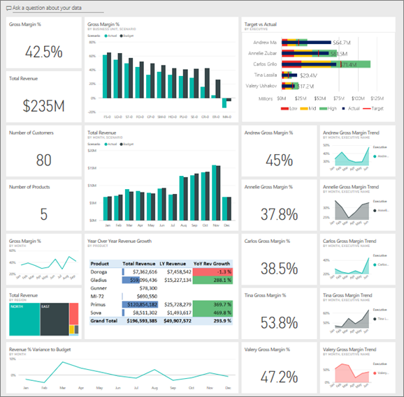
The Customer Profitability sample contains a dashboard, report, and semantic model for a company that manufactures marketing materials. A CFO created this dashboard to see key metrics about their five business unit managers (executives), products, customers, and gross margins (GM). At a glance, they can see what factors affect profitability.
This sample is part of a series that shows how you can use Power BI with business-oriented data, reports, and dashboards. The company obviEnce created this sample using real, anonymized data. The data is available in several formats: a built-in sample in the service, a .pbix Power BI Desktop file, or an Excel workbook. See Samples for Power BI.
This tour explores the built-in Customer Profitability sample in the Power BI service. Because the report experience is similar in Power BI Desktop and in the service, you can also follow along by using the sample .pbix file in Power BI Desktop.
Before you can use the sample, get the sample in one of the following ways:
- Get the built-in sample in the service.
- Download the .pbix file.
- Download the Excel workbook.
Prerequisites
You don't need a Power BI license to explore the samples in Power BI Desktop. You just need a Fabric free license to explore the sample in the Power BI service, and save it to your My workspace.
Get the built-in sample in the Power BI service
Open the Power BI service (
app.powerbi.com), and select Learn in the left navigation.On the Learning center page, under Sample reports, scroll until you see the Customer Profitability Sample.
Select the sample. It opens in Reading mode.
Power BI imports the built-in sample, adding a new dashboard, report, and semantic model to your current workspace.

Select the dashboard to view the sample dashboard.
Get the .pbix file for this sample
Alternatively, you can download the Customer Profitability sample as a .pbix file, which is designed for use with Power BI Desktop.
After you open the file in Power BI Desktop, select File > Publish > Publish to Power BI or choose Publish in the Home ribbon.
In the Publish to Power BI dialog, choose a workspace and then Select.
In the Power BI service, in your workspace, scroll down to the IT Spend Analysis Sample report and select to open.
From the More options (...) menu, select Pin to a dashboard. Select New dashboard, enter a name, and choose Pin live.
The dashboard that you create this way isn't the same as the sample dashboard created by the built-in sample. You can still use Q&A in the dashboard to learn more about your data and make changes to your dashboard.
Get the Excel workbook for this sample
If you want to view the data source for this sample, it's also available as an Excel workbook. To see the raw data, enable the Data Analysis add-ins, and then select Power Pivot > Manage.
If you want to get and use the Excel file in the Power BI service, follow these steps:
Download the sample from Power BI Desktop samples. The file is called IT Spend Analysis Sample-no-PV.xlsx.
Open the file in Excel and then select File > Publish > Publish to Power BI.
Select a workspace, such as My workspace, and choose Export.
There are different ways to work with Excel files. For more information, see Explore the Excel samples in Excel.
In the Power BI service, the exported data appears as a semantic model in the selected workspace. Select More options (...) > Auto-create report.
Select Save, enter a name for your report, and then choose Save.
From the More options (...) menu, select Pin to a dashboard. Select New dashboard, enter a name, and choose Pin live.
The dashboard and report that you create this way aren't the same as the ones created by the built-in sample. You can still use Q&A in the dashboard to explore your data and make changes to your dashboard.
What's the dashboard telling us?
With the built-in sample in the Power BI service, you have a report and a dashboard. If you obtained the sample as a .pbix or Excel file, your dashboard doesn't look as described int this section.
Let's start the tour at the dashboard. In the workspace where you saved the sample, find the Customer Profitability dashboard and select it:

Company-wide dashboard tiles
Open the dashboard in the Power BI service. The dashboard tiles give the CFO a view of the high-level company metrics important to them. When they see something interesting, they can select a tile to dig into the data.
Review the tiles on the left side of the dashboard.
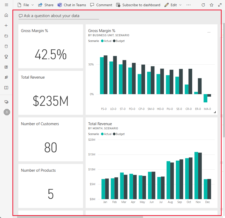
Note the following details:
- The company's gross margin is 42.5%.
- It has 80 customers.
- It sells five different products.
- It had its lowest revenue % variance to budget in February, followed by the highest in March.
- Most of the revenue comes from the east and north regions. Gross margin has never exceeded budget, with the ER-0 and MA-0 business units requiring further investigation.
- Total revenue for the year is close to budget.
Manager-specific dashboard tiles
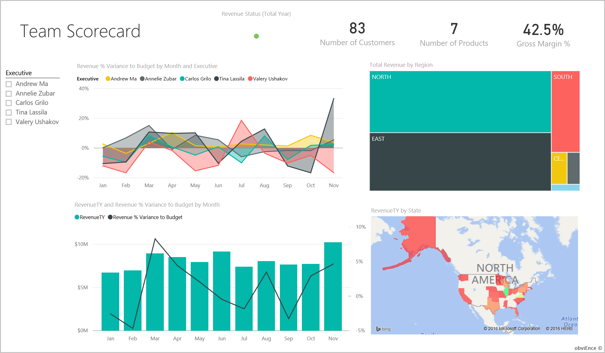
The tiles on the right side of the dashboard provide a team scorecard. The CFO needs to keep track of their managers and these tiles give them a high-level overview of profit, by using GM%. If the GM% trend is unexpected for any manager, then they can investigate further.
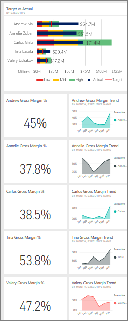
By analyzing the manager-specific dashboard tiles, you can make the following observations:
- All executives, except Carlos, have already exceeded their target sales. However, Carlos' actual sales are the highest.
- Annelie's GM% is the lowest, but you see a steady increase since March.
- Valery, on the other hand, has seen their GM% drop significantly.
- Andrew had a volatile year.
Explore the dashboard's underlying data
This dashboard has tiles that link to a report and to an Excel workbook.
If you downloaded the Excel workbook version of this sample, you don't have the dashboard or the report, but Power BI can auto-create a report for you from the data. See Get the Excel workbook for this sample in this article for details.
Open the Excel Online data source
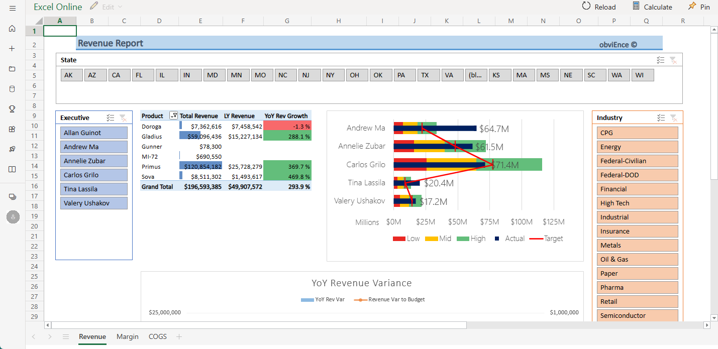
Two tiles on this dashboard, Target vs Actual and Year Over Year Revenue Growth, were pinned from an Excel workbook. When you select either of these tiles, Power BI opens the data source, in this case, Excel Online.
Select Target vs Actual. Excel Online opens within the Power BI service.
The workbook has three tabs worth of data. Open COGS.
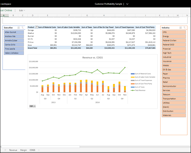
Total revenue is exceeding costs by a healthy margin. The shape of the total revenue line and height of the costs columns are similar. Interact with the data by filtering, slicing, drilling, and more. For example, look at Revenue vs COGS for just one Industry.
- From the Industry slicer, select Retail.
You see that only two district managers cover the retail industry: Andrew and Carlos.
Total revenue is exceeding costs by a healthy margin until 2014 quarter 3. And looking at the stacked column, there are some strange data that bears further examination. Did you truly have no costs for July? Did you get a refund from a third party?
Continue exploring. If you find something interesting, select Pin
 from the upper-right corner to pin it to a dashboard.
Use your browser's back arrow to return to the dashboard.
Open the underlying Power BI report
Many of the tiles on the Customer Profitability sample dashboard were pinned from the underlying Customer Profitability sample report.
Select one of these tiles to open the report in Reading view.
If the tile was created in Q&A, selecting it opens the Q&A window. Select Exit Q&A to return to the dashboard and try a different tile.
The report has three pages. You can select the page you want from the Pages pane on the left.

- Team Scorecard focuses on the performance of the five managers and their books of business.
- Industry Margin Analysis provides a way to analyze the profitability compared to what's happening in the entire industry.
- Executive Scorecard provides a view of each of the managers, in a custom page size format.
Team Scorecard page
Look at two of the team members in detail and see what insights you can gain:
In the Executive slicer on the left, select Andrew's name to filter the report page to display only data about Andrew:
- For a quick KPI, look at Andrew's Revenue Status (Total Year). It's green, which means Andrew's performing well.
- The Revenue % Variance to Budget by Month and Executive chart shows that, except for a dip in February, Andrew is doing well. Andrew's most dominant region is the east region, which includes 49 customers, and five out of seven products. Andrew's GM% isn't the highest or the lowest.
- The RevenueTY and Revenue % Var to Budget by Month chart shows a steady, even-profit story. However, if you filter by selecting the square for Central in the region treemap, you discover that Andrew has revenue only in March and only in Indiana. Is this trend intentional or is it something that needs looking into?
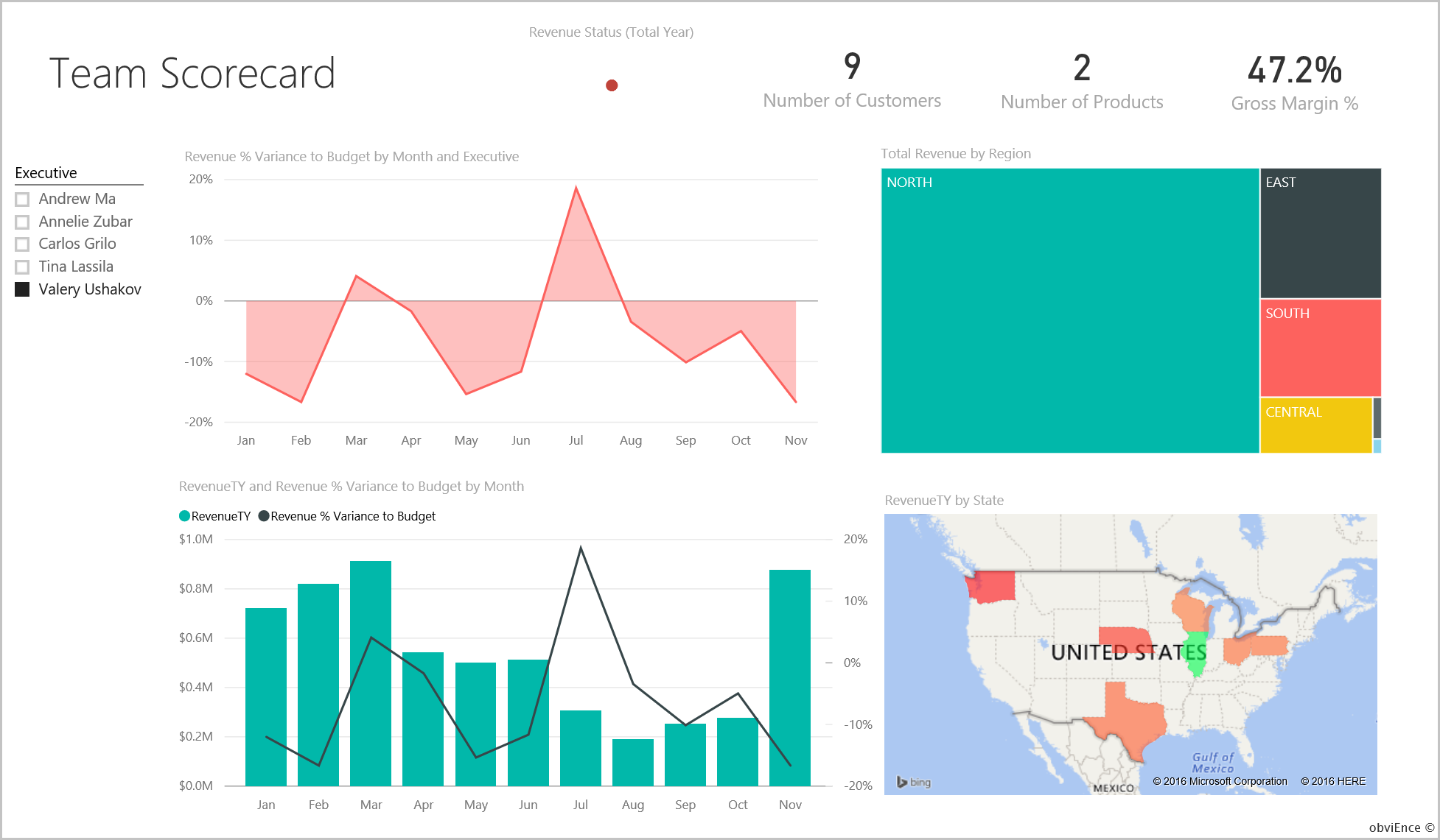
Now on to Valery. In the Executive slicer, select Valery's name to filter the report page to display data only about Valery.
- Notice the red KPI for Revenue Status (Total Year). This item definitely needs further investigation.
- Valery's revenue variance also paints a worrying picture. Valery isn't meeting set revenue margins.
- Valery has only nine customers, handles only two products, and works almost exclusively with customers in the north region. This specialization could explain the wide fluctuations in the metrics.
- If you select the North square in the tree map, it shows that Valery's gross margin in the north region is consistent with the overall margin.
- Selecting each of the other Total Revenue by Region squares tells an interesting story. Their GM% ranges from 23% to 79%. Valery's revenue numbers, in all regions except the north region, are extremely seasonal.
Continue exploring to find out why Valery's area isn't performing well. Look at regions, the other business units, and the next page in the report: Industry Margin Analysis.
Industry Margin Analysis page
This report page provides a different slice of the data. It looks at gross margin for the entire industry, broken down by segment. The CFO uses this page to compare company and business unit metrics to industry metrics to help them explain trends and profitability. You might wonder why the Gross Margin % by Month and Executive chart is on this page, because it's team-specific. Having it here lets you filter the page by business unit manager.
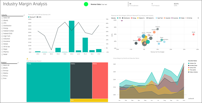
How does profitability vary by industry? How do the products and customers break down by industry? To answer these questions, select one or more industries from the top left. Start with the CPG industry. To clear the filter, select the eraser icon.
On the Revenue Var % to Budget, GM%, and RevenueTY by Industry bubble chart, the CFO looks for the largest bubbles, because they have the biggest effect on revenue. To easily see each manager's effect by industry segment, filter the page by selecting each manager's name in turn in the area chart.
As you select each manager in the chart, note the following details:
- Andrew's area of influence spans many different industry segments with widely varying GM% (mostly on the positive side) and Var%.
- Annelie's chart is similar. Annelie only concentrates on a handful of industry segments with a focus on the Federal segment and a focus on the Gladius product.
- Carlos has a clear focus on the services segment, with good profit. Carlos has also greatly improved Var% for the High Tech segment and a new segment, Industrial, performed exceptionally well compared to budget.
- Tina works with a handful of segments and has the highest GM%, but the mostly small size of the bubbles shows that Tina's effect on the company's bottom line is minimal.
- Valery, who is responsible for only one product, works in only five industry segments. Valery's industry influence is seasonal, but always produces a large bubble, indicating a significant effect on the company's bottom line. Do the industry segments explain their negative performance?
Executive Scorecard page
This page has a custom page size format, optimized for display on a mobile device..
Dig into the data by asking questions with Q&A
No matter whether you downloaded the dashboard or created your own, you can use Q&A in the dashboard to discover other details in the data. Let's get more specific.
For your analysis, it might be helpful to determine which industry generates the most revenue for Valery. Use Q&A.
From the top of the dashboard, select Ask a question about your data to open the Q&A question box.
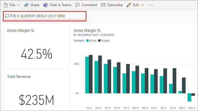
Type total revenue by industry for Valery in the question box. The visualization updates as you type the question.
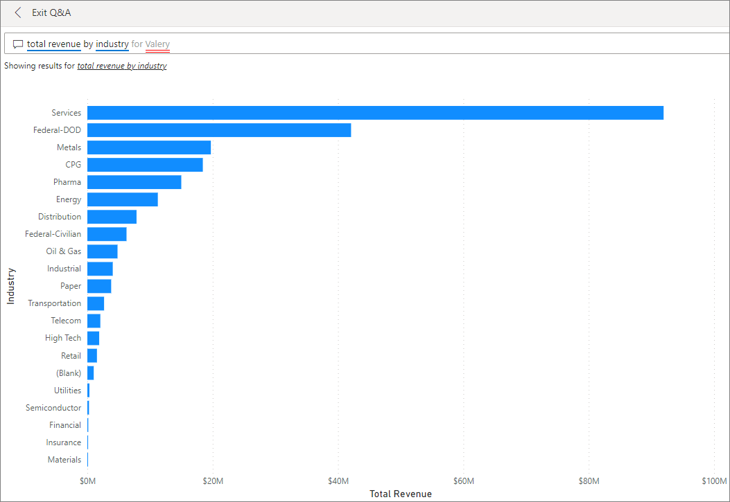
As you can see, the Services industry is the biggest revenue area for Valery.
Dig deeper by adding filters
Go back to the report and take a look at the Distribution industry.
Open the Industry Margin Analysis report page.
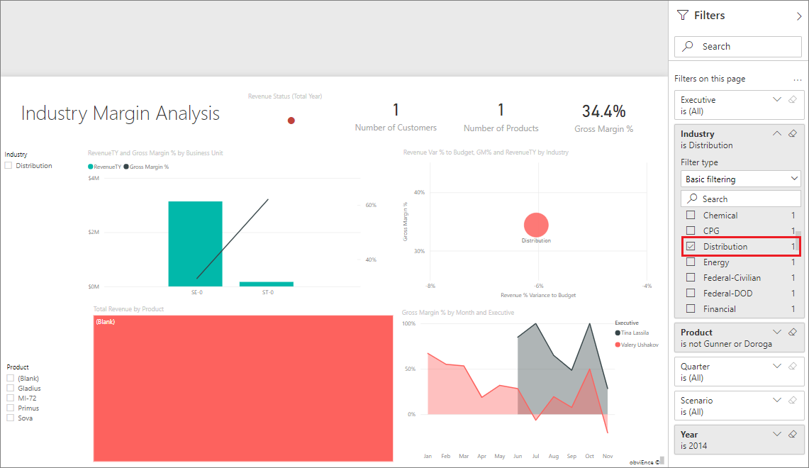
Without selecting any visualizations on the report page, expand the filter pane, if it isn't already expanded. The Filters pane should display only page level filters.
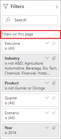
Locate the filter for Industry and select the arrow to expand the list. Add a page filter for the Distribution industry. First, clear all selections by clearing the Select All checkbox. Then select Distribution only.
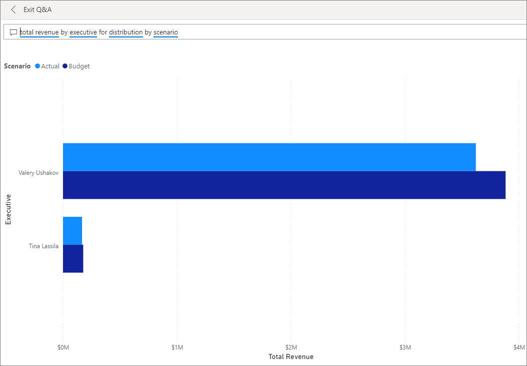
The Gross Margin % by Month and Executive chart tells you that only Valery and Tina have customers in this industry and Valery worked with this industry only from June to November.
Select Tina and then Valery in the Gross Margin by Month and Executive chart legend. Notice Tina's portion of the Total Revenue by Product chart is small compared to Valery's.
Use Q&A to see details
To see actual revenue, return to the dashboard, select the Q&A box, and enter total revenue by executive for distribution by scenario.
You can similarly explore other industries and even add customers to your visuals to understand causes for Valery's performance.
Related content
This environment is a safe one to play in, because you can choose not to save your changes. But if you do save them, you can always return to the Learning center for a new copy of this sample.
We hope this tour has shown how Power BI dashboards, Q&A, and reports can provide insights into sample data. Now it's your turn. Connect to your own data. With Power BI, you can connect to a wide variety of data sources. To learn more, see Get started with the Power BI service.
