Nota
L-aċċess għal din il-paġna jeħtieġ l-awtorizzazzjoni. Tista’ tipprova tidħol jew tibdel id-direttorji.
L-aċċess għal din il-paġna jeħtieġ l-awtorizzazzjoni. Tista’ tipprova tibdel id-direttorji.
Note
The Retail Interest Group by Dynamics 365 Commerce has moved from Yammer to Viva Engage. If you don't have access to the new Viva Engage community, fill out this form (https://aka.ms/JoinD365commerceVivaEngageCommunity) to be added and stay engaged in the latest discussions.
This article describes how to add module configuration fields in Microsoft Dynamics 365 Commerce.
You add configuration fields to a module to expose them to page authors and give them control of various module features. Examples of these features include different views, alignment properties, Boolean switches to turn features on or off, module titles or headings, rich text descriptions, call-to-action links, image URLs, and Commerce product data.
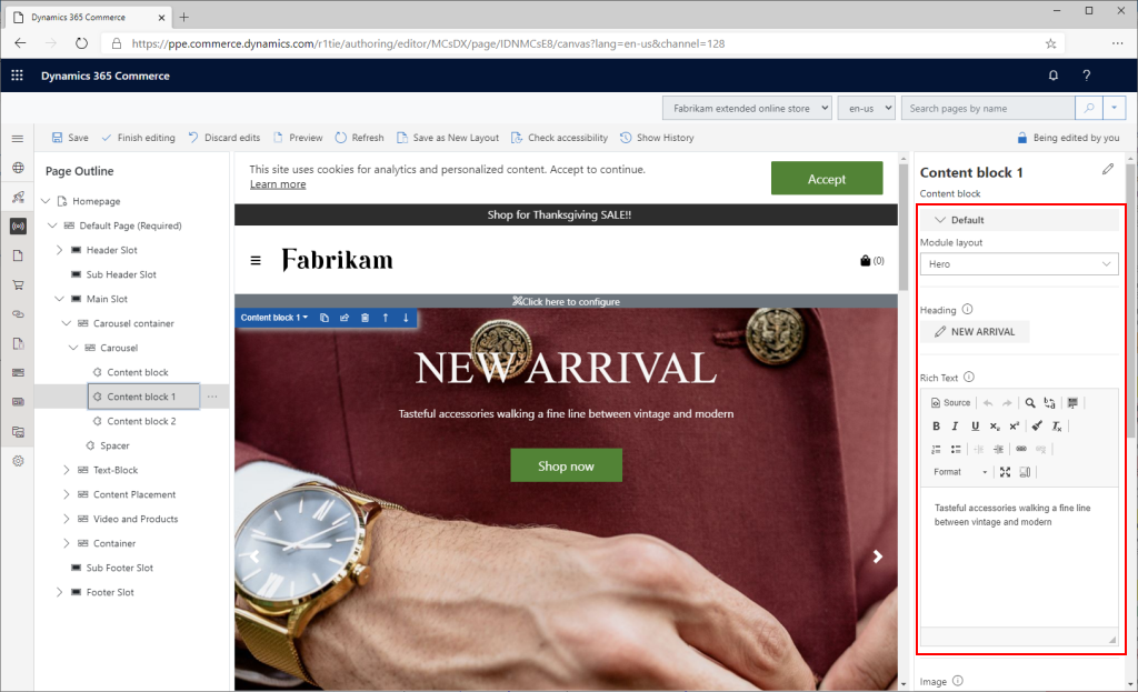
The following illustration shows how configuration fields for a selected module appear in Commerce site builder.
Add new module configuration fields
To add configuration fields, add an entry in the config section of the module definition file, MODULE_NAME.definition.json.
Example
In the following example of a module definition file, an imageAlignment configuration field is added so that page authors can configure the alignment of an image inside a module. There are two enumeration (enum) options: "Left" (the default option) and "Right".
{
    "$type": "contentModule",
    "friendlyName": "Product Feature",
    "name": "product-feature",
    "description": "Feature module used to highlight a product.",
    "categories": [
        "storytelling"
    ],
    "tags": [
        ""
    ],
    "dataActions": {
        "products": {
            "path": "@msdyn365-commerce-modules/retail-actions/dist/lib/get-simple-products",
            "runOn": "server"
        }
    },
    "config": {
        "imageAlignment": {
            "friendlyName": "Image Alignment",
            "description": "Sets the desired alignment of the image, either left or right on the text.",
            "type": "string",
            "enum": {
                "left": "Left",
                "right": "Right"
            },
            "default": "left",
            "scope": "module",
            "group": "Layout Properties"
        },
        "productTitle": {
            "type": "string",
            "friendlyName": "Title",
            "description": "Example config value",
            "default": "",
            "scope": "module"
        },
        "productDetails": {
            "type": "richText",
            "friendlyName": "SubTitle",
            "description": "Sub title rich text field"
        },
        "productImage": {
            "type": "image",
            "friendlyName": "Background image",
            "description": "Background image"
        },
        "buttonText": {
            "type": "string",
            "friendlyName": "Button text",
            "description": "Example config value",
            "default": "",
            "scope": "module"
        }
    }
}
Module configuration schema
The config section of the module definition file contains a list of the module's configuration fields to expose in the authoring tools.
- configuration name – The local name that you use to access the configuration values from your React source code. This name is case-insensitive.
- "friendlyName" – The friendly name that appears as the configuration name in the authoring tools.
- "description" – The description that appears as the configuration description in the authoring tools.
- "type" – The type of the configuration. The possible values are "string", "bool", "number", "integer", "richText", "image", "imageSettings", "css", "video", and "array".
- "enum" – For an enumerator type, set the value to "string".
- "default" – The default value to set if no value is set in the authoring tools.
- "scope" – Scope the configuration to either a specific module instance or all modules on the site. Possible values are "module" and "siteOnly". If you set the value to "siteOnly", the module configuration doesn't appear on a page and can't be configured there. You can view and configure it only at the site level in site builder, at Site settings > Extensions. Set the value one time for the entire site. If you don't set this field, the default value is "module".
- "group" – Organize the configurations into groups in the authoring tools.
- "required" – A Boolean flag that specifies whether a property must be set on the module. If the value is true, the authoring tools show an error if the required property isn't set, and an error appears when the module is rendered.
- "resources" – Use this field for localization resources.
- "definitions" - This field can contain complex config type definitions, which can be referenced in the config sections as extended types.
The following example shows how the various supported data types are used.
{
    "$type": "contentModule",
    "friendlyName": "Sample Configurations",
    "name": "sample-config",
    "description": "Provides various configuration property samples",
    "categories": [""],
    "tags": [""],
    "dataActions": {},
    "config": {
        "title": {
            "type": "string",
            "friendlyName": "Title",
            "description": "Example config value",
            "default": "",
            "scope": "module"
        },
        "subTitle": {
            "type": "richText",
            "friendlyName": "SubTitle",
            "description": "Sub title rich text field"
        },
        "bgImage": {
            "type": "image",
            "friendlyName": "Background image",
            "description": "Background image"
        },
        "images": {
            "type": "array",
            "friendlyName": "Images",
            "description": "Image array",
            "items": {
                "type": "image"
            }
        },
        "backgroundImageSettings": {
            "type": "imageSettings",
            "friendlyName": "Background image settings",
            "description": "Image settings for background image settings"
        },
        "ambientVideo": {
            "type": "video",
            "friendlyName": "Ambient video",
            "description": "Ambient video",
        },
        "headingArray":{
            "type": "array",
            "friendlyName": "Headings",
            "description": "Heading array",
            "items": {
                "$ref": "#/definitions/heading"
            }
        },
        "heading":{
            "$ref": "#/definitions/heading"
        },
        "heading2":{
            "type": "object",
            "friendlyName": "Heading2",
            "description": "Heading2 property with its own enum",
            "properties": {
                "style": {
                    "type": "string",
                    "enum": {
                        "bold": "Bold",
                        "underline": "Underline",
                        "italics": "Italics",
                        "strong": "Strong",
                        "emphasized": "Emphasized",
                        "none": "None"
                    },
                    "friendlyName": "Style",
                    "description": "Heading style"
                }
            }
        },
        "textPlacement":{
            "friendlyName": "Text placement",
                "description": "Placement of the text",
            "type": "object",
            "enum":{
                "left": "Left",
            "right": "Right",
            "center": "Center"
            },
            "default": "left"
        }
    },
    "definitions": {
        "heading": {
            "type": "object",
            "friendlyName": "Heading",
            "description": "Heading property",
            "properties": {
                "text": {
                    "type": "string",
                    "friendlyName": "Text",
                    "description": "Heading Text"
                },
                "style": {
                    "type": "string",
                    "enum": {
                        "bold": "Bold",
                        "underline": "Underline",
                        "none": "None"
                    },
                    "friendlyName": "Style",
                    "description": "Heading style"
                },
                "showImage":{
                    "type":"boolean",
                    "friendlyName": "Show image?",
                    "description": "Should Show Image"
                },
                "bgImage": {
                    "type": "image",
                    "friendlyName": "Background image",
                    "description": "Background image"
                },
                "imageArray":{
                    "type": "array",
                    "friendlyName": "Images",
                    "description": "Image Array",
                    "items": {
                        "type": "image"
                    }
                }
            }
        }
    }
}
css configuration type
Declare the configuration type of module configuration properties as "type": "css". Module configuration properties declared as the css type must specify a set of string enums of the classes that you can apply to a module. Only one of the enum options can be selected for a given module configuration property. When you select an enum option, the selected class is appended to the list of classes that is passed down to the module in the format propertyName__propertyValue via the this.props.config.className property. You can't access properties declared css configuration types directly from the this.props.config property, because they're merged into the this.props.config.className property.
className property
Every content module includes a built-in className configuration field. Access this configuration field inside the module's view via the this.props.config.className property. It appears in the site authoring tools. Page authors can add a string of space-separated Cascading Style Sheets (CSS) class names that should be appended to the module root class.
__cssClassName__ property
__cssClassName__ is a special property that you declare inside a module definition file. It provides a way for the module creator to specify a nonauthorable, noneditable, read-only className property that always applies to the module. Set its editable property to false and specify a default value.
In the following example, the module creator gives this field a default value of hero so that every instance of this module always has the hero class as part of the this.props.config.className property.
...
    "__cssClassName__": {
        "default": "hero",
        "editable": false,
        "friendlyName": "Readonly CSS Class Name(s)",
        "description": "Provides a way to set constant, unchangeable default css class(es) to apply to your module.",
        "type": "string"
    },
...
Use mock data in configuration fields for local testing
The following example shows how to set a mock value for a new configuration field in the mocks/MODULE_NAME.json file. Use mock data when rendering a module in a local development environment.
{
    "id": "R1Module1",
    "config": {
        "imageAlignment": "left",
        "productTitle": "Retro Horn Rimmed Keyhole Nose Bridge Round Sunglasses",
        "productDetails": "High-quality and pioneered with the perfect blend of timeless classic and modern technology with hint of old school glamor.",
        "productImage": {
            "src": "https://bit.ly/33cMGxr",
            "altText": "Retro Horn Rimmed Keyhole Nose Bridge Round Sunglasses"
        },
        "buttonText": "Buy Now"
    },
    "data": {
        "actionResponse": {
            "text": "Sample Action Response"
        }
    },
    "typeName": "product-feature"
}
Access configuration fields in the module React component
To access configuration fields in the React component, use the props.config application programming interface (API).
The following example creates a props property that has configuration values that the module view file uses to render the appropriate HTML.
import * as React from 'react';

import { IProductFeatureData } from './product-feature.data';
import { imageAlignment, IProductFeatureProps } from './product-feature.props.autogenerated';

export interface IProductFeatureViewProps extends IProductFeatureProps<IProductFeatureData> {
    productName: string;
    productInfo: string;
    productImageUrl: string;
    productPrice: string;
    buttonInfo: string;
    alignment: imageAlignment;
}

/**
 *
 * ProductFeature component
 * @extends {React.PureComponent<IProductFeatureProps<IProductFeatureData>>}
 */
class ProductFeature extends React.PureComponent<IProductFeatureProps<IProductFeatureData>> {
    public render(): JSX.Element | null {
        const { config } = this.props;

        // set default product info values
        const ProductName = config.productTitle ? config.productTitle : 'No product name defined';
        const ProductInfo = config.productDetails ? config.productDetails.toString() : 'No product details defined';
        const ProductImageUrl = config.productImage ? config.productImage.src : '';
        const ButtonInfo = config.buttonText ? config.buttonText : 'No button text defined';
        const ProductPrice = '129';

        const ProductFeatureViewProps = {
            ...this.props,
            productName: ProductName,
            productInfo: ProductInfo,
            productImageUrl: ProductImageUrl,
            productPrice: ProductPrice,
            buttonInfo: ButtonInfo,
            alignment: config.imageAlignment
        };

        return this.props.renderView(ProductFeatureViewProps);
    }
}

export default ProductFeature;
The following example shows the corresponding module view file that handles the HTML layout by using the configuration values that the preceding React component passes in.
import * as React from 'react';
import { IProductFeatureViewProps } from './product-feature';
import { imageAlignment } from './product-feature.props.autogenerated';

const _renderImage=(productImageUrl: string, productName: string): JSX.Element => {
    return <img src={productImageUrl} alt={productName} className='img-fluid p-3' />;
};

const _renderInfo=(productName: string, productInfo: string, productPrice: string, buttonInfo: string): JSX.Element => {
    return (
        <div className='container'>
            <h2>{productName}</h2>
            <p>{productInfo}</p>
            <p>{productPrice}</p>
            <button type='button' className='btn btn-primary'>{buttonInfo}</button>
        </div>
    );
};

export default (props: IProductFeatureViewProps) => {
    const { productName, productInfo, productImageUrl, productPrice, buttonInfo, alignment } = props;

    let left;
    let right;

    if (alignment === imageAlignment.left) {
        left = _renderImage(productImageUrl, productName);
        right = _renderInfo(productName, productInfo, productPrice, buttonInfo);
    } else {
        right = _renderImage(productImageUrl, productName);
        left = _renderInfo(productName, productInfo, productPrice, buttonInfo);
    }

    return (
        <div className='row align-items-center'>
            <div className='col-sm-6'>
                {left}
            </div>
            <div className='col-sm-6'>
                {right}
            </div>
        </div>
    );
};