View Retail insights in Store Operations Assist
Retail insights is a Power BI enabled dashboard that provides a rich and rounded view of operations to your Store Manager or District Manager. This view currently brings the data across tasks and gives a view for stores/departments that are doing well and plan for stores/departments where extra focus is needed.
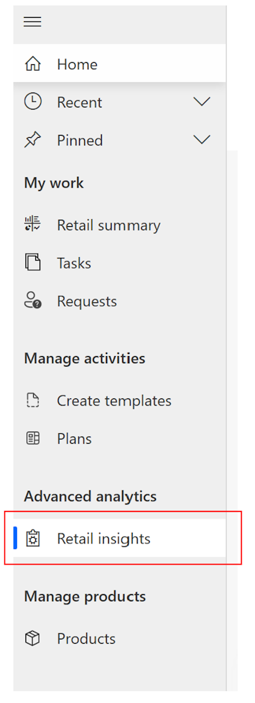
Select Retail insights under Advanced analytics to access the advanced Power BI reports.
Store operations tab
The Store operations tab provides a view of all task executions across your organization. You can view tasks specific to status and priority for your respective business units. The Store operations tab has five key sections:
Today's highlights
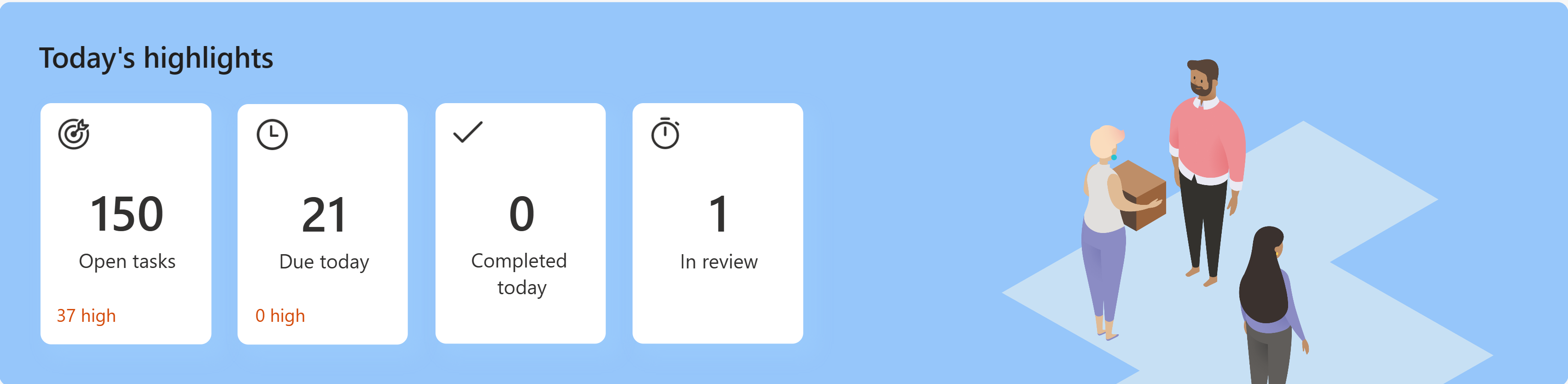
This section contains the status of tasks such as:
- Tasks that are open as of today
- Tasks that are due today (where the completion date is today)
- Tasks that are completed today
- Tasks pending review (on the user)
Each of the tile is clickable and takes you to the specific view, for example, the tile for ‘Due today’ takes you to the Open Tasks page with the list of tasks where due date is today.
Task status
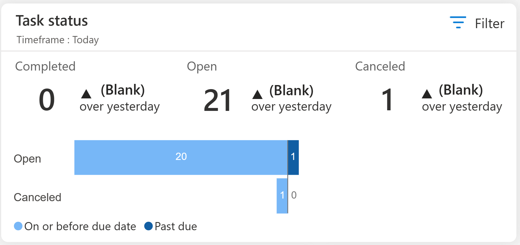
The top half of the task status report contains the status of tasks as of today/this week/this month with a respective comparison over the same previous period. You can select the period through filter options. If you select ‘Today’, the report compares with yesterday’s data and when you select ‘This week’, the report compares with last week’s data.
The bottom half of the task status report contains the number of tasks categorized into ‘Open,’ ‘Completed’, and ‘Canceled’ statuses. Each of these numbers is further divided into two parts to analyze if the action was completed before or after the due date.
Outlier detection
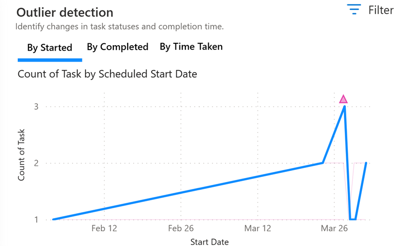
The Outlier detection report offers insights into the task count across different departments over a specific time period while also identifying any anomalies present in the data. The report allows for intuitive actions and further analysis based on the highlighted anomalies. The task count and respective anomaly detection can be done ‘By started’ date, ‘By Completed’ date, or ‘By time taken’ for task completion. The Outlier Detection report helps identify any unusual patterns, deviations, or outliers in the task count data by applying different perspectives.
This report is based on the Anomaly detection feature of Power BI. For more information on how to set up for detecting anomalies and respective variance, Power Admins can refer Anomaly detection.
Task type
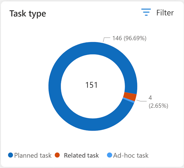
The task type report contains a breakup of the task based on the type that is, Planned, ad-hoc or related tasks. You can filter to select Store, Department, Status (of task), Priority (of task), ‘From’ and, ‘To’ date range (considering scheduled start dates).
Task completion rate % by date/region/store/department
The task completion rate report provides a comparative view of task completions across your organization. This report shows completion percentage of tasks that is, percentage of number of tasks completed (based on actual end date / number of tasks due).
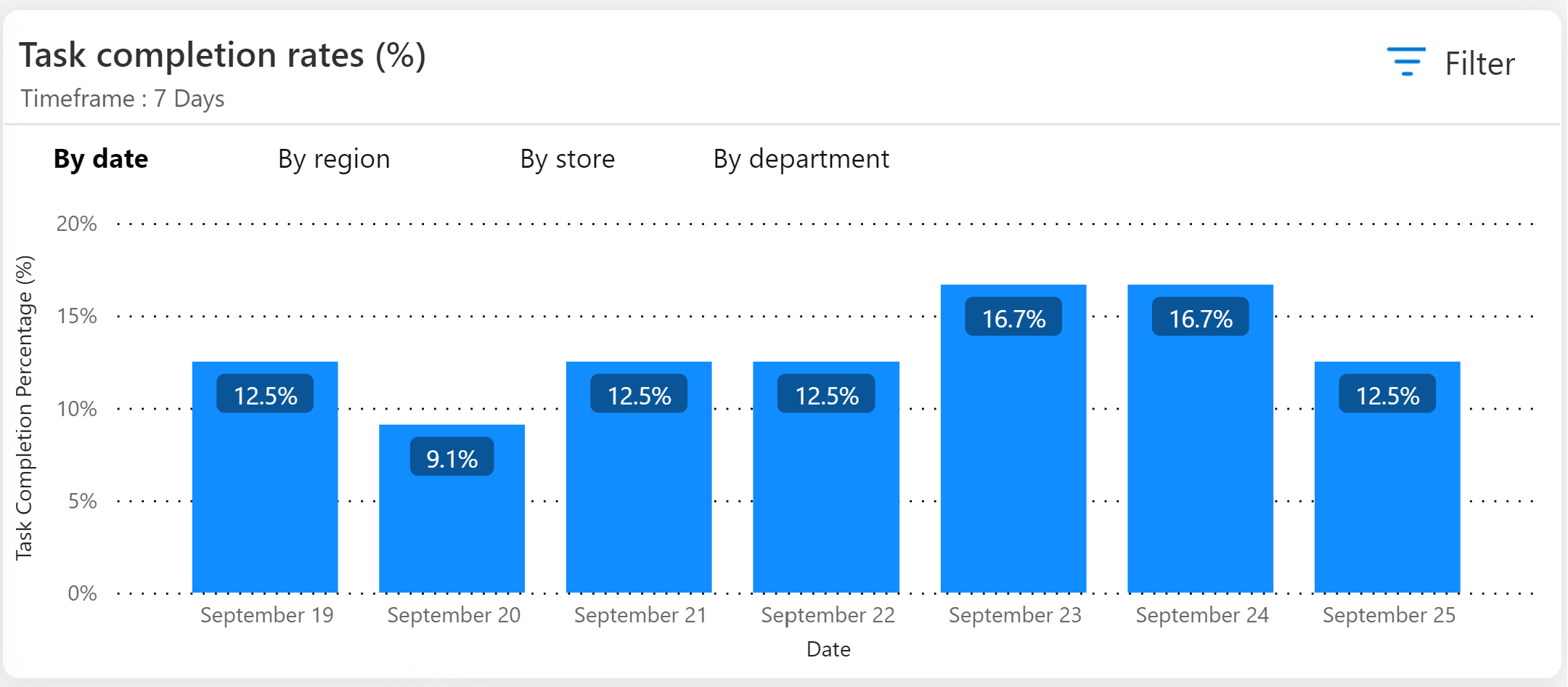
There are four tabs in this report, each tab shows bar graph with specific aggregation of data:
- By date: In this view, you see a bar for each day based on the filter selection. Each bar gives the percentage completion for that particular day.
- By region: In this view, you see a bar for each region based on the filters selected. Each bar gives the percentage completion of task aggregated at the region level. The ‘Region’ shows all business units of type organization or district and shows data based on access given to user role.
- By store: In this view, you see a bar for each store based on the filters selected. Each bar gives the percentage completion of task aggregated at the store level. This report shows all business units of type store and shows the business units based on access given to user role.
- By department: In this view, you see a bar for each department based on the filters selected. Each bar gives the percentage completion of task aggregated at the department level. This report shows all business units of type department and shows only the business units based on access given to user role.
Task count drilldown
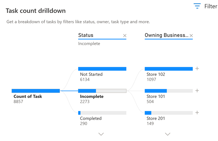
The Task count drilldown report provides a visual representation of data related to the total count of tasks, allowing you to analyze and explore it across various variables such as Priority, Type, Owner, Owning Business Unit, and Status. Depending on your selection, the report automatically consolidates the data and allows you to drill down further into any of the variables in any desired order. This report is useful for conducting ad hoc exploration and performing root cause analysis of task count, time taken and so on.
Although the report comes with preconfigured units, Power BI administrators have the flexibility to define their own variables according to their organization's specific evaluation requirements. This customization capability enables organizations to tailor the report to their unique needs and gain insights that are most relevant to them.
Using the various variables, you can intuitively use any value to drill down for further data.
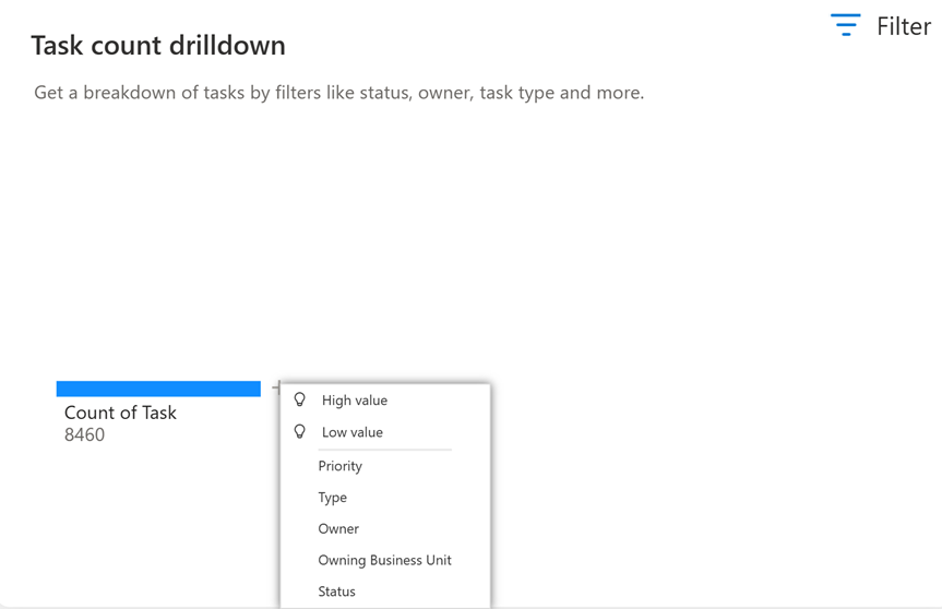
In addition to the preset variables, the view also provides ‘Artificial intelligence’ based splits such as:
- High Value: Considers all available fields and determines which one to drill into to get the highest value of the measure being analyzed.
- Low Value: Considers all available fields and determines which one to drill into to get the lowest value of the measure being analyzed.
Using the various variables, you can intuitively use any value to drill down further as shown:
This report is based on the Decomposition tree feature of Power BI. For more information, refer Decomposition tree.
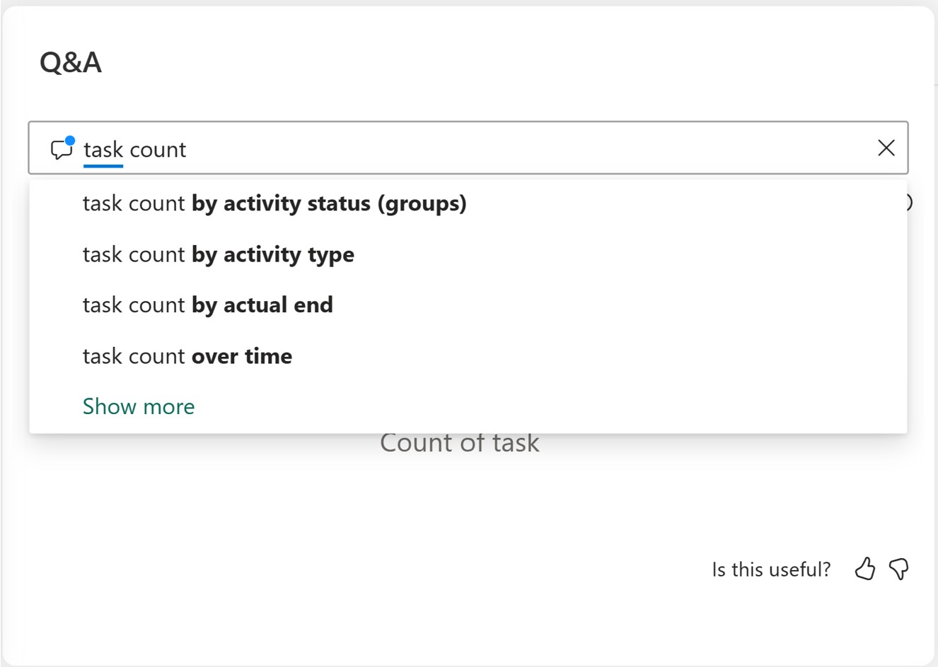
Q&A
The Q&A report lets you explore data using natural language queries. You can type your question in everyday language in the designated Q&A question box. The report intelligently understands the words you use and determines where and which dataset to search for the answer. Q&A also assists you in crafting your question by offering autocompletion, restatement suggestions, and other textual and visual aids.
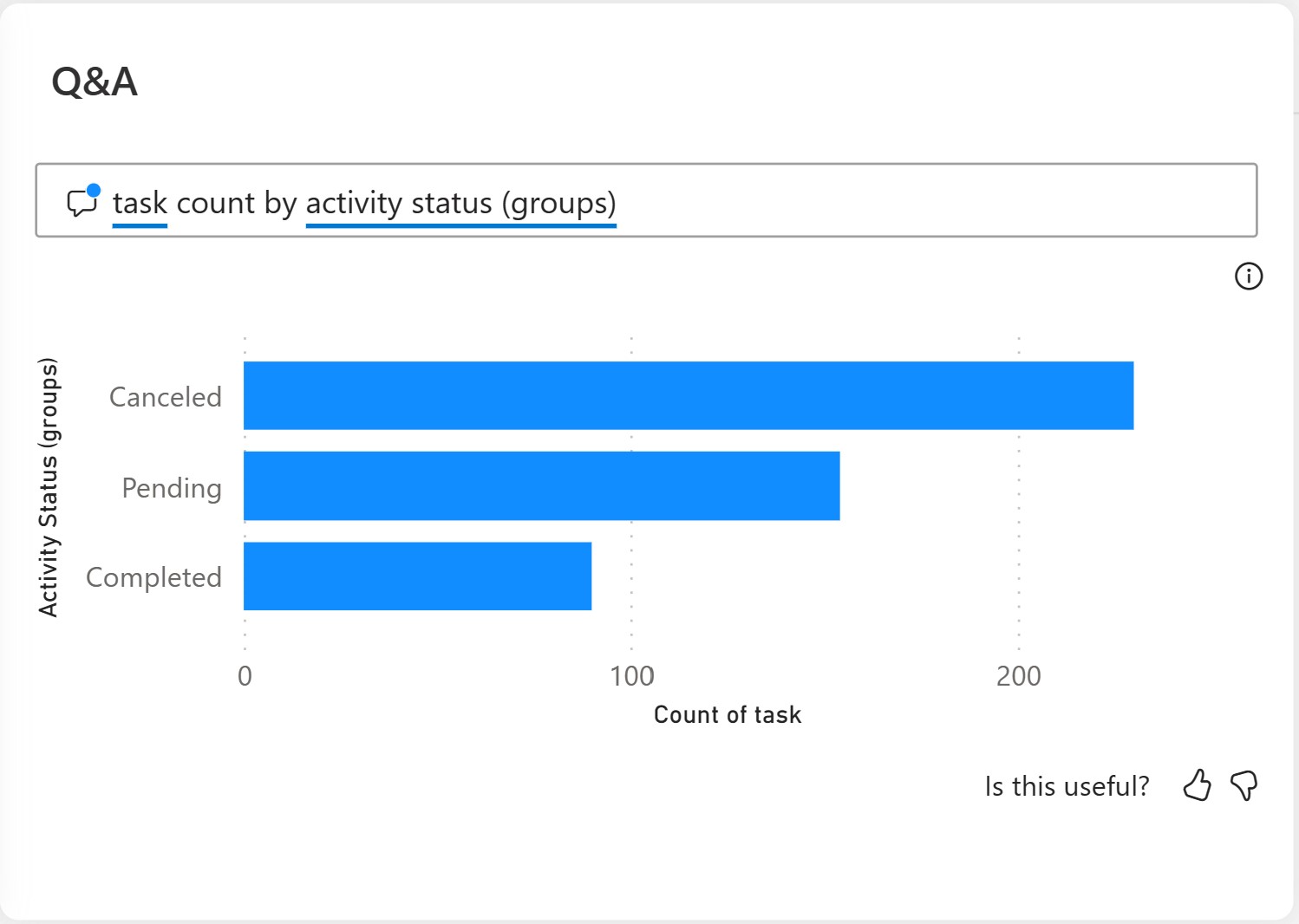
For example, if you want to see the break up by task count, type the words ‘task count’ and Q&A auto recommends the types of grouping that can be done based on the system data.
When you select any of the recommended options, such as, activity status, the system provides an instant Power BI report with a visual display.
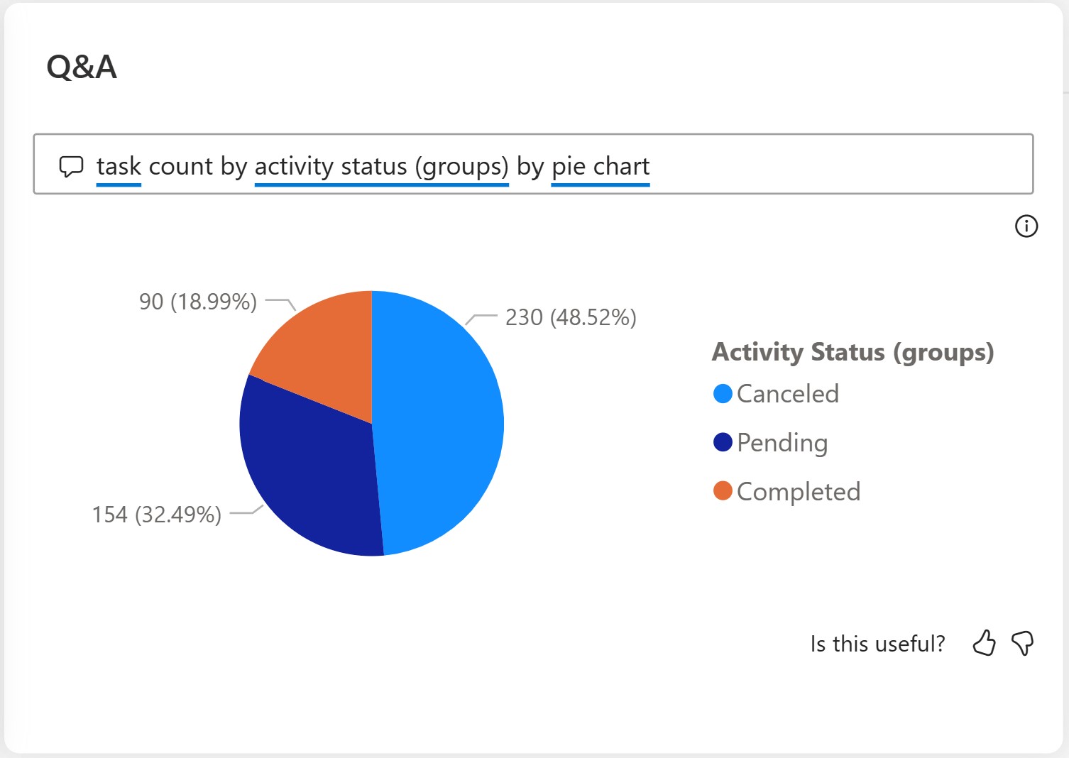
You can also change the display and select the type of Power BI chart as needed.
For more information on this report and related visualizations, refer Use Power BI Q&A.
Task cancellation rate % by date/region/store/department
Cancellation rate report provides a comparative view of task cancellations done manually vs automatically canceled tasks, across your organization. For more information, see Automatic task cancellation flow.
Automatic canceled % gives percentage cancellation of tasks done automatically that is, percentage of (number of tasks automatically cancelled/number of tasks completed or canceled).
Manual canceled % gives percentage cancellation of tasks done manually that is, percentage of (number of tasks manually cancelled/number of tasks completed or canceled).
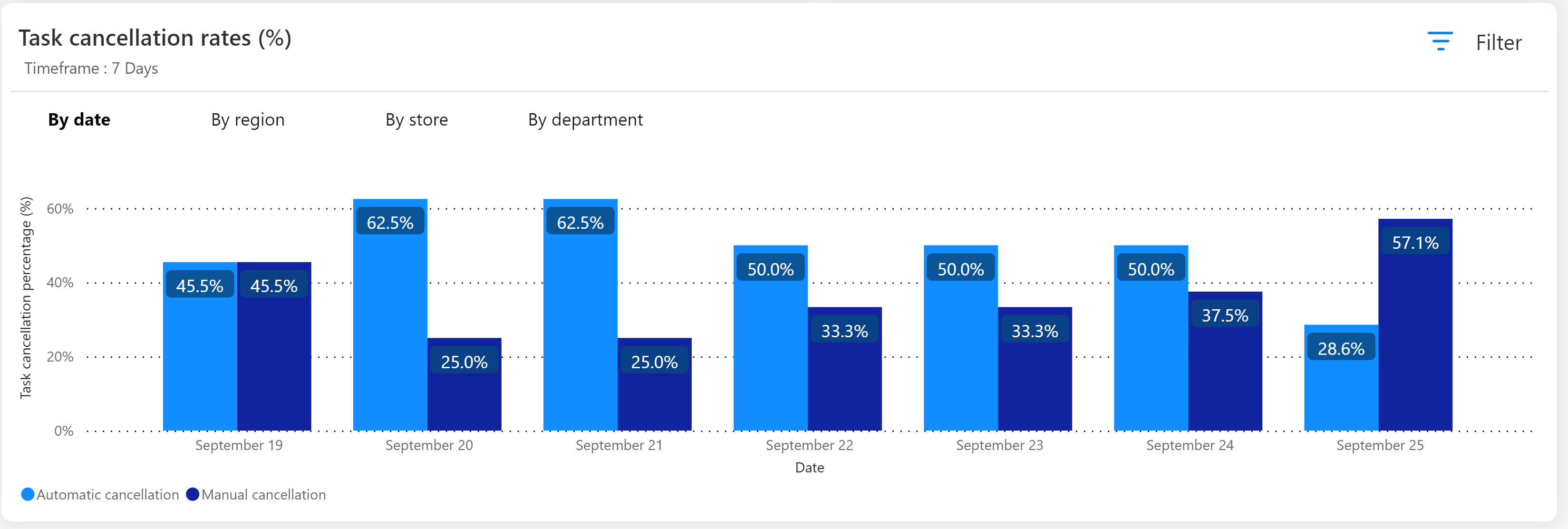
You see four tabs in this report, each tab shows bar graph with specific aggregation of data, with a bar each for automatically canceled tasks and manually canceled tasks respectively:
- By date: In this view, you see two bars for each day. The number of days shown is based on the filter selection.
- By region: In this view, you see two bars for each region for the filters selected. Each bar gives percentage completion of task aggregated at Region level. The ‘Region’ shows all business units of type organization or district and shows data based on access given to user role.
- By store: In this view, you see two bars for each store based on the filters selected. This view shows all business units of type store and shows only business units based on access given to user role.
- By department: In this view, you see two bars for each department based on the filters selected. This view shows all business units of type department and shows only business units based on access given to user role.
Measure execution time for planned tasks
Store Operations Assist now empowers you to capture the duration of task execution for planned tasks created using the forms, inventory spot count, and product pricing update templates. You can use the newly integrated dashboard within Retail Insights to monitor both the average and cumulative time required to finalize tasks. Using the available filters, you can conveniently choose specific timeframes, task configurations, and other parameters to access comprehensive reporting on task completion times.
Survey response summary tab
In Retail insights, you can view all the responses given against specific tasks in an intuitive Power BI report ‘Survey response summary’. The responses are aggregated across a specific task and at the question level.

Store managers and district managers are able to view the responses aggregated based on their respective security access. For example, the store manager for Store A can view the response of a particular task across the store associates at their store level. The district manager who manages Store A, Store B, and Store C can see the response aggregated across all the stores or across each store depending on their filter selection.
In order to view the aggregated response, you need to filter this report based on ‘Plan’ and ‘Task setup’ to view the response specific to the task. You can directly select the Task Setup or you can select it after filtering Plan.
Note
Only one plan and one task setup against that plan can be selected at a time to ensure a cohesive view across aggregation.
You can filter on 'Business unit' to get an aggregated view specific to the business unit. The business unit visibility is based on role based access.
You can also filter based on date to view response for a specific date range. If no specific date is selected, then all response for the specific task type is shown. Once you select a task, date filter is autoselected based on the first date and last date of the response as 'From' and 'To' fields.
The survey response summary report shows the list of questions and their responses enumerated in a list format on the left side.
The survey response summary dashboard also shows the status of tasks against a specific task setup as a pie chart on the top right.
You can select any specific question to see a bar graph view for that question on the right side. The graph contains an aggregated view of the responses received for that particular question. This report enables the store managers to decide strategic or tactical actions based on the result.