Note
Access to this page requires authorization. You can try signing in or changing directories.
Access to this page requires authorization. You can try changing directories.
APPLIES TO:
Power BI Desktop
Power BI service
The decomposition tree visual in Power BI lets you visualize data across multiple dimensions. It automatically aggregates data and lets you drill down into your dimensions in any order. It's also an artificial intelligence (AI) visualization, so you can ask it to find the next dimension into which to drill down based on certain criteria. This tool is valuable for ad hoc exploration and conducting root-cause analysis.
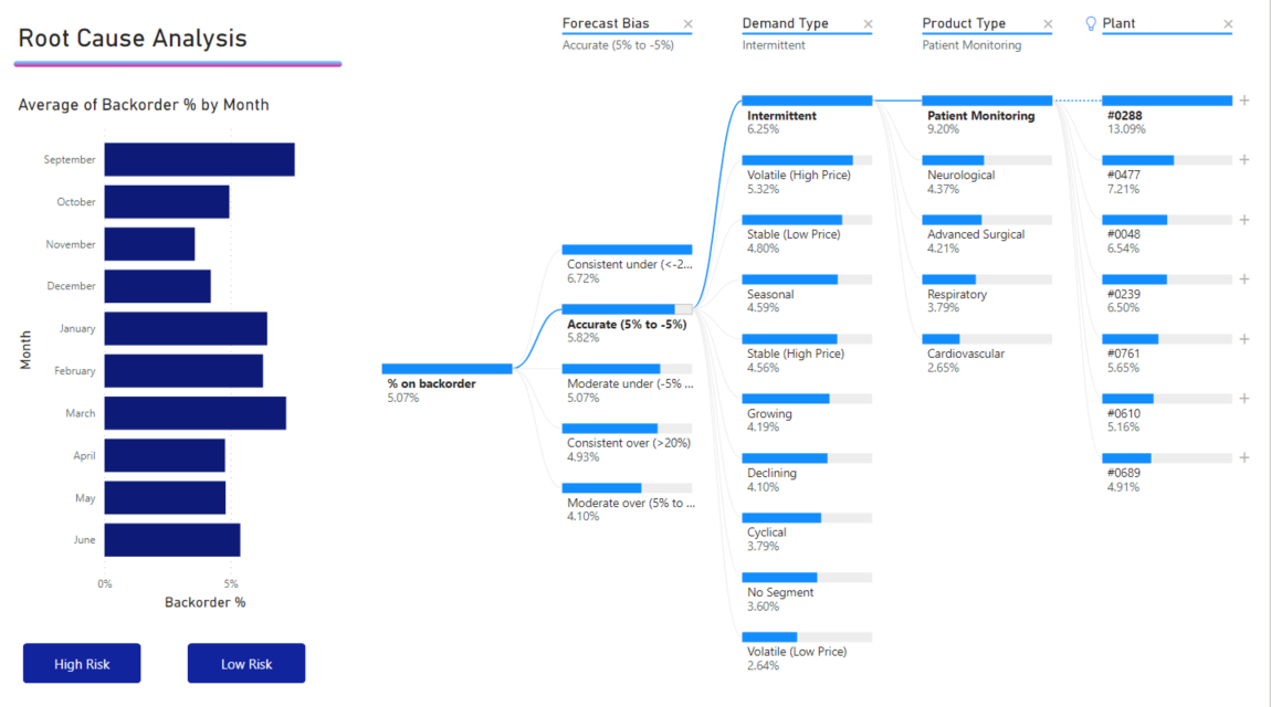
This tutorial uses two examples:
- A supply-chain scenario that analyzes the percentage of products a company has on backorder (out of stock).
- A sales scenario that breaks down video game sales by numerous factors like game genre and publisher.
For Power BI Desktop, you can download the supply-chain scenario semantic model. If you'd like to use the Power BI service, download Supply Chain Sample.pbix, then upload it to a workspace in the Power BI service.
Note
To share content (or for a colleague without edit rights to view content outside your personal My workspace) both users need either a Power BI Pro or Premium Per User (PPU) license, OR the content must reside in a workspace on a capacity (Fabric F64+ or Power BI Premium (P)). PPU workspaces behave like capacity for feature availability. Free users can only consume content that lives on a capacity.
Get started
Select the decomposition tree icon from the Visualizations pane.
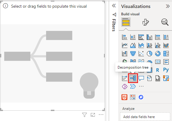
The visualization requires two types of input:
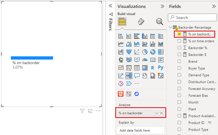
- Analyze: the metric you want to analyze. It must be a measure or an aggregate.
- Explain By: one or more dimensions into which you want to drill down.
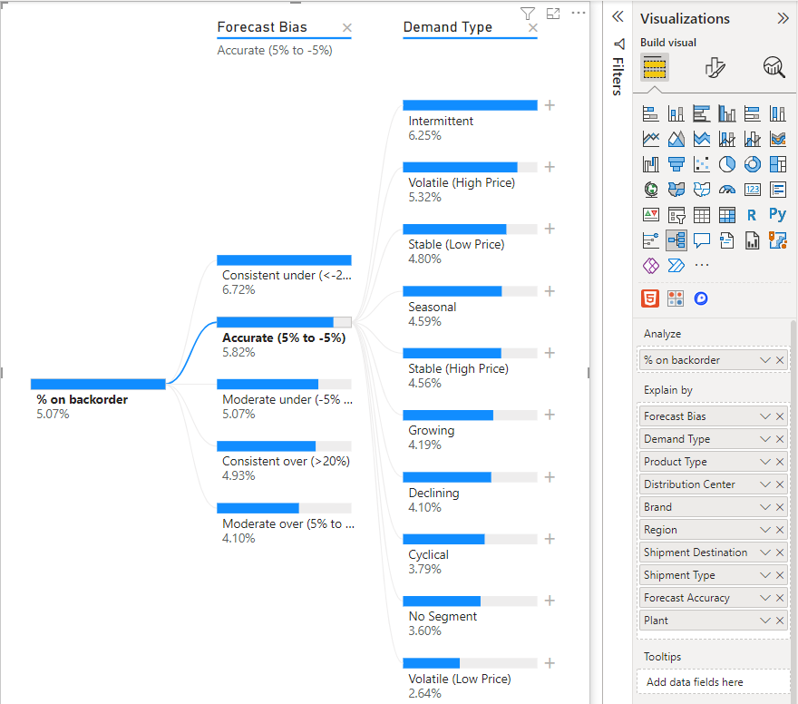
Once you drag your measure into the field well, the visual updates to showcase the aggregated measure. In the following example, we're visualizing the average % of products on backorder (5.07%).
The next step is to add one or more dimensions into which you want to drill down. Add these fields to the Explain by bucket. Notice that a plus sign appears next to your root node. Selecting the + lets you choose into which field you want to drill (you can drill into fields in any order you want).
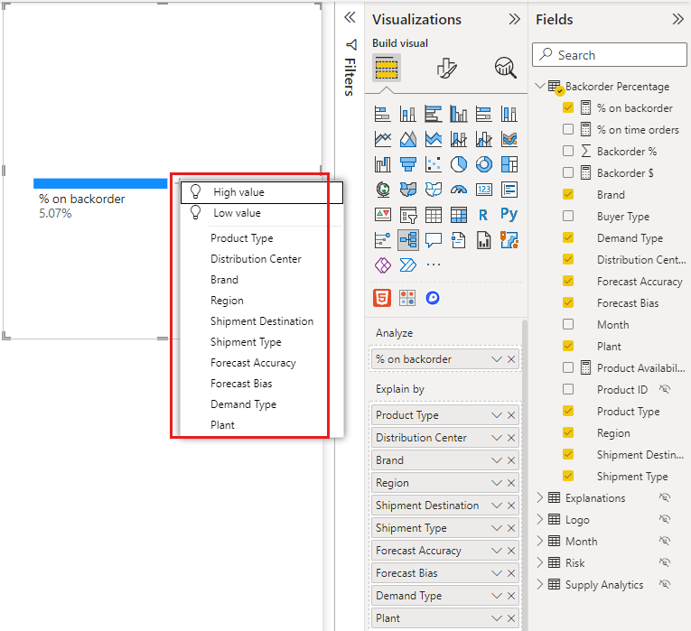
Selecting Forecast bias results in the tree expanding and breaking down the measure by the values in the column. You can repeat this process by choosing another node into which to drill.
Selecting a node from the last level cross-filters the data. Selecting a node from an earlier level changes the path.
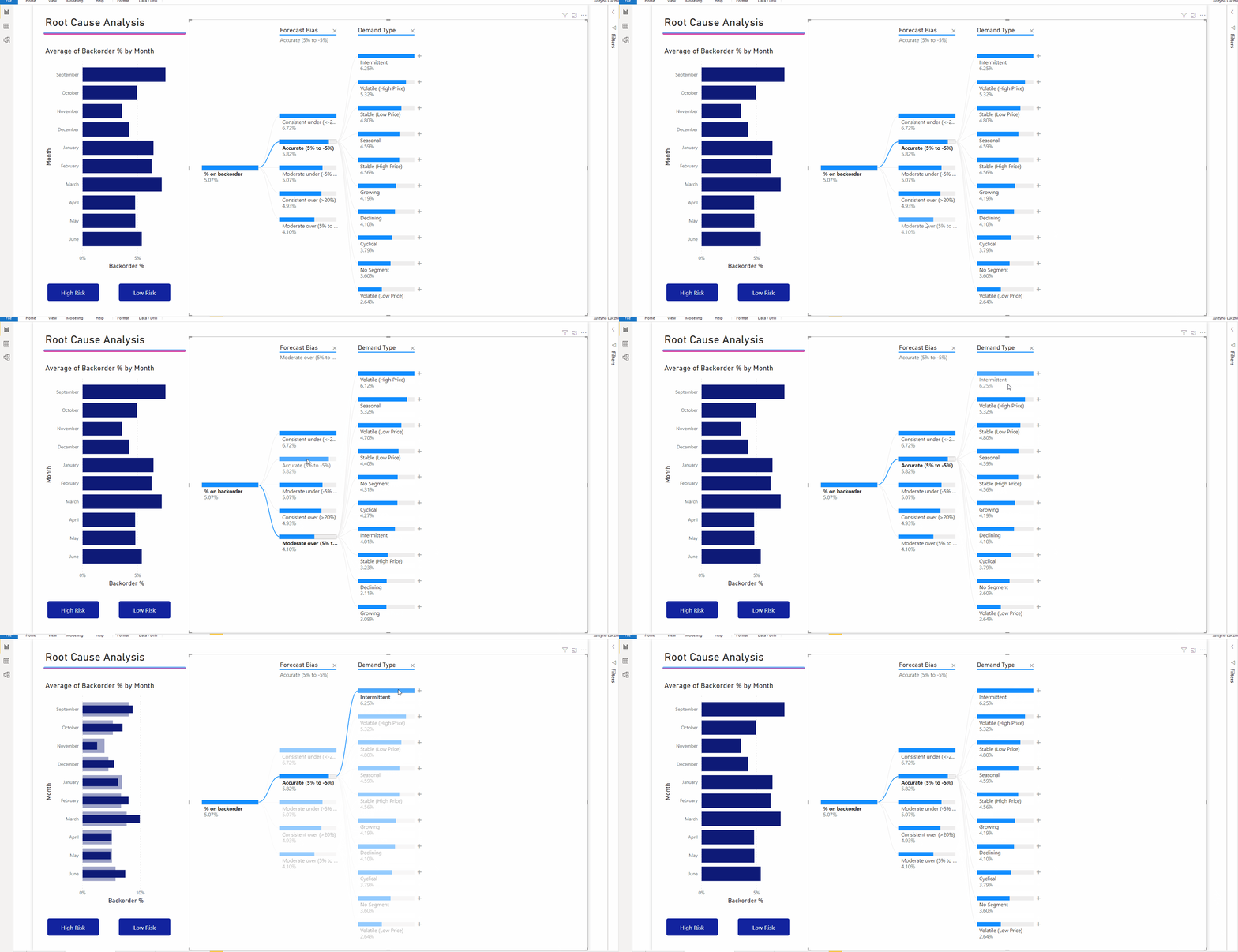
Interacting with other visuals cross-filters the decomposition tree. The order of the nodes within levels could change as a result.
To show a different scenario, the following example looks at video game sales by publisher.
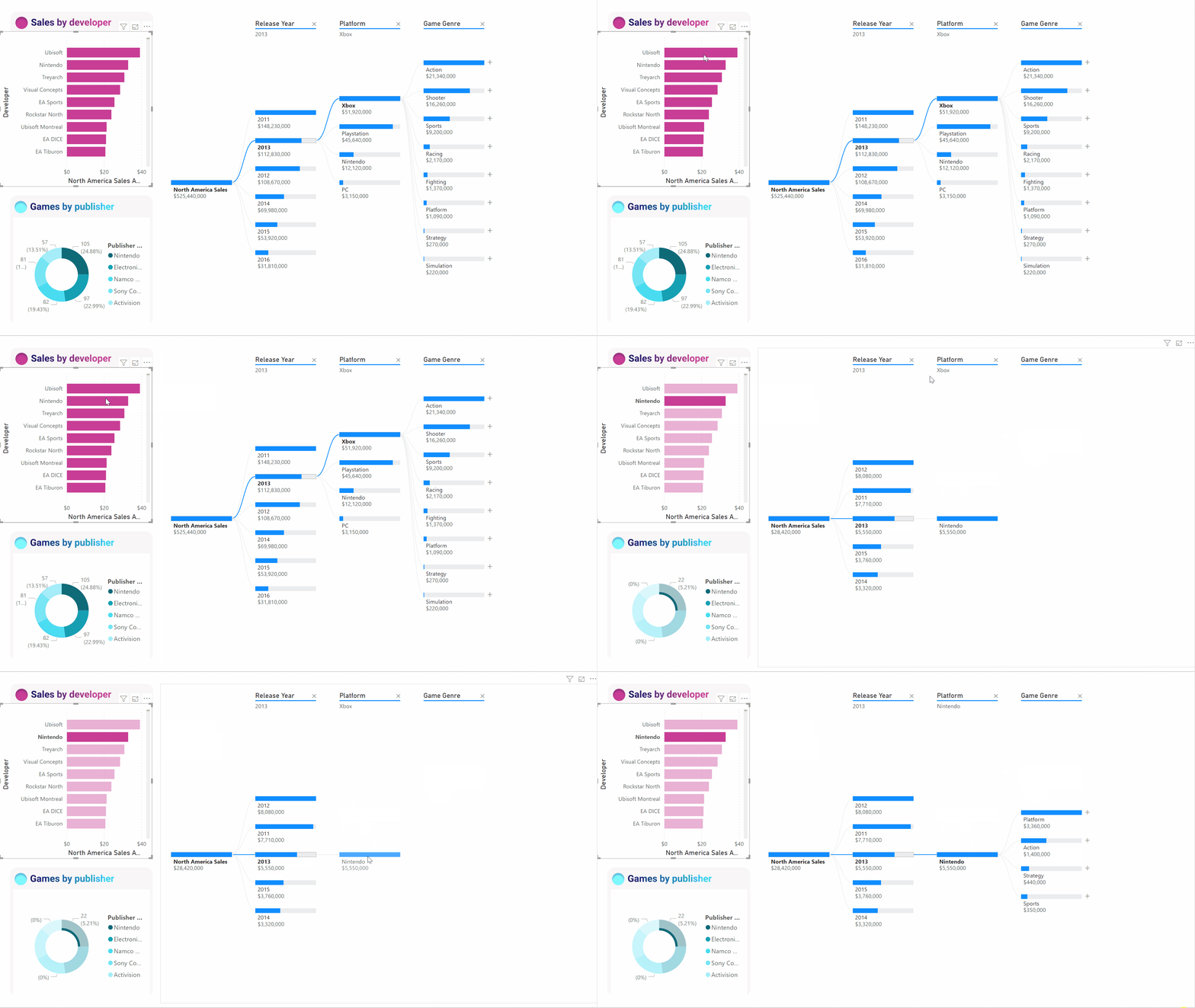
When we cross-filter the tree by Ubisoft, the path updates to show Xbox sales moving from first to second place, surpassed by PlayStation.
If we then cross-filter the tree by Nintendo, Xbox sales are blank as there are no Nintendo games developed for Xbox. Xbox, along with its subsequent path, gets filtered out of the view.
Despite the path disappearing, the existing levels (in this case, Game Genre) remain pinned on the tree. Selecting the Nintendo node therefore automatically expands the tree to Game Genre.
AI splits
You can use AI Splits to figure out where you should look next in the data. These splits appear at the top of the list and are marked with a light bulb. The splits are there to help you find high and low values in the data, automatically.
The analysis can work in two ways depending on your preferences. Using the supply chain sample again, the default behavior is as follows:
- High Value: Considers all available fields and determines which one to drill into to get the highest value of the measure being analyzed.
- Low Value: Considers all available fields and determines which one to drill into to get the lowest value of the measure being analyzed.
Select High Value using the plus sign next to Intermittent. A new column marked Product Type appears.
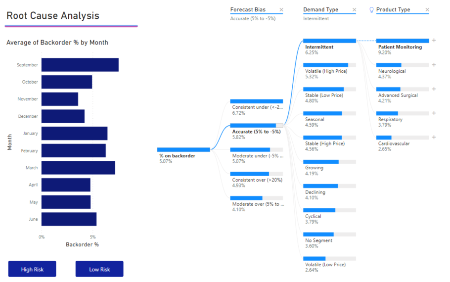
A light bulb appears next to Product Type indicating this column was an AI split. The tree also provides a dotted line recommending the Patient Monitoring node, indicating the highest value of backorders (9.2%).
Hover over the light bulb to see a tooltip. In this example, the tooltip is “% on backorder is highest when Product Type is Patient Monitoring”.
You can configure the visual to find Relative AI splits as opposed to Absolute ones.
Relative mode looks for high values that stand out (compared to the rest of the data in the column). Let's look at video game sales again as an example:
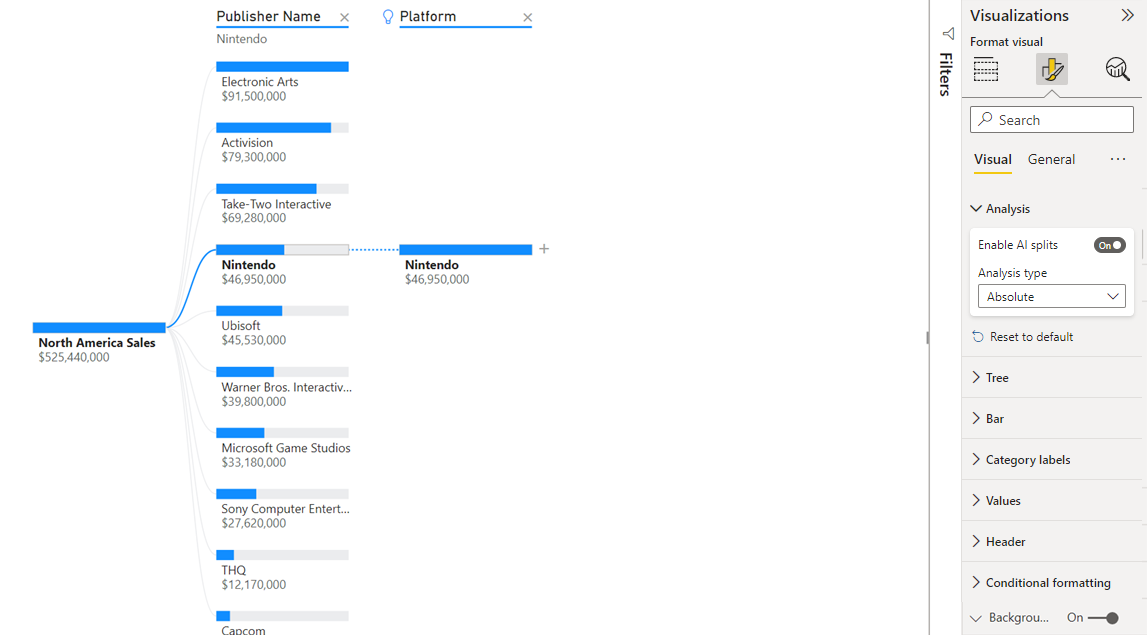
In the preceding screenshot, we're looking at North America sales of video games. We first split the tree by Publisher Name, then drill into Nintendo. Selecting High Value results in Platform is Nintendo expanding. Because Nintendo (the publisher) only develops for Nintendo consoles, there's only one value present, so that's unsurprisingly the highest value.
Nevertheless, it's a more interesting split to look at which high value stands out relative to other values in the same column. If we change the Analysis type from Absolute to Relative, we get the following result for Nintendo:
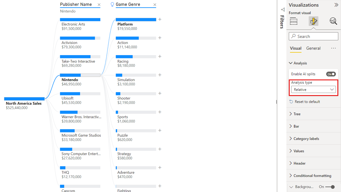
This time, the recommended value is Platform within Game Genre. Platform doesn't yield a higher absolute value than Nintendo; $19,950,000 vs. $46,950,000. Nevertheless, it's a value that stands out.
More precisely, because there are 10 Game Genre values, the expected value for Platform would be 4.6 million USD if they were split evenly. Because Platform has a value of almost 20 million USD, that's an interesting result, as it's four times higher than the expected result.
The calculation is as follows:
North America Sales for Platform / Abs(Avg(North America Sales for Game Genre))
vs.
North America Sales for Nintendo / Abs(Avg(North America Sales for Platform))
Which translates to:
19,550,000 / (19,550,000 + 11,140,000 + ... + 470,000 + 60,000 /10) = 4.25x
vs.
46,950,000/ (46,950,000/1) = 1x
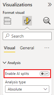
If you prefer not to use any AI splits in the tree, you can also turn them off under the Analysis formatting options:
Tree interactions with AI splits
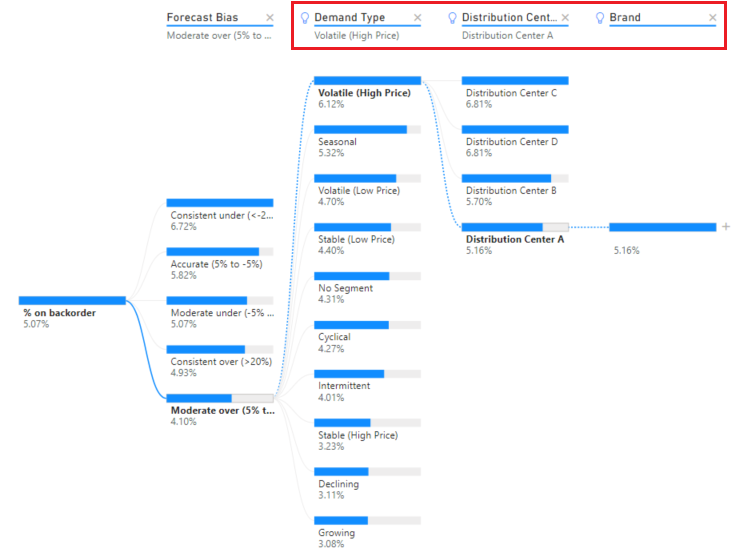
You can have multiple subsequent AI levels. You can also mix up different kinds of AI levels (go from high value to low value and back to high value):
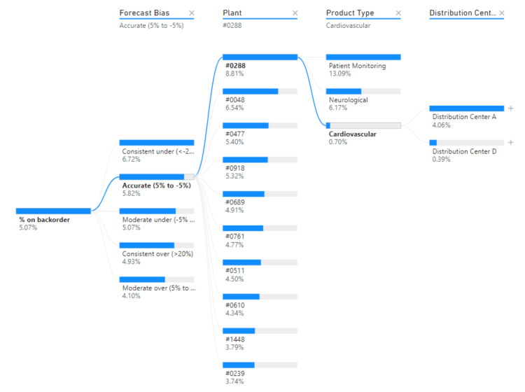
If you select a different node in the tree, the AI Splits recalculate from scratch. In the following example, we changed the selected node in the Forecast Bias level. The subsequent levels change to yield the correct high and low values.
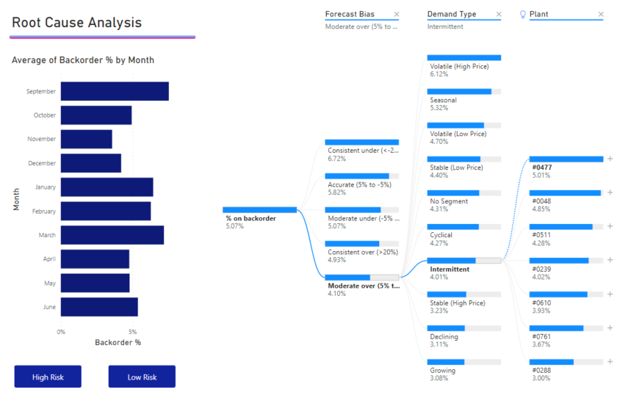
AI levels are also recalculated when you cross-filter the decomposition tree by another visual. In the following example, we can see that our backorder % is highest for Plant #0477.
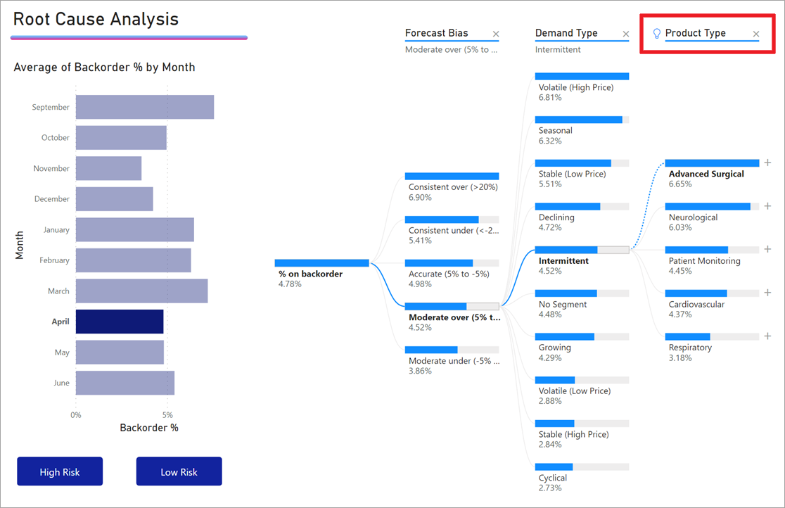
However, if we select April in the bar chart, the highest changes to Product Type is Advanced Surgical. In this case, it's not just the nodes that got reordered, but a different column was chosen.
If you want AI levels to behave like non-AI levels, select the light bulb to revert the behavior to default.
While multiple AI levels can be chained together, a non-AI level can't follow an AI level. If we do a manual split following an AI split, the light bulb from the AI level disappears and the level transforms into a normal level.
Locking
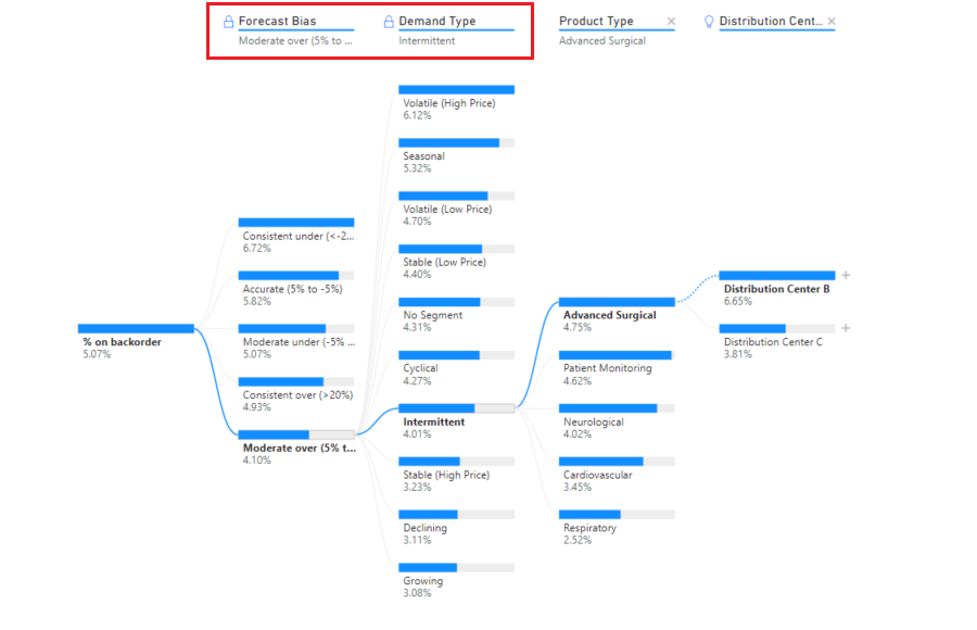
A content creator can lock levels for report consumers. When a level is locked, it can't be removed or changed. A consumer can explore different paths within the locked level, but they can't change the level itself. As a creator, you can hover over existing levels to see the lock icon. You can lock as many levels as you want, but you can't have unlocked levels preceding locked levels.
In the following example, the first two levels are locked. Report consumers can change levels 3 and 4, and even add new levels afterwards. However, the first two levels can't be changed.
Considerations and limitations
The maximum number of levels for the tree is 50. Maximum number of data points you can visualize at one time on the tree is 5,000. We truncate levels to show top n. Currently the top n per level is set to 10.
The decomposition tree isn't supported in the following scenarios:
- On-premises Analysis Services
AI splits aren't supported in the following scenarios:
- Azure Analysis Services
- Power BI Report Server
- Publish to Web
- Complex measures and measures from extensions schemas in Analyze
Other limitations:
- Support inside Q&A