Showcasing Windows 7 Platform with Applets
About every decade we make the big decision to update what we refer to as the applets (note we’ll use applet, application, program, and tool all interchangeably as we write about these) in Windows—historically Calc (Calculator), Paint (or MS Paint, Paint Brush) and WordPad (or Write), and also the new Sticky Notes applet in Windows 7. As an old-timer, whenever I think of these tools I think of all the history behind them and how they came about. I’m sure many folks have seen the now “classic” video of our (now) CEO showing off Windows to our sales force (the last word of this video is the clue that this video was done for inside Microsoft). Windows 7 seems like a great time to update these tools. The motivation for updating the applets this release is not the 10-year mark or just time to add some applet-specific features, but the new opportunities for developers to integrate their applications with the Windows 7 desktop experience. While many use the applets as primary tools, our view of these is much more about demonstrating the overall platform experience and to provide guidance to developers about how to integrate and build on Windows 7, while at the same time providing “out of box” value for everyone. There’s no real “tension” over adding more and more features to these tools as our primary focus is on showing off what’s new in Windows—after all there are many full-featured tools available that provide similar functionality for free. So let’s not fill the comments with request for more bitmap editing features or advanced scientific calculator features :-).
The APIs discussed in this post are all described on MSDN in the updated developer area for Windows 7 where you can find the Windows 7 developer guide. Each of the areas discussed is also supported by the PDC and WinHEC sessions on those sites.
This post was written by several folks on our applications and gadgets team with Riyaz Pishori, the group program manager, leading the effort. --Steven
This blog post discusses some of the platform innovations in Windows 7 and how Windows 7 applications have adopted and showcased these innovations. This post details some of the platform features that developers and partners can expect in Windows 7 and how Windows 7 programs have showcased these innovations. This post also discusses how applications have been given a facelift both in terms of their functionality as well as their user experience by focusing on key Windows design principles and platform innovations. Finally, this post can serve as a pointer or guide to application developers and ISVs to get themselves familiar with some of the key new Windows platform innovations, see them in action and then figure out how they can build on these APIs for their own software.
The post is organized by each subsystem, and how Windows applets are using that particular subsystem.
Windows Ribbon
The Windows Ribbon User Interface is the next generation rich, new user interface for Windows development. The Windows Ribbon brings the now familiar Office 2007 Ribbon user interface to Windows 7, making it available to application developers and ISVs.
There are several advantages of adopting the Windows Ribbon user interface, many of which have been talked about in the Office 2007 blogs. The Ribbon provides a rich, graphical user interface for all commands in a single place, without the need to expose various functions and commands under different menus or toolbars. The Ribbon UI is direct and self-explanatory, and has a labelled grouping of logically related commands. While using an application that is built on the Ribbon UI platform, the user only needs to focus on his workflow and the context of his task, rather than worry about where a particular function is located or accessible. The Ribbon UI also takes care of layout and provides consistency as compared to toolbars which the user can customize in terms of their sizes, location and contents. It also has built-in and improved keyboard accessibility, and making the application DPI and theme aware becomes easier by using the Ribbon. Finally, development and changes to the user interface is very quick and rapid due to the XML-markup based programming model for the Ribbon User Interface.
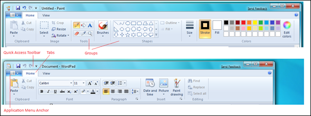
Paint and Wordpad are two of the first consumers of the Windows Ribbon UI Platform. In Windows 7, both these applications are enhanced with a set of new features, and the user interface of these applications also required to be brought up to the Windows 7 experience and standards. The Windows Ribbon UI is a great fit for these applications to revamp their user experience and make it consistent, and make these applications rich, fun and easy to use. The tasks and commands in these applications were amenable to be applied to the Ribbon UI framework, and it also served as an opportunity for popular native Windows applications to showcase the Windows Ribbon UI platform to consumers, as well as developers and ISVs. Many has asked about the Windows Explorer and IE also using the ribbon, which we did not plan on for Windows 7. Our Windows 7 focus was on the platform and demonstrating the platform for document-centric applications such as Paint and Wordpad.
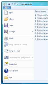
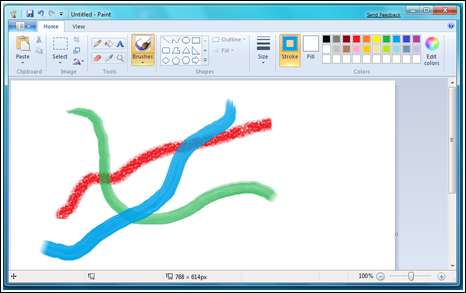
Both these applications showcase several elements of the Windows UI Ribbon. The Application Menu of both Paint and Wordpad exposes Application related commands that are typically available thru the ‘File’ menu of an application. Both the applications have a core tab set that consists of ‘Home’, which exposes most of the commands in the application, and ‘View’ which exposes the image or document viewing options in the application. The commands in both these tabs are laid out logically in groups of related functionality.
A quick access toolbar (QAT) is provided by both Paint and Wordpad, which comes with certain defaults like Save, Undo and Redo that are meaningful to the application. The user can customize the QAT by using the QAT drop-down, or right-click on any command or group in the ribbon and add it to the QAT.
Several ribbon commands are used in both these applications, like command buttons, split buttons, galleries, drop-downs, check boxes and toggle buttons.
Further, both applications provide a ‘Print preview’ mode which shows a print preview of the image or the document in context. In a mode, all the core tabs are removed and only the mode is displayed for the user to interact with. On exiting a mode, the user is returned to the core tab set.
Paint also exposes a contextual tab for the Text tool, which is displayed only when a text control is drawn on canvas. A contextual tab shown next to the core tab set when the text tool is in focus, and removed when the text is applied to the image on the canvas. The contextual tab set contains the tools that are specific and relevant only to the text tool.
Both the applications provide live previews through ribbon galleries, for example the font size and font name for Wordpad and Paint while formatting text, bullets and lists in Wordpad, and color selection, outline size selection and outline and fill styles for shapes in Paint. A live preview allows the user to see the changes instantaneously on mouse hover, and then apply those changes on a selection. These previews are one of the key elements of the ribbon UI and demonstrate why the metaphor is much more than a “big toolbar” but a new interaction style.
By adopting the Ribbon User Interface, both the applications inherit built-in keyboard accessibility support using ribbon Keytips, have tooltips on all commands, and have ready support for DPI and Windows themes.
Paint and Wordpad can serve as examples of how the Ribbon UI can be easily used in MFC applications. The Windows Ribbon presents new opportunities and options for developers and ISVs to develop applications with the Ribbon User Interface. The Windows Scenic Ribbon programming model and architecture emphasizes the separation of the markup file and the C++ code files to help developers decouple the presentation and customization of the UI from the underlying application code. The platform also promotes developer-designer workflow, where the developer can focus on the application logic, while the designer can work on the UI presentation and layout. The ribbon UI is a significant investment for us and you should expect to see us continue to use it more throughout Microsoft, including an implementation in the .NET Framework as was demonstrated by Scott Guthrie at the PDC, which will be built on Windows 7 natively in the future.
Multi-touch platform
Windows 7 provides support for multi-touch input data, as well as supporting multi-touch in Win32 via Windows messages. The investments in the multi-touch platform include the developer platform that exposes touch APIs to applications, enhancing the core user interface in Windows 7 to optimize for touch experiences, and providing multi-touch gestures for applications to consume. Developers on Windows 7 can build on these APIs decide on the appropriate level of touch support they would like to provide in their software.
Wordpad enhances the document reading experience by using the multi-touch platform and using the zoom and pan gestures. Zooming, panning and inertia lets the user get to a particular piece of content very quickly in an intuitive fashion. By using the zoom gesture, the user can zoom in or zoom out of the document which is akin to using the zoom slider at the right of the Wordpad status bar. On multi-touch capable hardware, the user can zoom in and out of the document by placing his fingers anywhere within the document window and executing the zoom gesture. Wordpad also supports the pan gesture to pan thru the pages of a document that is open in Wordpad. By executing the pan gesture, the user can scroll-down or scroll-up a document similar to using the scroll bar of the Wordpad application.
In Paint multi-touch data is used to allow users to paint with multiple fingers. It is an example of an application that allows multi-touch input without the usage of gestures. For Paint’s functionality, providing multiple finger painting ability was more compelling and enriching than allowing for zoom, pan, rotate or other gestures that act on the picture in a read-only mode and not in an edit-mode. New brushes in Paint are multi-touch enabled, and they handle touch inputs via multiple fingers and allow the user to simultaneously draw strokes on canvas on finger drag. These brushes are also pressure-sensitive, thereby providing a realistic experience with touch by varying the stroke width based on the pressure on the screen. While adopting the multi-touch platform to enhance the end-user experience in Paint, conscious design decisions were made to preserve the single touch experience for functionalities where a multi-touch scenario does not apply such as the color picker, magnifier and text tool.
By building with the multi-touch APIs, Paint and Wordpad have created more natural and intuitive interfaces on touch-enabled hardware and show “out of the box” how different capabilities can be exposed by developers in their software.
Taskbar
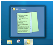
Sticky Notes (or just Notes) is an extension of a TabletPC applet available in Windows 7. One of the things which was key to the Notes experience on the desktop was to have the ability to quickly take all the notes away and get them back, but still making sure it is really easy to create a new note. We achieved this by having a single top level window for the sticky notes application. You can minimize all your notes and view a stack of notes in the preview on the command bar with a single click. The stacked preview has been achieved using the new thumbnail preview APIs that enable apps to override the default taskbar previews that are essentially a redirected snapshot of the top level application window, and provide their own. This enables applications to decouple their previews from the top level application window and provide a more productive preview based on the scenario. For example, this was very valuable in Sticky Note scenarios where a quick peek at a note that was last touched provides for quite a productive workflow. Taskbar also caches the preview thumbnail images so once the preview is given to the Taskbar, the application does not need to keep it around – the application does however need to send an updated preview whenever it changes.
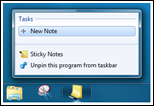
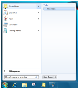
Another nifty customization end-point on the task bar is the destination menu (aka jumplist). This menu comes up when a user right clicks on the application in the taskbar or hovers over the application icon in the Start Menu. The Sticky Notes application does not have a single main application window – this makes the application feel really light weight and fits in well into the Windows 7 philosophy of creating simple and powerful user experiences. The challenge then was exposing functionality such as the ability to create a new note from a central location or potentially other custom “tasks”. The destination menu helped exposing these scenarios in a simple yet discoverable way.
The new taskbar functionality and extensibility built in that has the potential to make it a lot easier for people to work with applications/scenarios in a more productive and efficient manner when developers integrate their software with the Windows desktop.
Search
Building on the long history of Search in Windows and the significant enhancements in Windows 7, there are APIs available to developers to deeply integrate their content types with the desktop search user experience affordances in Windows 7. Sticky Notes shows one example of how these APIs can be used.
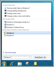
The Sticky Notes application now allows users to get back to their notes by simply searching for content through Windows Inline search within the start menu. This is in line with allowing users to reach the relevant note as quickly as possible even when the application is closed. Even though search could be done for both Text and Ink content, it is restricted to text because of lower success rates with varied handwriting styles in ink. The application registers a protocol handler that generates a URL for each Note. The Sticky Notes Filter handler gets asked for the content associated with each note that is then indexed by the Search infrastructure. These indexes are then used to perform a quick lookups when the user searches the Search interfaces provided by the Windows Shell. When a user clicks on a result, Search invokes the associated application with the URL corresponding to the one that the protocol handler had generated that the Filter handler associated with the content it sent to the Search indexer.
The search platform also has the ability to enable the filter handler to specify the language of each chunk of content passed on to it that overrides the default Search heuristics used to compute the language - this increases Search accuracy manifold and thereby enhances internationalization support of the entire ecosystem.
The reason Sticky Notes implemented a protocol handler in addition to a Filter handler was because it implements its own integrated storage schema on top of the Windows File system - all the notes are represented by a single .snt file. The protocol handler generates URL's to individual entities (in this case - notes); the filter handler picks out content for each of these URL's and gives it to Search for indexing.
This demonstrates the ease in which applications can plug into the search platform in Windows 7, and add search handlers which can enhance the overall user experience from the App as well as the platform.
Real-Time Stylus
Real-Time Stylus (RTS) is infrastructure that provides access to the stylus events coming from pen or touches digitizers. It provides information about strokes and points and provides access to ink-related events. Using RTS, applications can get access to stylus information and develop compelling end-user scenarios and experiences.
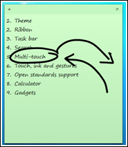
Sticky Notes now allows the users to Ink and Type on notes depending on the availability of inking hardware. Users can use keyboard input to type on notes and use the stylus to ink on notes. Though the experience has been designed keeping in mind that users will either use either ink or text on a particular note, it does allow users to ink and type on the same note. However these surfaces are maintained agnostic to each other. Sticky Notes also auto-grows the note while inking on the note, providing a real-time experience of the note adjusting its size to fit the inked content.
Real Time Stylus (RTS) is used for inking features provided in Sticky Notes. Inking gestures are also available to applications, and the scratch out gesture has been implemented in Sticky Notes to delete content.
In addition, Paint uses RTS to get a stream of positional input from mouse, stylus or touch which are used for drawing strokes on canvas. Paint also captures additional input variables like pressure and touch surface area when such input is available from the digitizer, and maps these inputs into the stroke algorithms that are used to generate Paint strokes on canvas. Using this algorithm, the user is able to modulate stroke width and other parameter based on the pressure or touch area on canvas.
Using RTS allows the development of applications and software that can build on the inking platform and provide ways to interact with the application that go beyond mouse or keyboard. Using stylus, inking and gestures, developers can create interactive experiences for end-users.
Restart and Recovery
The Windows Error Reporting (WER) infrastructure is a set of feedback technologies that is built into Windows 7 and other earlier versions of Windows client and server. WER allows applications to register for application failures and capture this data for end-users who agree to report it. This data can be accessed and analyzed and can be used to monitor error trends and download debug information to help developers and ISVs determine the root cause for application failures.
WER can add value to software development at various stages: during development, during beta testing by getting early feedback from end-users, after the release of the product by analysing and prioritizing the top fixes, and at end of life of the product.
Related to failure recovery, Applications can also register with WER for restart on application of a Windows patch that terminates the application and on application of an update that reboots the computer, as well as failure caused due to an application crash or hang or not responding state. Applications can optionally register for recovery of lost data, can develop their own mechanism for recovery.
Several Windows applications adopt the WER infrastructure to collect and analyze data. Calculator, Paint and Wordpad register for restart and additionally recover the current data in the sessions of the application that were running. Sticky Notes also registers for restart and recovery, and returns the user to the set of notes open on the desktop. Using WER, end-users would allow Windows to capture and collect problem data and then would be returned to the applications in the same state that they were in earlier.
As you can see, our primary effort for the applets in Windows 7 is to showcase some of the new platform APIs and innovations available to developers. As you get to try out these applications you will see that while showcasing the Windows 7 platform innovations, we have also added some commonly requested features and functionality. Some of them are: Check and correct, calculation modes and templates in Calculator, New brushes, shapes and multi-touch support in Paint, Open standards support in Wordpad and Ink and text, taskbar and search integration in Sticky notes. Maybe we won’t wait 10 years to update these again :-)
--Riyaz Pishori and team
Comments
Anonymous
January 28, 2009
I would be more interested in hearing more about these WER improvemtents. What about Windows update driver finder improvements?Anonymous
January 28, 2009
Why were Windows Meeting Space and InkBall removed? Were they showcase applets for the P2P API/PNRP/IPv6 and tablet platform?Anonymous
January 28, 2009
The new set of WER features sound terrific. Assuming it's possible for every software developer to register for these features with the win7 platform, there will be no need to worry about losing work due to a crash ever again. Of course, one would expect the release version to crash once in a blue moon anyway ;)Anonymous
January 28, 2009
I really like that you guys bring the Ribbon to other programs than Office! :D Is the Ribbon coming to Notepad? I really would like an update of that program (Numbers of liner, tabbed browser, ribbon, different support for different languages like PHP/HTML etc) The new recovery function in Windows really saved me when I had an exam, my computer crashed. I tried recovering with the recoverfunction, and it worked! MartinAnonymous
January 29, 2009
Ribbon is fine if you like unforgivably Microsoft still feels as thought it has to be forced on people, there should be options not to have it. That won't happen, Microsoft has licensed the ribbon for free but I don't see a whole lot of companies jumping on that band wagon. as far as the task bar goes very much improved, but one small annoying "bug" that has plagued the task bar since the inception. When the task bar is placed on the top programs get stuck underneath the task bar, with no way to move them except by unlocking the task bar and moving it out of the way. I would have hopped that Microsoft would have that worked by now. JimAnonymous
January 29, 2009
While I think the Ribbon works wonderfully in Word and Excel, it's just silly in Paint. There just aren't that many commands.Anonymous
January 29, 2009
The comment has been removedAnonymous
January 29, 2009
The comment has been removedAnonymous
January 29, 2009
> What about Windows update driver finder improvements? From what I've seen - Windows Update finally seems to be working how it should be - in addition to finding updates for the Windows itself - it also updates drivers for the hardware. I think this is critical because - in my experience - from the total population of computer users maybe 5% regularly checks for driver updates for their hardware at the manufacturer's websites. This functionality in XP was a joke, situation changed a little with Vista, now with W7 I hope it will change dramatically and finally become what it was meant to be. I know manufacturers have a big role to play here but I think Microsoft can encourage them to add drivers to WU/MU.Anonymous
January 29, 2009
For example, if I click on a drive then a ribbon would display all the drives related tasks (format, clean up, rename etc), the same goes for folders and files to make things much easier and their corresponding tasks just in front of our eyes w/o having to right click and then go through menus, tabs etc, just like in Office 2007 (word, excel etc) but unfortunately it's pretty much unchanged. And applications like pain and wordpad that are never used have been updated with ribbon UI. Almost all the computers that I have seen including mine, have Photoshop and Word installed replacing both paint and wordpad.Anonymous
January 30, 2009
It is a travesty that the 'pearl' has been moved from the top-left corner. There is no need to be able to double click on the top left corner of a window to close it, the pearl was so much more useful. Anyway... I'd like to see the ability to use two mice, simultaneously in windows 7, something which I imagine the multi-touch feature could enable. There are several things in audio editing applications that could potentially benefit from using two mice, such as timestretching clips. Holding the clip in place with one mouse cursor, while pulling it's start or end point with the other, for example. Or for selecting the start and end points of regions and so on. Sure, it would take time to get used to mousing with your left (or right) hand, but these things come with practice. Another feature I'd have liked to have seen is ustilising panning gestures, using mouse buttons. For example, holding both mouse buttons down and moving the mouse would pann the document in a similar manner to the multi touch experience. Anyway, just my 2 cents.Anonymous
January 31, 2009
http://www.youtube.com/watch?v=_-8IufkbuD0 Great post as always. Thanks a lot! The upper left area of ribbon-enabled applications (Paint, Wordpad, Office 14) looks very confusing. Too many buttons. Office 2007 is visually simpler. Are there any plans to simplify this area? Why aren't sticky notes desktop gadgets?Anonymous
January 31, 2009
I know Microsoft doesn't care and won't change but I hate the Ribbon. I think it is a poor UI that offers a terrible UX as compared with the older, user-configurable menu and toolbars. The Quick Access Toolbar is pathetic, too small and a poorly designed. The Ribbon is bad juju.Anonymous
January 31, 2009
I would have said that Notepad needs bottom tabs also, but now with the taskbar pop-up previews I have changed my mind. - This will do nicely. The sticky note design you have is the same as Vista app gadget, except it's been vastly improved. However, you should probably still be taken out and shot for Sound recorder - this is an upgrade for MP3 - but a HUGE downgrade for the ability of the old version. *Plus both old & new probably could have included a little 'change your voice' module for man, woman and child - physo, etc. Because otherwise your stuck with MS voices. (For animation, movie-making,etc.)Anonymous
February 01, 2009
I second all the other commenters--the "pearl" or Office button should appear in these applets. If you haven't already, you should read Jensen Harris' post on Fitts' Law. Such an important button/menu should occupy a corner of the screen. (The application menu functionality can still be preserved, as in Office 2007, with a right-click and double-click to close.) Also, although Wordpad and Paint are replaced by many users with more fully-featured applications, please consider that users nowadays, with the net everywhere, work on many machines. I use PCs at work, at off-site work locations, at home, in the coffee shop, at the library, etc. I simply can't--I don't have time or the authority--to install Word or Paint.NET or whatnot on every machine I encounter. Instead, often I find myself forced to use apps that ship with Windows, and their limited functionality really has impaired my ability to work. Increasing their functionality would let me work at distributed locations much more efficiently.Anonymous
February 02, 2009
The comment has been removedAnonymous
February 06, 2009
Can you support good old .doc please?Anonymous
February 10, 2009
Windows Explorer, Folder Options, and Search are confusing messes! I don't like the Ribbon in Office, but it would be great on Windows Explorer, Folder Options, and Advanced Search - all placed under Windows Explorer. It would put all the customisation and options under our instant control.Anonymous
February 20, 2009
!Important The applet are great but I fear accessibility has been overlook. Anytime I use the calculator, I have to search for it or go launch it. It's a small applet. So is the notes. I would be nice if an applet layer was provided over the desktop where you can add applet just like the gadget side bar(which was always in your face). Thus clicking the gadget/app on the taskbar will slide the applet/gadget layer over the UI with all the applet you add. It's an easy access where I can make calculation and add a note at the same time. A keyboard shortcut will even make it better sliding in the gadget layer.Anonymous
February 26, 2009
I agree with pepkaro, faramond, yeehaamcgee et al. about the ribbon. The 'Application Menu Anchor' should really be in the extreme top-left of a maximised window. As faramond already mentions, the easiest 4 pixels to reach on your screen with a mouse are the 4 corners. In Windows 7 this gives us: bottom-left for start menu, bottom right to show desktop, top-right to close a maximised application, and top-left SHOULD be used therefore to access the main menu of a maximised application. The existing menu in the top-left of every window is a relic from Windows 3, and should be removed or replaced with the 'application menu anchor' completely. I know of almost noone that uses any of the restore/move/size/minimize/maximize/close options in the standard windows application menu on the top-left, and therefore this is somewhere where windows 7 could make a useful UI change. One way that I propose to distinguish whether the icon in the top-left has this additional menu functionality would be to firstly make the application's icon in the top-left larger (perhaps larger than the title bar with some overlap, similar to the way the vista start orb is larger than the vista taskbar). Secondly, the improved application menu that I propose could be further distinguished from a standard application by having a drop-down arrow on its right, similar to that in the existing 'Application Menu Anchor' in the current Windows 7 beta.Anonymous
February 26, 2009
Here are a couple of mock-up proposoals that I v. quickly grafted in 5 mins for something that I think would be a better idea for the 'Application Menu Anchor': http://www.sensical.net/~s01042/win7/Windows_7%20application_menu_proposal_1.png http://www.sensical.net/~s01042/win7/Windows_7%20application_menu_proposal_2.pngAnonymous
March 15, 2009
The comment has been removedAnonymous
March 20, 2009
Hi! I'm woundering how you people at Microsoft are building the Windows Operating System (OS)? Are you using any speciall tools or so? Have a nice day...Anonymous
July 10, 2009
Please Microsoft take a look at my idea here and make the Ribbon even better: http://www.windows7taskforce.com/view/2934Anonymous
August 05, 2009
Hi, According to the Shortcuts, Escape "Cancels a Selection" while Delete "Deletes a Selection". If you move an object and then cancel the selection, the object will stay in it's place, I think this is the correct behavior. Now if you make a new Shape (e.g. Rectangle), pressing Esc and Delete have the same functionality, i.e. the shape is deleted. Instead I think pressing Esc should actually place the shape instead of deleting it (i.e. the same that a single mouse-click would do). Having a key be able to 'place the shape' is especially important if you are using a Tablet PC and precise same-pixel mouse clicks take 1-2 seconds to do. In short, could you please make the Esc button place the currently drawn/selected shape onto the canvas?Anonymous
November 10, 2009
Hi, is there an api for snt files, how can I read and write to this files? thnaksAnonymous
April 04, 2010
The comment has been removedAnonymous
April 04, 2010
thanks for your promth answer so many times when you leave a comments, it seems like a waste of time, but still in all I will leave one never know when someone will take your comment serious.Anonymous
April 08, 2010
Hi! I'm woundering how you people at Microsoft are building the Windows Operating System (OS)? Are you using any speciall tools or so? Have a nice day...
