Charting with PowerShell
You may be aware that there are some 3-rd party add-ins for PowerShell that allow you to create charts and graphs from your PowerShell scripts. What you may not be aware of is that there is a free download from Microsoft that will allow you to do the same. The Microsoft Chart Controls for Microsoft .NET Framework 3.5 are a set of .NET classes that allow you to draw bar, line, pie, etc charts with relative ease.
I’ve been using these for a C# project I’m working on, but I thought I’d write a short post to show how easy they are to use from PowerShell.
If you want to follow along with the examples, you’ll need to install the following:
PowerShell v1.0 (I used v2.0 on Windows 7, but don’t see any reason why v1.0 won’t do just as well)
I’ll build a simple example script step-by-step. To use it, simply copy the individual sections into a file called something like “Chart.ps1”, then execute from the PowerShell command window.
To create a chart the first thing you need to do is to load the appropriate .NET assemblies:
# load the appropriate assemblies
[void][Reflection.Assembly]::LoadWithPartialName("System.Windows.Forms")
[void][Reflection.Assembly]::LoadWithPartialName("System.Windows.Forms.DataVisualization")
System.Windows.Forms gives you the standard forms classes. While not necessary in order to use the Chart Controls, I’ll be using a form later to display the chart. System.Windows.Forms.DataVisualization is the main namespace for the chart controls.
Next you’ll need to create a Chart object and set some basic properties:
# create chart object
$Chart = New-object System.Windows.Forms.DataVisualization.Charting.Chart
$Chart.Width = 500
$Chart.Height = 400
$Chart.Left = 40
$Chart.Top = 30
Next you must define a ChartArea to draw on and add this to the Chart:
# create a chartarea to draw on and add to chart
$ChartArea = New-Object System.Windows.Forms.DataVisualization.Charting.ChartArea
$Chart.ChartAreas.Add($ChartArea)
Now for some data to display:
# add data to chart
$Cities = @{London=7556900; Berlin=3429900; Madrid=3213271; Rome=2726539;
Paris=2188500}
[void]$Chart.Series.Add("Data")
$Chart.Series["Data"].Points.DataBindXY($Cities.Keys, $Cities.Values)
For simplicity, I’ve hard-coded some data on European cities taken from WikiPedia. As you’ll see later, it is just as easy to use data gathered or generated by the script itself.
The final step is to display the chart on a Windows Form:
# display the chart on a form
$Chart.Anchor = [System.Windows.Forms.AnchorStyles]::Bottom -bor [System.Windows.Forms.AnchorStyles]::Right -bor
[System.Windows.Forms.AnchorStyles]::Top -bor [System.Windows.Forms.AnchorStyles]::Left
$Form = New-Object Windows.Forms.Form
$Form.Text = "PowerShell Chart"
$Form.Width = 600
$Form.Height = 600
$Form.controls.add($Chart)
$Form.Add_Shown({$Form.Activate()})
$Form.ShowDialog()
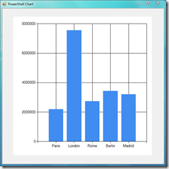
If you put all of this together and run it, you should see a Window similar to the one below:
The chart will re-size when you pull the edges of the form around. In fact, when displayed on a form like this the charts can be quite interactive and, for example, can be updated with live data. I’ll leave that as an exercise for the reader!
So, we’ve got a fairly basic chart, but what tweaks can we make to improve it?
First thing is to add a title and some labels to the axes:
# add title and axes labels
[void]$Chart.Titles.Add("Top 5 European Cities by Population")
$ChartArea.AxisX.Title = "European Cities"
$ChartArea.AxisY.Title = "Population"
Although it is quite clear in this example which item is the largest, in some instances it might not be as obvious, so it is possible to highlight that item (as well as the smallest):
# Find point with max/min values and change their colour
$maxValuePoint = $Chart.Series["Data"].Points.FindMaxByValue()
$maxValuePoint.Color = [System.Drawing.Color]::Red$minValuePoint = $Chart.Series["Data"].Points.FindMinByValue()
$minValuePoint.Color = [System.Drawing.Color]::Green
Let's get rid of the extra white space around the chart:
# change chart area colour
$Chart.BackColor = [System.Drawing.Color]::Transparent
Finally, those flat looking bars aren’t too interesting, so let’s give them a slightly 3D appearance:
# make bars into 3d cylinders
$Chart.Series["Data"]["DrawingStyle"] = "Cylinder"
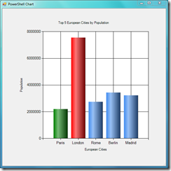
Now, you should have something like this:
A nice little chart, with minimal effort.
This is all good, but your chart is gone once you close the form. Wouldn’t it be great if you could save a copy? Well, the good news is that you can. The code below adds a button to the form that saves the chart to your desktop when clicked:
# add a save button
$SaveButton = New-Object Windows.Forms.Button
$SaveButton.Text = "Save"
$SaveButton.Top = 500
$SaveButton.Left = 450
$SaveButton.Anchor = [System.Windows.Forms.AnchorStyles]::Bottom -bor [System.Windows.Forms.AnchorStyles]::Right
$SaveButton.add_click({$Chart.SaveImage($Env:USERPROFILE + "\Desktop\Chart.png", "PNG")})$Form.controls.add($SaveButton)
A couple of points about this button:
- I also reduced the height of the chart to make room for the button, by changing the chart height set earlier in the script: $Chart.Height = 450
- As it happens, this button is not necessary, and you can call the save method directly from PowerShell, like this:
# save chart to file
$Chart.SaveImage($Env:USERPROFILE + "\Desktop\Chart.png", "PNG")
- You should call “$Form.controls.add($SaveButton)” after creating the form object. This seems obvious, but I just wanted to be clear as the snippet above doesn’t show the rest of the code for the form and depending on where you paste it in, it may fail.
If you’re more interested in a fully automated script with no GUI or user interaction, then you’ll be glad to hear that the Windows Form is not necessary at all – you can create, populate, configure and save the chart to file without ever displaying it. This is useful if you don’t actually want to see it there and then, but need it for a report or presentation later.
Ok, so you’re not interested in European demography. In that case, let’s look at an example that is more useful if you’re a SysAdmin.
As you know, with PowerShell it is trivial to gather certain system information. For example, here is how to gather information on running processes and display it in a (truncated) table:
PS C:\Windows\system32> Get-Process | Format-Table
Handles NPM(K) PM(K) WS(K) VM(M) CPU(s) Id ProcessName
------- ------ ----- ----- ----- ------ -- -----------
128 10 15848 15556 52 5580 audiodg
909 40 19888 33372 128 5.79 2368 CcmExec
1324 79 45556 53780 351 26.96 3924 communicator
57 7 2356 6404 74 0.06 668 conhost
665 13 1976 4128 48 2.56 364 csrss
509 19 3972 18040 112 9.86 452 csrss
116 15 29240 26832 139 43.98 3064 dwm
1171 148 56664 66612 307 38.08 1256 explorer
Tables are good, but often a simple graph is better, especially in presentations. Let’s assume you want to show the top 5 consumers of physical memory (WS – Working set – in the table above). Normally, to show this in a table, you’d do something like this:
Get-Process | Sort-Object -Property WS | Select-Object Name,WS,ID -Last 5 | Format-Table -AutoSize
To add this to a chart, do this instead:
# add data to chart
$Processes = Get-Process | Sort-Object -Property WS | Select-Object Name,WS,ID -Last 5
$ProcNames = @(foreach($Proc in $Processes){$Proc.Name + "_" + $Proc.ID})
$WS = @(foreach($Proc in $Processes){$Proc.WS/1MB})[void]$Chart.Series.Add("Data")
$Chart.Series["Data"].Points.DataBindXY($ProcNames, $WS)
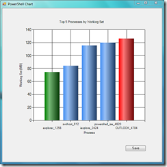
Apart from this change to how the data is gathered (and the chart titles), everything else in our script remains the same as before. This is great - once we have a script that shows a chart, we can easily re-use it to show other data. Obviously, if you’re going to use a lot of charts, then you probably want to organise the charting part as a separate function you can call when needed. So, this time, your chart should look something like this:
As before, the largest and smallest columns are highlighted. If your data does not come pre-sorted, as it is in the example, the chart control can sort the data after it is bound to the control, like this:
$Chart.Series["Data"].Sort([System.Windows.Forms.DataVisualization.Charting.PointSortOrder]::Descending, "Y")
This chart is pretty clear and easy to understand, but not all data benefits from a Column view. Although not ideal for the current example, let’s assume a pie chart would be better. How do you draw one of those? Easy.
Remove these code sections from your script:
$Chart.Series["Data"].Sort([System.Windows.Forms.DataVisualization.Charting.PointSortOrder]::Descending, "Y")
$ChartArea.AxisX.Title = "Process"
$ChartArea.AxisY.Title = "Working Set (MB)"# Find point with max/min values and change their colour
$maxValuePoint = $Chart.Series["Data"].Points.FindMaxByValue()
$maxValuePoint.Color = [System.Drawing.Color]::Red$minValuePoint = $Chart.Series["Data"].Points.FindMinByValue()
$minValuePoint.Color = [System.Drawing.Color]::Green# make bars into 3d cylinders
$Chart.Series["Data"]["DrawingStyle"] = "Cylinder"
Substitute the following:
# set chart type
$Chart.Series["Data"].ChartType = [System.Windows.Forms.DataVisualization.Charting.SeriesChartType]::Pie
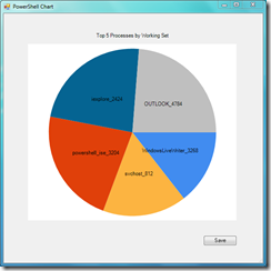
Which gives you a basic pie chart:
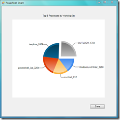
To improve the appearance, add the following code:
# set chart options
$Chart.Series["Data"]["PieLabelStyle"] = "Outside"
$Chart.Series["Data"]["PieLineColor"] = "Black"
$Chart.Series["Data"]["PieDrawingStyle"] = "Concave"
($Chart.Series["Data"].Points.FindMaxByValue())["Exploded"] = $true
Now, your chart should look like this:
Well, that’s it for this short tutorial, but if you’re hungry for more (and there is a lot more) on using the Chart Controls, download the Chart Control documentation and samples:
Microsoft Chart Controls for .NET Framework Documentation
Samples Environment for Microsoft Chart Controls
