Notitie
Voor toegang tot deze pagina is autorisatie vereist. U kunt proberen u aan te melden of de directory te wijzigen.
Voor toegang tot deze pagina is autorisatie vereist. U kunt proberen de mappen te wijzigen.
This article provides a high level overview of the new features introduced in Android 5.0 (Lollipop). These features include a new user interface style called Material Theme, as well as new supporting features such as animations, view shadows, and drawable tinting. Android 5.0 also includes enhanced notifications, two new UI widgets, a new job scheduler, and a handful of new APIs to improve storage, networking, connectivity, and multimedia capabilities.
Lollipop Overview
Android 5.0 (Lollipop) introduces a new design language, Material Design, and with it a supporting cast of new features to make apps easier and more intuitive to use. With Material Design, Android 5.0 not only gives Android phones a facelift; it also provides a new set of design rules for Android-based tablets, desktop computers, watches, and smart TVs. These design rules emphasize simplicity and minimalism while making use of familiar tactile attributes (such as realistic surface and edge cues) to help users quickly and intuitively understand the interface.
Material Theme is the embodiment of these UI design principles in Android. This article begins by covering Material Theme's supporting features:
Animations – Touch feedback animations, activity transition animations, view state transition animations, and a reveal effect.
View shadows and elevation – Views now have an
elevationproperty; views with higherelevationvalues cast larger shadows on the background.Color features – Drawable tinting makes it possible for you to reuse image assets by changing their color, and prominent color extraction helps you dynamically theme your app based on colors in an image.
Many Material Theme features are already built into the Android 5.0 UI experience, while others must be explicitly added to apps. For example, some standard views (such as buttons) already include touch feedback animations, while apps must enable most view shadows.
In addition to the UI improvements brought about through Material Theme, Android 5.0 also includes several other new features that are covered in this article:
Enhanced notifications – Notifications in Android 5.0 have been significantly updated with a new look, support for lockscreen notifications, and a new Heads-up notification presentation format.
New UI widgets – The new
RecyclerViewwidget makes it easier for apps to convey large data sets and complex information, and the newCardViewwidget provides a simplified card-like presentation format for displaying text and images.New APIs – Android 5.0 adds new APIs for multiple network support, improved Bluetooth connectivity, easier storage management, and more flexible control of multimedia players and camera devices. A new job scheduling feature is available to run tasks asynchronously at scheduled times. This feature helps to improve battery life by, for example, scheduling tasks to take place when the device is plugged in and charging.
Requirements
The following is required to use the new Android 5.0 features in Xamarin-based apps:
Xamarin.Android – Xamarin.Android 4.20 or later must be installed and configured with either Visual Studio or Visual Studio for Mac.
Android SDK – Android 5.0 (API 21) or later must be installed via the Android SDK Manager.
Java Developer Kit – Xamarin.Android requires JDK 1.8 or later if you are developing for API level 24 or greater (JDK 1.8 also supports API levels earlier than 24, including Lollipop). The 64-bit version of JDK 1.8 is required if you are using custom controls or the Forms Previewer.
You can continue to use JDK 1.7 if you are developing specifically for API level 23 or earlier.
Setting Up an Android 5.0 Project
To create an Android 5.0 project, you must install the latest tools and SDK packages. Use the following steps to set up a Xamarin.Android project that targets Android 5.0:
Install Xamarin.Android tools and activate your Xamarin license. See Setup and Installation for more information about installing Xamarin.Android.
If you are using Visual Studio for Mac, install the latest Android 5.0 updates.
Start the Android SDK Manager (in Visual Studio for Mac, use Tools > Open Android SDK Manager…) and install Android SDK Tools 23.0.5 or later:
Also, install the latest Android 5.0 SDK packages (API 21 or later):
For more information about using the Android SDK Manager, see SDK Manager.
Create a new Xamarin.Android project. If you are new to Android development with Xamarin, see Hello, Android to learn about creating Android projects. When you create an Android project, be sure to configure the version settings for Android 5.0. In Visual Studio for Mac, navigate to Project Options > Build > General and set Target framework to Android 5.0 (Lollipop) or later:

Under Project Options > Build > Android Application, set minimum and target Android version to Automatic - use target framework version:

Configure an emulator or an Android device to test your app. If you are using an emulator, see Android Emulator Setup to learn how to configure an Android emulator for use with Xamarin Studio or Visual Studio. If you are using an Android device, see Setting Up the Preview SDK to learn how to update your device for Android 5.0. To configure your Android device for running and debugging Xamarin.Android applications, see Set Up Device for Development.
Note: If you are updating an existing Android project that was targeting the Android L Preview, you must update the Target Framework and Android version to the values described above.
Important Changes
Previously published Android apps could be affected by changes in Android 5.0. In particular, Android 5.0 uses a new runtime and a significantly changed notification format.
Android Runtime
Android 5.0 uses the new Android Runtime (ART) as the default runtime instead of Dalvik. ART implements several major new features:
Ahead-of-time (AOT) compilation – AOT can improve app performance by compiling app code before the app is first launched. When an app is installed, ART generates a compiled app executable for the target device.
Improved garbage collection (GC) – GC improvements in ART can also improve app performance. Garbage collection now uses one GC pause instead of two, and concurrent GC operations complete in a more timely fashion.
Improved app debugging – ART provides more diagnostic detail to help in analyzing exceptions and crash reports.
Existing apps should work without change under ART – except for apps that exploit techniques unique to the previous Dalvik runtime, which may not work under ART. For more information about these changes, see Verifying App Behavior on the Android Runtime (ART).
Notification Changes
Notifications have changed significantly in Android 5.0:
Sounds and vibration are handled differently – Notification sounds and vibrations are now handled by
Notification.Builderinstead ofRingtone,MediaPlayer, andVibrator.New color scheme – In accordance with Material Theme, notifications are rendered with dark text over white or very light backgrounds. Also, alpha channels in notification icons may be modified by Android to coordinate with system color schemes.
Lockscreen notifications – Notifications can now appear on the device lockscreen.
Heads-up – High-priority notifications now appear in a small floating window (Heads-up notification) when the device is unlocked and the screen is turned on.
In most cases, porting existing app notification functionality to Android 5.0 requires the following steps:
Convert your code to use
Notification.Builder(orNotificationsCompat.Builder) for creating notifications.Verify that your existing notification assets are viewable in the new Material Theme color scheme.
Decide what visibility your notifications should have when they are presented on the lockscreen. If a notification is not public, what content should show up on the lockscreen?
Set the category of your notifications so they are handled correctly in the new Android 5.0 Do not disturb mode.
If your notifications present transport controls, display media playback status,
use RemoteControlClient, or call ActivityManager.GetRecentTasks.
For information about creating notifications in Android, see Local Notifications.
Material Theme
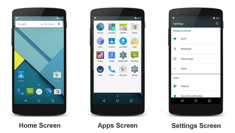
The new Android 5.0 Material Theme brings sweeping changes to the look and feel of the Android UI. Visual elements now use tactile surfaces that take on the bold graphics, typography, and bright colors of print-based design. Examples of Material Theme are depicted in the following screenshots:
Android 5.0 greets you with the home screen shown on the left. The center screenshot is the first screen of the app list, and the screenshot on the right is the Settings screen. Google's Material Design specification explains the underlying design rules behind the new Material Theme concept.
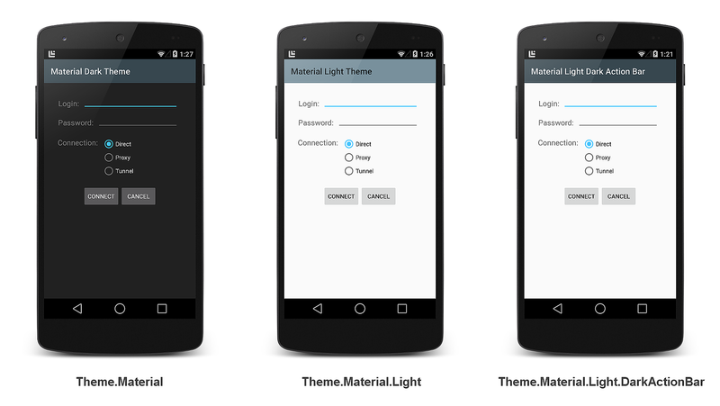
Material Theme includes three built-in flavors that you can use in your
app: the Theme.Material dark theme (the default), the
Theme.Material.Light theme, and the
Theme.Material.Light.DarkActionBar theme:
For more about using Material Theme features in Xamarin.Android apps, see Material Theme.
Animations
Android 5.0 provides touch feedback animations, activity transition animations, and view state transition animations to make app interfaces more intuitive to use. Also, Android 5.0 apps can use reveal effect animations to hide or reveal views. You can use curved motion settings to configure how quickly or slowly animations are rendered.
Touch Feedback Animations
Touch feedback animations provide users with visual feedback when a view
has been touched. For example, buttons now display a ripple effect when
they are touched – this is the default touch feedback animation in
Android 5.0. Ripple animation is implemented by the new RippleDrawable
class. The ripple effect can be configured to end at the bounds of the
view or extend beyond the bounds of the view. For example, the following
sequence of screenshots illustrates the ripple effect in a button during
touch animation:

Initial touch contact with the button occurs in the first image on the left, while the remaining sequence (from left to right) illustrates how the ripple effect spreads out to the edge of the button. When the ripple animation ends, the view returns to its original appearance. The default ripple animation takes place in a fraction of a second, but the length of the animation can be customized for longer or shorter lengths of time.
For more on touch feedback animations in Android 5.0, see Customize Touch Feedback.
Activity Transition Animations
Activity transition animations give users a sense of visual continuity when one activity transitions to another. Apps can specify three types of transition animations:
Enter transition – For when an activity enters the scene.
Exit transition – For when an activity exits the scene.
Shared element transition – For when a view that is common to two activities changes as the first activity transitions to the next.
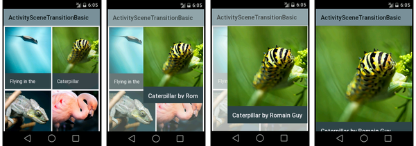
For example, the following sequence of screenshots illustrates a shared element transition:
A shared element (a photo of a caterpillar) is one of several views in the first activity; it enlarges to become the only view in the second activity as the first activity transitions to the second.
Enter Transition Animation Types
For enter transitions, Android 5.0 provides three types of animations:
Explode animation – Enlarges a view from the center of the scene.
Slide animation – Moves a view in from one of the edges of a scene.
Fade animation – Fades a view into the scene.
Exit Transition Animation Types
For exit transitions, Android 5.0 provides three types of animations:
Explode animation – Shrinks a view to the center of the scene.
Slide animation – Moves a view out to one of the edges of a scene.
Fade animation – Fades a view out of the scene.
Shared Element Transition Animation Types
Shared element transitions support multiple types of animations, such as:
Changing the layout or clip bounds of a view.
Changing the scale and rotation of a view.
Changing the size and scale type for a view.
For more about activity transition animations in Android 5.0, see Customize Activity Transitions.
View State Transition Animations
Android 5.0 makes it possible for animations to run when the state of a view changes. You can animate view state transitions by using one of the following techniques:
Create drawables that animate state changes associated with a particular view. The new
AnimatedStateListDrawableclass lets you create drawables that display animations between view state changes.Define animation functionality that runs when the state of a view changes. The new
StateListAnimatorclass lets you define an animator that runs when the state of a view changes.
For more about view state transition animations in Android 5.0, see Animate View State Changes.
Reveal Effect
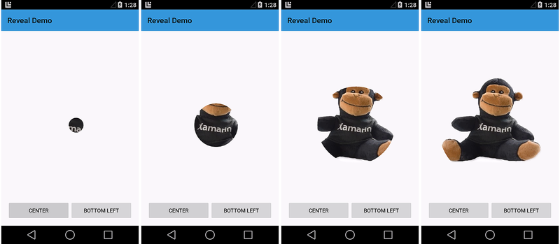
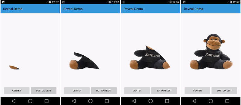
The reveal effect is a clipping circle that changes radius to reveal or hide a view. You can control this effect by setting the initial and final radius of the clipping circle. The following sequence of screenshots illustrates a reveal effect animation from the center of the screen:
The next sequence illustrates a reveal effect animation that takes place from the bottom left corner of the screen:
Reveal animations can be reversed; that is, the clipping circle can shrink to hide the view rather than enlarge to reveal the view.
For more information on the Android 5.0 reveal effect in, see Use the Reveal Effect.
Curved Motion
In addition to these animation features, Android 5.0 also provides new APIs that enable you to specify the time and motion curves of animations. Android 5.0 uses these curves to interpolate temporal and spatial movement during animations. Three curves are defined in Android 5.0:
Fast_out_linear_in – Accelerates quickly and continues to accelerate until the end of the animation.
Fast_out_slow_in – Accelerates quickly and slowly decelerates towards the end of the animation.
Linear_out_slow_in – Begins with a peak velocity and slowly decelerates to the end of the animation.
You can use the new PathInterpolator class to specify how motion interpolation
takes place. PathInterpolator is an interpolator that traverses animation paths
according to specified control points and motion curves. For more information about
how to specify curved motion settings in Android 5.0,
see Use Curved Motion.
View Shadows & Elevation
In Android 5.0, you can specify the elevation of a view by setting
a new Z property. A greater Z value causes the view to cast a
larger shadow on the background, making the view appear to float higher
above the background. You can set the initial elevation of a view by
configuring its elevation attribute in the layout.
The following example illustrates the shadows cast by an empty
TextView control when its elevation attribute is set to 2dp, 4dp, and
6dp, respectively:
View shadow settings can be static (as shown above) or they can be used
in animations to make a view appear to temporarily rise above the
view's background. You can use the ViewPropertyAnimator class to
animate the elevation of a view. The elevation of a view is the sum of
its layout elevation setting plus a translationZ property that you
can set through a ViewPropertyAnimator method call.
For more about view shadows in Android 5.0, see Defining Shadows and Clipping Views.
Color Features
Android 5.0 provides two new features for managing color in apps:
Drawable tinting lets you alter the colors of image assets by changing a layout attribute.
Prominent color extraction makes it possible for you to dynamically customize your app's color theme to coordinate with the color palette of a displayed image.
Drawable Tinting
Android 5.0 layouts recognize a new tint attribute that you can use to
set the color of drawables without having to create multiple versions
of these assets to display different colors. To use this feature, you
define a bitmap as an alpha mask and use the tint attribute to define
the color of the asset. This makes it possible for you to create assets
once and color them in your layout to match your theme.
In the following example, a single image asset – a white logo with a transparent background – is used to create tint variations:

This logo is displayed above a blue circular background as shown in
the following examples. The image on the left is how the logo appears
without a tint setting. In the center image, the logo's tint
attribute is set to a dark gray. In the image on the right, tint is
set to a light gray:

For more about drawable tinting in Android 5.0, see Drawable Tinting.
Prominent Color Extraction
The new Android 5.0 Palette class lets you extract colors from an image
so that you can dynamically apply them to a custom color palette. The
Palette class extracts six colors from an image and labels these
colors according to their relative levels of color saturation and
brightness:
Vibrant
Vibrant dark
Vibrant light
Muted
Muted dark
Muted light
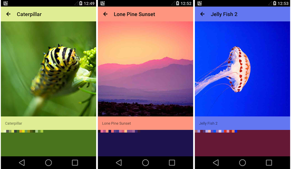
For example, in the following screenshots, a photo viewing app extracts the prominent colors from the image on display and uses these colors to adapt the color scheme of the app to match the image:
In the above screenshots, the action bar is set to the extracted "vibrant light" color and the background is set to the extracted "vibrant dark" color. In each example above, a row of small color squares is included to illustrate the palette colors that were extracted from the image.
For more about color extraction in Android 5.0, see Extracting Prominent Colors from an Image.
New UI Widgets
Android 5.0 introduces two new UI widgets:
RecyclerView– A view group that displays a list of scrollable items.CardView– A basic layout with rounded corners.
Both widgets include baked-in support for Material Theme features; for
example, RecyclerView uses animations for adding and removing views,
and CardView uses view shadows to make each card appear to float above
the background. Examples of these new widgets are shown in the following
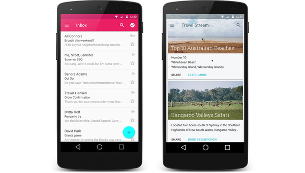
screenshots:
The screenshot on the left is an example of RecyclerView as used in an
email app, and the screenshot on the right is an example of CardView
as used in a travel reservation app.
RecyclerView
RecyclerView is similar to ListView, but it is better suited for
large sets of views or lists with elements that change dynamically. Like
ListView, you specify an adapter to access the underlying data
set. However, unlike ListView, you use a layout manager to position
items within RecyclerView. The layout manager also takes care of view
recycling; it manages the reuse of item views that are no longer visible
to the user.
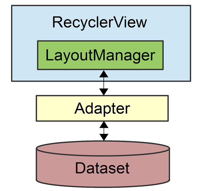
When you use a RecyclerView widget, you must specify a LayoutManager
and an adapter. As shown in this figure, LayoutManager is the
intermediary between the adapter and the RecyclerView:
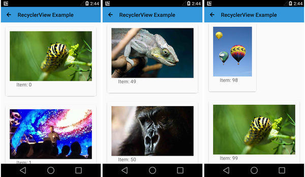
The following screenshots illustrate a RecyclerView that contains 100
items (each item consists of an ImageView and a TextView):
RecyclerView handles this large data set with ease – scrolling
from the beginning of the list to end of the list in this sample app
takes only a few seconds. RecyclerView also supports animations;
in fact, animations for adding and removing items are enabled by
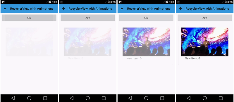
default. When an item is added to a RecyclerView, it fades in as shown
in this sequence of screenshots:
For more about RecyclerView,
see RecyclerView.
CardView
CardView is a simple view that simulates a floating card with rounded
corners. Because CardView has built-in view shadows, it provides
an easy way for you to add visual depth to your app. The following
screenshots show three text-oriented examples of CardView:
Each of the cards in the above example contains a TextView; the
background color is set via the cardBackgroundColor attribute.
For more about CardView,
see CardView.
Enhanced Notifications
The notification system in Android 5.0 has been significantly updated with a new visual format and new features. Notifications have a new look in Android 5.0. For example, notifications in Android 5.0 now use dark text over a light background:

When a large icon is displayed in a notification (as shown in the above example), Android 5.0 presents the small icon as a badge over the large icon.
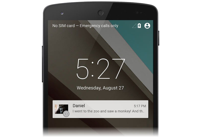
In Android 5.0, notifications can also appear on the device lockscreen. For example, here is an example screenshot of a lockscreen with a single notification:
Users can double-tap a notification on the lockscreen to unlock the device and jump to the app that originated that notification, or swipe to dismiss the notification. Notifications have a new visibility setting that determines how much content can be displayed on the lockscreen. Users can choose whether to allow sensitive content to be shown in lockscreen notifications.
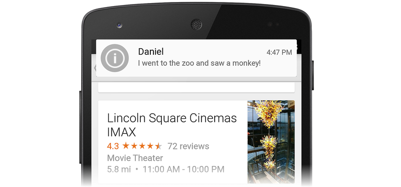
Android 5.0 introduces a new high-priority notification presentation format called Heads-up. Heads-up notifications slide down from the top of the screen for a few seconds and then retreat back to the notification shade at the top of the screen. Heads-up notifications make it possible for the system UI to put important information in front of the user without disrupting the currently running activity. The following example illustrates a simple Heads-up notification that displays on top of an app:
Heads-up notifications are typically used for the following events:
A new next message
An incoming phone call
Low battery indication
An alarm
Android 5.0 displays a notification in Heads-up format only when it has a high or max priority setting.
In Android 5.0, you can provide notification metadata to help Android sort and display notifications more intelligently. Android 5.0 organizes notifications according to priority, visibility, and category. Notification categories are used to filter which notifications can be presented when the device is in Do not disturb mode.
For detailed information about creating and launching notifications with the latest Android 5.0 features, see Local Notifications.
New APIs
In addition to the new look-and-feel features described above, Android 5.0 adds new APIs that extend the capabilities of existing multimedia, storage, and wireless/connectivity functionality. Also, Android 5.0 includes new APIs that provide support for a new job scheduler feature.
Camera
Android 5.0 provides several new APIs for enhanced camera
capabilities. The new Android.Hardware.Camera2 namespace includes
functionality for accessing individual camera devices connected to an
Android device. Also, Android.Hardware.Camera2 models each camera
device as a pipeline: it accepts a capture request, captures the image,
and then outputs the result. This approach makes it possible for apps to
queue multiple capture requests to a camera device.
The following APIs make these new features possible:
CameraManager.GetCameraIdList– Helps you to programmatically access camera devices; you useCameraManager.OpenCamerato connect to a specific camera device.CameraCaptureSession– Captures or streams images from the camera device. You implement aCameraCaptureSession.CaptureListenerinterface to handle new image capture events.CaptureRequest– Defines capture parameters.CaptureResult– Provides the results of an image capture operation.
For more about the new camera APIs in Android 5.0, see Media.
Audio Playback
Android 5.0 updates the AudioTrack class for better audio playback:
ENCODING_PCM_FLOAT– ConfiguresAudioTrackto accept audio data in floating-point format for better dynamic range, greater headroom, and higher quality (thanks to increased precision). Also, floating-point format helps to avoid audio clipping.ByteBuffer– You can now supply audio data toAudioTrackas a byte array.WRITE_NON_BLOCKING– This option simplifies buffering and multithreading for some apps.
For more about AudioTrack improvements in Android 5.0,
see Media.
Media Playback Control
Android 5.0 introduces the new Android.Media.MediaController class,
which replaces RemoteControlClient. Android.Media.MediaController
provides simplified transport control APIs and offers thread-safe
control of playback outside of the UI context. The following new APIs
handle transport control:
Android.Media.Session.MediaSession– A media control session that handles multiple controllers. You callMediaSession.GetSessionTokento request a token that your app uses to interact with the session.MediaController.TransportControls– Handles transport commands such as Play, Stop, and Skip.
Also, you can use the new Android.App.Notification.MediaStyle class
to associate a media session with rich notification content (such as
extracting and showing album art).
For more about the new media playback control features in Android 5.0, see Media.
Storage
Android 5.0 updates the Storage Access Framework to make it easier for applications to work with directories and documents:
To select a directory subtree, you can build and send an
Android.Intent.Action.OPEN_DOCUMENT_TREEintent. This intent causes the system to display all provider instances that support subtree selection; the user then browses and selects a directory.To create and manage new documents or directories anywhere under a subtree, you use the new
CreateDocument,RenameDocument, andDeleteDocumentmethods ofDocumentsContract.To get paths to media directories on all shared storage devices, you call the new
Android.Content.Context.GetExternalMediaDirsmethod.
For more about new storage APIs in Android 5.0, see Storage.
Wireless & Connectivity
Android 5.0 adds the following API enhancements for wireless and connectivity:
New multi-network APIs that make it possible for apps to find and select networks with specific capabilities before making a connection.
Bluetooth broadcasting functionality that enables an Android 5.0 device to act as a low-energy Bluetooth peripheral.
NFC enhancements that make it easier to use near-field communications functionality for sharing data with other devices. .
Job Scheduling
Android 5.0 introduces a new JobScheduler API that can help users
minimize battery drain by scheduling certain tasks to run only when the
device is plugged in and charging. This job scheduler feature can also
be used for scheduling a task to run when conditions are more suitable
to that task, such as downloading a large file when the device is
connected over a Wi-Fi network instead of a metered network.
For more about the new job scheduling APIs in Android 5.0, see Scheduling Jobs.
Summary
This article provided an overview of important new features in Android 5.0 for Xamarin.Android app developers:
Material Theme
Animations
View shadows and elevation
Color features, such as drawable tinting and prominent color extraction
The new
RecyclerViewandCardViewwidgetsNotification enhancements
New APIs for camera, audio playback, media control, storage, wireless/connectivity, and job scheduling
If you are new to Xamarin Android development, read Setup and Installation to help you get started with Xamarin.Android. Hello, Android is an excellent introduction for learning how to create Android projects.


