Notitie
Voor toegang tot deze pagina is autorisatie vereist. U kunt proberen u aan te melden of de directory te wijzigen.
Voor toegang tot deze pagina is autorisatie vereist. U kunt proberen de mappen te wijzigen.
Xamarin.Forms Layouts are used to compose user-interface controls into visual structures.
The Layout and Layout<T> classes in Xamarin.Forms are specialized subtypes of views that act as containers for views and other layouts. The Layout class itself derives from View. A Layout derivative typically contains logic to set the position and size of child elements in Xamarin.Forms applications.
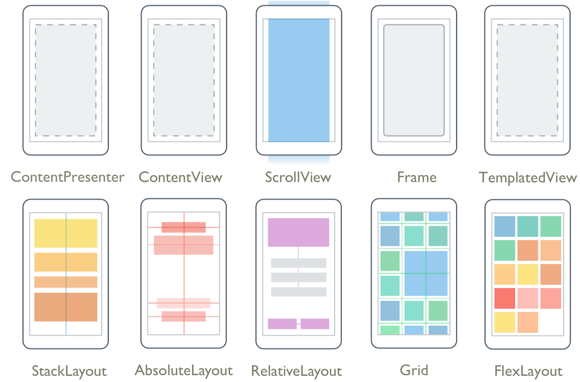
The classes that derive from Layout can be divided into two categories:
Layouts with Single Content
These classes derive from Layout, which defines Padding and IsClippedToBounds properties:
| Type | Description | Appearance |
|---|---|---|
ContentView |
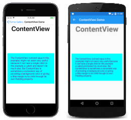
ContentView contains a single child that is set with the Content property. The Content property can be set to any View derivative, including other Layout derivatives. ContentView is mostly used as a structural element and serves as a base class to Frame.API Documentation / Guide |
 C# code for this page / XAML page |
Frame |
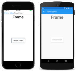
The Frame class derives from ContentView and displays a border, or frame, around its child. The Frame class has a default Padding value of 20, and also defines BorderColor, CornerRadius, and HasShadow properties.API Documentation / Guide |
 C# code for this page / XAML page |
ScrollView |
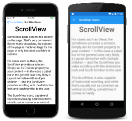
ScrollView is capable of scrolling its contents. Set the Content property to a view or layout too large to fit on the screen. (The content of a ScrollView is very often a StackLayout.) Set the Orientation property to indicate if scrolling should be vertical, horizontal, or both.API Documentation / Guide |
 C# code for this page / XAML page |
TemplatedView |
TemplatedView displays content with a control template, and is the base class for ContentView.API Documentation / Guide |
 |
ContentPresenter |
ContentPresenter is a layout manager for templated views, used within a ControlTemplate to mark where the content that is to be presented appears.API Documentation / Guide |
 |
Layouts with Multiple Children
These classes derive from Layout<View>:
| Type | Description | Appearance |
|---|---|---|
StackLayout |
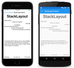
StackLayout positions child elements in a stack either horizontally or vertically based on the Orientation property. The Spacing property governs the spacing between the children, and has a default value of 6.API Documentation / Guide |
 C# code for this page / XAML page |
Grid |
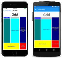
Grid positions its child elements in a grid of rows and columns. A child's position is indicated using the attached properties Row, Column, RowSpan, and ColumnSpan.API Documentation / Guide |
 C# code for this page / XAML page |
AbsoluteLayout |
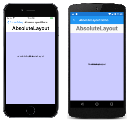
AbsoluteLayout positions child elements at specific locations relative to its parent. A child's position is indicated using the attached properties LayoutBounds and LayoutFlags. An AbsoluteLayout is useful for animating the positions of views.API Documentation / Guide |
 C# code for this page / XAML page with code-behind |
RelativeLayout |
RelativeLayout positions child elements relative to the RelativeLayout itself or to their siblings. A child's position is indicated using the attached properties that are set to objects of type Constraint and BoundsConstraint.API Documentation / Guide |
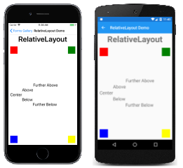 C# code for this page / XAML page |
FlexLayout |
FlexLayout is based on the CSS Flexible Box Layout Module, commonly known as flex layout or flex-box. FlexLayout defines six bindable properties and five attached bindable properties that allow children to be stacked or wrapped with many alignment and orientation options.API Documentation / Guide |
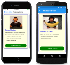 C# code for this page / XAML page |
