Notitie
Voor toegang tot deze pagina is autorisatie vereist. U kunt proberen u aan te melden of de directory te wijzigen.
Voor toegang tot deze pagina is autorisatie vereist. U kunt proberen de mappen te wijzigen.
Every Xamarin.Forms view has HorizontalOptions and VerticalOptions properties, of type LayoutOptions. This article explains the effect that each LayoutOptions value has on the alignment and expansion of a view.
Overview
The LayoutOptions structure encapsulates two layout preferences:
- Alignment – the view's preferred alignment, which determines its position and size within its parent layout.
- Expansion – used only by a
StackLayout, and indicates if the view should use extra space, if it's available.
These layout preferences can be applied to a View, relative to its parent, by setting the HorizontalOptions or VerticalOptions property of the View to one of the public fields from the LayoutOptions structure. The public fields are as follows:
The Start, Center, End, and Fill fields are used to define the view's alignment within the parent layout:
- For horizontal alignment,
Startpositions theViewon the left hand side of the parent layout, and for vertical alignment, it positions theViewat the top of the parent layout. - For horizontal and vertical alignment,
Centerhorizontally or vertically centers theView. - For horizontal alignment,
Endpositions theViewon the right hand side of the parent layout, and for vertical alignment, it positions theViewat the bottom of the parent layout. - For horizontal alignment,
Fillensures that theViewfills the width of the parent layout, and for vertical alignment, it ensures that theViewfills the height of the parent layout.
The StartAndExpand, CenterAndExpand, EndAndExpand, and FillAndExpand values are used to define the alignment preference, and whether the view will occupy more space if available within the parent StackLayout.
Note
The default value of a view's HorizontalOptions and VerticalOptions properties is LayoutOptions.Fill.
Alignment
Alignment controls how a view is positioned within its parent layout when the parent layout contains unused space (that is, the parent layout is larger than the combined size of all its children).
A StackLayout only respects the Start, Center, End, and Fill LayoutOptions fields on child views that are in the opposite direction to the StackLayout orientation. Therefore, child views within a vertically oriented StackLayout can set their HorizontalOptions properties to one of the Start, Center, End, or Fill fields. Similarly, child views within a horizontally oriented StackLayout can set their VerticalOptions properties to one of the Start, Center, End, or Fill fields.
A StackLayout does not respect the Start, Center, End, and Fill LayoutOptions fields on child views that are in the same direction as the StackLayout orientation. Therefore, a vertically oriented StackLayout ignores the Start, Center, End, or Fill fields if they are set on the VerticalOptions properties of child views. Similarly, a horizontally oriented StackLayout ignores the Start, Center, End, or Fill fields if they are set on the HorizontalOptions properties of child views.
Note
LayoutOptions.Fill generally overrides size requests specified using the HeightRequest and WidthRequest properties.
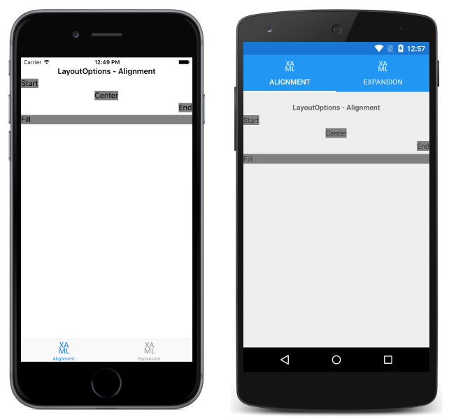
The following XAML code example demonstrates a vertically oriented StackLayout where each child Label sets its HorizontalOptions property to one of the four alignment fields from the LayoutOptions structure:
<StackLayout Margin="0,20,0,0">
  ...
  <Label Text="Start" BackgroundColor="Gray" HorizontalOptions="Start" />
  <Label Text="Center" BackgroundColor="Gray" HorizontalOptions="Center" />
  <Label Text="End" BackgroundColor="Gray" HorizontalOptions="End" />
  <Label Text="Fill" BackgroundColor="Gray" HorizontalOptions="Fill" />
</StackLayout>
The equivalent C# code is shown below:
Content = new StackLayout
{
  Margin = new Thickness(0, 20, 0, 0),
  Children = {
    ...
    new Label { Text = "Start", BackgroundColor = Color.Gray, HorizontalOptions = LayoutOptions.Start },
    new Label { Text = "Center", BackgroundColor = Color.Gray, HorizontalOptions = LayoutOptions.Center },
    new Label { Text = "End", BackgroundColor = Color.Gray, HorizontalOptions = LayoutOptions.End },
    new Label { Text = "Fill", BackgroundColor = Color.Gray, HorizontalOptions = LayoutOptions.Fill }
  }
};
The code results in the layout shown in the following screenshots:
Expansion
Expansion controls whether a view will occupy more space, if available, within a StackLayout. If the StackLayout contains unused space (that is, the StackLayout is larger than the combined size of all of its children), the unused space is shared equally by all child views that request expansion by setting their HorizontalOptions or VerticalOptions properties to a LayoutOptions field that uses the AndExpand suffix. Note that when all the space in the StackLayout is used, the expansion options have no effect.
A StackLayout can only expand child views in the direction of its orientation. Therefore, a vertically oriented StackLayout can expand child views that set their VerticalOptions properties to one of the StartAndExpand, CenterAndExpand, EndAndExpand, or FillAndExpand fields, if the StackLayout contains unused space. Similarly, a horizontally oriented StackLayout can expand child views that set their HorizontalOptions properties to one of the StartAndExpand, CenterAndExpand, EndAndExpand, or FillAndExpand fields, if the StackLayout contains unused space.
A StackLayout can't expand child views in the direction opposite to its orientation. Therefore, on a vertically oriented StackLayout, setting the HorizontalOptions property on a child view to StartAndExpand has the same effect as setting the property to Start.
Note
Note that enabling expansion doesn't change the size of a view unless it uses LayoutOptions.FillAndExpand.
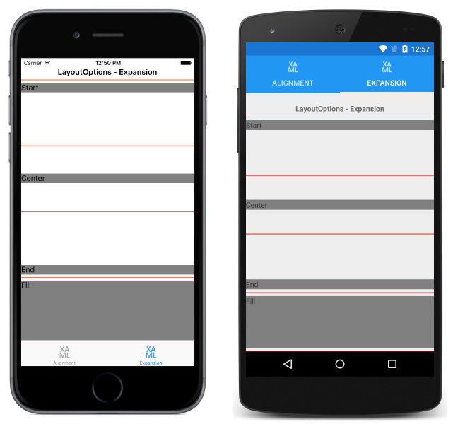
The following XAML code example demonstrates a vertically oriented StackLayout where each child Label sets its VerticalOptions property to one of the four expansion fields from the LayoutOptions structure:
<StackLayout Margin="0,20,0,0">
  ...
  <BoxView BackgroundColor="Red" HeightRequest="1" />
  <Label Text="Start" BackgroundColor="Gray" VerticalOptions="StartAndExpand" />
  <BoxView BackgroundColor="Red" HeightRequest="1" />
  <Label Text="Center" BackgroundColor="Gray" VerticalOptions="CenterAndExpand" />
  <BoxView BackgroundColor="Red" HeightRequest="1" />
  <Label Text="End" BackgroundColor="Gray" VerticalOptions="EndAndExpand" />
  <BoxView BackgroundColor="Red" HeightRequest="1" />
  <Label Text="Fill" BackgroundColor="Gray" VerticalOptions="FillAndExpand" />
  <BoxView BackgroundColor="Red" HeightRequest="1" />
</StackLayout>
The equivalent C# code is shown below:
Content = new StackLayout
{
  Margin = new Thickness(0, 20, 0, 0),
  Children = {
    ...
    new BoxView { BackgroundColor = Color.Red, HeightRequest = 1 },
    new Label { Text = "StartAndExpand", BackgroundColor = Color.Gray, VerticalOptions = LayoutOptions.StartAndExpand },
    new BoxView { BackgroundColor = Color.Red, HeightRequest = 1 },
    new Label { Text = "CenterAndExpand", BackgroundColor = Color.Gray, VerticalOptions = LayoutOptions.CenterAndExpand },
    new BoxView { BackgroundColor = Color.Red, HeightRequest = 1 },
    new Label { Text = "EndAndExpand", BackgroundColor = Color.Gray, VerticalOptions = LayoutOptions.EndAndExpand },
    new BoxView { BackgroundColor = Color.Red, HeightRequest = 1 },
    new Label { Text = "FillAndExpand", BackgroundColor = Color.Gray, VerticalOptions = LayoutOptions.FillAndExpand },
    new BoxView { BackgroundColor = Color.Red, HeightRequest = 1 }
  }
};
The code results in the layout shown in the following screenshots:
Each Label occupies the same amount of space within the StackLayout. However, only the final Label, which sets its VerticalOptions property to FillAndExpand has a different size. In addition, each Label is separated by a small red BoxView, which enables the space the Label occupies to be easily viewed.
Summary
This article explained the effect that each LayoutOptions structure value has on the alignment and expansion of a view, relative to its parent. The Start, Center, End, and Fill fields are used to define the view's alignment within the parent layout, and the StartAndExpand, CenterAndExpand, EndAndExpand, and FillAndExpand fields are used to define the alignment preference, and to determine whether the view will occupy more space, if available, within a StackLayout.

