Maps in Reporting Services mobile reports
Note
SQL Server Mobile Report Publisher is deprecated for all releases of SQL Server Reporting Services after SQL Server Reporting Services 2019. It's discontinued starting in SQL Server Reporting Services 2022 and Power BI Report Server.
Maps are a great way to visualize geographical data. SQL Server Mobile Report Publisher provides three different types of map visualization, and built-in maps for continents and many individual countries/regions. You can also upload and use custom maps.
Types of maps
SQL Server mobile reports offer three different types of maps, useful for different circumstances.
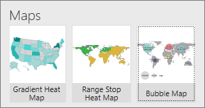
Gradient Heat Maps The field in the Values property is displayed as shades of a single color filling each region in a map. You can set whether the higher or the lower values are darker in the Value Direction box.
Bubble Map The Values property determines the radius of a bubble visualization displayed over the associated region. You can set whether all the bubbles are the same or all different colors.
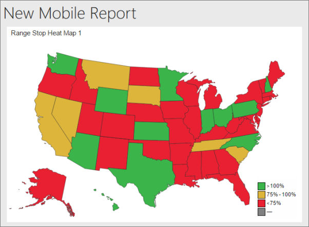
Range Stop Heat Maps shows a value in relation to a target. The Targets property determines the delta between a Comparison field and the Values field. The resulting delta determines the color that fills the associated region of the map, from green to yellow to red. You can set whether higher or the lower values are green in the Value Direction box.
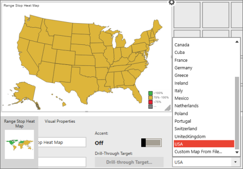
Select the map type and region
On the Layout tab, select a map type, drag it to the design surface, and make it the size you want.
In Layout view, choose the Visual Properties panel, choose Map, and then select the specific map region you need.
For both radiant and range stop heat maps, set whether higher or lower values are better in the Value Direction box under Visual Properties.
For bubble maps, under Visual Properties set Use Different Colors to On or Off to make the bubbles all the same color or all different colors.
Select the map data
When you first add a map to your report, Mobile Report Publisher populates it with simulated geography data.
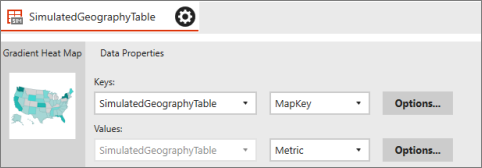
To display real data in your map, you need to set values for at least two of the map's data properties:
- The Keys property connects the data to specific map regions. These regions include states in the USA, for instance, or countries/regions in Africa.
- The Values property is a numeric field in the same table as the selected keys field. These values are represented differently in different maps. The gradient map uses these values to color each region with a varying shades based on the range of values. The bubble map base the size of a bubble visualization over each region on the value property.
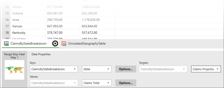
- For range stop heat maps, you also need to set the Targets property.
Set map data properties
Select the Data tab in the upper-left corner.
Select Add Data, then either Local Excel or SSRS Server.
Tip
Make sure the data is in a format that works for mobile reports.
Select the worksheets you want and select Import.
You see your data in the Mobile Report Publisher.In this Data view, select the Data Properties panel under Keys, in the left box select the table containing the map data, and in the right box select the key field that matches the regions in your map.
Under Values, the same table is already in the left box. Select the numeric field whose values you want to display on the map.
If this map is a range stop heat map, under the Targets box the same table is in the left box. In the box on the right, select the numeric field whose values you want to be the target.
Select Preview in the upper-left corner.
Select the Save icon in the upper-left corner and Save Locally on your computer or Save to Server.