Inspect XAML properties while debugging
You can get a real-time view of your running XAML code with the Live Visual Tree and the Live Property Explorer. These tools give you a tree view of the UI elements of your running XAML application, and show you the runtime properties of any UI element you select.
You can use these tools in the following configurations:
| Type of App | Operating System and Tools |
|---|---|
| Windows Presentation Foundation (4.0 and later) applications | Windows 7 and later |
| Universal Windows apps | Windows 10 and later, with the Windows 10 SDK and later |
| .NET Multi-platform App UI apps | Windows 10 and later, .NET 8 and later, Visual Studio 2022 17.9 and later |
Look at Elements in the Live Visual Tree
Let's get started with a very simple WPF application that has a list view and a button. Every time you click the button, another item is added to the list. Even-numbered items are colored gray, and odd-numbered items are colored yellow.
Create the project
Create a new C# WPF application (File > New > Project, type "C# WPF", choose the WPF Application project template, name the project TestXAML, and then verify that the correct .NET version appears in the Target Framework drop-down).
Change MainWindow.xaml to the following:
<Window x:Class="TestXAML.MainWindow"
   xmlns="http://schemas.microsoft.com/winfx/2006/xaml/presentation"
   xmlns:x="http://schemas.microsoft.com/winfx/2006/xaml"
   xmlns:d="http://schemas.microsoft.com/expression/blend/2008"
   xmlns:mc="http://schemas.openxmlformats.org/markup-compatibility/2006"
   xmlns:local="clr-namespace:TestXAML"
   mc:Ignorable="d"
   Title="MainWindow" Height="350" Width="525">
   <Grid>
      <Button x:Name="button" Background="LightBlue" Content="Add Item" HorizontalAlignment="Left" Margin="216,206,0,0" VerticalAlignment="Top" Width="75" Click="button_Click"/>
      <ListBox x:Name="listBox" HorizontalAlignment="Left" Height="100" VerticalAlignment="Top" Width="100" Margin="205,80,0,0"/>
   </Grid>
</Window>
Add the following command handler to the MainWindow.xaml.cs file:
int count;

private void button_Click(object sender, RoutedEventArgs e)
{
   ListBoxItem item = new ListBoxItem();
   item.Content = "Item" + ++count;
   if (count % 2 == 0)
   {
      item.Background = Brushes.LightGray;
   }
   else
   {
      item.Background = Brushes.LightYellow;
   }
   listBox.Items.Add(item);
}
Build the project and start debugging. (The build configuration must be Debug, not Release. For more information about build configurations, see Understanding Build Configurations.)
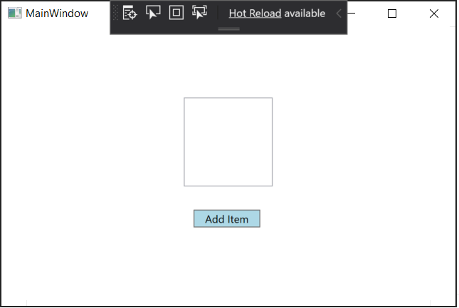
When the window comes up you should see the in-app toolbar appear within your running application.

Now, click the Add Item button a few times to add new items into the list.
Inspect XAML properties
Next, open the Live Visual Tree window by clicking on the very left button of the in-app toolbar (or by going to Debug > Windows > Live Visual Tree). Once its open, drag it away from its docking position so we can look at this window and the Live Properties window side by side.
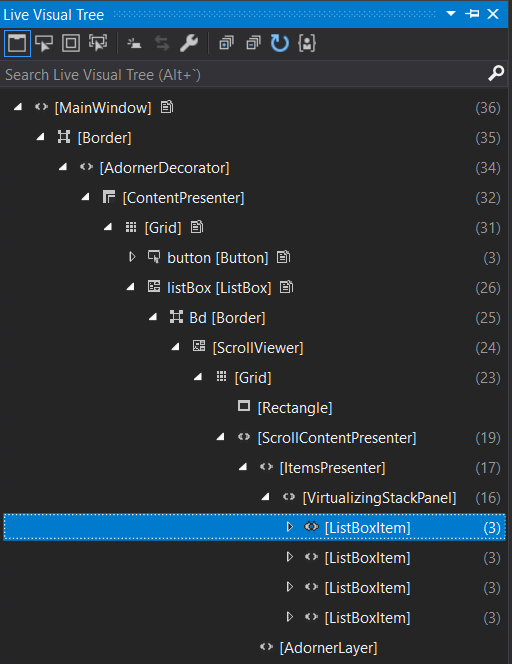
In the Live Visual Tree window, expand the ContentPresenter node. It should contain nodes for the button and the list box. Expand the list box (and then the ScrollContentPresenter and the ItemsPresenter) to find the list box items.
If you don't see ContentPresenter node, toggle the Show Just My XAML icon on the toolbar. Starting in Visual Studio 2019 version 16.4, the view of XAML elements is simplified by default using the Just My XAML feature. You can also disable this setting in options to always show all XAML elements.
The window should look like this:

Go back to the application window and add a few more items. You should see more list box items appear in the Live Visual Tree.
Now, let's look at the properties of one of the list box items.
Select the first list box item in the Live Visual Tree and click the Show Properties icon on the toolbar. The Live Property Explorer should appear. Note that the Content field is "Item1", and the Background > Color field is #FFFFFFE0.
Go back to the Live Visual Tree and select the second list box item. The Live Property Explorer should show that the Content field is "Item2", and the Background > Color field is #FFD3D3D3 (depending on theme).
Note
A yellow border around a property in the Live Property Explorer means that the property value is set through a binding, such as
Color = {BindingExpression}. A green border means that the value is set using a resource, such asColor = {StaticResource MyBrush}.The actual structure of the XAML has a lot of elements that you're probably not directly interested in, and if you don't know the code well you might have a hard time navigating the tree to find what you're looking for. So the Live Visual Tree has a couple of ways that let you use the application's UI to help you find the element you want to examine.
Select Element in the Running Application. You can enable this mode when you select this button on the Live Visual Tree toolbar. With this mode on, you can select a UI element in the application, and the Live Visual Tree (and the Live Property Viewer) automatically updates to show the node in the tree corresponding to that element, and its properties. Starting in Visual Studio 2019 version 16.4, you can configure the behavior of element selection.
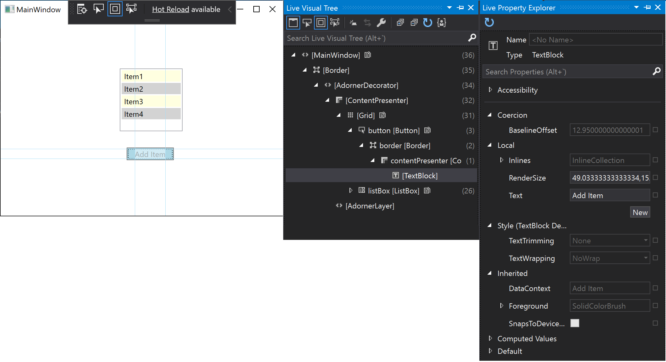
Display Layout Adorners in the Running Application. You can enable this mode when you select the button that is immediately to the right of the Select element... button. When Display layout adorners is on, it causes the application window to show horizontal and vertical lines along the bounds of the selected object so you can see what it aligns to, as well as rectangles showing the margins. For example, turn both Select element and Display layout on, and select the Add Item text block in the application. You should see the text block node in the Live Visual Tree and the text block properties in the Live Property Viewer, as well as the horizontal and vertical lines on the bounds of the text block.

Track Focused Element. You can enable this mode by selecting this button on the Live Visual Tree toolbar. This mode shows the XAML where the element was declared, if you have access to the source code of the application. Select Select element and Track Focused Element, and then you select the button in our test application. The MainWindow.xaml file opens in Visual Studio and the cursor is placed on the line where the button is defined.
Use XAML tools with running applications
You can use these XAML tools even when you don't have the source code. When you attach to a running XAML application, you can use the Live Visual Tree on the UI elements of that application too. Here's an example, using the same WPF test application we used before.
Start the TestXaml application in the Release configuration. You cannot attach to a process that is running in a Debug configuration.
Open a second instance of Visual Studio and click Debug > Attach to Process. Find TestXaml.exe in the list of available processes, and click Attach.
The application starts running.
In the second instance of Visual Studio, open the Live Visual Tree (Debug > Windows > Live Visual Tree). You should see the TestXaml UI elements, and you should be able to manipulate them as you did while debugging the application directly.