Notitie
Voor toegang tot deze pagina is autorisatie vereist. U kunt proberen u aan te melden of de directory te wijzigen.
Voor toegang tot deze pagina is autorisatie vereist. U kunt proberen de mappen te wijzigen.
In dit artikel wordt beschreven hoe u Mica kunt toepassen als de basislaag van uw UWP-app met behulp van WinUI 2, het prioriteren van de toepassing en zichtbaarheid in het titelbalkgebied. Voor meer informatie over lagen voor apps met Mica, zie Mica-materiaal.
Mica is een ondoorzichtig materiaal dat het thema en de bureaubladachtergrond van de gebruiker bevat om een zeer gepersonaliseerde uitstraling te creëren. Terwijl de gebruiker het venster over het scherm verplaatst, past het Mica-materiaal zich dynamisch aan om een rijke visualisatie te maken met behulp van de achtergrond onder de toepassing. Daarnaast helpt het materiaal gebruikers zich te concentreren op de huidige taak door terug te vallen op een neutrale kleur wanneer de app inactief is.
Mica is beschikbaar voor UWP-apps die Gebruikmaken van WinUI 2 terwijl ze worden uitgevoerd op Windows 11 versie 22000 of hoger. In Windows 10 valt de achtergrond terug op een effen kleur.
Vereiste voorwaarden
- Het NuGet-pakket WinUI 2 (zie Aan de slag met WinUI 2)
- Bekendheid met Mica materiaal.
- Bekendheid met personalisatie van de titelbalk
Mica gebruiken met WinUI 2 voor UWP
Belangrijke API's: De klasse Achtergrondmateriaal
Als u Mica wilt toepassen in een UWP-app, gebruikt u de klasse BackdropMaterial van WinUI 2. U wordt aangeraden de gekoppelde eigenschap BackdropMaterial.ApplyToRootOrPageBackground in te stellen op een XAML-element dat de hoofdmap van uw XAML-inhoud is, omdat deze van toepassing is op de hele inhoudsregio (zoals een venster). Als uw app een frame heeft dat door meerdere pagina's navigeert, moet u deze eigenschap instellen op het frame. Anders moet u deze eigenschap instellen op de hoofdpagina van uw app.
xmlns:muxc="using:Microsoft.UI.Xaml.Controls"

<Page muxc:BackdropMaterial.ApplyToRootOrPageBackground="True">
    <TextBlock>Hello world</TextBlock>
</Page>
In de volgende voorbeelden ziet u hoe u de standaard gelaagde patronen implementeert die worden weergegeven in het Mica-materiaaloverzicht . Elk van deze voorbeelden gebruikt en vereist dezelfde titelbalkcode achter, die wordt weergegeven in het laatste voorbeeld.
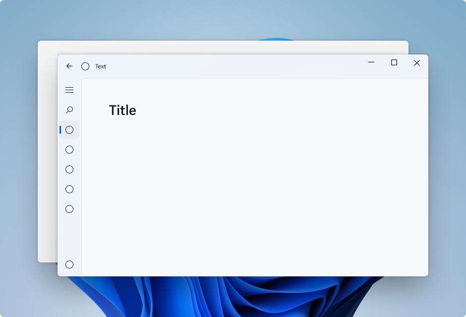
Voorbeeld: Standaardpatroon in Linkernavigatieweergave
Navigatieweergave in Linkermodus bevat standaard de laag voor de inhoud binnen het inhoudsgebied. In dit voorbeeld wordt Mica uitgebreid naar het titelbalkgebied en wordt een aangepaste titelbalk gemaakt.
<Page
    x:Class="LeftNavView.MainPage"
    xmlns="http://schemas.microsoft.com/winfx/2006/xaml/presentation"
    xmlns:x="http://schemas.microsoft.com/winfx/2006/xaml"
    xmlns:local="using:LeftNavView"
    xmlns:d="http://schemas.microsoft.com/expression/blend/2008"
    xmlns:mc="http://schemas.openxmlformats.org/markup-compatibility/2006"
    xmlns:muxc="using:Microsoft.UI.Xaml.Controls"
    mc:Ignorable="d"
    muxc:BackdropMaterial.ApplyToRootOrPageBackground="True">
    <Page.Resources>
        <!--This top margin is the height of the custom TitleBar-->
        <Thickness x:Key="NavigationViewContentMargin">0,48,0,0</Thickness>
    </Page.Resources>
    <Grid>
        <Border x:Name="AppTitleBar"
                IsHitTestVisible="True"
                VerticalAlignment="Top"
                Background="Transparent"
                Height="48"
                Canvas.ZIndex="1"
                Margin="48,0,0,0">
            <StackPanel Orientation="Horizontal">
                <Image x:Name="AppFontIcon"
                    HorizontalAlignment="Left"
                    VerticalAlignment="Center"
                    Source="Assets/Square44x44Logo.png"
                    Width="16"
                    Height="16"/>
                <TextBlock x:Name="AppTitle"
                    Text="Test App Title"
                    VerticalAlignment="Center"
                    Margin="12, 0, 0, 0"
                    Style="{StaticResource CaptionTextBlockStyle}" />
            </StackPanel>
        </Border>
        <muxc:NavigationView x:Name="NavigationViewControl"
            IsTitleBarAutoPaddingEnabled="False"
            IsBackButtonVisible="Visible"
            Header="Title"
            DisplayModeChanged="NavigationViewControl_DisplayModeChanged"
            Canvas.ZIndex="0">
            <muxc:NavigationView.MenuItems>
                <muxc:NavigationViewItem Icon="Target" Content="Text"/>
                <muxc:NavigationViewItem Icon="Target" Content="Text"/>
                <muxc:NavigationViewItem Icon="Target" Content="Text"/>
                <muxc:NavigationViewItem Icon="Target" Content="Text"/>
                <muxc:NavigationViewItem Icon="Target" Content="Text"/>
            </muxc:NavigationView.MenuItems>
            <Grid>
                <Frame x:Name="contentFrame">
                    <Grid>
                        <TextBlock Padding="56,16,0,0">Page content!</TextBlock>
                    </Grid>
                </Frame>
            </Grid>
        </muxc:NavigationView>
    </Grid>
</Page>
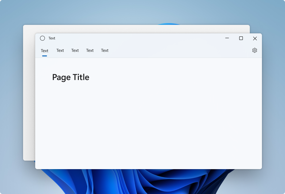
Voorbeeld: Standaardpatroon in Bovenste Navigatieweergave
Navigatieweergave in Top modus bevat standaard de inhoudslaag in het inhoudsgebied. In dit voorbeeld wordt Mica uitgebreid naar het titelbalkgebied en wordt een aangepaste titelbalk gemaakt.
<Page
    x:Class="TopNavView.MainPage"
    xmlns="http://schemas.microsoft.com/winfx/2006/xaml/presentation"
    xmlns:x="http://schemas.microsoft.com/winfx/2006/xaml"
    xmlns:local="using:TopNavView"
    xmlns:d="http://schemas.microsoft.com/expression/blend/2008"
    xmlns:mc="http://schemas.openxmlformats.org/markup-compatibility/2006"
    xmlns:muxc="using:Microsoft.UI.Xaml.Controls"
    mc:Ignorable="d"
    muxc:BackdropMaterial.ApplyToRootOrPageBackground="True">
    <Page.Resources>
        <CornerRadius x:Key="NavigationViewContentGridCornerRadius">0</CornerRadius>
    </Page.Resources>
    <Grid>
        <Border x:Name="AppTitleBar"
                IsHitTestVisible="True"
                VerticalAlignment="Top"
                Background="Transparent"
                Height="32"
                Margin="48,0,0,0">
            <StackPanel Orientation="Horizontal">
                <Image x:Name="AppFontIcon"
                    HorizontalAlignment="Left"
                    VerticalAlignment="Center"
                    Source="Assets/Square44x44Logo.png"
                    Width="16"
                    Height="16"/>
                <TextBlock x:Name="AppTitle"
                    Text="Test App Title"
                    VerticalAlignment="Center"
                    Margin="12,0,0,0"
                    Style="{StaticResource CaptionTextBlockStyle}" />
            </StackPanel>
        </Border>
            <muxc:NavigationView x:Name="NavigationViewControl"
            Header="Page Title"
            DisplayModeChanged="NavigationViewControl_DisplayModeChanged"
            PaneDisplayMode="Top">
                <muxc:NavigationView.MenuItems>
                    <muxc:NavigationViewItem Content="Text"/>
                    <muxc:NavigationViewItem Content="Text"/>
                    <muxc:NavigationViewItem Content="Text"/>
                    <muxc:NavigationViewItem Content="Text"/>
                    <muxc:NavigationViewItem Content="Text"/>
            </muxc:NavigationView.MenuItems>
                <Grid>
                    <Frame x:Name="contentFrame">
                        <Grid>
                            <TextBlock Padding="56,16,0,0">Page content!</TextBlock>
                        </Grid>
                    </Frame>
                </Grid>
            </muxc:NavigationView>
    </Grid>
</Page>
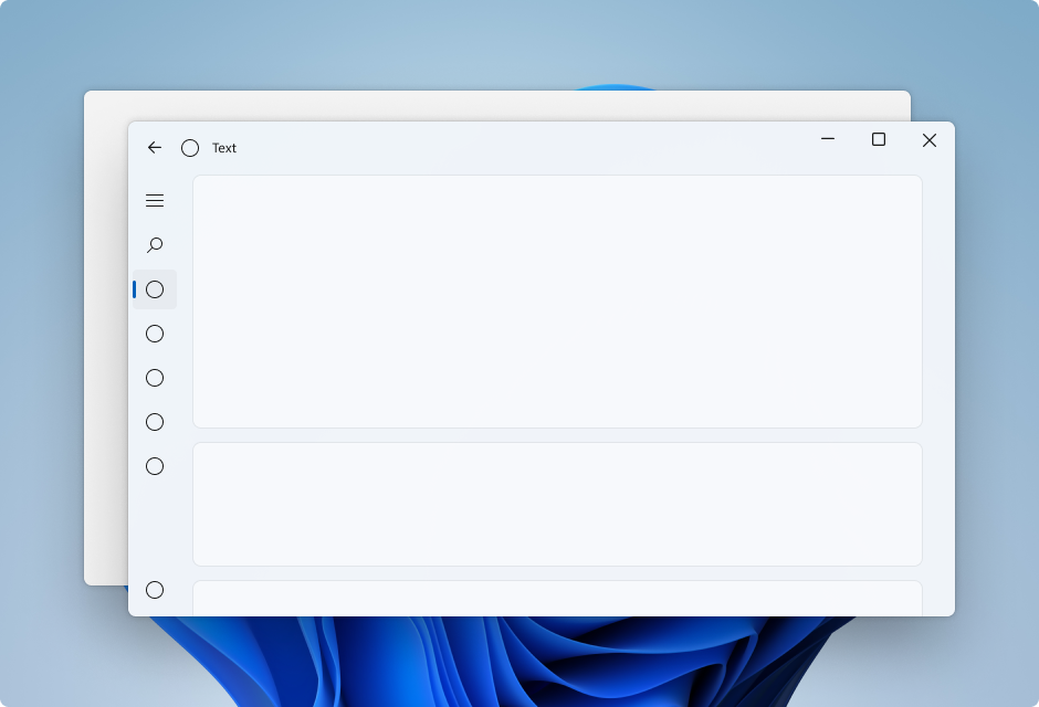
Voorbeeld: Kaartpatroon in Linkernavigatieweergave
Als u het kaartpatroon wilt volgen met behulp van een NavigationView , moet u de standaardinhoudslaag verwijderen door de resources voor achtergrond- en randthema's te overschrijven. Vervolgens kunt u de kaarten maken in het inhoudsgebied van het besturingselement. In dit voorbeeld worden verschillende kaarten gemaakt, wordt Mica uitgebreid naar het titelbalkgebied, en wordt een aangepaste titelbalk gemaakt. Zie de richtlijnen voor lagen en hoogte voor meer informatie over de kaartengebruikersinterface.
<Page
    x:Class="CardLayout.MainPage"
    xmlns="http://schemas.microsoft.com/winfx/2006/xaml/presentation"
    xmlns:x="http://schemas.microsoft.com/winfx/2006/xaml"
    xmlns:local="using:CardLayout"
    xmlns:d="http://schemas.microsoft.com/expression/blend/2008"
    xmlns:mc="http://schemas.openxmlformats.org/markup-compatibility/2006"
    xmlns:muxc="using:Microsoft.UI.Xaml.Controls"
    mc:Ignorable="d"
    muxc:BackdropMaterial.ApplyToRootOrPageBackground="True">
    <Page.Resources>
        <!--This top margin is the height of the custom TitleBar-->
        <Thickness x:Key="NavigationViewContentMargin">0,48,0,0</Thickness>
        <Thickness x:Key="NavigationViewContentGridBorderThickness">0</Thickness>
        <SolidColorBrush x:Key="NavigationViewContentBackground" Color="Transparent"></SolidColorBrush>
    </Page.Resources>

    <Grid>
        <Border x:Name="AppTitleBar"
                IsHitTestVisible="True"
                VerticalAlignment="Top"
                Background="Transparent"
                Height="48"
                Canvas.ZIndex="1"
                Margin="48,0,0,0">
            <StackPanel Orientation="Horizontal">
                <Image x:Name="AppFontIcon"
                    HorizontalAlignment="Left"
                    VerticalAlignment="Center"
                    Source="Assets/Square44x44Logo.png"
                    Width="16"
                    Height="16"/>
                <TextBlock x:Name="AppTitle"
                    Text="Test App Title"
                    VerticalAlignment="Center"
                    Margin="12,0,0,0"
                    Style="{StaticResource CaptionTextBlockStyle}" />
            </StackPanel>
        </Border>

        <muxc:NavigationView x:Name="NavigationViewControl"
            IsTitleBarAutoPaddingEnabled="False"
            IsBackButtonVisible="Visible"
            Header="Title"
            DisplayModeChanged="NavigationViewControl_DisplayModeChanged"
            Canvas.ZIndex="0">
            <muxc:NavigationView.MenuItems>
                <muxc:NavigationViewItem Icon="Target" Content="Text"/>
                <muxc:NavigationViewItem Icon="Target" Content="Text"/>
                <muxc:NavigationViewItem Icon="Target" Content="Text"/>
                <muxc:NavigationViewItem Icon="Target" Content="Text"/>
                <muxc:NavigationViewItem Icon="Target" Content="Text"/>
            </muxc:NavigationView.MenuItems>
            <Grid>
                <Frame x:Name="contentFrame">
                    <StackPanel Orientation="Vertical" Margin="40,16,0,0">
                        <Border Width="600" Height="200" Background="{ThemeResource LayerFillColorDefaultBrush}"
                                VerticalAlignment="Top"
                                HorizontalAlignment="Left"
                                Margin="16"
                                CornerRadius="8"
                                BorderThickness="1"
                                BorderBrush="{ThemeResource CardStrokeColorDefaultBrush}">
                            <TextBlock VerticalAlignment="Center" HorizontalAlignment="Center">Content here!</TextBlock>
                        </Border>
                    </StackPanel>
                </Frame>
            </Grid>
        </muxc:NavigationView>
    </Grid>
</Page>
Code achter titelbalk
De vorige drie XAML-pagina's in de app-opmaak gebruiken deze achterliggende code om een aangepaste titelbalk te maken die zich aanpast aan de status en zichtbaarheid van de app.
Zie Titelbalk aanpassenvoor meer informatie.
public MainPage()
{
    this.InitializeComponent();
    var titleBar = ApplicationView.GetForCurrentView().TitleBar;

    titleBar.ButtonBackgroundColor = Colors.Transparent;
    titleBar.ButtonInactiveBackgroundColor = Colors.Transparent;

    // Hide default title bar.
    var coreTitleBar = CoreApplication.GetCurrentView().TitleBar;
    coreTitleBar.ExtendViewIntoTitleBar = true;
    UpdateTitleBarLayout(coreTitleBar);

    // Set XAML element as a draggable region.
    Window.Current.SetTitleBar(AppTitleBar);

    // Register a handler for when the size of the overlaid caption control changes.
    // For example, when the app moves to a screen with a different DPI.
    coreTitleBar.LayoutMetricsChanged += CoreTitleBar_LayoutMetricsChanged;

    // Register a handler for when the title bar visibility changes.
    // For example, when the title bar is invoked in full screen mode.
    coreTitleBar.IsVisibleChanged += CoreTitleBar_IsVisibleChanged;

    //Register a handler for when the window changes focus
    Window.Current.Activated += Current_Activated;
}

private void CoreTitleBar_LayoutMetricsChanged(CoreApplicationViewTitleBar sender, object args)
{
    UpdateTitleBarLayout(sender);
}

private void UpdateTitleBarLayout(CoreApplicationViewTitleBar coreTitleBar)
{
    // Update title bar control size as needed to account for system size changes.
    AppTitleBar.Height = coreTitleBar.Height;

    // Ensure the custom title bar does not overlap window caption controls
    Thickness currMargin = AppTitleBar.Margin;
    AppTitleBar.Margin = new Thickness(currMargin.Left, currMargin.Top, coreTitleBar.SystemOverlayRightInset, currMargin.Bottom);
}

private void CoreTitleBar_IsVisibleChanged(CoreApplicationViewTitleBar sender, object args)
{
    if (sender.IsVisible)
    {
        AppTitleBar.Visibility = Visibility.Visible;
    }
    else
    {
        AppTitleBar.Visibility = Visibility.Collapsed;
    }
}

// Update the TitleBar based on the inactive/active state of the app
private void Current_Activated(object sender, Windows.UI.Core.WindowActivatedEventArgs e)
{
    SolidColorBrush defaultForegroundBrush = (SolidColorBrush)Application.Current.Resources["TextFillColorPrimaryBrush"];
    SolidColorBrush inactiveForegroundBrush = (SolidColorBrush)Application.Current.Resources["TextFillColorDisabledBrush"];

    if (e.WindowActivationState == Windows.UI.Core.CoreWindowActivationState.Deactivated)
    {
        AppTitle.Foreground = inactiveForegroundBrush;
    }
    else
    {
        AppTitle.Foreground = defaultForegroundBrush;
    }
}

// Update the TitleBar content layout depending on NavigationView DisplayMode
private void NavigationViewControl_DisplayModeChanged(Microsoft.UI.Xaml.Controls.NavigationView sender, Microsoft.UI.Xaml.Controls.NavigationViewDisplayModeChangedEventArgs args)
{
    const int topIndent = 16;
    const int expandedIndent = 48;
    int minimalIndent = 104;

    // If the back button is not visible, reduce the TitleBar content indent.
    if (NavigationViewControl.IsBackButtonVisible.Equals(Microsoft.UI.Xaml.Controls.NavigationViewBackButtonVisible.Collapsed))
    {
        minimalIndent = 48;
    }

    Thickness currMargin = AppTitleBar.Margin;

    // Set the TitleBar margin dependent on NavigationView display mode
    if (sender.PaneDisplayMode == Microsoft.UI.Xaml.Controls.NavigationViewPaneDisplayMode.Top)
    {
        AppTitleBar.Margin = new Thickness(topIndent, currMargin.Top, currMargin.Right, currMargin.Bottom);
    }
    else if (sender.DisplayMode == Microsoft.UI.Xaml.Controls.NavigationViewDisplayMode.Minimal)
    {
        AppTitleBar.Margin = new Thickness(minimalIndent, currMargin.Top, currMargin.Right, currMargin.Bottom);
    }
    else
    {
        AppTitleBar.Margin = new Thickness(expandedIndent, currMargin.Top, currMargin.Right, currMargin.Bottom);
    }
}