Office Ribbon: Styling the Pivot Control
One thing I love about the XAML platform is the ability to modify the visual styles of any control without access to the source code and still benefitting from the control’s behavior.
While starting a project I wanted to have a similar visual style as the one found in modern versions of Office, specially the Ribbon control, but then I couldn’t find a Ribbon control in the toolkit that ships with the Windows SDK, and while the Ribbon control behaves very similar to a Tabs control there wasn’t one either for UWP apps. After searching for a while I found that in UWP it is the Pivot control the one that offers a generalized functionality like Tabs or Ribbon.
The Pivot control offers a series of sections identified with a header and as the user selects one of those headers the content of the section is presented. The way the Pivot control made its way into Windows Phone and after that to Windows 8.1 and 10 was to change Page views. For that reason, it didn’t occur to me that it could be used as a Ribbon.
Now, the task is to change the styles and visual resources of the Pivot control to match as much as possible the experience of the Ribbon control found in Office.
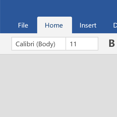
Image 1 Ribbon control used on Word Mobile.
disclaimer: to implement this post I didn’t have access to any source code of the Pivot control nor the Word Mobile application. This is achieved simply by observing the behavior, taking screenshots and measuring the sizes of the different elements in the application GUI.
For this post, Visual Studio 2017 (with the latest updates applied) and Windows 10 Fall Creators Update will be used with its corresponding Software Development Kit.
Fail Fast
The starting point for any change to the style of a control is usually looking at the controls Style property where we can easily right-click the control in the Designer area or through the Document Outline in Visual Studio. But after trying some changes and looking at the style contents I couldn’t figure out how to totally modify the PivotHeaderItem to mimic those tabs found in the Ribbon control.
The PivotHeaderItem is the element that renders the contents assigned to the Header property for each PivotItem. But the style that defines those elements is not exposed through any “style” property in the Pivot control, instead we only get a HeaderTemplate property which generates an empty DataTemplate to start from scratch. Not very helpful for what we want to do.
I took another approach based on something I read on MSDN on the many searches for a solution, modifying the controls ThemeResources.
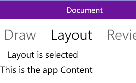
Image 2 Initial application state.
Initial Setup
We start by creating a New Project in Visual Studio using the Blank App template for Windows Universal, on this I made modifications to the MainPage.xaml and its code behind to extend the contents of the window to cover the window’s TitleBar and mimic a similar style as with the target application.
Following by adding a ResourceDictionary (AppStyles.xaml) to the project where all style definitions and modifications of existing ones will be stored and added a reference to this resource in the Page section of MainPage.xaml. A series of numerical and color and brushes definitions were added to be applied to the TitleBar look.
 <!-- Numerical Values for TitleBar -->
<x:Double x:Key="TitleBarHeight">32</x:Double>
<x:Double x:Key="TitleBarFontSize">13</x:Double>
<GridLength x:Key="TitleBarLeftReservedAreaWidthGridLength">320</GridLength>
<GridLength x:Key="TitleBarRightReservedAreaWidthGridLength">138</GridLength>
<GridLength x:Key="TitleBarCurrentUserAreaWidthGridLength">182</GridLength>

<!-- Colors and Brushes for TitleBar-->
<Color x:Key="TitleBarBackgroundColor">#FF6C139C</Color>
<Color x:Key="TitleBarForegroundColor">White</Color>
<SolidColorBrush x:Key="TitleBarBackgroundColorBrush"
                 Color="{StaticResource TitleBarBackgroundColor}" />
<SolidColorBrush x:Key="TitleBarForegroundColorBrush"
                 Color="{StaticResource TitleBarForegroundColor}" />
In the XAML code for MainPage.xaml, there is a series of Grid elements to layout the different pieces that made up the TitleBar, there is a reserved area to the left where some apps have the Back navigation button, an area for the document title, another area where Word in this case shows the current logged in user, a panel separator for aesthetics, and the window control buttons to minimize, maximize and close the program window. After that a Pivot control with a series of PivotItem elements following the sections found in the Word application.
 <Page.Resources>
  <ResourceDictionary>
    <ResourceDictionary.MergedDictionaries>
      <ResourceDictionary Source="AppStyles.xaml" />
    </ResourceDictionary.MergedDictionaries>
  </ResourceDictionary>
</Page.Resources>
<Grid Background="{ThemeResource ApplicationPageBackgroundThemeBrush}">
  <Grid.RowDefinitions>
    <RowDefinition Height="Auto" /> <!-- Title Bar -->
    <RowDefinition Height="Auto" /> <!-- Ribbon -->
    <RowDefinition /> <!-- Window Content -->
  </Grid.RowDefinitions>
  <Grid x:Name="TitleBarPanel" Grid.Row="0"
        Background="{StaticResource TitleBarBackgroundColorBrush}"
        Height="{StaticResource TitleBarHeight}">
    <Grid.ColumnDefinitions>
      <!-- Left Reserved Area -->
      <ColumnDefinition Width="{StaticResource TitleBarLeftReservedAreaWidthGridLength}" />
      <!-- Window Title -->
      <ColumnDefinition  />
      <!-- Current User -->
      <ColumnDefinition Width="{StaticResource TitleBarCurrentUserAreaWidthGridLength}" />
      <!-- Right Reserved Area -->
      <ColumnDefinition Width="{StaticResource TitleBarRightReservedAreaWidthGridLength}" />
    </Grid.ColumnDefinitions>
    <Grid x:Name="LeftReservedColumn" />
    <Grid x:Name="DocumentTitlePanel" Grid.Column="1"
          VerticalAlignment="Center" HorizontalAlignment="Center">
      <TextBlock x:Name="TitleBarText" Text="Document"
                 Foreground="{StaticResource TitleBarForegroundColorBrush}"
                 FontSize="{StaticResource TitleBarFontSize}" />
    </Grid>
    <Grid Grid.Column="2">
      <StackPanel Orientation="Horizontal"
                  VerticalAlignment="Center"
                  HorizontalAlignment="Right">
        <TextBlock x:Name="CurrentUserNameText" Text="Daniel Jackson"
                   Foreground="{StaticResource TitleBarForegroundColorBrush}"
                   VerticalAlignment="Center"
                   FontSize="{StaticResource TitleBarFontSize}"
                   Margin="15,0" />
        <TextBlock x:Name="TitleBarSeparator" Text="│"
                   Foreground="{StaticResource TitleBarForegroundColorBrush}"
                   VerticalAlignment="Center"
                   Opacity="0.5"
                   Margin="17,0" />
      </StackPanel>
    </Grid>
    <Grid x:Name="SystemWindowButtonsMask" Grid.Column="3"/>
  </Grid>
  <Grid x:Name="RibbonContainer" Grid.Row="1" Height="73">
    <Pivot x:Name="AppRibbon">
      <PivotItem Header="File">
        <Grid><TextBlock Text="File is selected"/></Grid>
      </PivotItem>
      <PivotItem Header="Home">
        <Grid><TextBlock Text="Home is selected"/></Grid>
      </PivotItem>
      <PivotItem Header="Insert">
        <Grid><TextBlock Text="Insert is selected"/></Grid>
      </PivotItem>
      <PivotItem Header="Draw">
        <Grid><TextBlock Text="Draw is selected"/></Grid>
      </PivotItem>
      <PivotItem Header="Layout">
        <Grid><TextBlock Text="Layout is selected"/></Grid>
      </PivotItem>
      <PivotItem Header="Review">
        <Grid><TextBlock Text="Review is selected"/></Grid>
      </PivotItem>
      <PivotItem Header="View">
        <Grid><TextBlock Text="View is selected"/></Grid>
      </PivotItem>
    </Pivot>
  </Grid>
  <Grid Grid.Row="2">
    <TextBlock Text="This is the app Content" />
  </Grid>
</Grid>
And the code behind added to MainPage constructor to change the color of the TitleBar, specially the reserved buttons area and some instructions to extend the window contents into the area reserved for the TitleBar.
 // Change the colors for the TitleBar
var titleBar = ApplicationView.GetForCurrentView().TitleBar;
if (titleBar != null)
{
  // Get the resoueces values from the current Page Resources
  var bgColor = (Color)Resources["TitleBarBackgroundColor"];
  var fgColor = (Color)Resources["TitleBarForegroundColor"];

  titleBar.BackgroundColor = bgColor;
  titleBar.ButtonBackgroundColor = bgColor;
  titleBar.ForegroundColor = fgColor;
  titleBar.ButtonForegroundColor = fgColor;
}

// Extend the application content to cover the TitleBar provided by Windows
var coreTitleBar = CoreApplication.GetCurrentView().TitleBar;
// Set the TitleBar height
coreTitleBar.LayoutMetricsChanged +=
  (CoreApplicationViewTitleBar sender, object args) => TitleBarPanel.Height = sender.Height;

coreTitleBar.ExtendViewIntoTitleBar = true;
// Set the area that respond to dragging operations in the window
Window.Current.SetTitleBar(TitleBarPanel);
Modifying the Pivot control
To modify the Pivot control, we will use some of the Theme elements and Styles found in the generic.xaml ResourceDictionary that all controls from the SDK use. This file is located for the developer’s convenience at the \[Program Files]\Windows Kits\10\DesignTime\CommonConfiguration\Neutral\UAP\[Windows SDK version]\Generic folder. From this file, we can search for all the elements that contain “Pivot” on its key value. Although not all of them need to be modified and to keep things simple, I will only override the ones that required a value change.
We copy into our own ResourceDictionary the elements to override into a ThemeResources section and assign the new values. This will cause that the controls that have references to this resources will take our changes first, and if we didn’t modify them, they use the default values.
 <ResourceDictionary.ThemeDictionaries>
  <ResourceDictionary x:Key="Default">
    <FontFamily x:Key="PivotHeaderItemFontFamily">Segoe UI</FontFamily>
    <FontWeight x:Key="PivotHeaderItemThemeFontWeight">Normal</FontWeight>
    <x:Double x:Key="PivotHeaderItemFontSize">13</x:Double>
    <Thickness x:Key="PivotHeaderItemMargin">16,0,16,3</Thickness>
    <Thickness x:Key="PivotItemMargin">20,0</Thickness>

    <!-- Resources for Windows.UI.Xaml.Controls.Pivot -->
    <StaticResource x:Key="PivotBackground" ResourceKey="PivotItemBackgroundColorBrush" />
    <StaticResource x:Key="PivotHeaderBackground" ResourceKey="PivotHeaderBackgroundColorBrush" />

    <!-- Resources for Windows.UI.Xaml.Controls.Primitives.PivotHeaderItem -->
    <StaticResource x:Key="PivotHeaderItemBackgroundUnselectedPointerOver"
                    ResourceKey="PivotItemBackgroundColorMediumLowBrush" />
    <StaticResource x:Key="PivotHeaderItemBackgroundUnselectedPressed"
                    ResourceKey="PivotItemBackgroundColorMediumLowBrush" />
    <StaticResource x:Key="PivotHeaderItemBackgroundSelected"
                    ResourceKey="PivotItemBackgroundColorBrush" />
    <StaticResource x:Key="PivotHeaderItemBackgroundSelectedPointerOver"
                    ResourceKey="PivotItemBackgroundColorBrush" />
    <StaticResource x:Key="PivotHeaderItemBackgroundSelectedPressed"
                    ResourceKey="PivotItemBackgroundColorBrush" />
    <StaticResource x:Key="PivotHeaderItemForegroundUnselected"
                    ResourceKey="PivotHeaderForegroundColorBrush" />
    <StaticResource x:Key="PivotHeaderItemForegroundUnselectedPointerOver"
                    ResourceKey="PivotHeaderForegroundColorBrush" />
    <StaticResource x:Key="PivotHeaderItemForegroundUnselectedPressed"
                    ResourceKey="PivotHeaderForegroundColorBrush" />
    <StaticResource x:Key="PivotHeaderItemForegroundSelected"
                    ResourceKey="PivotHeaderBackgroundColorBrush" />
    <StaticResource x:Key="PivotHeaderItemForegroundSelectedPointerOver"
                    ResourceKey="PivotHeaderBackgroundColorBrush" />
    <StaticResource x:Key="PivotHeaderItemForegroundSelectedPressed"
                    ResourceKey="PivotHeaderBackgroundColorBrush" />
  </ResourceDictionary>
</ResourceDictionary.ThemeDictionaries>
As we change some of the values for the Theme resources we might notice that certain changes get reflected immediately on the Designer in Visual Studio, but other changes will require to Build the project, so changes get compiled and the Designer refreshes its cache values for those resources.
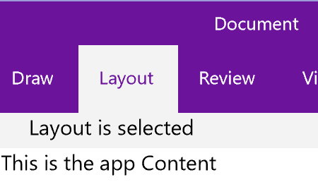
Image 3 Impact of changing ThemeResources.
After all the possible modifications to themes, there is still some changes to get closer to have a Pivot that resembles the Ribbon in Word, for that we need to modify some values on elements of the Pivot, PivotItem and PivotHeaderItem styles.
To avoid getting lost in the contents of the styles and not making this post even longer, I will only point to the particular changes to the styles but you can have access to the complete sample code for this post at GitHub.
The ThemeResources in the previous code excerpt made some references to a series of Brushes that were not previously presented. Those are the colors for the Pivot control copied from the values used for the TitleBar but I wanted to have separate identifiers for them in case we wanted to quickly made changes that affect only one control.
   <!-- Numeric Values for Pivot -->
<x:Double x:Key="SideHeaderWidth">20</x:Double>
<x:Double x:Key="SideHeaderHeight">32</x:Double>

<!-- Colors and Brushes for Pivot -->
<Color x:Key="PivotHeaderBackgroundColor">#FF6C139C</Color>
<Color x:Key="PivotHeaderForegroundColor">White</Color>
<Color x:Key="PivotItemBackgroundColor">#FFF3F3F3</Color>
<SolidColorBrush x:Key="PivotHeaderBackgroundColorBrush"
                 Color="{StaticResource PivotHeaderBackgroundColor}" />
<SolidColorBrush x:Key="PivotHeaderForegroundColorBrush"
                 Color="{StaticResource PivotHeaderForegroundColor}" />
<SolidColorBrush x:Key="PivotItemBackgroundColorBrush"
                 Color="{StaticResource PivotItemBackgroundColor}" />
<SolidColorBrush x:Key="PivotItemBackgroundColorMediumLowBrush"
                 Color="{StaticResource PivotItemBackgroundColor}"
                 Opacity="0.4" />
The style for the Pivot control, look in the source code for “style for Windows.UI.Xaml.Controls.Pivot” , contains five minimal changes, 3 of them are numeric values and the other 2 add properties to a pair of ControlPresenters. The numeric values affect the following elements, the Grid “PivotLayoutElement” which defines two rows had its first row's Height value changed from Auto to 32. This is the height of the tabs area for the Ribbon. The other two numerical changes were in the Height property of the Buttons “PreviousButton” and “NextButton” from 36 to 32 as they need to fit in the row defined for the Ribbon’s tabs. The remaining two changes on the ControlPresenters are highlighted in the below code fragments.
 <ContentPresenter x:Name="LeftHeaderPresenter"
                  Content="{TemplateBinding LeftHeader}"
                  ContentTemplate="{TemplateBinding LeftHeaderTemplate}"
                  HorizontalAlignment="Stretch"
                  VerticalAlignment="Stretch"
                  Height="{StaticResource SideHeaderHeight}"
                  Background="{StaticResource PivotHeaderBackgroundColorBrush}"
                  Width="{StaticResource SideHeaderWidth}"/>
 <ContentPresenter x:Name="RightHeaderPresenter"
                  Grid.Column="2"
                  Content="{TemplateBinding RightHeader}"
                  ContentTemplate="{TemplateBinding RightHeaderTemplate}"
                  HorizontalAlignment="Stretch"
                  VerticalAlignment="Stretch"
                  Height="{StaticResource SideHeaderHeight}"
                  Background="{StaticResource PivotHeaderBackgroundColorBrush}"
                  Width="{StaticResource SideHeaderWidth}"/>
For the PivotItem style, search for “style for Windows.UI.Xaml.Controls.PivotItem” in the source code of AppStyle.xaml there are two changes. The value for the Setter property VerticalContentAlignment changed from Stretch to Center. And the Grid serving as container for the ControlTemplate got two additional properties, BorderBrush and BorderThickness.
 <Grid Background="{TemplateBinding Background}"
        HorizontalAlignment="{TemplateBinding HorizontalAlignment}"
        VerticalAlignment="{TemplateBinding VerticalAlignment}"
        BorderBrush="LightGray"
        BorderThickness="0,0,0,1">
The last set of changes are in the PivotHeaderItem style, search for “style for Windows.UI.Xaml.Controls.Primitives.PivotHeaderItem” in the source code. Changes to this style are two, the first is to change the value of the Height property on the style Setter from 48 to 32 as seen in previous changes this represents the height of the tabs row in the Ribbon. The other change is in the ControlTemplate container adding to the Grid a CornerRadius property with value "2,2,0,0" to set the rounded corners of the tabs. As we can see in image 3, that’s the most noticeable missing change to achieve our goal.
 <Grid x:Name="Grid"
      Background="{TemplateBinding Background}"
      Padding="{TemplateBinding Padding}"
      CornerRadius="2,2,0,0">
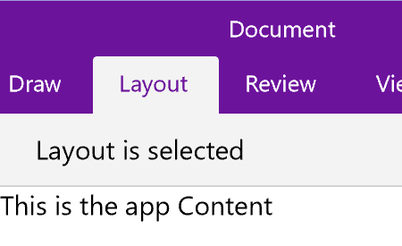
Image 4 Final Ribbon effect.
After all these changes are in place, we can build and run the solution to observe the effect. Notice that while our changes makes the experience quite similar, we didn’t copy the entire behavior of the Ribbon control. If we look closer into the Ribbon in Word we will see that as we move the mouse over the unselected tabs, their background change into a color that is not quite solid, as in our code, it feels more like a gradient brush. Also the tabs at each side of the one being hovered get a small glowing background effect creating a more vivid illusion of light, it is a nice touch, but was not part of what I planned to do. I kept thinking on how that could be implemented, might it be possible that such effect is part of the new Fluent Design? Certainly, I will revisit this in a future post.
You can find the complete source code for this article on GitHub and use it as a starting point for your project.