When you do UX work, sometimes you have to worry about the strangest things…
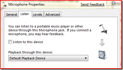
I recently got a bug reported to me about the visuals in the sound control panel applet not being aligned properly (this is from the UI for a new Windows 7 feature):
The problem as reported was that the microphone was aligned incorrectly w.r.t. the down arrow. – the microphone was too far to the right.
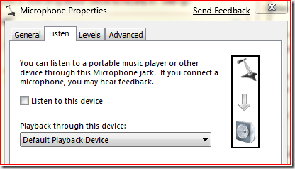
But if you look carefully, you’ll see that that isn’t the case – drawing a box around the controls makes it clearer:
 Nitpickers Corner: For those of you that love to count pixels, it’s entirely possible that the arrow might be off by a couple of pixels but fixing it wouldn’t fix the problem, because then the arrow would be off-center with respect to the speakers. The real problem is that the microphone icon is visually weighted to the right – the actual icon resource was lined up with the arrow, but because the visual weight was to the right, it displayed poorly.
It turns out that there’s really no good way of fixing this – if we were to adjust the location of the icons, it wouldn’t help, because a different device would have a different visual center (as the speaker icon does)…
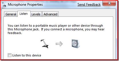
Instead, we looked at the visuals and realized that there was an alternative solution: Adjust the layout for the dialog and the problem more-or-less goes away:
The problem still exists at some level because the arrow is centered with the icons but some icons (like the stalk microphone above) are bottom heavy. But for whatever reason, the visuals aren’t as disconcerting when laid out horizontally.
As I said in the title – sometimes you need to worry about the strangest things.
Comments
Anonymous
January 13, 2009
I do a lot of typography work, and I run into the same problem. Even when character bounding boxes are aligned on a margin, their visual weights might create a ragged impression. Fixing this problem automatically is... non-trivial.Anonymous
January 13, 2009
While you are it: Can you explain why the font used in these dialogs is Segoe UI 8 points instead of 9 points like in other UI new to Vista? :)Anonymous
January 13, 2009
Mike: Beats me. All the volume UI uses 8 point Segoe UI. Looking through the Windows code, there doesn't appear to be any standardization of the font size in dialogs. Some are 8 point, some are 9 point, some are even 10 point. And the sounds control panel is NOT "new to vista". Even though the UX did go through a major rewrite in Vista, it still has its basis in the old Windows XP sounds control panel.Anonymous
January 13, 2009
Why not use an icon of a handheld microphone?Anonymous
January 13, 2009
The comment has been removedAnonymous
January 13, 2009
File as: Not a bug, will not fix. It's impressive that someone else noticed it and took the time to file a bug and more impressive that you guys invested that much effort to fix it. In another company I think that would have been filed as: Will not fix.Anonymous
January 13, 2009
FYI - you can get rid of the red border in the snipping tool. Go to options and clear the "show selection ink..." checkbox.Anonymous
January 13, 2009
Mark Sowul: THanks for the suggestion. Ryan: In this case, we wanted to rework the location of the arrows anyway and this kind of thing bugs the heck out of me. nt: The image can come from the audio device manufacturer, we don't control it. Slackmaster K: Beats me why the artists drew a stalk microphone, my guess is that it was easier than a handheld microphone (but I don't know).Anonymous
January 13, 2009
I'm not a doctor but I have a hunch that being really bothered by things like this is diagnosable as something. Heck, there's probably already meds that will make it all ok.Anonymous
January 13, 2009
Clearly icons need to have a "center of mass" property. :)Anonymous
January 13, 2009
"Some are 8 point, some are 9 point, some are even 10 point." Maybe the question should be, why is it so difficult to make font-sensitive dialogs in Windows? IMO it is an error -- though an incredibly common one! -- for a window not to pick up the system font. I had to write my own layout code which was a giant pain -- especially as there are no APIs to "get the size of this control with this label using this font" -- so I can see why not many people do it, but it's something the OS could really improve on. I suppose the solution is C# but there still seems to be an awful lot of code that isn't using that stuff, and the C# GUI toolkits have problems of their own.Anonymous
January 13, 2009
I'm curious: from a process POV it was easier to re-layout the dialog, test that in n languages than to get some more icons drawn up by someone who isn't a rather senior technical guy? Seems a curious one. Although it's possibly a good sign for Win7 if those are the only bugs you've got left to finish (or this was one of those "lessee, 30 minutes to EOD" ones). Perhaps rather than 3 separate icons, write a brief to the artist for a vertical image (or is the dialog fancy and use different depth icons depending on the screen?).Anonymous
January 13, 2009
(sorry to double post) Another solution is to delete the icons entirely. Not sure they add much value.Anonymous
January 13, 2009
This is the kind of bug which should be solved because otherwise you give the impression of not caring about the product. Beside, it's the typical bug you risk the CEO (or some other powerful entity) passing by and saying "you still haven't fix those icons ?!". Top to bottom is less a problem because the world we live in is full of left-right simmetries (starting from the human body) but lacks in top to bottom ones (thanks gravity).Anonymous
January 13, 2009
The comment has been removedAnonymous
January 13, 2009
Font spot: the tabs are still using Tahoma. Programmers seem to have a blind spot for distinguishing fonts. I'm not sure that some designers don't, either! A lot of Windows is still very inconsistent, and that annoys aesthetes. Other people may just get a vague feeling that something's wrong with the dialog. See also the second dialog at http://blogs.msdn.com/ie/archive/2008/12/03/compatibility-view-improvements-to-come-in-ie8.aspx, where the 'Include updated website lists from Microsoft' checkbox is using Arial, for some reason. The dialog itself is in Tahoma even though this is clearly Windows Vista or Windows 7.Anonymous
January 14, 2009
If we are now talking about bad Dialogs... Turn off ClearType in Windows, open VS2008 and Goto File, Recent Projects, Clear Recent Projects List. That's a bad Dialog :)Anonymous
January 14, 2009
@DanT: The medication for that is available OTC in most states. It's called "liquor" :) @Larry: I thought this was going to go in a different direction before I read it. Looking at the dialog, my thought was, "someone complained that the mic looks like a War of the Worlds ship?"Anonymous
January 14, 2009
Mike: Interesting, I'll pass this on. My suspicion is that it's intentional on the part of the designers of the tabbed dialog however. steveg: 2 of the 3 icons come from the device and are potentially authored by 3rd parties.Anonymous
January 14, 2009
Mike: I suspect that the mockup on the IE page is just that: a mockup. It takes work to modify the font within a dialog, but it's really easy in paint.Anonymous
January 14, 2009
Once you put them horizontally, now you have to worry about right-to-left languages. If you're running in Arabic or Hebrew, do you have to re-order the icons and flip the arrow around?Anonymous
January 14, 2009
Offtopic but has support for WDM softsynths been removed in Windows 7? In Vista the UI to select the softsynth was gone but with replacements like "MIDI Device Picker" (search a bit), it was fixed. Now after installing my favorite Yamaha XG Softsynth and WinGroove on Windows 7, I find they no longer show up.Anonymous
January 14, 2009
I'm not a doctor, either, but I agree with DanT - being bothered by people is definately the problem here, and I hope there's meds that can fix whatever made him so grumpy today. Show some basic respect for people, or call them insane because they aren't clones of yourself? Yeah, I see that being a great idea.... (And yes, I am happy to respect his belief that accusing random strangers of insanity is perfectly acceptable, but what can you do?)Anonymous
January 14, 2009
It's a nice clean solution, but you should plan for RTL layoutAnonymous
January 14, 2009
1001010 and Adrian: Yes, RTL becomes an issue now. And the localizers handle most of that work.Anonymous
January 17, 2009
The comment has been removedAnonymous
January 19, 2009
> Offtopic but has support for WDM softsynths been removed in Windows 7? In Vista the UI to select the softsynth was gone but with replacements like "MIDI Device Picker" (search a bit), it was fixed. Now after installing my favorite Yamaha XG Softsynth and WinGroove on Windows 7, I find they no longer show up. I thought that support was already removed in Vista. I had old games that on Vista, even if you set them up to play on softsynths other than the MS one, you won't actually hear anything. A search on the Internet showed that they removed support for kernel-mode softsynths (hardware MIDI out still supported though) when they reworked most of the audio engine to user-mode in Vista: http://www.freelists.org/post/wdmaudiodev/Wavesink-for-Kernelmode-Software-Synthesizer-fails-to-function-in-Vista,1 If you actually got the Yamaha softsynth to work on Vista I'm curious how.Anonymous
January 19, 2009
The comment has been removedAnonymous
March 17, 2009
The comment has been removedAnonymous
March 17, 2009
Barry, it's a stalk Microphone, I actually have one like it in my office. Ultimately the IHV gets to chose the icon that their device shows. If the user wants to they can override that choice.Anonymous
April 05, 2009
The comment has been removed

