Notatka
Dostęp do tej strony wymaga autoryzacji. Może spróbować zalogować się lub zmienić katalogi.
Dostęp do tej strony wymaga autoryzacji. Możesz spróbować zmienić katalogi.
Discover new workflows in the following comprehensive reference of Microsoft Edge DevTools features related to viewing and changing CSS.
To learn the basics, see Get started viewing and changing CSS.
Detailed contents:
- Select an element
- View CSS
- Navigate with links
- View tooltips with CSS documentation, specificity, and custom property values
- View the external stylesheet where a rule is defined
- View invalid, overridden, inactive, and other CSS
- View only the CSS that is actually applied to an element
- View CSS properties in alphabetical order
- View inherited CSS properties
- View CSS at-rules
- View an element's box model
- Search and filter the CSS of an element
- Emulate a focused page
- Toggle a pseudo-class
- View inherited highlight pseudo-elements
- View cascade layers
- View a page in print mode
- View used and unused CSS with the Coverage tool
- Force print preview mode
- Copy CSS
- Change CSS
- Two ways to add a CSS declaration to an element
- Change a declaration name or value
- Change enumerable values with keyboard shortcuts
- Change length values
- Add a class to an element
- Emulate light and dark theme preferences and enable automatic dark mode
- Toggle a class
- Add a style rule
- Toggle a declaration
- Edit the
::view-transitionpseudo-elements during an animation - Align grid items and their content with the Grid Editor
- Change colors with the Color Picker
- Sample a color off the page with the Eyedropper
- Change angle value with the Angle Clock
- Change box and text shadows with the Shadow Editor
- Edit animation and transition timings with the Easing Editor
- See also
Select an element
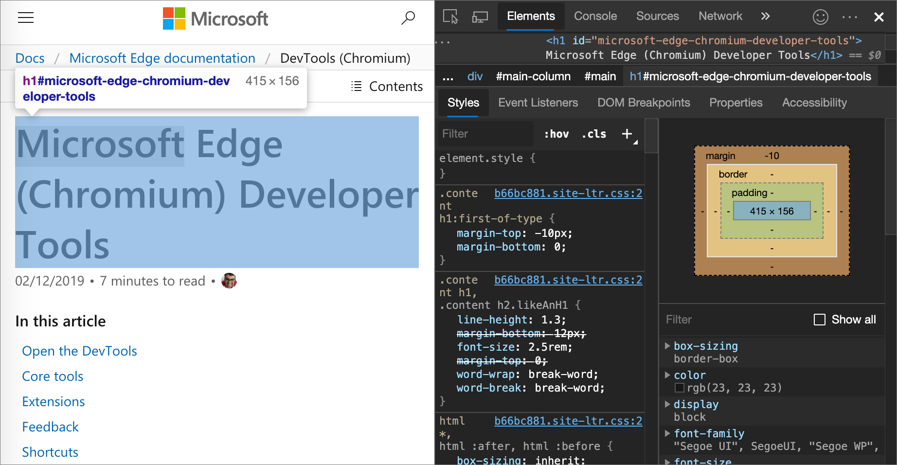
The Elements tool in DevTools lets you view or change the CSS of one element at a time. The selected element is highlighted in the DOM Tree. The styles of the element are shown in the Styles pane. For a tutorial, see View the CSS for an element.
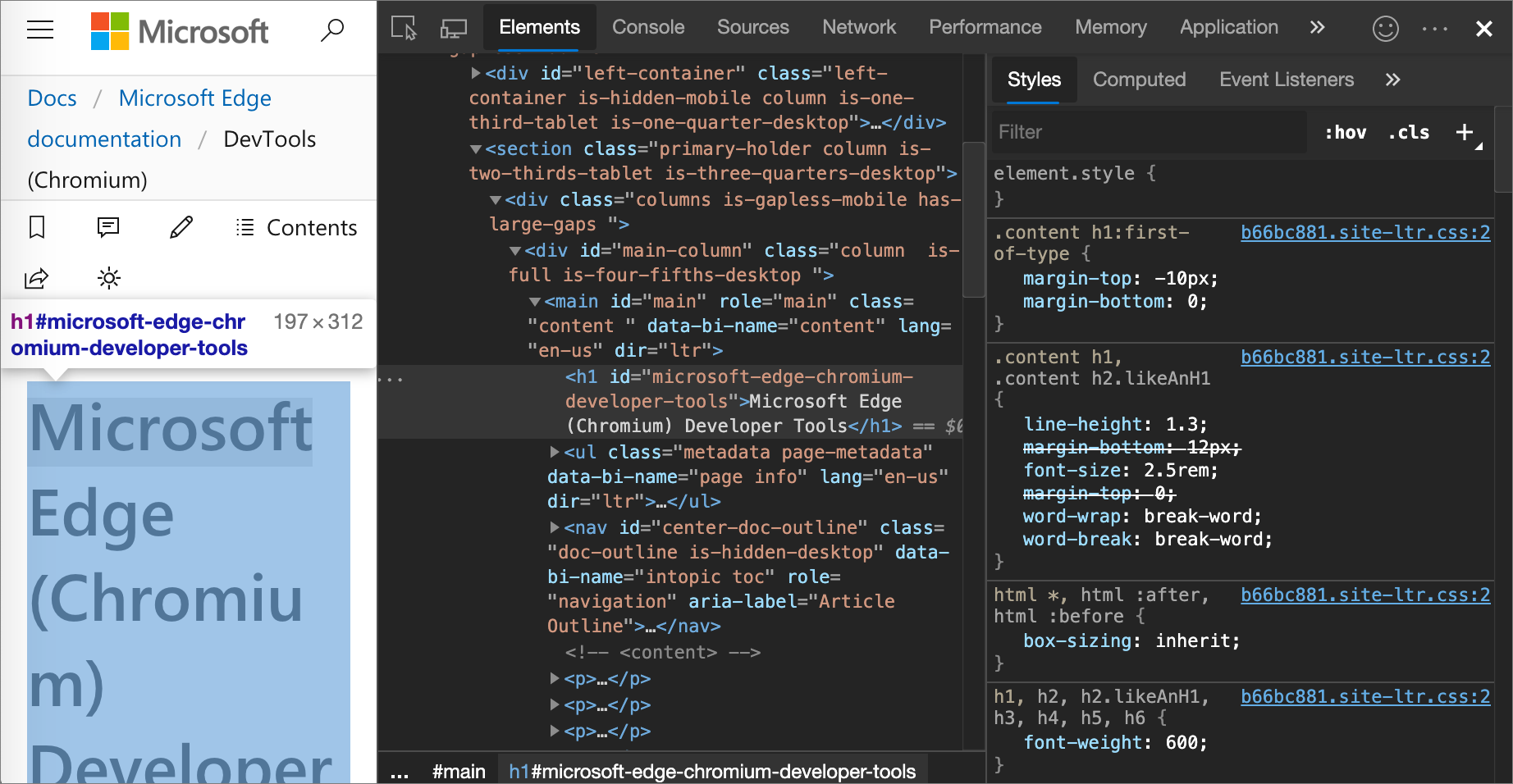
In the above figure:
- The
h1element that is highlighted in the DOM Tree is the selected element. - On the right, the styles of the element are shown in the Styles pane.
- On the left, the element is highlighted in the viewport, but only because the mouse is currently hovering over it in the DOM Tree:
There are multiple ways to select an element:
In a rendered webpage, right-click a page element, and then click Inspect.
In DevTools, click Select an element (
 ) or press Ctrl+Shift+C (Windows, Linux) or Command+Shift+C (macOS), and then click the element in the viewport.
In DevTools, click the element in the DOM Tree.
In DevTools, run a query such as
document.querySelector('p')in the Console, right-click the result, and then select Reveal in Elements panel.
View CSS
Use the Elements > Styles and Computed tabs to view CSS rules and diagnose CSS issues.
Navigate with links
The Styles tab displays links in various places to various other places, including but not limited to:
Next to CSS rules, to stylesheets and CSS sources. Such links open the Sources tool. If the stylesheet is minified, see Reformat a minified JavaScript file with pretty-print in JavaScript debugging features.
In the Inherited from sections, to parent elements.
In
var()calls, to custom property declarations. See Using CSS custom properties (variables) at MDN.In
animationshorthand properties, to@keyframes.Learn more links in documentation tooltips.
Links may be styled differently. If you're not sure if something is a link, try clicking it to find out.
For example:
Go to To Do app in a new window or tab.
Right-click white space above the string "Add a task", and then click Inspect.
DevTools opens, with the Elements tool selected.
Select the Styles tab.
Various types of links are displayed:
View tooltips with CSS documentation, specificity, and custom property values
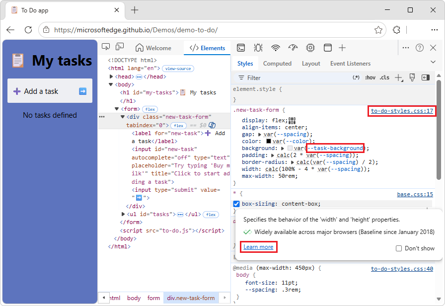
In the Elements tool, the Styles tab shows tooltips with useful information when you hover over specific elements.
View CSS documentation
To display the description of a CSS property, in a tooltip:
Go to a webpage, such as To Do app, in a new window or tab.
Right-click white space above the string "Add a task", and then click Inspect.
DevTools opens, with the Elements tool selected.
Select the Styles tab.
Hover over a CSS property name, such as
padding:.A tooltip is displayed:
DevTools pulls the descriptions for tooltips from the VS Code Custom Data repo.
In the tooltip, click the Learn more link.
The CSS reference page for the property at MDN is displayed, such as
paddingCSS property.
To turn the CSS tooltips off:
- In the tooltip, select the Don't show checkbox.
To turn CSS tooltips on again:
In DevTools, select Customize and control DevTools, and then select Settings.
In the outline on the left, select Preferences, and then scroll down to the Elements section.
Select the Show CSS documentation tooltip checkbox.
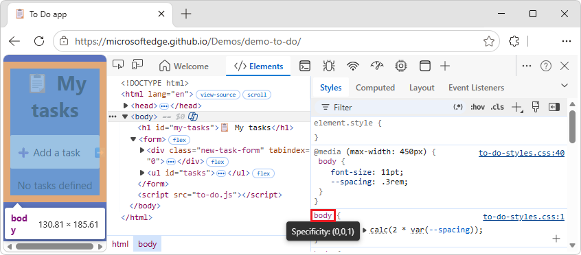
View selector specificity
Hover over a CSS selector, to display a tooltip that shows the selector's specificity weight, such as: Specificity: (0,0,1):
For example:
Go to a webpage, such as To Do app, in a new window or tab.
Right-click the webpage, and then click Inspect.
DevTools opens, with the Elements tool selected.
In the DOM tree, select the
<body>element.In the Styles tab, hover over the
bodyCSS selector.A tooltip is displayed, showing Specificity: (0,0,1):
See also:
- Specificity - MDN.
View the values of custom properties
Hover over a var(--custom-property) function to see the value of the custom property in a tooltip.
For example:
Go to a webpage, such as To Do app, in a new window or tab.
Right-click the webpage, and then click Inspect.
DevTools opens, with the Elements tool selected.
In the DOM tree, select the
<body>element.In the Styles tab, in the
bodyCSS rule, hover over--spacing.The value
.3remis displayed in a tooltip: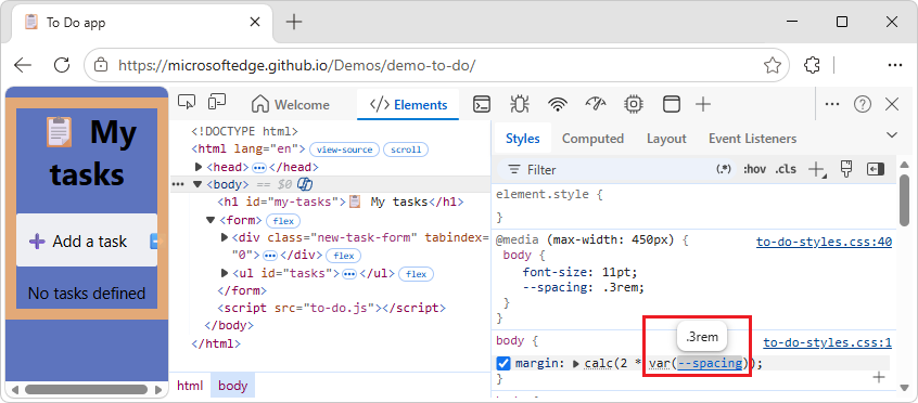
See also:
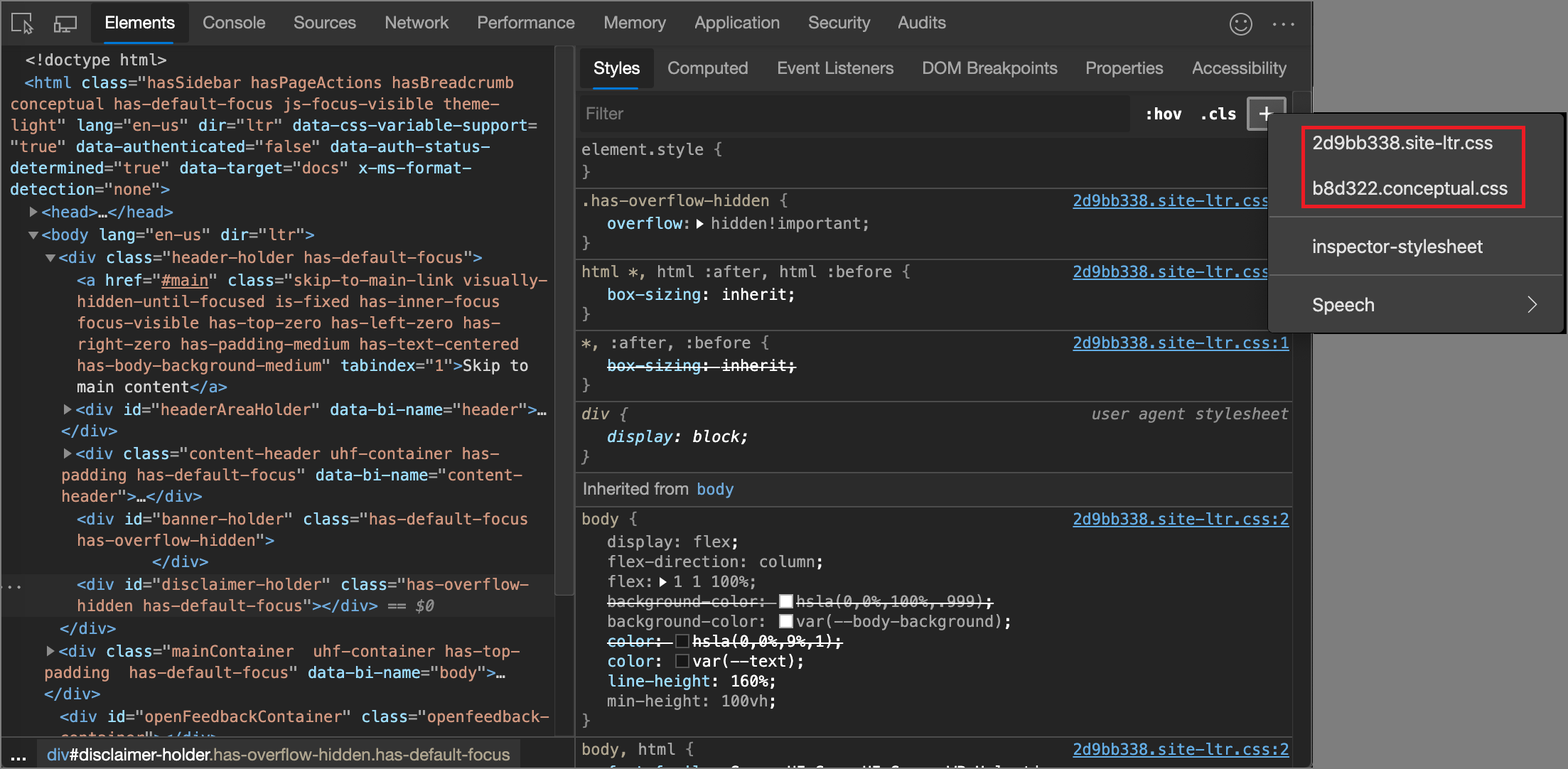
View the external stylesheet where a rule is defined
In the Styles pane, click the link next to a CSS rule to open the external stylesheet that defines the rule. The stylesheet opens in the Editor pane of the Sources tool.
If the stylesheet is minified, click the Format ( ) button, at the bottom of the Editor pane. For more information, see Reformat a minified JavaScript file with pretty-print in JavaScript debugging features.
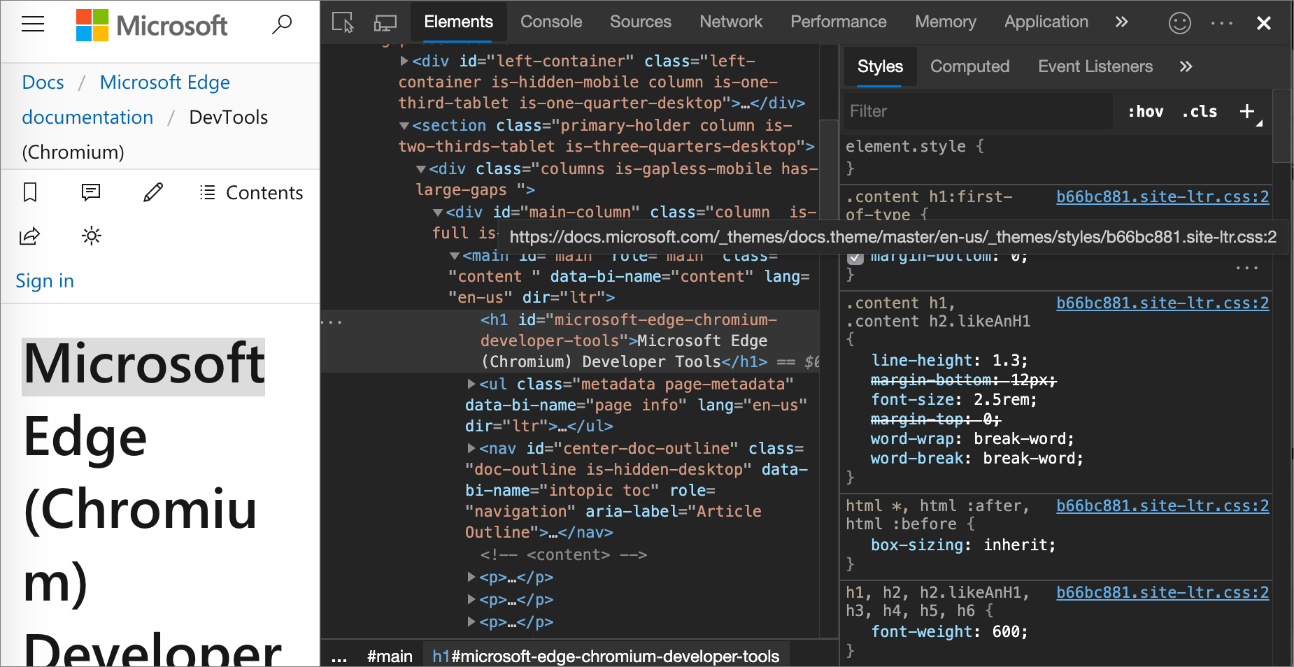
In the above figure, after you click to-do-styles.css:5, you are taken to line 5 of to-do-styles.css, where the h1 CSS rule is defined.
View invalid, overridden, inactive, and other CSS
The Styles tab recognizes many kinds of CSS issues and highlights them in different ways.
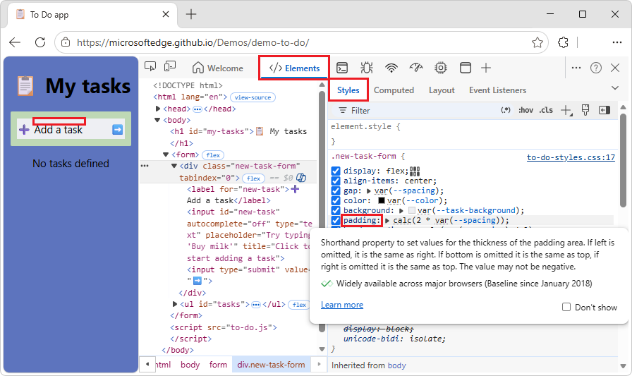
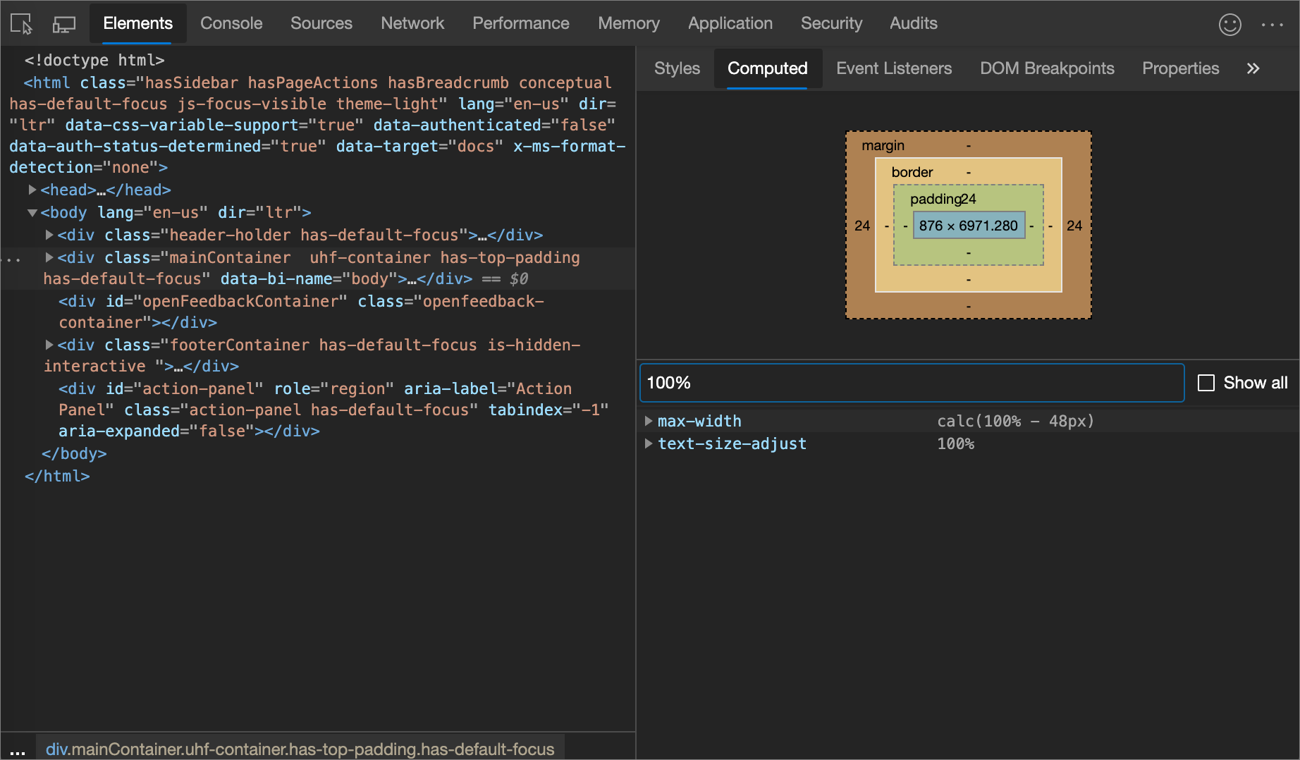
View only the CSS that is actually applied to an element
The Styles pane shows you all of the rules that apply to an element, including declarations that have been overridden. When you aren't interested in overridden declarations, use the Computed pane to view only the CSS that is actually being applied to an element.
For example:
Go to a webpage, such as To Do app, in a new window or tab.
Right-click the heading My tasks, and then click Inspect.
DevTools opens, with the Elements tool selected, with the
<h1>element selected in the DOM tree.In the Elements tool, select the Computed tab.
The CSS properties that are applied to the selected element are displayed:
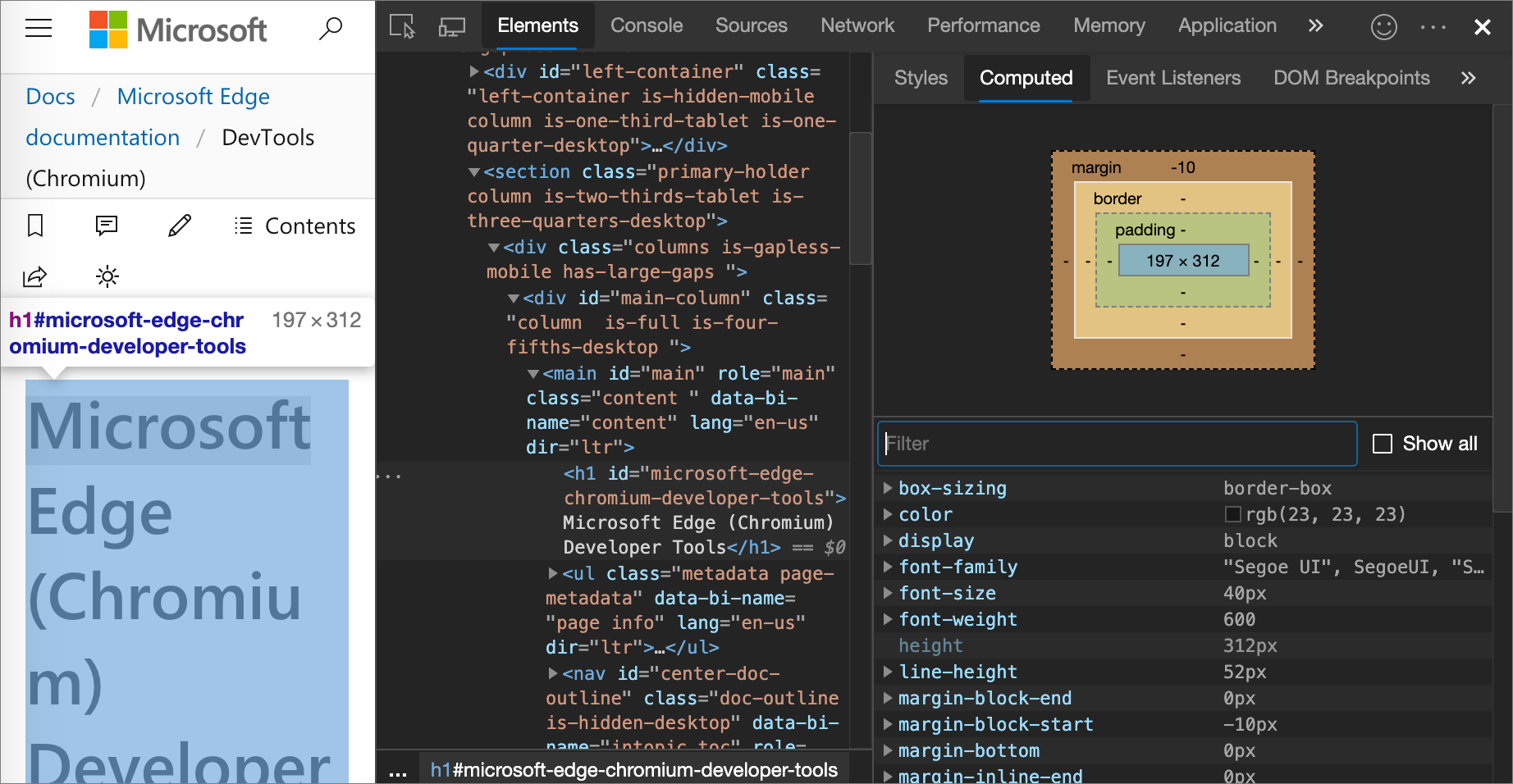
A property name and value in italics indicates a value that's calculated at runtime.
To display all properties, select the Show all checkbox.
View CSS properties in alphabetical order
Use the Computed pane. See View only the CSS that is actually applied to an element, above.
View inherited CSS properties
Check the Show All checkbox in the Computed pane. See View only the CSS that is actually applied to an element, above.
View CSS at-rules
At-rules are CSS statements that let you control CSS behavior.
In the Elements tool, the Styles tab shows the following at-rules in dedicated sections:
@property- see View@propertyat-rules, below.@supports- see View@supportsat-rules, below.@scope- see View@scopeat-rules, below.@font-palette-values- see View@font-palette-valuesat-rules, below.@position-try- see View@position-tryat-rules, below.
View @property at-rules
The @property CSS at-rule lets you define CSS custom properties of specific types in a stylesheet.
Hover over the name of such a property in the Styles tab, to see a tooltip that contains:
- The property's value, such as
20%. - The property's descriptors, such as:
initial value: 40% - A View registered property link to its registration in the collapsible
@propertysection at the bottom of the Styles tab.
For example:
Go to a page that uses the
@propertyat-rule, such as View@propertyat-rules, in a new window or tab.Right-click the Item three paragraph, and then click Inspect.
DevTools opens, with the Elements tool selected.
In the Styles tab, hover over that
var(--itemSize)function: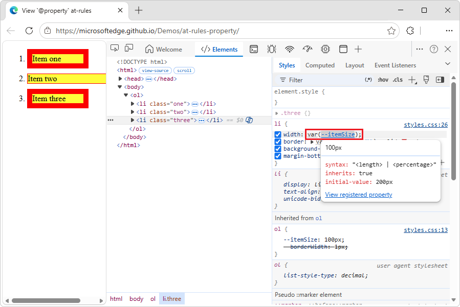
The tooltip contains:
- The property's value, such as
100px. - The property's descriptors, such as initial value.
- A View registered property link.
- The property's value, such as
Click the View registered property link.
The expanded @property section is displayed, further down in the Styles tab:
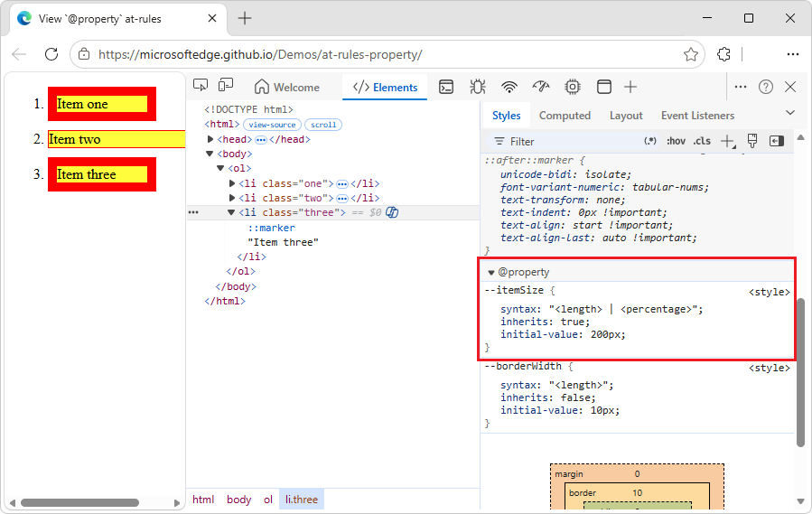
To edit an @property rule, double-click its name or value. See Change a declaration name or value, below.
See also:
- @property: giving superpowers to CSS variables at Web.dev.
- Custom properties (
--*): CSS variables at MDN.
View @supports at-rules
The Styles tab shows you the @supports CSS at-rules, if they are applied to an element.
For example, to view the @supports rule:
In a new window or tab, go to a page that uses the
@supportsat-rule, such as View@supportsat-rules.Right-click "I support CIE LAB color space!", and then select Inspect.
DevTools opens. In the Elements tool, in the DOM tree, the
<div class="box">element is selected. In the Styles tab,@supportsCSS declarations are listed: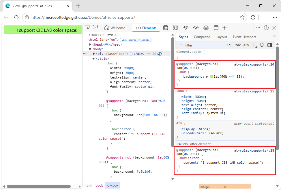
If your browser supports the
lab()function, the element is green.If your browser doesn't support the
lab()function, the element is purple.
To see which browser versions support the CIE LAB color space, search Caniuse.com for "lab".
View @scope at-rules
The Styles tab displays CSS @scope at-rules if they are applied to an element.
The @scope at-rules allow you to scope CSS styles; that is, explicitly apply styles to specific elements. See @scope CSS at-rule at MDN.
To view the @scope rule:
In a new window or tab, go to a page that uses the
@scopeat-rule, such as the View@scopeat-rules demo: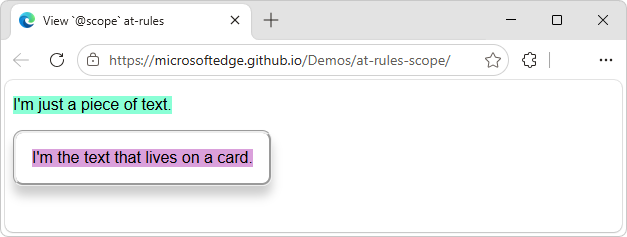
Right-click "I'm the text that lives on a card", and then select Inspect.
DevTools opens, with the Elements tool selected.
Select the Styles tab.
Examine the
@scoperule: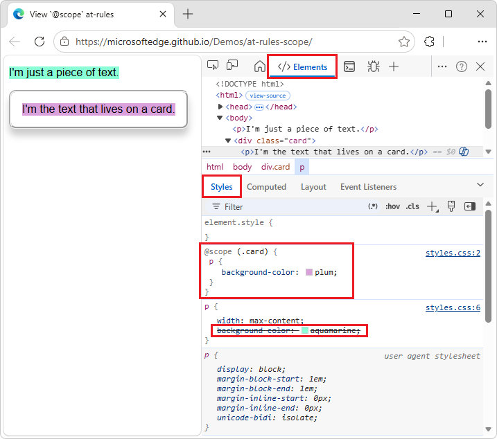
In this example, the
@scoperule (background color = plum) overrides the global CSSbackground-colordeclaration (aquamarine), for any<p>element that's inside an element (such as a<div>) that has acardclass.To edit the
@scoperule, you double-click in the rule:In the Styles tab, double-click plum, press Delete, and then select beige.
The text in the card in the demo webpage changes from plum background to beige background.
View @font-palette-values at-rules
The @font-palette-values CSS at-rule lets you customize (override) the default values of the font-palette property. In the Elements tool, the Styles tab shows this at-rule in a dedicated section.
To view the @font-palette-values CSS rule:
In a new window or tab, go to a page that uses the
@font-palette-valuesat-rule, such as the View@font-palette-valuesat-rules demo.Right-click "new colors", and then select Inspect.
DevTools opens, with the Elements tool selected.
In the Styles tab, find the
@font-palette-valuesCSS rule: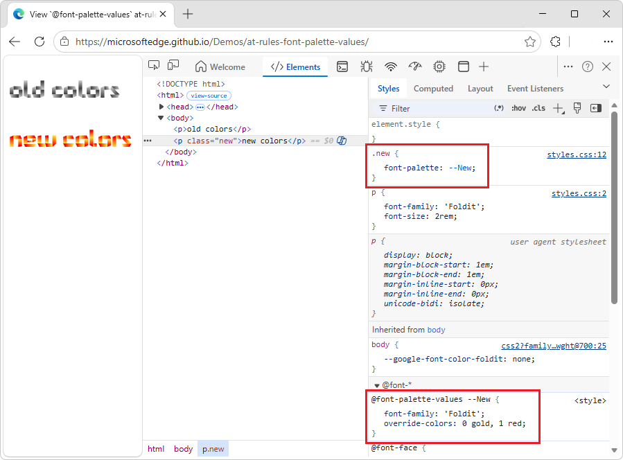
In this example, the
--Newfont palette values override the default values of the colored font.To edit a custom value, double-click it, as follows:
In the
@font-palette-valuesCSS rule, in theoverride-colorsproperty, double-click0 gold, 1 red, and enter0 blue, 1 red.In the inspected webpage, "new colors" is now rendered as blue and red.
View @position-try at-rules
The @position-try CSS rule along with the position-try-fallbacks property lets you define alternative anchor positions for elements.
In the Elements tool, the Styles tab resolves and links the following:
The
position-try-fallbacksproperty values (orposition-try-optionsproperty values) link to a dedicated@position-try --nameCSS rule section.The
position-anchorproperty values andanchor()arguments link to the corresponding elements that havepopovertargetattributes.
For example, inspect the position-try-fallbacks values and @position-try CSS rules, as follows:
In a new window or tab, go to a page that uses the
position-try-fallbacksvalues and@position-tryat-rule, such as the View@position-tryat-rules demo.In the rendered webpage, open the submenu; that is, click YOUR ACCOUNT, and then click STOREFRONT.
The submenu is displayed, showing a list of commands: LISTINGS, SPECIAL OFFERS, SIGN OUT.
In the submenu, right-click above LISTINGS, and then select Inspect.
DevTools opens, with the Elements tool selected. The submenu element
<ul id="submenu">is selected in the DOM tree: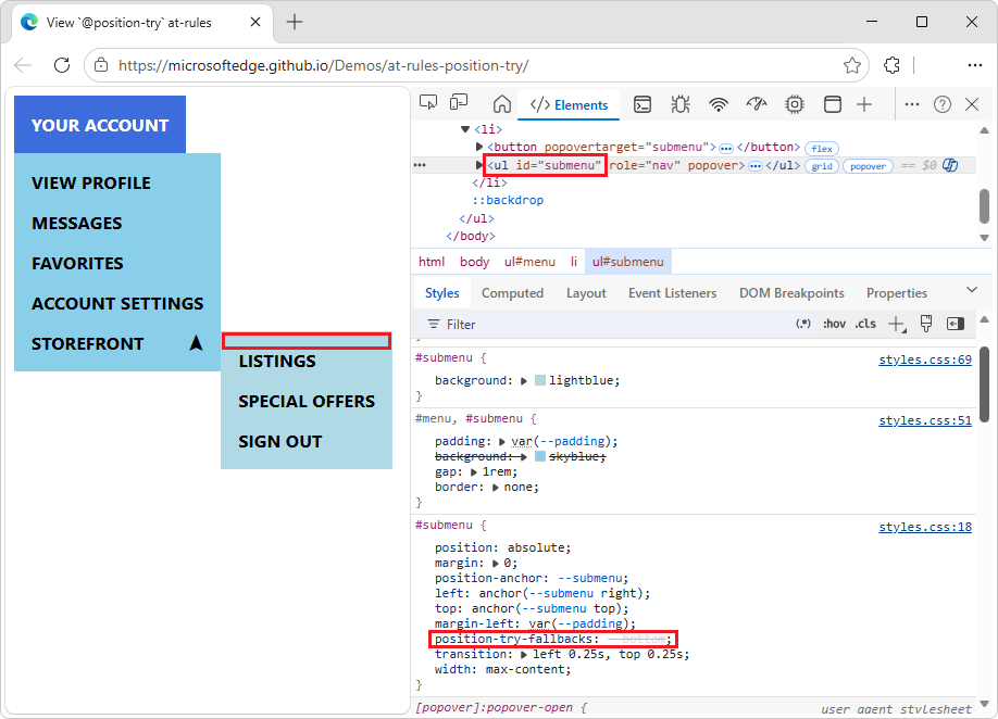
In the Styles tab, in the
#submenuCSS rule, find theposition-try-fallbacksproperty, and click its--bottomvalue.The Styles tab scrolls down to the corresponding
@position-trysection: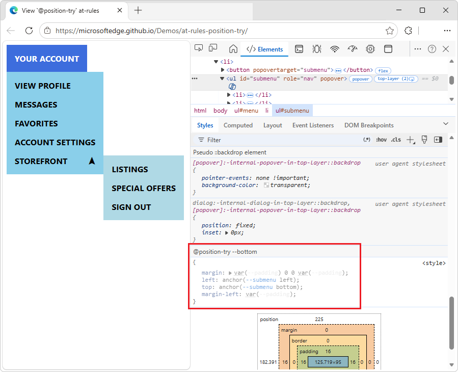
In the Styles tab, in the
#submenuCSS rule, click the--submenulink in any of the following properties:position-anchor: --submenu; left: anchor(--submenu right); top: anchor(--submenu top);The DOM tree selects the element (
<button popovertarget="submenu">) that has the correspondingpopovertargetattribute value (popovertarget="submenu"), and the Styles tab shows the element's CSS: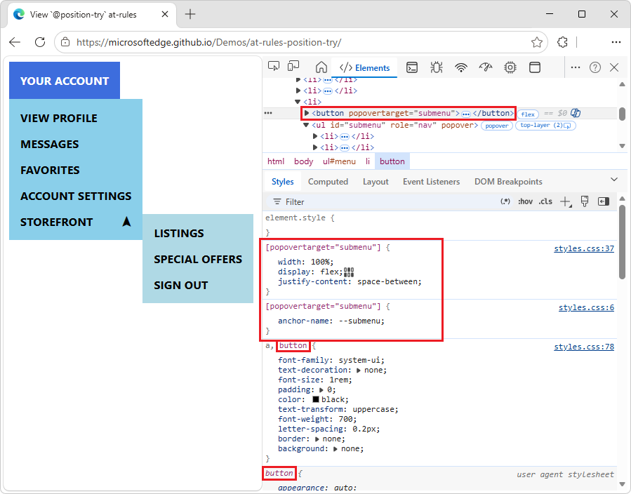
To edit a value, double-click the value.
See also:
- @position-try CSS at-rule, at MDN.
View an element's box model
To view the box model of an element, go to the Styles pane, and scroll down.
To change a value, double-click the value.
In the following figure, the Box Model diagram in the Styles pane shows the box model for the currently selected h1 element:
See also:
- The box model at MDN.
Search and filter the CSS of an element
Use the Filter text box on the Styles and Computed panes to search for specific CSS properties or values.
To also search inherited properties in the Computed pane, check the Show All checkbox.
In the following figure, the Styles pane is filtered to only show rules that include the search query color.

In the following figure, the Computed pane is filtered to only show declarations that include the search query 100%:
Emulate a focused page
If you switch focus from the inspected webpage to DevTools, some overlay elements automatically hide, if they are triggered by focus. For example:
- Dropdown lists.
- Menus.
- Date pickers.
To debug such an element as if the page has focus, do either of the following:
- In the Elements tool, in the Styles tab, click
:hov(Toggle Element State), and then select the Emulate a focused page checkbox. - In the Rendering tool, select the Emulate a focused page checkbox.
Caution: When this option is on, the document.visibilityState is set to visible and the visibilitychange event doesn't fire. See Page Visibility API at MDN.
To try emulating a focused page:
Open the Emulate a focused page demo in a new window or tab.
Click the input text box. Or, press Tab to put focus on the input text box.
Another element appears under the input text box, saying "This message only appears when the text box is focused."
Right-click the input text box, and then select Inspect.
DevTools opens, and the message element disappears. The DevTools window is now in focus, instead of the inspected webpage, so the message element disappears.
In the Elements tool, in the Styles tab, click
:hov(Toggle Element State), and then select the Emulate a focused page checkbox.Make sure the input text box element
<input id="textBox" type="text">is still selected.Under the input text box, the message element reappears below the input text box.
You can now inspect the message element that's below the input text box, even though DevTools, rather than the inspected page, has focus:
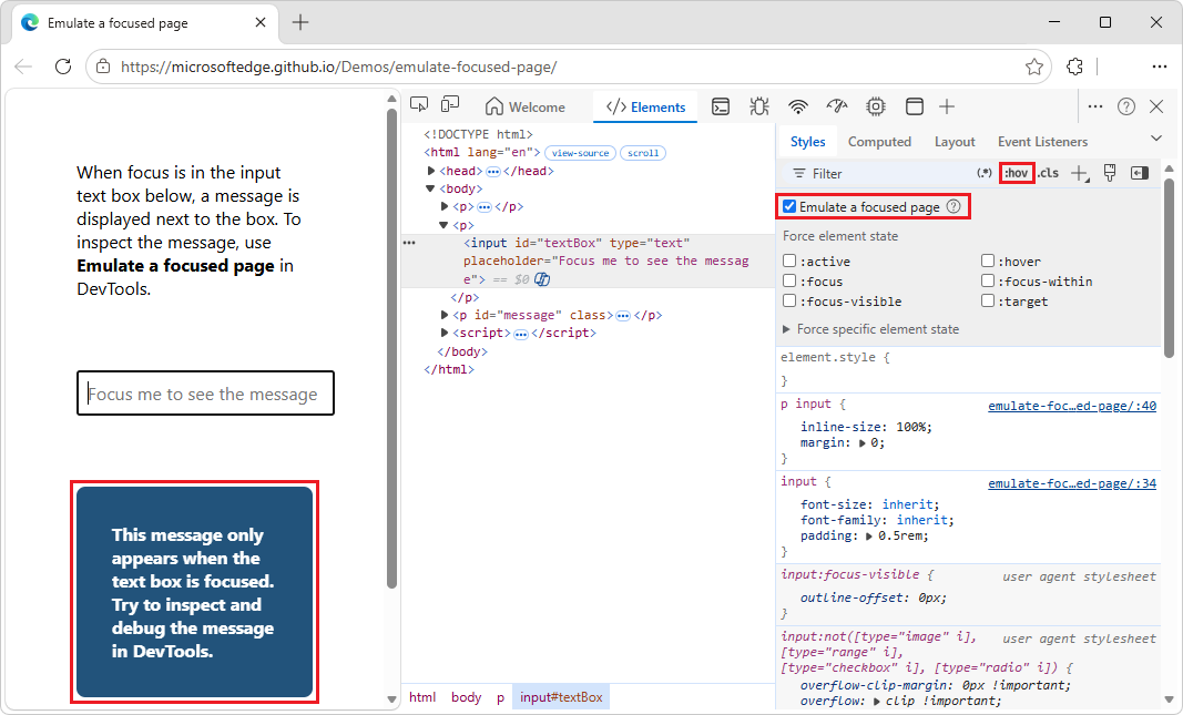
Cleanup: In the Elements tool, in the Styles tab, click
:hov(Toggle Element State), and then clear the Emulate a focused page checkbox.
An Emulate a focused page checkbox also appears in the Rendering tool; see Rendering tool, to see what a webpage looks like with different display options or vision deficiencies.
See also:
- Freeze screen & inspect disappearing elements, in the Chrome for Developers blog.
Toggle a pseudo-class
To toggle a pseudo-class:
Go to a webpage, such as To Do app, in a new window or tab.
Enter a task, such as task 1.
Right-click the webpage, and then select Inspect.
DevTools opens.
Select the Elements tool.
In the DOM tree, select the
<li class="task">element.Select the Styles tab.
In the upper right, click :hov.
Checkboxes are displayed.
Select the checkbox for the pseudo-class that you want to enable, such as
:hover: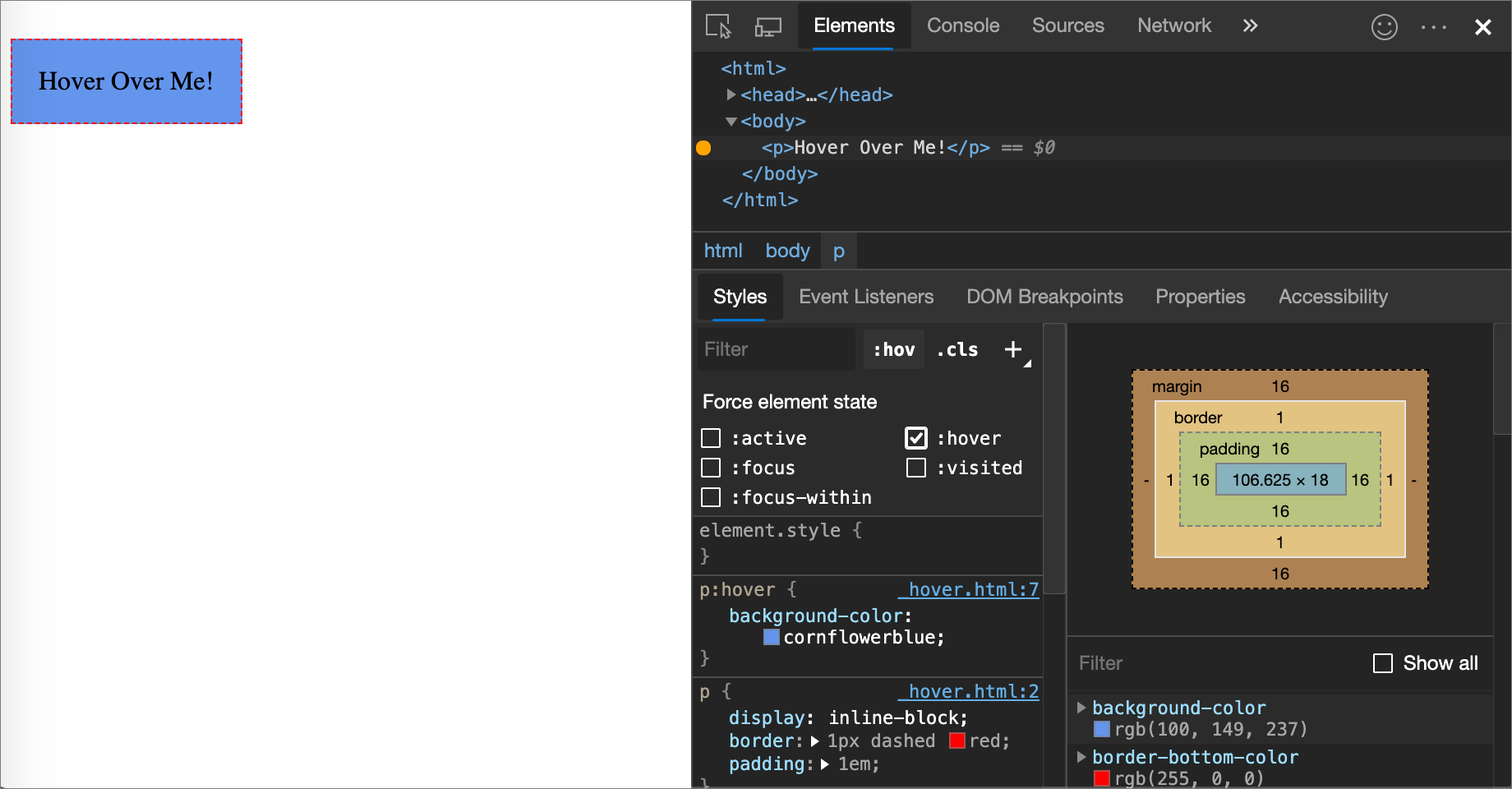
In the rendered webpage, the circle next to the task name is filled with a checkmark, and a red X in a red circle appears in the right side of the task, as if the element is being hovered over, even though the element isn't actually being hovered over.
The Styles tab shows the following pseudo-classes for all elements:
Additionally, some elements might have element-specific pseudo-classes. When you select such an element, the Styles tab shows a Force specific element state section that you can expand and turn on pseudo-classes that are specific to the element, such as a :read-write checkbox:
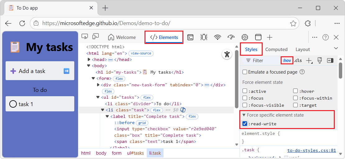
For an interactive tutorial, see Add a pseudo-state to a class.
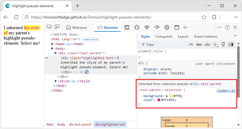
View inherited highlight pseudo-elements
Pseudo-elements let you style specific parts of elements. Highlight pseudo-elements are document portions with a "selected" status and they are styled as "highlighted" to indicate this status to the user.
For example, such pseudo-elements are:
::selection::spelling-error::grammar-error::highlight
When multiple styles conflict, the CSS cascade determines the winning style. See Introduction to the CSS cascade at MDN.
To better understand the inheritance and priority of the rules, view the inherited highlight pseudo-element in the following demo.
To view the inherited highlight pseudo-elements:
Go to the Highlight pseudo-elements demo in a new window or tab.
Select a portion of the text "I inherited the style of my parent's highlight pseudo-element. Select me!"
The selected text changes to red text on yellow background.
Right-click the text "I inherited the style of my parent's highlight pseudo-element. Select me!", and then select Inspect.
DevTools opens. In the Elements tool, in the Styles tab, the section is displayed: Inherited from ::selection pseudo of div.text-parent:
In the DOM tree, select the
<div class="text-parent">element.In the Styles tab, the section is displayed: Pseudo ::selection element:
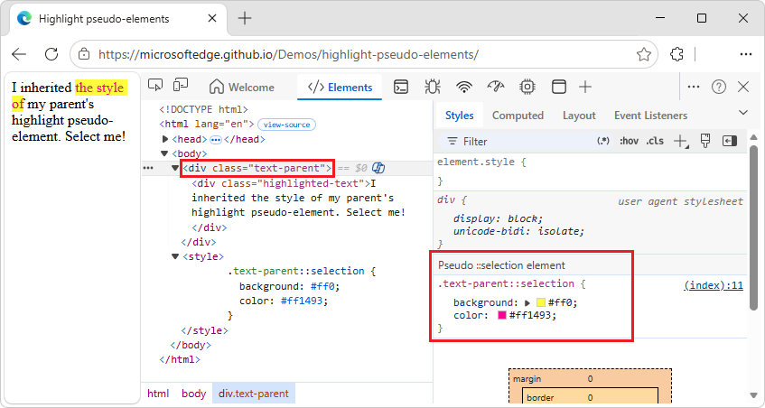
See also:
- Pseudo-elements at MDN.
View cascade layers
Cascade layers enable more explicit control of your CSS files, to prevent style-specificity conflicts. This is useful for:
- Large codebases.
- System design.
- Managing third-party styles.
To view cascade layers:
Go to a webpage that uses cascade layers, such as the Cascade layers demo.
Right-click the "My styles are layered!" element, and then select Inspect.
DevTools opens.
In the Elements tool, select the Styles tab.
In the Styles tab, view the three cascade layers and their styles:
page,componentandbase: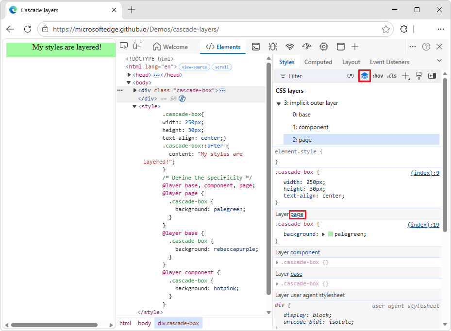
To view the layer order, click the layer name (page, component, or base). Or, click the
 Toggle CSS Layers view button.
The
pagelayer has the highest specificity, therefore the element's background is green.
See also:
- Cascade layers, at MDN.
View a page in print mode
To view a page in print mode:
Go to a webpage.
Right-click the webpage, and then select Inspect.
DevTools opens.
Press Esc once or twice, so that the Quick View toolbar appears at the bottom of DevTools.
On the Quick View toolbar, select More tools (+).
Select the Rendering tool.
The Rendering tool opens in the Quick View panel at the bottom of DevTools.
In the Rendering tool, click the Emulate CSS media type dropdown list, and then select print.
The webpage is rendered as if printing.
When finished, in the Rendering tool, click the Emulate CSS media type dropdown list, and then select No emulation.
View used and unused CSS with the Coverage tool
The Coverage tool shows you what CSS a page actually uses.
Open the Command Menu by pressing Ctrl+Shift+P (Windows, Linux) or Command+Shift+P (macOS), while DevTools has focus.
Start typing
coverage, and then select Show Coverage: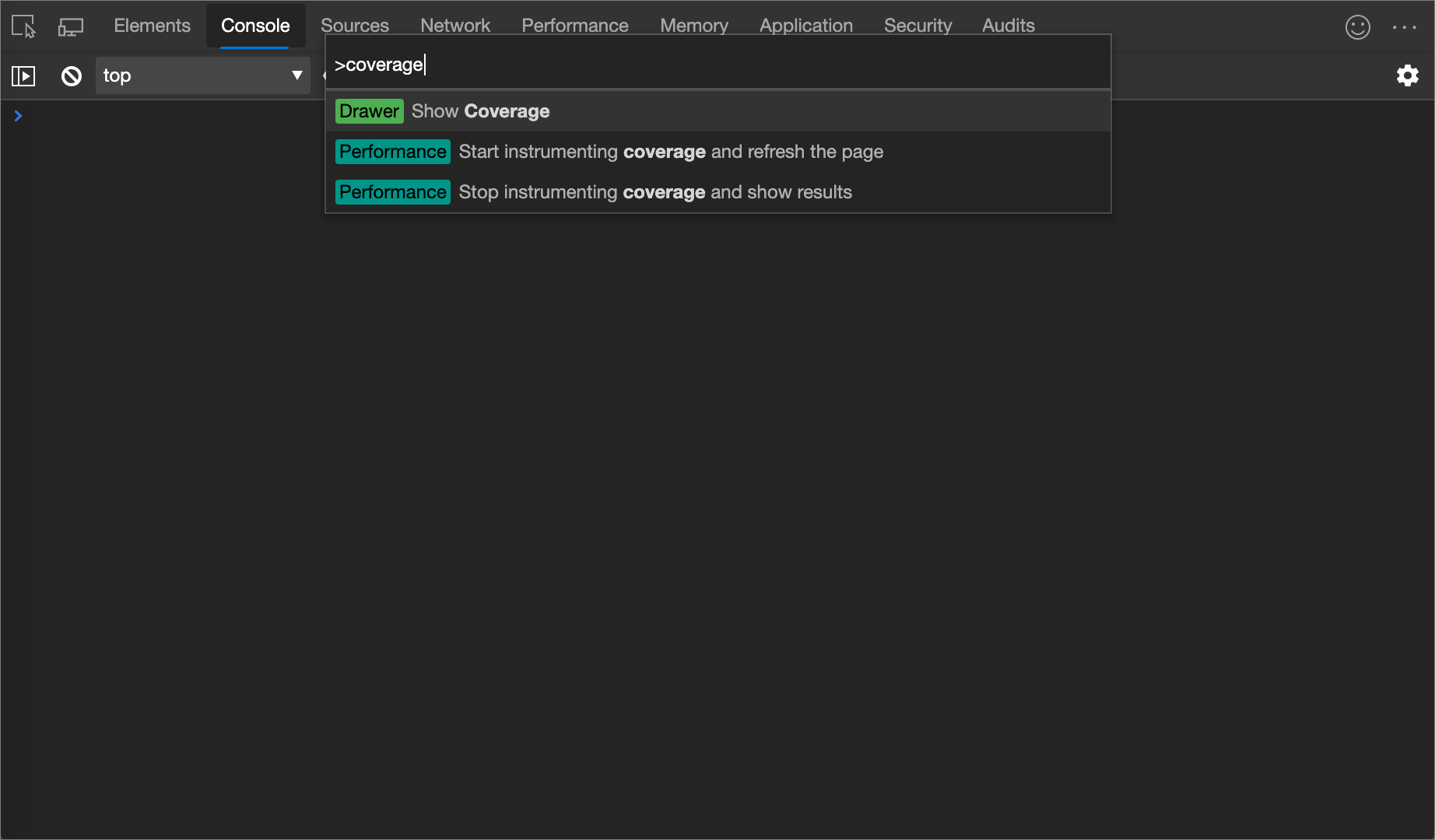
The Coverage tool appears:
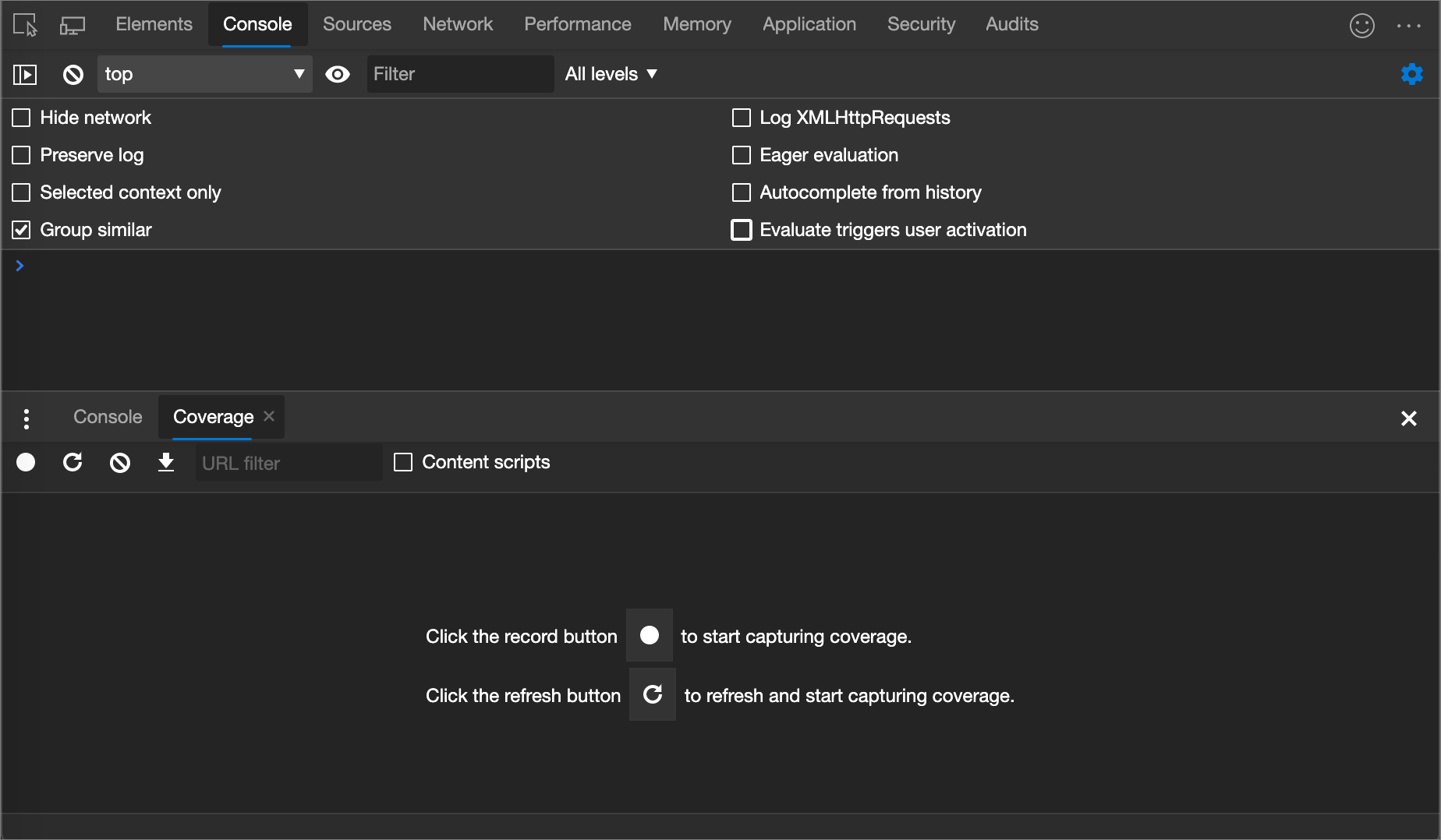
Click Start instrumenting coverage and refresh the page (
 ). The page refreshes and the Coverage tool provides an overview of how much CSS (and JavaScript) is used from each file that the browser loads. Green represents used CSS. Red represents unused CSS.
An overview of how much CSS (and JavaScript) is used and unused:
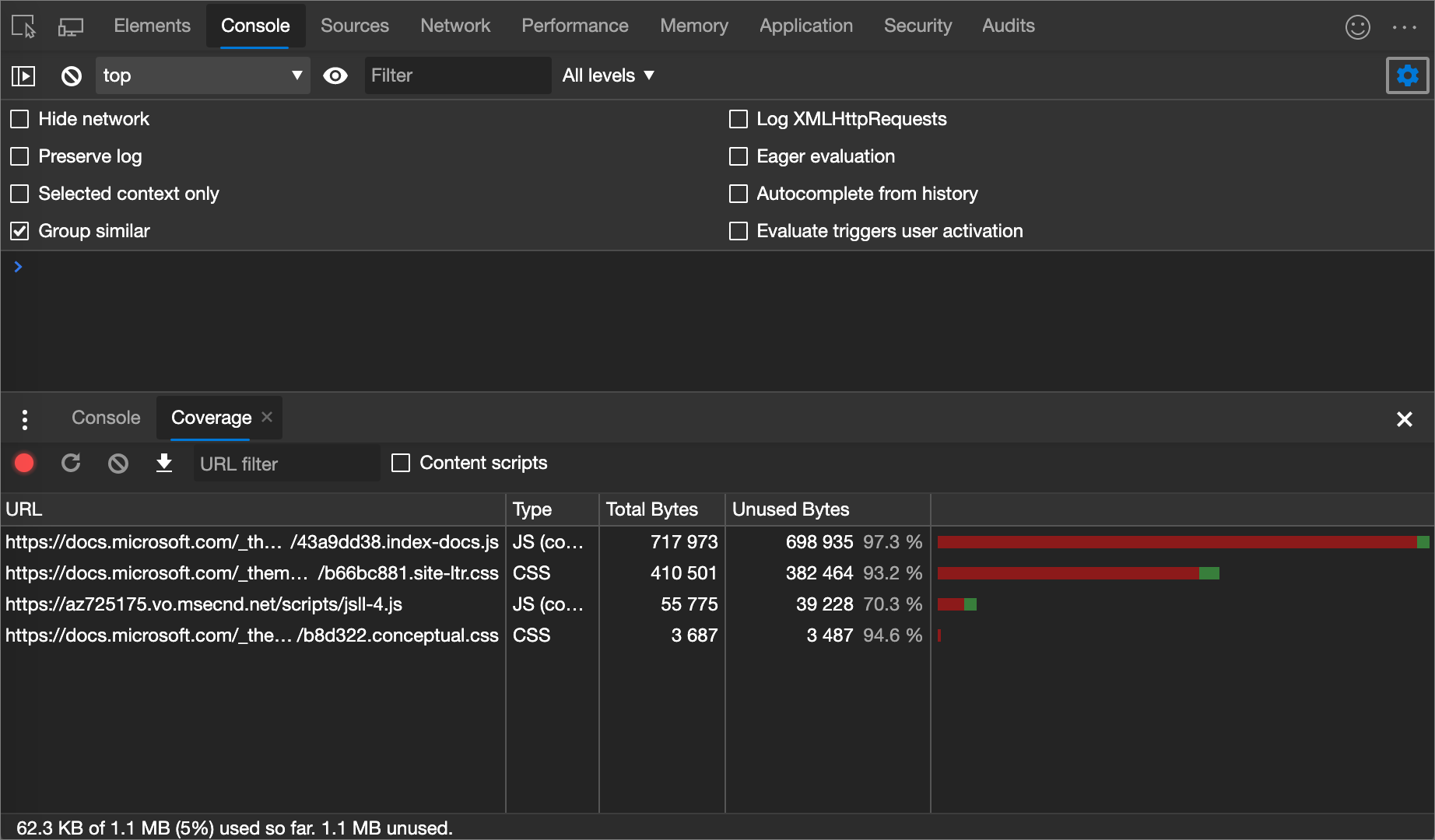
To display a line-by-line breakdown of what CSS is used, click a CSS file.
In the following figure, lines 145 to 147 and 149 to 151 of
b66bc881.site-ltr.cssare unused, whereas lines 163 to 166 are used: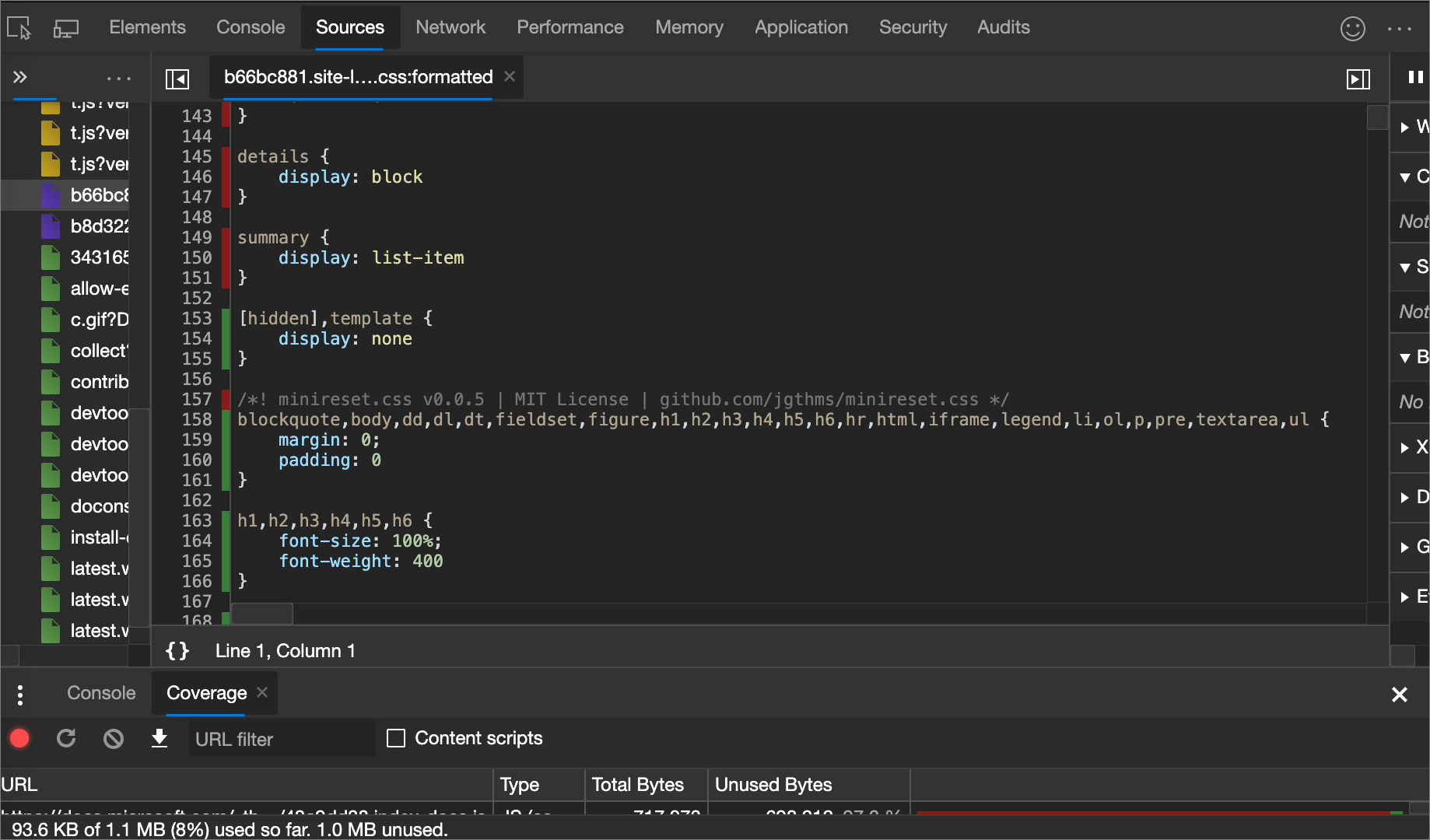
Force print preview mode
See Force DevTools into Print Preview mode.
Copy CSS
From a single dropdown menu in the Styles tab, you can copy separate CSS rules, declarations, properties, or values; see CSS syntax basics in What is CSS? at MDN.
Additionally, you can copy CSS properties in JavaScript syntax. This option is handy if you're using CSS-in-JS libraries; see Style editing for CSS-in-JS frameworks.
To copy CSS:
Go to a webpage that uses CSS, such as To Do app, in a new window or tab.
Right-click the webpage, and then click Inspect.
DevTools opens, with the Elements tool selected.
In the DOM tree, select an element, such as
<h1>.In the Styles tab, within a CSS rule, right-click a CSS property, such as
text-align: center: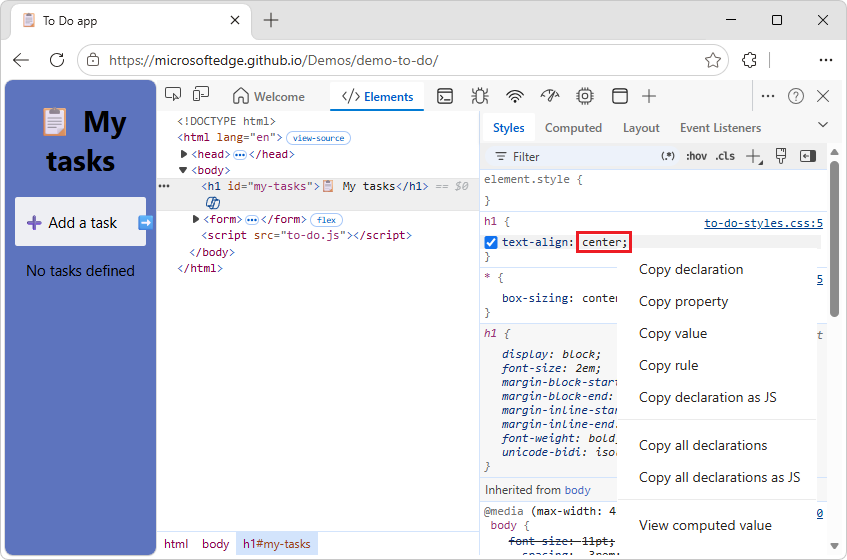
Select a right-click menuitem:
Copy declaration. Copies the property and its value in CSS syntax:
property: value;Copy property. Copies only the
propertyname.Copy value. Copies only the
value.Copy rule. Copies the entire CSS rule:
selector[, selector] { property: value; property: value; ... }Copy declaration as JS. Copies the property and its value in JavaScript syntax:
propertyInCamelCase: 'value'Copy all declarations. Copies all properties and their values in the CSS syntax:
property: value; property: value; ...Copy all declarations as JS. Copies all properties and their values in JavaScript syntax:
propertyInCamelCase: 'value', propertyInCamelCase: 'value', ...Copy all CSS changes. Copies the changes that you make in the Styles tab across all declarations. This menuitem conditionally appears.
View computed value. Takes you to the Computed tab; see View only the CSS that's actually applied to an element, above.
Change CSS
This section lists all the ways you can change CSS in Elements > Styles.
Additionally, you can:
Override CSS across page loads. See Override webpage resources with local copies (Overrides tab).
Save modified CSS to your local sources in a workspace. See Edit and save files in a workspace (Sources tool Workspace tab).
Two ways to add a CSS declaration to an element
The order of declarations affects how an element is styled. You can add declarations either by adding an inline declaration, or by adding a declaration to a style rule. These two approaches are described in the following sections.
Adding an inline CSS declaration to an element
Adding a inline declaration is equivalent to adding a style attribute to the HTML of an element. For most scenarios, you probably want to use inline declarations.
Inline declarations have higher specificity than external declarations, so using inline declarations ensures that the changes take effect in your specific, expected element. For more information about specificity, see Selector Types in Specificity at MDN.
To add an inline declaration:
In the Styles pane, click between the brackets of the element.style section. The cursor focuses, allowing you to enter text.
Enter a property name and press Enter.
Enter a valid value for that property and press Enter. In the DOM Tree, a
styleattribute has been added to the element.
Alternatively, enter the value in the property field, and DevTools will then suggest a list of matching property: value pairs to select from. For example, if you enter bold in the property field, DevTools suggests font-weight: bold and font-weight: bolder as the possible rules. Press Enter to apply the rule.
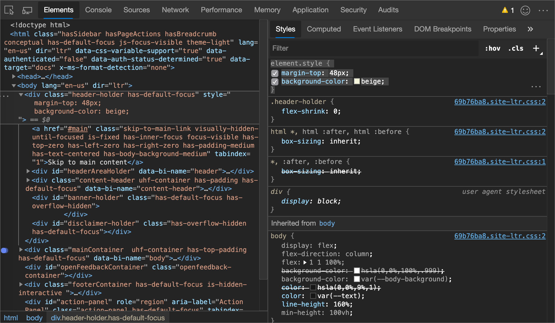
In the following figure, the margin-top and background-color properties have been applied to the selected element. In the DOM Tree, the declarations are reflected in the element's style attribute.
Adding a CSS declaration to an existing style rule
If you're debugging an element's styles and you need to specifically test what happens when a declaration is defined in different places, add a declaration to an existing style rule.
To add a declaration to an existing style rule:
In the Styles pane, click between the brackets of the style rule to which you want to add the declaration. The cursor focuses, allowing you to enter text.
Enter a property name and press Enter.
Enter a valid value for that property and press Enter.
Change a declaration name or value
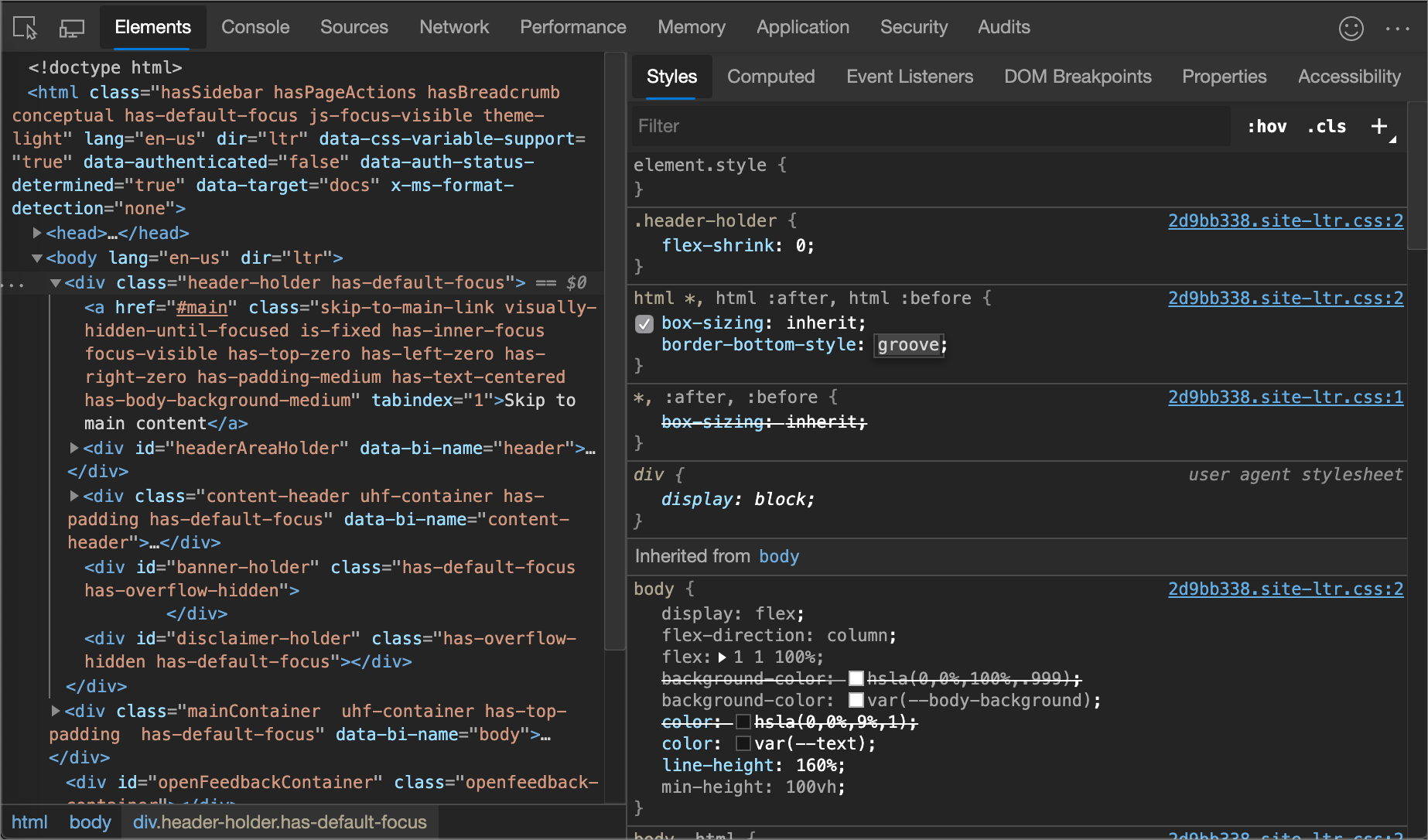
To change the name of a CSS declaration, double-click the declaration's name.
To change the value of a CSS declaration, double-click the declaration's value. The following screenshot shows selecting a value from a list:
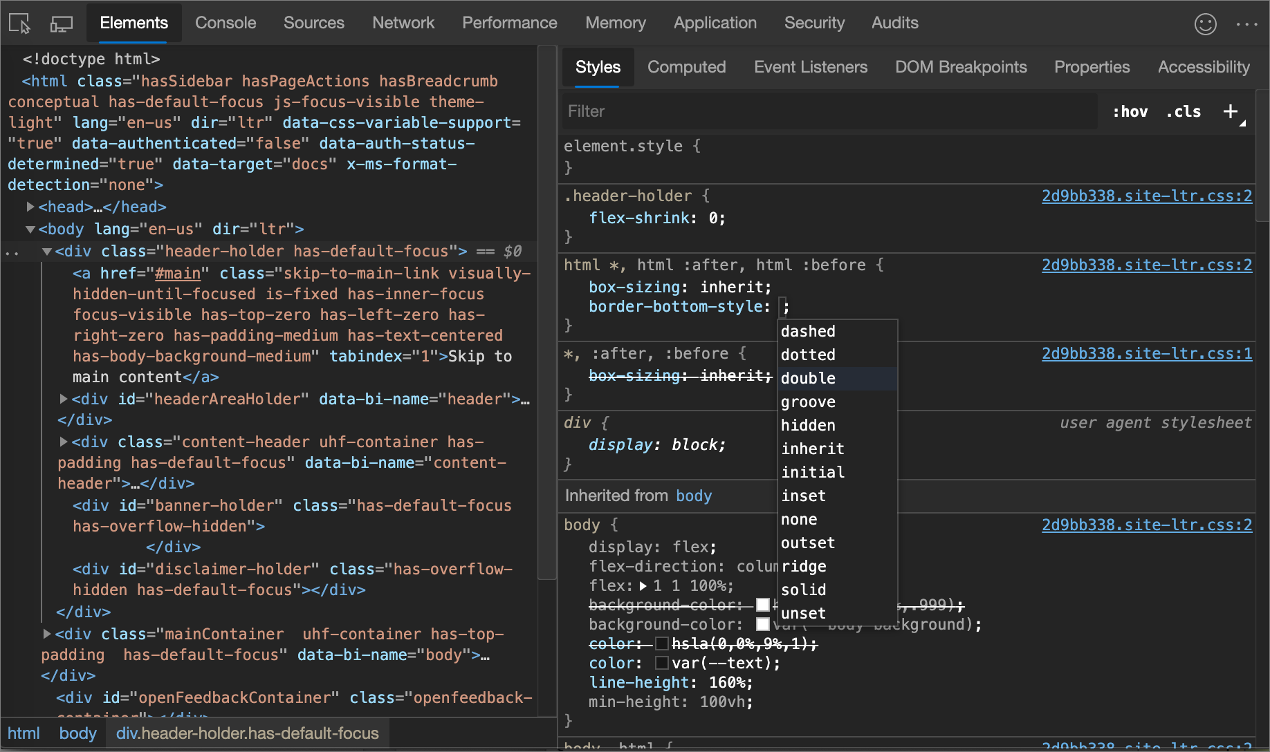
To change a numerical value, type in the value, or use the arrow keys, per the next section.
Change enumerable values with keyboard shortcuts
To change a numerical value of a CSS declaration, type in the value, or use the arrow keys to increment the value by a specific amount. While editing an enumerable value of a declaration, for example, font-size, you can use the following keyboard shortcuts to increment the value by a fixed amount:
| Key combination | Action |
|---|---|
| Alt+Up Arrow (Windows, Linux), Option+UpArrow (macOS) | Increment by 0.1. |
| Up Arrow | Increment by 1, or by 0.1 if the current value is between -1 and 1. |
| Shift+Up Arrow | Increment by 10. |
| Ctrl+Shift+PgUp (Windows, Linux), Shift+Command+UpArrow (macOS) | Increment by 100. |
To decrement, press the Down Arrow (or Page Down) key instead of the Up Arrow (or Page Up) key.
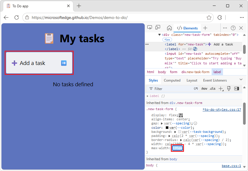
Change length values
You can use your pointer to change any property that has a length value, such as width, height, padding, margin, or border.
To change the length unit:
Open a webpage that uses CSS, such as To Do app, in a new window or tab.
Right-click the text Add a task, and then select Inspect.
DevTools opens, displaying the Elements tool. The
<label>element is selected in the DOM tree.In the Styles tab, in the
.new-task-formCSS rule, in themax-width:property, hover over50rem.A tooltip appears, showing the equivalent value and units:
800px.Click the value
50rem.A tooltip appears: "Increment/decrement with mousewheel or up/down keys. Ctrl: +/-100, Shift: +/-10, Alt: +/-0.1"
Move the mousewheel, or press UpArrow and DownArrow keys, while pressing a key:
Ctrl: Increment by 100. Shift: Increment by 10. Alt: Increment by 0.1.
In the inspected webpage, the Add a task input text box changes width as you change the value.
In the max-width property's value field, make the value
200px(changing fromremunits topxunits).Again move the mousewheel, or press UpArrow and DownArrow keys, while holding the Ctrl (+/-100), Shift (+/-10), or Alt (+/-0.1) key.
In the inspected webpage, the Add a task input text box changes width as you change the value:
Add a class to an element
To add a class to an element:
Select the element in the DOM Tree.
Click .cls.
Enter the name of the class in the Add new class text box.
Press Enter.
Emulate light and dark theme preferences and enable automatic dark mode
To toggle automatic dark mode, or emulate the user's preference of light or dark themes:
In the Elements tool, in the Styles tab, click the Toggle common rendering emulations (
 ) button in the upper right:
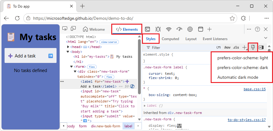
Select one of the following options from the dropdown list:
prefers-color-scheme: light. Indicates that the user prefers the light theme.
prefers-color-scheme: dark. Indicates that the user prefers the dark theme.
Automatic dark mode. Displays your page in dark mode even if you didn't implement it. Additionally, sets
prefers-color-schemetodarkautomatically.
This dropdown list is a shortcut for Emulate CSS media feature prefers-color-scheme and Enable automatic dark mode options of the Rendering tool.
See also:
- Emulating dark or light mode using the Rendering tool in Emulate dark or light schemes in the rendered page.
- Check for contrast issues with dark theme and light theme
- Auto Dark Theme, in the Chrome for Developers blog.
- prefers-color-scheme: Hello darkness, my old friend at web.dev.
Toggle a class
To enable or disable a class on an element:
Select the element in the DOM Tree.
Open the Element Classes pane. See Add a class to an element. Below the Add New Class text boxes are all of the classes that are being applied to this element.
Toggle the checkbox next to the class that you want to enable or disable.
Add a style rule
To add a new style rule:
Click New Style Rule (
 ). DevTools inserts a new rule beneath the element.style rule.
In the following figure, DevTools adds the
h1.devsite-page-titlestyle rule after you click New Style Rule.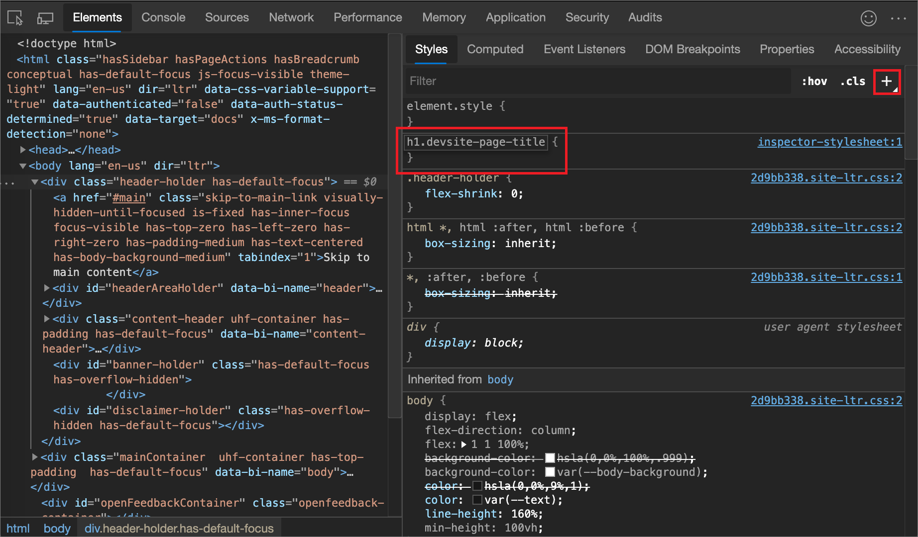
Select a stylesheet to add a rule to
By default, when adding a style rule, DevTools creates a new stylesheet named inspector-stylesheet in the document and then adds the new style rule in this stylesheet.
To instead add the rule in an existing stylesheet:
- Click and hold New Style Rule () and then select a stylesheet from the list to add the style rule to.
Add a style rule to a specific location in a stylesheet
By default, adding a style rule by clicking the New Style Rule () button inserts the new rule beneath the element.style rule in the inspector-stylesheet stylesheet.
To add a style rule in a specific location of a particular stylesheet by starting from the Styles pane:
In the Elements tool, in the Styles tab, hover over the style rule that's directly above where you want to add your new style rule.
An Insert style rule below (
 ) button appears on the right side of the CSS rule.
Click the Insert style rule below (
) button: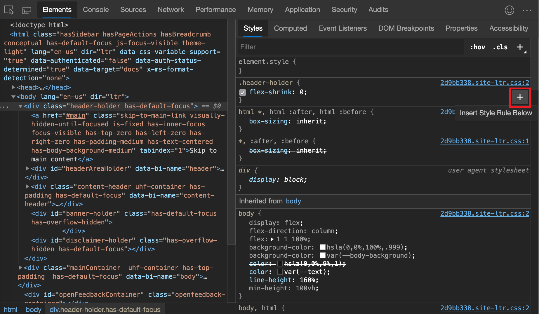
Toggle a declaration
To toggle a single declaration on or off:
In the Styles pane, hover on the rule that defines the declaration. A checkbox appears next to each declaration.
Select or clear the checkbox next to the declaration. When you clear a declaration, DevTools crosses it out, to indicate that it is no longer active.
In the following figure, the
margin-topproperty for the currently selected element has been toggled off.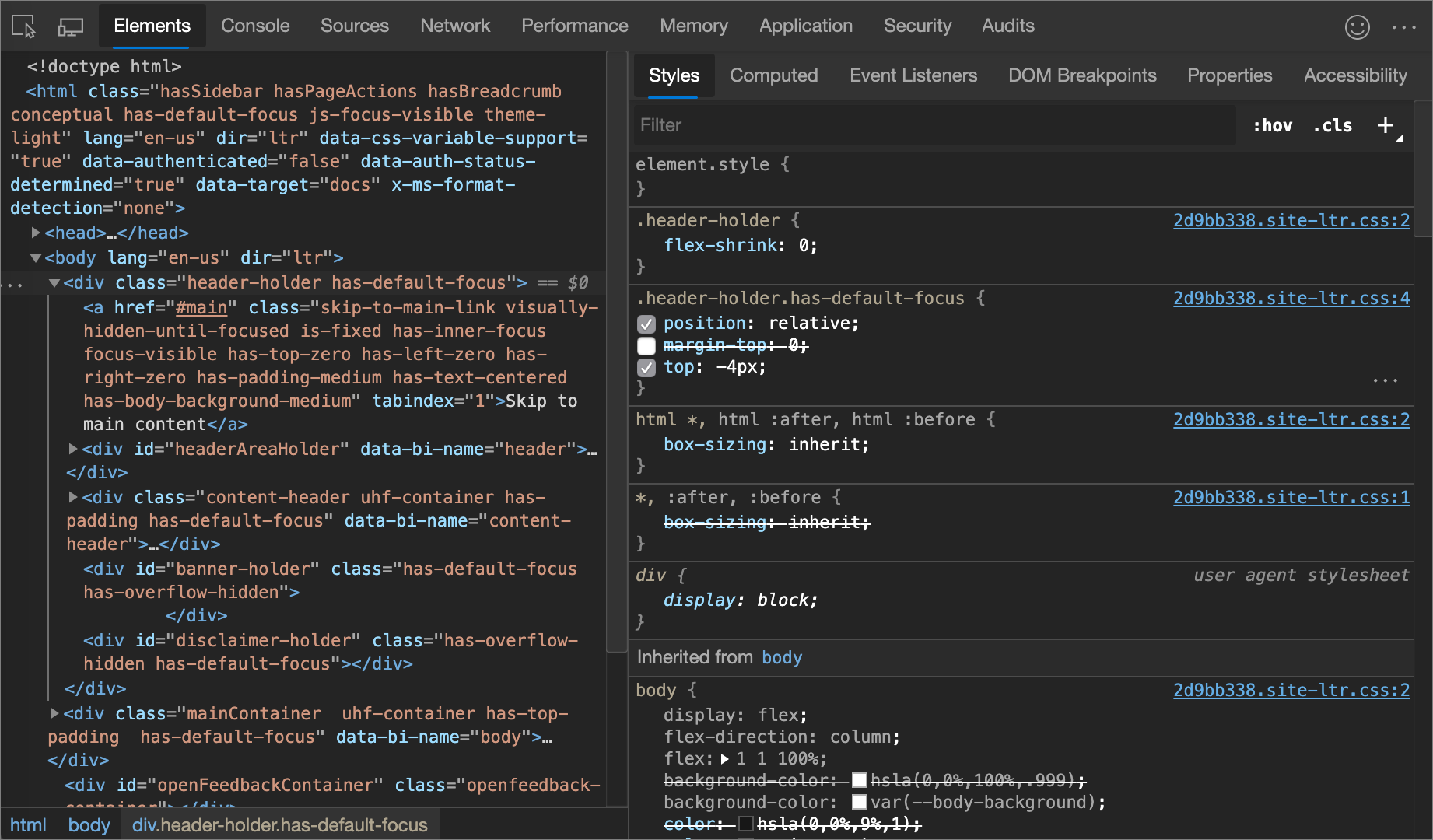
Edit the ::view-transition pseudo-elements during an animation
See:
- Edit the ::view-transition pseudo-elements during an animation in Animations: Inspect and modify CSS animation effects, in Chrome docs.
- Smooth transitions with the View Transition API in Chrome docs.
Align grid items and their content with the Grid Editor
See:
- Align grid items and their content: the grid editor popup in Inspect CSS Grid layouts.
Change colors with the Color Picker
The Color Picker provides a user interface for changing color and background-color declarations.
To open the Color Picker:
In the Styles pane, find the
color,background-color, or similar declaration that you want to change. To the left of thecolor,background-color, or similar value, there is a small square, which is a preview of the color.In the following figure, the small square to the left of
rgba(0, 0, 0, 0.7)is a preview of that color.
Click the preview to open the Color Picker.
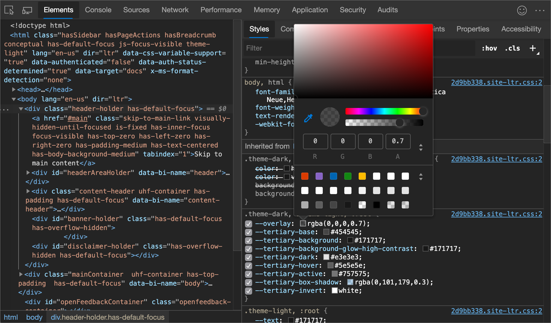
The following figure and list describes of each of the UI elements of the Color Picker.
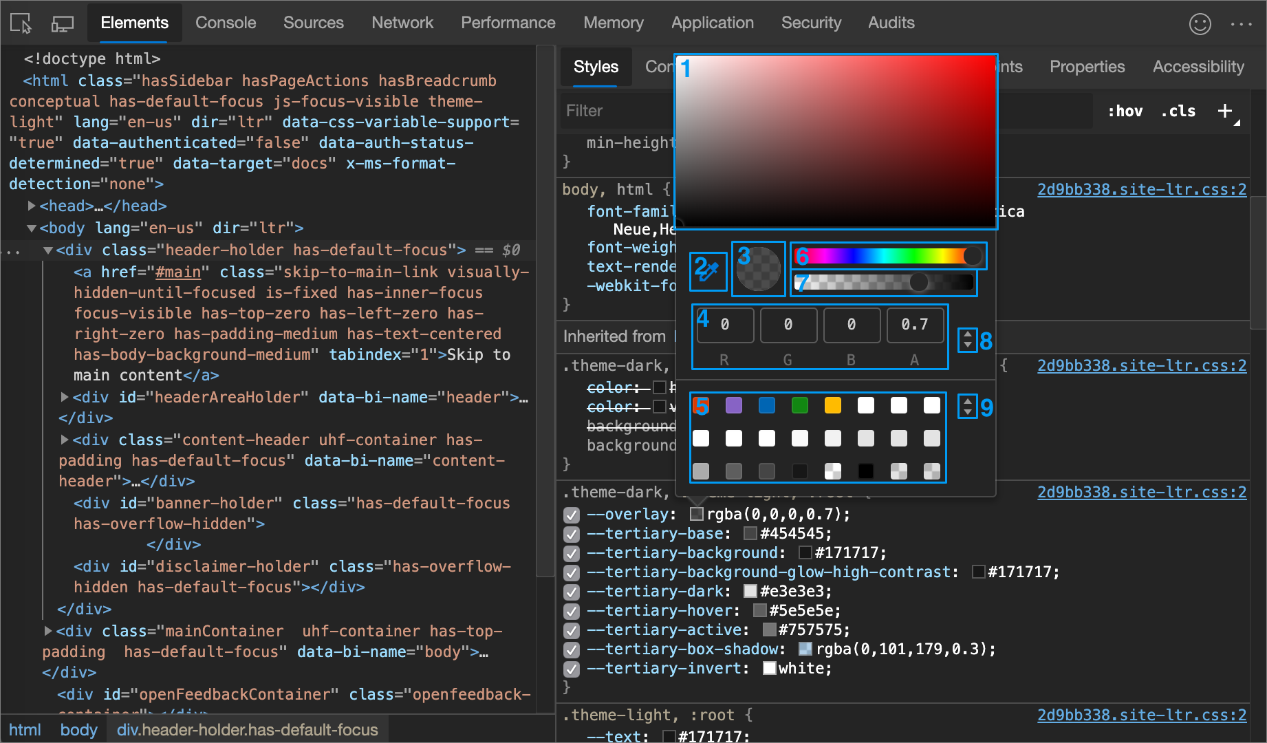
| Callout | Component | Description |
|---|---|---|
| 1 | Shades | |
| 2 | Eyedropper | Sample a color off the page with the Eyedropper |
| 3 | Copy To Clipboard | Copy the Display Value to your clipboard. |
| 4 | Display Value | The RGBA, HSLA, or Hex representation of the color. |
| 5 | Color Palette | Click a square to change the color. |
| 6 | Hue | |
| 7 | Opacity | |
| 8 | Display Value Switcher | Toggle between the RGBA, HSLA, and Hex representations of the current color. |
| 9 | Color Palette Switcher | Toggle between the Material Design palette, a custom palette, or a page colors palette. DevTools generates the page color palette based on the colors that it finds in your stylesheets. |
See also:
- Color usage and palettes in The color system at material.io: the Material Design palette.
Sample a color off the page with the Eyedropper
To change the selected color to some other color on the page:
Click the Eyedropper icon (
 ). Your cursor changes to a magnifying glass.
Hover on the pixel that has the color you want to sample, anywhere on your screen.
Click to confirm.
In the following figure, the Color Picker shows a current color value of
rgba(0,0,0,0.7), which is close to black. The specific color changes to the version of black that is currently highlighted in the viewport after you clicked it.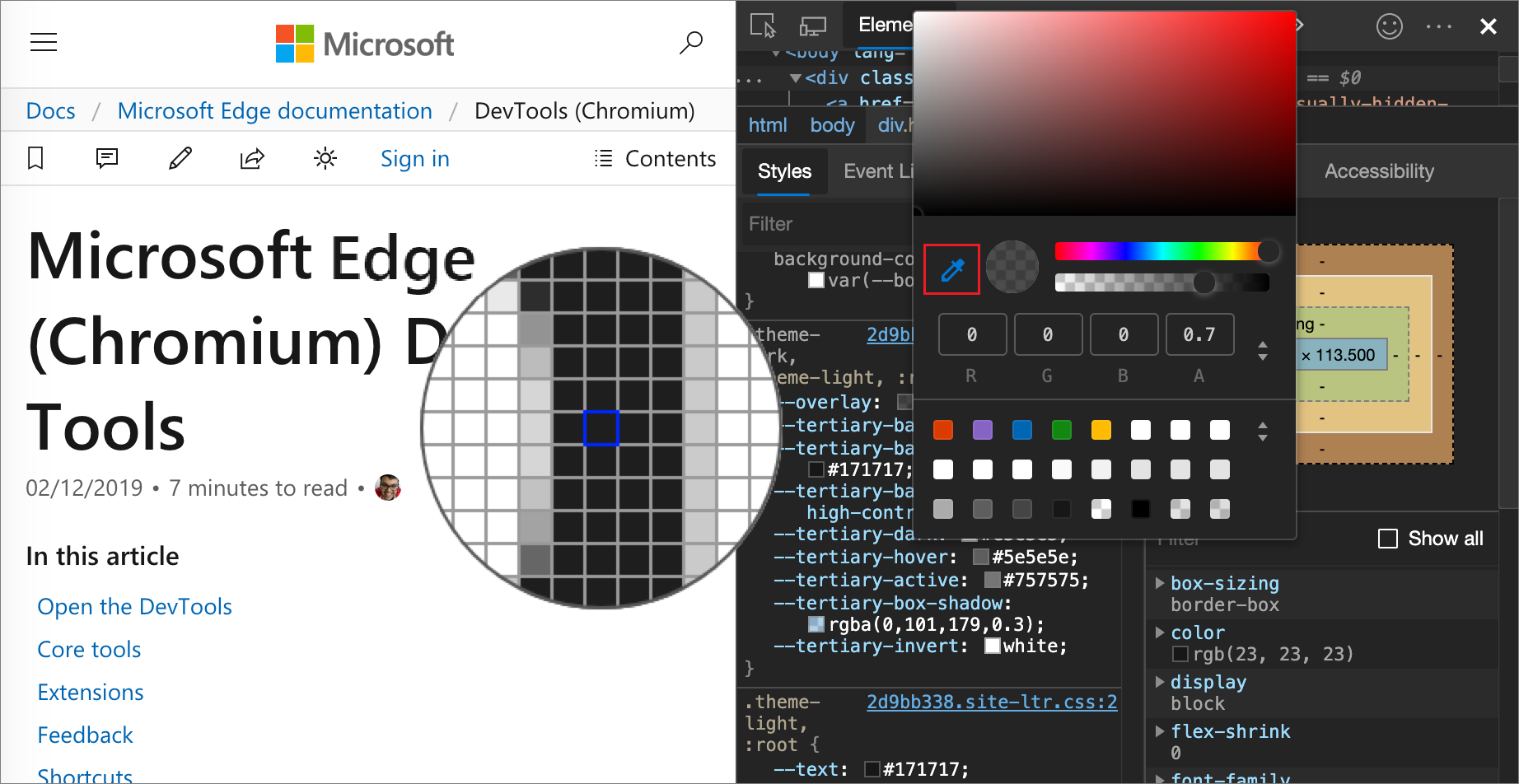
See also:
Change angle value with the Angle Clock
The Angle Clock provides a user interface for changing the angle amounts in CSS property values.
To open the Angle Clock:
Select an element which includes an angle declaration.
In the Styles pane, find the
transformorbackgrounddeclaration that you want to change. Click the Angle Preview box next to the angle value.In the following figure, the small clock to the left of
100degis a preview of the angle.Click the preview to open the Angle Clock:
Change the angle value by clicking on the Angle Clock circle, or scroll your mouse to increase or decrease the angle value by 1.
There are more keyboard shortcuts to change the angle value. Find out more in the Styles pane keyboard shortcuts.
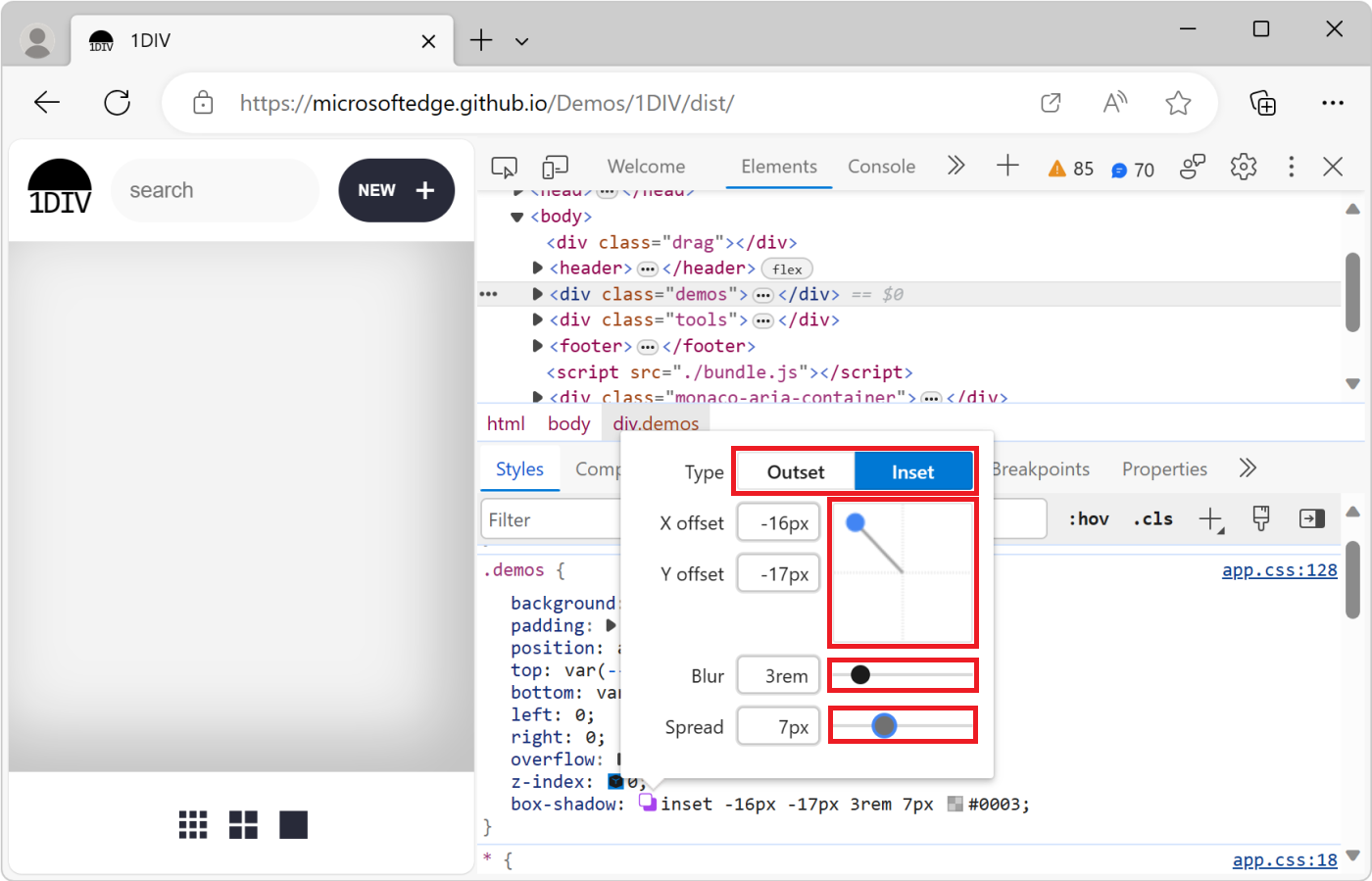
Change box and text shadows with the Shadow Editor
Use the Shadow Editor to change the value of the box-shadow or text-shadow CSS property on an HTML element:
Select an element with a
box-shadowortext-shadowdeclaration.For example, open the 1DIV demo page in a new tab or window, right-click the page and select Inspect to open DevTools, and then in the Elements tool, select the
<div class="demos">element.In the Styles pane, in the
.demosCSS rule, find thebox-shadowdeclaration, and then click its Open shadow editor ( ) button.
The Shadow Editor opens:
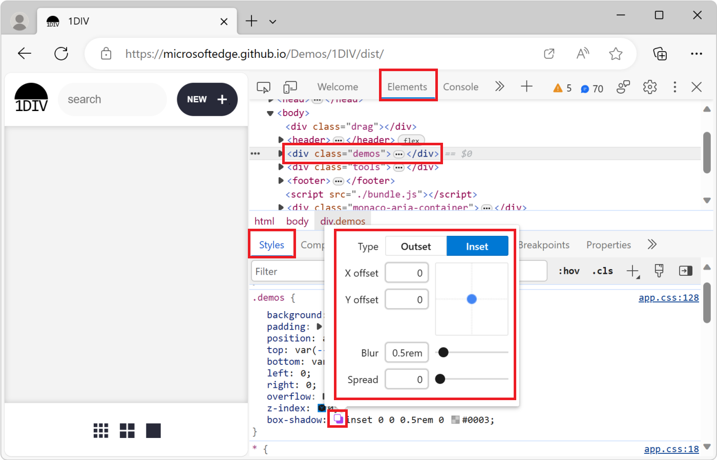
Change the shadow properties, as follows:
Property How to change Type Select Outset or Inset. Only for box-shadow.X offset Specify a value in the text box, or drag the blue dot. Y offset Specify a value in the text box, or drag the blue dot. Blur Specify a value in the text box, or drag the slider. Spread Specify a value in the text box, or drag the slider. Only for box-shadow.The changes are applied to the element in the rendered webpage in real time:
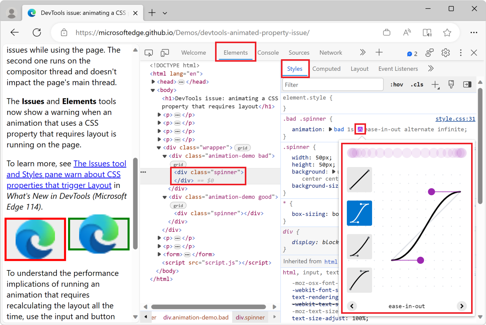
Edit animation and transition timings with the Easing Editor
Use the Easing Editor to change the value of the animation-timing-function or transition-timing-function property on an HTML element.
To open the Easing Editor:
In DevTools, in the Elements tool, in the DOM tree, select an element that has a CSS animation or transition applied.
For example, open the animated property demo page in a new tab or window, right-click the green box that contains an animation, and then select Inspect.
DevTools opens, displaying the Elements tool.
Press Ctrl+F and find "spinner", and then select the
<div class="spinner">element that's inside<div class="animation-demo good">.The red (bad) and green (good) boxes on this demo page are two different CSS animations. Both animations run with CSS by using the
animationCSS property, and define anease-in-outtiming function.In the Styles tab, in the
.good .spinnerCSS rule, in theanimationdeclaration, to the left ofease-in-out, click the Open cubic bezier editor ( ) button.
The Easing Editor opens:
Use presets to adjust timings
To adjust timings by a simple mouse-click, use the presets in the Easing Editor:
Open the Easing Editor, as described in Edit animation and transition timings with the Easing Editor, above.
Click one of the four picker buttons:
Button Function type CSS keyword 
Linear functions linear
Ease-in-out functions ease-in-out
Ease-in functions ease-in
Ease-out functions ease-outSelecting a button sets a keyword value in the CSS rule (which varies if you select a variant preset in the next step), and the Presets switcher opens at the bottom of the Easing Editor.
In the Presets switcher, click the Left
<or Right>buttons to pick one of the following presets:Linear presets:
elastic,bounce, oremphasized.Cubic Bezier presets:
Timing keyword Preset Cubic Bezier ease-in-out In Out, Sine cubic-bezier(0.45, 0.05, 0.55, 0.95)ease-in-out In Out, Quadratic cubic-bezier(0.46, 0.03, 0.52, 0.96)ease-in-out In Out, Cubic cubic-bezier(0.65, 0.05, 0.36, 1)ease-in-out Fast Out, Slow In cubic-bezier(0.4, 0, 0.2, 1)ease-in-out In Out, Back cubic-bezier(0.68, -0.55, 0.27, 1.55)Timing keyword Preset Cubic Bezier ease-in In, Sine cubic-bezier(0.47, 0, 0.75, 0.72)ease-in In, Quadratic cubic-bezier(0.55, 0.09, 0.68, 0.53)ease-in In, Cubic cubic-bezier(0.55, 0.06, 0.68, 0.19)ease-in In, Back cubic-bezier(0.6, -0.28, 0.74, 0.05)ease-in Fast Out, Linear In cubic-bezier(0.4, 0, 1, 1)Timing keyword Preset Cubic Bezier ease-out Out, Sine cubic-bezier(0.39, 0.58, 0.57, 1)ease-out Out, Quadratic cubic-bezier(0.25, 0.46, 0.45, 0.94)ease-out Out, Cubic cubic-bezier(0.22, 0.61, 0.36, 1)ease-out Linear Out, Slow In cubic-bezier(0, 0, 0.2, 1)ease-out Out, Back cubic-bezier(0.18, 0.89, 0.32, 1.28)
See also:
- Bézier curve at MDN.
Configure custom timings
To set custom values for timing functions, use the control points on the lines:
For linear functions, click anywhere on the line to add a control point and drag it. To remove a control point, double-click it.
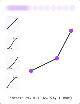
For Cubic Bezier functions, drag one of the control points:
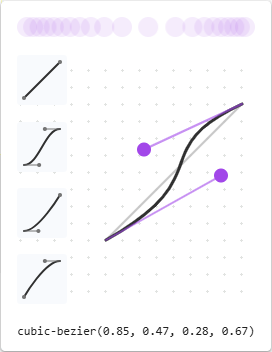
Any change triggers a ball animation in the Preview at the top of the Easing Editor.
See also
- Get started viewing and changing CSS.
- View the CSS for an element.
- Reformat a minified JavaScript file with pretty-print in JavaScript debugging features.
- Rendering tool, to see what a webpage looks like with different display options or vision deficiencies.
- Add a pseudo-state to a class.
- Command Menu
- Force DevTools into Print Preview mode.
- Override webpage resources with local copies (Overrides tab).
- Edit and save files in a workspace (Sources tool Workspace tab).
- Emulating dark or light mode using the Rendering tool in Emulate dark or light schemes in the rendered page.
- Check for contrast issues with dark theme and light theme
- Align grid items and their content: the grid editor popup in Inspect CSS Grid layouts.
- Test text-color contrast using the Color Picker
- Styles pane keyboard shortcuts.
Demos:
- To Do app
- View
@propertyat-rules - View
@supportsat-rules - View
@scopeat-rules - View
@font-palette-valuesat-rules - View
@position-tryat-rules - Emulate a focused page
- Highlight pseudo-elements
- Cascade layers
- 1DIV
- Animated property demo page
MDN:
- Using CSS custom properties (variables)
paddingCSS property- Specificity
- Custom properties (
--*): CSS variables @scopeCSS at-rule- @position-try CSS at-rule
- @font-palette-values CSS at-rule
- The box model
- Page Visibility API
:active:focus:focus-within:target:hover:focus-visible- Introduction to the CSS cascade
- Pseudo-elements
- Cascade layers.
- CSS syntax basics in What is CSS?
- Selector Types in Specificity.
- animation-timing-function
- transition-timing-function
- Bézier curve
GitHub:
- VS Code Custom Data - the "microsoft / vscode-custom-data" repo.
Web.dev:
Chrome for Developers blog:
Chrome docs:
- Edit the ::view-transition pseudo-elements during an animation in Animations: Inspect and modify CSS animation effects, in Chrome docs.
- Smooth transitions with the View Transition API in Chrome docs.
material.io:
- Color usage and palettes in The color system: the Material Design palette.
Note
Portions of this page are modifications based on work created and shared by Google and used according to terms described in the Creative Commons Attribution 4.0 International License. The original page is found here and is authored by Kayce Basques.
 This work is licensed under a Creative Commons Attribution 4.0 International License.