Uwaga
Dostęp do tej strony wymaga autoryzacji. Może spróbować zalogować się lub zmienić katalogi.
Dostęp do tej strony wymaga autoryzacji. Możesz spróbować zmienić katalogi.
W tym przewodniku przedstawiono nasze zalecane wzorce projektowe dla urządzeń z podwójnym ekranem z kodem i przykładami, które ułatwiają tworzenie interfejsów zapewniających atrakcyjne i przydatne środowiska użytkownika.
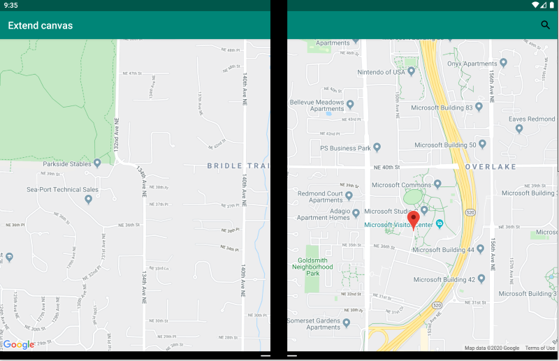
Wzorzec rozszerzonej kanwy
Wzorzec rozszerzonej kanwy traktuje oba ekrany jako jedną dużą kanwę do wyświetlania mapy, obrazu, arkusza kalkulacyjnego lub innej zawartości, która korzysta z rozpowszechniania w celu korzystania z maksymalnej ilości miejsca:
<ContentPage xmlns:local="clr-namespace:Xamarin.Duo.Forms.Samples"
             xmlns="http://xamarin.com/schemas/2014/forms"
             xmlns:x="http://schemas.microsoft.com/winfx/2009/xaml"
             xmlns:d="http://xamarin.com/schemas/2014/forms/design"
             xmlns:mc="http://schemas.openxmlformats.org/markup-compatibility/2006"
             mc:Ignorable="d"
             x:Class="Xamarin.Duo.Forms.Samples.ExtendCanvas">
    <Grid>
        <WebView x:Name="webView"
                 HorizontalOptions="FillAndExpand"
                 VerticalOptions="FillAndExpand" />
        <SearchBar x:Name="searchBar"
                   Placeholder="Find a place..."
                   BackgroundColor="DarkGray"
                   Opacity="0.8"
                   HorizontalOptions="FillAndExpand"
                   VerticalOptions="Start" />
    </Grid>
</ContentPage>
W tym przykładzie. zawartość wewnętrzna Grid i rozszerza się, aby korzystać ze wszystkich dostępnych ekranów, zarówno wyświetlanych na jednym ekranie, jak i obejmującej dwa ekrany.
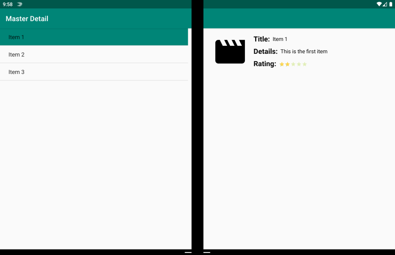
Wzorzec szczegółów wzorca
Wzorzec szczegółów wzorca dotyczy, gdy widok główny, zazwyczaj lista po lewej stronie, udostępnia zawartość, z której użytkownik wybiera, aby wyświetlić szczegółowe informacje o tym elemencie po prawej stronie:
<ContentPage xmlns:local="clr-namespace:Xamarin.Duo.Forms.Samples"
             xmlns="http://xamarin.com/schemas/2014/forms"
             xmlns:x="http://schemas.microsoft.com/winfx/2009/xaml"
             xmlns:dualScreen="clr-namespace:Xamarin.Forms.DualScreen;assembly=Xamarin.Forms.DualScreen"
             x:Class="Xamarin.Duo.Forms.Samples.MasterDetail">
    <dualScreen:TwoPaneView MinWideModeWidth="4000"
                            MinTallModeHeight="4000">
        <dualScreen:TwoPaneView.Pane1>
            <local:Master x:Name="masterPage" />
        </dualScreen:TwoPaneView.Pane1>
        <dualScreen:TwoPaneView.Pane2>
            <local:Details x:Name="detailsPage" />
        </dualScreen:TwoPaneView.Pane2>
    </dualScreen:TwoPaneView>
</ContentPage>
W tym przykładzie można użyć TwoPaneView polecenia , aby ustawić listę w jednym okienku i widok szczegółów na drugim.
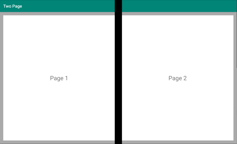
Wzorzec dwóch stron
Wzorzec dwóch stron jest idealny dla zawartości, która nadaje się do układu dwuwymiarowego, takiego jak czytnik dokumentów, notatki lub tablica artystyczna:
<Grid x:Name="layout">
    <CollectionView x:Name="cv"
                    BackgroundColor="LightGray">
        <CollectionView.ItemsLayout>
            <GridItemsLayout SnapPointsAlignment="Start"
                             SnapPointsType="MandatorySingle"
                             Orientation="Horizontal"
                             HorizontalItemSpacing="{Binding Source={x:Reference mainPage}, Path=HingeWidth}" />
        </CollectionView.ItemsLayout>
        <CollectionView.ItemTemplate>
            <DataTemplate>
                <Frame BackgroundColor="LightGray"
                       Padding="0"
                       Margin="0"
                       WidthRequest="{Binding Source={x:Reference mainPage}, Path=ContentWidth}"
                       HeightRequest="{Binding Source={x:Reference mainPage}, Path=ContentHeight}">
                    <Frame Margin="20"
                           BackgroundColor="White">
                        <Label FontSize="Large"
                               Text="{Binding .}"
                               VerticalTextAlignment="Center"
                               HorizontalTextAlignment="Center"
                               HorizontalOptions="Center"
                               VerticalOptions="Center" />
                    </Frame>
                </Frame>
            </DataTemplate>
        </CollectionView.ItemTemplate>
    </CollectionView>
</Grid>
Element CollectionView, z układem siatki, który dzieli szerokość zawiasu, zapewnia idealne podejście do zapewnienia tego dwuekranowego środowiska.
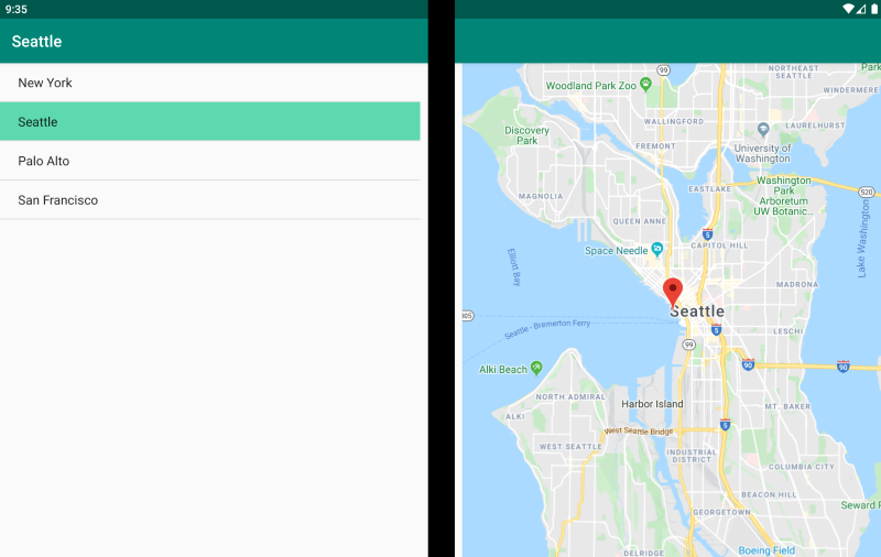
Wzorzec podwójnego widoku
Wzorzec podwójnego widoku może wyglądać podobnie jak w widoku "Dwie strony", ale rozróżnienie jest w scenariuszu zawartości i użytkownika. W tym wzorcu porównujesz zawartość obok siebie, na przykład w celu edytowania dokumentu lub zdjęcia, porównywania różnych menu restauracji lub różnicowania konfliktu scalania dla plików kodu:
<ContentPage xmlns:local="clr-namespace:Xamarin.Duo.Forms.Samples"
             xmlns="http://xamarin.com/schemas/2014/forms"
             xmlns:x="http://schemas.microsoft.com/winfx/2009/xaml"
             xmlns:dualScreen="clr-namespace:Xamarin.Forms.DualScreen;assembly=Xamarin.Forms.DualScreen"
             x:Class="Xamarin.Duo.Forms.Samples.DualViewListPage">
    <dualScreen:TwoPaneView>
        <dualScreen:TwoPaneView.Pane1>
            <CollectionView x:Name="mapList"
                            SelectionMode="Single">
                <CollectionView.ItemTemplate>
                    <DataTemplate>
                        <Grid Padding="10,5,10,5">
                            <Frame Visual="Material"
                                   BorderColor="LightGray">
                                <StackLayout Padding="5">
                                    <Label FontSize="Title"
                                           Text="{Binding Title}" />
                                </StackLayout>
                            </Frame>
                        </Grid>
                    </DataTemplate>
                </CollectionView.ItemTemplate>
            </CollectionView>
        </dualScreen:TwoPaneView.Pane1>
        <dualScreen:TwoPaneView.Pane2>
            <local:DualViewMap x:Name="mapPage" />
        </dualScreen:TwoPaneView.Pane2>
    </dualScreen:TwoPaneView>
</ContentPage>
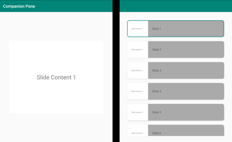
Wzorzec towarzyszący
Wzorzec towarzyszący pokazuje, jak można użyć drugiego ekranu, aby zapewnić drugi poziom zawartości związanej z widokiem podstawowym, na przykład w przypadku aplikacji do rysowania, gry lub edycji multimediów:
<ContentPage xmlns:local="clr-namespace:Xamarin.Duo.Forms.Samples"
             xmlns="http://xamarin.com/schemas/2014/forms"
             xmlns:x="http://schemas.microsoft.com/winfx/2009/xaml"
             xmlns:dualscreen="clr-namespace:Xamarin.Forms.DualScreen;assembly=Xamarin.Forms.DualScreen"
             x:Name="mainPage"
             x:Class="Xamarin.Duo.Forms.Samples.CompanionPane"
             BackgroundColor="LightGray"
             Visual="Material">
    <dualscreen:TwoPaneView x:Name="twoPaneView"
                            MinWideModeWidth="4000"
                            MinTallModeHeight="4000">
        <dualscreen:TwoPaneView.Pane1>
            <CarouselView x:Name="cv"
                          BackgroundColor="LightGray"
                          IsScrollAnimated="False" >
                <CarouselView.ItemTemplate>
                    <DataTemplate>
                        <Frame BackgroundColor="LightGray"
                               Padding="0"
                               Margin="0"
                               WidthRequest="{Binding Source={x:Reference twoPaneView}, Path=Pane1.Width}"
                               HeightRequest="{Binding Source={x:Reference twoPaneView}, Path=Pane1.Height}">
                            <Frame Margin="20"
                                   BackgroundColor="White">
                                <Label FontSize="Large"
                                       Text="{Binding ., StringFormat='Slide Content {0}'}"
                                       VerticalTextAlignment="Center"
                                       HorizontalTextAlignment="Center"
                                       HorizontalOptions="Center"
                                       VerticalOptions="Center" />
                            </Frame>
                        </Frame>
                    </DataTemplate>
                </CarouselView.ItemTemplate>
            </CarouselView>
        </dualscreen:TwoPaneView.Pane1>
        <dualscreen:TwoPaneView.Pane2>
            <CollectionView x:Name="indicators"
                            SelectionMode="Single"
                            Margin="20, 20, 20, 20"
                            BackgroundColor="LightGray"
                            WidthRequest="{Binding Source={x:Reference twoPaneView}, Path=Pane2.Width}"
                            ItemsSource="{Binding Source={x:Reference cv}, Path=ItemsSource}">
                <CollectionView.Resources>
                    <ResourceDictionary>
                        <Style TargetType="Frame">
                            <Setter Property="VisualStateManager.VisualStateGroups">
                                <VisualStateGroupList>
                                    <VisualStateGroup x:Name="CommonStates">
                                        <VisualState x:Name="Normal">
                                            <VisualState.Setters>
                                                <Setter Property="Padding"
                                                        Value="0" />
                                            </VisualState.Setters>
                                        </VisualState>
                                        <VisualState x:Name="Selected">
                                            <VisualState.Setters>
                                                <Setter Property="BorderColor"
                                                        Value="Green" />
                                                <Setter Property="Padding"
                                                        Value="1" />
                                            </VisualState.Setters>
                                        </VisualState>
                                    </VisualStateGroup>
                                </VisualStateGroupList>
                            </Setter>
                        </Style>
                    </ResourceDictionary>
                </CollectionView.Resources>
                <CollectionView.ItemsLayout>
                    <LinearItemsLayout Orientation="Vertical"
                                       ItemSpacing="10" />
                </CollectionView.ItemsLayout>
                <CollectionView.ItemTemplate>
                    <DataTemplate>
                        <Frame WidthRequest="{Binding Source={x:Reference twoPaneView}, Path=Pane2.Width}"
                               CornerRadius="10"
                               HeightRequest="60"
                               BackgroundColor="White"
                               Margin="0">
                            <StackLayout HorizontalOptions="Fill"
                                         VerticalOptions="Fill"
                                         Orientation="Horizontal">
                                <Label FontSize="Micro"
                                       Padding="20,0,20,0"
                                       VerticalTextAlignment="Center"
                                       WidthRequest="140" Text="{Binding ., StringFormat='Slide Content {0}'}" />
                                <Label FontSize="Small"
                                       Padding="20,0,20,0"
                                       VerticalTextAlignment="Center"
                                       HorizontalOptions="FillAndExpand"
                                       BackgroundColor="DarkGray"
                                       Grid.Column="1"
                                       Text="{Binding ., StringFormat='Slide {0}'}" />
                            </StackLayout>
                        </Frame>
                    </DataTemplate>
                </CollectionView.ItemTemplate>
            </CollectionView>
        </dualscreen:TwoPaneView.Pane2>
    </dualscreen:TwoPaneView>
</ContentPage>