Manager effectiveness
Important
This article is for the legacy Workplace Analytics app and does not reflect functionality available on the updated Viva Insights platform. Access current documentation for Viva Insights advanced insights here: advanced insights documentation.
The Manager effectiveness dashboard for Power BI uses Viva Insights data to analyze people manager behaviors in your organization. HR analysts can use this analysis to measure behaviors and trends of people managers across four key themes within your organization, including coach, empower, connect, and model.
Each theme includes insights about manager effectiveness and ways to help maintain or increase preferred leadership behaviors. Key metrics are used to deep dive into each theme, along with a Why it matters interpretation and best practices recommended by industry experts.
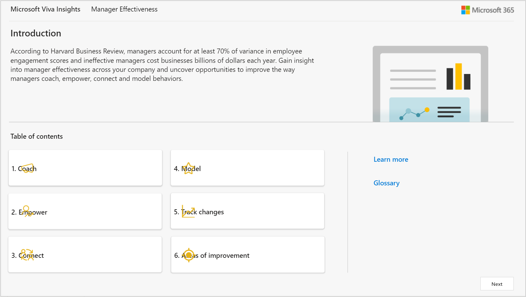
The following describes the analysis within each theme and the actions you can take, such as tracking changes.
Coach
- Do managers have enough time for their employees? Shows the weekly average number of hours that managers spent collaborating with people in the company, divided into groups and types of communication (meetings, emails, chats, and calls). It also shows the average percentage of collaboration time that managers spent with direct reports as compared to others in the organization.
- Are employees receiving sufficient coaching time with their manager? Analyzes managers’ behavior in scheduling 1:1 time with their direct reports by groups. Metrics include monthly average number of minutes in 1:1 meetings with direct reports, percentage of employees who receive a different number of 1:1 hours with their manager, and the average frequency of 1:1 time (weekly, monthly, or quarterly).
Empower
- Are managers balancing oversight with employee autonomy? Shows the percentage of employees whose managers co-attend their meetings and might be micromanaging them as direct reports. It also shows the weekly average number of hours that managers co-attended meetings and spent in 1:1 meetings with their direct reports.
- How are manager habits impacting employee empowerment, workflows, and trust? Compares average percentages of collaboration load that's generated by managers as compared to individual contributors grouped by organization. It also compares scheduled and unscheduled collaboration time that managers generate, including meetings, email, Teams calls and chats.
Connect
- Do managers have large, diverse, and influential networks to enable and support their teams? Shows average connectivity metrics for managers, including distinct internal connections across different organizations and what percentage of managers are in the top 20 percent of influencers. It also shows details about the size and breadth of contacts and influencing potential for managers, which are grouped by organization.
- Do well-connected and influential managers have well-connected teams? Shows the average internal network size of managers as compared to individual contributors grouped by organization. It also shows the internal network size distribution of managers as compared to the full organizational population grouped by organization.
Model
- Are managers modeling good work-life balance? Shows the weekly average of after-hours work for managers as compared to individual contributors in the organization. It also shows the difference in average workweek span collaboration hours for managers and for individual contributors, which is grouped by organization.
Take action
- Track changes - How are manager behaviors evolving? Shows metrics for the key indicator trends for managers, including metrics about coaching and empowerment, network connections, and after-hours work habits.
- Areas of improvement - How can manager effectiveness be improved? Lists some opportunity areas with related best practices and recommendations and links to related articles about ways to help your managers improve in each area.
The dashboard also includes:
- Customize report enables you to select what time period and organizational attribute to view the reports by and which employees to include in the reports.
- Glossary that describes the metrics used in the different reports.
To populate the dashboard in Power BI, you must set up and successfully run the predefined Manager effectiveness query and the Influence insights by month query in the advanced insights app. After you successfully run it, you'll see the template as an available download option for the query. This template is required to create the dashboard in Power BI. After you download the template, you can then connect the query data from the advanced insights app to the dashboard in Power BI.
When the dashboard is populated with your data, you can use it to visualize, explore, and report about your manager's workplace patterns and trends.
Demonstration
The following demo uses sample data that is only representative of this dashboard and might not be exactly what you see in a live dashboard specific to your organization's unique data.
To find the template for the Manager effectiveness dashboard for Power BI, go to the Query designer(if that link doesn't work, try this link instead). For complete steps, see Set up the dashboard.
Prerequisites
Before you can run the query and populate the dashboard in Power BI, you must:
- Be assigned the role of Analyst in the advanced insights app.
- Have the latest version of Power BI Desktop installed. If you have an earlier version of Power BI installed, uninstall it before installing the new version. Then go to Get Power BI Desktop to download and install the latest version.
Set up the dashboard
Note
This dashboard is currently only available in English and will only work with data generated from the English version of the advanced insights app. Before completing the setup steps, confirm or change the browser language to en-us in the app's URL: https://workplaceanalytics.office.com/en-us/Home/
In the app(if that link doesn't work, try this link instead) , select Analyze > Query designer.
In Create > Other templates, select Manager effectiveness to see the required setup steps, and then in step 2, select Set up next to Manager effectiveness (or select Influence insights by month, per Step 8).
When prompted, select or confirm the options for Group by, Time period, and Meeting exclusions.
In Select metrics, keep the preselected metrics, which are required for the dashboard to work.
In Select filters, select Active only for Which measured employees do you want to include in your query results? Optionally, you can further filter the employees in scope for the dashboard. For more details about filter and metric options, see Create a Person Query.
In Organizational data, you can choose Select all to include all available attributes. For best results, select all required attributes that identify managers and their groups, such as LevelDesignation, ManagerId, Organization, and SupervisorIndicator.
Important
LevelDesignation is a reserved optional attribute when uploading your organizational data. If this attribute was not uploaded and is unavailable in the advanced insights app, charts and data relating to LevelDesignation will not show in the query output or in Power BI reports.
Select Run (at top right) to run the query, which can take a few minutes up to a few hours to complete.
When prompted, select to return to the Query designer, and then repeat Steps 2-7 and select the Influence insights by month query. Make the same selections as for Manager effectiveness.
When prompted, select to go to Results. After both queries successfully run, in Query designer > Results, select the Download icon for the Manager effectiveness query results, select PBI template, and then select OK to download the template.
Open the downloaded Manager effectiveness template.
If prompted to select a program, select Power BI.
When prompted by Power BI:
- In Query designer > Results, select the Link icon for each query, and select to copy the generated OData URL link.
- In Power BI, paste each copied link into its respective URL field.
- Set the Minimum group size for data aggregation within this report's visualizations in accordance with your company's policy for viewing Viva Insights data.
- Select Load to import the query results into Power BI. Loading these large files might take a few minutes up to a few hours to complete.
If you're already signed in to Power BI with your Viva Insights organizational account, the dashboard visualizations will populate with your data. You are done and can skip the following steps. If not, proceed to the next step.
If you're not signed in to Power BI, or if an error occurs when updating the data, sign in to your organizational account again. In the OData feed dialog box, select Organizational account, and then select Sign in. See Troubleshooting for more details.
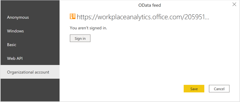
Select and enter credentials for the organizational account that you use to sign in to Viva Insights, and then select Save.
Important
You must sign in to Power BI with the same account you use to access Viva Insights.
Select Connect to prepare and load the data, which can take a few minutes to complete. After the data loads, you'll see visualization charts in Power BI about manager effectiveness within your organization.
Customize report
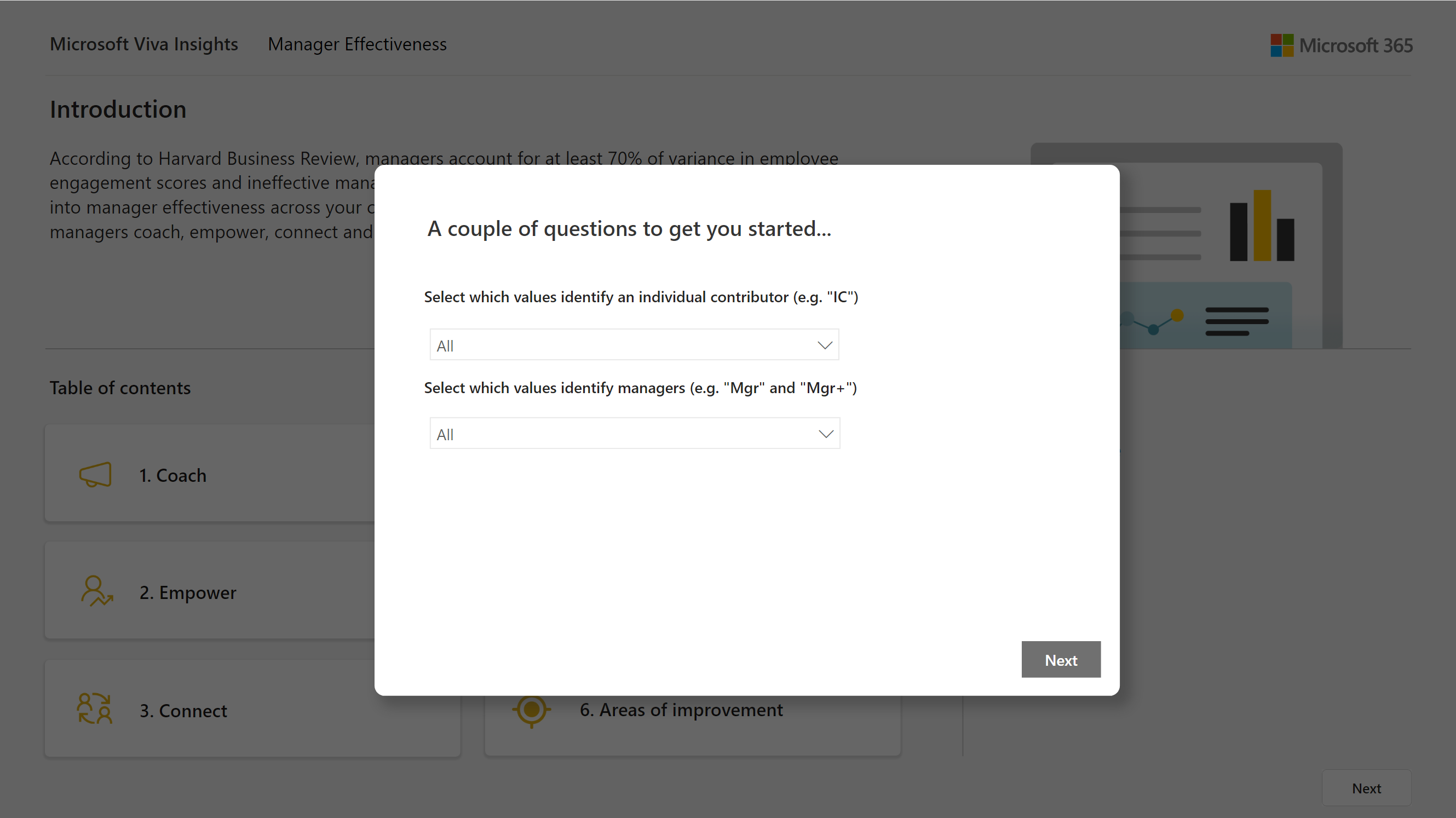
After the Manager effectiveness dashboard is set up and populated with Viva Insights data in Power BI, you are prompted to select the following attribute values.
- Individual contributor attribute - Select the attribute values that identify employees as individual contributors who do not manage people within your organization.
- Manager indicator attribute - Select the attribute values that identify managers who manage people within your organization, such as Mngr and Mngr+.
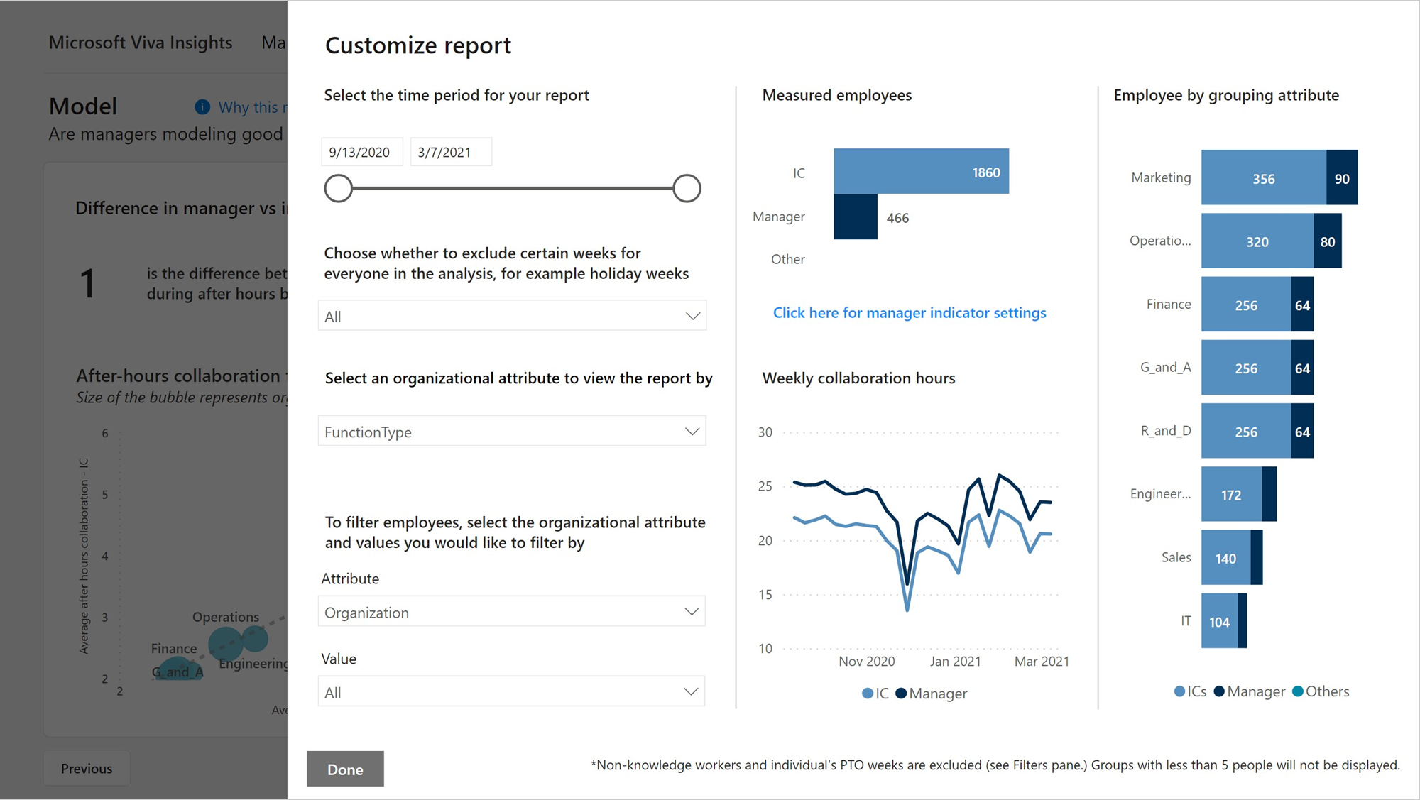
After this initial prompt, you can then select Customize at top right of any page to view and change the following attribute values.
- Time period – Select the time period you want to view data for in the dashboard.
- Exclusions - Select the weeks you want to exclude for everyone in the analysis population, such as holiday weeks where everyone is away from work.
- Organizational attribute to view the report by - Select the primary “group-by” attribute shown in all the reports. You can change this attribute at any time and all report pages will show group values by the new attribute.
- Employee filter - Select the organizational attribute and values you want to filter the employees by in the reports.
Power BI tips, troubleshooting, and FAQs
For details about how to share the dashboard and other Power BI tips, troubleshoot any issues, or review the FAQ, see Power BI tips, FAQ, and troubleshooting.