Observação
O acesso a essa página exige autorização. Você pode tentar entrar ou alterar diretórios.
O acesso a essa página exige autorização. Você pode tentar alterar os diretórios.
The LoginButton is both a button and flyout control to facilitate Microsoft identity platform authentication. It provides two states:
- When the user is not signed in, the control is a simple button to initiate the sign in process.
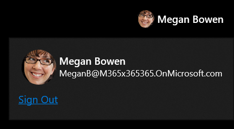
- When the user is signed in, the control displays the current signed in user name, profile image, and email. When clicked, a flyout is opened with a command to sign out.
Available in the CommunityToolkit.Graph.Uwp package.
Syntax
<Grid xmlns:controls="using:CommunityToolkit.Graph.Uwp.Controls">
    <controls:LoginButton />
</Grid>
Sample Output

Properties
| Property | Type | Description |
|---|---|---|
| UserDetails | User | Gets or sets details about this person retrieved from the graph or provided by the developer. |
| IsLoading | bool | Indicates if the control is loading and hasn't established a sign-in state. |
Events
| Events | Description |
|---|---|
| LoginInitiated | The user clicked the sign in button to start the login process. |
| LoginCompleted | The login process was successful and the user is now signed in. |
| LoginFailed | The user canceled the login process or was unable to sign in. |
| LogoutInitiated | The user started to logout. |
| LogoutCompleted | The user signed out. |
Requirements
- Namespace: CommunityToolkit.Graph.Uwp.Controls
- NuGet package: CommunityToolkit.Graph.Uwp
- Scope:
User.Read