Fish Eye for the Blend Guy

Thought I would share a panel that I and one of my dev friends, Paul Tallett created a while back. I also wanted o show you how you can use it in Blend.
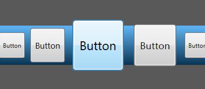
A while back, we wanted to create a panel that would scale up its contents depending how close the mouse pointer was - however - we didn't want the panel to take up anymore width - tricky. This neat effect is similar to the Fish Eye effect, similar to the list of words on 10x10.org. The only difference was, we actually scale down the items furthest away from the mouse, ensuring the panel doesn't require any extra width.
Paul took this spec and created the code for the custom panel (you can read the full development article here) and then handed me a file called FishEyePanel.cs. From here, it was really easy to use in my Blend project. I have attached a .zip file to this post containing an example project and the FishEyePanel.cs file - and so, here are the steps to use a custom panel in your Blend project...
- With your Blend project open, go to the Project menu at the top, and click 'Add existing item...'
- Now, browse to FishEyePanel.cs, and click 'Open' (you will see in your Project tab that the panel has been added
- Go back to the Project menu, and select 'Rebuild Project'
- The panel is now ready to use - simply open up the Asset Library from the bottom of the tool box, click on the CustomControls tab and hey presto - you will see the FishEyePanel in there, and ready to use.
- Select it and then pop one onto your UI, then put stuff in.
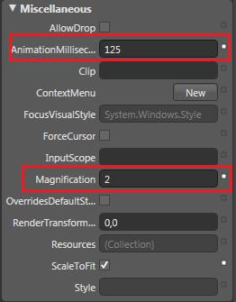
Thing to remember, is that the FishEyePanel is very size aware, and will always scale its contents to fit its space. There are also a couple of properties you can play with found in the Miscellenous properties panel...

AnimationMilliseconds will change the responsiveness of the panel, and magnification will change how large the items scale up by.
Please have a play with the panel, feedback, and let me know if you have created any wack custom panels - would be great to start sharing these with everyone!
Martin
Comments
Anonymous
April 06, 2007
This is brilliant! Works beautifully. I actually needed a vertical one. So i just rotated the thing and placed the child items inside it. I think resizing the child items causes some sort of a problem in blend. But the smoothness of the code is par excellence! Thanks much.Anonymous
November 13, 2007
Very cool control, thank you! I have a question. If I wrap the panel into ViewBox - it does not scale. Any ideas how to fix that?Anonymous
February 03, 2008
very tkx 4 your greatful guide~Anonymous
February 04, 2008
Hi, Thank U So Much.It is Useful for me.Anonymous
June 24, 2008
Martin Grayson has a fantastic post, along with code, on one of the best Fish Eye controls I've seenAnonymous
November 18, 2008
Do you have to use button controls? What if you wanted a bit of title text to appear under the button image as its being rolled over? It looks like a button control will not allow this. What is preferred instead? Do you ever answer questions put forth in the comment section? :) zac@wetinkpro.comAnonymous
November 18, 2008
Nope, you can put anything in (that inherits UIElement) - pictures, grids, videos, drawings - anything. I have just used buttons in my example. MartinAnonymous
February 25, 2009
Has anyone updated this control to work with the latest release of Silverlight? If so, can you post the updated code. Thanks, DontaAnonymous
February 26, 2009
Hi Donta, I have asked the author, I will get back to you! Thanks, MartinAnonymous
February 26, 2009
Donta, Not that we know of. If you do, let us know! MartinAnonymous
May 28, 2009
I ported this to silverlight 2 with minimal coding - find the entire class on my new blog; http://devoodoo.blogspot.com/2009/05/wpf-fisheyepanel-port-to-silverlight-2.html Enjoy; -JoshAnonymous
July 22, 2009
Thanks, for this wonderful post. However, can you please explain how can i deploy it on my sharepoint (MOSS 2007) site. Regards PallaviAnonymous
August 06, 2009
Thanks, saved me a lot of time.Anonymous
August 13, 2009
The comment has been removedAnonymous
October 14, 2010
Nice control. Found one small bug though. If a child control is collapsed/hidden and the control gets to the foreach loop in the AnimateAll method, it'll crash. Adding a small check in the beginning of the loop to skip invisible children fixes the bug.